
An effective dashboard design presents data in a concise, engaging, and powerful way. The presentation of data should not just be visually pleasing. It should also be easy for the target audience to comprehend. In this tutorial, we’ll discuss some ideas on how we can be creative with visualizations for our Power BI dashboard designs.

Card Visuals And Hover Effects For Power BI Dashboard Designs
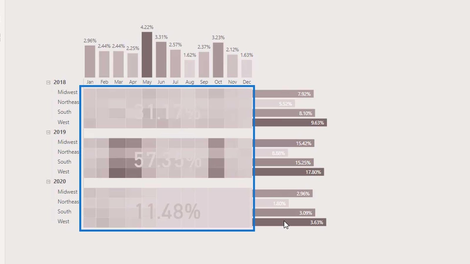
In the first example, we’ll be placing a card visual on top of a heat map as shown from the image below.

For the second example, we’ll make use of the blank button options in Power BI. We can actually add hover effects on blank buttons. For example, if we hover over this measure, it will display additional information about our data.
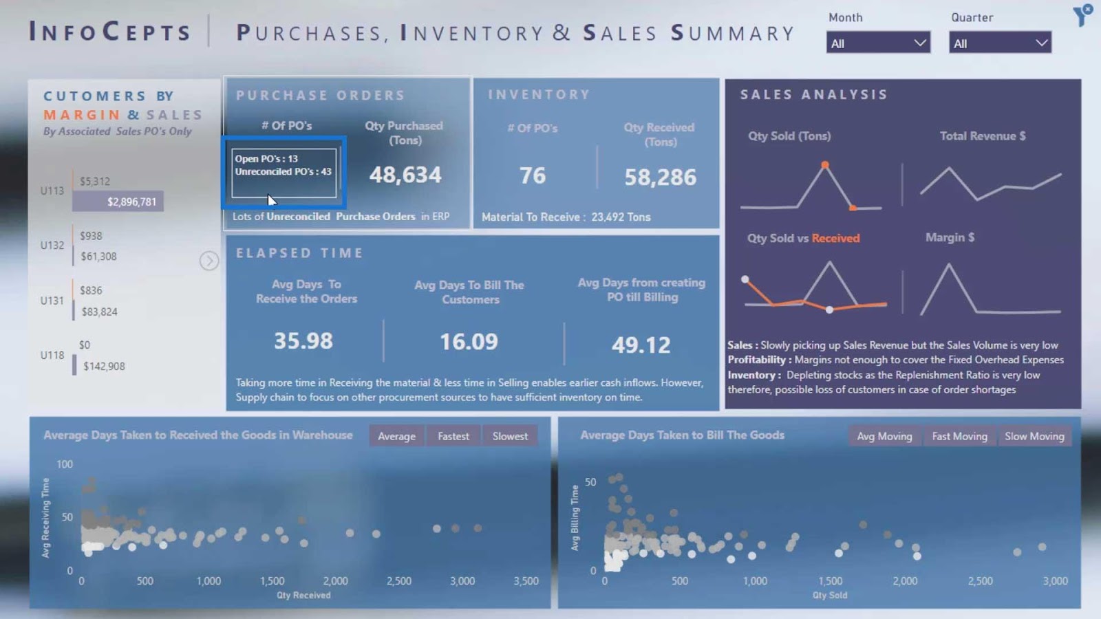
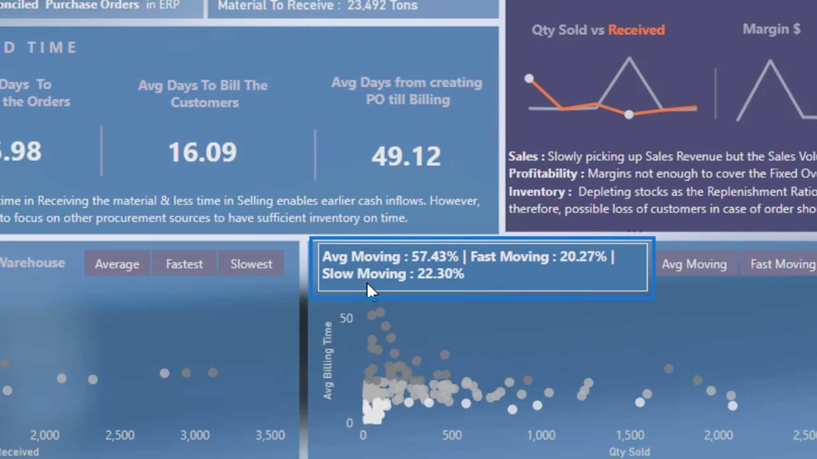
Moreover, we can make use of the titles of the visuals. For example, this title indicates “Average Days Taken to Bill The Goods”.
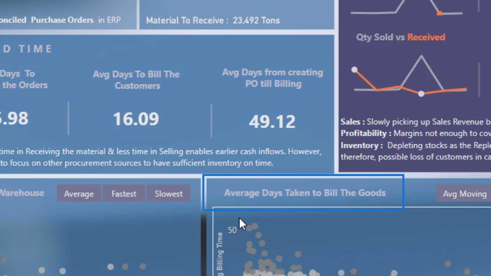
If we hover over this title, it will show us more information like the average, fast, and slow moving percentage of goods.
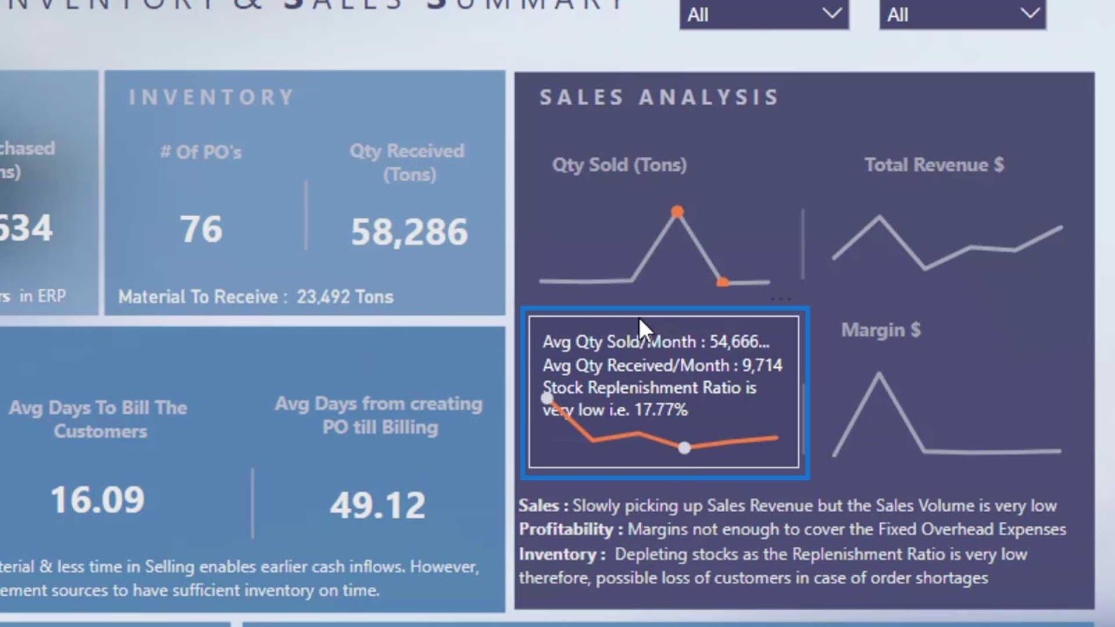
We can also place a hover effect on a line chart or other charts.
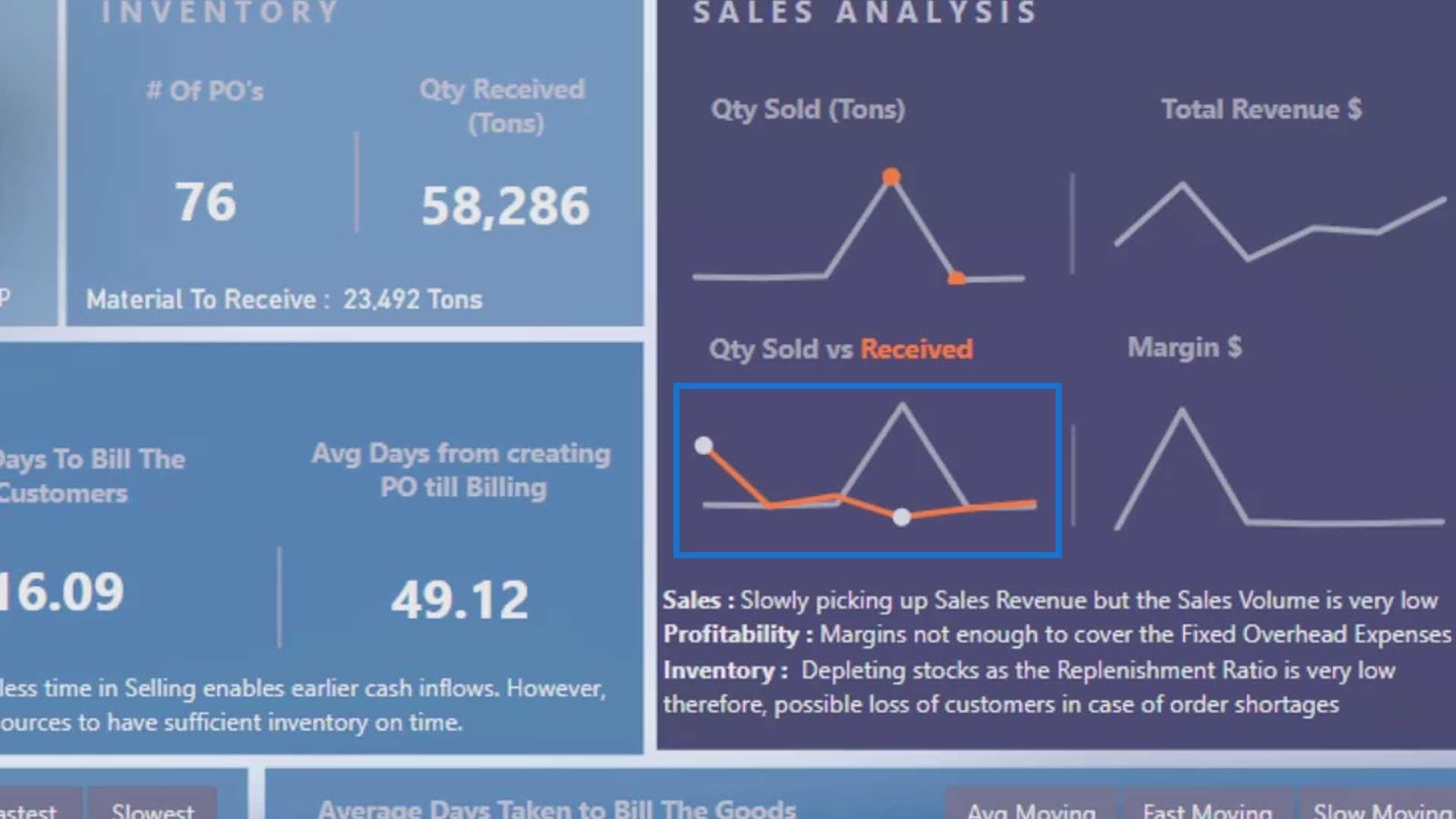
In this example, if we hover over the line chart, it will display additional information.
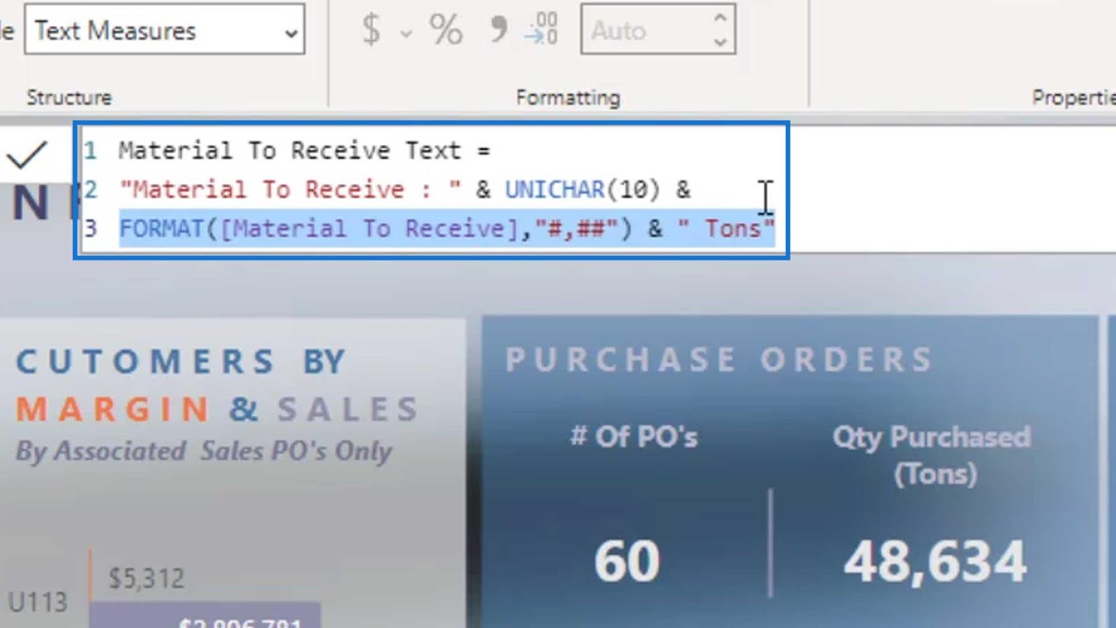
Creating this is pretty simple and straightforward. The only thing that we should keep in mind is that this only accepts a measure if it’s wrapped around a text function or a text format.
Creating The Hover Effects For Power BI Dashboard Designs
These are all the text measures that I’ve created for the hover effects.

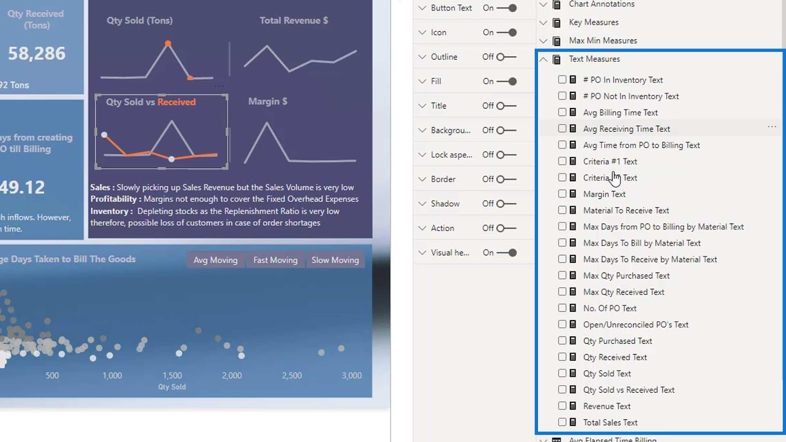
If I click on one text measure, we’ll see that it’s all texts. I even converted the measure that was in the value into a text using the FORMAT DAX function. Otherwise, it won’t accept it.
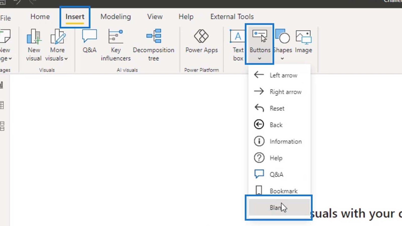
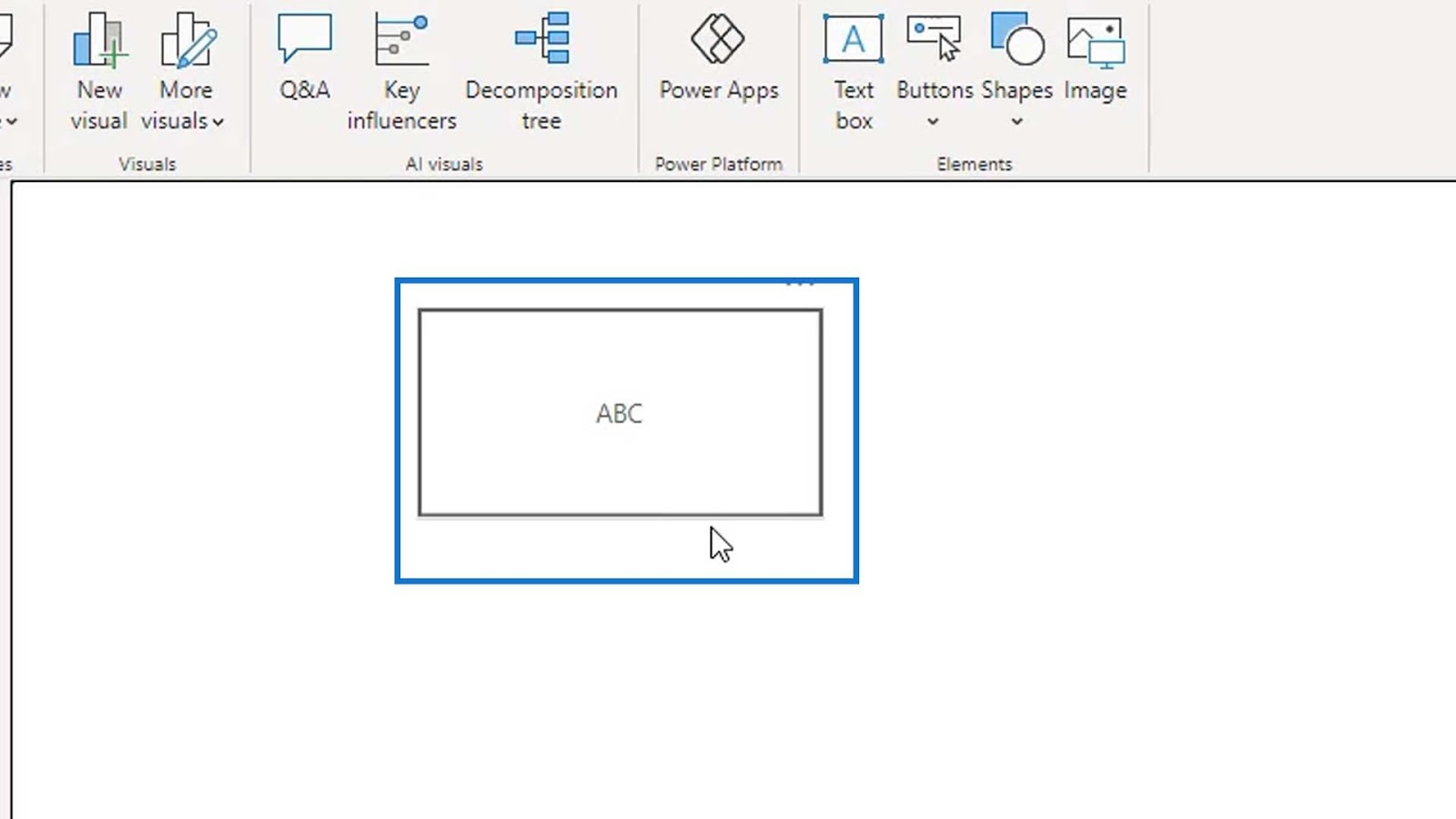
To create this effect, go to Insert tab, click Buttons, and select Blank.
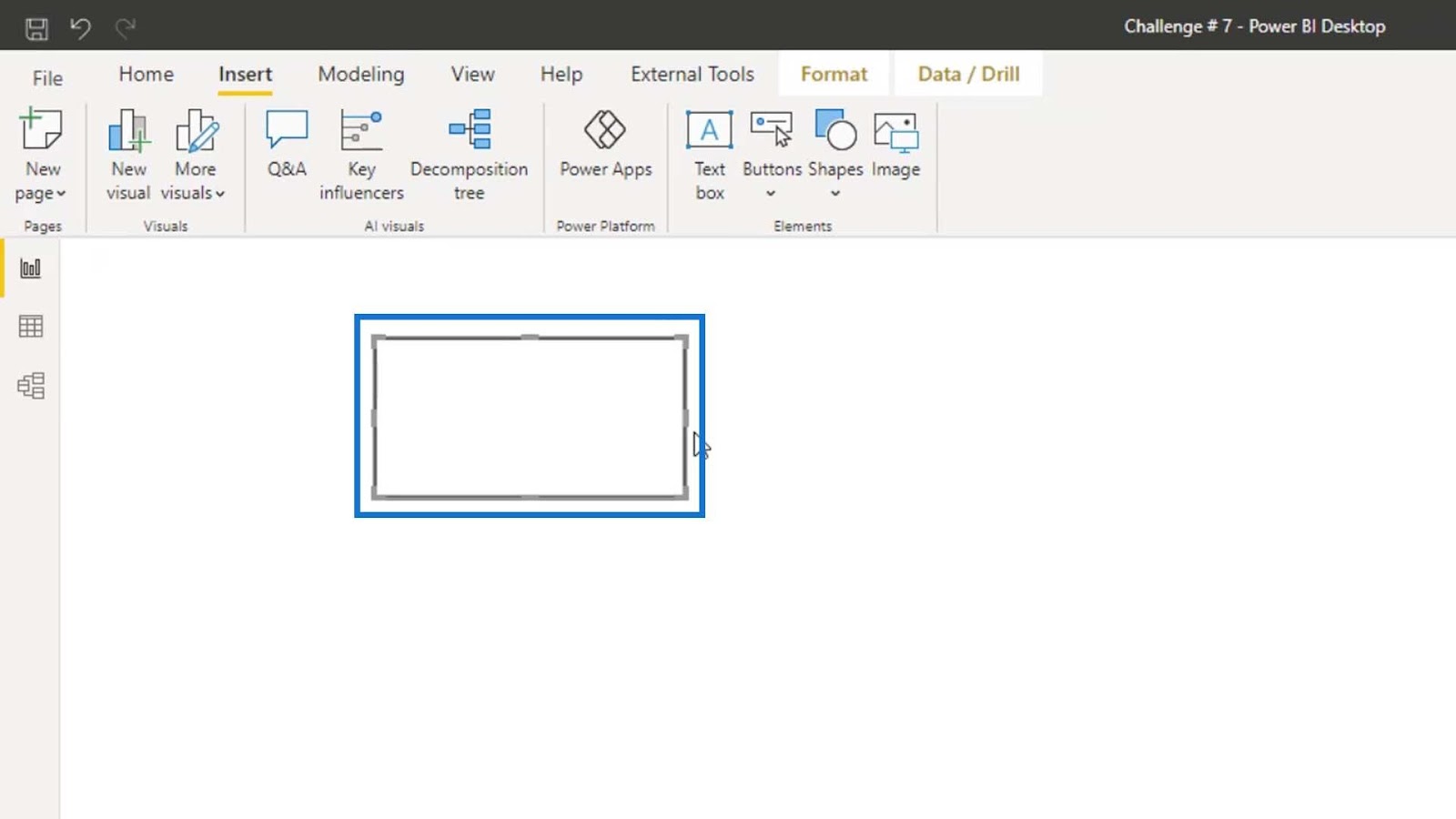
We can then resize this blank button as shown in the image.
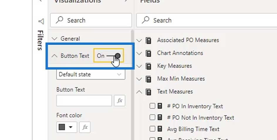
Next, enable the Button Text option.
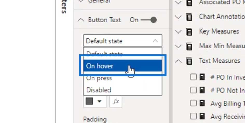
In this dropdown, the Default state means nothing will happen for this button.
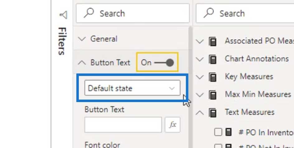
We want to create a hover effect so let’s change it to On hover.
If we want, we can add static texts by putting them in the Button Text field. For example, let’s type ABC here.
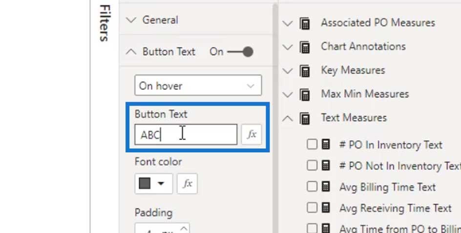
If we hover over the blank button, it will display the ABC text.
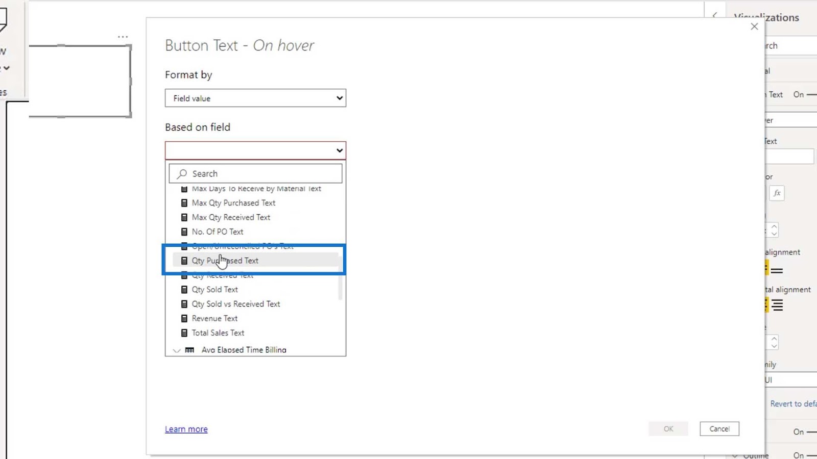
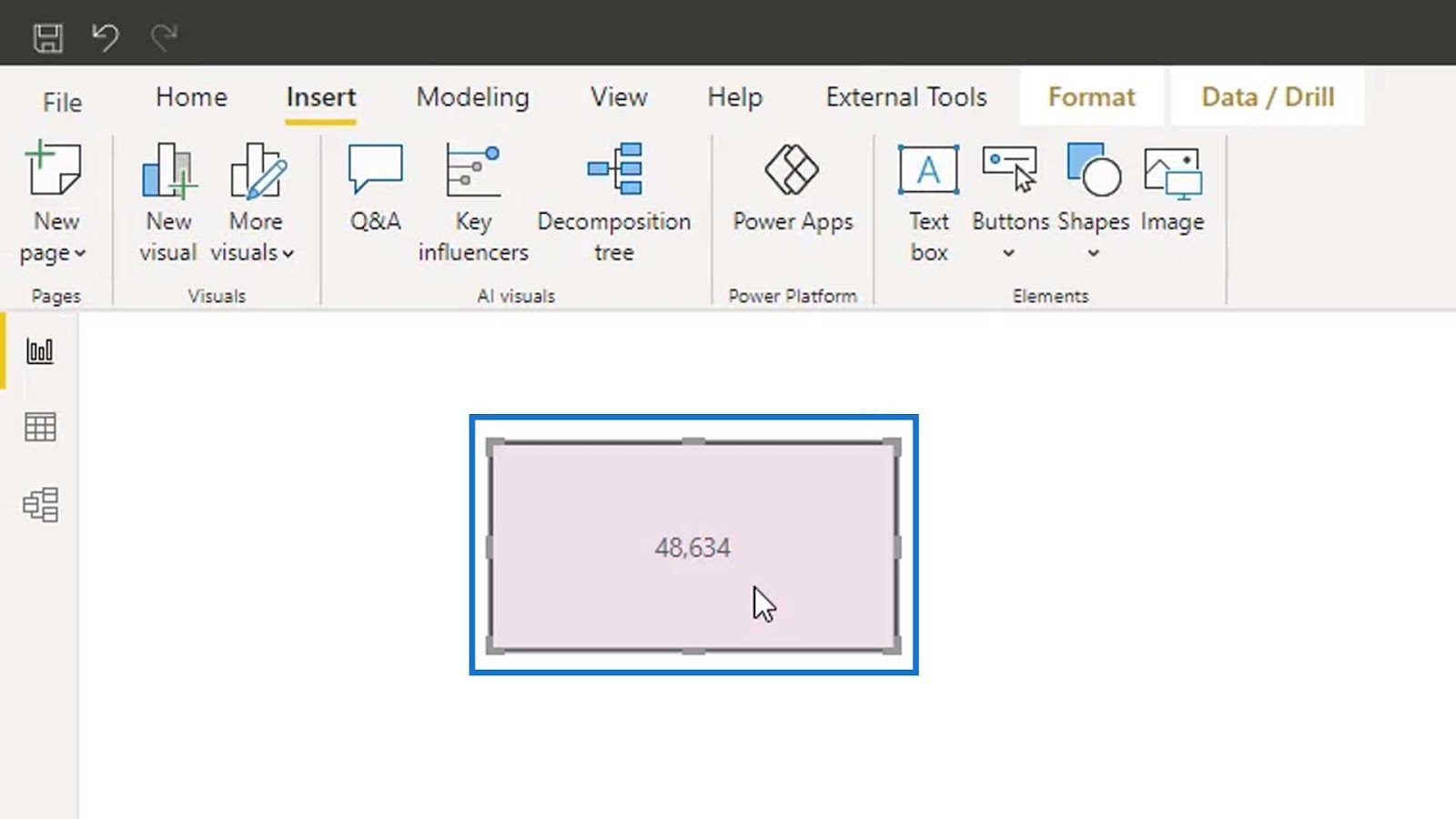
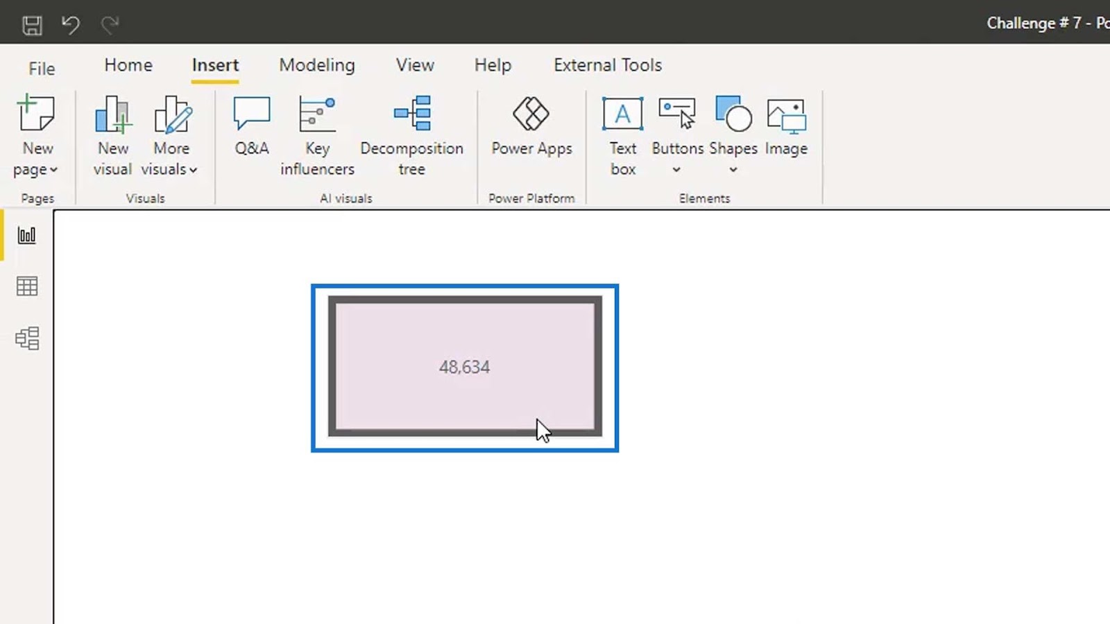
To make the text dynamic, click the fx button.
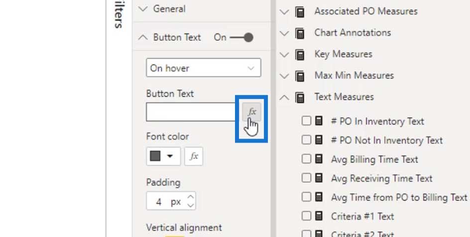
Under the Based on field dropdown, we can now select our text measure. For this example, I’ll select the Qty Purchased Text measure.
Click the OK button.
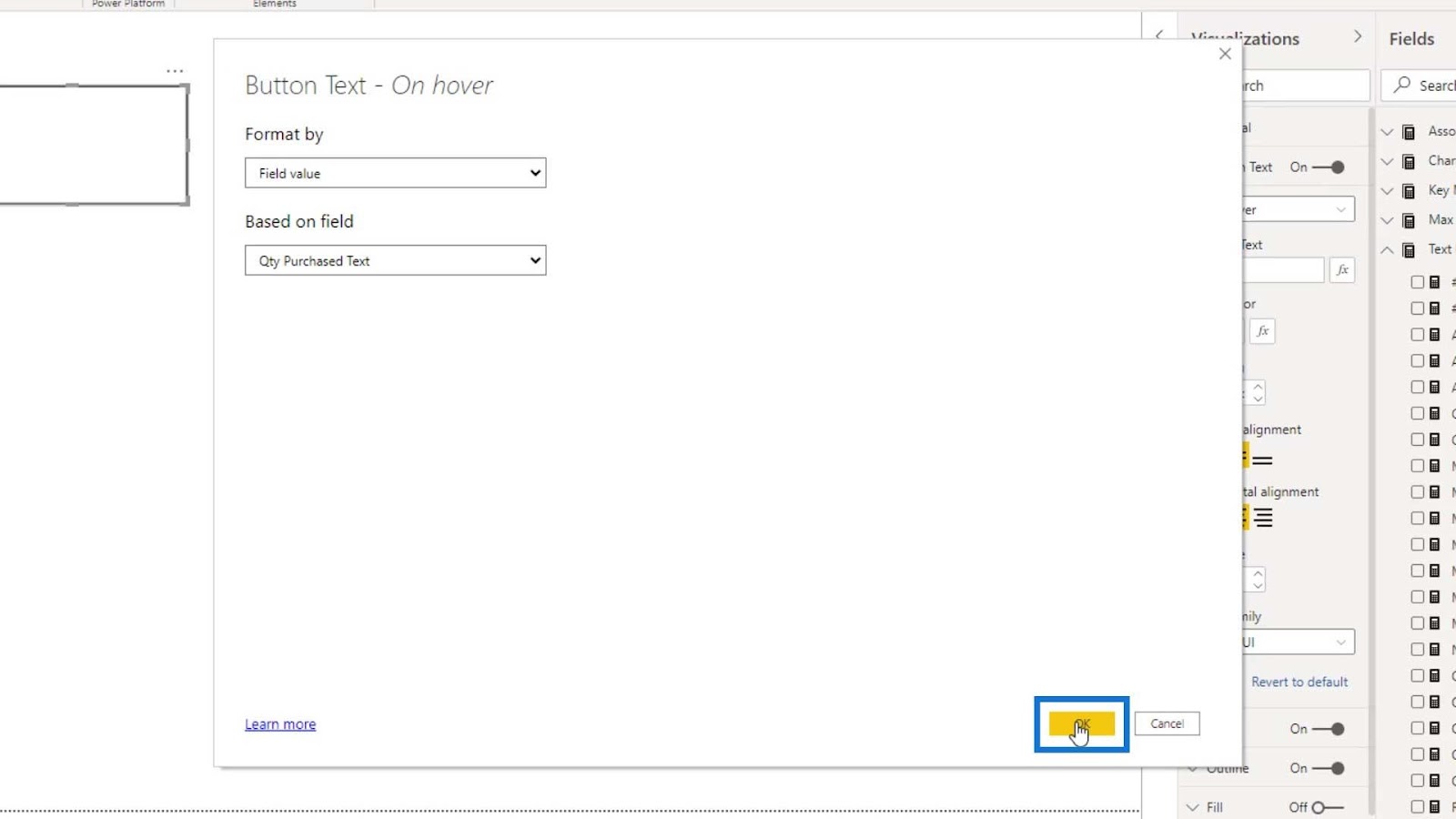
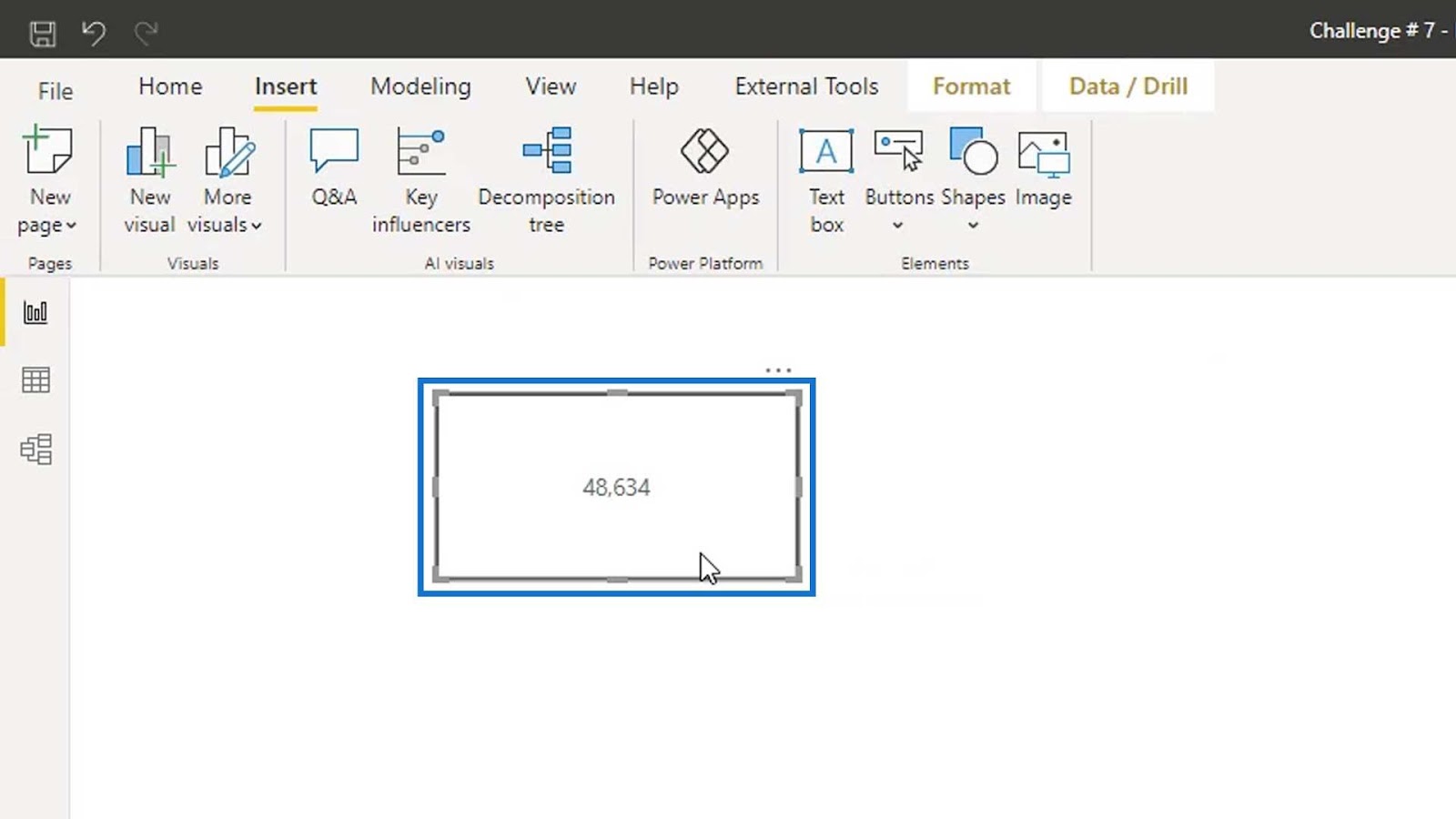
As a result, if we hover over on the blank button, it will now show 48,634.
Modifying The Hover Effect
To make the effect look better, we can enable the Fill, and change the state to On hover.
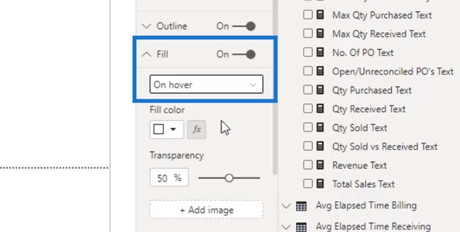
Then, set the color for the hover state.
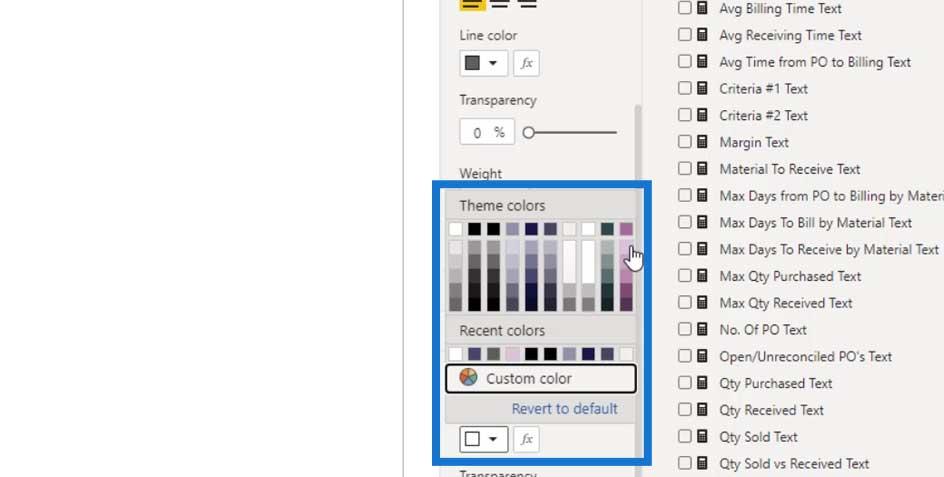
Now, if we hover over again on the blank button, its color will also change.

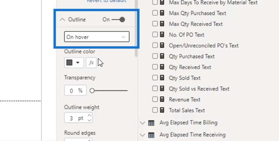
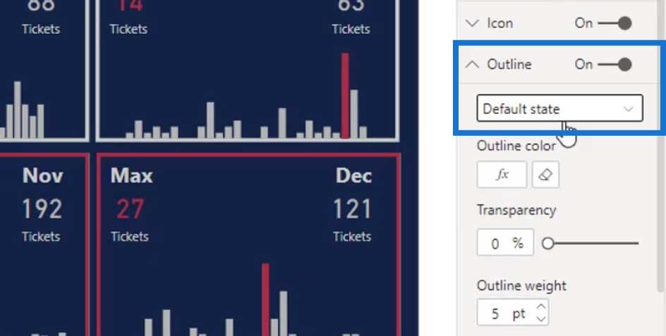
We can also do this on the outline. Enable the Outline, and change the state to On hover.
Then, change the Outline weight to 7.
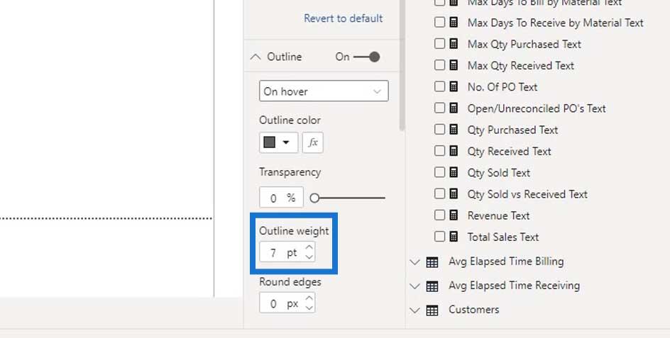
As you can see, if we hover over the button, the outline becomes thicker.
Let me show you another example on where we can use this blank.
Dynamic Outline Effect On Power BI Dashboard Designs
For this example, we created a calendar type visualization.
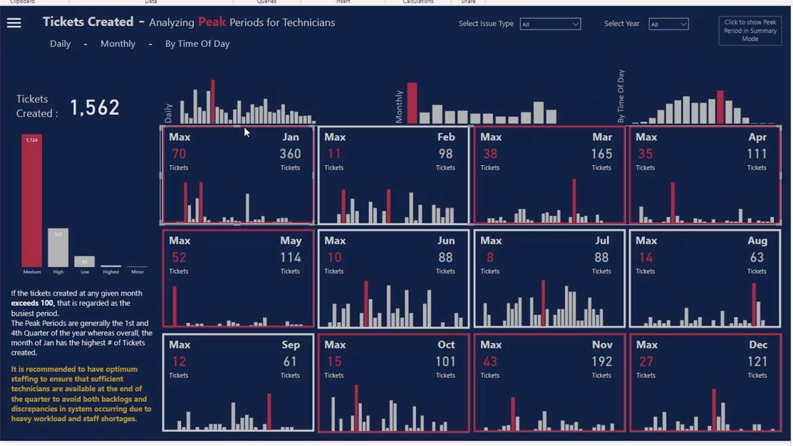
Inside this blank button, we added a column chart that shows the created tickets every single day in the month of January.
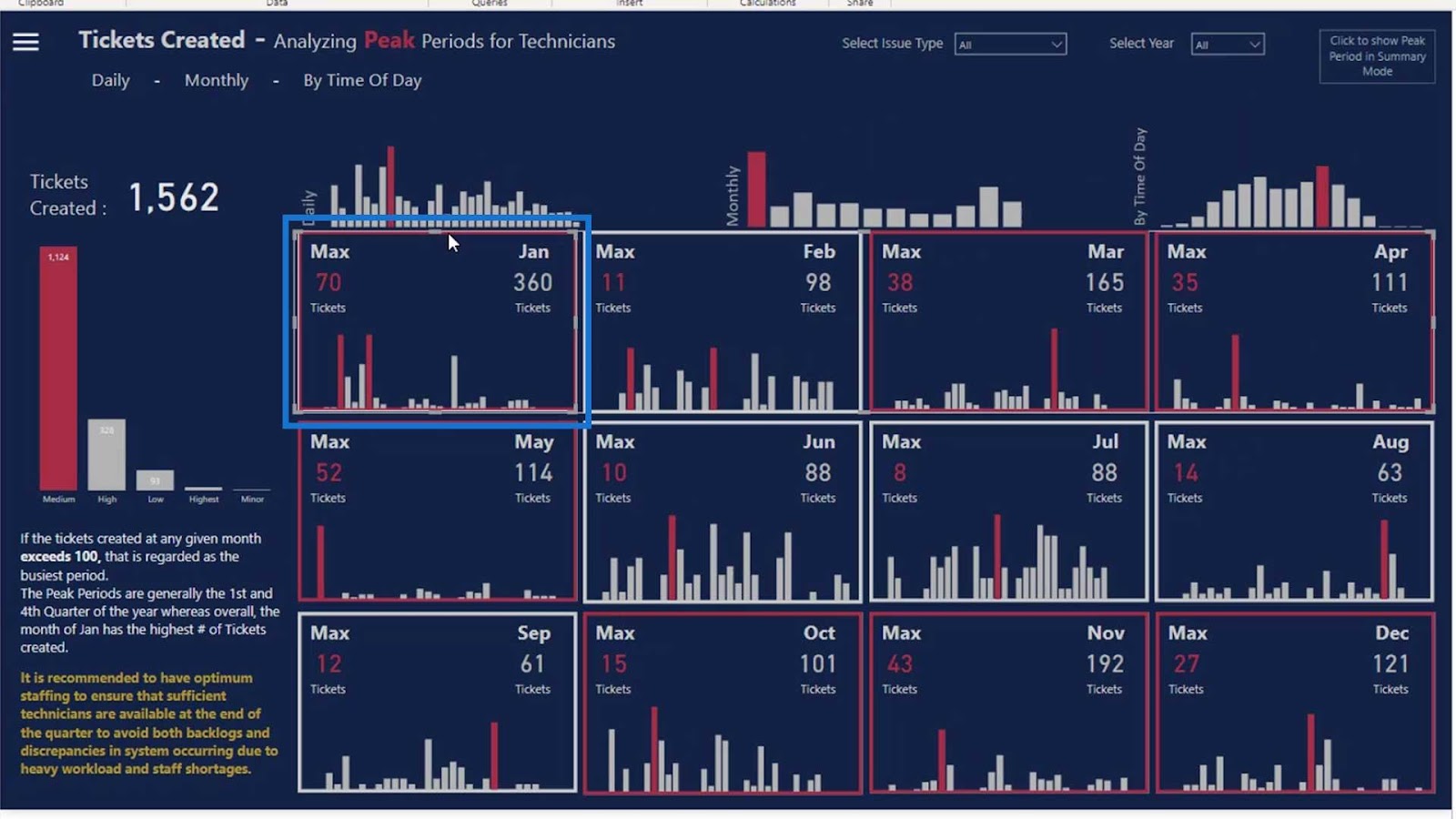
We also added a card visual, which shows the total amount of tickets issued for the month.
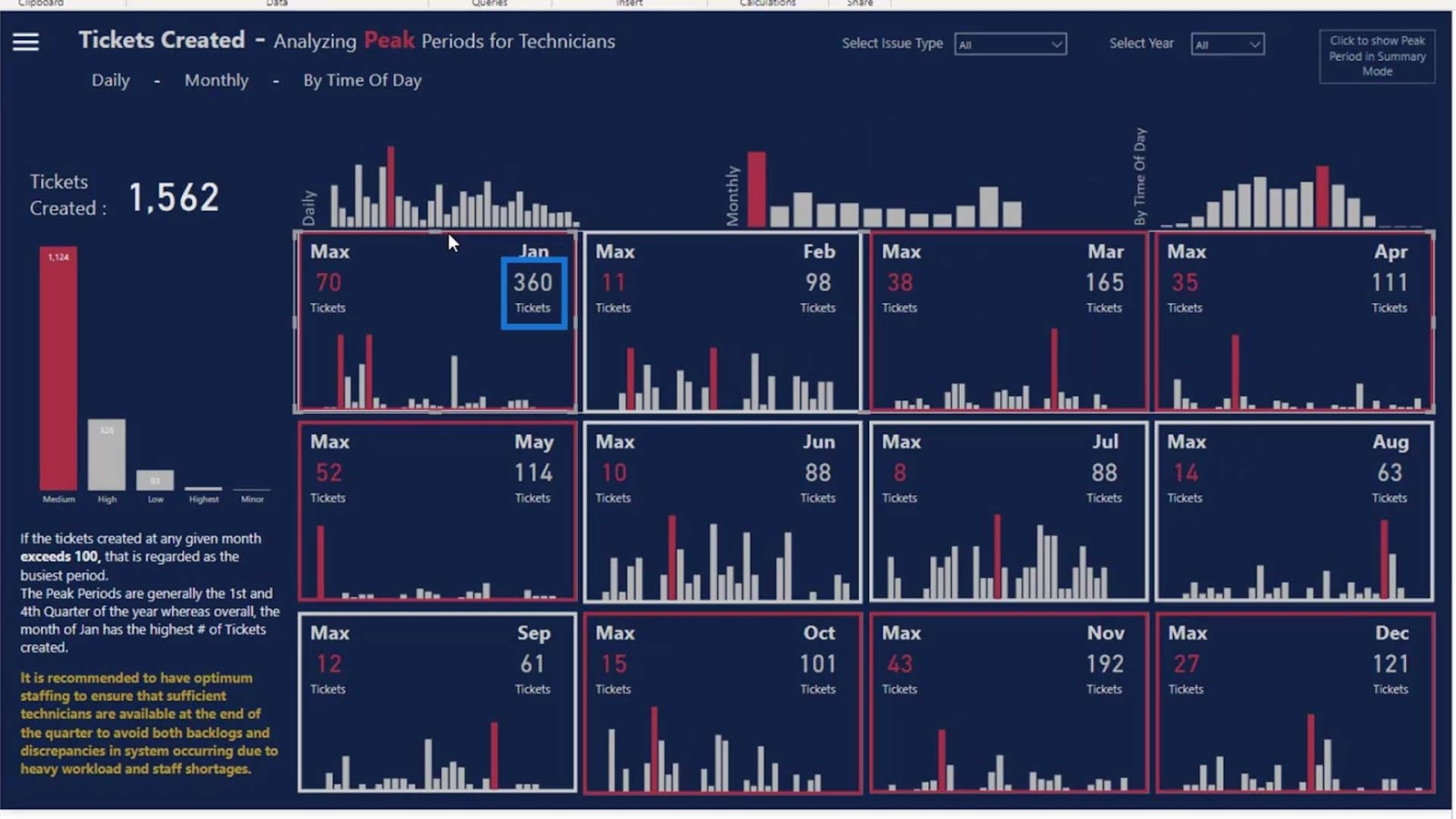
Then, this visual shows the maximum tickets being issued on a particular day.
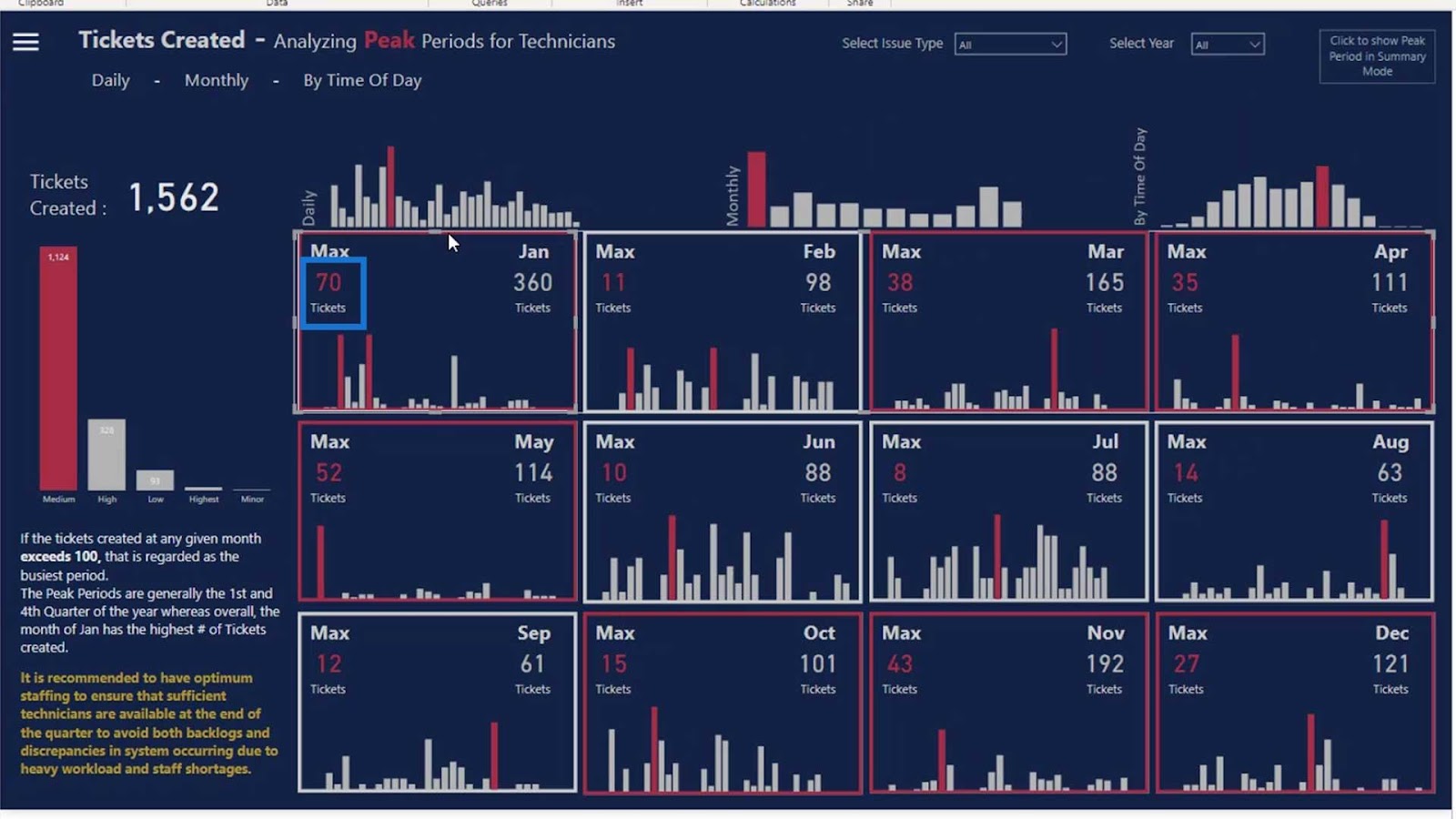
As you can see, some borders are red and some are white. This is because we added a dynamic measure here to show that whenever we have a peak season, the borders will become red.
This is useful if you are working in a retail environment. As you can see, this type of visual could show us the total number of items we have sold in a particular month, and the highest number of items sold in a particular day.
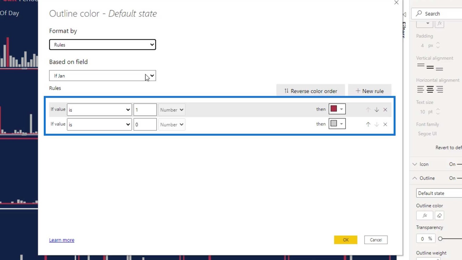
Now, let’s talk about the outline option that we used in this example.
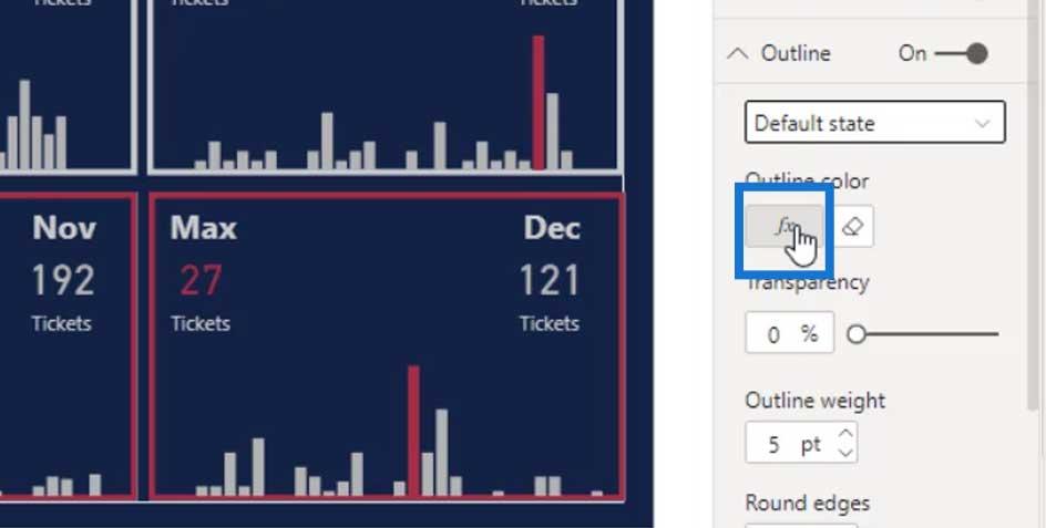
To create the outline effect, we set the Outline option to Default state.
Click the fx button.
The Format by should be by Rules.
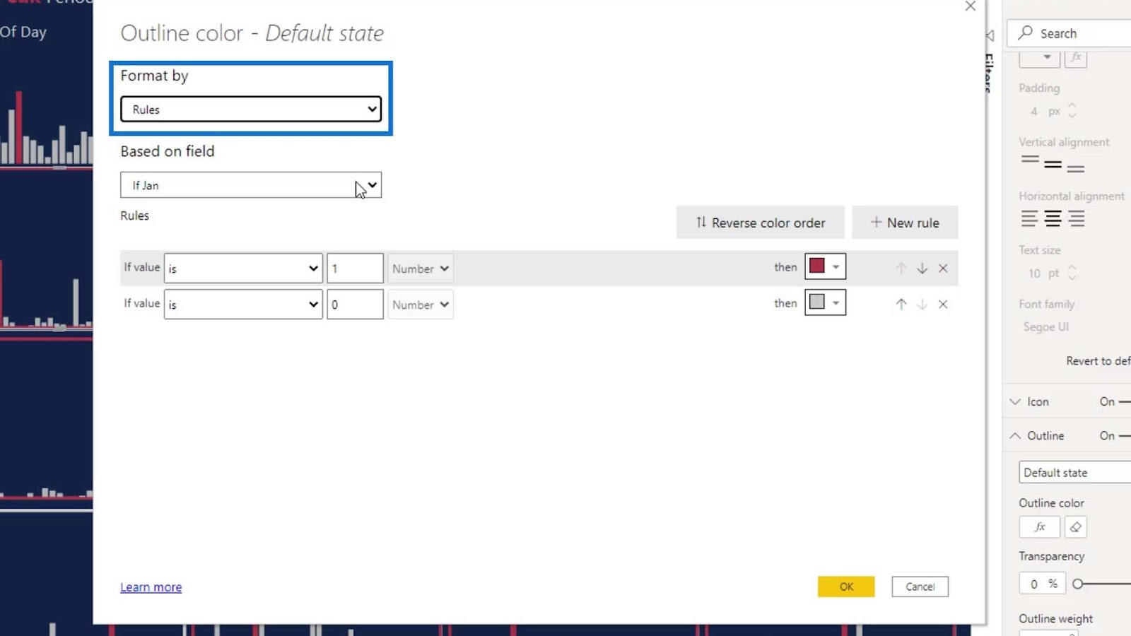
Then, place one measure here.
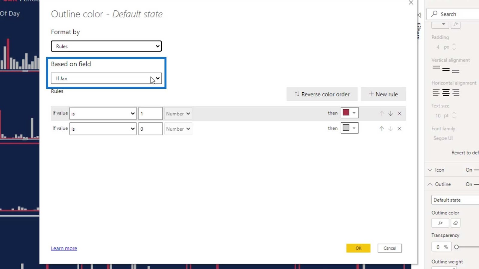
For the rules, we set it to “If Jan value is equal to 1”, then set the color to red. “If Jan value is equal to 0”, set the color to gray.
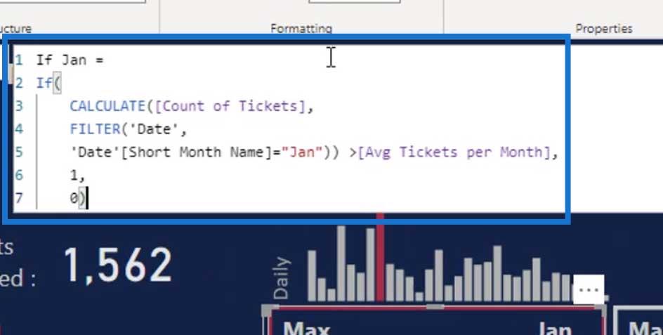
This is the If Jan measure. This measure turns the border’s color to red if the number of tickets issued is greater than the average tickets per month. The average number is 100.
As you can see, the border for January is red because the issued tickets were more than 100. On the other hand, the border for the months when the issued tickets are less than 100 is gray.
This is a great way to highlight your peak seasons. You can also use this visual if you work with shipping. You can see that the months with red borders are the peak periods while the gray ones are not.
With this visual, you can allocate your resources and manage the vacations of your employees better.

***** Related Links *****
Power BI Dashboard Design – An Impressive Page Turning Visualization Idea
Power BI Dashboard Tutorial – How To Improve Dashboard Design
Best Practice Tips For Dashboards
Conclusion
We’ve discussed adding card visuals, making blank buttons, and creating hover effects on our dashboard designs. These are just some of the ways on how we can be more creative with our Power BI tools.
I would encourage you to try out different things especially if you’re participating in the Power BI Challenges. Refrain from being afraid of what other people might think about your visual as everybody has unique ideas when it comes to dashboarding.
Be creative as you want to be, but also consider the understandability of the presented data.
Until next time,
Mudassir


