In this tutorial, you’ll learn how to create round bar charts for your Power BI report. It’s another type of bar chart but with round edges. It shows valuable data and information in a more sophisticated format.
Creating A Dataset For Charticulator
This is the round bar chart that you’re going to recreate.

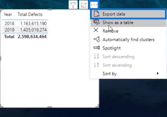
First, export a dataset that contains both the category and value into Charticulator. For this example, Year is used as category and Total Defects is used as value. Next, click the three dots on top of the table and select Export data. Make sure to save the file with a CSV extension.
Then, go to charticulator.com and click Launch Charticulator.

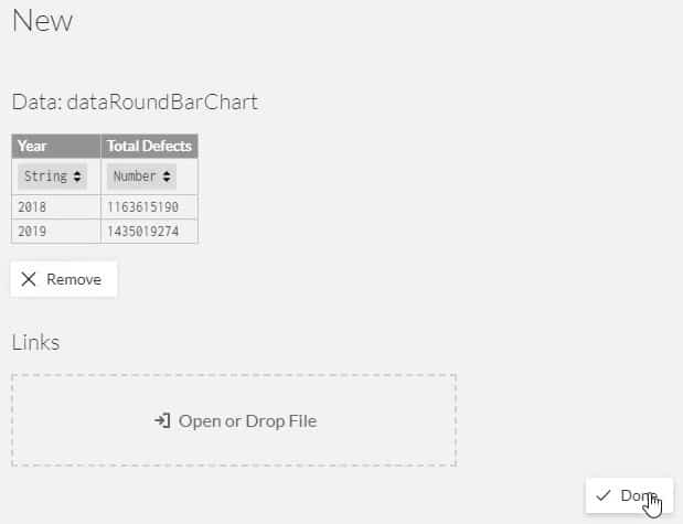
Next, open the dataset that you exported and wait for the Charticulator canvas to launch.
Designing Round Bar Charts
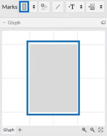
Drag the rectangle shape from Marks into the Glyph. It’s shape will be shown in the actual canvas.
Click the first panel on top of the bar in the actual canvas and select Stack Y. You’ll then see that the bars’ position will change.

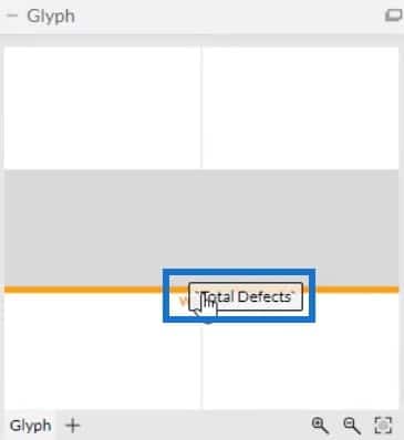
Following that, drag Year to the Y-Axis of the chart and place Total Defects in the width of the shape inside Glyph.

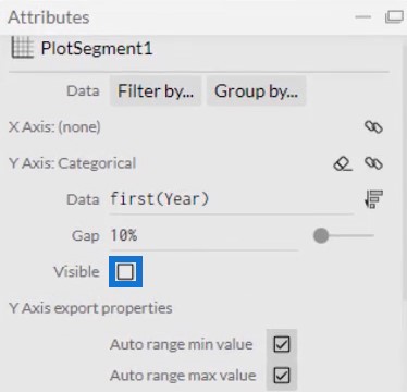
Click PlotSegments1 to open Attributes and uncheck the Visible box to remove the labels in the Y-Axis.
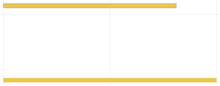
The height and color of the bars depend on your preference and data report style. To adjust the settings of the bars, click Shape1 to open Attributes. Your chart will now look like this.
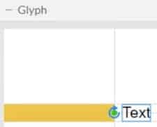
Next, show the data labels by adding Text in the Glyph. Move Text to the right end of the shape to make the values appear on the edge of the bar.
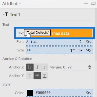
Bring Total Defects to the Text section of the Text1 Attributes.
You’ll then see values in the chart. However, you’ll notice that the values are large and have decimals.
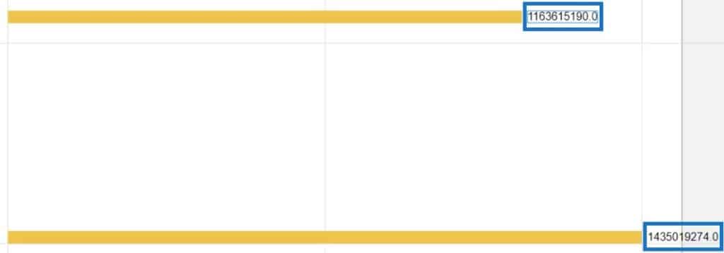
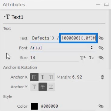
You need to divide it by 1 million and remove the decimals. Input /1000000 and change .1 to .0 in the Text section. You can also add M to the end of the section to represent million as a unit.
Next, adjust the color and height of the values to your preference. The visualization will now look like this.

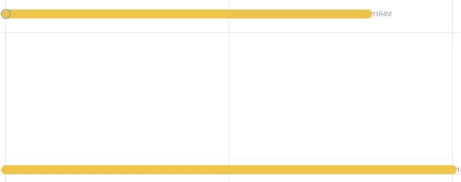
To make the edges round, bring in a circle into the Glyph and align it to the end of the bar.
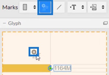
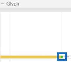
Then, change the color and height of the circle to match the bar and make it look like one entity. Now, do this process again but place the circle to the left edge of the bar. This will be the result.
Exporting The Visual To Power BI Custom Visual
After that, the file is now ready to be saved and exported to the Power BI Custom Visual.
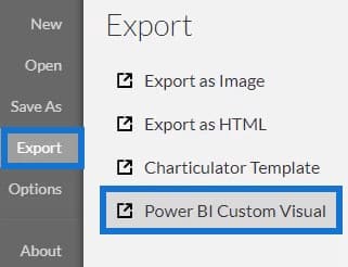
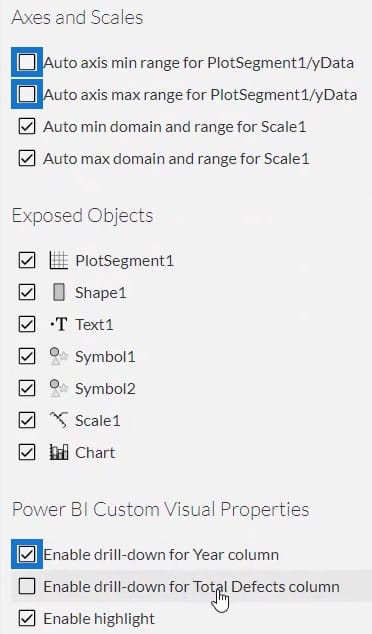
Before you export the file, uncheck the first two boxes under the Axes and Scales setting. This makes the axes unchangeable when a filter context is applied. Then, check the first box under the Power BI Custom Visual Properties to enable drill-down for the Year column. Once done, add a visual name and export the file.
Importing And Modifying The Round Bar Chart
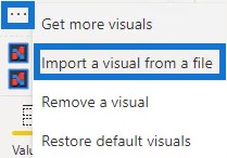
Now, open Power BI to import the chart file. Click the three dots below Visualizations and select Import a visual from a file. Then, locate and open the round bar chart file.
Next, click the Charticulator icon of the round bar chart and fill the Fields section with Year and Total Defects.
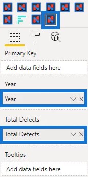
You can then see the round bar chart visualization in the dashboard.

The next thing to do is adjust the visualization according to your preference. In this example, the margins were adjusted and the title and background were removed.

To show the Total Defects that have impact on the quality, you can add another measure on the filters of the visualization. In this case, Defect Type is added on the data field of the visual.
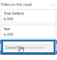
Next, click Require single selection and select Impact.
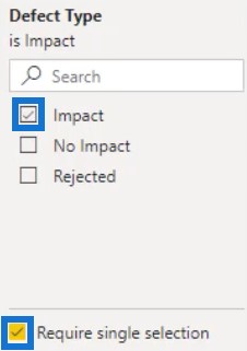
Create another round bar chart with no impact. Copy and paste the visualization and change the Defect Type to No Impact.
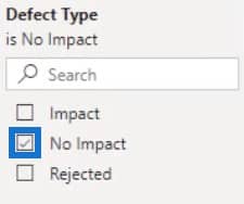

Lastly, do the same thing for the rejected Defect Type.
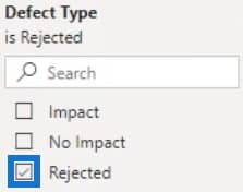

You’ll now have three different round bar charts in your report.

If you want to create another round bar chart, you have to be careful in duplicating the visualization. Since the values were divided by 1 million, you can only copy and paste the visual if you have large values. If you try and duplicate it using small values, your chart will look like this.

You can see that the chart shows 0M for the values. The only way to use small values is to go to Charticulator, create a new chart, and export back to Power BI Custom Visual.
***** Related Links *****
Custom Bar Chart In Power BI: Varieties And Modification
Small Multiples Chart In Power BI: An Overview
Power BI Conditional Formatting For Chart Visuals – What’s Possible?
Conclusion
Round bar charts are another type of bar charts. They provide information and data in a more sophisticated way. The round edges give the chart a satisfying look in your Power BI dashboard.
If you want to learn more about round bar charts, you can practice recreating them using Charticulator or Power BI’s Custom Visual. You can also read other blog posts about bar charts and other visualizations.
Mudassir


