
I want to show you how you can use filter fields and visual interactions in Power BI to great effect. They create simple and very effective ways to make your visualizations easier and more intuitive for the consumer especially if we need to create groupings of information in our analysis. You may watch the full video of this tutorial at the bottom of this blog.
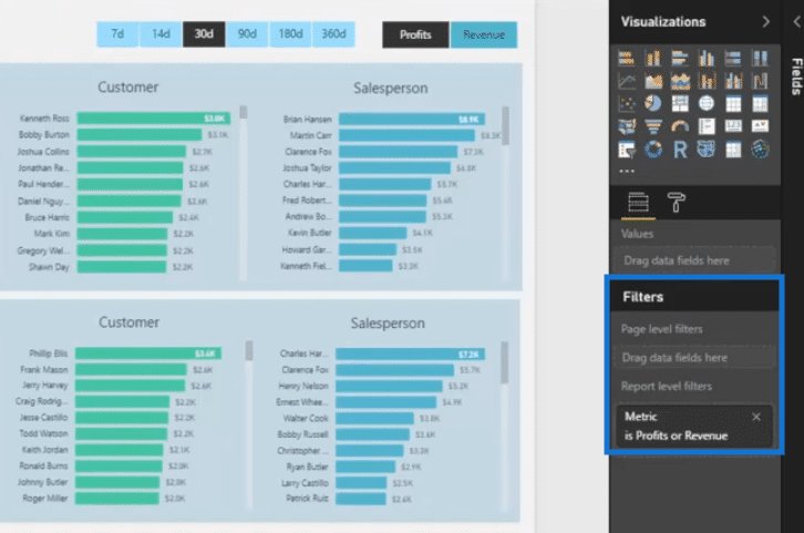
Filter fields enable you to adjust the results you are showcasing, but instead of having to manually select a filter within a report page, you can actually have a filter set across either a single visual, a report page, or even an entire report (I like to call this last one global filters).
By using these filters, you can start with data that might be extremely detailed, but if you want to focus your report page on one element of that data, you can do it easily without having to write any complex DAX formula.
Visual interactions are again easy to implement, and are great for making sure your visuals “filter” as they should when a user selects elements within a report page.

There is nothing worse than visuals where it’s too difficult to see what the results actually are.
This is how you make sure that the dynamic aspect of Power BI visuals pay off, and you enable users to really drill down into a granular level of detail.
But before we dive into the process of using these two techniques, let us first have a look at the visualization we will be working on.
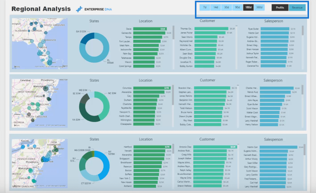
Overview Of The Visualization
The visualization we are reviewing here is created using what I call the multi threaded dynamic visuals technique.
You’ll notice that there are slicers in the upper right corner. These slicers make the visualization dynamic and allow us to look at the same visualization in various ways.
For this particular visualization, the slicers enable us to focus on either profits or revenue perspective or look at dates through time.

Creating this kind of visualization may not be easy but being able to do so allows you to come up with highly powerful and dynamic visuals.
You may check out my earlier blog, Creating Multi Threaded Dynamic Visuals, to learn how to create this extremely powerful visualization.
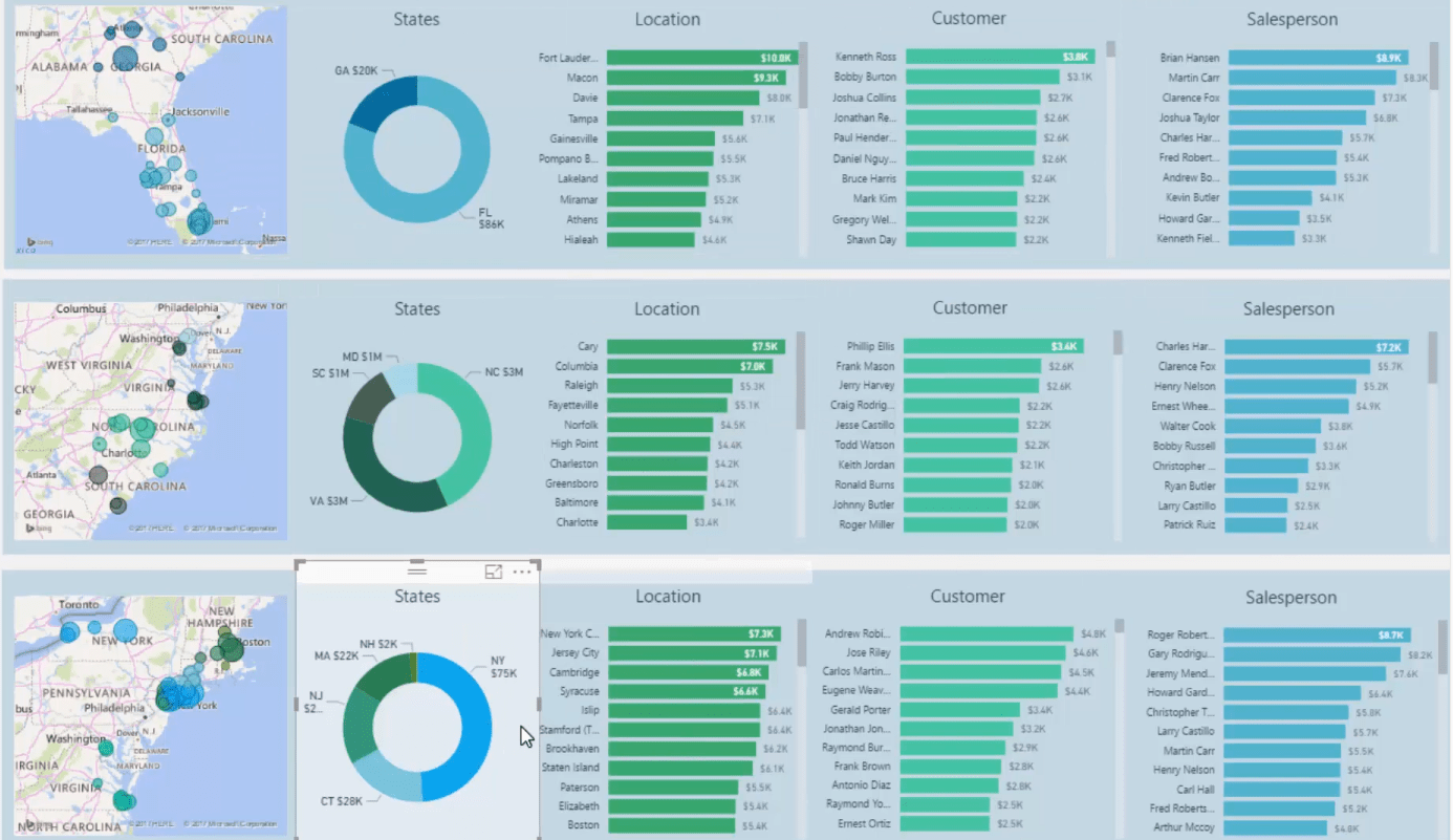
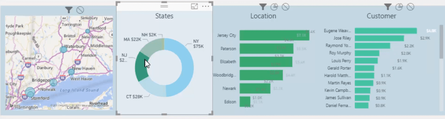
Another thing that you’ll notice here is that the information is broken down and presented per region on the United States East Coast.
This enables us to look at the key Southeastern States, the Middle Eastern States and the Northeastern States in the US.
Using The Filter Fields
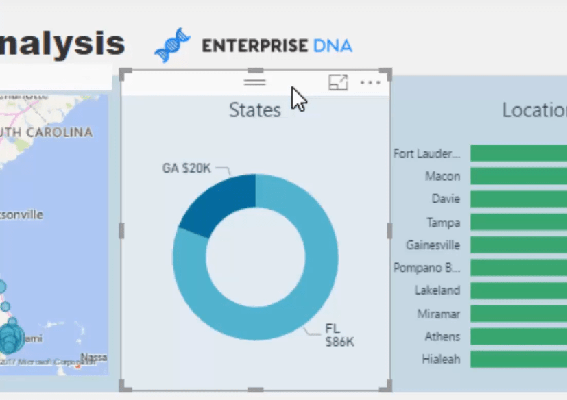
A single visualization could have shown all the details that we would like to present. But since doing so can give us a confusing visualization, it is helpful to be able to organize and present the information this way.
You may be thinking that presenting the data per region requires a different calculation for each one. But this is not the case. The core calculations that have already been created are already sufficient.
The filter fields are actually powerful enough to enable us to quickly filter certain aspects in our data and create groupings the way I showed earlier.
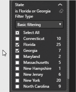
For example, I have filtered out some regions in this visualization to only show Florida and Georgia.
And since we want to apply the changes only on the visual, we used the visual level filter.
You can actually adjust every single visual in your analysis.
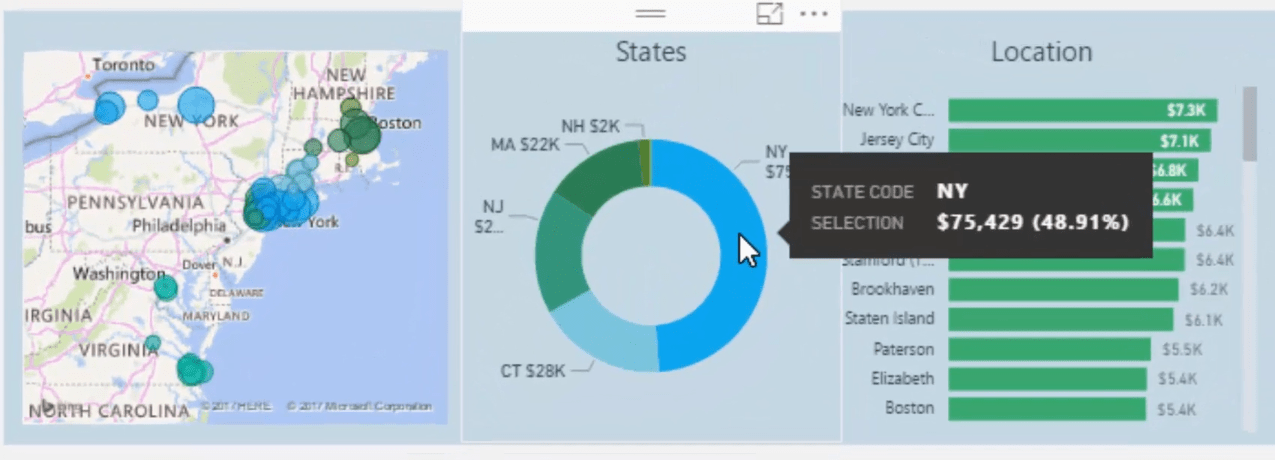
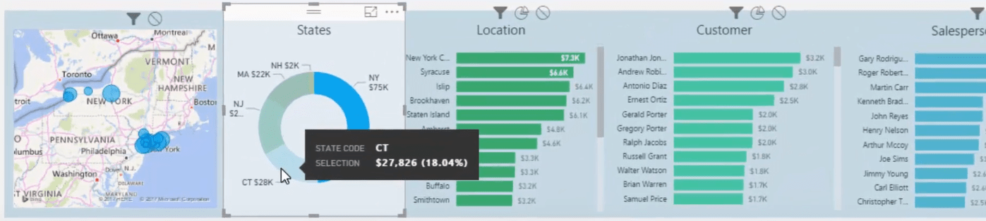
Let’s say you only wanted to look at New York, you can easily do that using the filter fields.
Managing Visual Interactions In Power BI
Another technique that allows you to come up with compelling visuals in Power BI is managing visual interactions in your reports.
Going back to the visualization that we’re working on, notice that I have selected New York here but none of those above is impacted. Only those in the same row are impacted.
This can be done by adjusting the interactions.
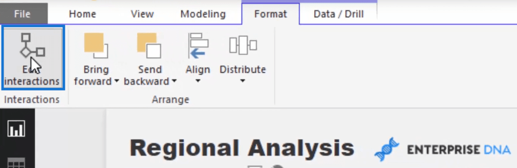
What I did here was I have turned off the interactions for all the visuals on the first two rows except for the visuals on the last row.

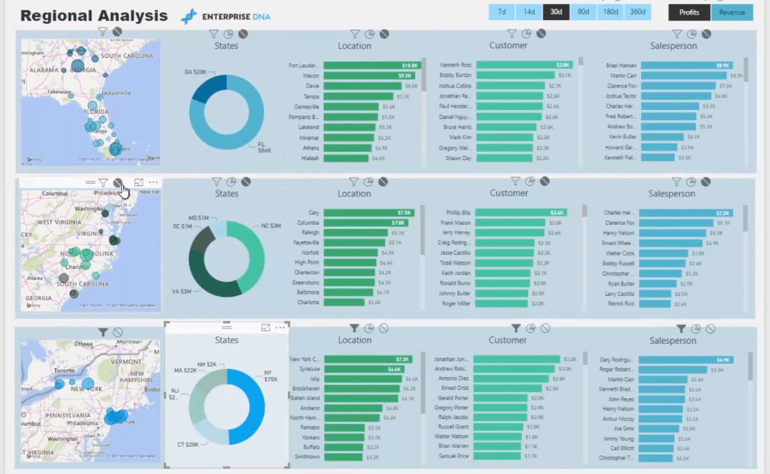
This is why when we click around this visual, it is affecting the elements of the visuals in the same row.
***** Related Links*****
Dynamic Report Technique For Power BI
Shape Map Visualizations For Spatial Analysis In Power BI
The Ultimate Advanced Viz. Technique in Power BI – Multi Measure Dynamic Visuals
Conclusion
In this post, I have shown you how to implement two visualization techniques that will allow you to create extremely powerful reports and visualizations.
Starting with the visualizations that we have created using the multi threaded technique, we have used the filter fields feature to drill into different aspects of visuals.
We have also edited the visual interactions so that the other aspects that we do not intend to be impacted will not be affected.
I hope you enjoyed reading this post. I’m sure there are many ways you can apply these techniques in your reports and analysis.
Cheers,
Sam
[youtube https://www.youtube.com/watch?v=4ODf0XDgNbo&w=784&h=441]


