It’s important to make your visuals look great to have a compelling Power BI report. In this tutorial, I share with you some of my best practices for Power BI report design and development. With these tips, you will speed up this part of your development work considerably. You may watch the full video of this tutorial at the bottom of this blog.
Building a Power BI report and making it look visually compelling can be challenging for most Power BI users, especially beginners. Here, I show you how you can put a lot of details on your canvas and get multiple visualizations on your dashboard without making them look too small for the users.
Thinking In Grids
The first technique I’ll share with you is how to think in grids. Remind yourself of this when you’re creating reports because it really helps in terms of page layout.
The same concepts come from PowerPoint design and design of applications and they’re very relevant to Power BI reports. Thinking in grids is a good way of getting started when it comes to knowing where to place things on a page.
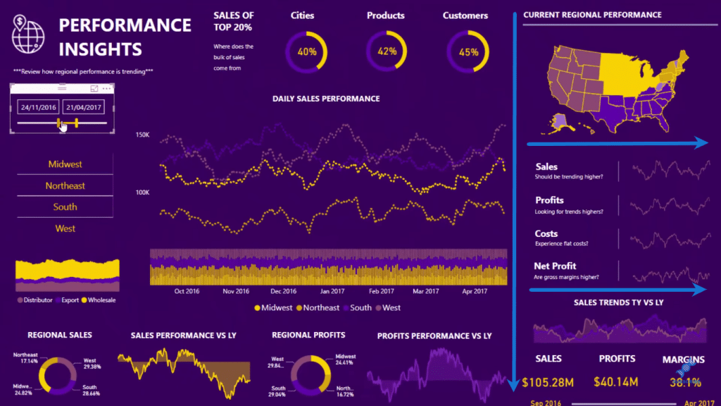
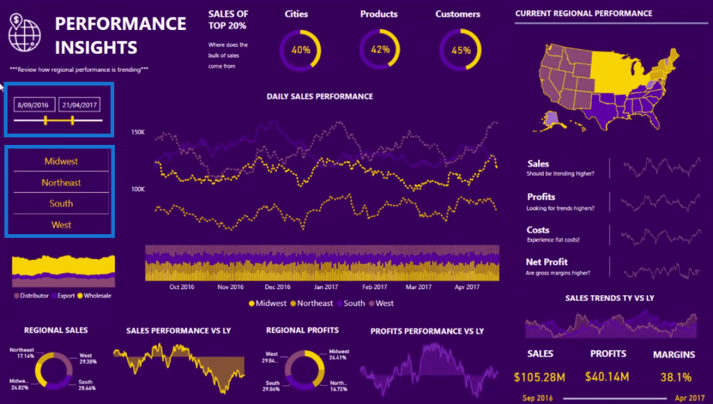
It may not be obvious where the grid is in this report page, but you can see once you draw it out. There’s a grid that has elements within it. So for instance, if you look at this report page, I have a grid that goes along here.
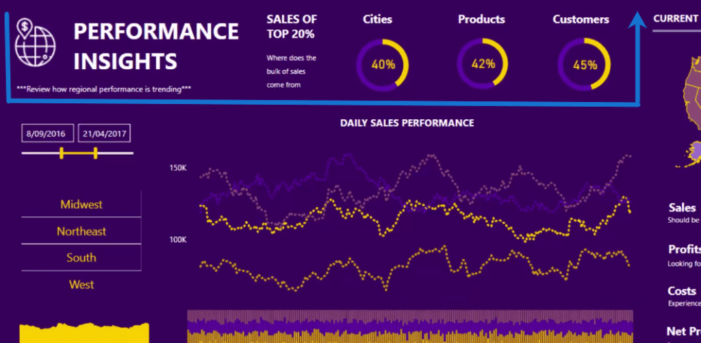
I have a grid that sort of comes down on the right hand side here, which I’ve split into different parts, so there are grids within grids.
Then I have another grid that is a rectangle around here and another that works along the bottom.
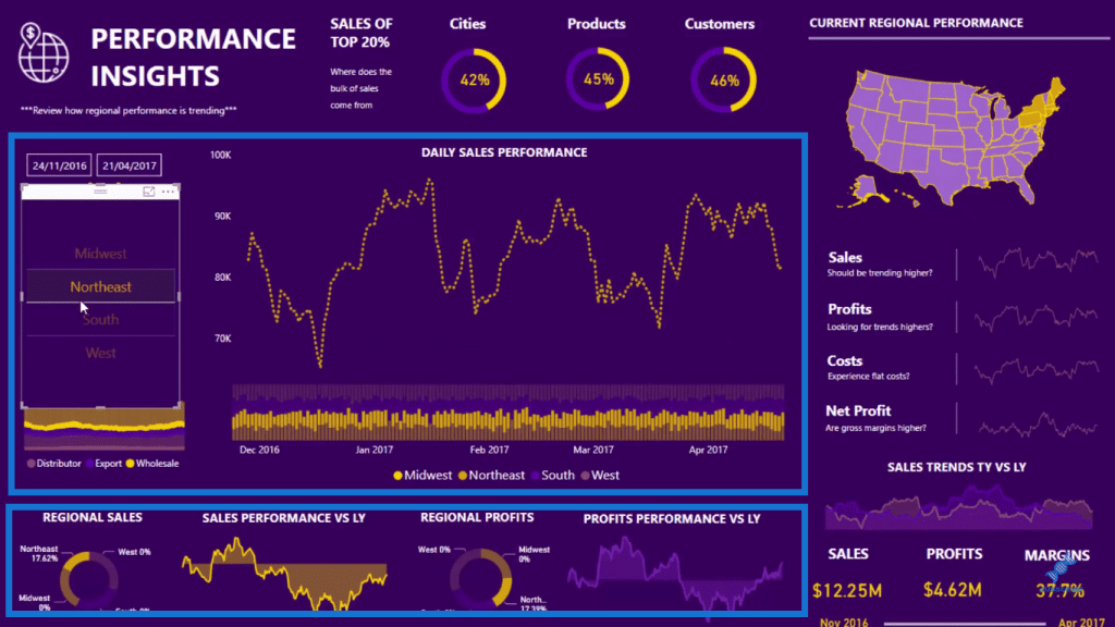
I find with all of my Power BI report designs that putting something into a grid just makes information much easier to read.
Making Key Information Stand Out
The second key thing for a great Power BI report design is to always make the most important information stand out. In this example, you can see that I have Sales, Profits, and Margins information down at the bottom right. This is the key information that I want the users to be able to see immediately.
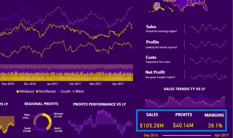
When they place additional filters on the report, such as this time frame, this key information will update. They can also drill into the data by clicking on these regions.
I’ve also included this information here at the top and I’ve put them inside donut chart or pie charts. I’ve made numbers because they draw the users’ eyes in the results.
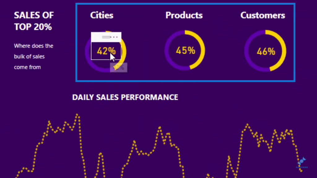
I also find that if you put them together within a grid, right next to each other it, it draws users eyes to the key information.
Considering The Colors
Another key thing to think about when creating your Power BI report design is the color scheme.
Colors are incredibly important. Colors can make an average report look compelling. However, there are some things you have to bear in mind when choosing colors. My tip is to use bright colors but don’t use too many different ones. Limit yourself to the main colors in a color palette.
In this report, the color palette I’ve used the top row or layer in this palette. I only used the main colors and not any of the sub colors at all.
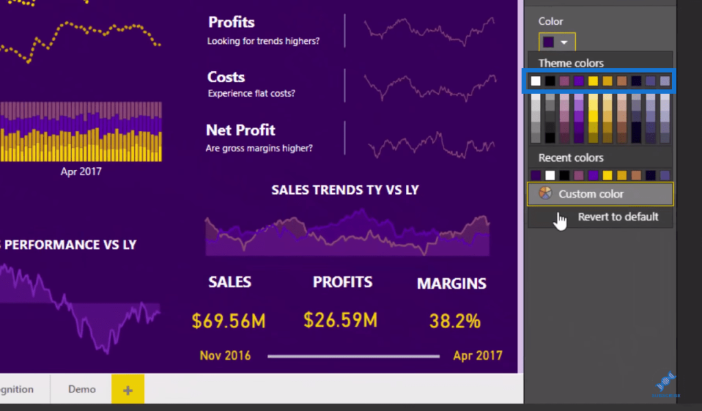
Too many varying colors is just unnecessary. It can take away from the key information that you want to stand out.
It’s always good to keep things simple on your report. If you feel like you have to use a lot of colors, you’ll find that you just have too much information on your page. It’ll not be effective for your users or consumers.
More Power BI Report Design Tips
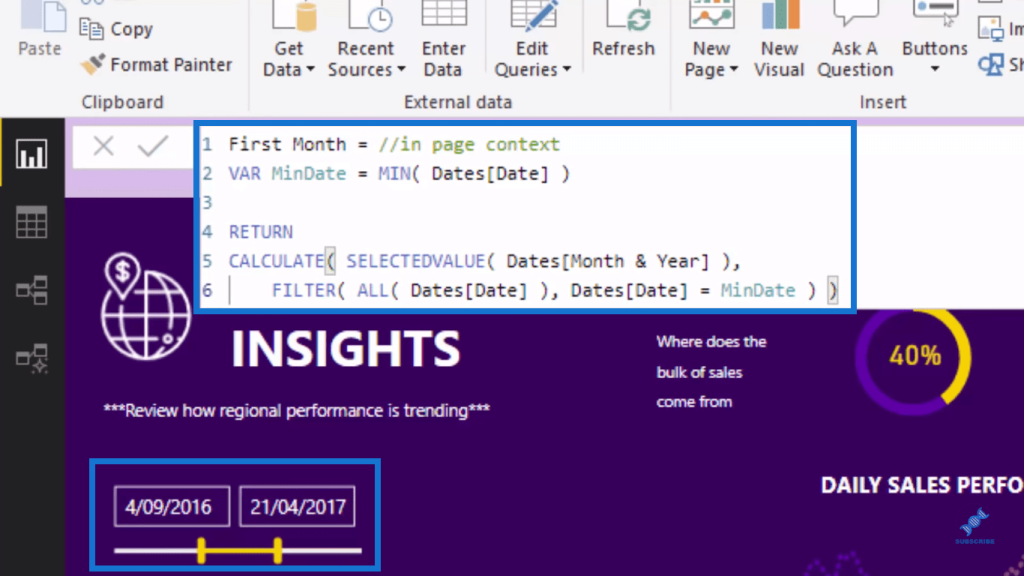
Moreover, just use your imagination and be creative in your Power BI report design. For example, what I did here is that I added these calculated dates based on the selection made in my date filter below to provide more details to the users.
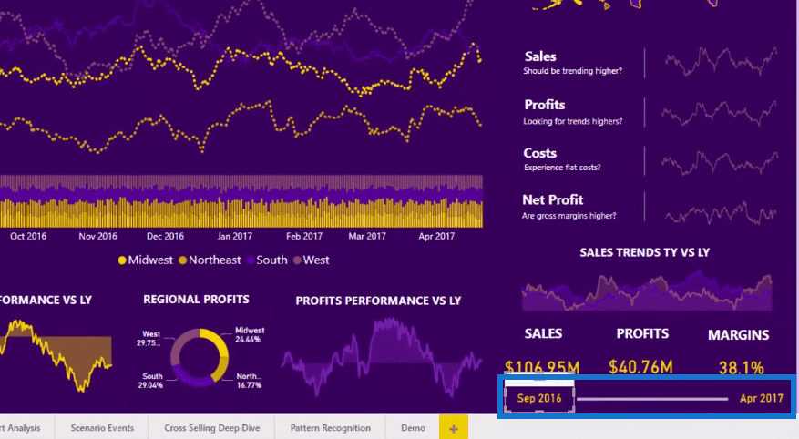
I have my date filter up here on the left hand side, but I wanted my users to easily recognize what the context is on the Sales, Profits, and Margins results.
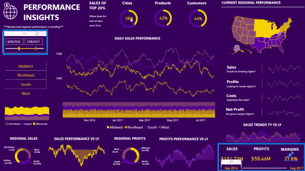
This shows that these Sales, Profits, and Margins results are in between these dates or time frame (September 2016 and August 2017), for example.
This is just a very simple calculation, which allows the consumer to easily understand what’s going on. It’s basically collecting the Min and Max Month and Year based on whatever selection is in the date filter.
Furthermore, I’ve created these percentage charts, which I mentioned earlier. These results show where the bulk of the top 20% of sales come from.
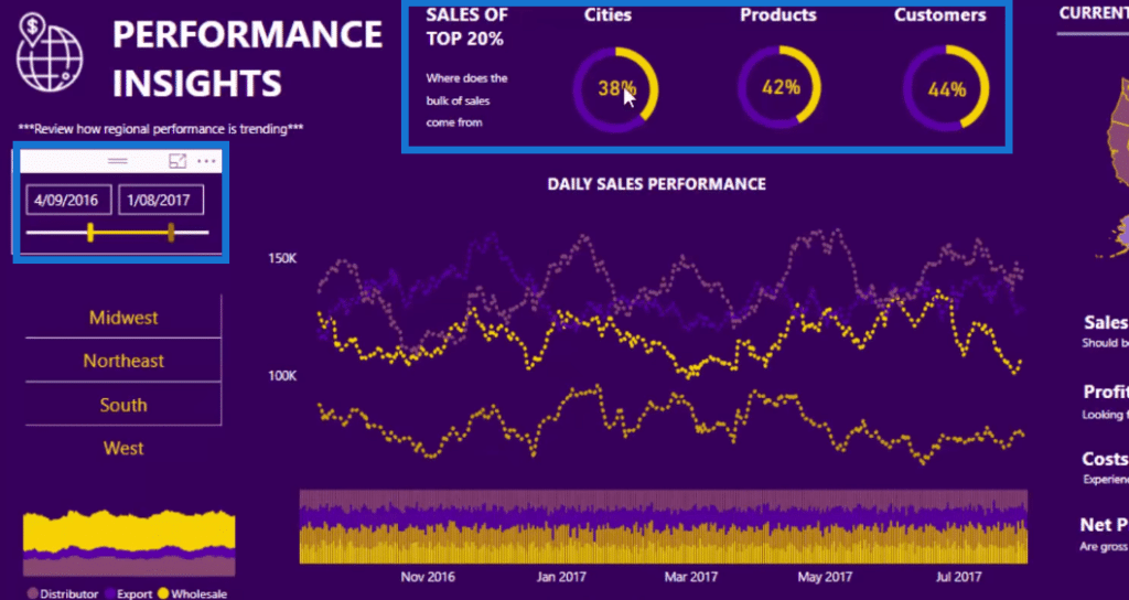
The yellow bar of the pie chart represents the number. This is a custom calculation that I’ve put into this pie chart, which adjusts based on whatever percentage we want to show from the date selection.
***** Related Links *****
How To Create Compelling Reports & Dashboards In Power BI
Using Great Color Schemes In Your Power BI Data Visualization
Power BI Visualization Technique: Learn How To Create Background Design Plates
Conclusion
This is how you can create a compelling Power BI report design. This is just a quick overview of a much longer session I did during an Enterprise DNA Learning Summit. In this tutorial, I’ve covered a few things, including getting good color palettes and putting important information on your report.
Visualization is such a key pillar of high-quality Power BI solutions. Use your imagination and creativity in making your reports more user-friendly and interesting.
All the best!
Sam


