
In this tutorial, I will explain how to modify shape maps Power BI visualizations. Shape maps are great for spatial analysis and they go well with Power BI reports and dashboards. They can also be used as a standard map feature. You can watch the full video of this tutorial at the bottom of this blog.
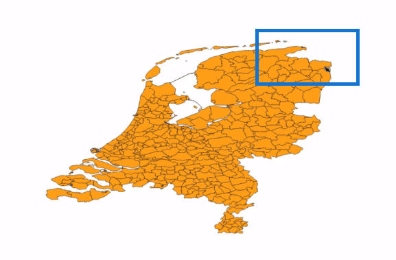
This example came from a problem encountered by one of my customers. The map represents municipalities in the Netherlands, and recently a few of these have been joined together to form one shape. As a result, the shape map is no longer correct and needs fixing.
Although this is a Power BI-related tutorial, I will show you the use of GIS software to address this issue. We need to correct the boundaries of the shapes, and I will demonstrate the use of special software to do this.

Using GIS Software To Modify Shape Maps Power BI Visuals
Commercial GIS software packages can do this type of processing, but in this case, I’m using free software named QGIS, which is outstanding. You can download this free software from their website, qgis.org. Then, select the most stable version.
At first sight, the user interface is intimidating, but no worries. We only need a few options. QGIS starts with a blank screen, but for reference, you can add a background map using plugins. We can add an open street map, so we have an accurate base map. You can find the plugins here under Manage and Installed plugins.
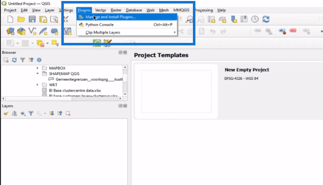
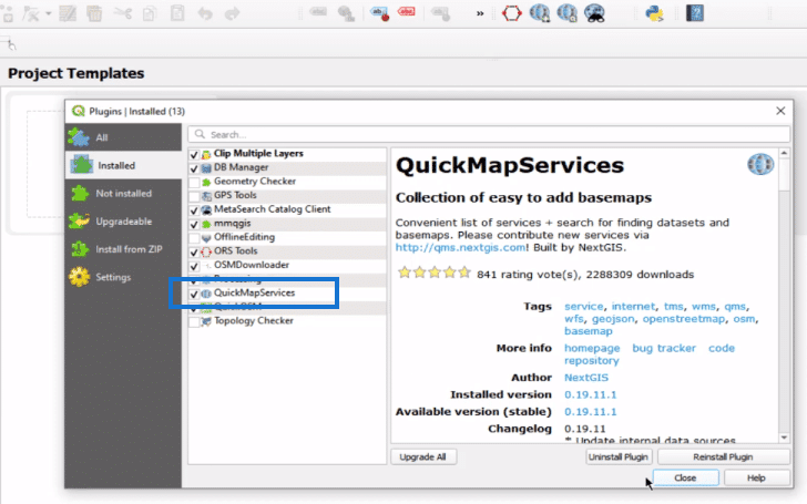
You can see that I have installed several plugins. The one that you need to install is Quick Map Services.
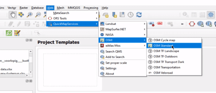
Next, go to Web, then to Quick Map Services, click on Open Street Map (OSM), and then Standard.
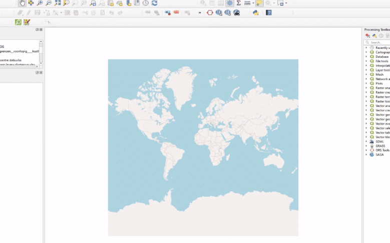
You will get a map like this, which can serve as a background map. But, I will hide it because we don’t need it in this case. But if you do, sometimes it comes in handy.
Repairing The Shape Map
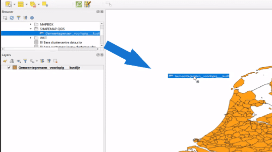
Now that we have a canvas, we can start repairing the shape of the map. Find the shapefile in the browser window on the left and drag it onto the white space, like so. The shape map will show up.

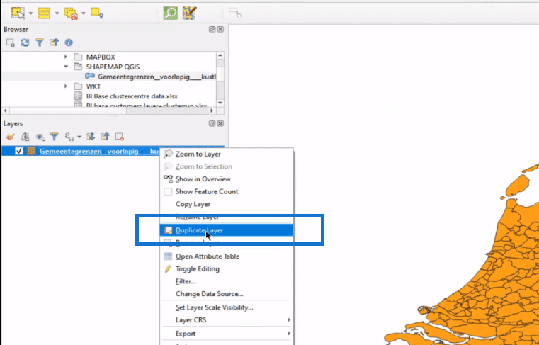
I always create a duplicate layer by right-clicking the layer and then selecting Duplicate Layer. This is for safety. If you mess up, you can always start over.
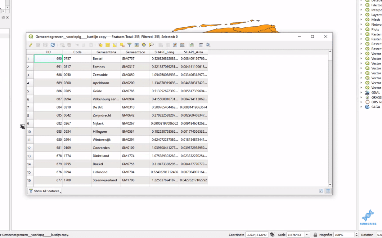
Now, right-click on the layer and open the attribute table. This table represents all the data in the shapefile and this will become a DBF file that we will later convert in Excel and use in Power BI.
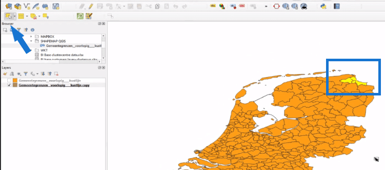
We need to join three municipalities to become one, so we select the three shapes either by using the control key and then clicking on the map or by selecting them in the table.
To go to the canvas, select the Features control (upper left corner) and then click on the three municipalities.
Once these are selected, go to Vector in the ribbon, select Geoprocessing Tools and then click Dissolve. This will remove the inner borders of the three municipalities to become one big shape.
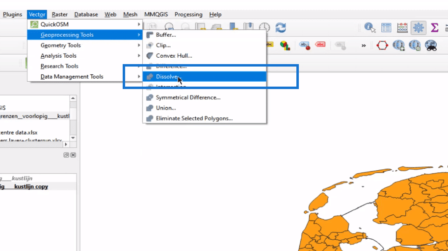
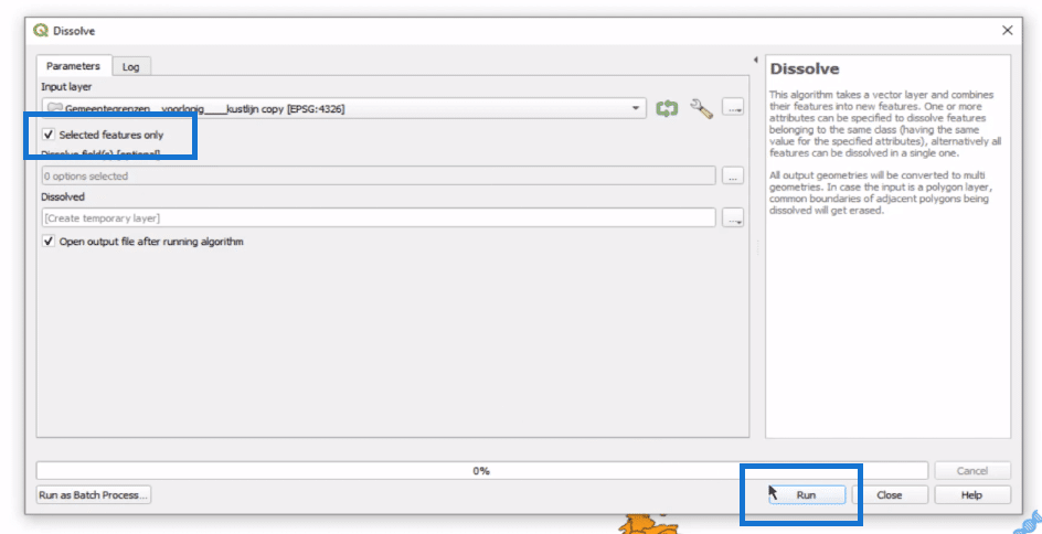
Within the pop-up box, click on Selected features only, and then Run.
And now we have this one big shape out of the three municipalities.
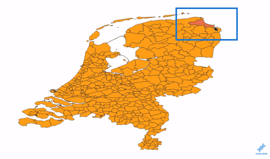
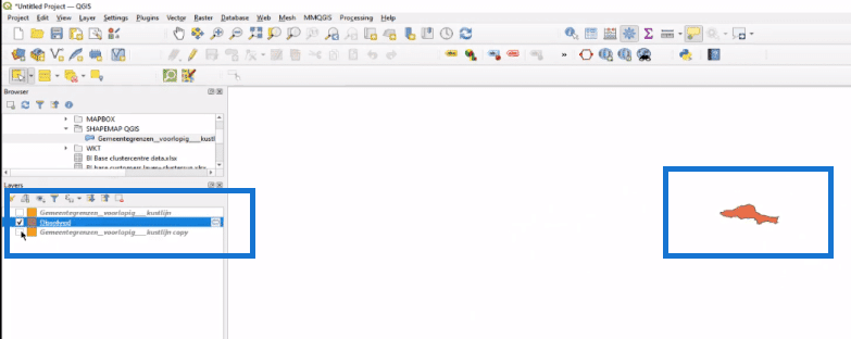
We now have two layers for processing. One is this original layer (image above) and the other is the Dissolved layer (image below), which is the part that we took out the rest of the map. As you can see, these are just those three shapes merged into one.
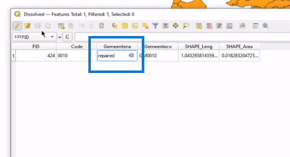
In the attribute table of the original layer, we will remove the three selected shapes. To do this, select the three municipalities, then click the pencil icon to allow editing, and then click on the trash bin. Don’t forget to save the table.
In the canvas, I hide the dissolved part and now you can see the void in the area of the three municipalities.
In the attribute table of the Dissolved layer, we can change the name to the desired one. In this example, let’s call it Repaired.
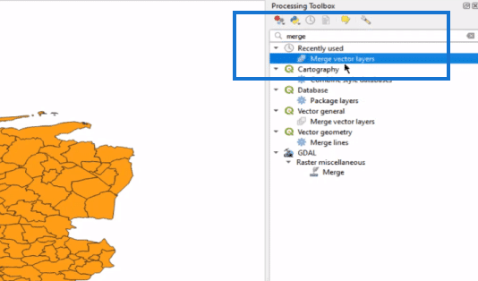
And now we need to fill the void in the original layer with the Dissolved layer. To do that, we go to our processing toolbox here on the right side, type merge, and select the merge vector layer.
A window pops up and here we can select the two layers.
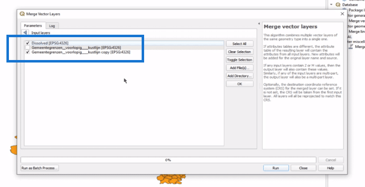
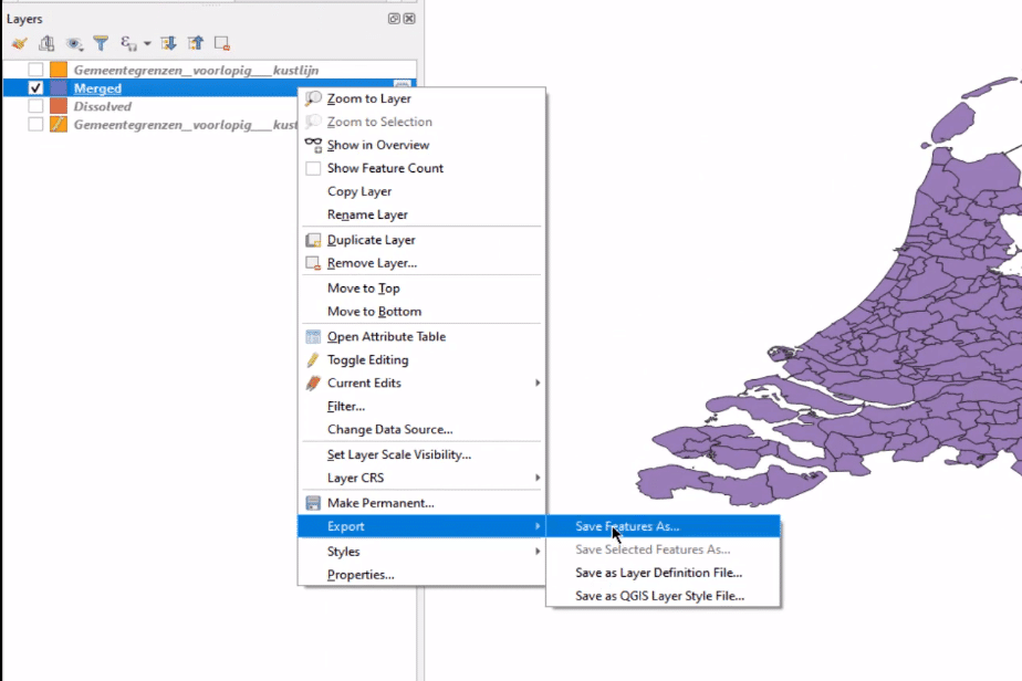
Now the shape has been repaired, which shows as a new layer, Merged. Right-click on this layer, select Export and save it as a shapefile. It’s very important that you select shapefile when saving it.
Converting Shapefiles To TopoJSON & Use As Shape Maps In Power BI
After repairing your maps in QGIS, you need to convert the shapefiles to TopoJSON files so you can use them as shape maps Power BI visuals.

To do that, we go to the map shape website (mapshaper.org) and load your shapefiles. Make sure to include all files. We need to make a few modifications.
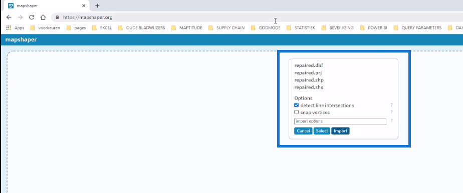
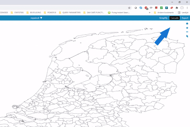
First, we click Import. The shapefile then opens in mapshaper. Click Console and you see a window pops up on the left side.
Within here, we type in info. The most important part of this information is the CRS, the reference system, which is the projection of the map. This should be WGS84.
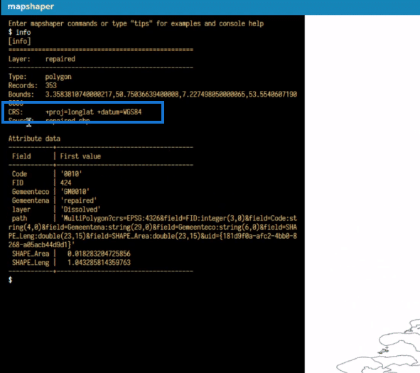
If this is not the case, type Project 84, and press enter. The type in Clear.
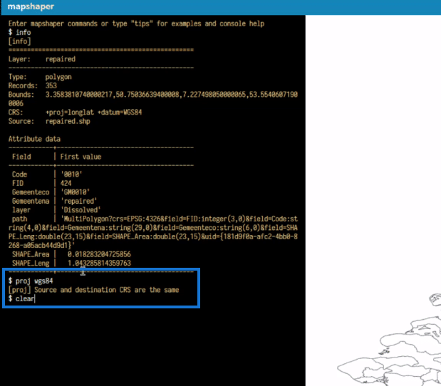
Type in info again, and you will then find that the projection has changed, given that your projection was different from the WGS84. The projection is now correct for use in Power BI.
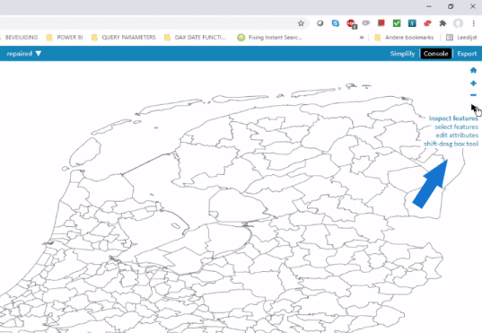
Since we have used QGIS to modify the entry table, we don’t need further editing. In case you do, you can use the icons on the upper right here. Click on it, select an area on the map, and the attributes will show and can be edited. If you edit, make sure that the names for the location on the map correspond with the location names in your data set.
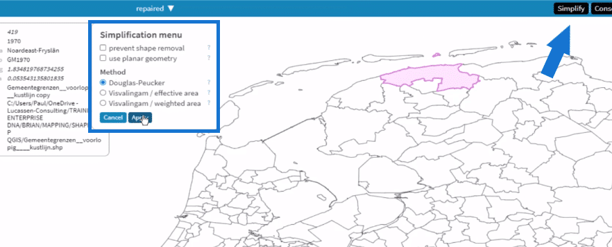
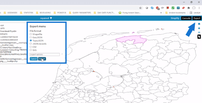
The next thing to do is to click the Simplified button. This will help reduce the file size of the shape by changing or stretching the contours of the shape. This will reduce the rendering time as well. Select the Method, then click apply.
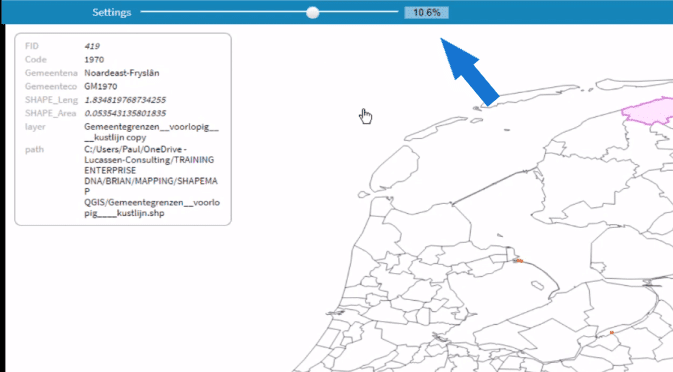
In the Settings pane, you can drag the slider. I usually take something like 10% and these shapes are okay for use.
If you’re happy, click Export, select TopoJSON, then export the file and save.
After that, go to Excel, open the DBF file and save it.
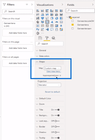
In Power BI, we have imported the table repaired. We have the shape map visual, and we have added the name of the municipality. Under the formatting pane – Shape, we have our repaired topoJSON file.
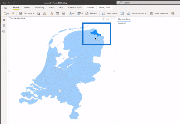
We can select on the new shape, and we can see that this is the repaired one.
***** Related Links *****
Power BI Shape Map Visualization For Spatial Analysis
Data Visualizations Power BI – Dynamic Maps In Tooltips
Using Filter Fields & Visual Interactions To Create Compelling Visualizations In Power BI
Conclusion
This is quite a step from Power BI, but it is a great skill to be able to create or modify your own geographical shapes and display them. In this use case, we have looked at administrative boundaries.
Say, you would like to display factories or buildings at that geographical position on a map. With an Excel table with three or more pairs of latitudes and longitudes, you create geographical shapes that can be placed on the map and make them selectable objects. You got endless possibilities.
I hope you find this tutorial helpful. Check out the links below for more content around shape maps Power BI.
Cheers!
Paul


