I want to show you a special technique that I used to highlight points in scatter charts based on a filter selection. You can watch the full video of this tutorial at the bottom of this blog.
This example actually came from one of the Enterprise DNA challenges. We had information from John Hopkins University regarding the COVID situation concerning the number of new cases confirmed, recovered, and death for every country. Every day, we had to create a report on one page with the most important information.
Using Scatter Charts To Show COVID Cases In Different Countries
The main idea of the report I wanted to build was to create something dynamic, something that will allow the end-user to engage with the data and do benchmark between countries very easily and see quickly the different metrics that are useful to follow.
I immediately thought about scatter charts because they have many advantages in the user experience. We can benchmark very easily the information inside a scatter chart. This type of visualization is very flexible because you have the Y-axis and the X-axis, and then you also have the tooltips.
The only thing that was missing here in my opinion was the relation between a filter and the scatter chart. For example, in the report below, if I choose a certain country on the filter, I wanted to highlight that point on a scatter chart that will draw attention to the end-user that will then show some additional information, which is embedded on a tooltip. This will make the report more engaging.
So this is why I created these scatter charts with the highlight technique.
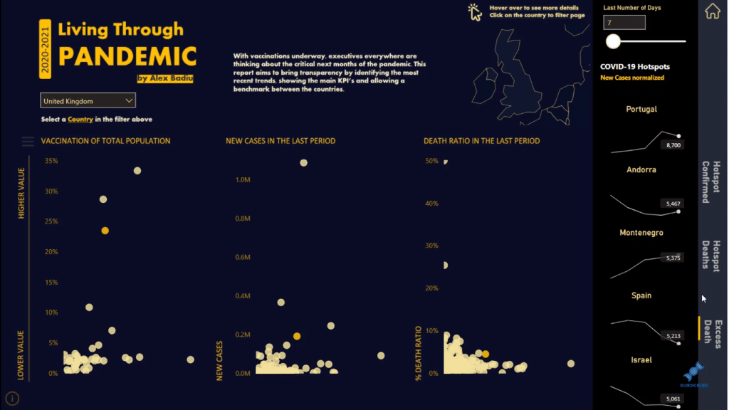
Another thing that was bothering me here is that when you look at the report, most of the points are too close together. It’s hard to see each country.
So to solve this, I added a menu where you can personalize the Y-axis. This makes it much easier to see the points inside the scatter charts.
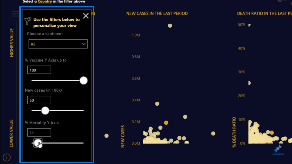
The report is very dynamic and allows the end-user to see and compare the information. So, now I’ll show you how it’s done.
Creating And Formatting Filters
First, I’ll show you how to format the filters in the scatter charts.
As you can see, I have my scatter charts here. But, when I change the selection of my filter, I will only have one point on the scatter chart, which is the country that I selected.
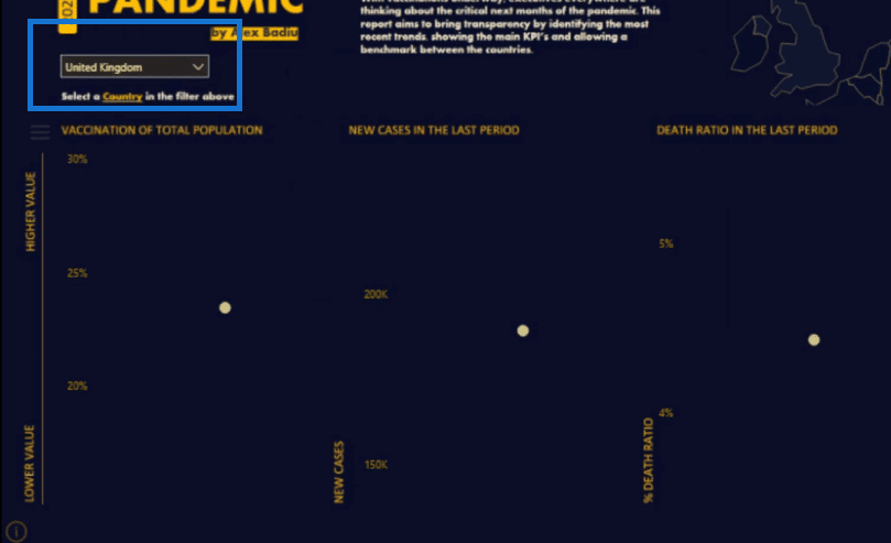
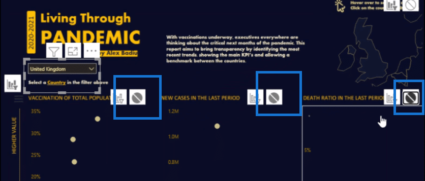
I want to see all the countries on the scatter charts. To fix this, I’ll click on the filter, then go to Format, then Edit interactions.
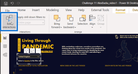
And then, I’ll cut the interaction of my field by clicking on this icon here on each chart.
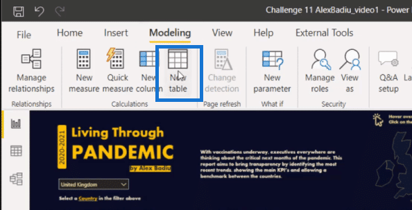
Next, I’ll create a new table with the same information as this filter slicer. So I want to have one table with all the countries. To do this, I’ll go to Modeling, then click on New Table.
Here, I’ll create a table that will take all the countries from the first table (slicer) using the ALL function.

Then, I’ll take this new table into the report page and turn it into a slicer. I’ll then transform it into a Dropdown.
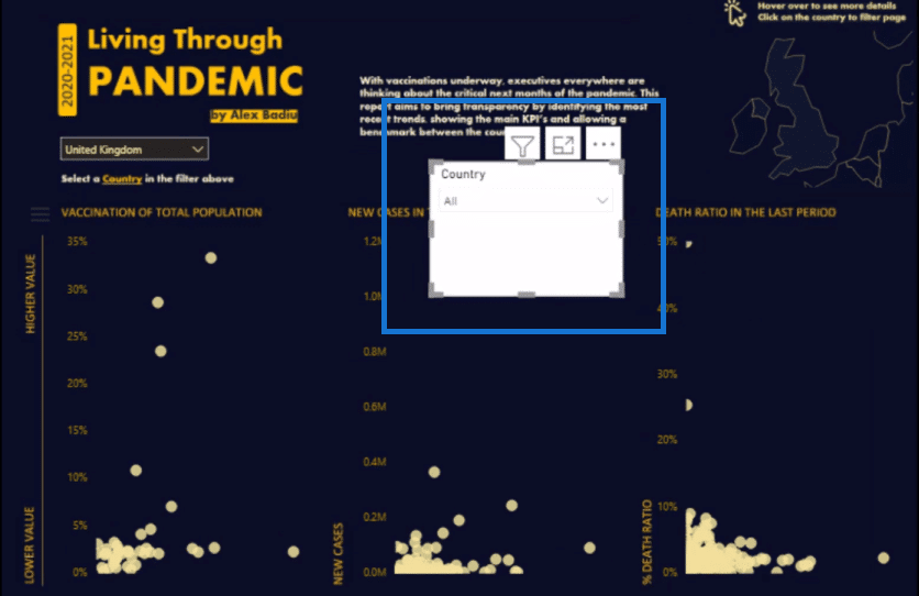
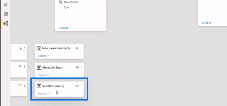
Note that this table is not connected to the model.
I want to put these two slicers in sync. So I will click on the first slicer, then go to View, and click on Sync Slicers.

Then, I’ll go to Advanced options and give it a name. In this example, I’ll call this Highlight.
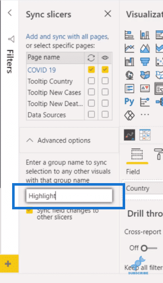
Then, I’ll click on the second slicer and give it the same name.
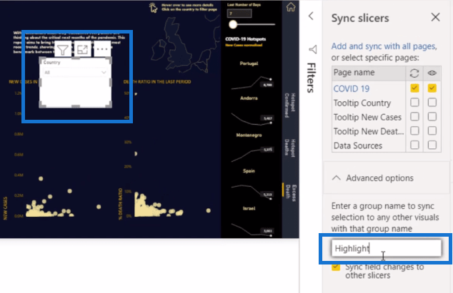
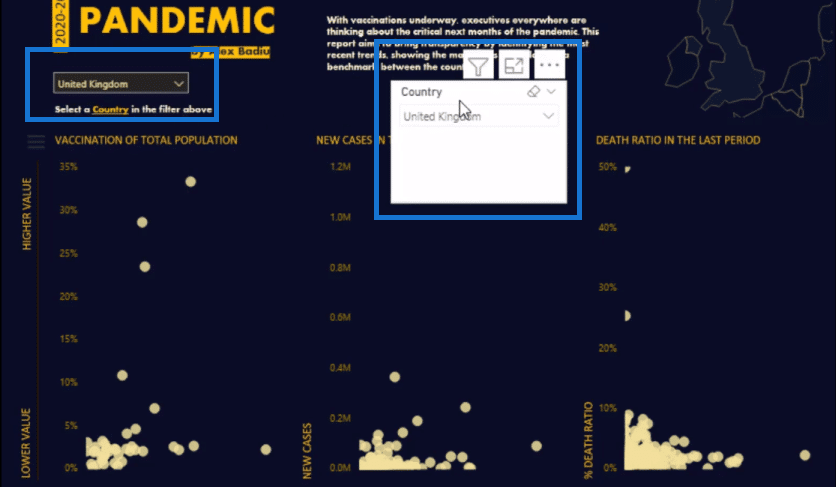
Now the two filters are in sync. So, when I choose the first slicer, for example, the United Kingdom, we can see that the United Kingdom is selected on the second slicer.
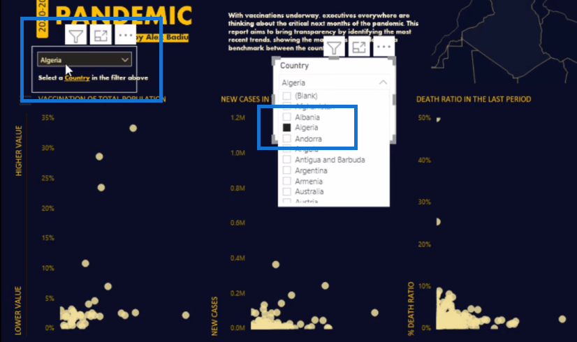
If I click Algeria on the second slicer, we can see it on the main or first slicer as well.
Using DAX To Highlight Points On Scatter Charts
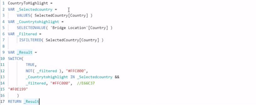
The next thing to do here is to create a measure that will be used to highlight specific results on the scatter charts. Let’s take a closer look at the measure or formula that I created for this example.
I created variables (VAR), which are great in simplifying complex formulas like this. The first is a list of all the countries that are on the filter using the VALUES function. Then, I use the SELECTEDVALUE for the main filter. Then, I use the ISFILTERED for the new table.
And then, I have the SWITCH TRUE statement at the bottom, which says that if it is not filtered, then it will appear on the scatter charts as the color yellow. The one that is selected will be color orange.
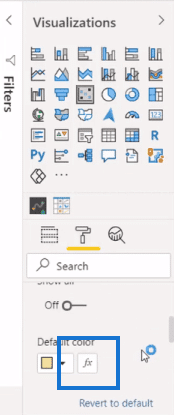
Then, on the report page, I’ll click on the scatter chart and go to the roller paint section. I’ll go to Data Colors and click on the small fx.
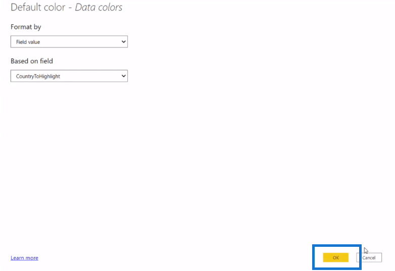
Here I’ll Format by Field Values, and the Based on Field, which is the measure I created. I’ll do the same with the other scatter charts.
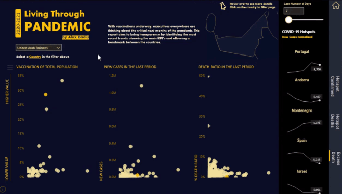
And now you can see that the selected country is highlighted on the scatter charts with the color orange.
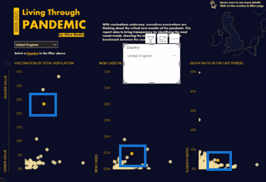
Now we don’t want to see this second slicer here on the report page. So we’ll just hide this by going to the View tab, then go to Selection, and then click on the eye icon of the slicer.
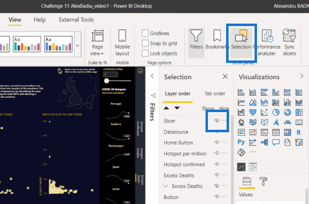
And now we have a clean report page with scatter charts that highlight the country we select on the slicer.
***** Related Links *****
How To Use The Built-in Analytics For Power BI Scatter Charts
Finding Patterns In Your Data Using Internal Logic In Power BI
Detecting & Showcasing Outlier Results In Power BI
Conclusion
This is a very easy technique that you can quickly implement in your own reports. This is a simple way to make your reports really compelling and engaging to your users.
I hope you find this tutorial helpful. If you want to learn more about scatter charts, check out the links below.
All the best!
Alex


