As you develop your Power BI reports, you have to make sure that your visuals are showcasing the insights that you need. You may watch the full video of this tutorial at the bottom of this blog.
Controlling the interactions of your visuals in Power BI can play an important role here.
This technique can make your dashboard really pop and keep your consumers happy. It is therefore very valuable for you to learn how to do this.
You have a few options when it comes to your visual interactions. Let’s go ahead and see how to use these options.
Controlling Interactions of Visuals in Power BI
Managing the interactions of your visuals is quite easy.
All you have to do is to first select the visual that you want to interact with the other visualizations and then select Edit interactions in the formatting section located at the top of the screen.
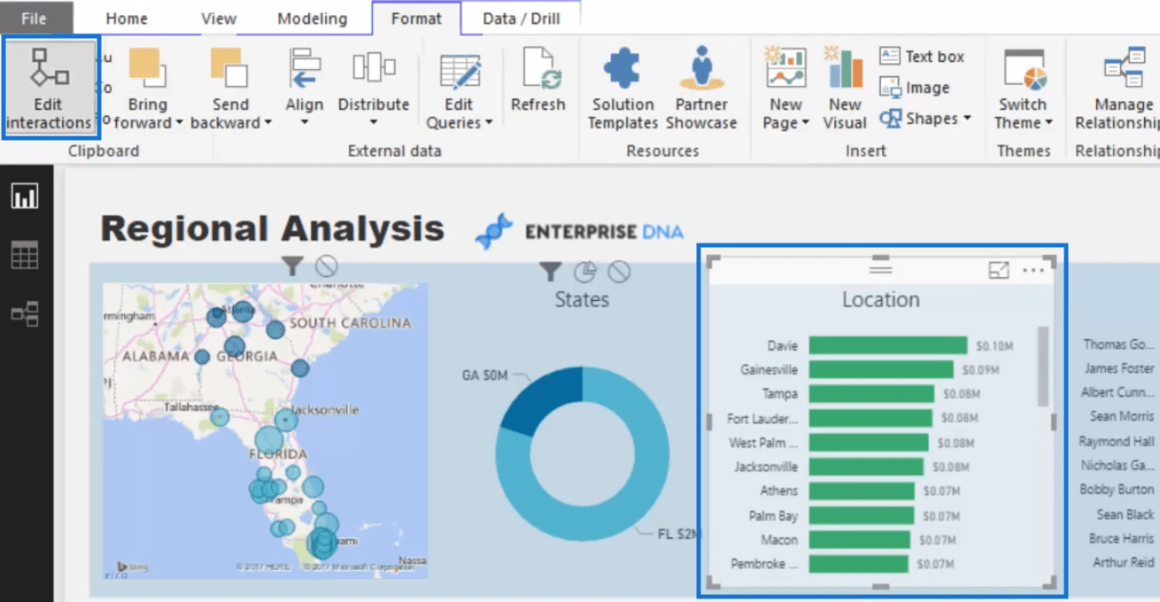
Once you have clicked on Edit interactions, you will see small icons at the top of each of your visuals for the following options: 1) filter, 2) highlight or pie slicer, and 3) none or no interaction.
Notice that the Location visual does not have those three icons. This is because it is the visual the we want to interact with the other visualizations.

Let us discuss each option.
1. Filter
So, one of the options you can select for the interactions of your visuals is the filter option or also known as full filter.
When you have selected this option and then you clicked on an element in a visualization, the other visuals will show a total change to the visualization depending on the filter applied to the visualizations.
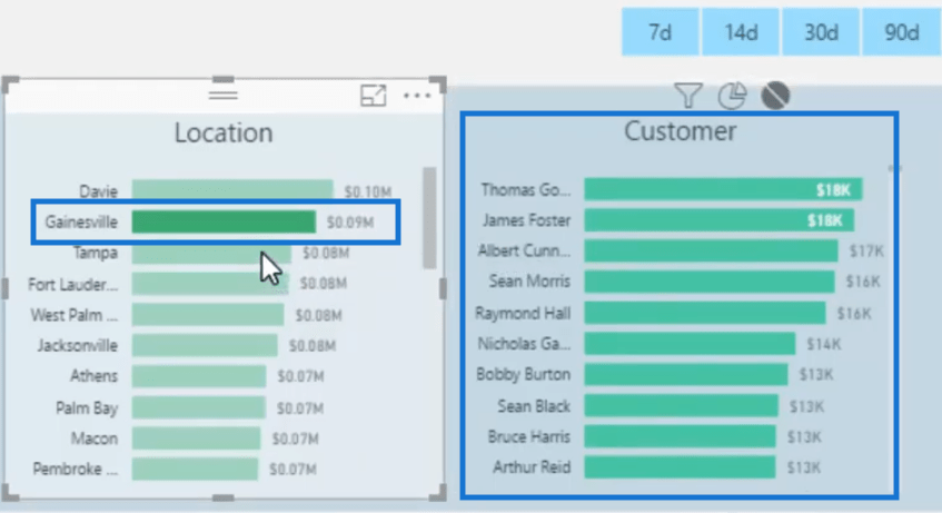
If we select Gainesville, for example, the Customer visual will show the total sales for each of the customers in this location.

The same is true if we select Tampa. The other visuals will exhibit a total change depending on the filter in place.

2. Highlight Or Pie Slicer
The next option which is the highlight option, highlights or shows the slice which is impacted. This is the reason why it is also called pie slicer.
In these two images below, for example, notice that the States visualization is divided into Georgia and Florida.
If we select the highlight option in the Customer visual and click on either Florida or Georgia in the States visual, the Customer visualization will show the slice of the total sales per customer depending on which state is selected.


What you need to remember here, however, is that there may be times when the changes in the visualizations do not make sense at all.
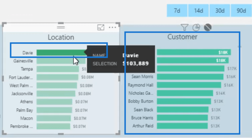
In the case of this image below, for example, we have selected the pie slicer in the Customer visual and then selected Davie in the location.
But then we cannot draw any insight from the interaction of these two visualizations.

The highlight option then can provide useful insights depending on the data in the visuals that have interactions.
3. Turning Off Interactions
Then of course, you may also choose to turn off the interactions.
For instance, we have grouped the visualizations in this image into three. We want the visuals to have interactions only with those in the same group they belong to.
We can then turn off the interactions so that if we select a visual in the first group, those in the other two will not be affected.
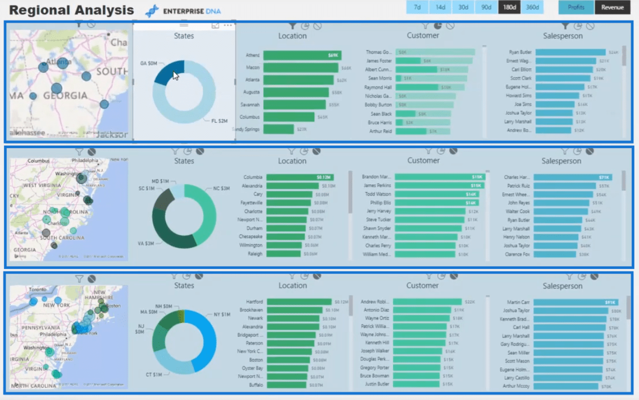
To turn off interactions, simply click the visual that you have selected, click on Edit interactions, and then change it to none or no interaction.
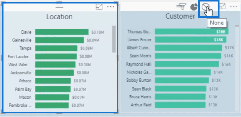
Now, if we select any of the elements in the Location visual, it will not affect the elements in the Customer visual.
Advantages Of Controlling The Visual Interactions
Having these options in Power BI allows us to really change the shape of the report. You can actually create mini dashboards within a report page as you turn on or off interactions between certain visuals.
This is a fantastic technique if you want to break down or group your dimensions in certain segments, like regionally or through age groups.
My advice is to first create the report with the end goal in mind. If an interaction looks more compelling one way than another then go for that.
I suggest, however, that if there are many ways that a certain chart can be filtered, then you might want to go for the full filter than the highlight or pie slicer.
The highlight option may not actually add value to the insights that you need, so be mindful of that.
Conclusion
We have just covered the different options that we have when controlling the interactions of the visuals in Power BI. We can opt to use either filter or highlight or even turn off the visual interactions altogether.
Creating really powerful visuals in Power BI is very easy if you know how to use some good techniques like managing the interactions between visuals effectively.
So go ahead and try this technique on your reports. Enjoy!
Sam
***** Learning Power BI? *****
FREE COURSE – Ultimate Beginners Guide To Power BI
FREE COURSE – Ultimate Beginners Guide To DAX
FREE – 60 Page DAX Reference Guide Download
FREE – Power BI Resources
Enterprise DNA Membership
Enterprise DNA Online
Enterprise DNA Events
[youtube https://www.youtube.com/watch?v=KQsRHWTF4Bs&w=784&h=441]

***** Related Links *****
Creating Multi Threaded Dynamic Visuals – Advanced Power BI Technique
Using Filter Fields & Visual Interactions To Create Compelling Visualizations In Power BI
How To Create Compelling Reports & Dashboards In Power BI
***** Related Course Modules *****
Data Visualization Tips
Dashboarding & Data Visualization Intensive
Business Analytics Series
***** Related Support Forum Posts *****
Data Visualization Tips – UNICHARS
Dashboarding & Data Visualization Intensive
Data visualisation
For more data visualization support queries to review see here….


