In this tutorial, I’ll take you through an outlier detection analysis, detecting and visualizing outlier results. Your data doesn’t even need to be unique or customized. The great thing is that you can do this on basically any data set. You may watch the full video of this tutorial at the bottom of this blog.
I’m going to show you just how amazing Power BI is as an analytical tool.
It involves just incorporating a range of DAX formula and analytical techniques into your models, and then ultimately visualizing it in an effective way with all the dynamic visualization features we have available to us in Power BI.
The key and most important concept that I want you to take away when viewing this tutorial is that this can be applied in so many different ways.
So, we’ll start with an explanation of outliers in a scatter chart. Then, I’ll show you the different formula techniques that you need to implement to be able to visualize it in this specific way.
Outliers In A Scatter Chart
If we were to detect an outlier, the main thing that we need to work out is the logic behind what makes up the outlier.
But first, I want to showcase how visually it can impact our reports and how much easier and effective it is for consumer to figure out what we’re trying to show them.
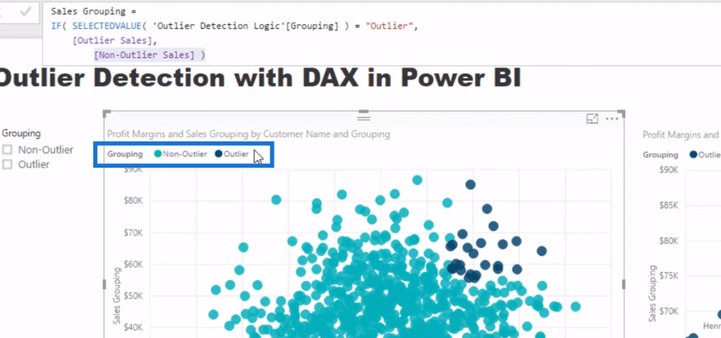
Now if we look at these two charts, the first chart (left) is showing exactly the same thing as that of the second one (right), except that I’ve created a legend or a slicer filter in the second chart, which shows us what our outliers are.
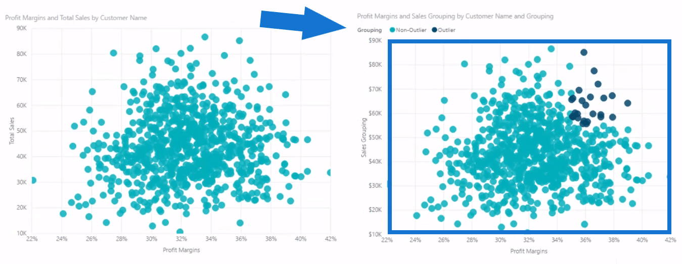
So if a Customer Sales and the Profit Margins is at the same time or above a certain level, then that’s an outlier in our data set.
We want to see who those customers are, and so we can virtually see that in the second chart much better than just looking at all our customers and their profit margins in the first chart.
Moreover, we can drill into our customers a lot better. We can select a filter,
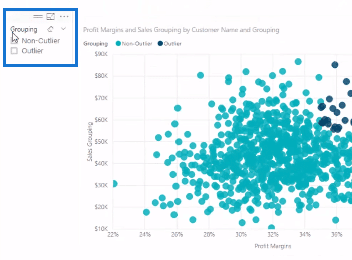
or create a chart and put a filter in the Filter fields section.
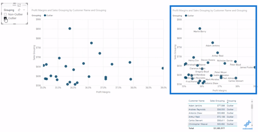
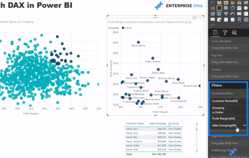
This chart enables us to drill into these customers who we deem as outliers. Now let’s look at our data model to see how this is applied.
Inside The Data Model
The first thing to note is that we need to do this in a dynamic way since we’re segmenting, creating groups of our customers here. To do anything dynamic, we have to do it inside of DAX formulas.
We can’t physically create a calculated column in our models and hope that if we were to put some different time frame in this model, then we’re going to get the results that we want. If we put calculated columns, then we’re going to get that static information. It’s only going to update on refresh.
The first way to do logic in a dynamic way is to have a supporting table. So as you can see here in the data model, I’ve created this Outlier Detection Logic. It’s a supporting table, which means that it’s not connected to anything.
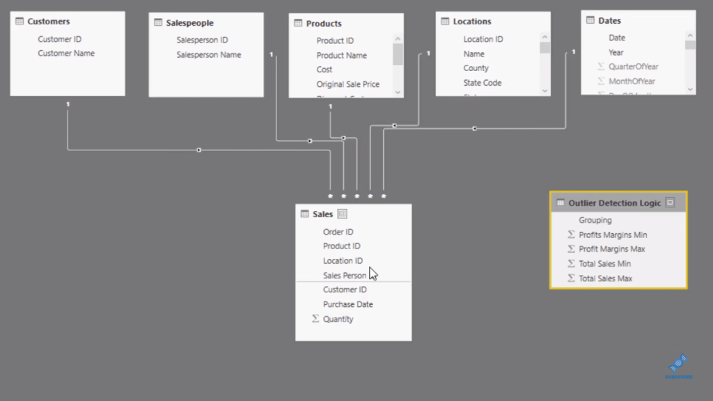
Inside this table is where we input our logic for outlier detection.
We identify our outliers by a minimum profit margin of thirty five percent and a maximum margin of one hundred percent, while our non-outliers have from zero up to thirty-five.
The same for sales, we have some logic that would identify outliers by total sales of above fifty five thousand.
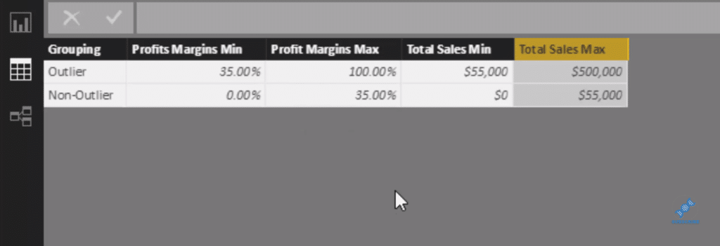
So think about how you can apply this your own logic. You might have three different parameters or variables that are going to detect the outlier.
Now let’s create the formulas that iterate through this table and evaluate the customers whether they match up to the outlier logic or to the no- outlier logic.
Outlier Detection Using DAX
Keep in mind that we need to run through each customer and determine whether they evaluate as an outlier or non-outlier.
To identify the outlier, we use CALCULATE to our Total Sales, for each Customer. And that’s what VALUES function does, as we FILTER through all our customers. Then we go through our Outlier Detection Logic.

For our non-outlier, on the other hand, we also run through some logic for each customer, but the main difference is this double line (||), which is for “or” and not “and” (&&).

If we do “and” here, then all it would showcase is the results that are both under fifty-five thousand and under thirty-five percent, as indicated in our Outlier Detection Logic.
Next is we need to create one formula that we can put inside our visualization, and that is our Sales Grouping formula.
This calculation is saying IF SELECTEDVALUE (Outlier Detection Logic) is an Outlier, then we want to return the Outlier Sales. If not, then we return Non-outlier Sales.

That then allows us to integrate or retrieve the different results or the different formulas for whatever selection or filter is applied in our visualization.
There’s no denying that there’s a little bit to it, but this just shows us how amazing DAX is in Power BI, especially for outlier detection analysis.
***** Related Links *****
Deep Dive Into Data Outliers – How To Discover And Analyze In Power BI Using DAX
How To Evaluate Clusters In Your Data Using DAX Technique In Power BI
Creating Dynamic Outlier Trigger Points – Advanced Power BI Analysis Technique
Conclusion
The approach I showcase on this tutorial is actually just one way, but hopefully you have learned a lot from this. We did some pretty advanced logic in there and showcase it in a really effective way using scatter charts.
There are so many applications for outlier detection. If you want to really drill into or showcase a very specific insight, especially when you’re doing some comparison with a scatter chart, then this is a perfect way to add value and more insight into your visualizations.
Therefore, if you can understand all the elements of the formulas, including combining the formulas and placing them inside a visualization, then you can apply these in many ways to showcase results with your own data sets.
Cheers!
Sam


