
Designing report layouts in Power BI is a challenge for most people. Some data analysts sometimes forget to make their reports more engaging and intuitive as they focus more on the data. In this tutorial, you’ll learn some simple tips and tricks to create good-looking layouts for your Power BI reports.
First, let’s talk about where to look for inspirations for your report. When you’re trying to create a report, most of the time, you’re running out of ideas.
If you don’t know how to use PowerPoint, Adobe Photoshop, or Illustrator, there are some online tools that can help you out. In fact, I created this format on a website called Canva.

Designing Report Layouts Using Canva
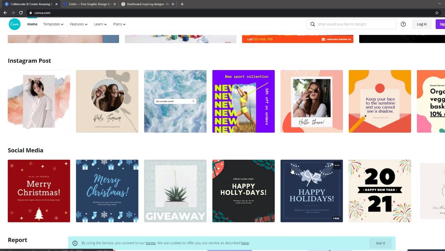
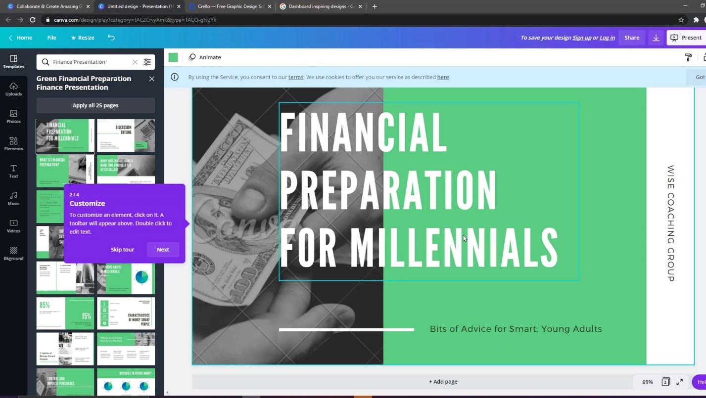
Canva provides thousands of templates. This website allows you to look for inspirations for your color palettes and backgrounds. You can also search for a particular type of report here.
For instance, I’m a financial guy, so I’ll look for financial reports.
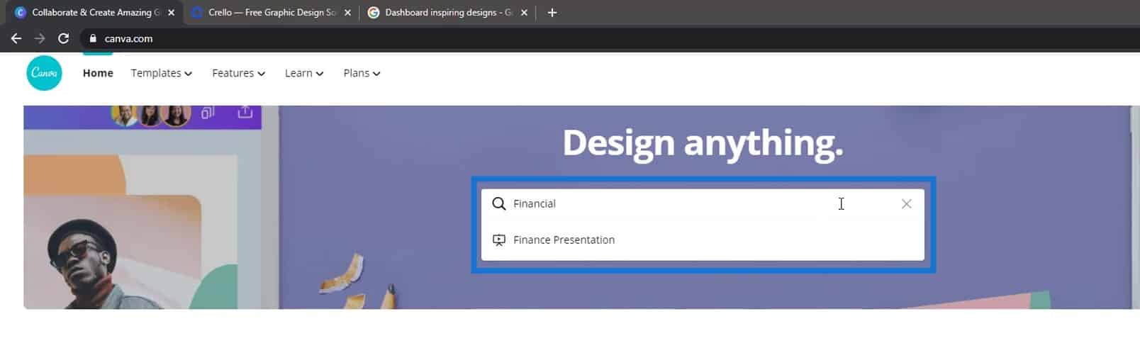
It will then display a lot of financial reports templates.
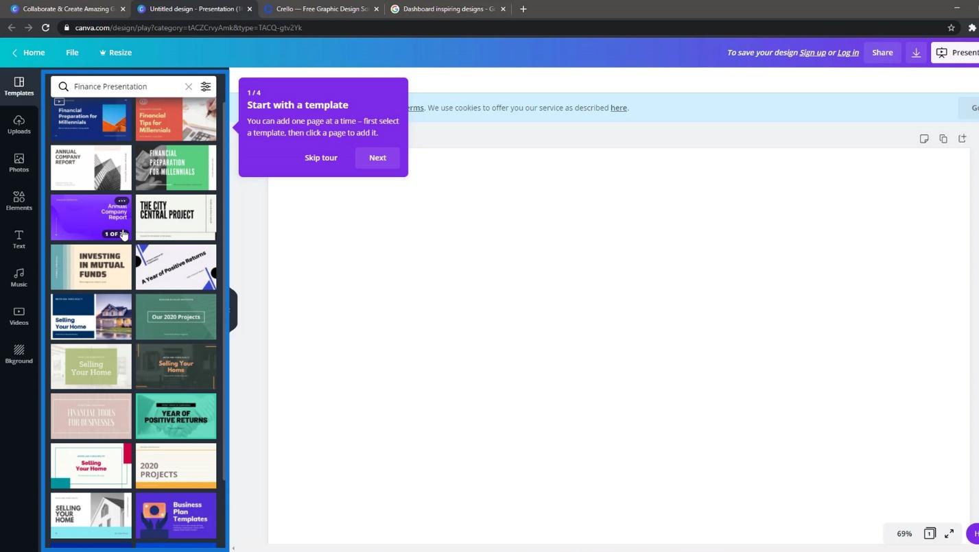
The good thing about this website is that you can see segments from other reports and combine them. For example, I like the idea of this line here.
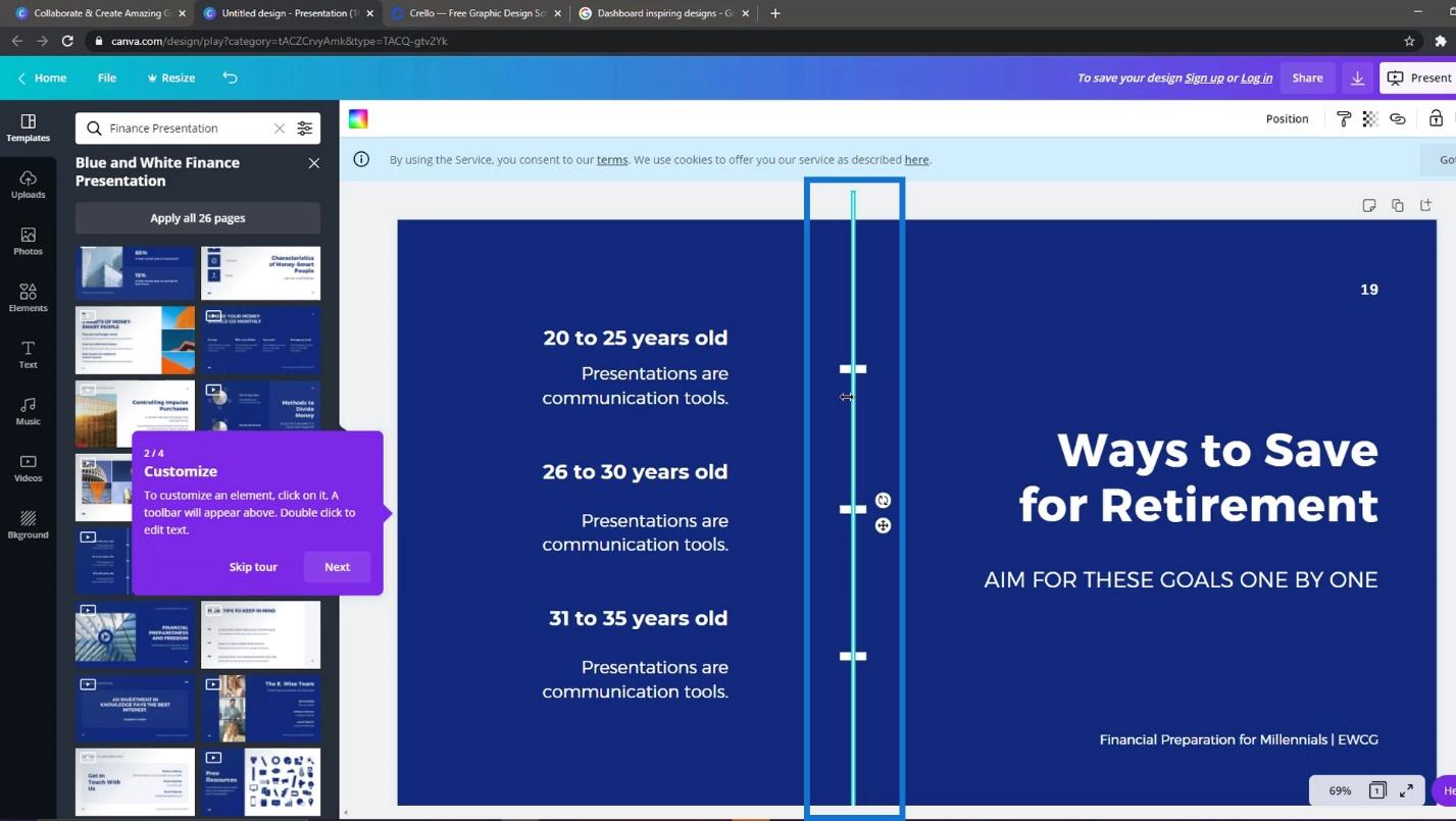
Then, I want another idea from another report. Let’s say I want to use the background of this template.
So, I’ll just copy that background and paste it here.

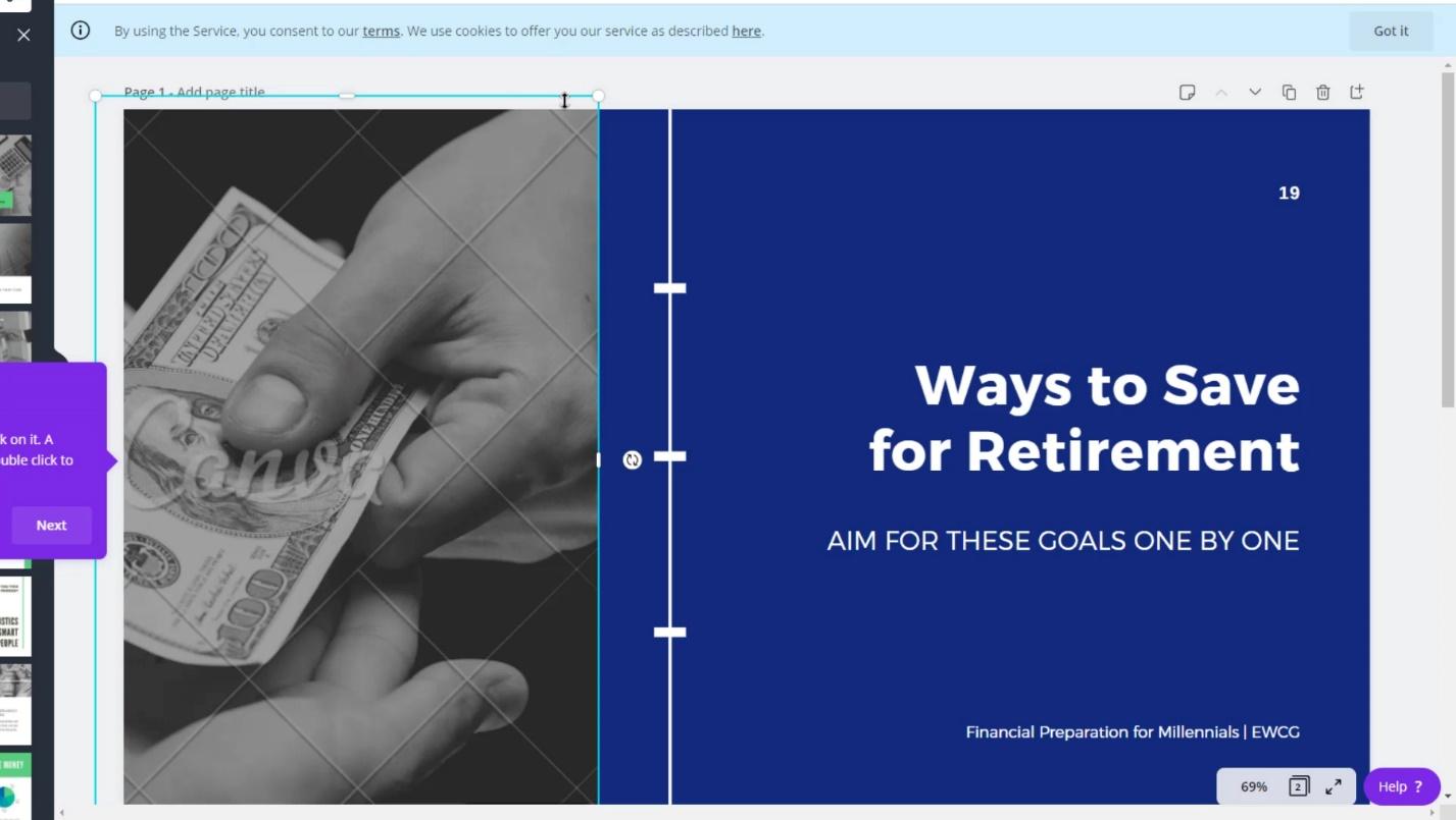
After that, I can download it by clicking the download icon at the upper right corner of the web page.
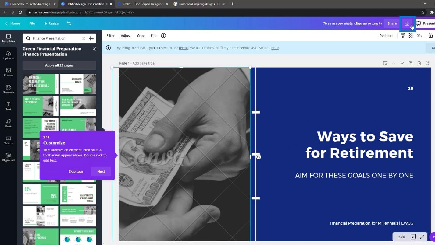
If you have the paid version, you’ll get high-definition images for your dashboards.
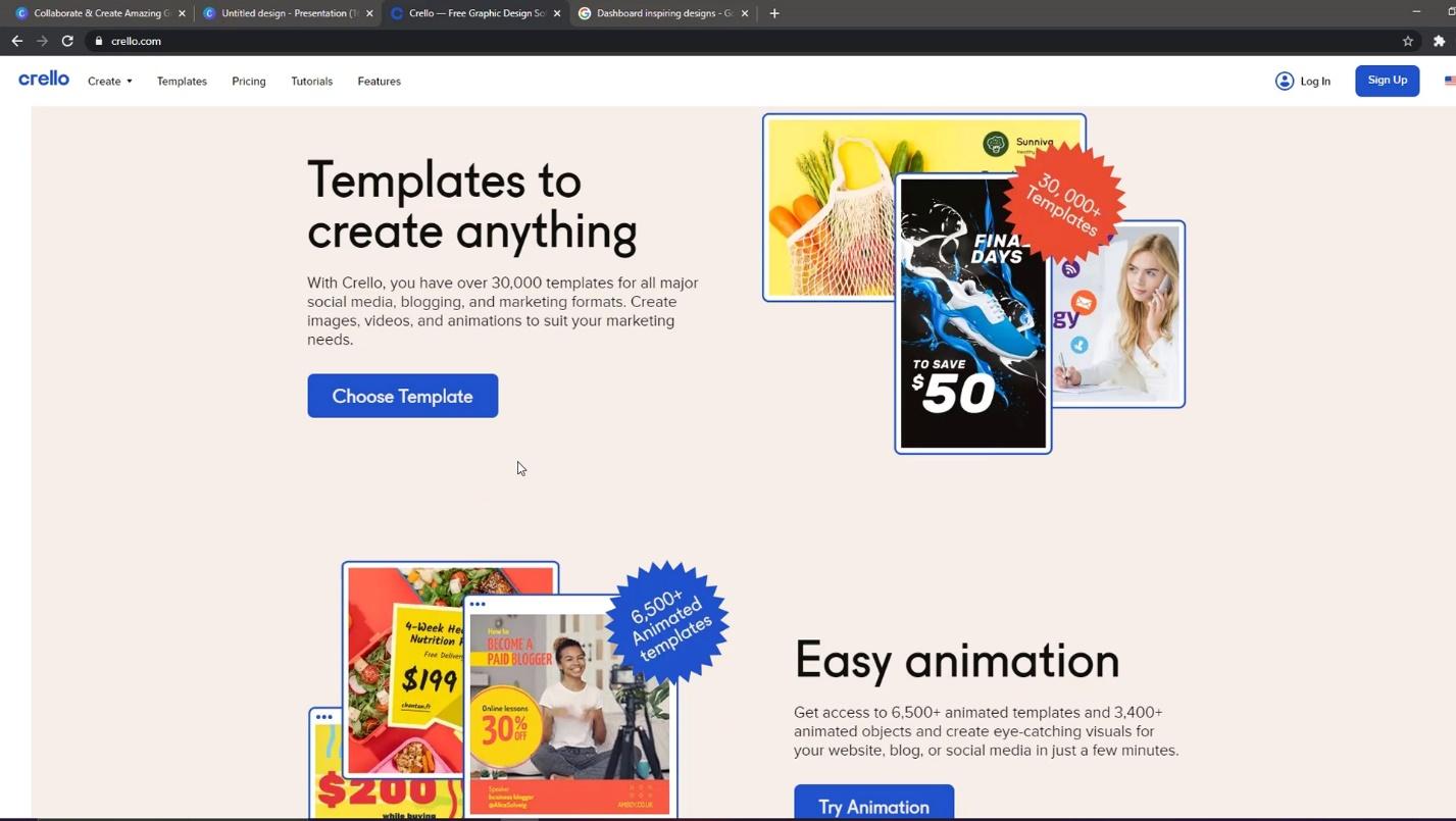
Designing Report Layouts Using Crello
Another website that you can check is Crello. There are many templates here with really cool colors.
Just click Templates and search for any color pattern for your report.
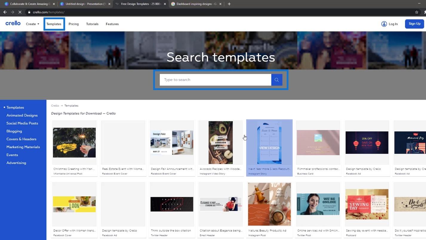
For example, let’s pick this one.
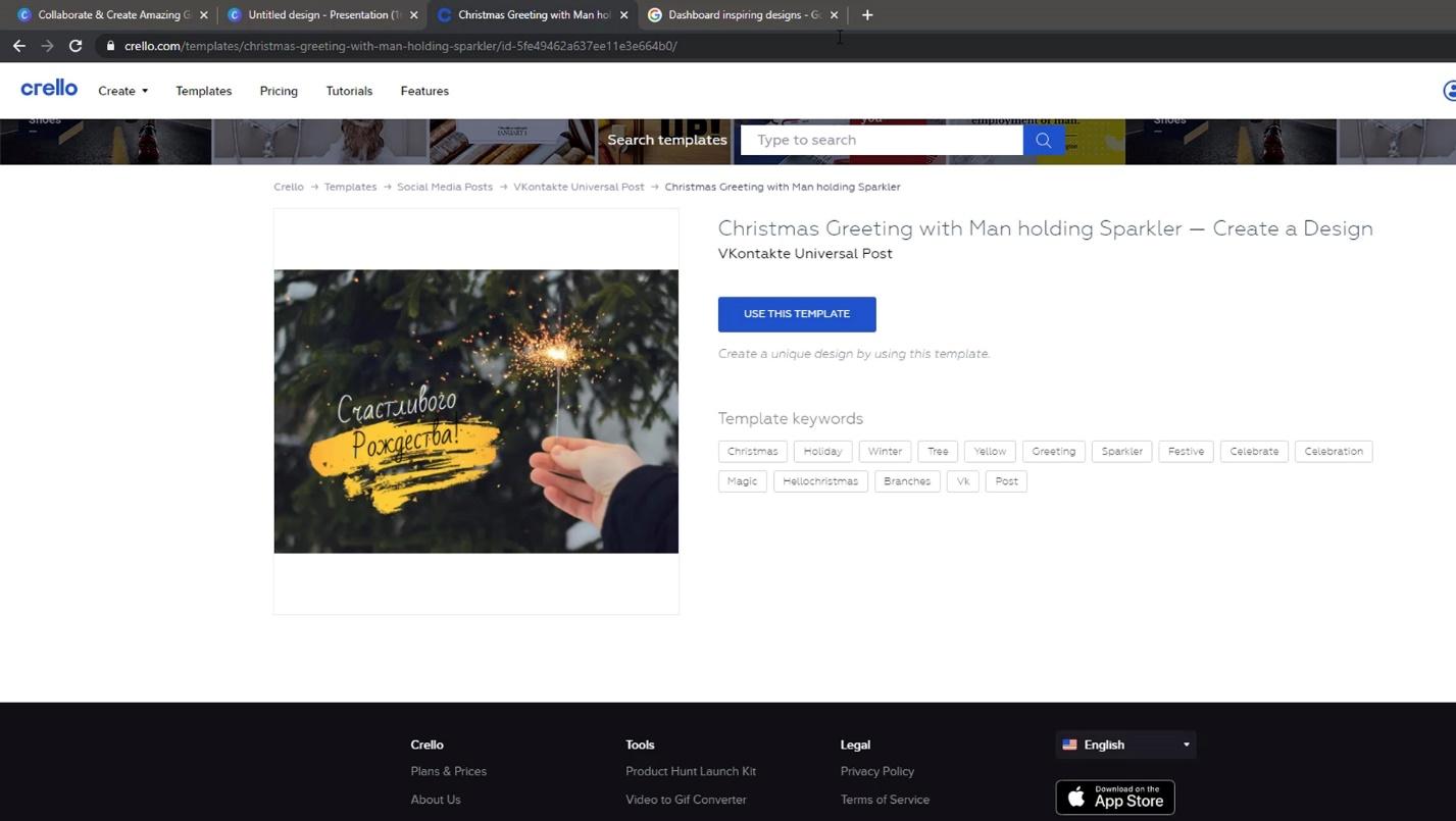
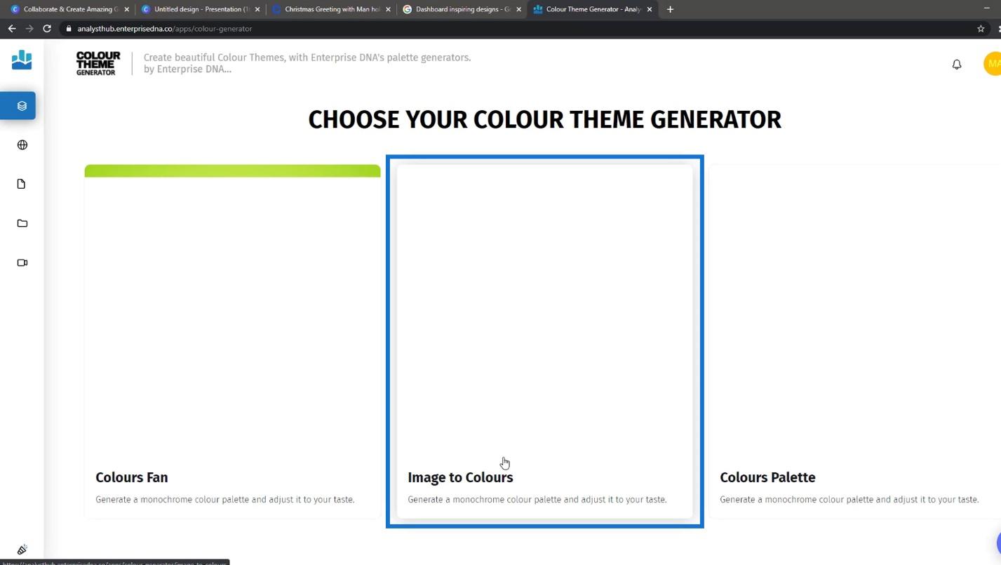
Then, if you like this template and want to generate its colors, you can go to the Analyst Hub apps center.
Click on the COLOUR THEME GENERATOR.
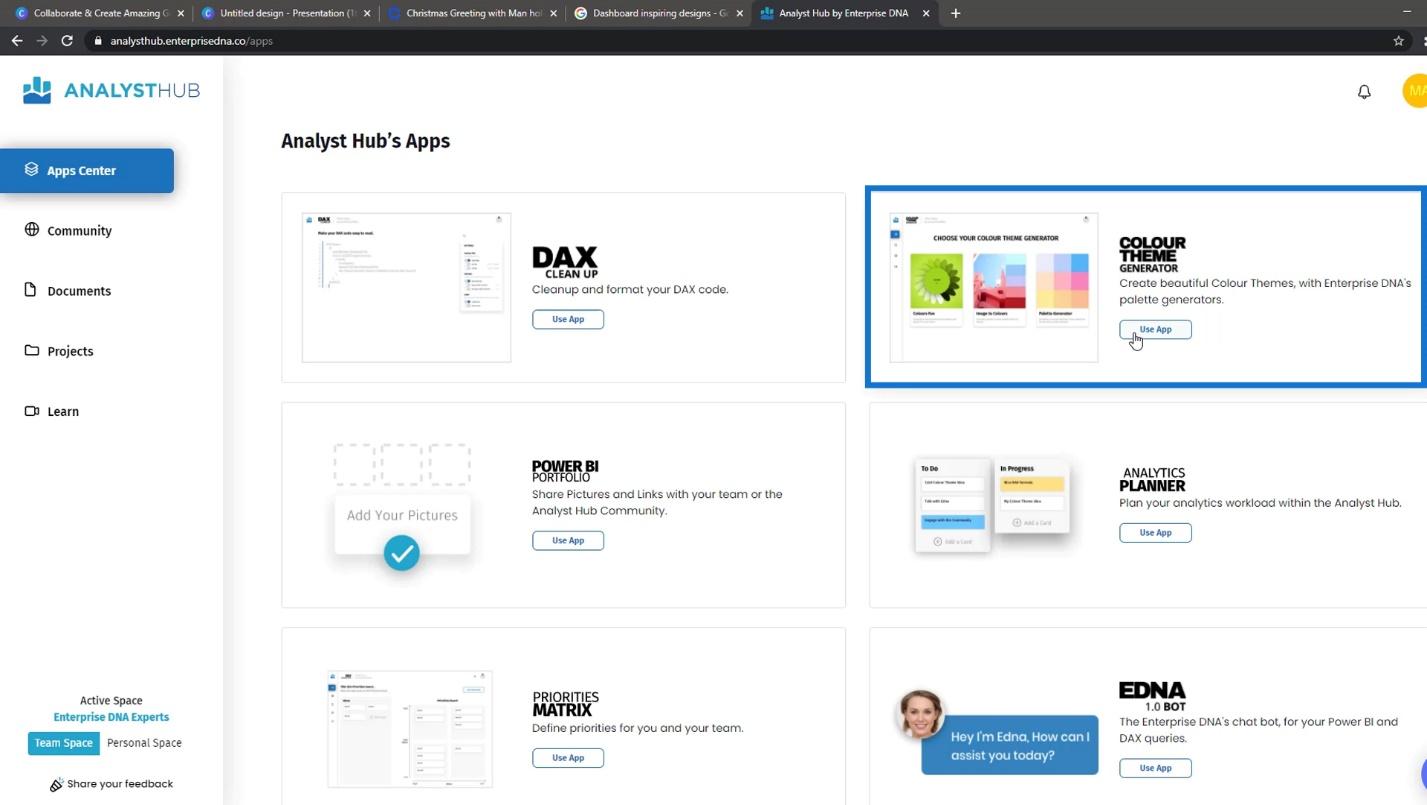
Select Image to Colours.
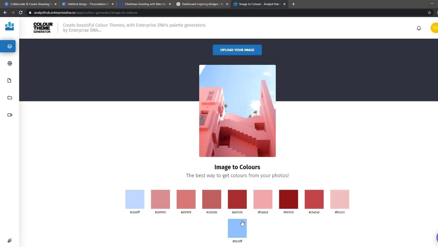
You can upload the image that you downloaded from Crello here. This will then generate and create a color pattern based on the image.
Finding Dashboard Designs In Google
The third thing that you can do is to go to Google, and type dashboard inspiring designs. It will then display various report designs.

It’s best to start with finding something challenging and then working on it.
In Power BI, it’s also possible to design shapes that you want to use in your report. You can design it in PowerPoint or other tools like Adobe Illustrator or Photoshop.
Designing Report Layouts In PowerPoint And Adobe
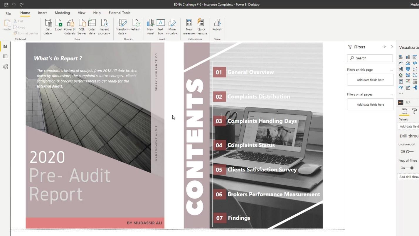
There are basic and small objects that you can create in PowerPoint. For example, I created these highlighted shapes in PowerPoint.
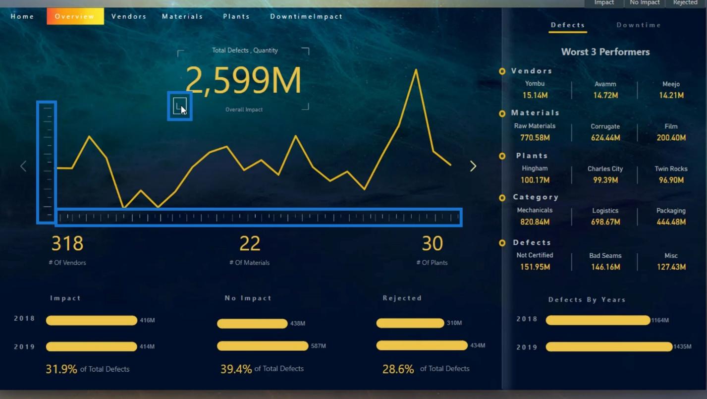
In this example, I have a shape that looks like a measurement scale and a focus on a camera shot. I can also create some texts and rotate them.
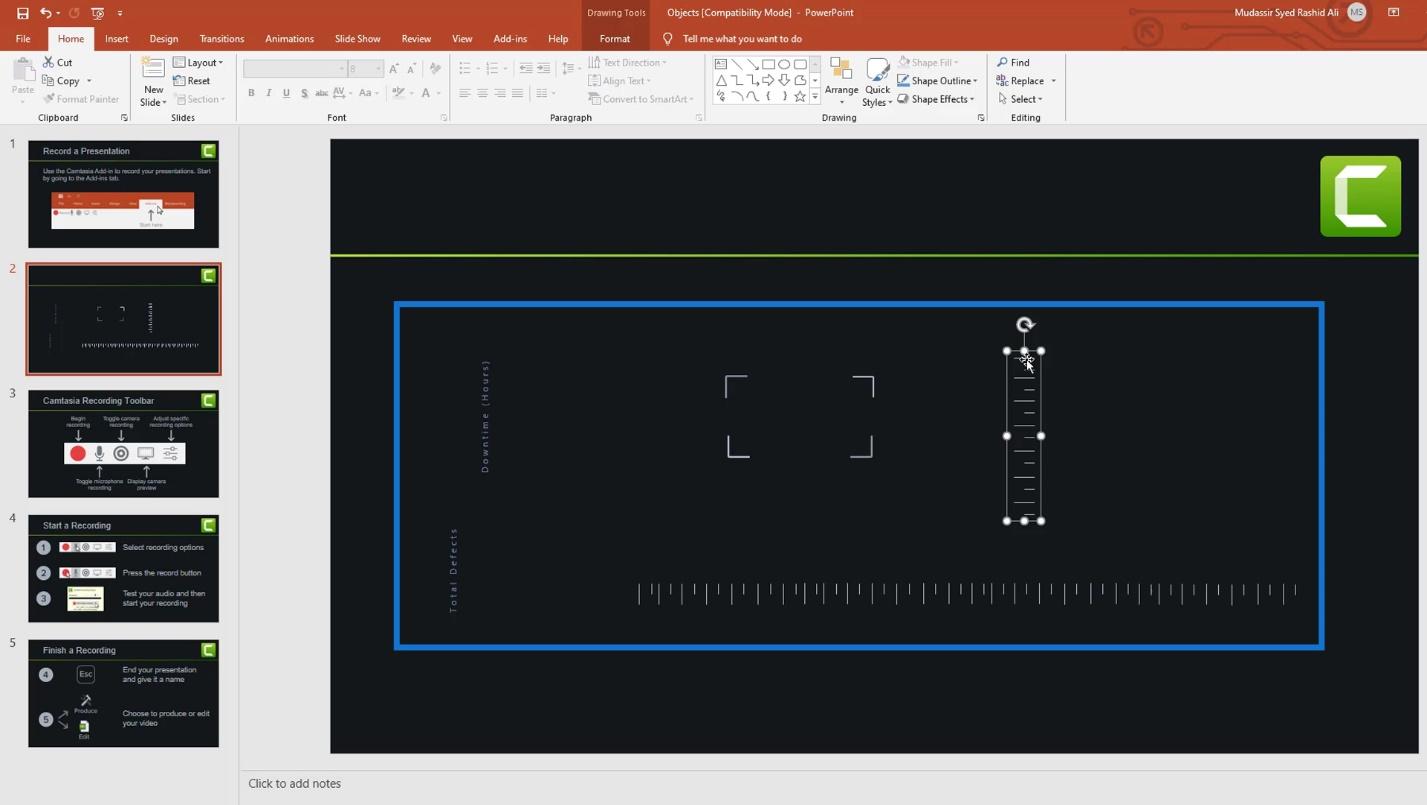
For the measurement scale, I simply used these straight lines.

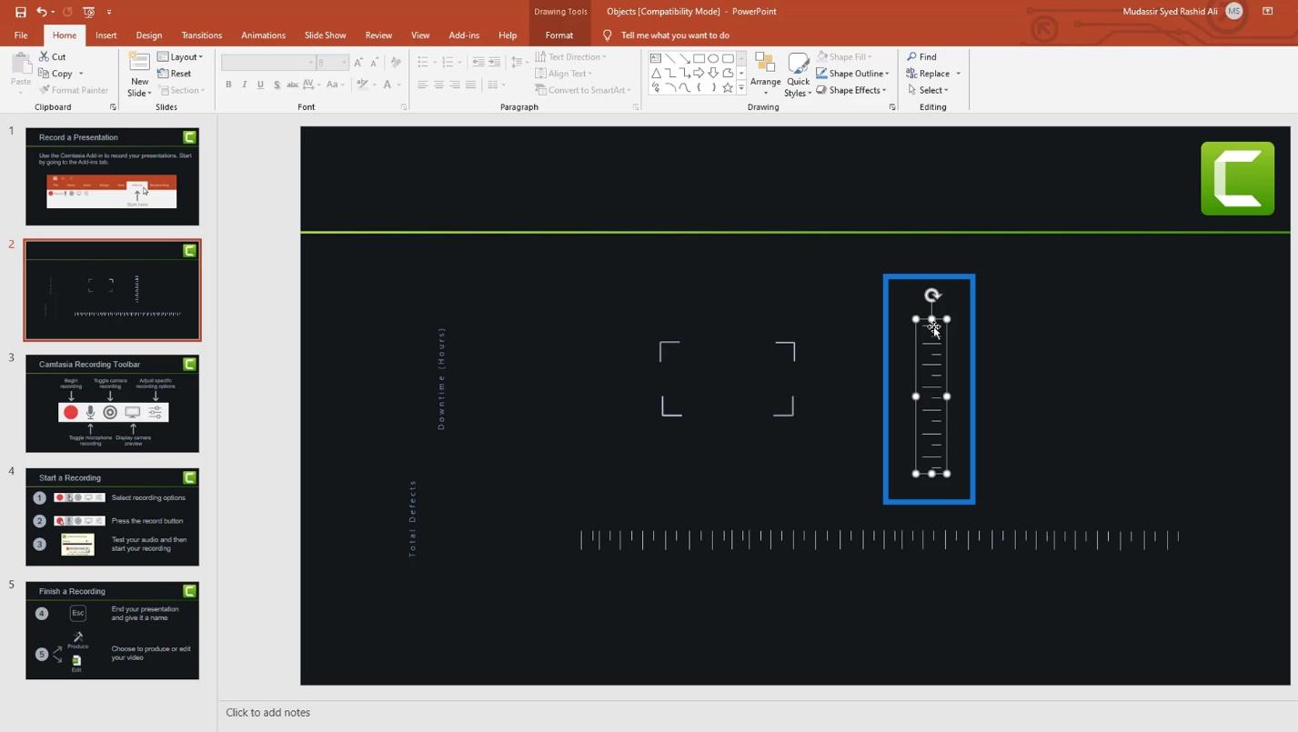
Then, I rotated it horizontally.
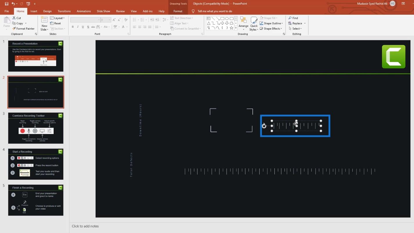
I duplicated it by pressing Ctrl + C and Ctrl + V in the keyboard. Then I positioned it like this.
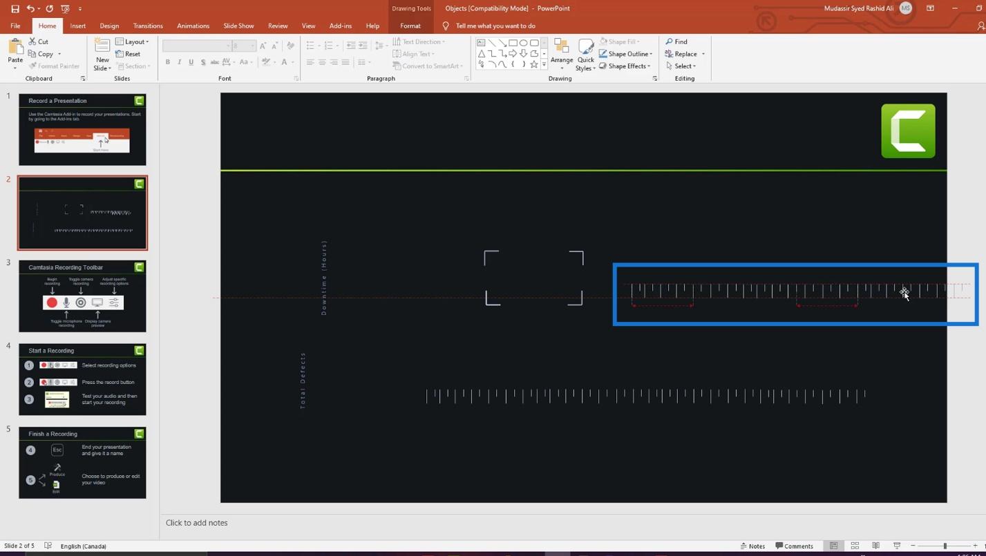
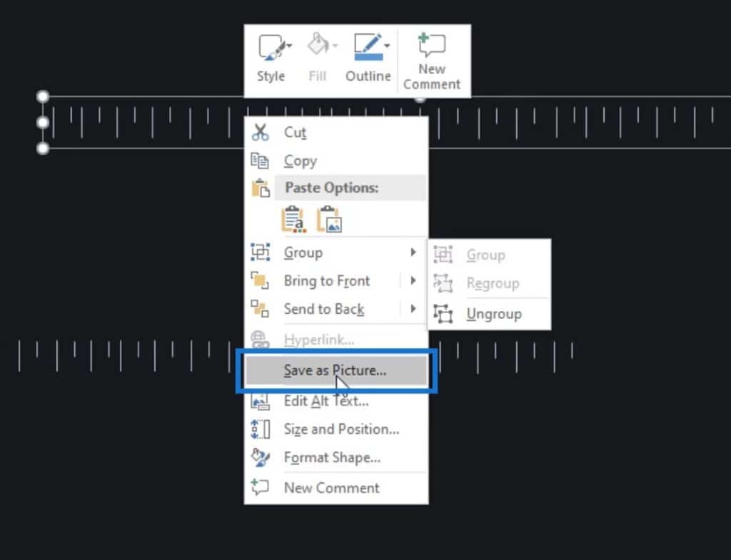
After that, I grouped them by right clicking on them and selecting Group.
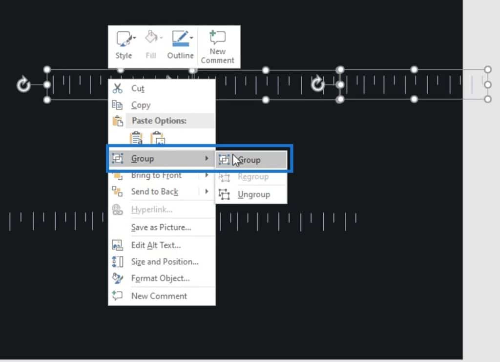
Finally, I right clicked on it again and selected Save as Picture. Then, I saved it in my desired folder.
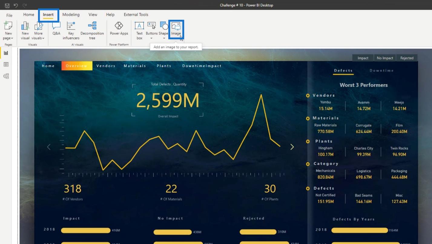
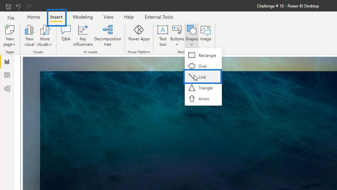
I can now use it in my Power BI report by clicking the Insert tab, then clicking on the Image option.
If you use Adobe illustrator or Photoshop, then you can create better images or objects. For example, this part here is created using Adobe Photoshop.
Some objects in this page were also designed using Photoshop and Illustrator.

If you have Adobe skills, then you are really lucky. However, some of you may not have Adobe skills and don’t know how to design objects in PowerPoint as well.
In that case, I recommend you to check these channels on YouTube: One Skill PowerPoint Tutorials and PowerPoint School.
These are definitely useful when learning how to design visuals for your reports. They will teach you the step-by-step procedures on how you can create cool-looking objects. If you can spend 1 or 2 days learning them, you can create advanced-level objects for your Power BI report layouts.
Using Power BI Tricks For Theme And Layout
Aside from being creative on objects using PowerPoint and Adobe applications, you can also be creative with Power BI. Actually, you can be as creative as you want when it comes to your report theme and layout.
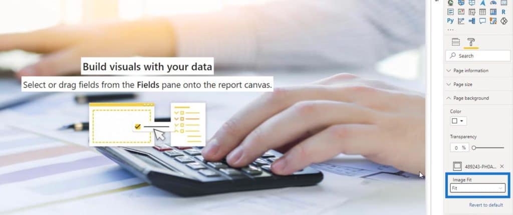
1. Blur Effect
For example, when I was trying to create this report, I wanted some blurry effect on the background. However, I wasn’t able to get any background that is close to this blurry effect.
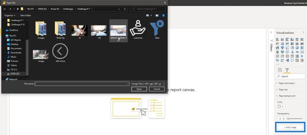
So, I just inserted a decent image here by clicking the Add image under the Page background section.
By default, the Image Fit option was set to Fit. So, I wasn’t able to get a blurry effect.
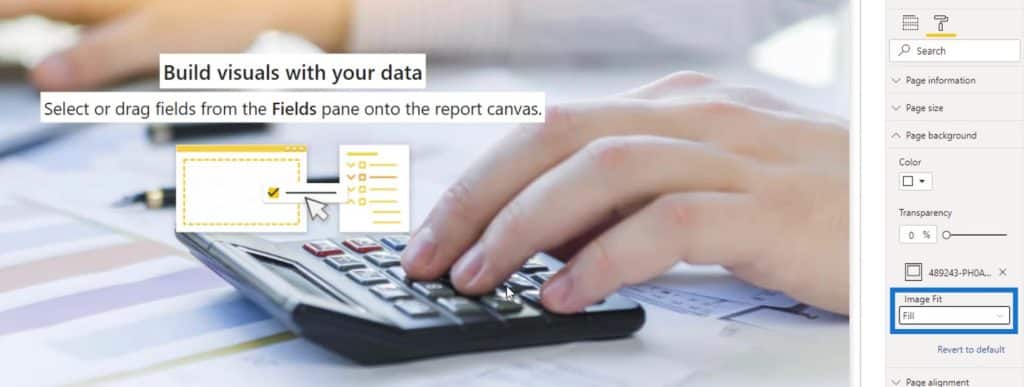
Choosing the Fill option will also give me a clear image.
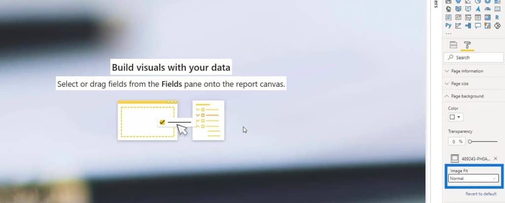
Then, I tried using the Normal. As you can see, it gave me the blurry effect that I want.
2. Line Effect
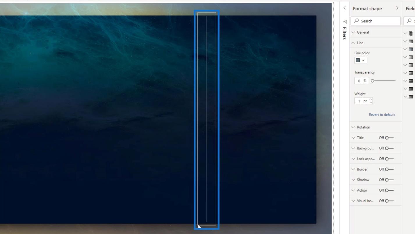
Another thing that you can do in Power BI is this line effect here.
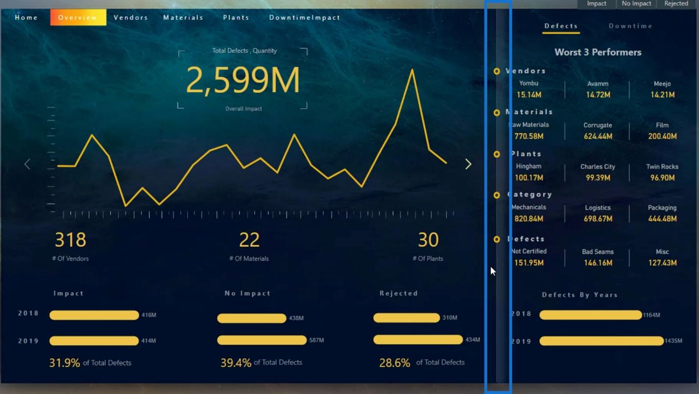
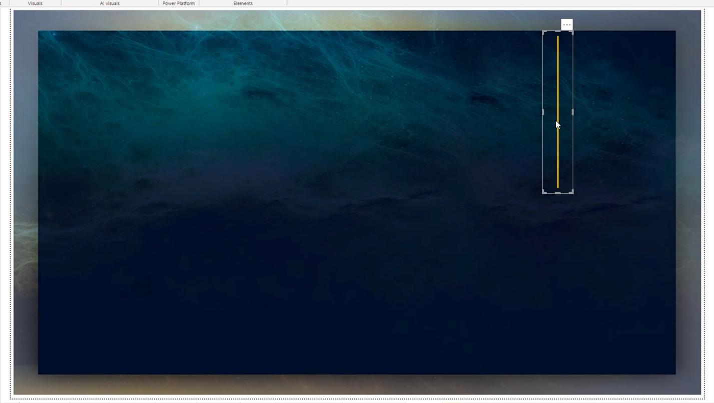
To do this effect, I inserted a line shape.
Then I positioned it around the right side of my canvas.
After that, I changed the color of this line by choosing from Line color.

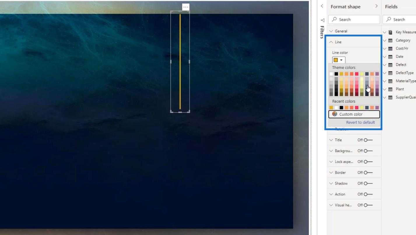
I also changed the Weight or thickness of this line from 3 to 1.
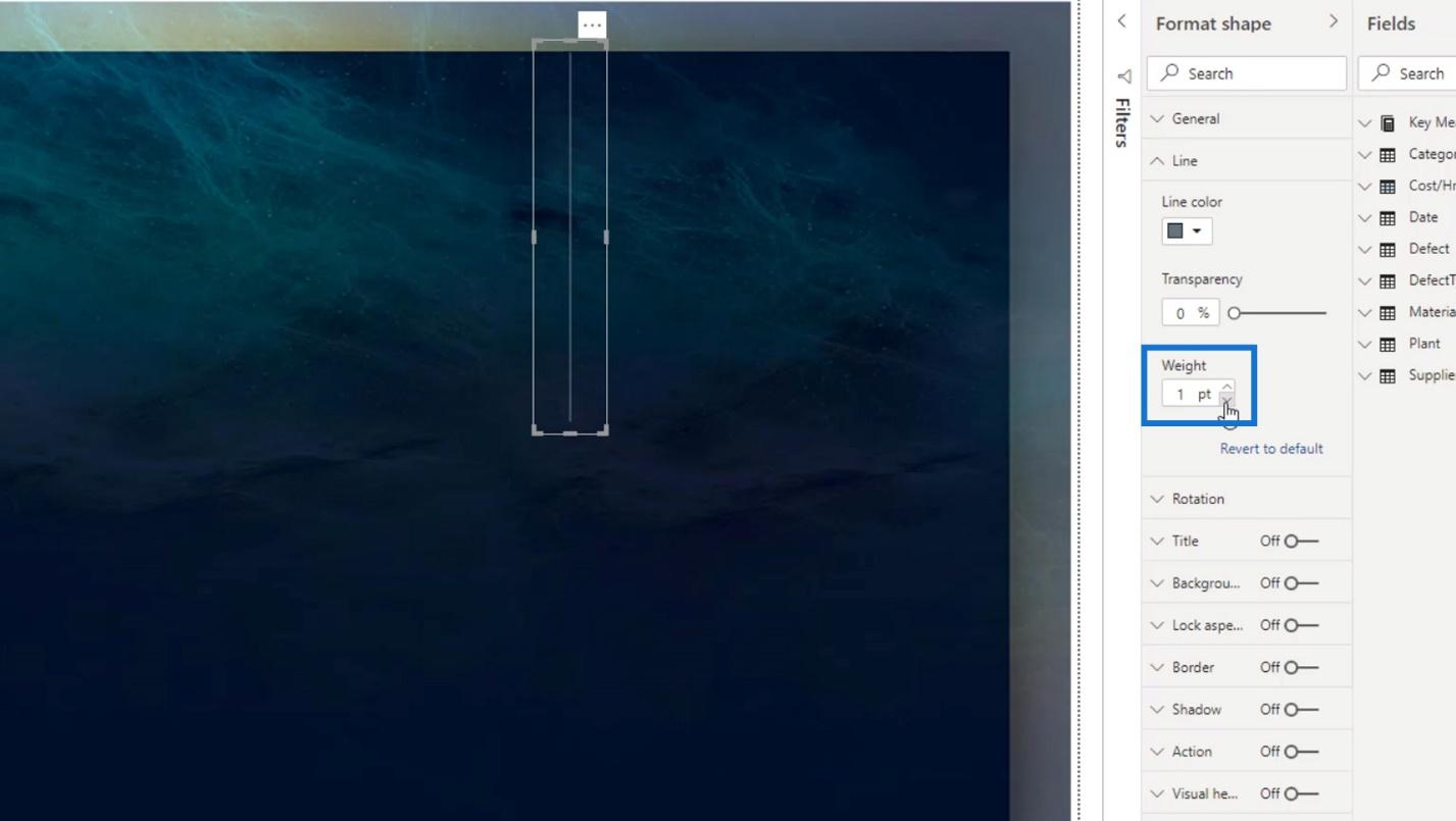
Lastly, I resized it to fit the height of the canvas.
3. Shadow Effect
For the shadow effect, I enabled the Shadow option here.
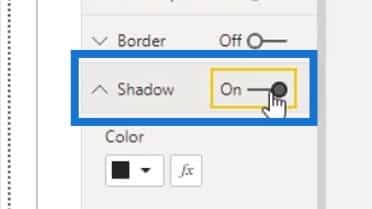
Then, I changed the color of the shadow.
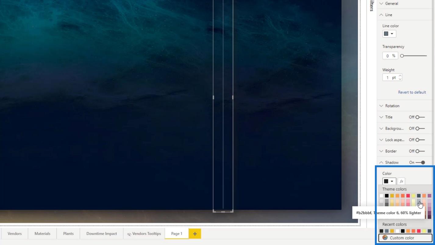
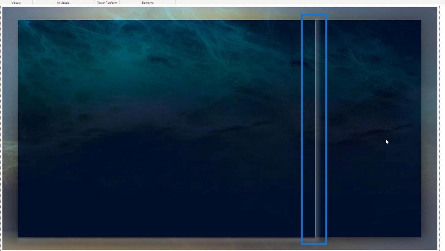
It resulted to this output. However, I want the line to be at the beginning point of the shadow.
So, I just copied the first line that I created.

Then, I positioned it beside the shadow of the first line.

For the first line, I made it transparent by setting the Transparency to 100.
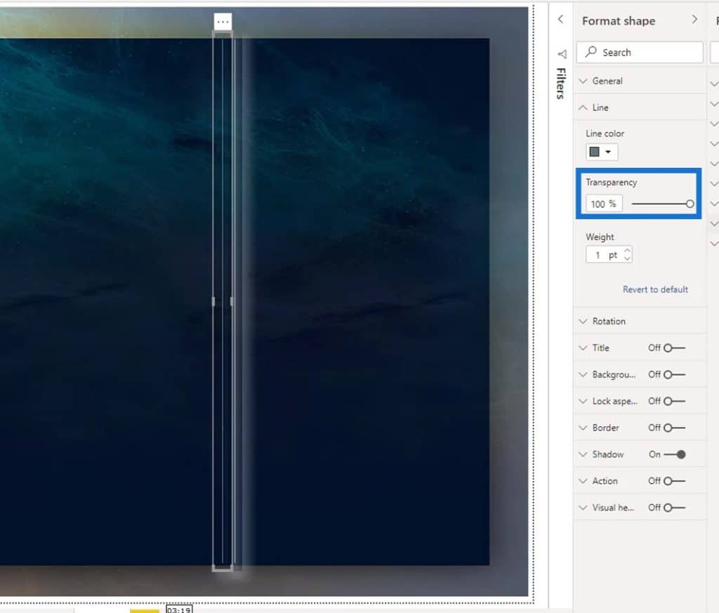
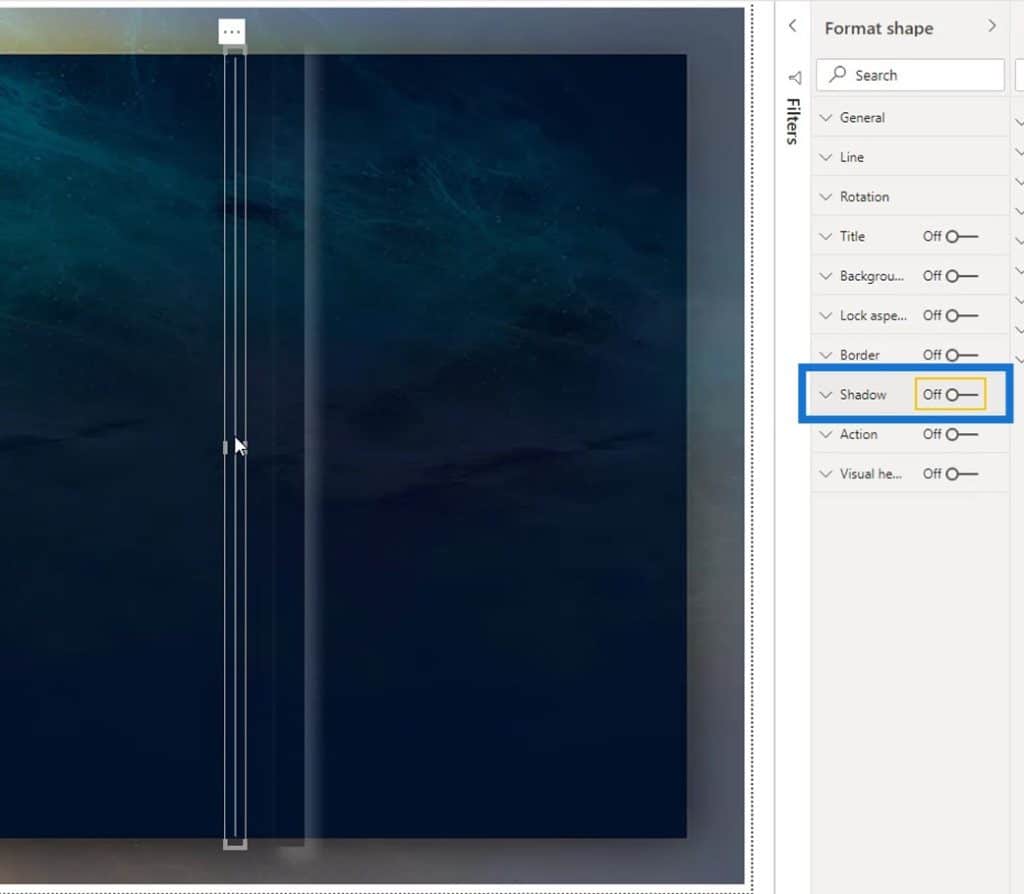
For the second line, I removed the Shadow.
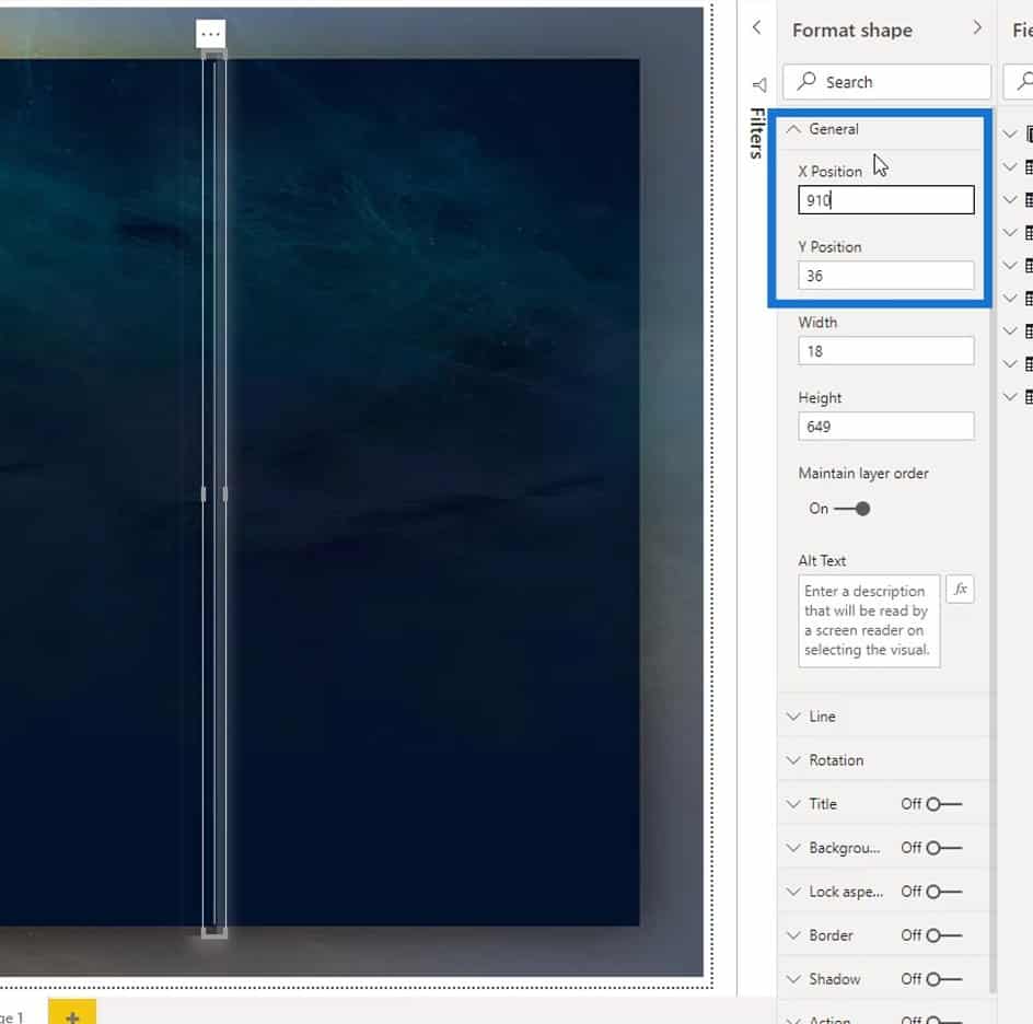
Then, to easily position the second shape beside the shadow of the first shape, I did a little tweaking here. The X Position is for positioning the object from left to right. The Y Position is for top and bottom.
Finally, I made the shadow effect.
***** Related Links *****
New Enterprise DNA Course: Advanced Visualization Techniques
Power BI Report Designs: How to Get Inspiration Through Enterprise DNA
Simple Visualization Techniques For Your Power BI Reports
Conclusion
To sum up, there are many things that you can do when designing report layouts in Power BI. You can use online tools such as Canva, Crello, and Google (for design inspiration). And if you want to have more flexibility in designing elements, you may use design software such as PowerPoint and Adobe Photoshop, or Illustrator.
My only advice is to spend some time when creating a report, especially if you’re participating in the Power BI challenges. By doing this, it won’t be too difficult for you to tap on your creativity because you won’t run out of ideas anymore.
Check out the links below for more examples and related content.
Cheers!
Mudassir


