
In this blog, I’ll be talking about how you can find inspiration for your Power BI report designs. You may watch the full video of this tutorial at the bottom of this blog.
It’s understandable that not everyone is artistically inclined. But I also acknowledge that aesthetics can also impact the quality of reports and dashboards. Not only does a well-designed report increase engagement with its intended audience, but it also helps deliver data and insights more efficiently.
This is why here at Enterprise DNA, we continue to work on different tools and resources that can help users create powerful dashboards with beautiful Power BI report designs.

Report Design Inspiration from the EDNA Knowledge Base
One of the best places to find design inspiration is the Enterprise DNA Knowledge Base.
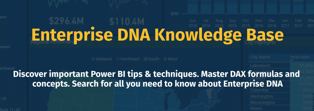
The Knowledge Base has everything you need to create compelling Power BI reports and dashboards. It contains techniques and tips about DAX functions, data visualization, achieving meaningful insights, and most importantly, report design inspiration.
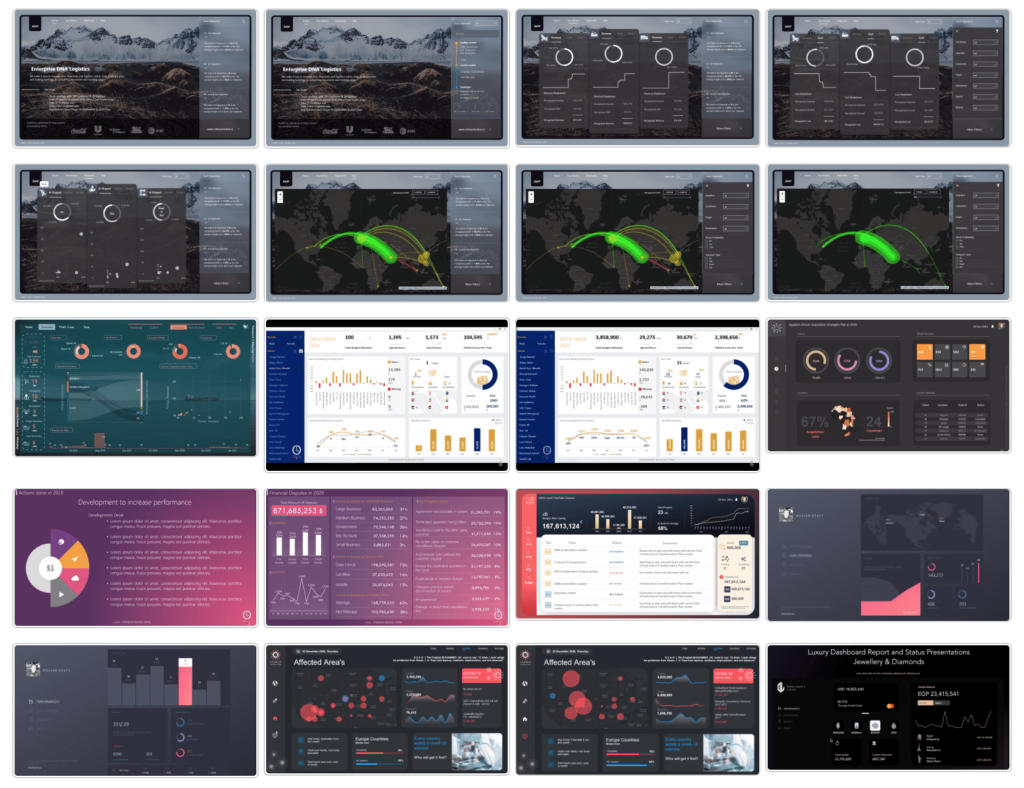
Inside the section about Report Design Inspiration, there’s a wide range of reports that you can browse through to get design ideas. The reports featured here are not necessarily Power BI reports but could also come from other platforms. After all, even reports that were not made via Power BI could still have imagery, color palettes and other design elements that you can imitate.
That’s one of the best things about Power BI. Almost anything is possible, design-wise. It has so many visual features that you can utilize.
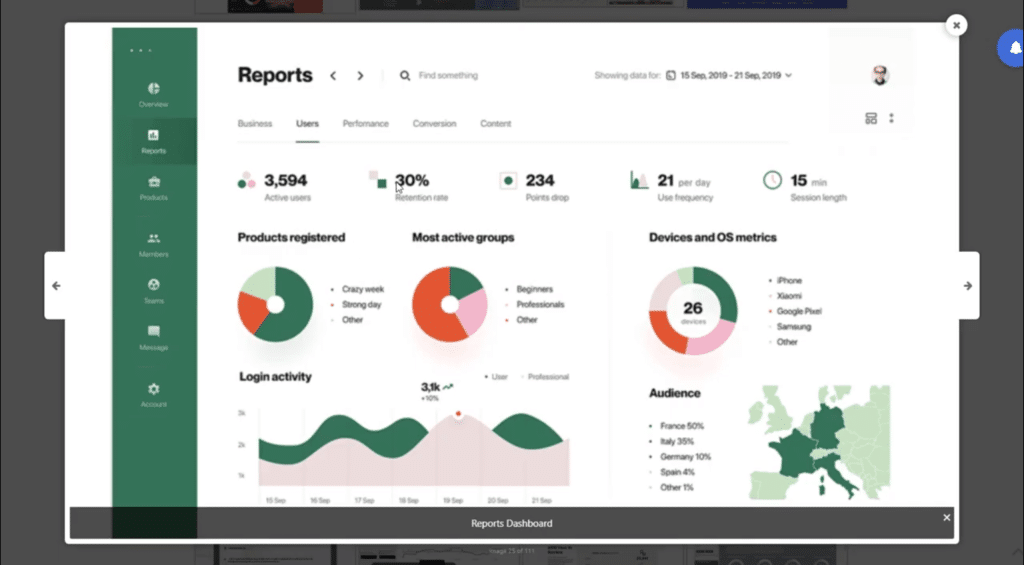
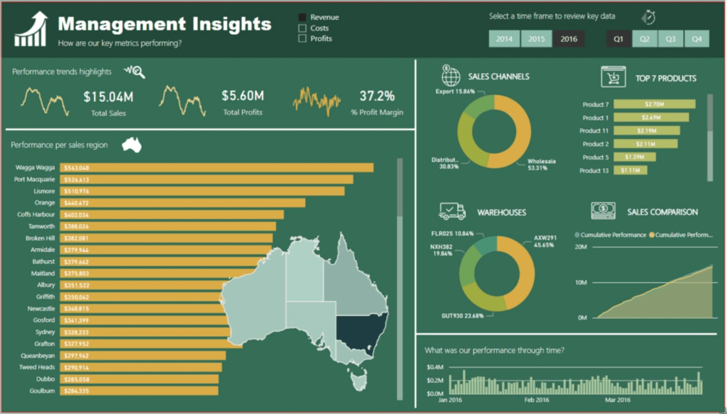
Take this report below, for example. This was not made in Power BI and actually comes from a different app. But it’s clean and aesthetically-pleasing, and it also displays insights in a clear manner.
With this as inspiration, you can create a Power BI report just like it. You can replicate the rectangle with the donut chart, for instance. This part does not just deliver data, it also does so in a creative manner.

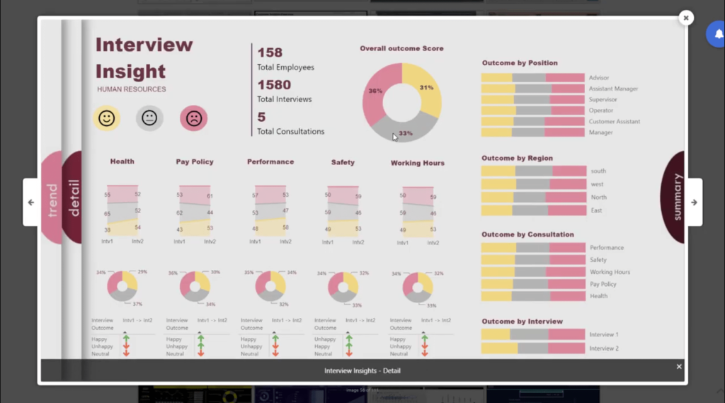
Here’s another example of a report that does an excellent way of delivering data. Here, you can copy the navigation feature on the leftmost pane that leads to different parts of the report.
We also have reports here that come from our Power BI Challenges, which I’ll be talking about next. These can also serve as design inspiration as you work on your own reports.
Power BI Report Designs From The Power BI Challenge Hall of Fame
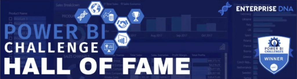
Also within the Knowledge Base is a link to the Power BI Challenge. Again, this is a great place to get some design inspiration, but this time, from actual Power BI reports that users in our community have worked on.
The Power BI Challenge aims to help Enterprise DNA members and non-members improve their craft as they take on data challenges that mimic real-life applications. With new challenges happening every two or three weeks, the winning reports are compiled into the Power BI Challenge Hall of Fame.
The reports displayed within the Hall of Fame are organized based on which challenges they were part of. Because Power BI is a dynamic tool that can be used across various industries, it’s easy to look for something related to the application you need and find inspiration from the way these reports were made.
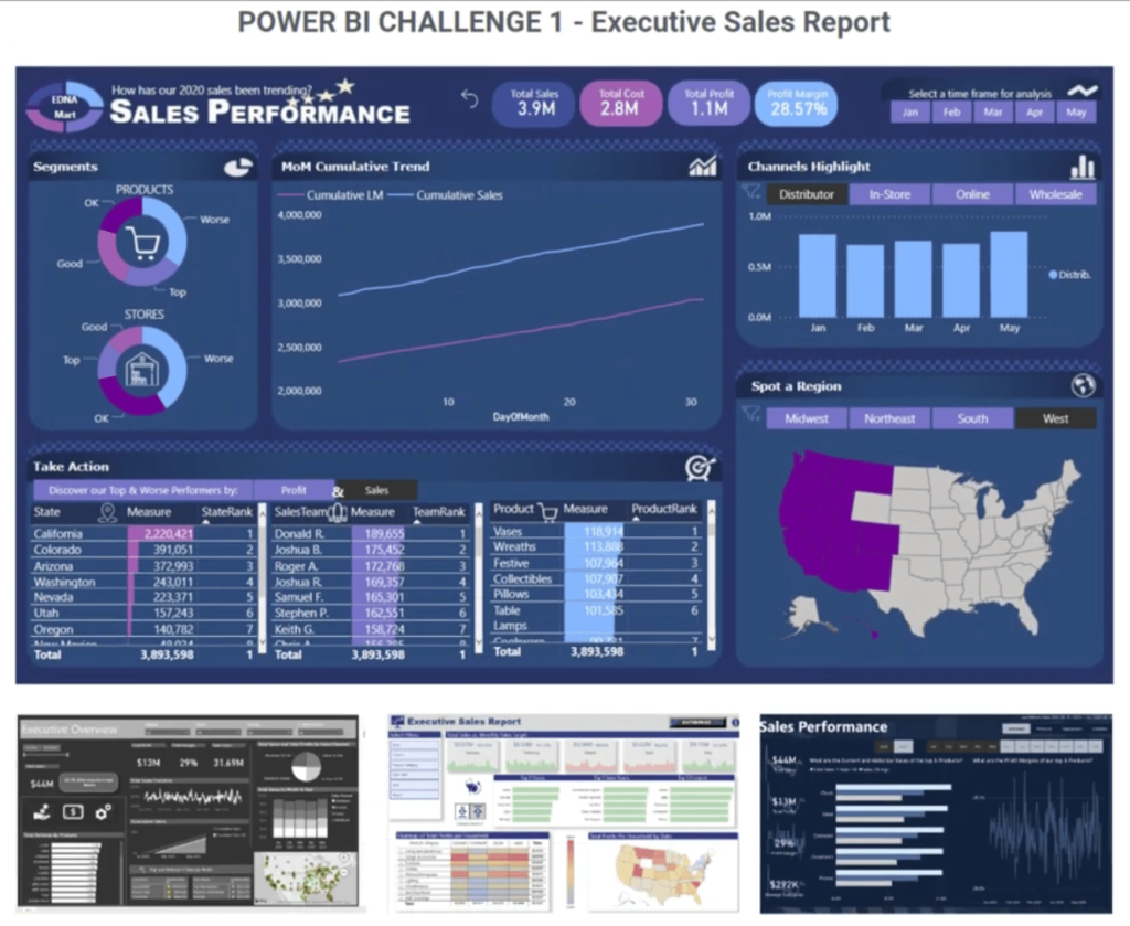
You can click on the different reports featured to get a closer look on the design aspects. The report below is a great example, with an image embedded into the page to give it a unique look.
Because we have new challenges every few weeks, expect that this collection will also continue growing over time.
Power BI Report Designs From The Power BI Showcase
The Power BI Showcase is also a collection of the most notable submissions from our Power BI Challenges.
What makes this different is that the reports can be downloaded in PBIX format so that you can dissect how each of these reports were done.
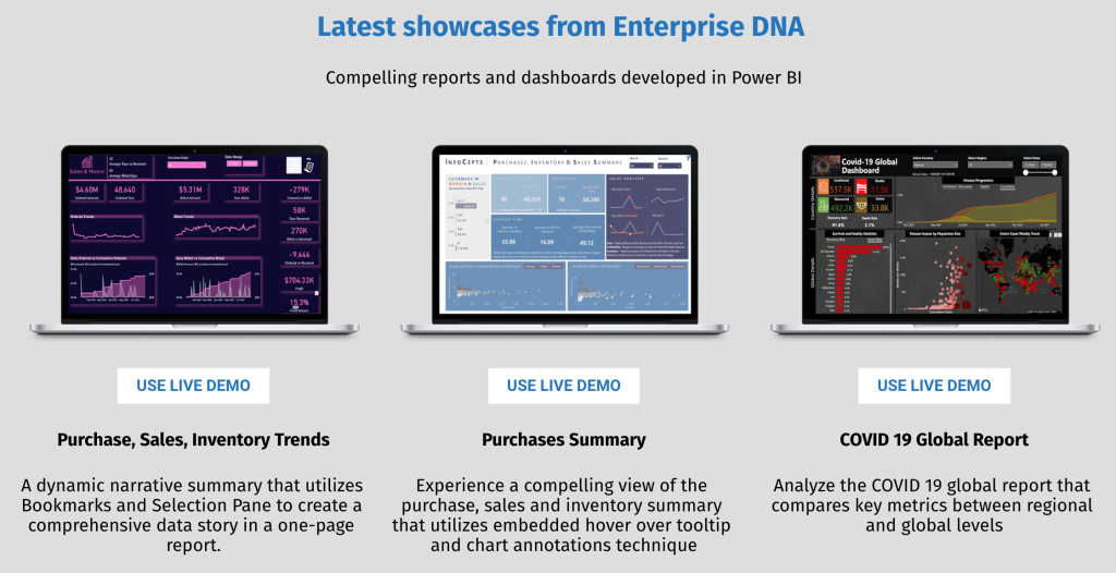
The ability to download the reports is exclusive to Enterprise DNA members. Once these reports are downloaded, you can load your own data and see actual insights that apply to your line of work.
Although you can’t download the PBIX files without a membership, you can still explore these reports. Just click on the button that says “Use Live Demo” below your chosen report and you’ll be able to filter the data and check what happens as you interact with the different portions of the report.
Here’s one example of a report I personally created.
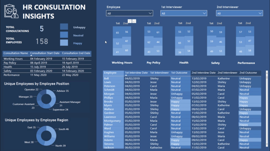
This is actually one of my submissions to a Power BI challenge about HR consultation insights. This is not too difficult to make design-wise, but to me, it looks quite compelling.
Using the Colour Theme Generator in the Analyst Hub
Let’s say you have a clear handle on how you can build your visualizations and layout but need help in coming up with colour palettes to use. In this case, the Colour Theme Generator can help you.
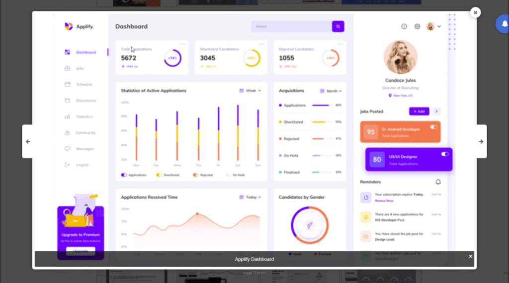
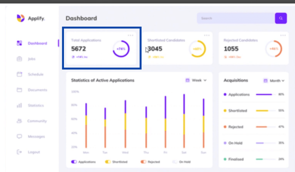
The report below is also from the showcase. Let’s use this as an example.

Just save an image of the report. Then, open the Apps Center in the Analyst Hub and go to the Colour Theme Generator.
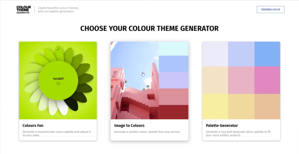
From there, click on the “Image to Colours” option.
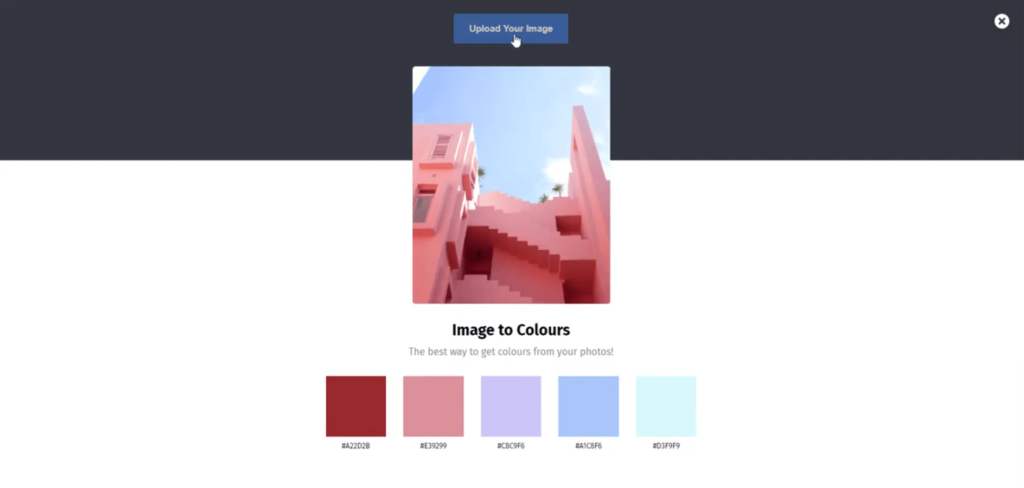
Then, upload the image of the report you saved earlier.
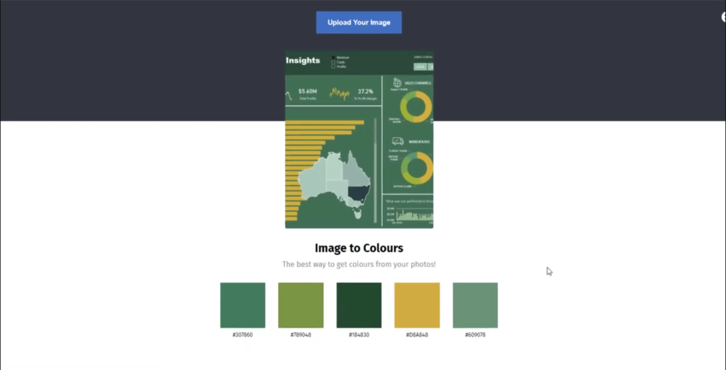
Once you do that, it will come up with a colour palette that you can apply to the report you’re working on. As you can see, it comes up with five colours right now, but we’re in the process of improving the tool so that you can get more colours from it in the future.
If you don’t have access to the Analyst Hub, you can try other colour pallete generators online, like Coolors.co.
***** Related Links *****
Tips For Power BI Report Design – Best Practices
Power BI Reports Design – Unlimited Possibilities
Creating Unique Power BI Report Template Designs
Conclusion
As you can see, the lack of creative knowledge shouldn’t stop you from working on reports that can catch anybody’s eye. We have so many resources and tools that you can use around the Enterprise DNA pipeline. We also continue to come up with more ways to help you come up with amazing reports.
Also, don’t underestimate the importance of leveling up the design aspects of your report. But know that there are also a number of tools that can help you with your codes and report development process as well.
All the best,
Sam


