In this tutorial, we will create a Power BI user guide in our reports starting from a simple icon. By doing so, we will create an onboarding environment for our end users directly inside Power BI.
In this report, we want to start from the information button at the bottom right of the report page, which shows an icon when we hover over. There’s also a tooltip saying that this is report information.
When clicking on this button, we will see all the interactions and all the buttons we want to make sure the users do not miss.
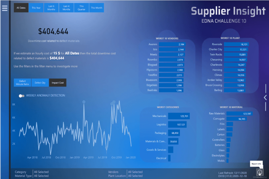
For example, we want to make sure that the users will not miss this hamburger menu that opens up different options for the user in this report.
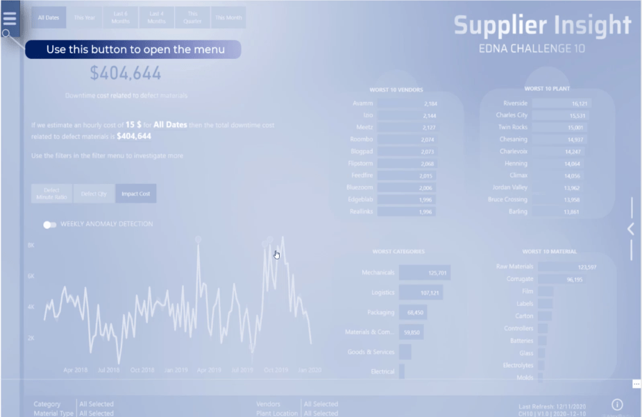
We want to make sure that the users will not miss the fact that by clicking on the different buttons, they can change the simulation of the downtime cost related to defective materials.
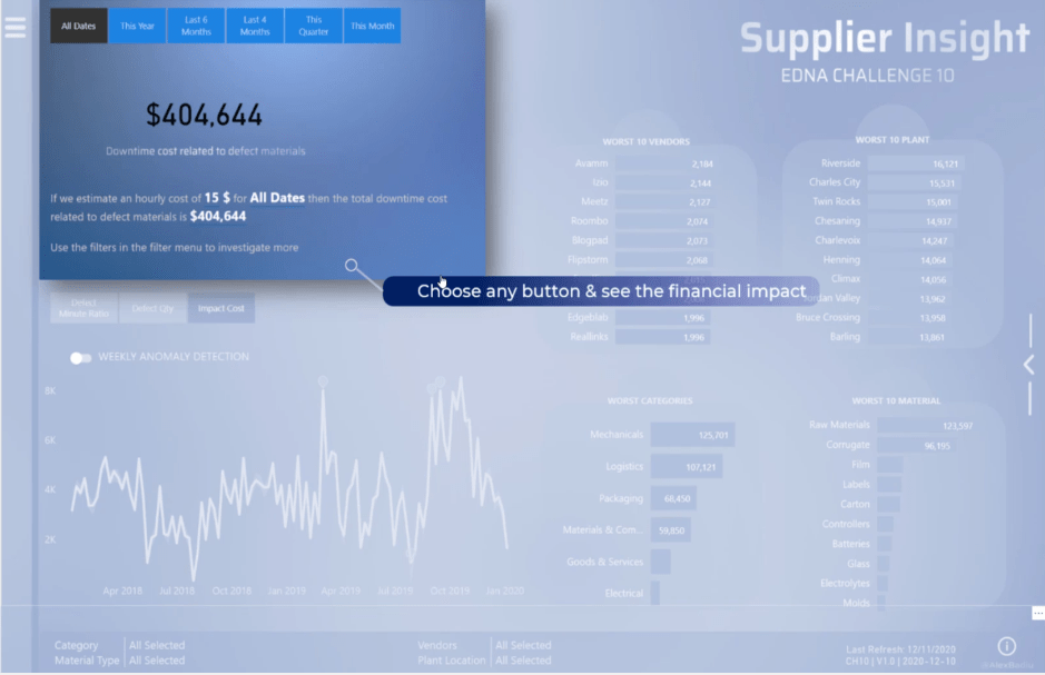
In this section, we want to make sure that the users know that these are the main KPIs to check and that there’s interaction when we click on them.
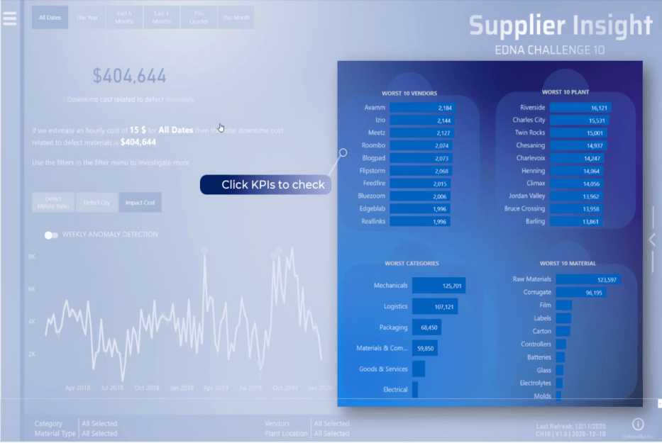
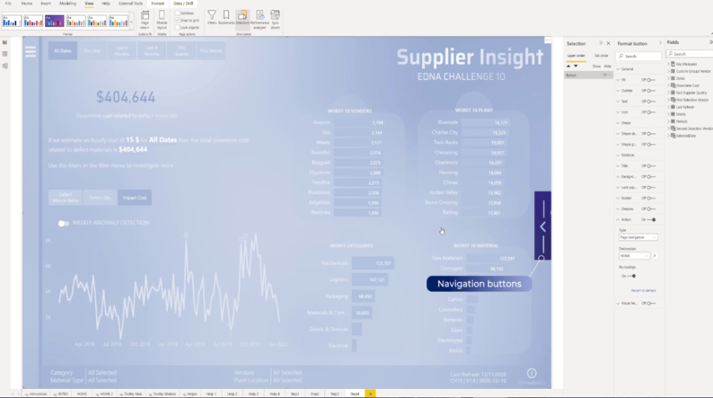
For this particular navigation, it pushed me to think and built a Power BI user guide. These navigation icons are important and they can be easily missed by the users.
If the user misses the button, then they will miss an important part of the report. This is why placing an information button has a lot of value and could be easily reproduced in any Power BI report.
The Power BI user guide will make users feel more confident in exploring the report.
The greatest thing about this is that it takes only a couple of minutes to create.
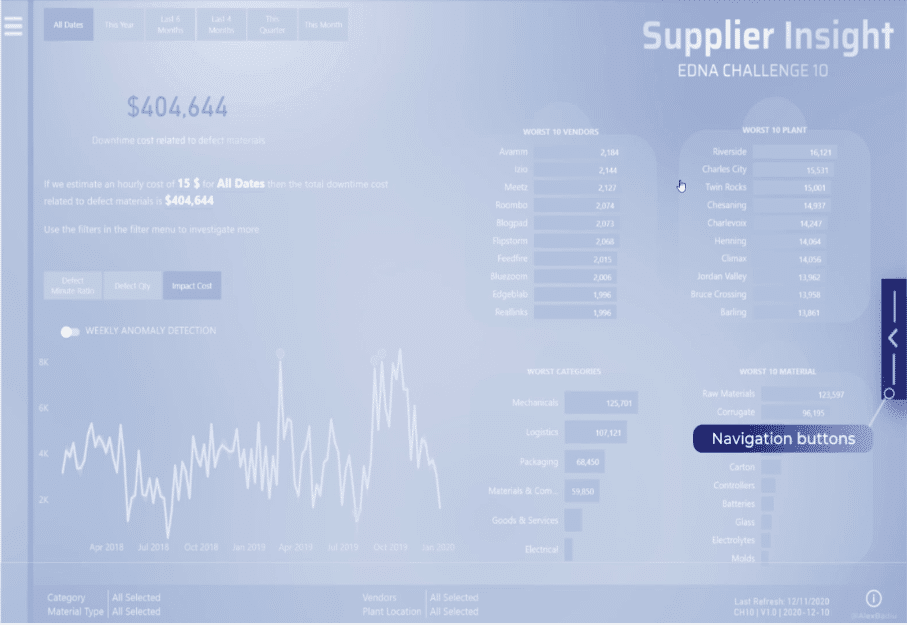
How To Create A Power BI User Guide
Let’s build it from scratch. To start, take the full size of the page and do a print screen.
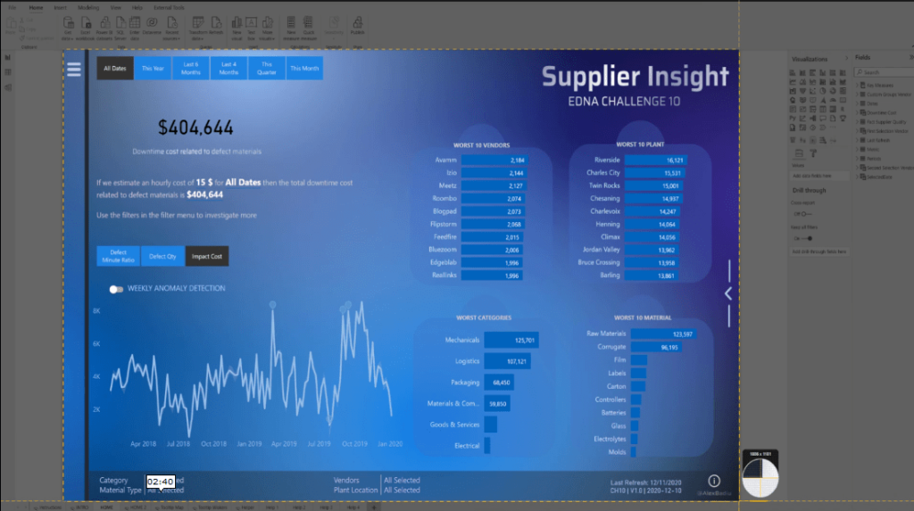
Open a PowerPoint, copy and paste the image then duplicate it multiple times.
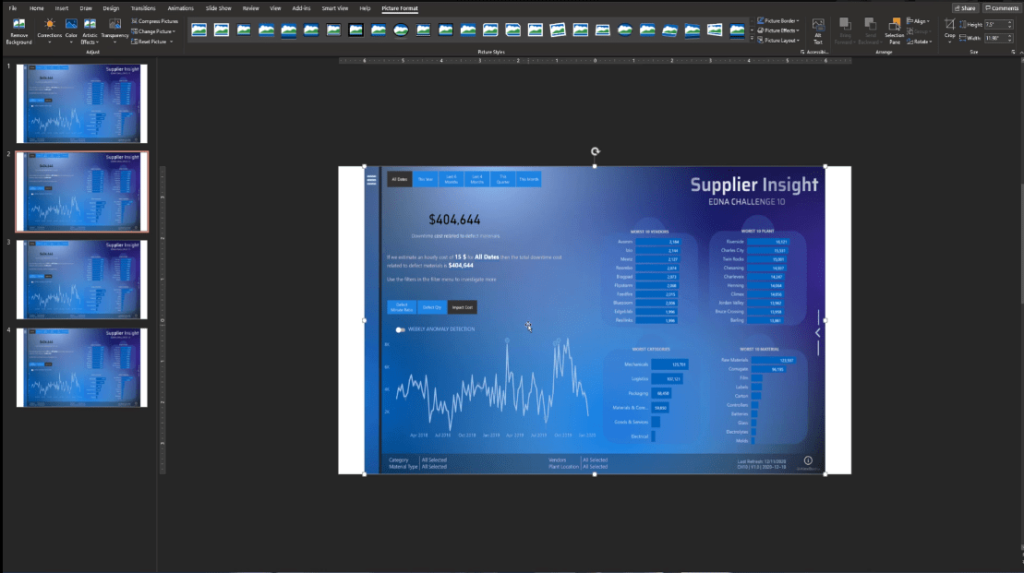
On the second page, select the image and click the Crop function.

Next, we need to focus only on the part of the page by selecting it and then clicking Crop again.
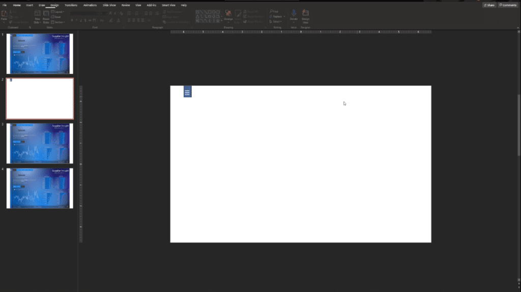
From the third to the fifth page, let’s do the same thing by selecting the part and then click Crop to cut the image.
We now have the different elements we want to highlight.
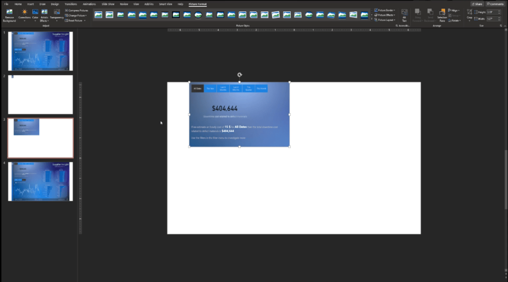
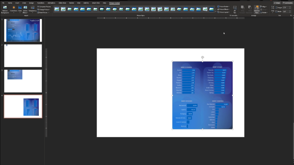
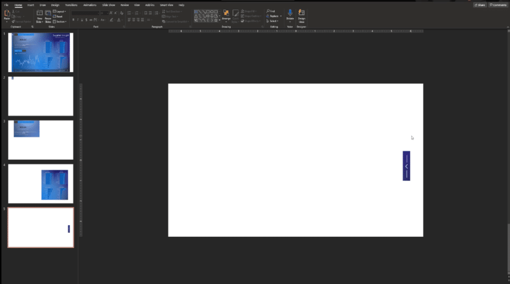
The next thing to do is select the first page. Let’s add some options and layers to the image.
To make it more transparent and white, click the image, go to Color, then choose the Blue Accent Color Light.
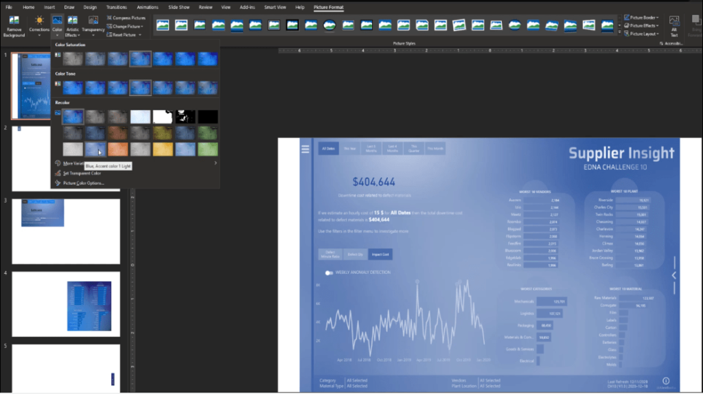
Let’s also set the transparency to 50%.
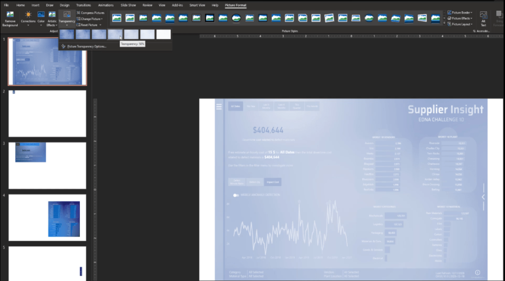
After that, let’s copy the image from the first page, and paste it onto the second page. Then, right-click the image and select the Send to Back option.
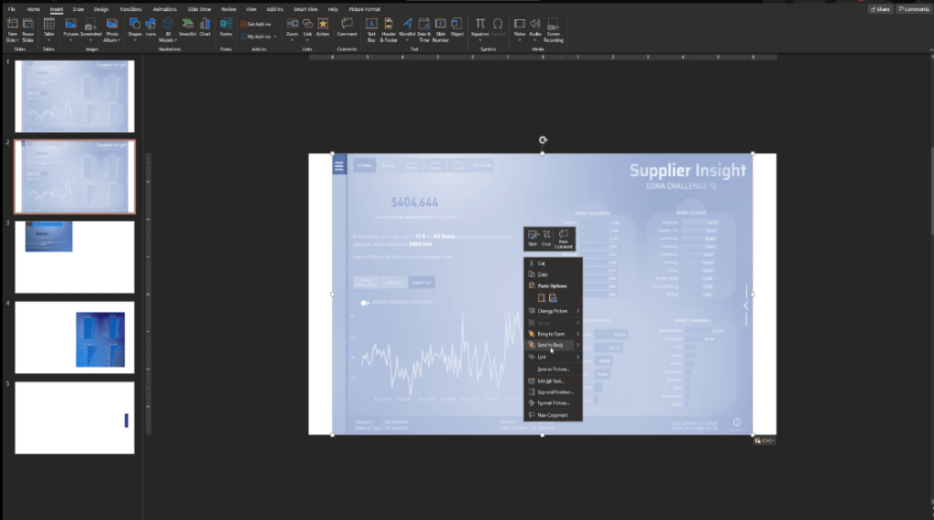
We will replicate these steps from the second to the fifth page then delete the first page since we won’t need that slide anymore.
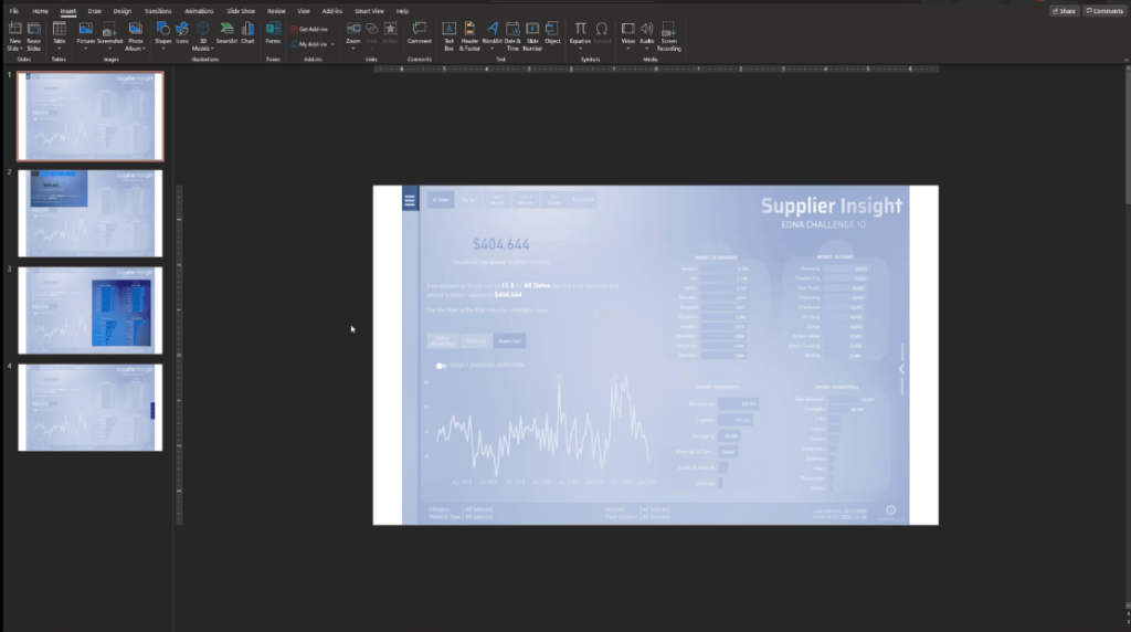
To speed up adding the texts, I will just copy and paste the elements that I created from another PowerPoint. This is very simple to do – I just added some texts and a shape underneath.

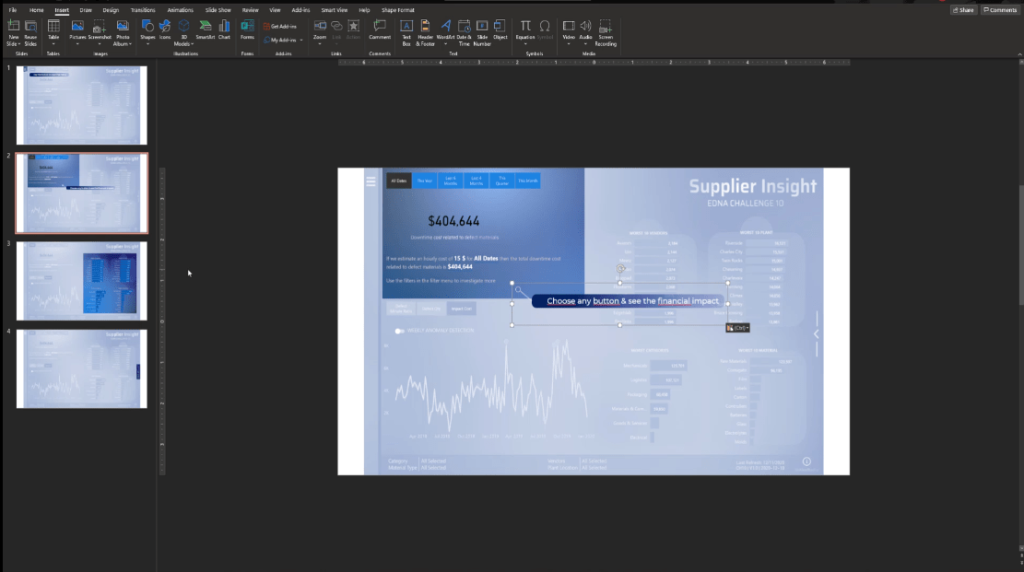
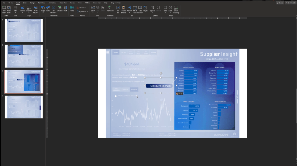
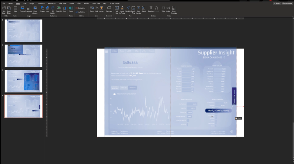
We now have the slides ready to use inside Power BI.
Click the first page, select all the elements by pressing CTRL + A, then right-click and choose Save as Picture.
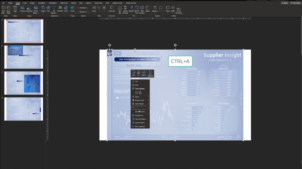
Then, let’s save it as Step 1.
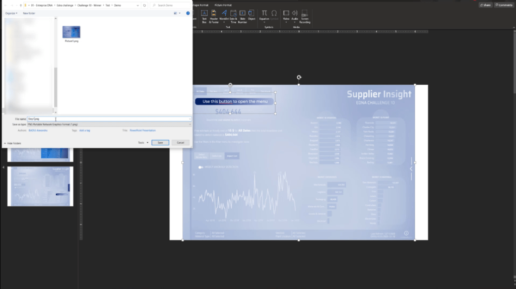
Again, we will do the same thing with all the other slides and name them from Step 2 to Step 4.
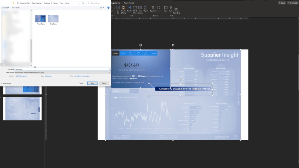
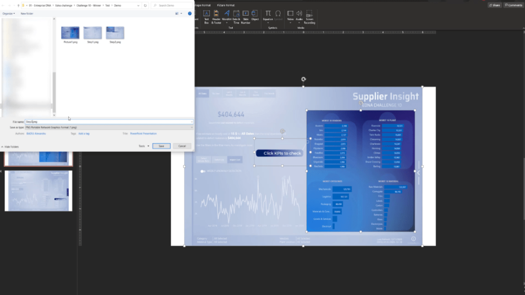
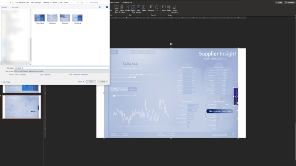
Go back to Power BI, add a page, and name it Step 1.
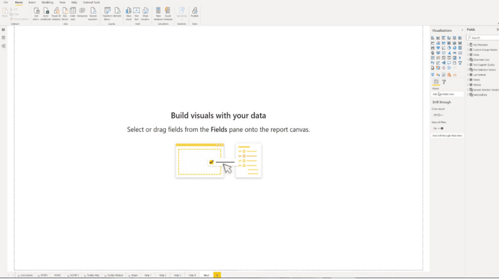
Then, go to the Visualization pane and go to Format.
On the Page background section, add the Step 1 image and select Fit from the Image fit dropdown.

Set the transparency to 0%.
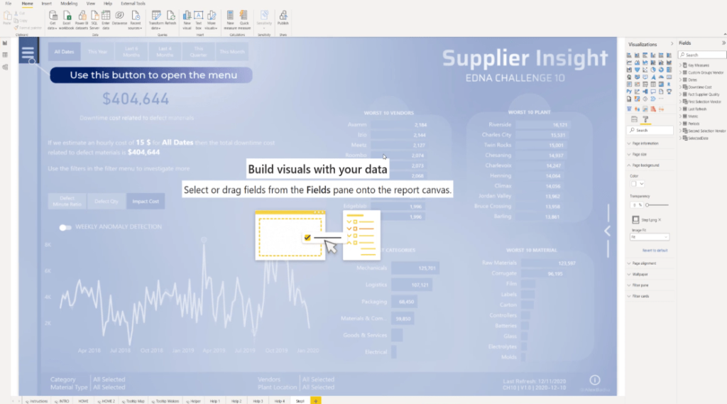
Also, to ensure it will work perfectly, let’s go to the Home page, check the Page size, and replicate the exact size to the Step 1 page.
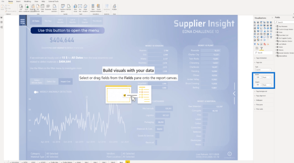
At this point, we will add a Blank button and then adjust it to fill the whole screen.
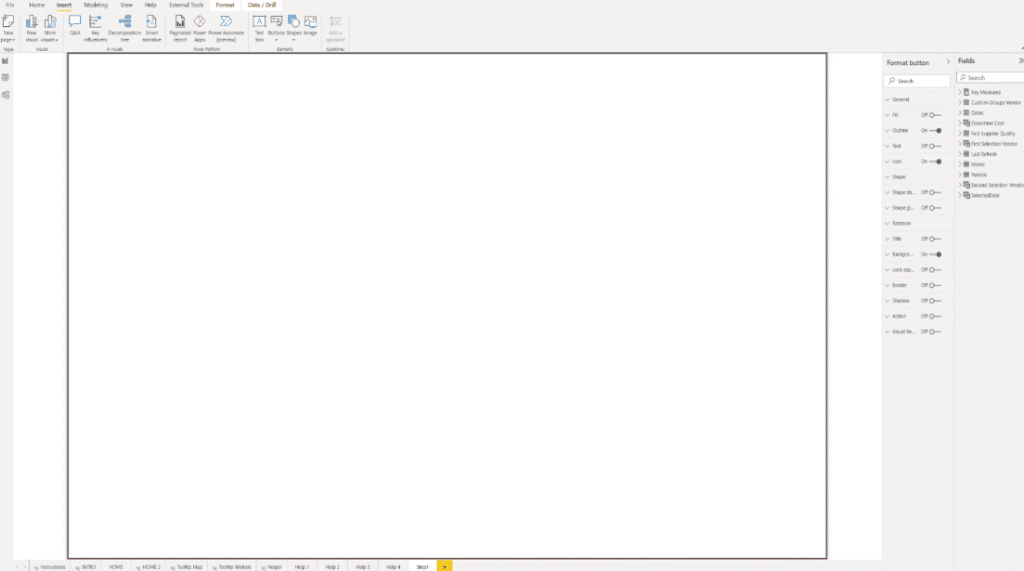
It is also important to toggle off all the options on the screen.
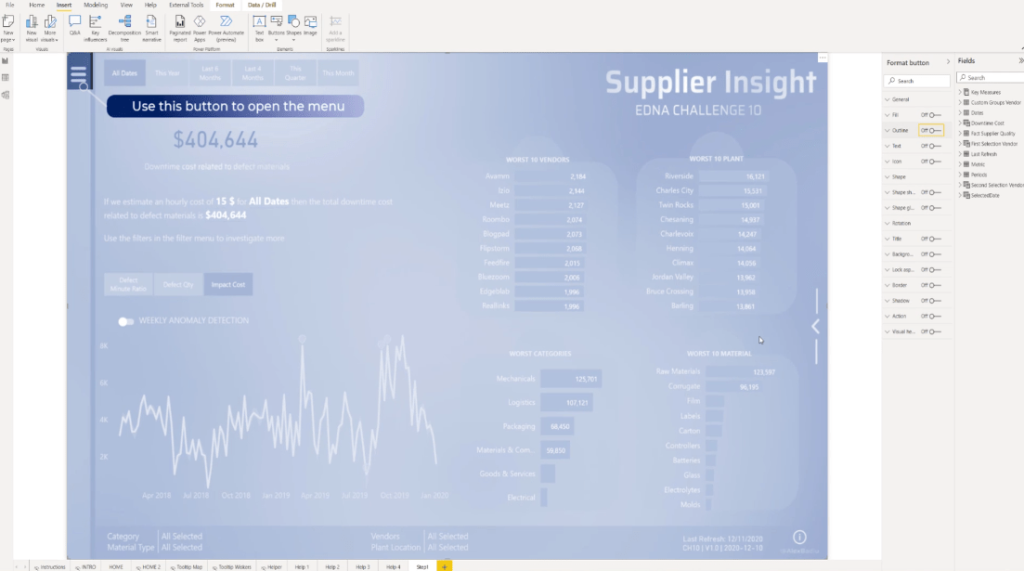
In addition, we also need to duplicate the Step 1 page thrice and then rename these as Step 2, Step 3, and Step 4.
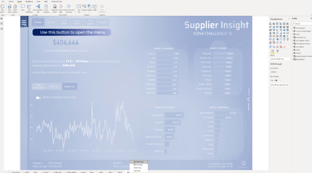
For the Step 2 page, let’s go back to Format to edit the Page background. Similar to what we did on the Step 1 page, let’s add the Step 2 image and select Fit. We also need to do the same procedure for Step 3 and 4 pages.
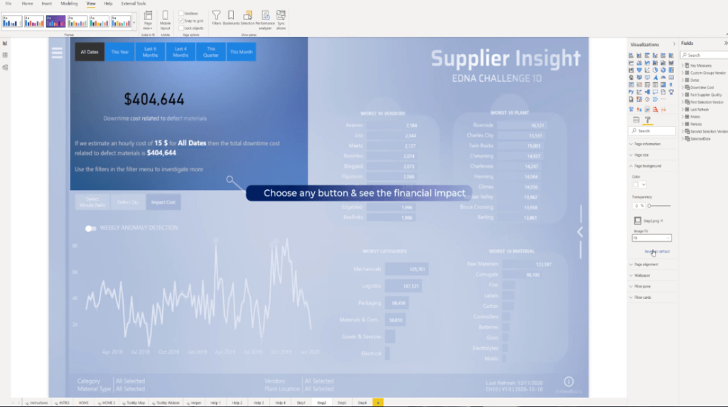
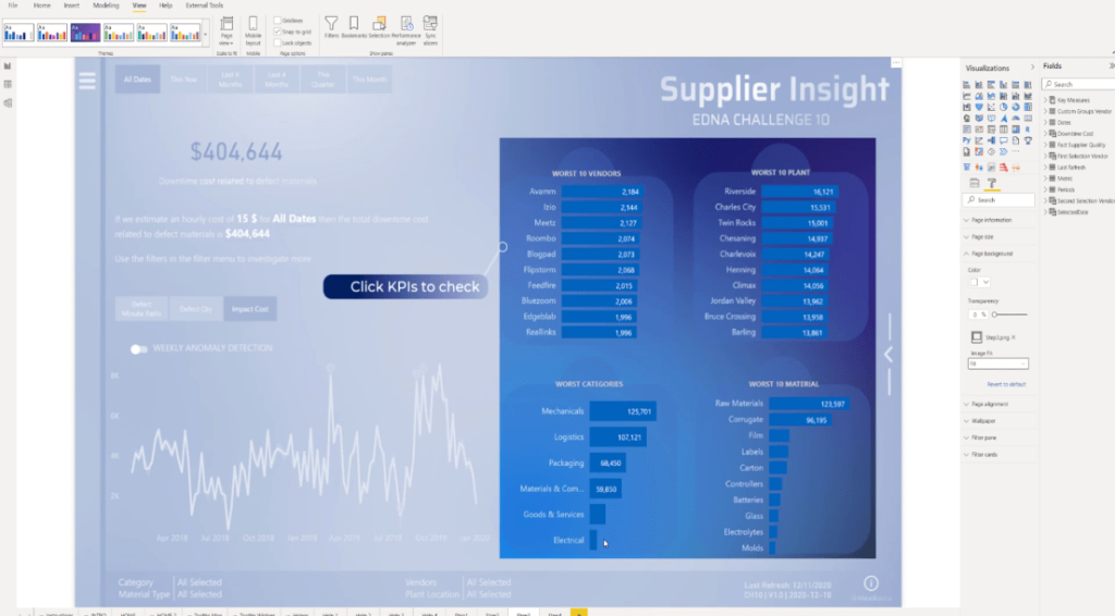
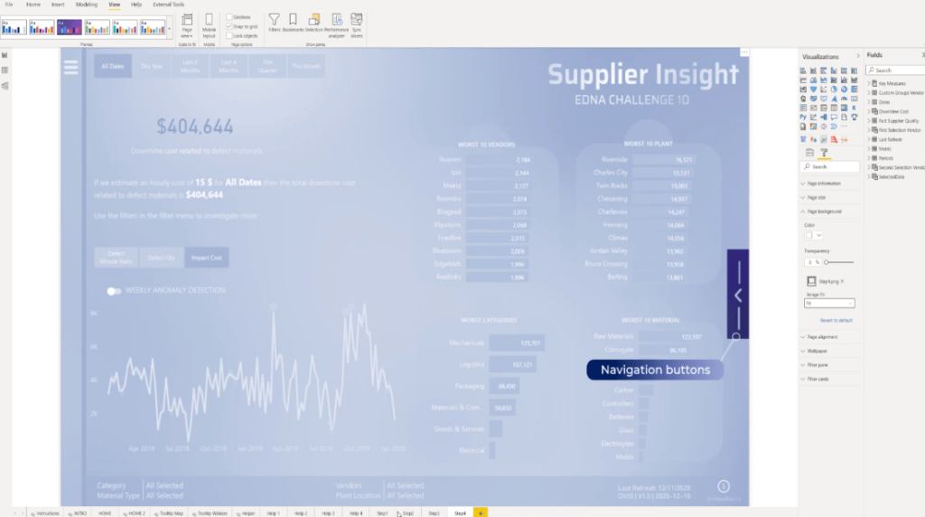
To activate the buttons, let’s go to Format and choose Selection.
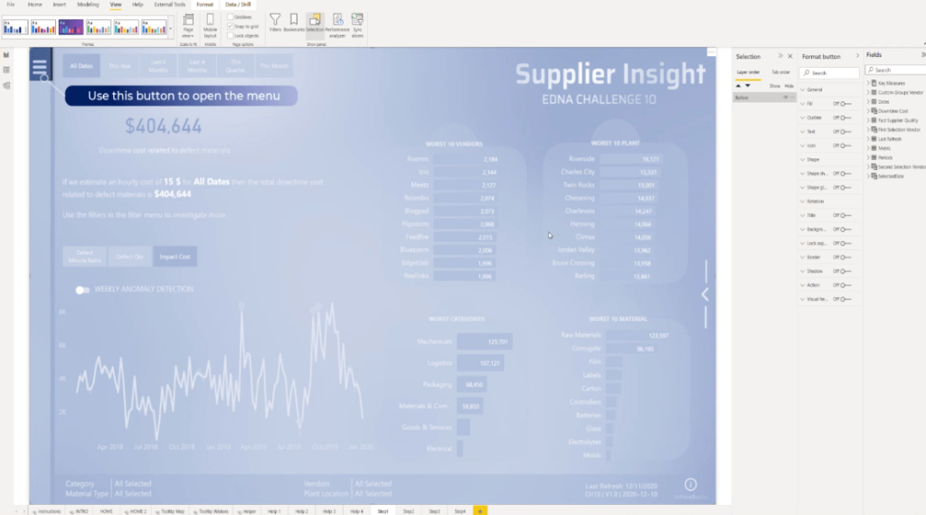
The next thing to do is to toggle on the Action, select Page navigation from the Type section, choose Step 2 from the Destination dropdown and turn off the tooltip.
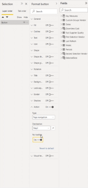
Since we are inside the Power BI desktop, just press CTRL on your keyboard and click the page to move to the next one.
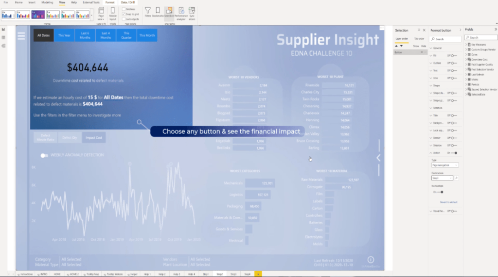
Then, let’s replicate the same procedure. Turn on the Action, and choose Page navigation, but this time let’s select Step 3 from the dropdown and make sure that the tooltip is off.
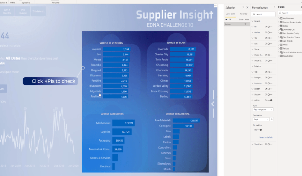
Again, turn on the Action, select Page navigation, and then select Step 4 from the dropdown and toggle on the No Tooltip section.
For the last page, turn on the Action, set it to Page navigation, pick Home from the Destination dropdown, and don’t forget to turn off the tooltip.
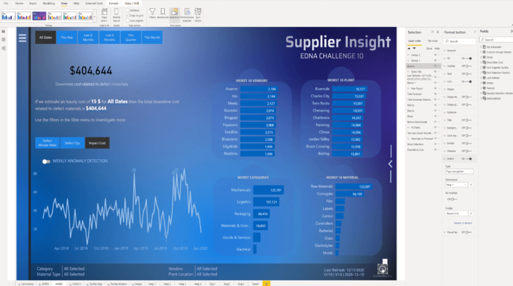
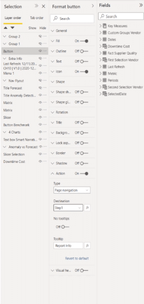
Finally, on the Home screen, let’s make sure to select Step 1 in the Destination section.
***** Related Links *****
Power BI Custom Icons | PBI Visualization Technique
Power BI Report Development: Creating Themes, Company Logos, Icons and Backgrounds
How To Add Custom Power BI Icons Into Your Reports
Conclusion
Adding a Power BI user guide can make your Power BI report easy to understand because it gives a demonstration of the significant areas of your reports. Most importantly, this is very easy to set up and it adds a lot of value.
I hope you’ve learned something new from this tutorial and you can definitely integrate something like this into your reports.
All the best,
Alexandru Badiu


