
This blog post is about building a custom legend to replace the default legend in a standard Power BI map visual. The ArcGIS map visual is great. It takes some tweaking to get the most out of it, but it’s certainly worth your while. Just like other mapping visuals, the legend doesn’t look too good and should be improved. You can watch the full video of this tutorial at the bottom of this blog.
In this tutorial, I’ll demonstrate how to build a custom legend in a choropleth map with filters for displaying both the preferred colors and the segmentation.
Choropleth maps are great for displaying aggregated values within geographical boundaries like states, municipalities, or postcodes.

Creating A Choropleth Power BI Map Visual
For this example, we’ll create a choropleth map based on postcode. The map is similar to the huff gravity analysis map in the Geospatial Analysis course. The same data set has been used here as well.
1. Importing Dataset For The Power BI Map Visual
To start, open the Power BI editor and go to the query editor. Then, import your dataset.
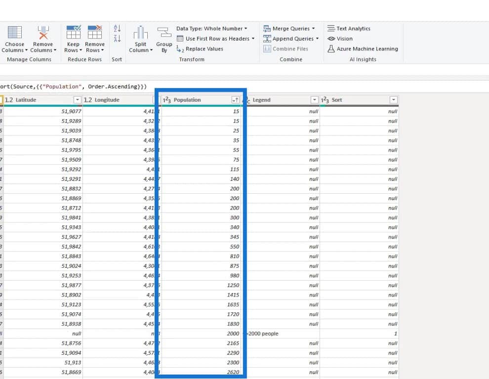
In this example, the dataset named as “Population” shows the postcodes in the Netherlands around Rotterdam. Moreover, it displays the Latitude and Longitude for the postcode centroids in case we need to map them as points layer.

2. Creating A Color Table
After that, we need to create a color table in power query with our segments, desired colors, and a sort column.
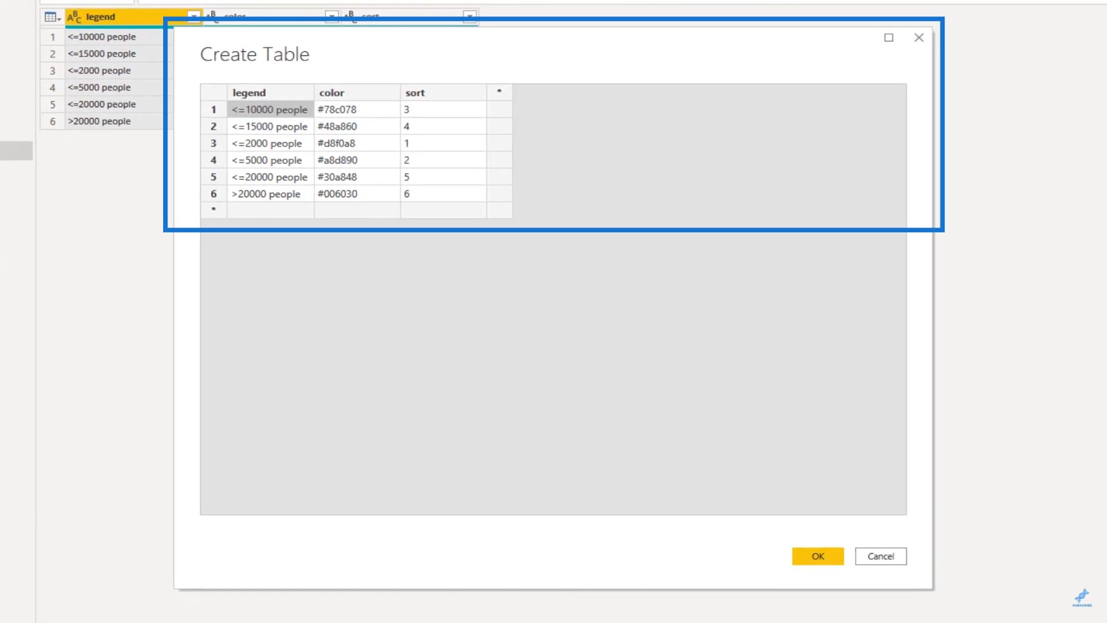
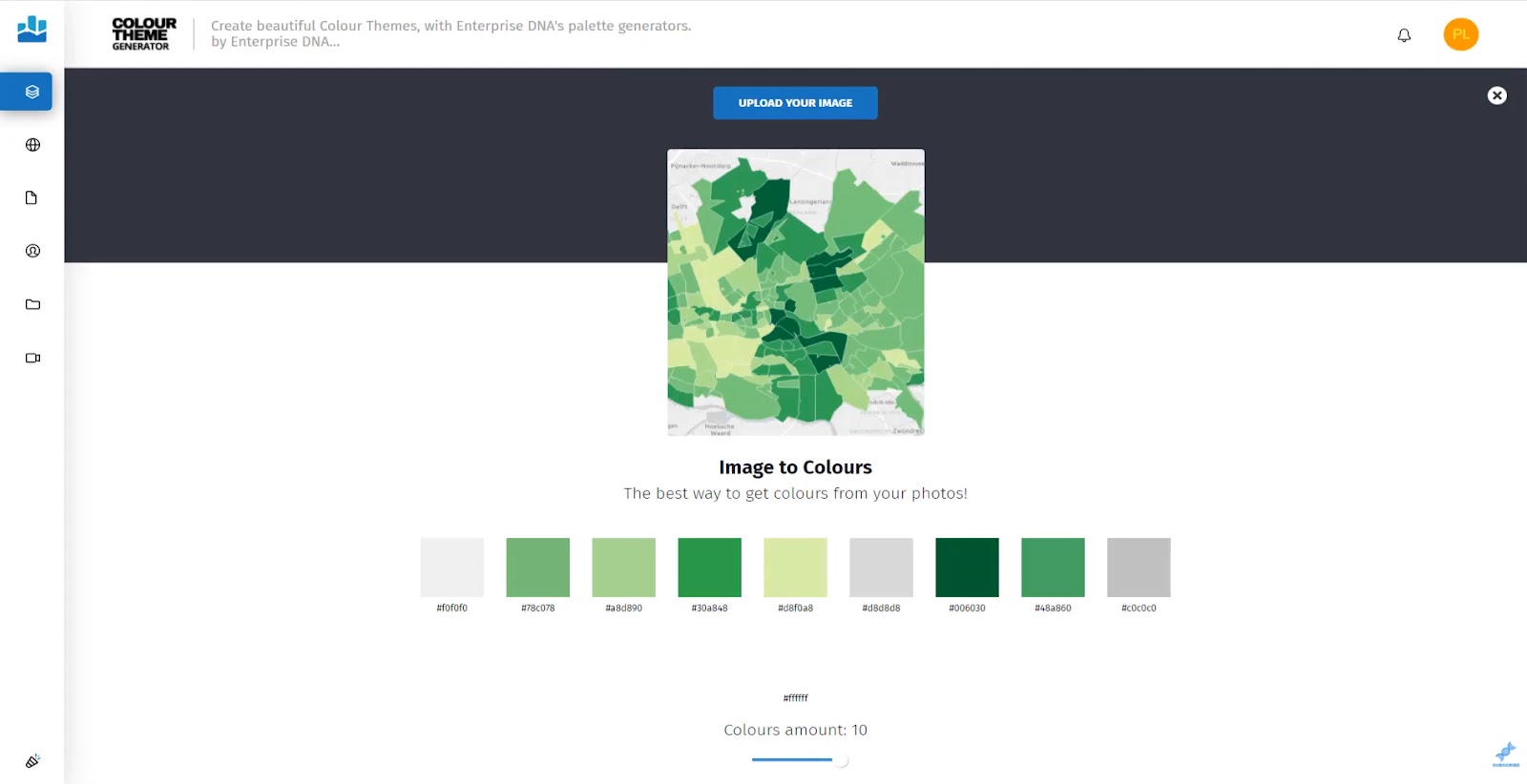
To obtain the matching hex color code, we can use the color theme generator in the Analyst Hub by using a screenshot of the Power BI map.
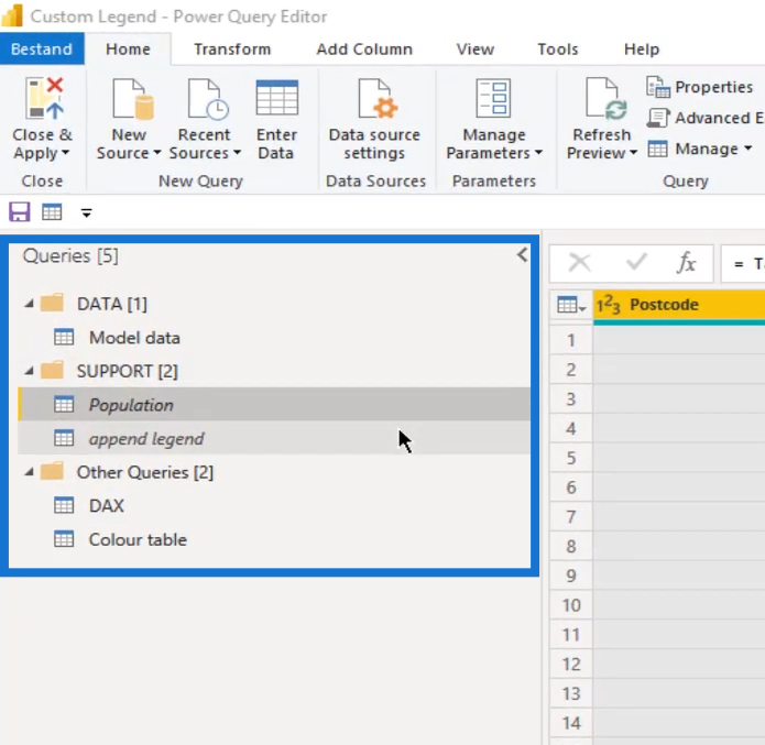
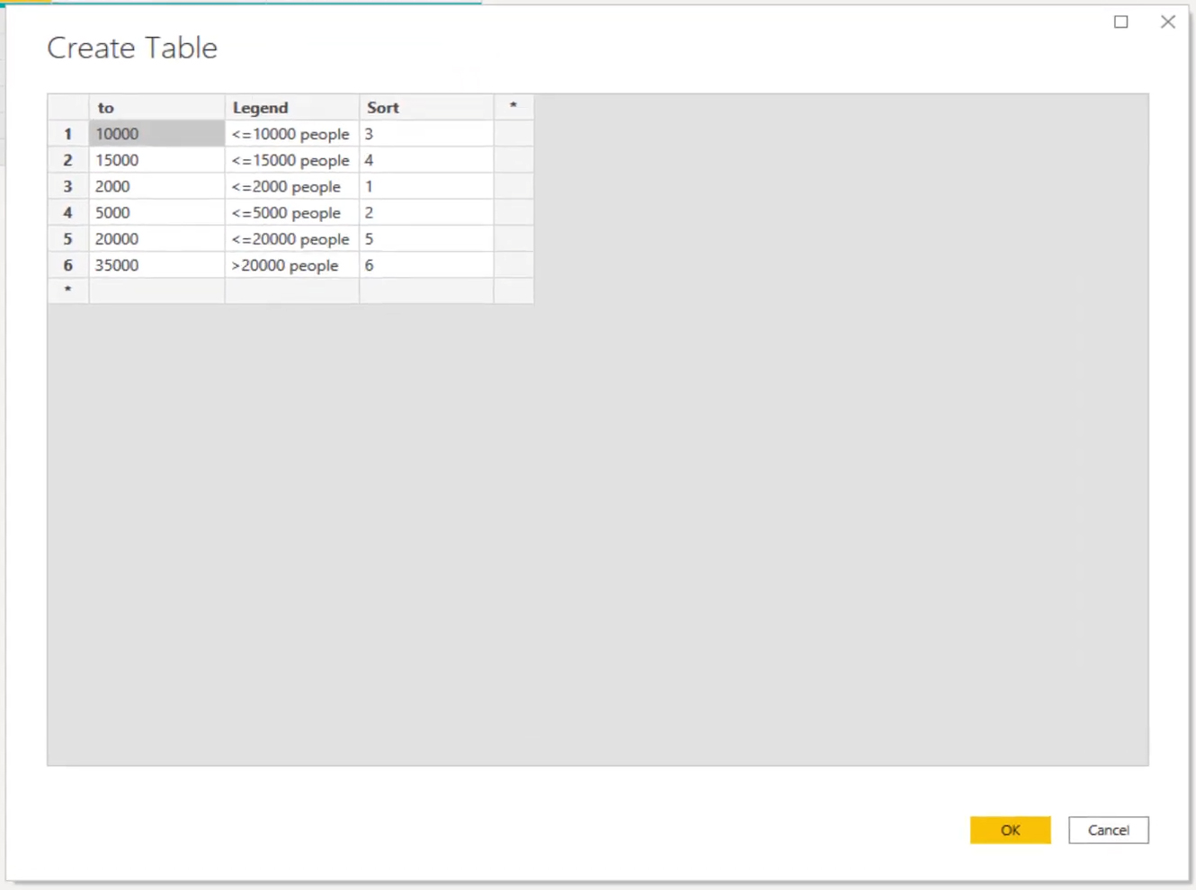
3. Appending The Legend Table
Let’s then append the legend to the map. First, let’s create a table and name it as “append legend”.

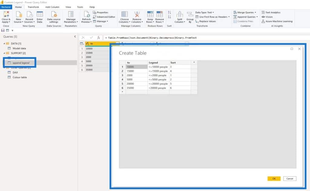
In Power BI, we can use bins to equally group a numeric field based on a division. This enables us to visualize data in a more meaningful way.
As a guide for our datasets, we need to create a histogram and select our bins according to the value distribution. In this case, we’ve taken six different bins. The “to” column here represents the bin ranges where we can choose our preferred bins.
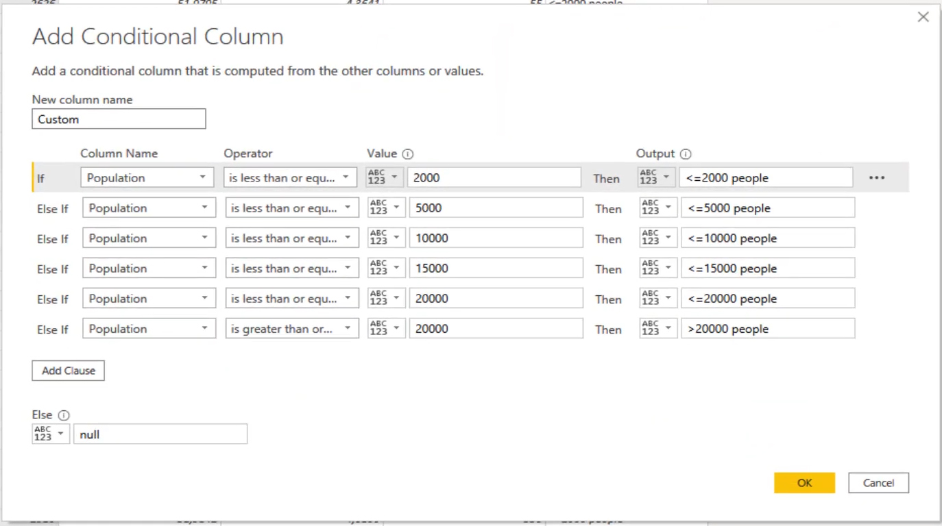
4. Adding The Segmentation
Now, we need to add segmentation to the population data. Adding a column is not a big deal given that we have a limited number of records. There are several ways to do this and I’ll show you two of them.
The first one uses the Add Conditional Column feature as shown below.
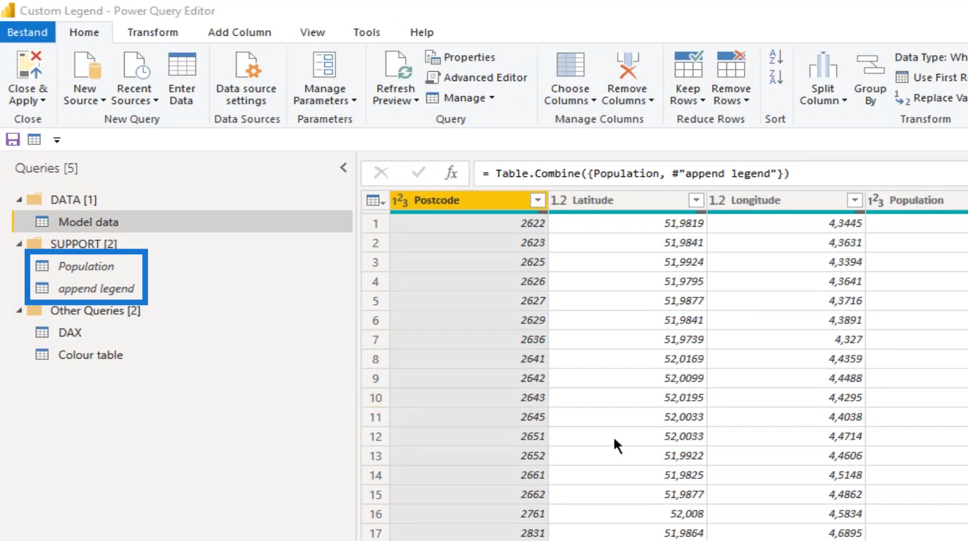
The other one is called the Append method using the append legend table, which is what we’ll be using in this example.
Append the Population and the append legend tables to make sure their headers for the Population column are the same in both tables. The append legend data will then be stacked on top of our population data.
After that, sort the rows in the Population column.
The next step is to fill up the Legend column.
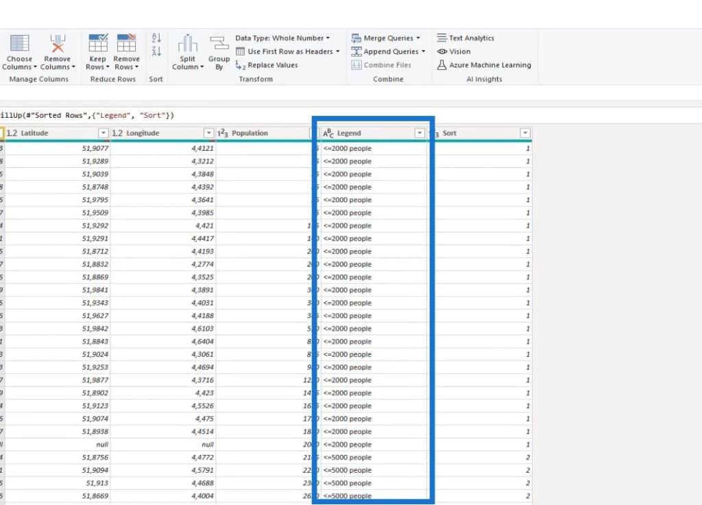
Then, filter out the rows that don’t have a value in the Postcode column.
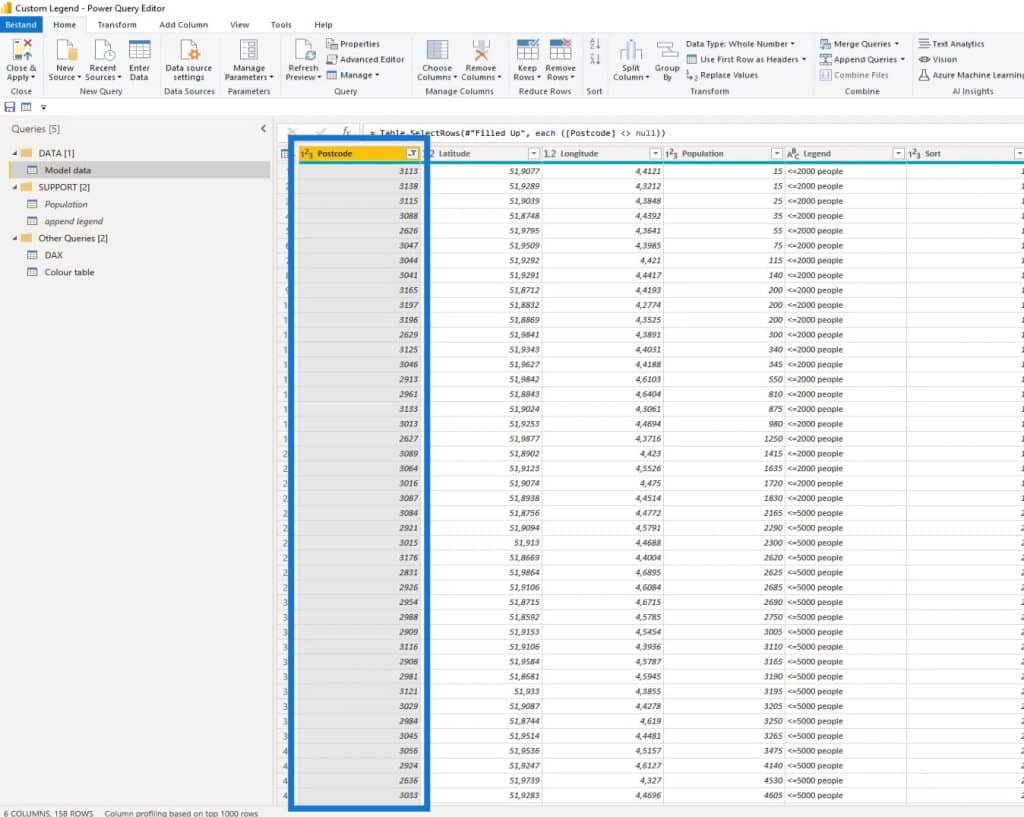
This model is now ready, and we can already load this to the query. We can now also load the color table into Power BI.
In Power BI, this is what our simple data model will look like.

5. Formatting The Map Visual
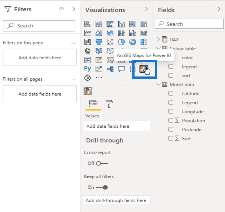
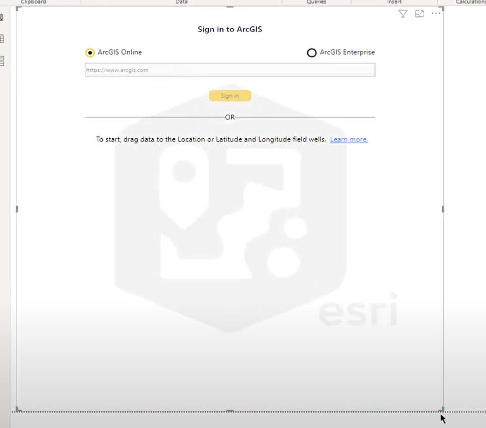
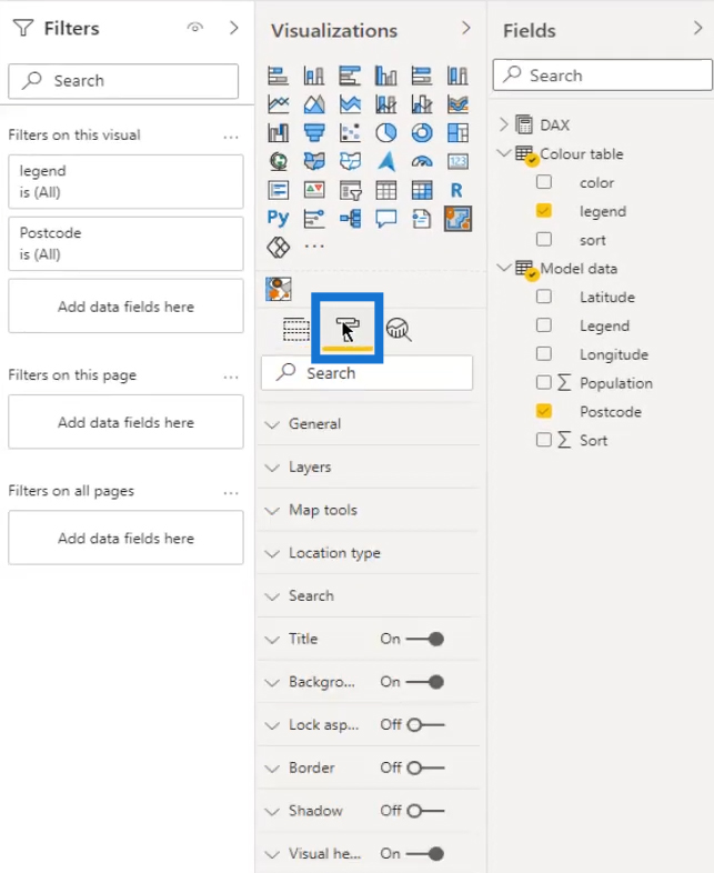
Go to the Data view and select the ArcGIS map.
Then, resize the ArcGis map placeholder.
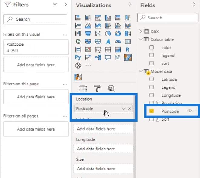
Then drag the Postcode to the Location field.
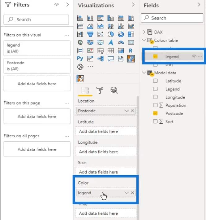
And the legend to the Color field.

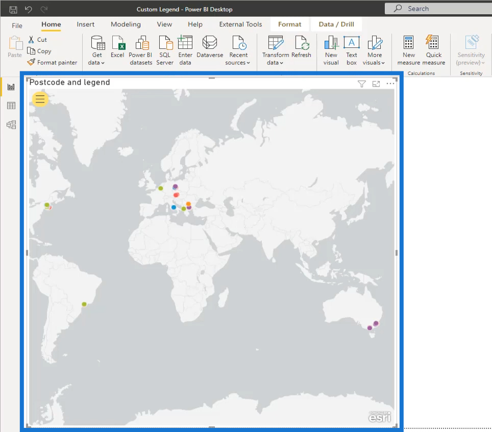
Our map visual will now look like this. It is clear that the visual is struggling to make sense of our data and it needs directions.
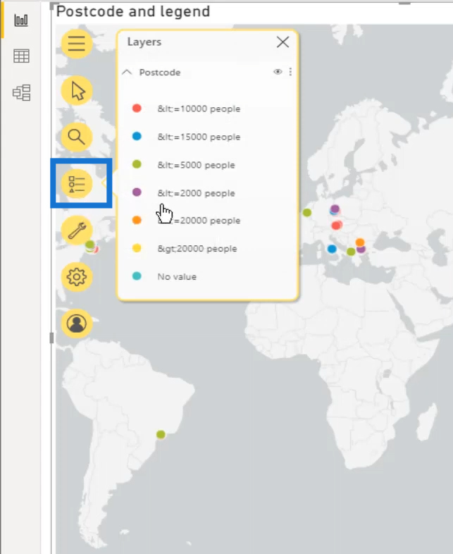
So, let’s click the Formatting icon.
Make sure that the Show Layers option is on.

Then, click on the yellow icon to show more options.

After that, select the Layers option.
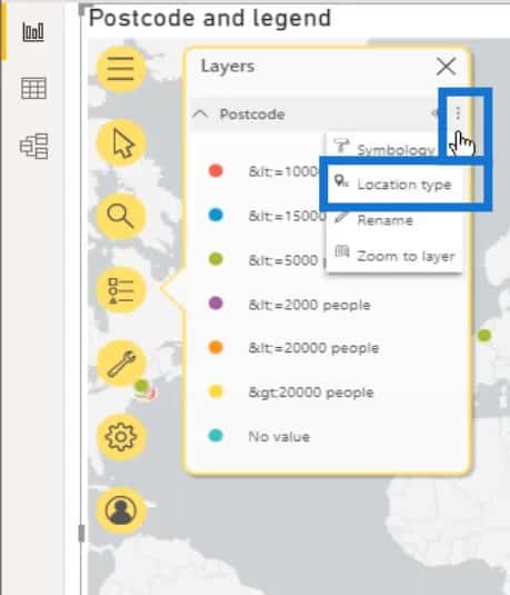
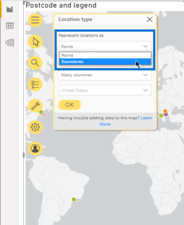
Click on the menu (three dots on the upper right), then select Location type.
By default, the map will display points. We could use this if we want to display a point layer using the Latitude and Longitude in our dataset.
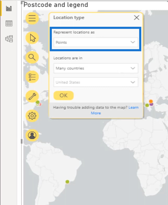
Let’s then click the dropdown arrow here and select Boundaries.
Now we can choose a country. In this example, we have chosen the Netherlands.
So, choose One country from the “Locations are in” section. Then, select Netherlands as the country.
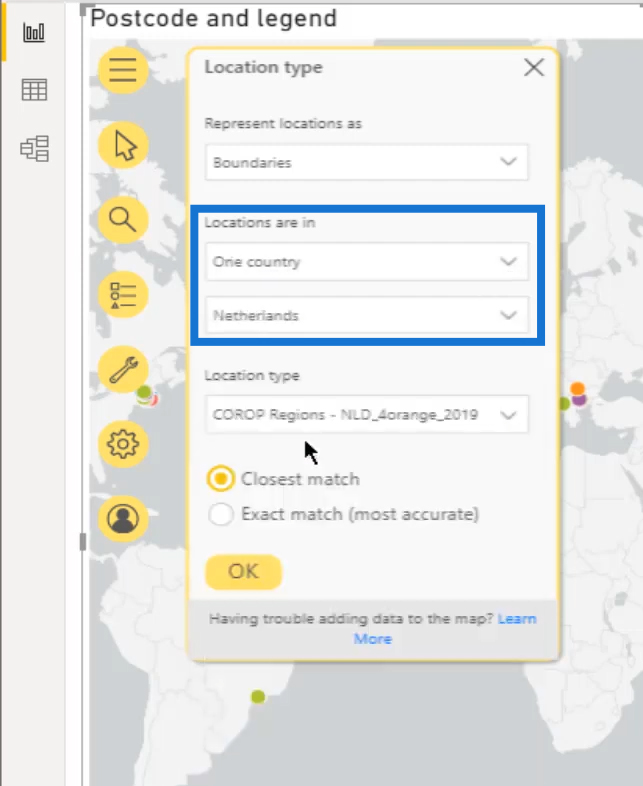
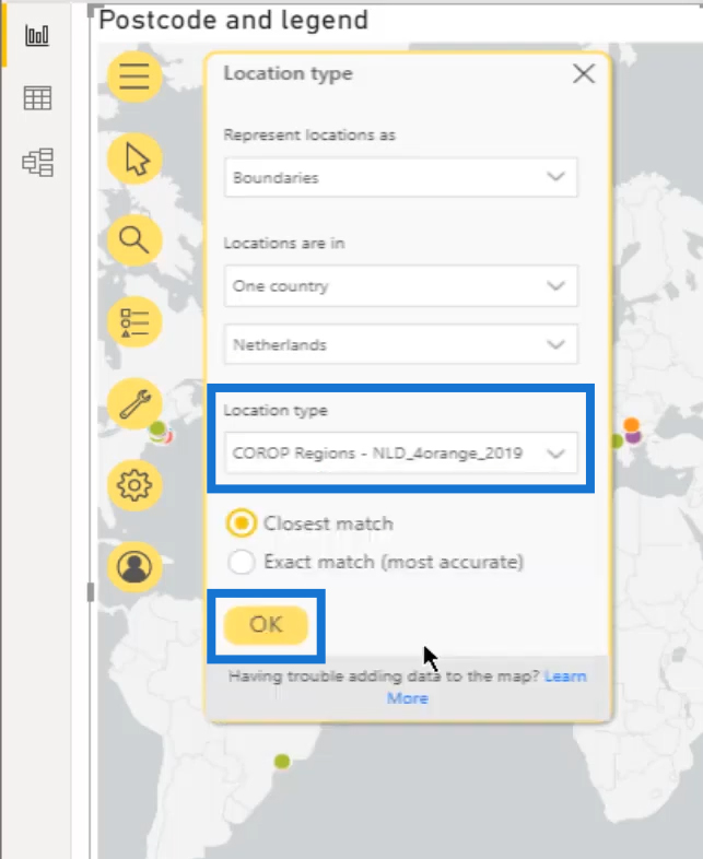
Next is the Location type that’s associated with the country selection. The pop-up table will show the available factor or layers in the selected country.
For this example, select Postcodes4 – NLD_4orange_2019. Then click the OK button.
Once that’s done, a very colorful visual of our postcode boundaries will then be displayed.
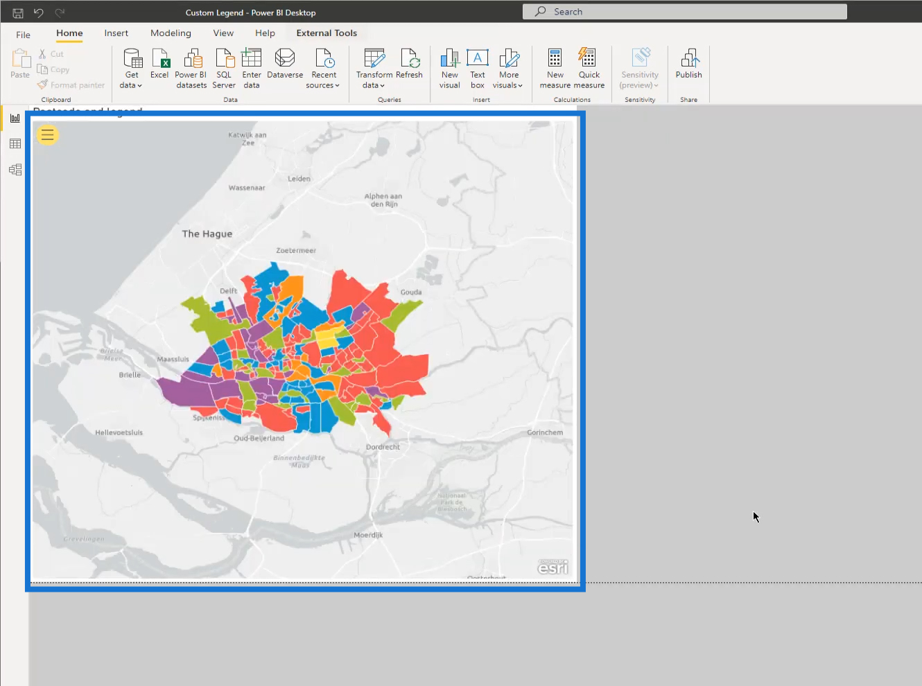
However, this is not the result that we currently want.
6. Applying Colors In The Power BI Map Visual
So, we need to open the Layers field again, click the menu (three dots on the upper right), and select the Symbology option.
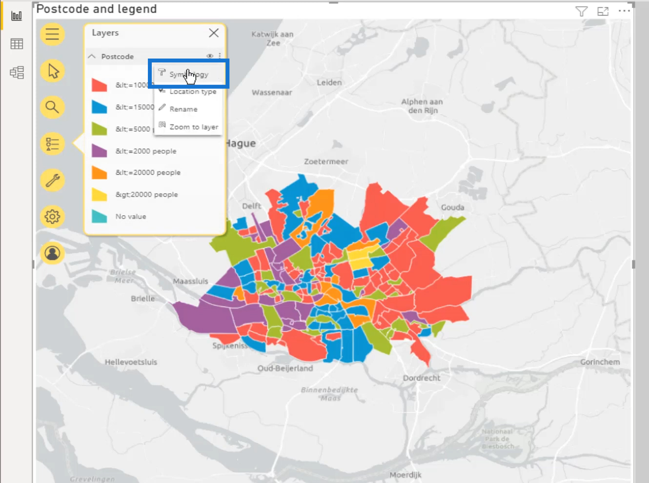
Scroll down all the way to access the color settings.
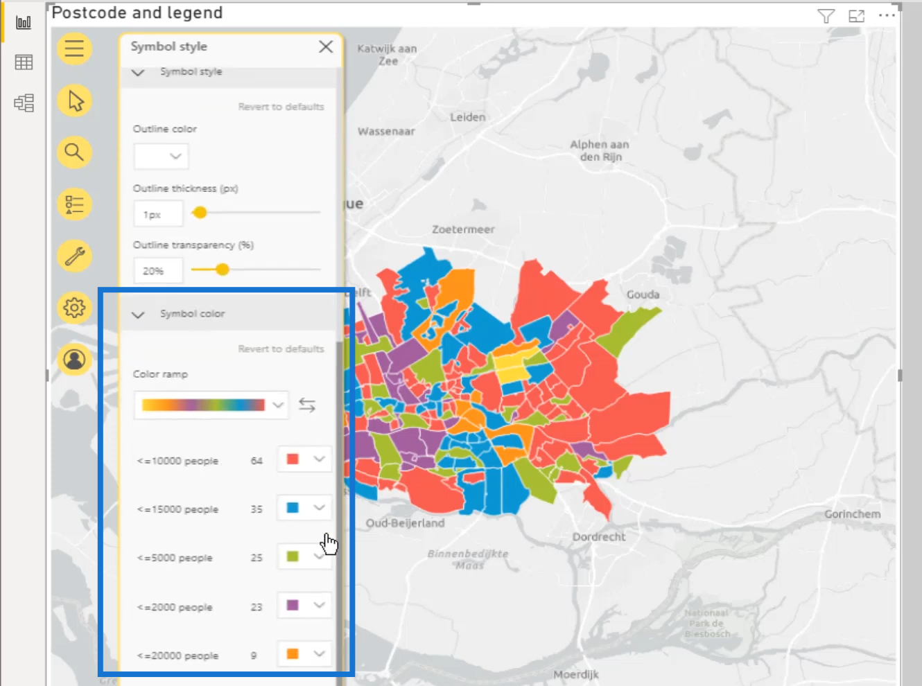
Then, select each segment and change the color to match it with the value from our color table.
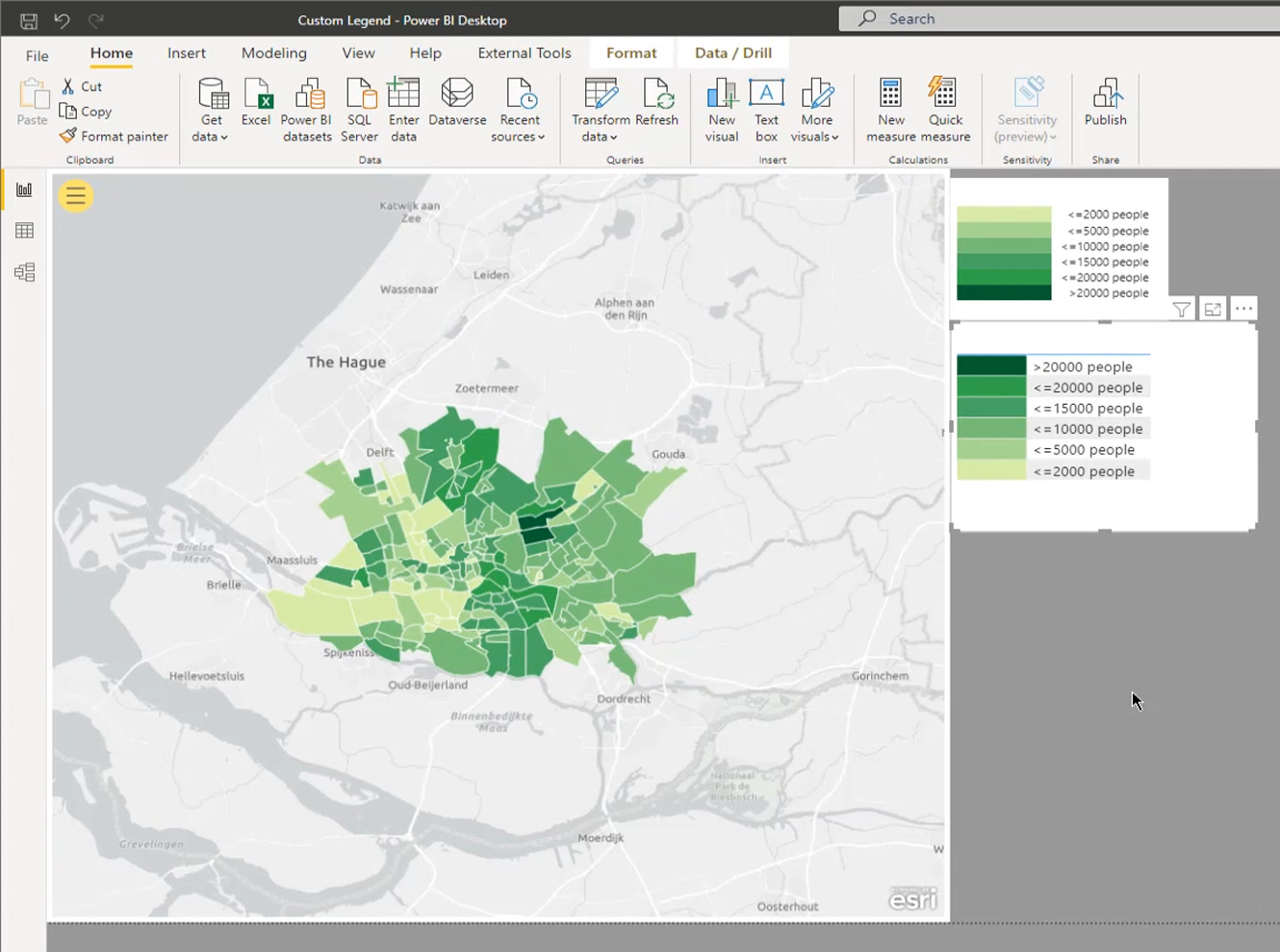
This will then display the map visual that we expect. However, it displays the default legends, which don’t look good, and also covers part of our map.
So, let’s start building our custom legends.
Creating Custom Legends For A Power BI Map Visual
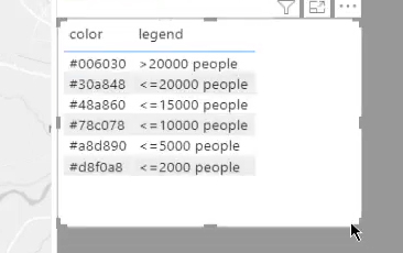
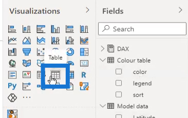
First, we’ll add the values from the color query in a table visual.

To do that, click the Table visualization.
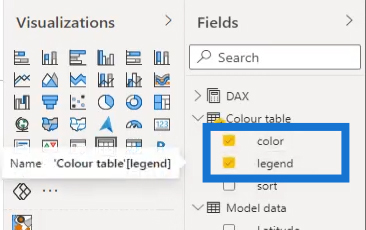
Then, click the color and legend columns from the Colour table.
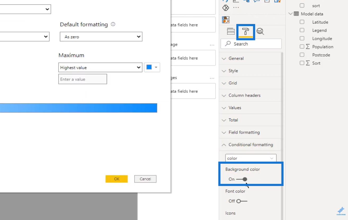
The next step is to click Formatting again. Under the Conditional formatting, turn on the Background color option.
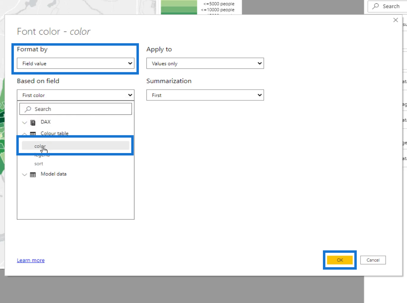
Select Field value from the Format By selection.
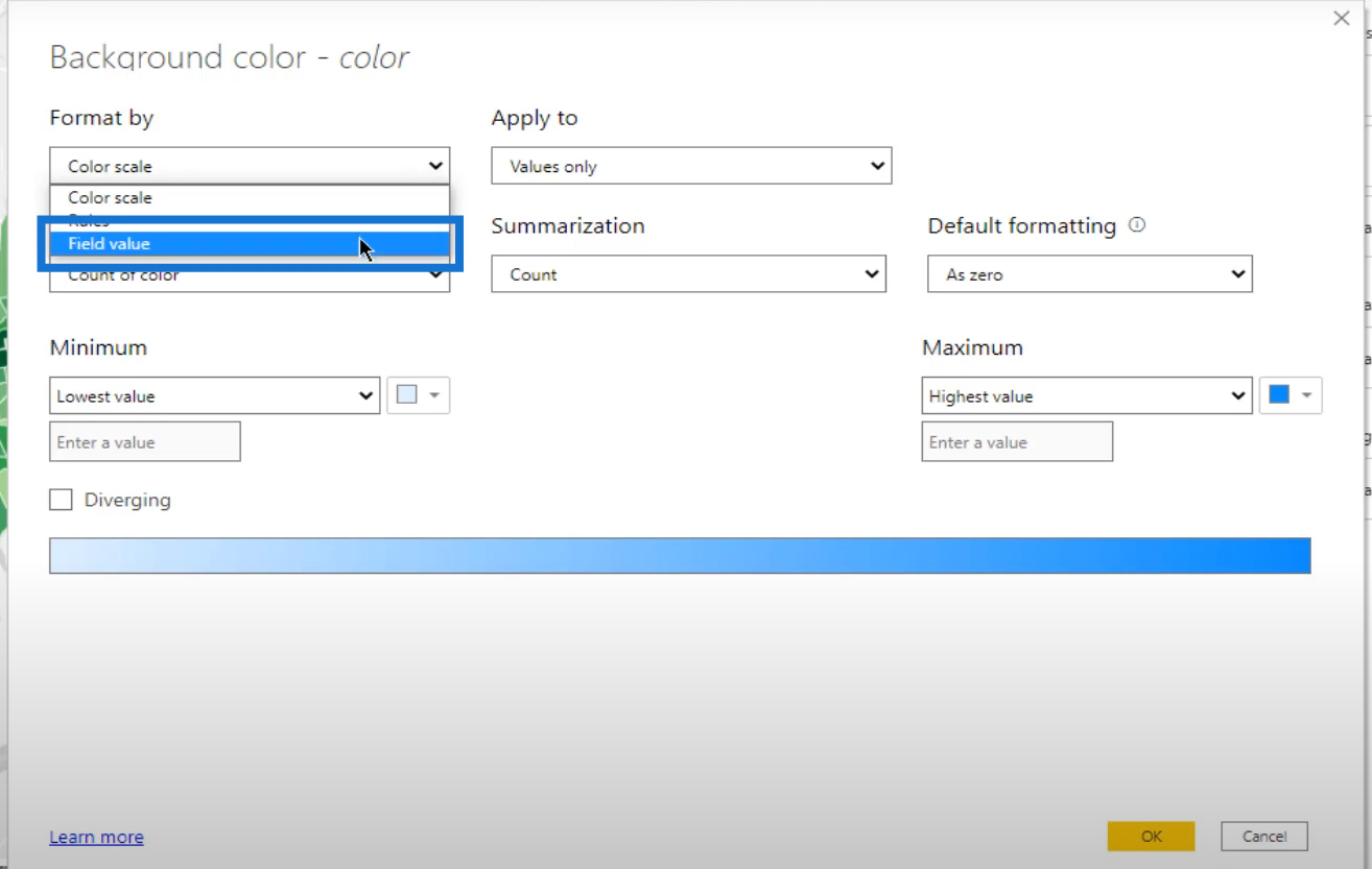
Under the Based on field option, click the color column from the Colour table query.

Then click the OK button.

We also need to do the same for the Font color. Turn on the Font color under Conditional formatting.
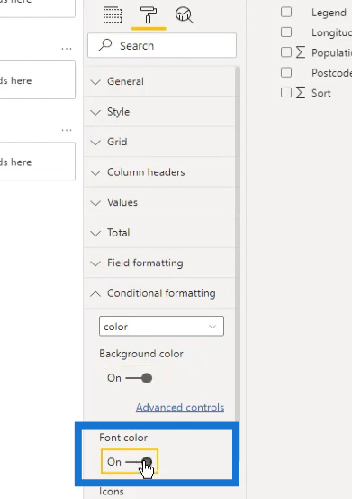
Set the Format By to Field value as well. Then, select color from the Colour table query under the Based on field selection. Click the OK button.
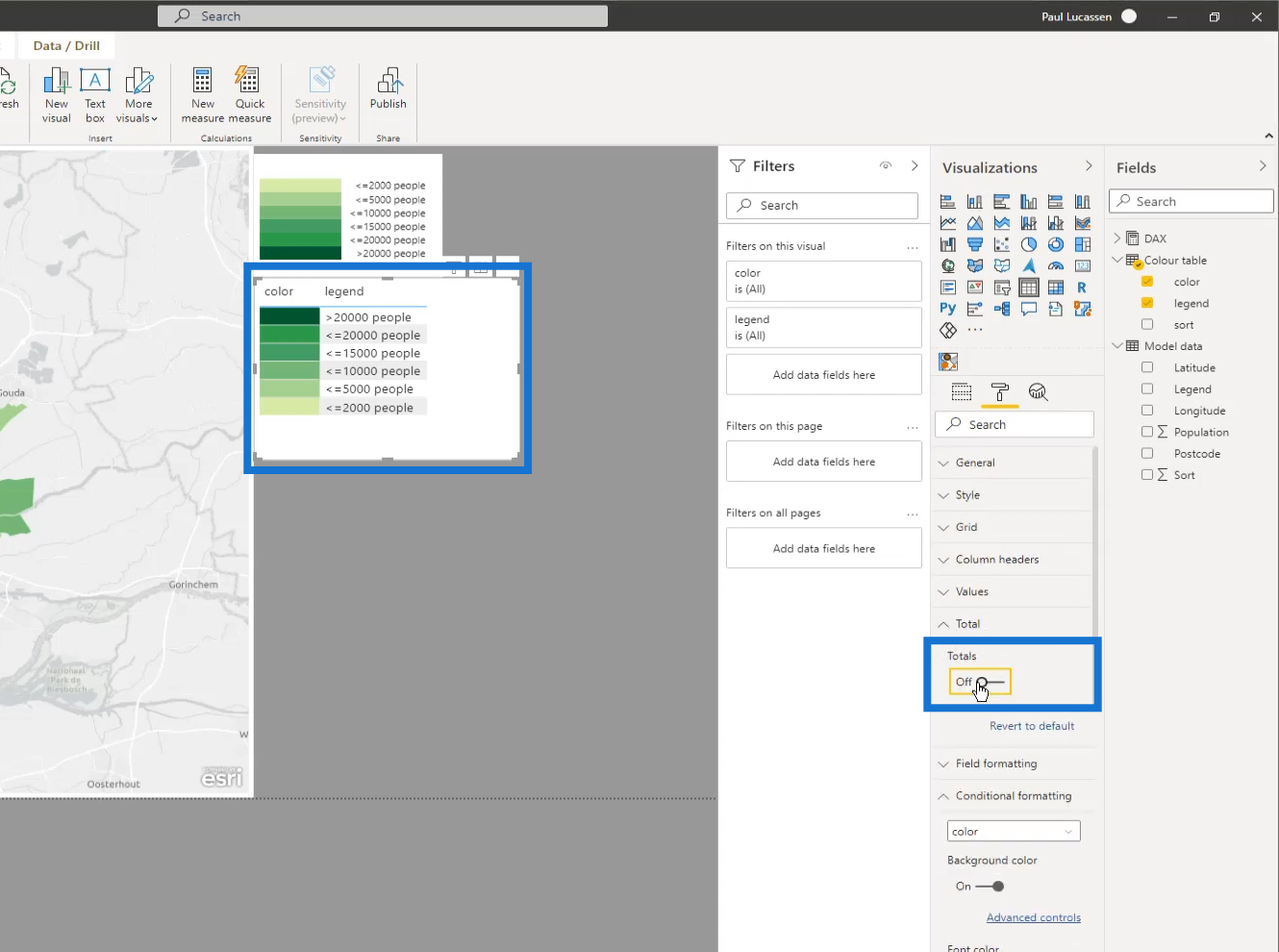
Next, remove the Totals by turning it off under the Formatting option.
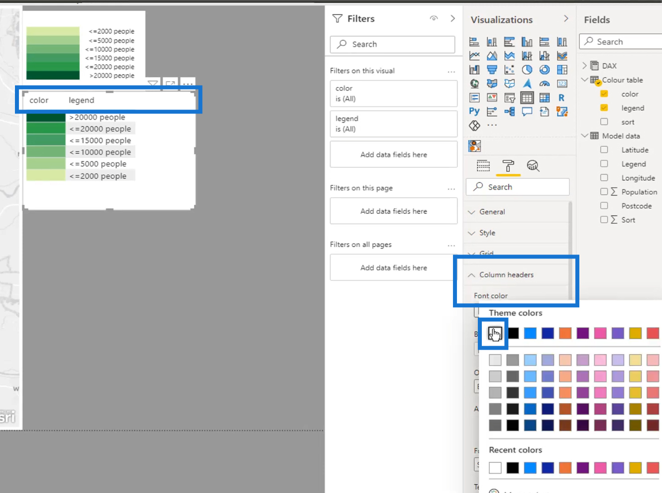
Finally, select a white font to hide the header.
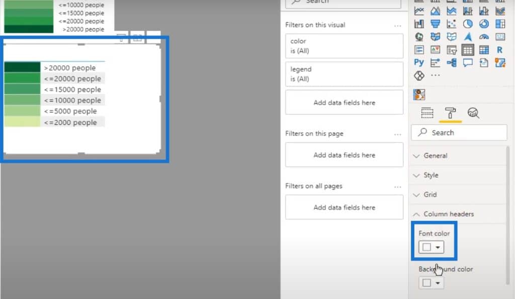
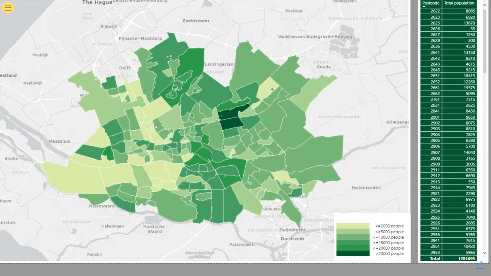
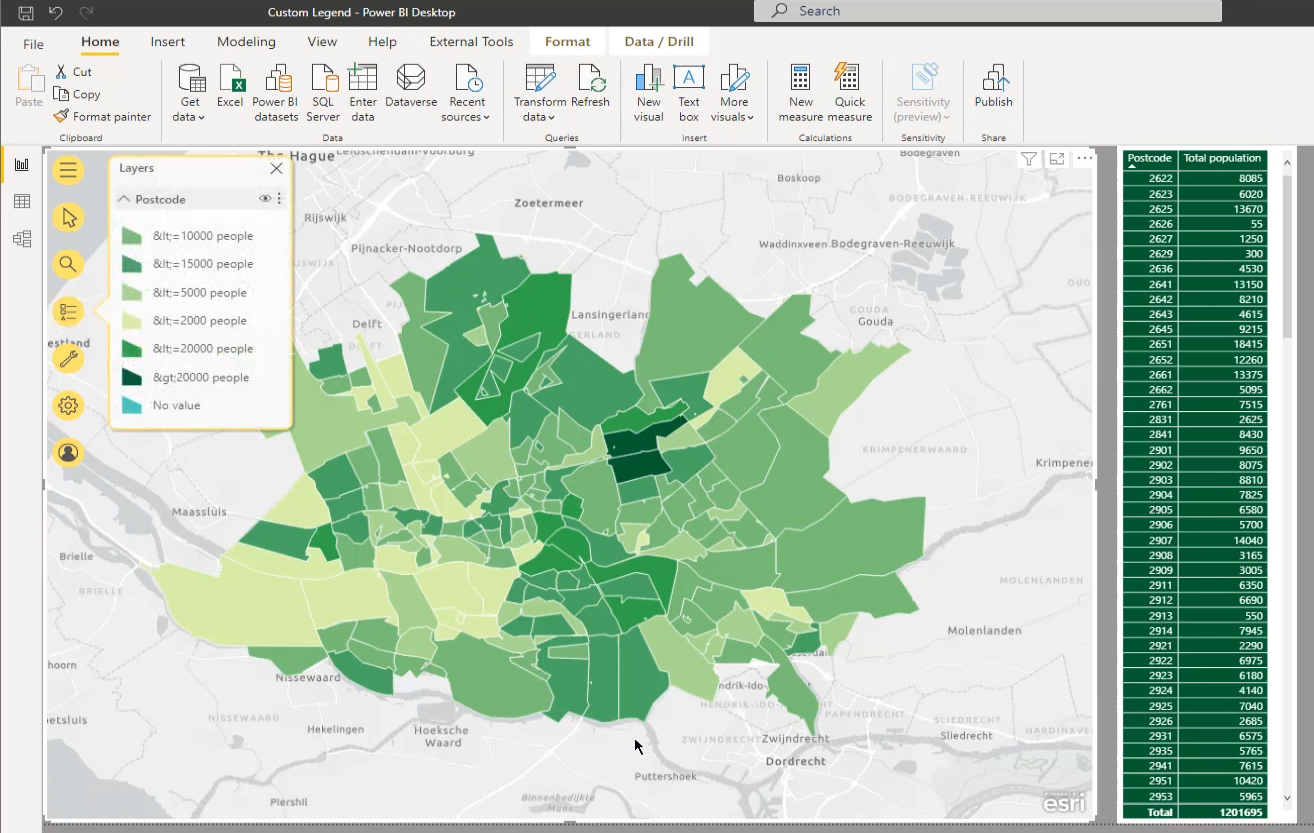
Our legend is now ready. As you can see, the map visual shows a nice set of legends that is informative and clickable. You can reshape it or do some final formatting within the canvas as needed.
***** Related Links *****
Data Visualizations Power BI – Dynamic Maps In Tooltips
Power BI Shape Map Visualization For Spatial Analysis
Hierarchies In Power BI Visualizations
Conclusion
That’s all for this tutorial. This post shows that adding custom legends in a Power BI map visual can display segmentation and colors from a customized color table. You just have to keep in mind that the proper set up of datasets and power queries are vital for this to work.
I hope you’ve enjoyed the process and found it useful. Check out the links below for more examples and related content.
Paul


