
Imagine being able to look at your data from every which way — from the bird’s eye view right down to the teeny-tiny details, and everything in between. That’s the magic of Power BI hierarchies.
A Power BI hierarchy is a collection of related fields within a dataset, arranged in a way that displays one element ranked over the other fields. By using hierarchies, end-users can easily drill down into the data and have a quick overview and a better understanding.
Power BI enables the creation of hierarchies for seamless data exploration across various dimensions and allows users to tailor custom hierarchies to meet specific reporting requirements.

In this article, we’ll be exploring the concept of Power BI hierarchies in great detail. We’ll start with the basics, guide you through creating your very own hierarchies, and dive into the different ways to utilize hierarchies in your reports.
So, keep on reading! With a bit of practice, you’ll soon be creating intuitive, insightful reports with Power BI hierarchies like a pro!
To begin, let’s establish a solid foundation by understanding the concept of the Power BI hierarchy.
What Are Hierarchies in Power BI?
In this section, we’ll explore the concept of hierarchies in the Power BI data model, explain their significance in data analysis, and how they can be used to enhance reporting and visualization.
1. Power BI Hierarchy Levels
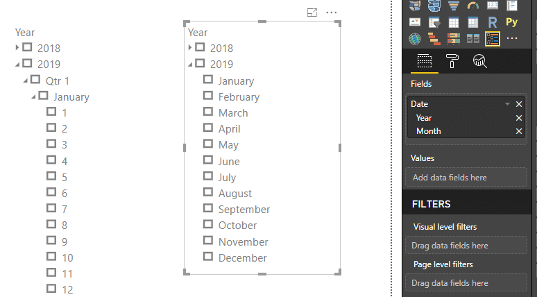
Hierarchies in Power BI are a way to organize data in a hierarchical structure, where one parent or first level is ranked over the other. This allows users to drill down from parent levels to lower levels in a specific order.
A common example of a hierarchy is a structure with a category, subcategory, and product. Power BI Desktop can automatically detect some of these hierarchical relationships, especially in the case of date-related data.

There are specific considerations and limitations for hierarchies in Power BI:
Up to 10,000 items per hierarchy (across all datasets)
Up to five hierarchies
Up to five levels per hierarchy
2. Hierarchies and Visualizations
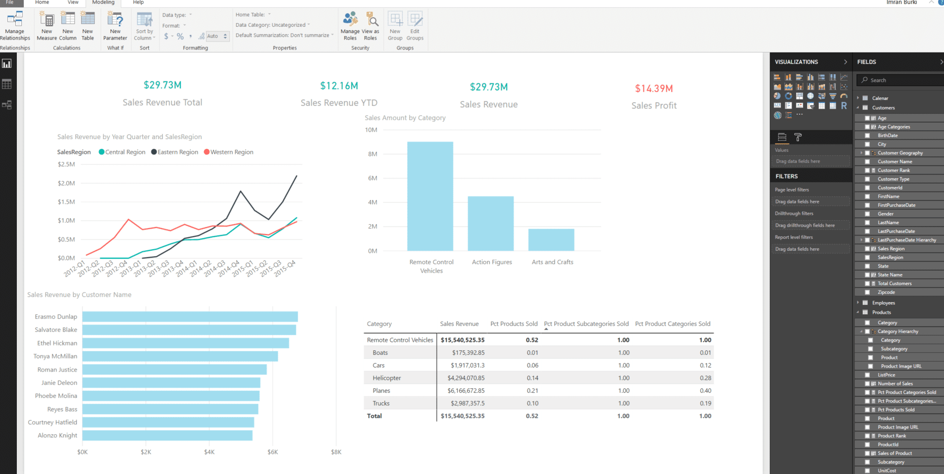
Using hierarchies in visualizations can enhance the user’s understanding of the data and provide a more comprehensive analysis. Some common visualizations that can benefit from incorporating hierarchies include bar charts, line charts, and treemaps.
When working with hierarchies in visualizations, there are several options available to the user. They can:
Enable inline hierarchy labels to sort the data by the hierarchy levels
Use the path function to find the entire path and create a path length column for an organization hierarchy
Employ measures to determine whether a path is the longest and apply it in visual level filters
It’s essential to use hierarchies to improve the data analysis experience in Power BI. By understanding the basics of hierarchy levels and their application in visualizations, users can enhance their Power BI reports and make the most out of the data.
Now that we’ve covered how hierarchies in Power BI are crucial for effective data analysis and visualization, let’s create some in the next section.
Creating and Managing Hierarchies
This section will discuss the process of creating and managing hierarchies using the ‘Data View’ mode in Power BI.
1. Create a Hierarchy
To create a hierarchy in Power BI:
Open Power BI Desktop and load your dataset.
Switch to ‘Data View’ mode by clicking on the ‘Data’ tab in the left pane.
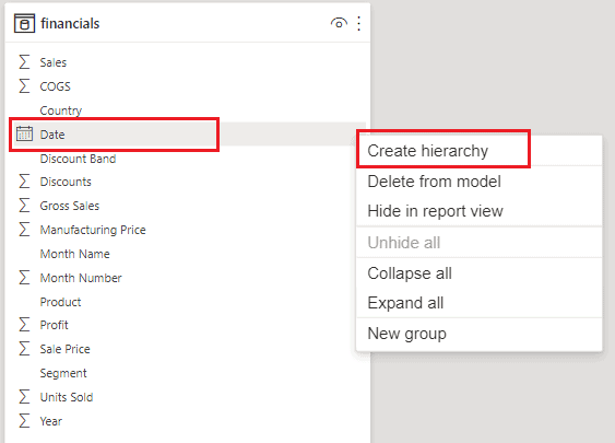
Locate the table containing the fields you want to create a hierarchy from.
Select the first field that you want to include in the hierarchy by clicking on its column header.
Right-click on the column header of the top-level element (‘Category’) and choose ‘Create Hierarchy’ from the context menu. A new hierarchy will be created with the chosen new name, followed by the word ‘Hierarchy’ (e.g., ‘Category Hierarchy’). You can rename it at any time.
A new hierarchy will be created with the selected fields as its levels. You can see the hierarchy in the ‘Fields’ pane on the right side.
Once you have created the hierarchy, you can use it in visualizations. All you have to do is simply drag and drop it onto the visualization canvas or use it as a field in a table or matrix.
2. Add to Hierarchy
To add more than three levels to the hierarchy, repeat steps 4 to 6, selecting additional elements, and right-clicking to choose ‘Add to Hierarchy’ instead of ‘Create Hierarchy’.
To remove a field from the hierarchy, right-click on the field in the ‘Fields’ pane and choose ‘Remove from Hierarchy’.
You can also reorder the levels of the hierarchy by dragging and dropping the fields within the hierarchy in the ‘Fields’ pane.
3. Drill Down and Up
Power BI hierarchies provide essential drill-down and drill-up capabilities for better data visualization and analysis.
To drill down, click on a data point or visual that represents the top level of the hierarchy. The visual will update to display the next level of the hierarchy, allowing you to explore data in many different ways with greater detail.
To drill up, look for the “Go to next level in the hierarchy” button (represented by an upward-pointing arrow) in the top-right corner of the visual. Clicking on this button will go up one level in the hierarchy, providing a more aggregated view of the data.
Here is an example of key actions when working with Power BI hierarchies:
Create a hierarchy: Right-click on the desired top-level element, then select “Create Hierarchy.”
Add to hierarchy: Drag and drop fields into the hierarchy.
Reorder fields: Click and drag the fields within the hierarchy to rearrange them.
Drill down: Click on a data point or visual to see the next level of the hierarchy.
Drill up: Click the “Go to next level in the hierarchy” button (upward-pointing arrow) to return to the aggregated view.
With these essential steps and actions, creating and managing hierarchies in Power BI becomes an accessible and efficient process, enabling better data analysis and visualization.

In the next section, we’ll delve into the concept of slicers and filters in Power BI hierarchy.
Hierarchy Slicers and Filters
Hierarchy slicers and filters are fundamental tools within Power BI that allow users to make the most of their data by offering the ability to delve deeper into the information at hand.
With these tools, data can be viewed, analyzed, and presented in a way that is tailored to specific needs, so let’s explore how hierarchy slicers and filters work in Power BI.
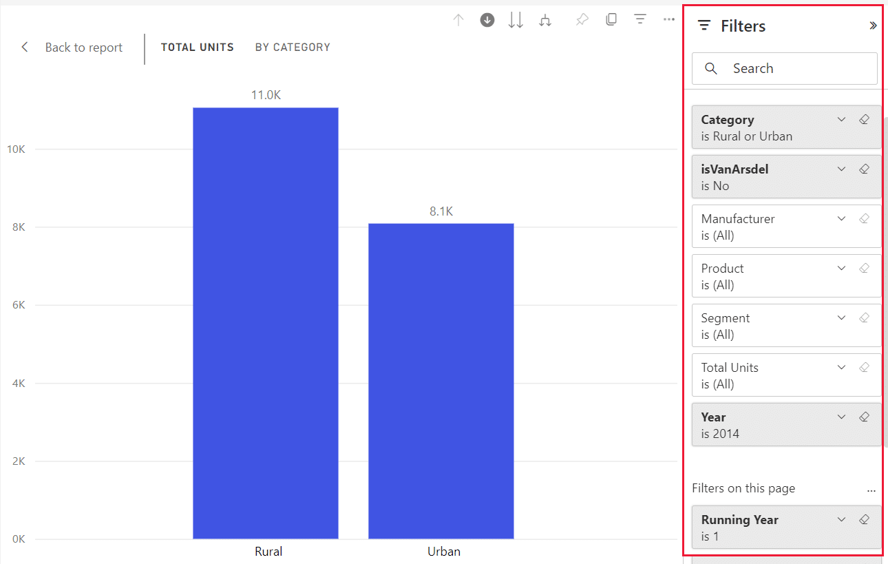
1. Filtering Data with Slicers
By creating a hierarchy slicer, the data can be navigated and filtered in a structured manner. The steps to create a full hierarchy data slicer are as follows:
Insert a slicer visual from the Visualizations pane.
Add the desired fields to the slicer, creating a hierarchical order.
Use the slicer to filter the data by selecting different levels in the hierarchy.
For example, if the fields are Category, Commodity, and Item, the hierarchy slicer will help users filter data by selecting a specific category, narrowing it down to specific commodities within that category, and finally, choosing a specific item within that commodity.
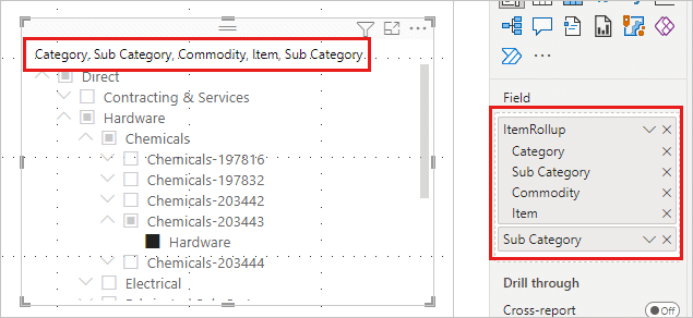
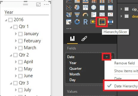
2. Drilling into Hierarchy Slicers
By default, hierarchies in Power BI slicers can be expanded and collapsed for easy navigation. With the drill into functionality, users can dive deeper into the database by selecting a particular field in the hierarchy to focus on that field and its underlying levels.
For example, a user might drill into the “Category” field to explore all the commodities and items within that category.
Here is an example of using the “drill into” feature with a hierarchy slicer:
Select the hierarchy slicer in the Power BI report.
Click the “Expand all” button or use the “+” icon next to the field to expand the hierarchy.
Choose a specific level in the hierarchy and view the filtered data.
The ‘drill into’ feature makes it easier to explore the data in a step-by-step manner.
3. Hierarchy Dropdowns
Hierarchy dropdowns serve as an alternative to using a hierarchy slicer for filtering data. Like hierarchy slicers, dropdowns enable users to filter data in a structured manner by selecting different levels in the hierarchy.
A dropdown is useful for conserving space, as it takes up less room than a slicer.
To create a hierarchy dropdown in Power BI, follow these steps:
Insert a slicer visual from the Visualizations pane.
Add the desired fields to the slicer, creating a hierarchical order.
In the slicer’s properties pane, under “Selection Controls,” set the “Type” to “Dropdown.”
The hierarchy dropdown is now available for users to filter the data by choosing different levels in the hierarchy, similar to how they would interact with a hierarchy slicer.
Now that we’ve explored the power of hierarchy slicers and filters in organizing data, let’s look into the relationship between hierarchies and visualizations.
Visualizations and Hierarchies in Power BI
Hierarchies in Power BI enable a consistent data exploration and drill-down experience across reports. They are commonly used in date and time data but can be applied to other categories as well.
For example:
Product Category
Product Subcategory
Color
Product
1. Charts
When creating a chart visualization, you can use hierarchies to allow users to drill down to different levels of granularity.
By adding a hierarchy to the chart axis, Power BI provides an interactive visual experience with expand and collapse functionality.
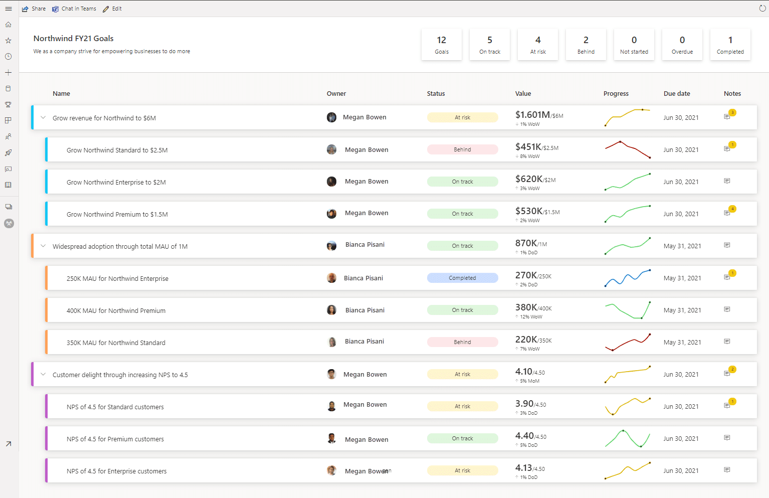
2. Scorecards
Scorecards in Power BI are used to display key performance indicators (KPIs) and their respective targets.
They can incorporate hierarchies to provide a multi-level view of the data, helping users to analyze and compare performance across various organizational levels or categories.

To effectively create hierarchical scorecards:
Set up a hierarchy for the scorecard.
Map Power BI datasets referenced by your metrics to the hierarchy levels and owner fields.
Automatically create a new scorecard view for each slice of your data with just a few clicks.
The benefits of this approach include potentially thousands of automated scorecard views and the ability to leverage cascading scorecards, which update based on the user’s selection in the overall hierarchy.
3. Project Hierarchy Visuals
Project hierarchy visuals in Power BI are often used to represent organizational structures or relationships between items, such as employee-manager relationships. To create these visuals, follow these steps:
Use the PATH function to find the entire path from one member in the original table and create a Path Length column.
Path = PATH('Table'[Employee_ID],'Table'[Manager's Employee_ID])
Path Length = PATHLENGTH('Table'[Path])
Create a measure to determine whether it is the longest path and apply it in the visual-level filter.
These visuals can be displayed in edit mode, allowing users to provide feedback and collaborate on the analysis directly within Power BI.
With the combination of datasets, hierarchies, and powerful visuals, Power BI enables users to make informed decisions and drive projects forward.
Let’s now explore advanced hierarchy scenarios in Power BI, including techniques for handling complex data structures.
3 Advanced Hierarchy Scenarios in Power BI
Stepping beyond the fundamentals of Power BI hierarchies, we arrive at the exciting territory of advanced hierarchy scenarios. These are the tools and techniques that push the boundaries of what’s possible with data visualization and analysis.
In this section, we’ll take a detailed look at some of these advanced scenarios.
1. Hierarchies with Columns
In Power BI, hierarchies with columns allow for more organized and structured data visualization within a BI report.
For instance, you could create a product hierarchy consisting of a subcategory, product category, and quarter columns to display sales data systematically. Using SQL Server Analysis Services can further improve column-based hierarchies by enabling more in-depth data analysis.
To create a hierarchy with columns:
Drag the required columns into the visualization pane
Right-click the new column header and select New Hierarchy
Add additional columns by dragging them onto the new hierarchy
2. Drill-Down with Metrics
Drill-down functionality can be employed in Power BI to reveal more specific metric-related details. In the context of sales, you might use the drill-down feature to explore sales performance across various product categories or subcategories.
For example, an initial visualization displays the total sales per quarter, and drilling down could reveal sales numbers per product category within that quarter.
To create a drill-down within a visualization:
Add a hierarchy to the visualization
Click on the “Expand to next level in the hierarchy” icon or select a specific data point to drill down
3. Automated Scorecard Views
Automated scorecard views in Power BI enable the generation of multiple scorecard views with just a few clicks.
By setting up a hierarchy for a scorecard and mapping the Power BI datasets referenced by metrics to hierarchy levels and owner fields, those scorecard views can be automatically updated to reflect the data structure.
The advantages of using automated scorecard views include:
Time-saving by generating multiple scorecard views efficiently
Consistent and accurate data representation based on hierarchies
Easy maintenance due to automation
To set up automated scorecard views:
Create a new hierarchy or select an existing one
Map Power BI datasets to hierarchy levels and owner fields
Configure the scorecard to use the hierarchy for data representation
Let’s now wrap up the world of Power BI hierarchies and discover resources and best practices that will elevate your data visualization capabilities to new heights.
Additional Resources and Best Practices for Power BI Hierarchy
When working with Power BI hierarchies, it’s essential to have a good understanding of the available resources and best practices to optimize your data visualization and reporting.

For setting up your hierarchy, consider the following best practices:
Ensure that you meet the requirements for creating hierarchies in Power BI for accurate cascading scorecards.
Deploy your BI solution in Power BI if it’s used as your reporting and analytics layer.
Utilize different storage modes, such as caching data or using DirectQuery, to improve performance and efficiency.
Noteworthy resources for managing your Power BI project hierarchy include:
Owners: Assign project owners to specific responsibilities in organizing, maintaining, and updating your organizational hierarchy.
Progress: Track project progress and status of a hierarchy level through regular check-ins and updates with your team members for continued success.
Statuses: Monitor various hierarchy levels to provide timely and efficient insights into your data.
Check-ins: Schedule frequent check-ins to maintain synchronization among your team and ensure a coherent and consistent project status.
Additionally, you can watch this YouTube video on how to execute hierarchies in Power BI visualizations to enhance your mastery:
Final Thoughts
Power BI hierarchy is a key to unlocking a vibrant visual data experience. Whether you’re riding the wave of automatic date-related hierarchies or crafting custom hierarchies tailored to your reporting needs, Power BI unleashes your data’s full potential.
So buckle up and embark on an exhilarating journey of discovery, where hierarchies become your companions, guiding you towards comprehensive analysis and empowering you to make data-driven decisions.
It’s time to level up your reporting game and harness the true power of Power BI hierarchies. Let the data adventure begin!


