
If you’re looking for a powerful tool to help you visualize and analyze data, then Power BI reports might be just what you need. With Power BI, you can create multi-perspective views into your datasets, complete with visuals representing your findings and insights.
The top 21 Power BI Report examples are a set of reports designed to provide users with an overview of the most important aspects of Power BI. Businesses can use these reports to connect to various data sources, transform, and clean the data, and then create visualizations and dashboards to gain insights and make data-driven decisions.
In this article, we will go over 21 of our favorites and show you how they can help you bring your data to life.

So if you’re ready to take your data analysis to the next level, it’s time to try these Microsoft Power BI reports!
Top 21 Power BI Report Examples, It’s Time to Get Inspired
As organizations continue to move towards a digital-first approach, the need for data visualization and reporting tools has never been greater.
There are different reports on Power BI, each with its own unique capabilities. Below, we’ll explore some aweseom Power BI report examples that every organization should be using:

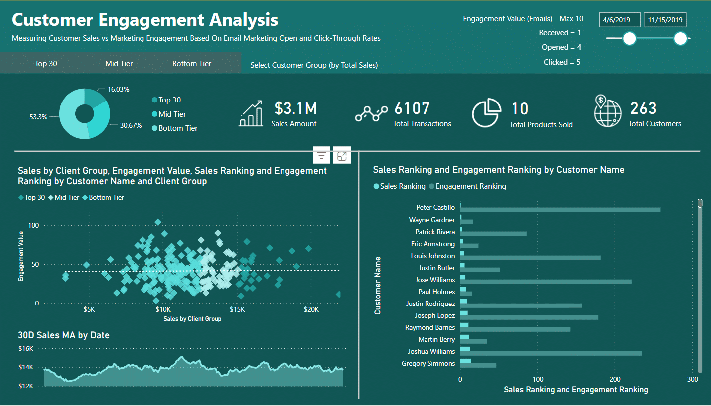
1. Customer Engagement Report
A Customer Engagement report is a visual representation of data that provides insights into customer behavior, interactions, and engagement with a business or organization.
Businesses and organizations can learn which email formats encourage the most consumer interaction and revenue, as well as which customer groups respond best to email marketing.
With this knowledge, companies, and organizations can create tailored email marketing campaigns that are more likely to connect with their intended audience and result in conversions.

2. Environmental Data Report
An Environmental Data Power BI report is used to analyze and visualize environmental data. This type of report can include data related to energy usage, carbon emissions, water usage, waste management, and other environmental factors.
By using Power BI, organizations can gain insights into their environmental impact and make data-driven decisions to reduce their carbon footprint and improve sustainability.
This report can help organizations looking to improve their environmental performance and meet sustainability goals
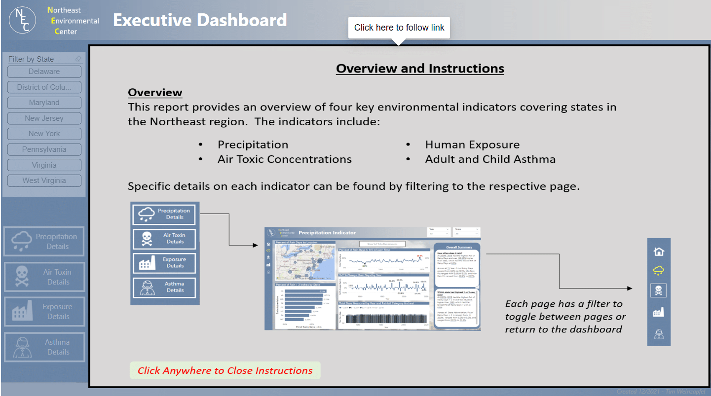
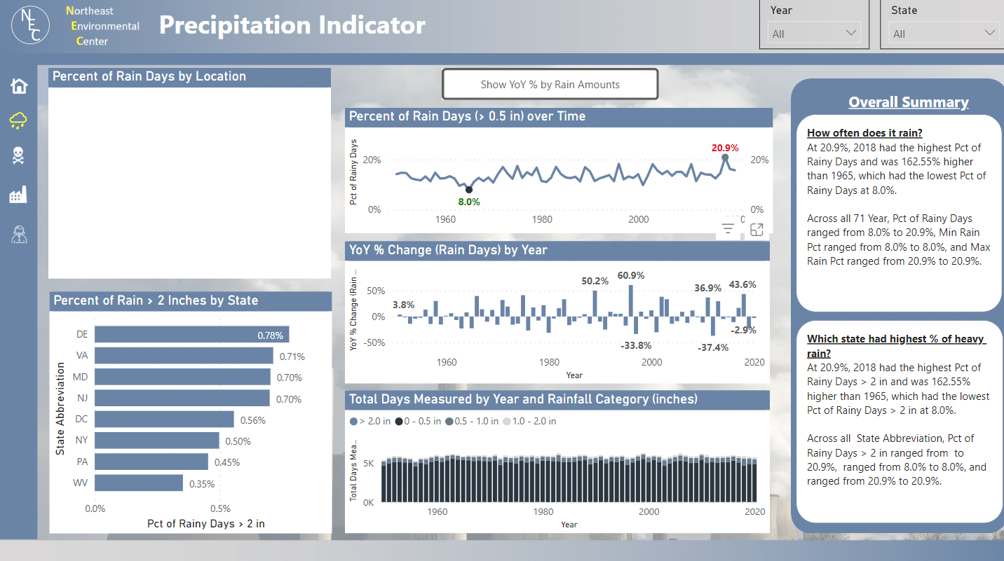
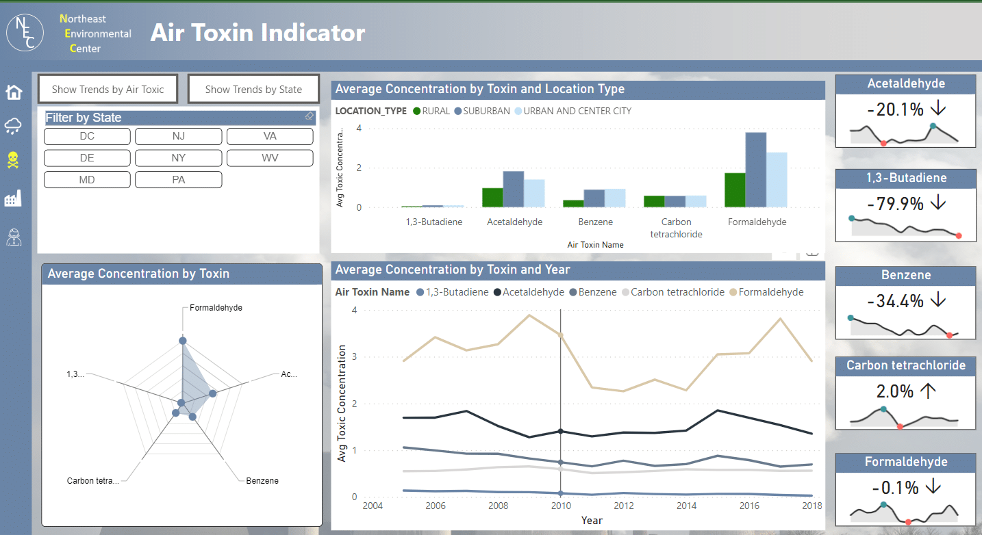
This report can be found in our Power BI Gallery.
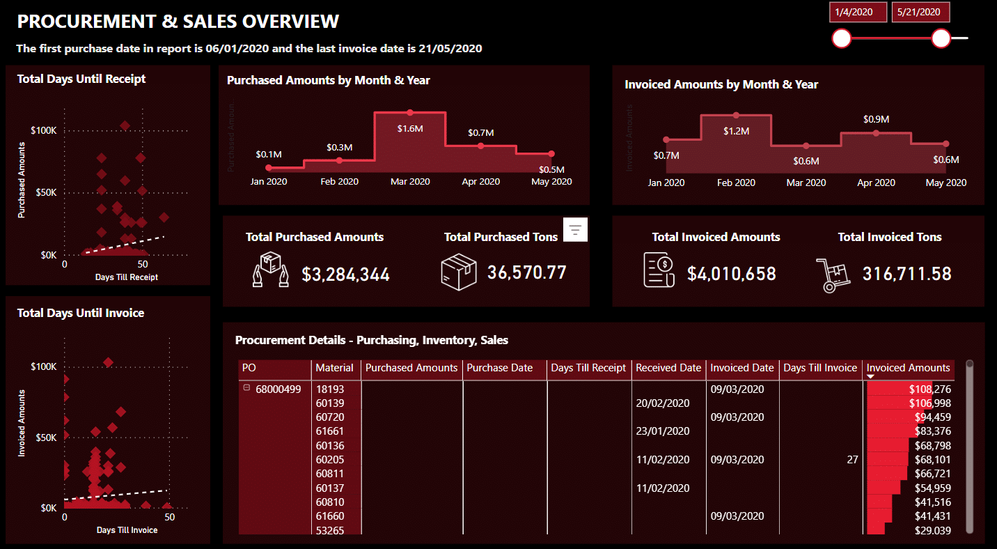
3. Procurement Insights Report Example
The Procurement Insights report is useful if you want to learn more about your procurement process. By examining how long it takes for a purchased item to get to the invoice or receipt stage in the report, users can identify any delays or bottlenecks in the process.
The report provides customers with a thorough understanding of their procurement data, empowering them to make their own decisions and take the required actions to streamline their processes.
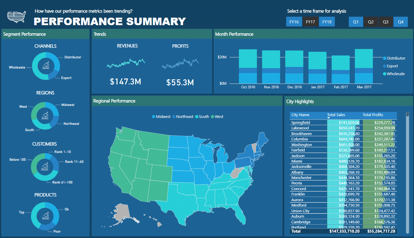
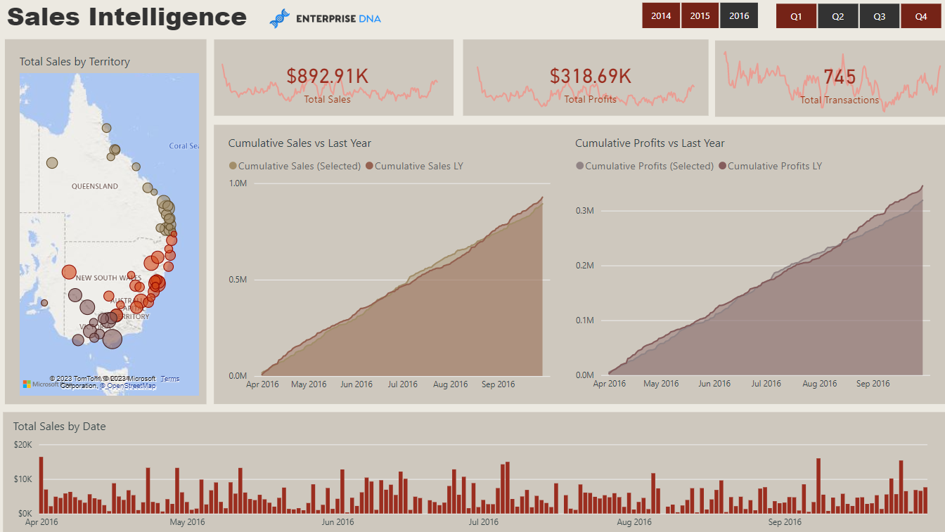
4. Quarterly Business Insights Report
Users can get insightful business intelligence and data on all significant organizational indicators for each fiscal quarter through the Quarterly Business Insights report.
The report enables users to evaluate important performance metrics, such as revenue, profit margins, and customer satisfaction. This enables users to spot areas for development and make informed choices to streamline their business operations.
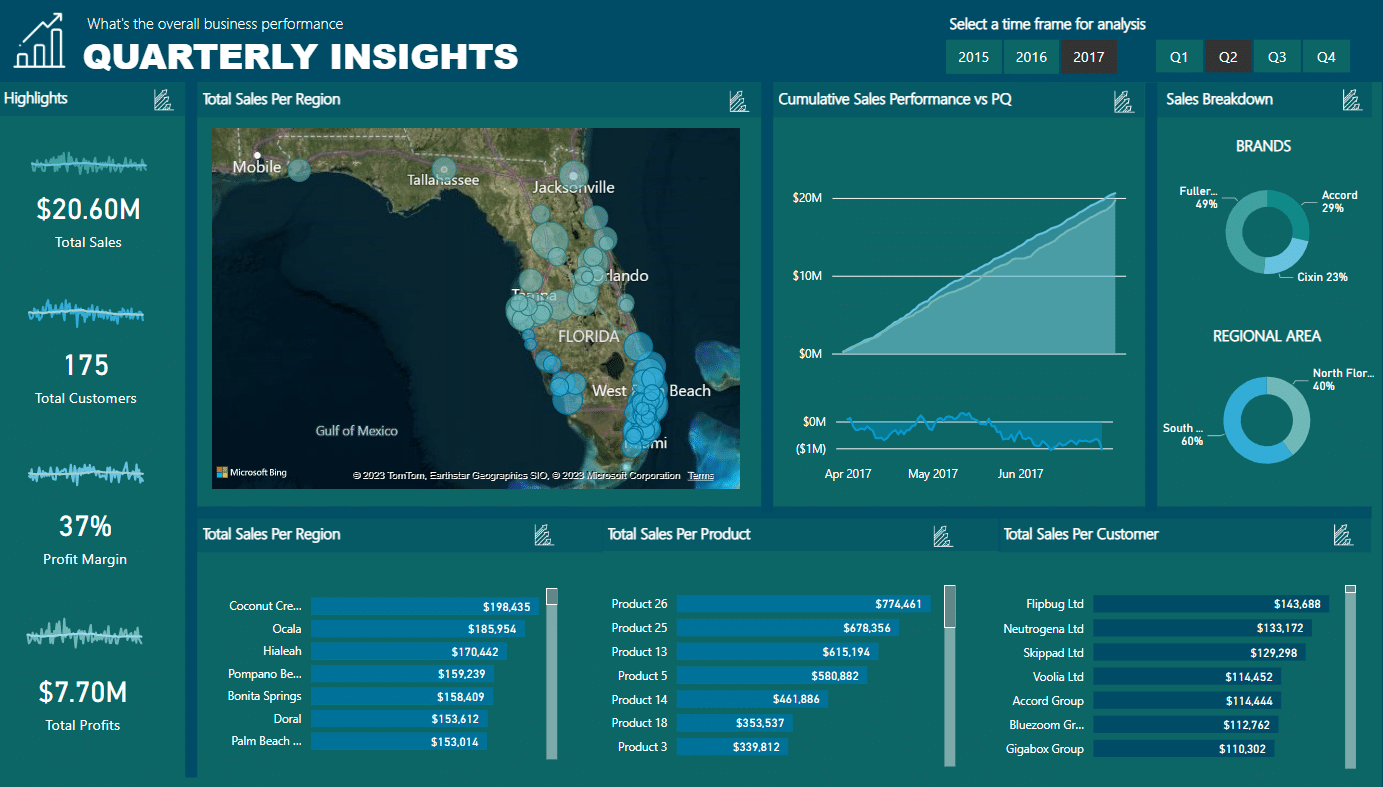
Find out more about the quarterly business report and see more Power BI reports here.
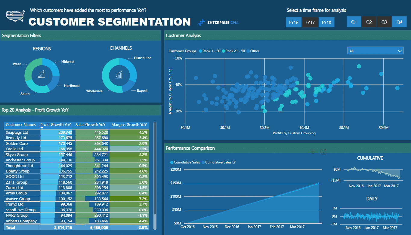
5. Regional Summary Report Example
The Regional Summary report provides a thorough evaluation of regional financial performance. It gives a thorough overview of performance determinants and dynamically highlights the factors influencing previous performances.
The regional summary, which is broken down by region, gives a thorough summary of the financial performance in each region.
This report helps businesses can discover areas of strength and weakness in each region and make data-driven choices about how to enhance financial performance using the breakdown of performance factors.
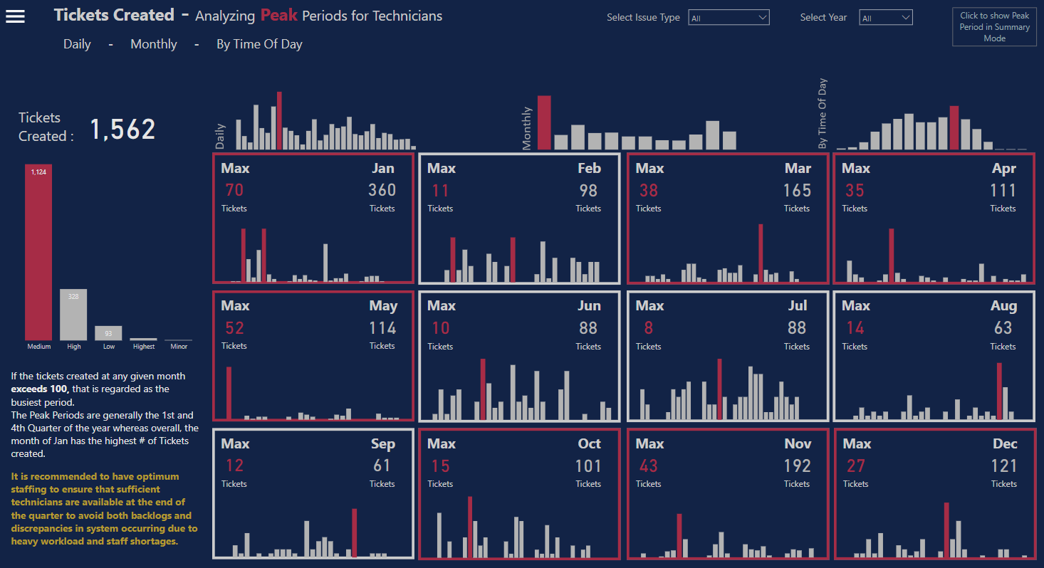
6. Service Desk Analysis Report
The Service Desk Analysis report is designed to examine problem peak times over the course of several days and months.
It assists organizations in deploying the ideal workforce during the weeks and months when problems are at their peak in order to avoid backlogs.
Businesses can discover areas of strength and weakness and make data-driven decisions to enhance performance with the help of the application, which gives them a thorough picture of service desk performance.

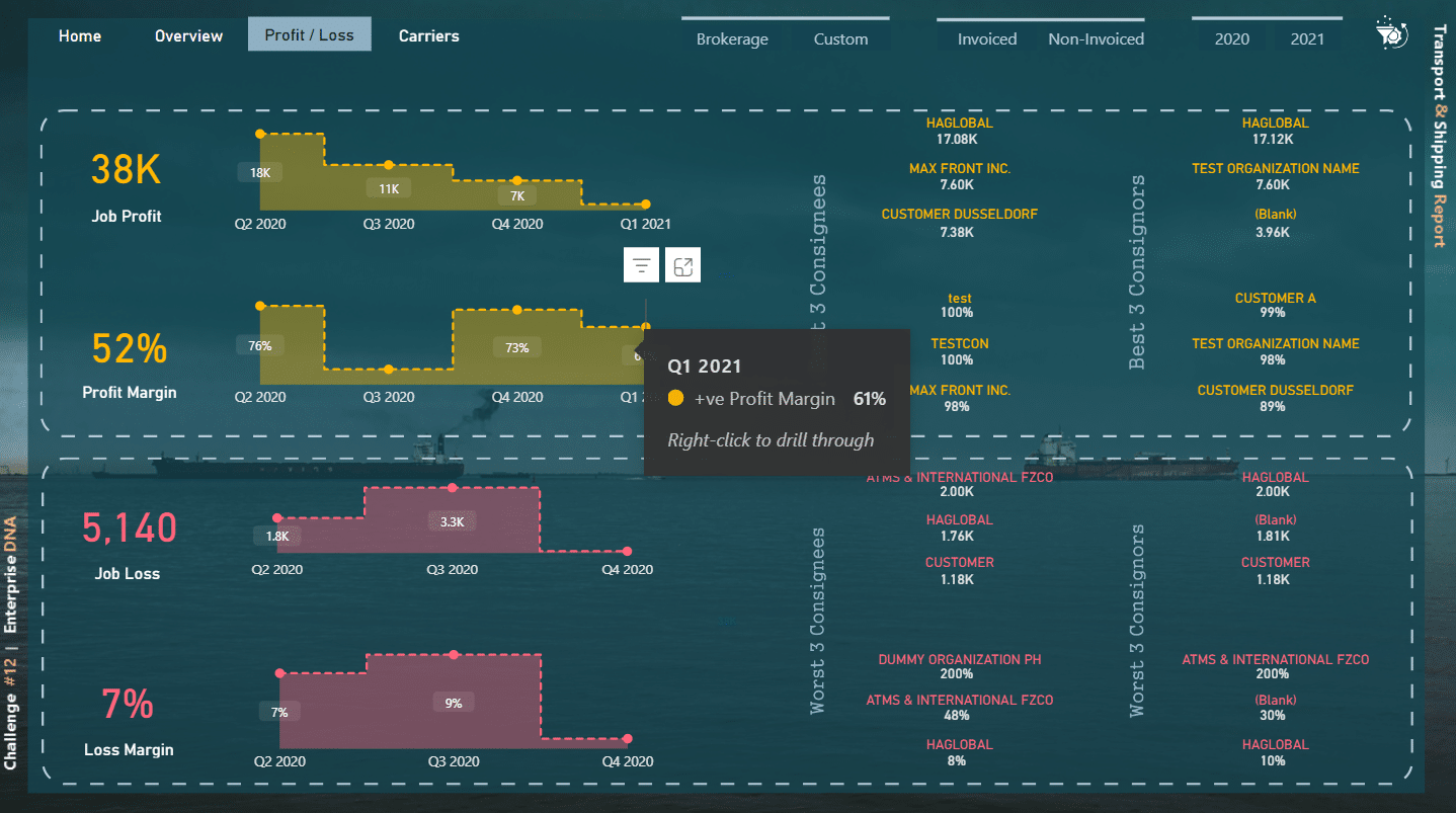
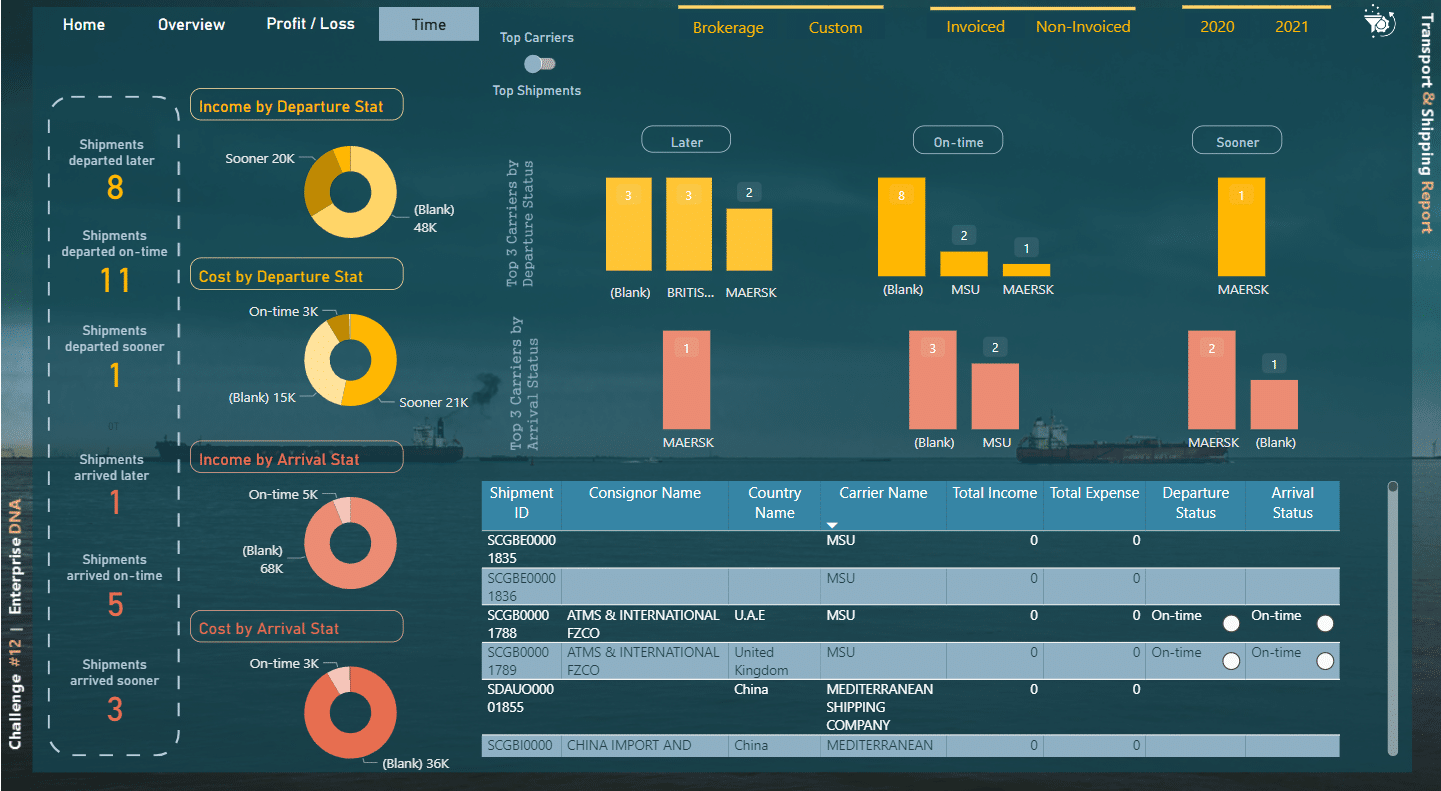
7. Transport & Shipping Report
The Transport & Shipping report is a logistics report modeled after an app and created to give a thorough picture of the company’s profitability.
The report provides insights into historical revenue, cost, and profit patterns using a number of criteria. It also offers a bird’s-eye perspective of the shipping and transport operations, emphasizing important performance factors including the percentage of deliveries made on time, the amount of freight moved, and shipping expenses.
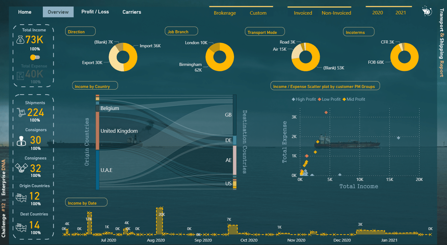
Credit: Hossein Seyedagha
Click here to see our entire collection of Power BI reports.
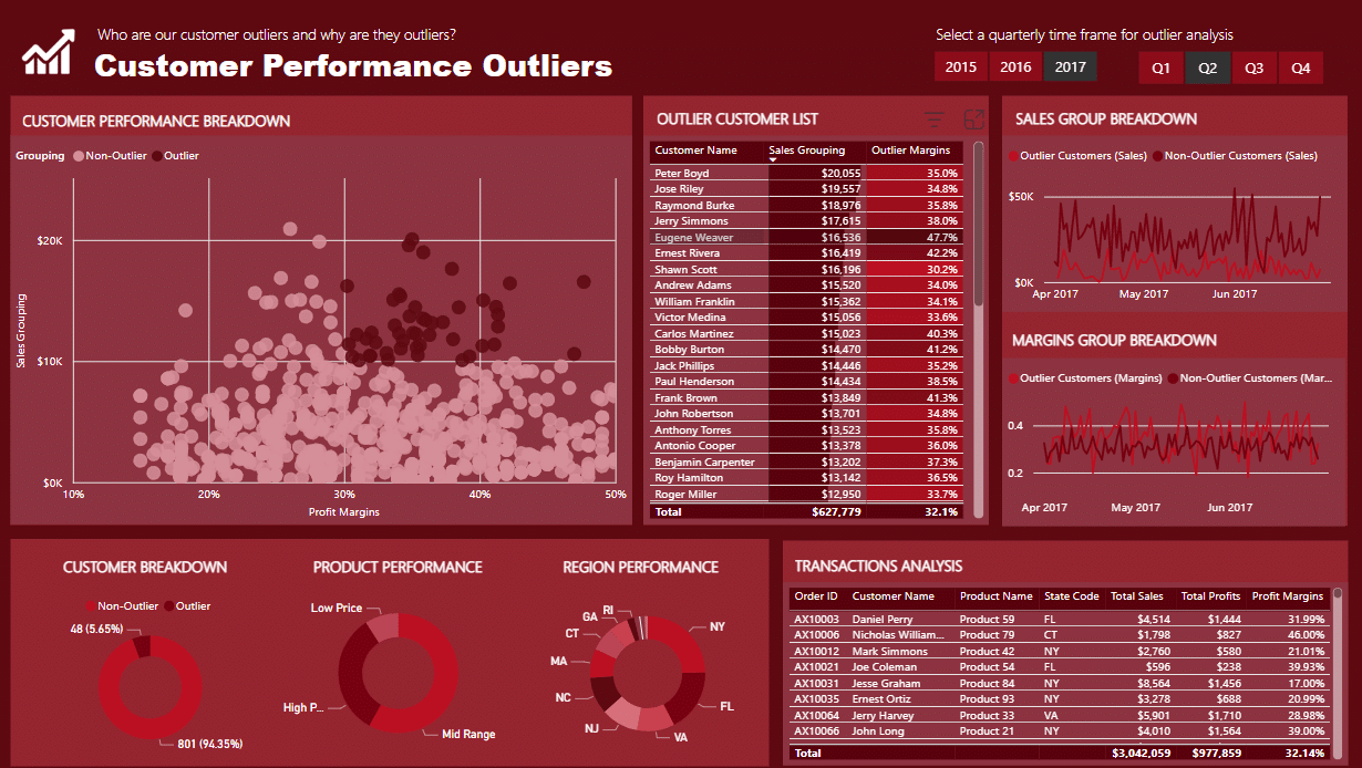
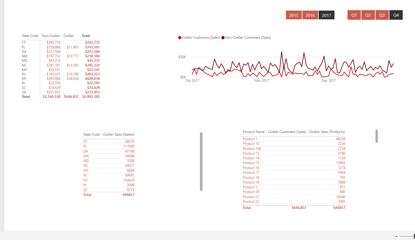
8. Detecting Outliers Report Examples
A crucial stage in data analysis involves discovering outliers or abnormalities within a dataset. Businesses and organizations may learn more about possible mistakes, data quality problems, or key events by identifying these odd data points.
Through the Detecting Outliers report, businesses and organizations may get insights into probable causes and take preventative action to stop reoccurring incidents by evaluating the patterns and changes linked to the anomalies the detecting outliers report.
This report can also assist in identifying potential benefits or dangers linked to the outliers, enabling more informed choice-making.
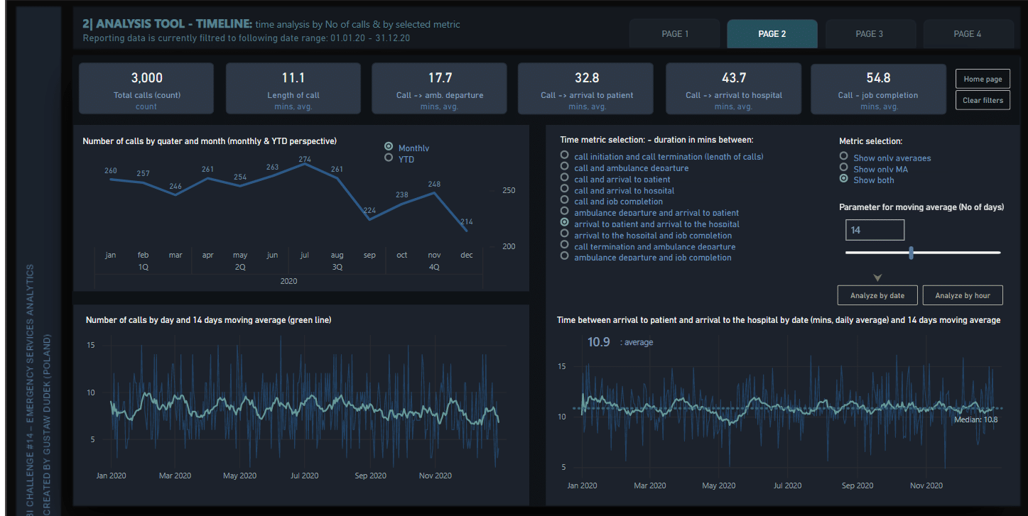
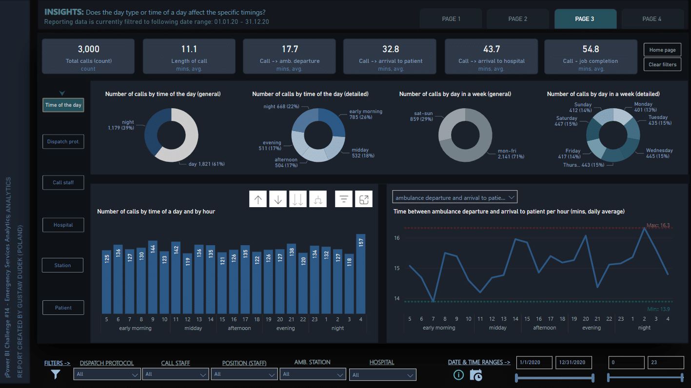
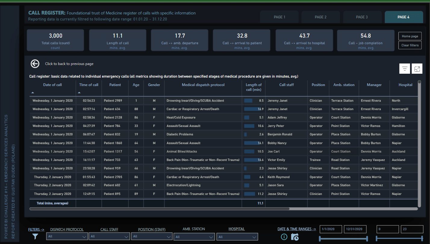
9. Emergency Services Analytics Report
Any emergency response team that wants to swiftly make data-driven choices should use the Emergency Services Analytics report. The report’s layout is simple and effective, making it simple to explore and get the data you want.
The report’s inventive use of tooltips is also remarkable since it offers in-depth analytical insights without sacrificing the report’s compact design.
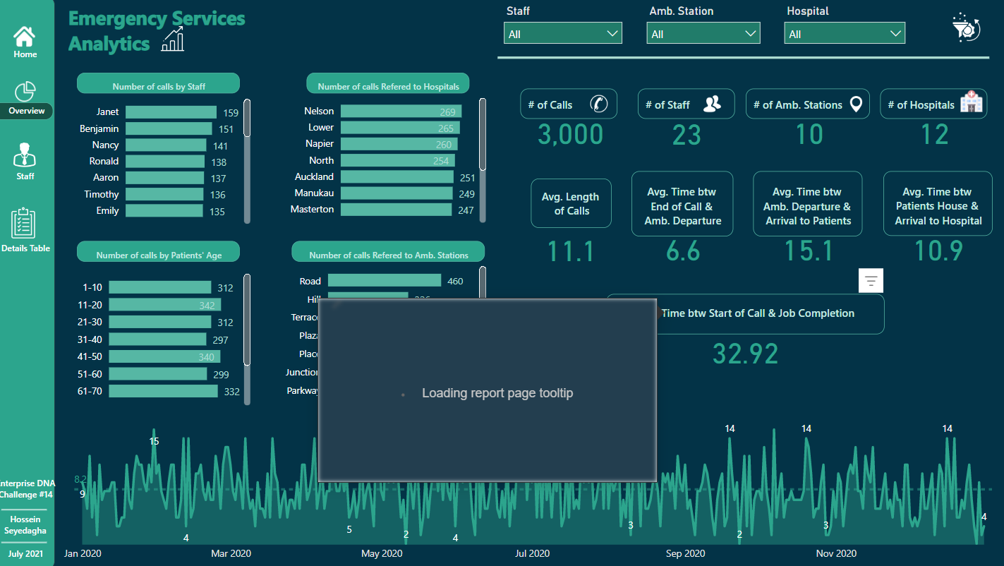
To find out more about the Emergency Services Analytics report, check it out and many other Power BI reports, click here.
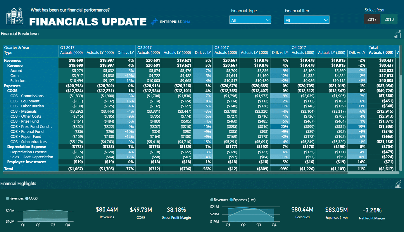
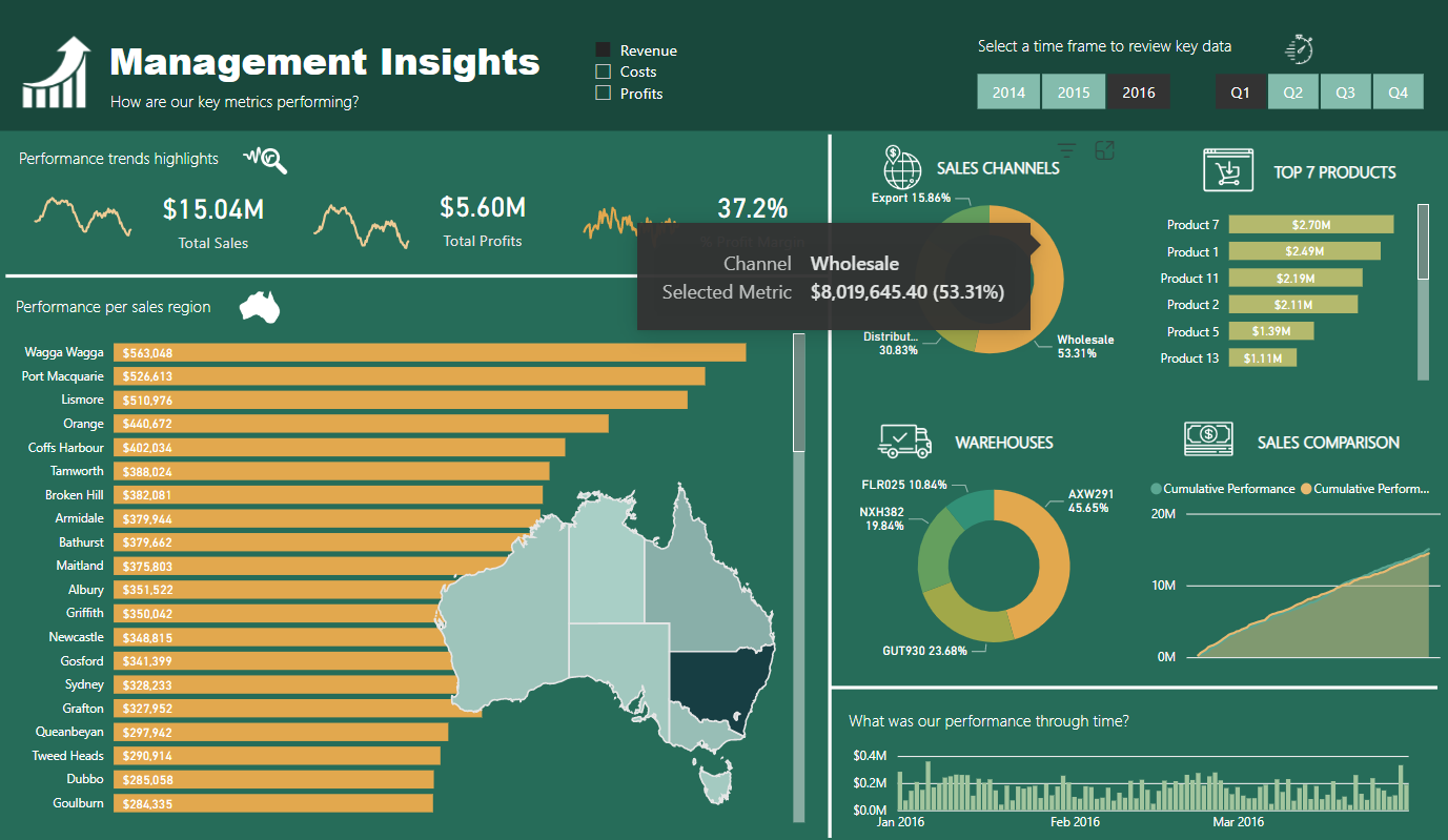
10. Management Insights Report
The Management Insights report offers a thorough overview of important financial and sales information. It is a very useful tool for decision-makers who need to examine their company’s performance swiftly and correctly.
This reports offers data with clear graphics, interactive elements, and an easy-to-understand manner. Executives can swiftly evaluate crucial financial and sales information including revenue, profit margins, client acquisition expenses, and more.
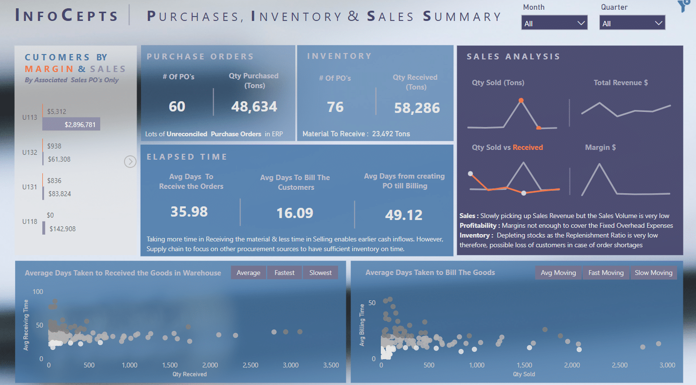
11. Purchases Summary Report
The Purchases Summary report gives customers a compelling picture of the purchase, sales, and inventory overview. This makes it simple for users to acquire and comprehend crucial data points and trends, empowering them to take well-informed decisions that will improve their business operations.
This report is designed to be extremely interactive, with a variety of visualizations that allow users to drill down into specific data points and gain deeper insights into their purchase, sales, and inventory data.
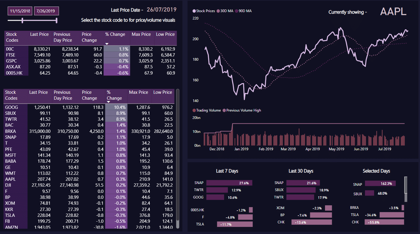
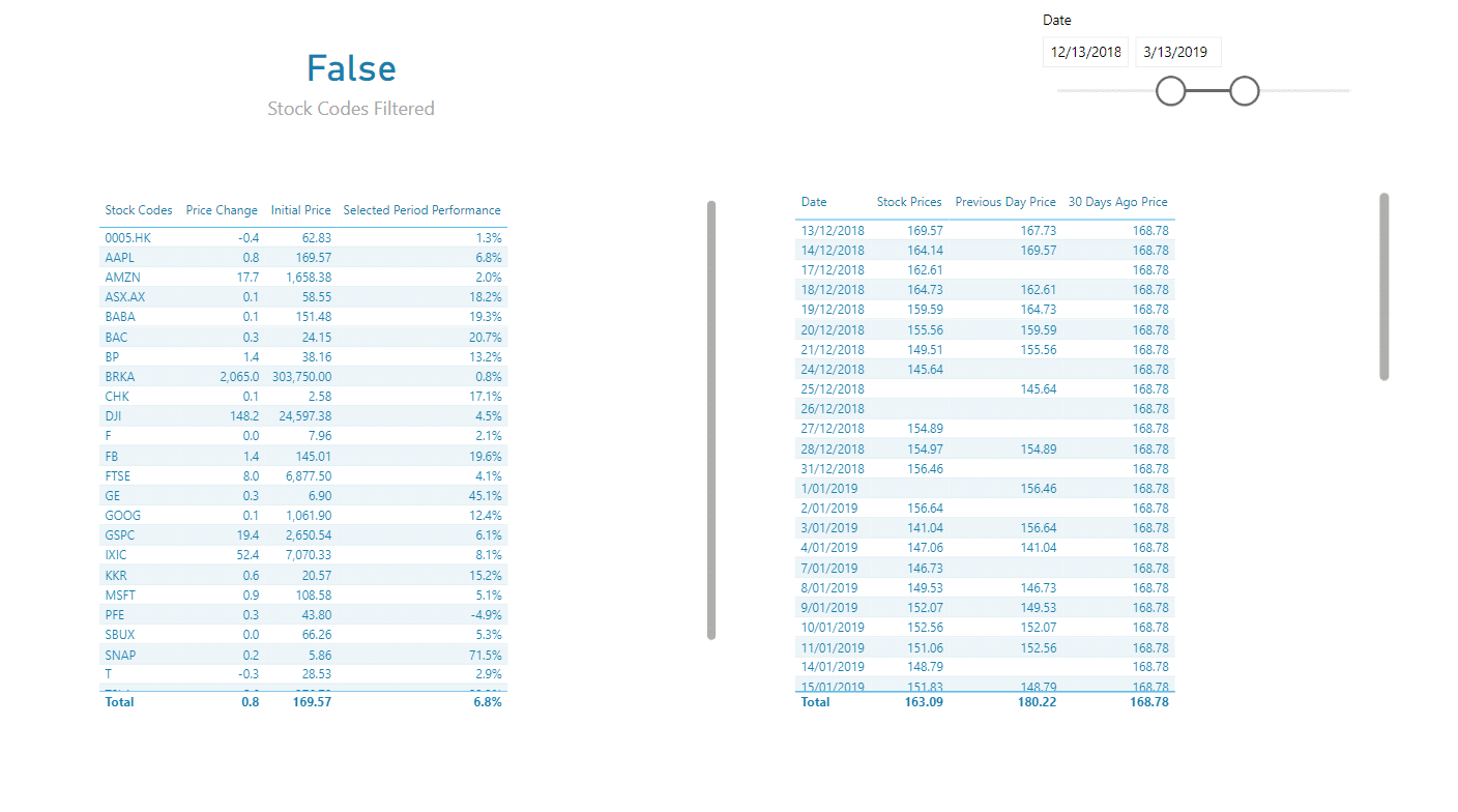
12. Stock Market Report Example
The Stock Market report is made to assist companies in tracking and analyzing stock market data. It enables companies to explore dynamic stock market data, analyzing important pricing and trading data.
This report enables companies to swiftly and simply spot trends and insights in stock market data, assisting them in making smart investment choices. It also has extensive customization features that let organizations alter the display to meet their needs and concentrate on the parameters that matter most to them.
We have a huge collection of free Power BI reports, you can check them out in our Power BI Gallery.
13. Time Intelligence Report
The Time Intelligence report was created to assist organizations in tracking important indicators throughout time and comparing current data to that from a previous time period.
Through the analysis of total sales, expenses, and profits provided in this report, businesses are able to spot patterns as they develop.
This report helps businesses can spot possible growth opportunities and take proactive steps to seize them by evaluating indicators for the success of their products, their regions, and their customers.

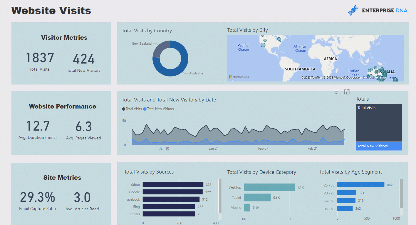
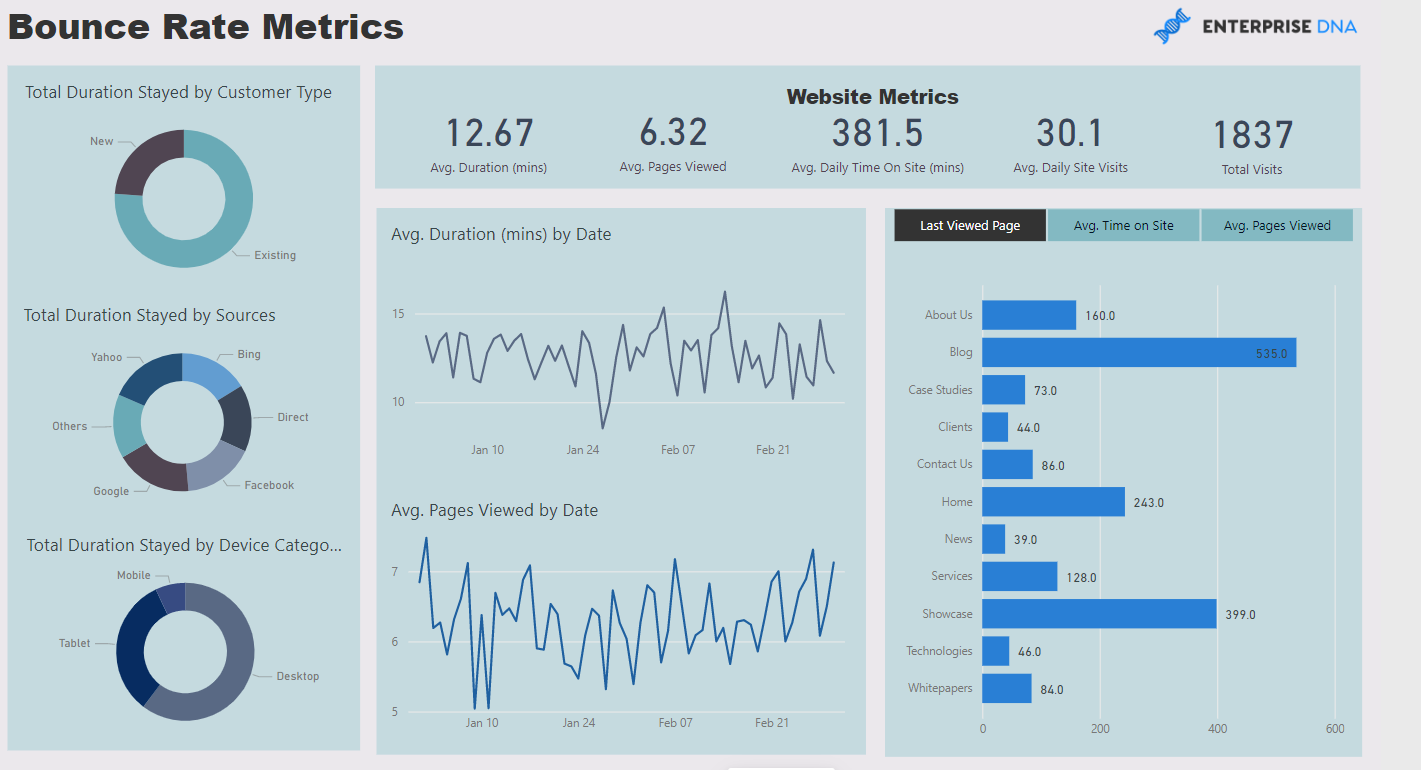
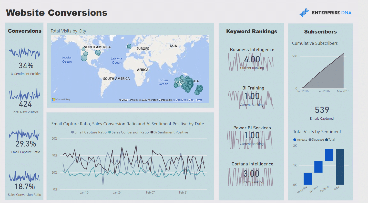
14. Website Analytics Report
The Website Analytics report offers a thorough examination of the company’s website and user activity. Users can analyze important website features like traffic source, device, age group, and more in the report.
The report offers helpful insights into the company’s worldwide audience and offers the option to evaluate website data by geographic location.
Users can discover areas for development and make adjustments based on actual website data thanks to the report’s spotlight on the website’s entry and exit points.
For companies aiming to boost their online visibility and engagement, the Website Analytics report is a crucial resource.
To see more Power BI reports, you can click here
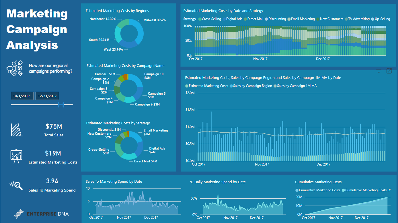
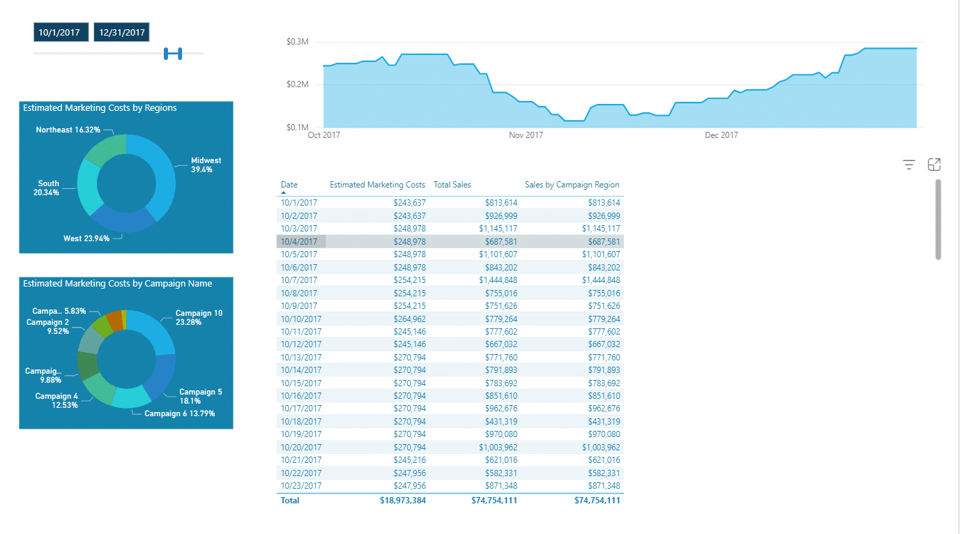
15. Advertising Campaigns Report
The Advertising Campaigns report can assist you in determining which campaigns are engaging and creating the most interest from your intended audience and which ones are underperforming.
You can use this data to make data-driven decisions about where to spend your marketing budget, modify your messaging and targeting techniques, and optimize your campaigns to get better outcomes.
This strategy can assist you in achieving your marketing goals more successfully and efficiently, which will boost your return on investment and enhance your company’s performance.
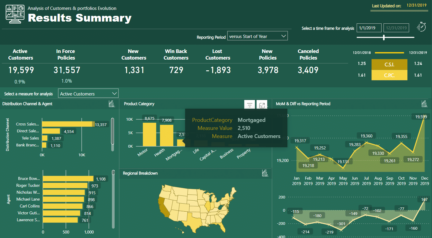
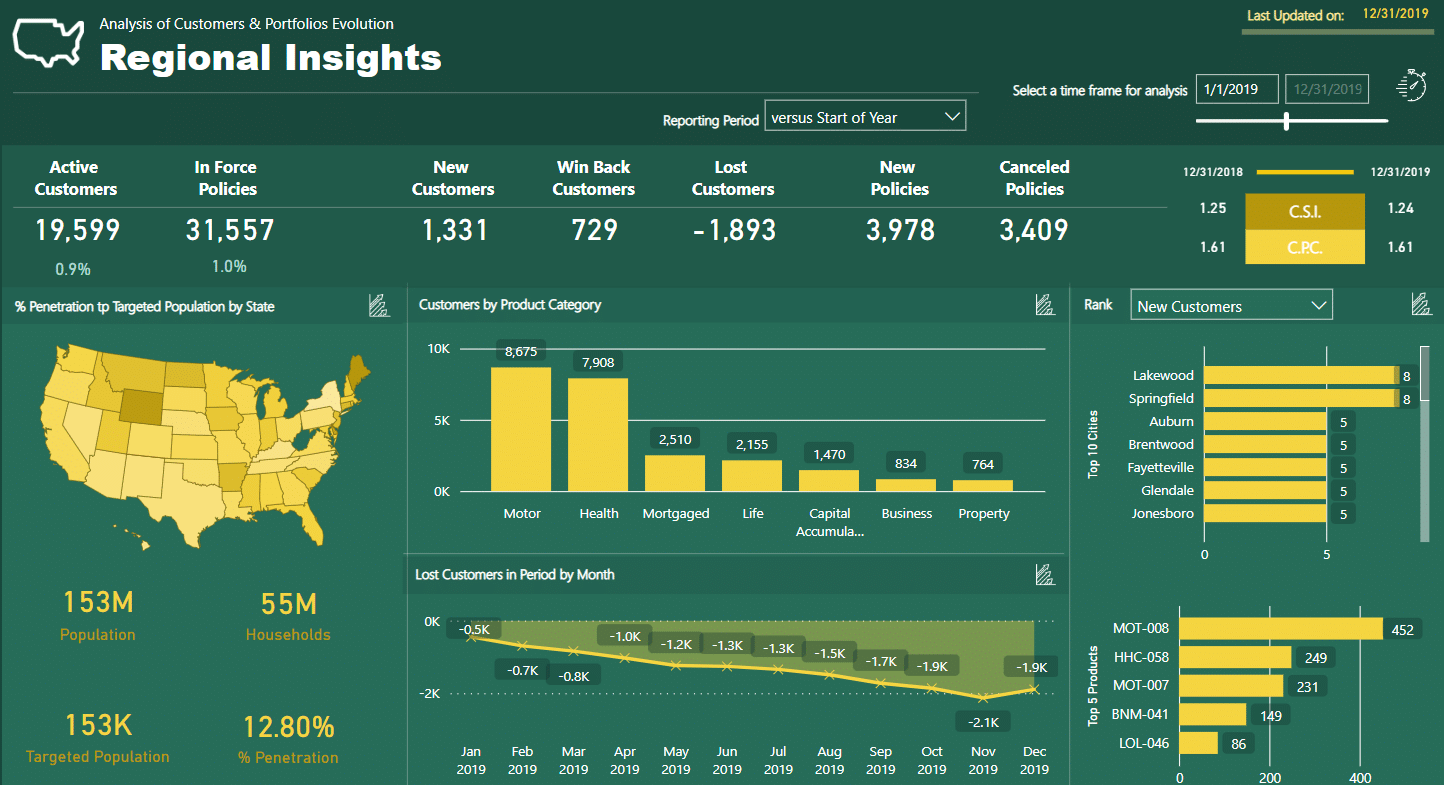
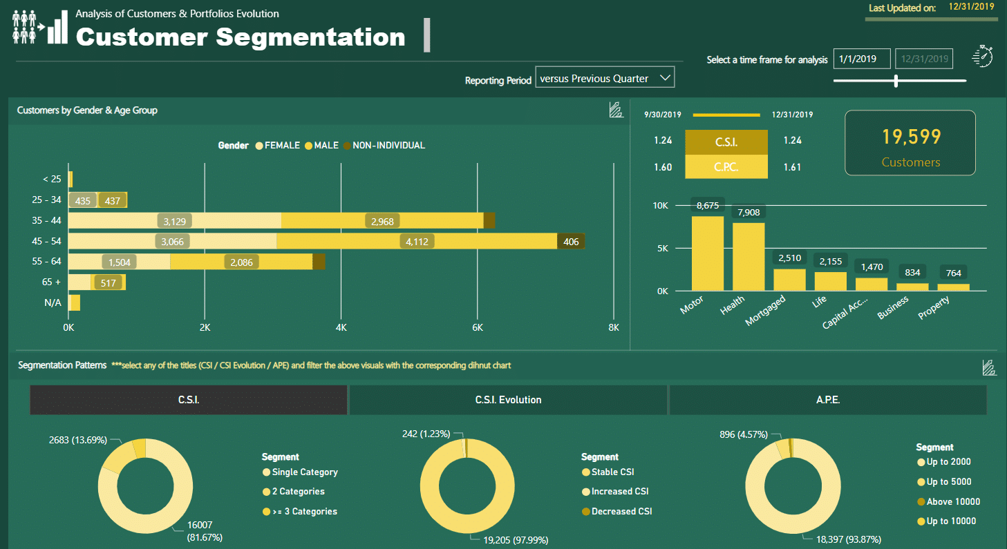
16. Insurance Portfolio Analysis Report
The Insurance Portfolio Analysis report is a comprehensive report designed to help organizations determine who their active consumers are, which product categories sell insurance quickly, and which distribution channels work best.
The report offers consumers a variety of visualizations that allow them to acquire insights into their insurance sales success.
This data is crucial in assisting organizations in identifying areas for improvement and optimizing their sales operations. This report also includes information on consumer demographics, product categories, and sales performance measures.
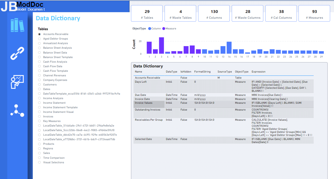
17. Data Documentation Report
A Data documentation report helps businesses and organizations can immediately spot patterns and trends in their data, making it simpler to make informed choices.
Advanced scripting is also used to collect huge amounts of data in a structured and organized manner, guaranteeing the accuracy and dependability of the data.
18. Health Services Analytics Report
The Health Services Analytics report is a well-designed tool that uses timelines, drill-through, and hovering techniques to efficiently approach the data from four distinct viewpoints.
The report provides customers with a comprehensive overview of healthcare data, allowing them to identify trends, patterns, and anomalies in the data. It also includes information on a wide range of health services, such as patient demographics, medical procedures, and healthcare provider contact information.
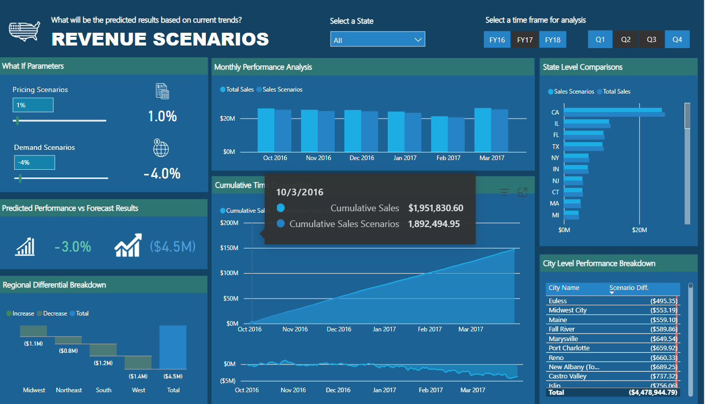
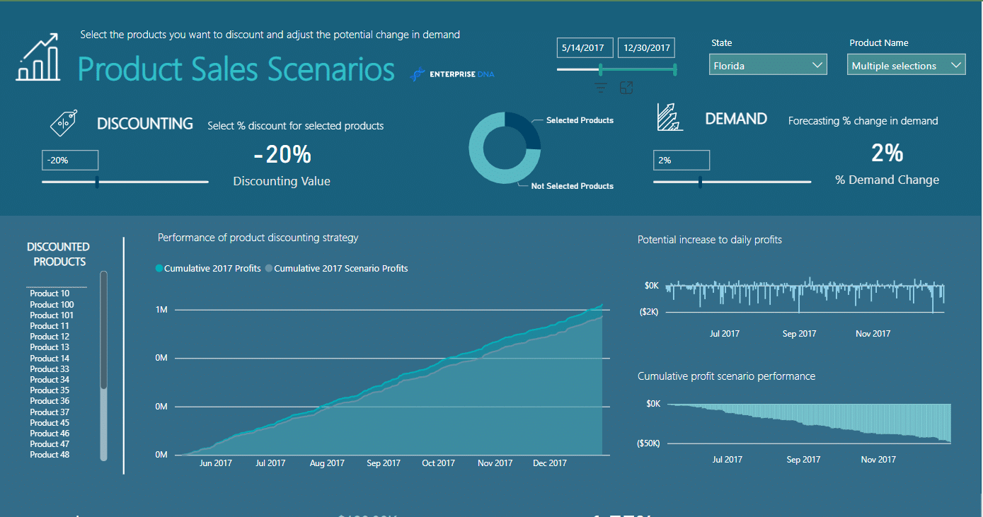
19. Product Discounting Scenarios Report
Users can create unlimited “what if” scenarios for product discounting strategies using the Product Discounting Scenarios report. This enables users to evaluate the efficiency of various discounting strategies and monitor crucial performance metrics.
This report gives customers a clear picture of their discounted data so they can decide what to do and how to best employ their strategies. It is also designed to be very adaptable, enabling customers to modify the scenarios to meet their own needs and specifications.
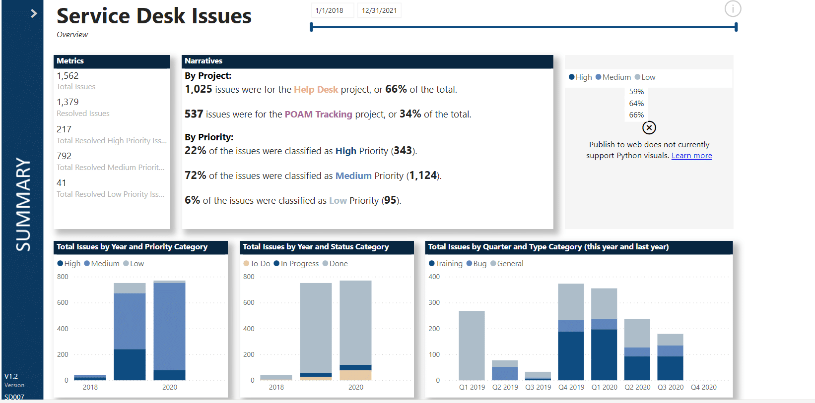
20. Service Desk Issues Report
The Service Desk Issues report is intended to assist companies in managing and keeping track of their projects. Businesses can use it to identify which projects are producing the greatest problems and how many of them are of high priority.
Businesses can also use the application to keep track of these issues’ statuses and concentrate on those that are still “To Do” or “In Progress.” Through this report, businesses can spot possible bottlenecks in their projects using the Service Desk Issues tool and take proactive steps to prevent delays.
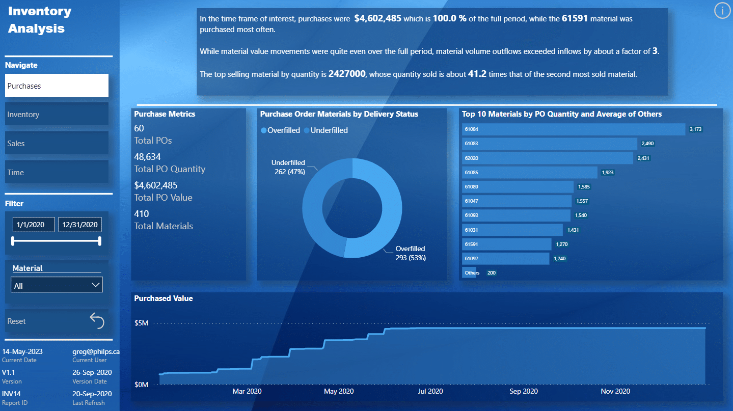
21. Inventory Analysis Report
The Inventory Analysis report is a tool that assists organizations in analyzing their inventory data. The report employs several bookmarks to make a single-page report appear multi-page. The report offers consumers a variety of visuals to help them acquire insights into their inventory data.
This data is crucial in assisting firms in identifying areas for improvement and optimizing their inventory management procedures. The report includes information on-premises, such as inventory levels, stock movements, and reorder points.
Creating Power BI reports is a fundamental skill that can help you visualize and analyze your data effectively.
Now that we’ve covered the top 21 Microsoft Power Bi reports, we’ll examine the basic steps of how to create them.
Let’s get to it.
How to Create Power BI Reports
When creating reports in Microsoft Power BI, you can use two main tools: Power BI Desktop and Power BI Service. Both tools have strengths and weaknesses, so it’s important to understand when to use each and the major differences between them.
1. Using Power BI Desktop
Power BI Desktop is a powerful tool that allows you to create rich, interactive reports with a wide range of visualizations and data sources. Here are the basic steps to create a report in Power BI Desktop:
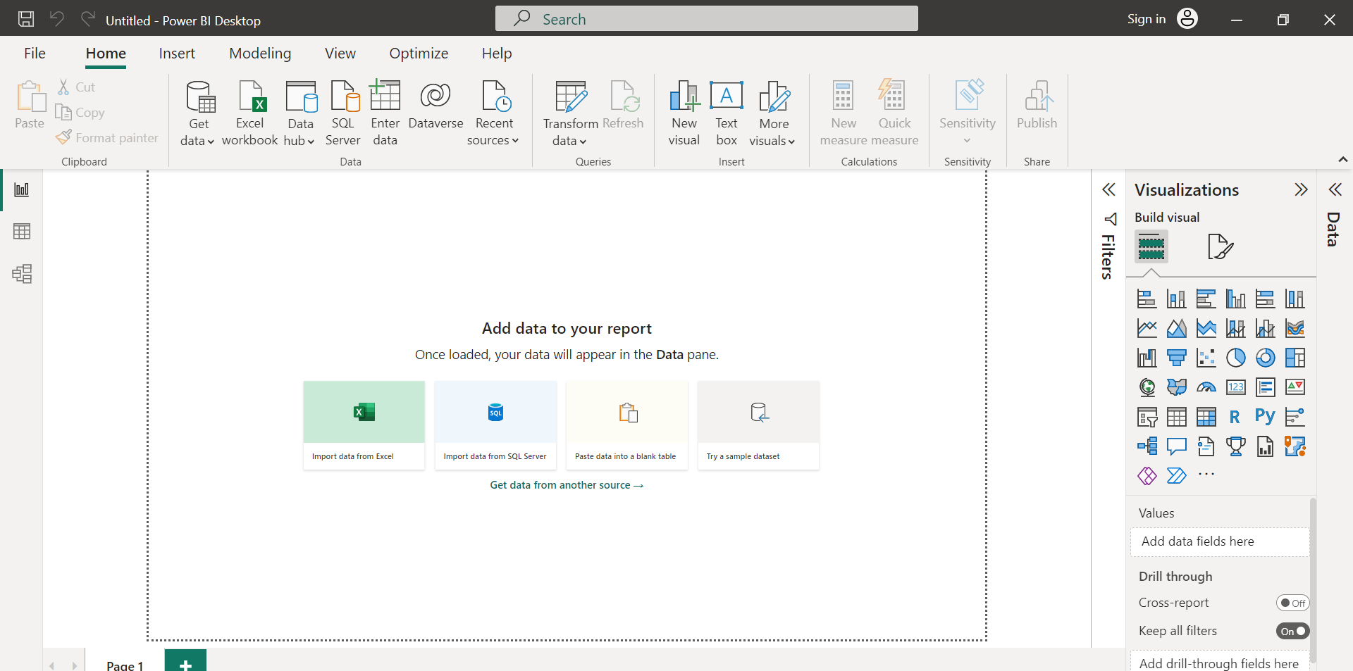
Connect to your data source: Power BI Desktop supports a wide range of data sources, including Excel, SQL Server, and many others. You can also connect to cloud-based data sources like Azure SQL Database and Salesforce.
Create your dataset: Once you’ve connected to your on-premises or cloud data warehouse, you can create a dataset that defines the fields and relationships you want to use in your report. You can also explore data transformations and calculations to prepare your data for visualization.
Design your report: With your underlying dataset in place, you can start designing your report. Power BI Desktop provides a wide range of visualizations and customization options to create a report that meets your specific needs.
Publish your report: Once you’re happy with it, you can publish reports to the cloud, where you can share them with others and collaborate.
2. Using Power BI Service
Power BI Service is a cloud-based tool that allows you to create, view, and share reports from anywhere. Here are the basic steps to create a report:
Connect to your data source: Like Power BI Desktop, Power BI Service supports a wide range of sources, including Excel, SQL Server, and many others. You can also connect to cloud-based services like Azure SQL Database and Salesforce.
Create your dataset: Once you’ve connected to your data source, you can create a dataset that defines the fields and relationships you want to use in your report. You can also perform data transformations and calculations to prepare your data for visualization.
Design your report: With your dataset in place, you can start designing your report. The program provides a wide range of visualizations and customization options, so you can create a report that meets your specific needs.
Share your report: Once you’re happy with your report, you can share it with others by publishing it to the cloud. You can also collaborate on the report with others, allowing them to view, edit, and comment on the report.
Creating Power BI reports can be a powerful way to visualize and analyze your data. Whether you’re using Power BI Desktop or Power BI Service, a wide range of tools and options are available to help you create the perfect report for your needs.
Having established how to create a Power BI report, we’ll move on to explore how to design interactive Power BI reports.
How to Design Interactive Power BI Reports
When designing your reports, creating interactive elements that engage your audience and allow them to explore the data more meaningfully is important.
Here are some tips for creating interactive reports to keep your audience engaged.
1. Adding Filters
Adding filters to your report is an easy way for your audience to interact with the data. Filters can be added to any visual in your report and can be used to highlight specific data points or to drill down into the data.
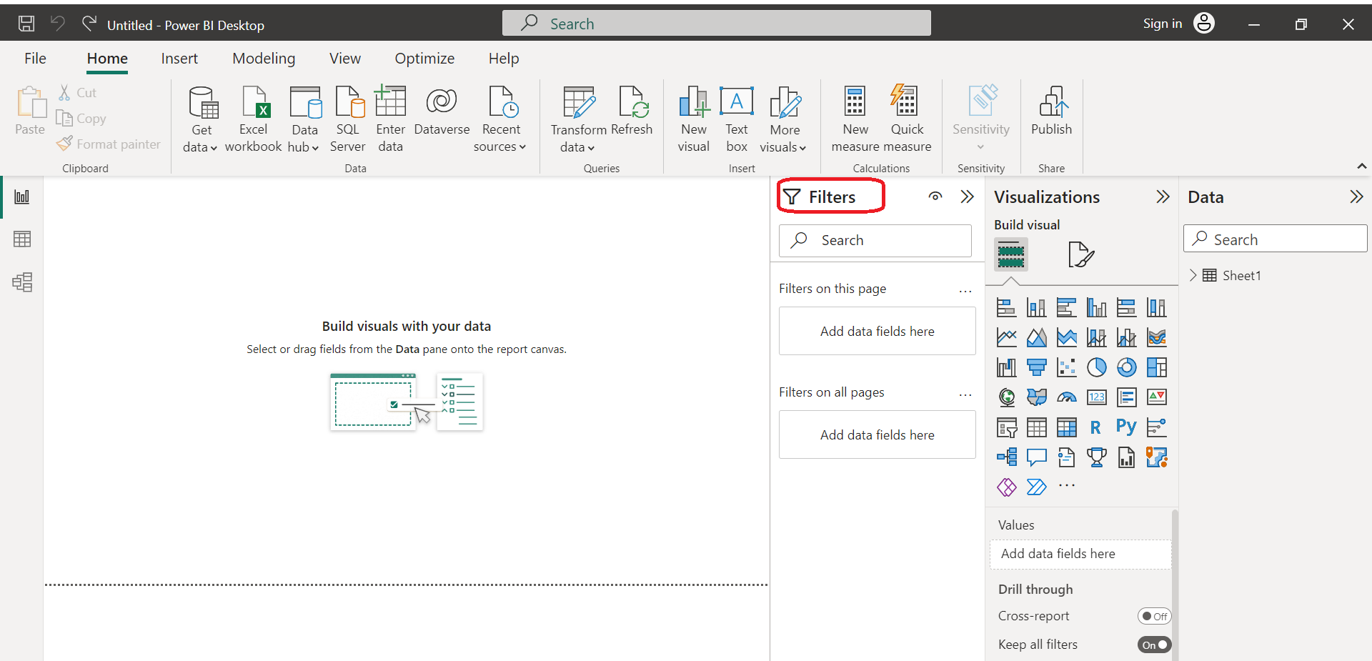
To add a filter, simply select the visual you want to filter and click on the “Filters” button in the Visualizations pane.
You can then select the field you want to filter by and choose the type of filter you want to apply. Power BI offers a variety of filter types, including basic, advanced, and relative date filters.
2. Creating Bookmarks
Bookmarks are a powerful Power BI solution that allows you to save the state of your report and return to it later. This is especially useful when you have a complex report with multiple pages or when you want to highlight specific data points.
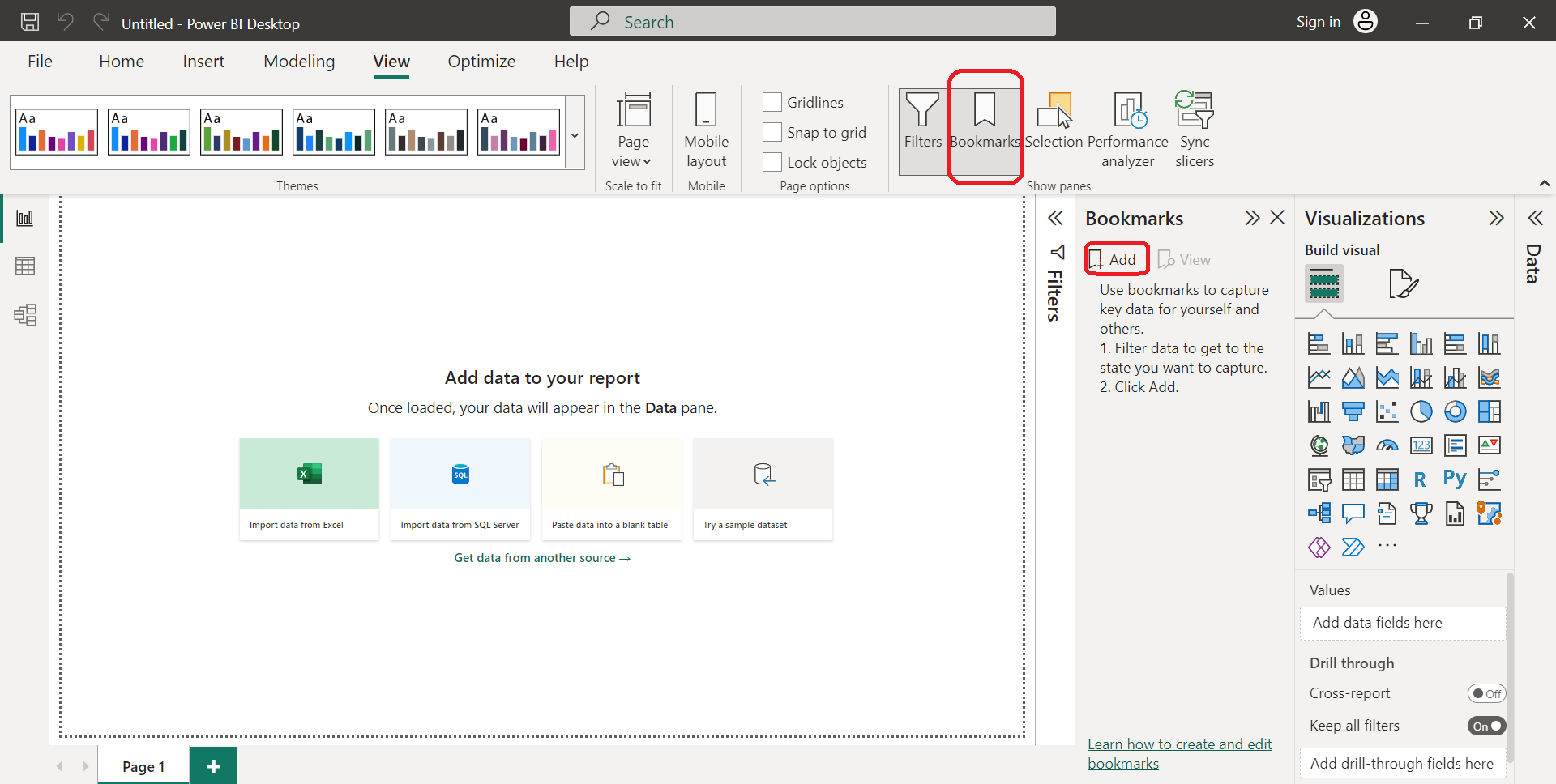
To create a bookmark, simply navigate to the page or visual you want to bookmark and click on the “Bookmark” button in the Visualizations navigation pane below. You can then give your bookmark a name and choose whether to include the current filter state and drill-down state.
3. Adding Comments
Adding comments to your report is a great way to provide additional context or insights into the data. Comments can be added to any visual in your report and can be used to highlight specific data points or to provide additional information.
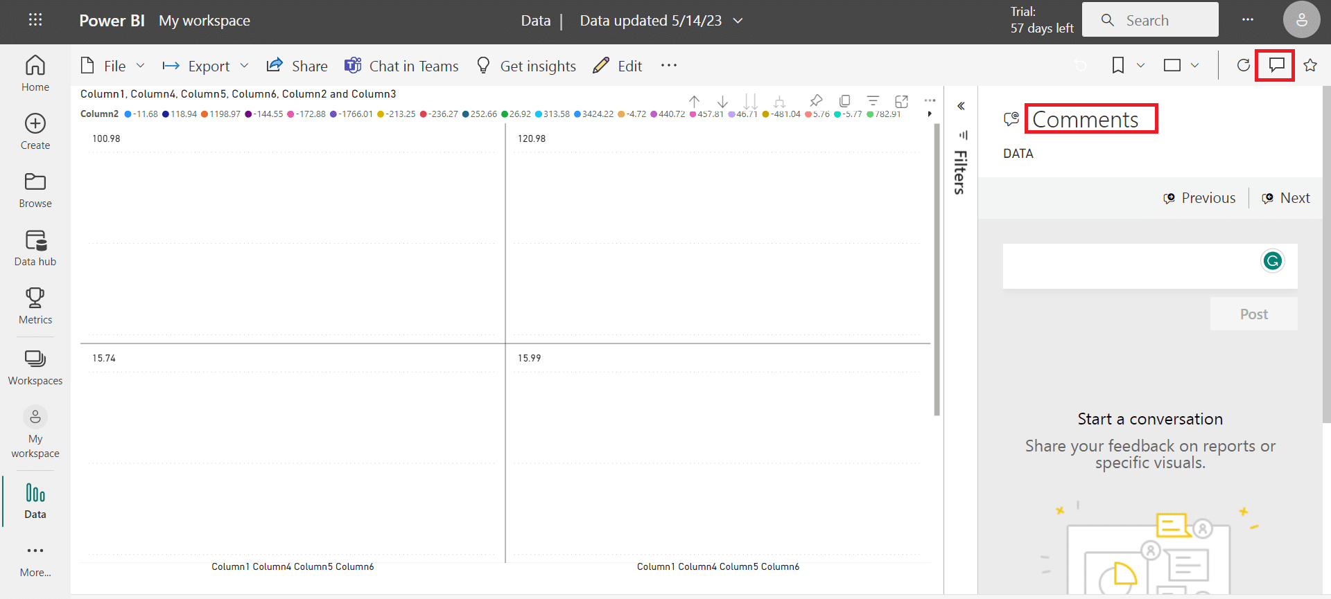
To add a comment, simply select the visual you want to comment on and click on the “Comment” button in the Visualizations pane. You can then enter your comment and choose whether to make it public or private.
Adding filters, bookmarks, and comments to your reports allows you to create interactive and customizable reports that engage your audience and provide valuable insights into the data.
Next, we’ll examine sharing and collaborating on Power BI reports.
How to Share and Collaborate on Power BI Reports
Sharing and collaborating on reports is an essential aspect of Power BI. It helps business users to work together and share insights with their colleagues.
This section will discuss the two main ways to share and collaborate on reports: Publishing and Sharing Reports and Collaborating on Reports.
1. Publishing and Sharing Reports
To share a report, you need to publish it first. Once you have published a report, you can share it with others inside or outside your organization. Here are the steps to publish and share a report in Power BI:
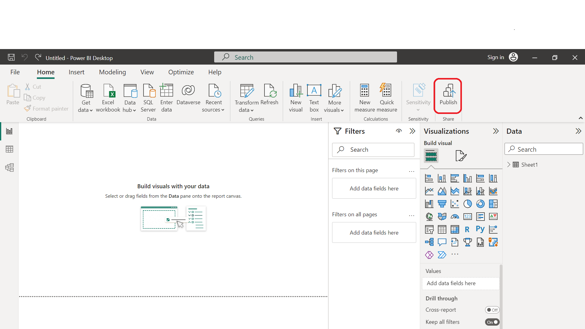
Open the report you want to share in Power BI Desktop.
Click on the Publish button in the Home tab.
Select the workspace where you want to publish the report.
Enter a name and description for the report.
Click on the Publish button to publish the report to the cloud.
Once you have published the report, you can share it with others. To share a report, follow these steps:
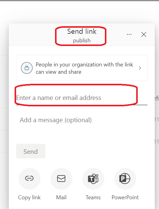
Open the report.
Click on the Share button in the top-right corner.
Enter the email addresses of the people you want to share the report with.
Choose whether you want to allow them to edit the report or just view it.
Click on the Share button to share the report.
2. Collaborating on Reports
Collaborating on reports allows you to work together with your colleagues to create and edit reports. Here are some ways you can work with others:
Power BI community: The Power BI community is an online forum where you can connect with other Power BI users, ask questions, and share your knowledge. You can collaborate on reports by posting your questions or ideas in the community and getting feedback from other users.
Mobile app: The mobile app allows you to view and share reports on your mobile device. You can collaborate on reports by sharing them with your colleagues through the mobile app and getting their feedback.
Power BI service: The cloud service allows you to collaborate on reports with your colleagues in real-time. You can work together on the same report, make changes, and see the changes as they happen.
Business users: Business users can collaborate on reports by sharing their insights and ideas with their colleagues with a Power BI pro license. They can also provide feedback on the reports and suggest changes to improve them.
Sharing and collaborating on reports is an essential aspect of the software. It allows business users to work together and share insights with their colleagues.
By following the steps outlined in this section, you can easily publish and share reports and collaborate with your colleagues to create and edit reports.
We’ll move on to the next section by covering how to export and share data.
How to Export and Share Data in Power BI Report
If you’re working with Power BI reports, you’ll likely need to export and share data at some point. Fortunately, the software offers several options for both exporting and sharing data, making it easy to collaborate with your team and stakeholders.
1. Exporting Data
Exporting data from reports is a straightforward process. To transfer data from a report visual, simply select the visual, then select More options (…) > Export data.
From there, you can choose a location for the .csv file and edit the file name if needed. Once you’ve saved the file, you can share it with others as needed.
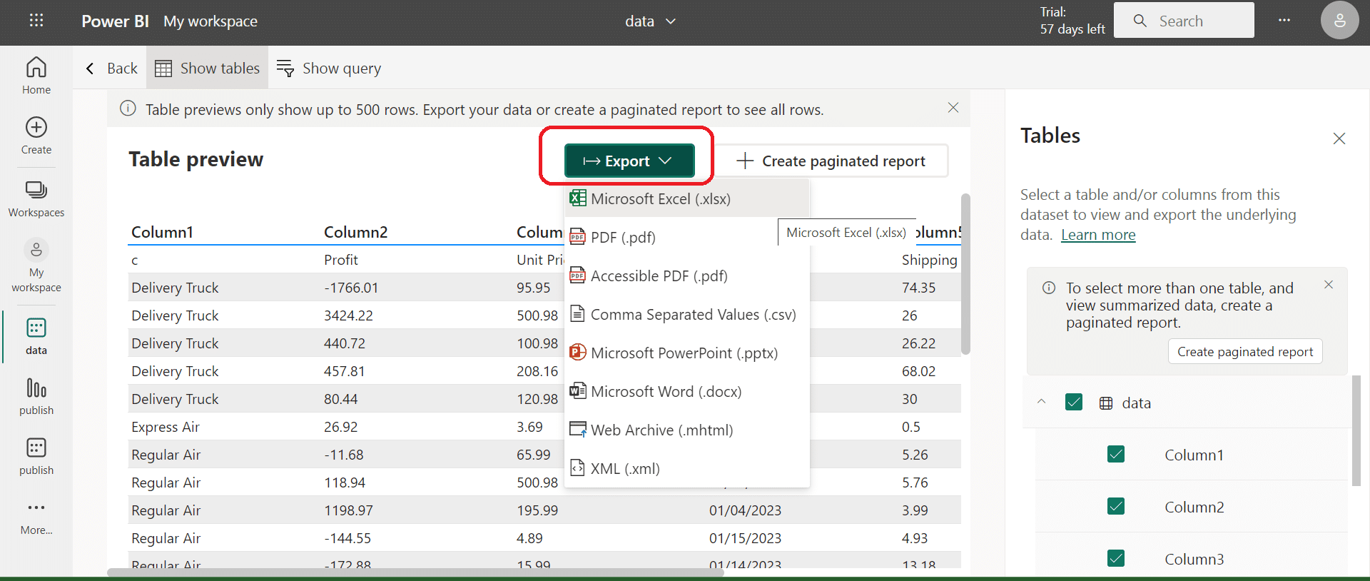
The tool also offers other options for exporting data, such as exporting data from Power BI dashboards.
To transfer data from a dashboard, simply select the Export data option from the dashboard menu. You can also do the same from a report using that option from the More Options menu.
2. Sharing Reports on Mobile Devices
Power BI makes sharing reports on mobile devices easy, allowing you to collaborate with your team and stakeholders even when you’re on the go.
To share your report, simply select the Share option from the report menu. From there, you can share the report via link or email or share it directly with other users.
In addition to sharing reports, you can also share dashboards and individual visuals on mobile devices. To share a dashboard or visual, simply select the Share option from the dashboard or visual menu. From there, you can share the item via link or email or share it directly with other users.
Overall, Power BI offers a range of options for exporting and sharing data, making it easy to create a detailed tabular report and collaborate with your team and stakeholders.
Whether you’re working on a desktop or a mobile device, you can easily export and share information from your data warehouse with just a few clicks.
We’ll progress by reviewing how to create metrics and dashboards in Power BI in the next section.
How to Create Metrics and Dashboards in Power BI
You need to create metrics and dashboards to get the most out of your data in Power BI. Metrics are key performance indicators (KPIs) that help you track your company goals.
Dashboards are collections of visualizations that help you monitor your metrics and make informed decisions.
1. Creating Metrics
To create a metric in Power BI, you need to follow these steps:
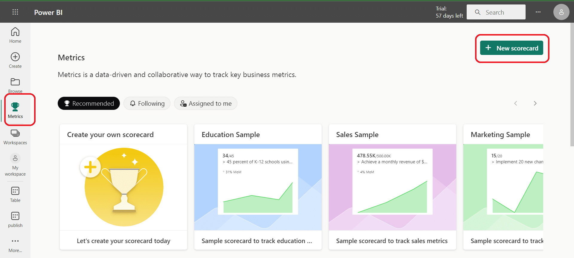
Open Power BI and go to the workspace where you want to create the metric.
Click on the “Create” button and select “Metric” from the dropdown menu.
Choose the data source for your metric and select the measure you want to use.
Customize your metric by adding a title, description, and target value.
Save your metric and add it to a dashboard.
2. Creating Dashboards
To create a dashboard in Power BI, you need to follow these steps:
Open Power BI and go to the workspace where you want to create the dashboard.
Click on the “Create” button and select “Dashboard” from the dropdown menu.
Choose the visualizations you want to add to your dashboard and customize them.
Add your metrics to your dashboard by clicking on the “Add Tile” button and selecting “Metric.”
Customize your dashboard by adding a title, description, and filters.
Share your dashboard with your team by publishing it to the Power BI service.
Best Practices for Metrics and Dashboards
To get the most out of your metrics and dashboards, you should follow these best practices:
Keep your metrics simple and focused on your business goals.
Use visualizations that are easy to understand and interpret.
Update your metrics regularly to ensure they reflect the latest data.
Share your dashboards with your team to encourage collaboration and informed decision-making.
Use filters to drill down into your data and identify trends and insights.
By following these best practices, you can create metrics and dashboards that help you monitor your business goals and make informed decisions. Power BI makes it easy to create and customize metrics and dashboards, so you can get started right away.
If you want to learn how to create paginated reports, keep reading as we’ll go over that in the next section.
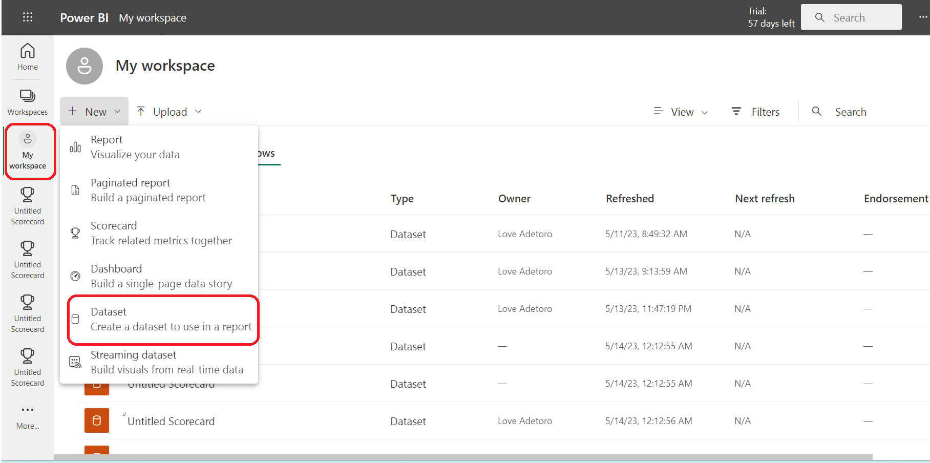
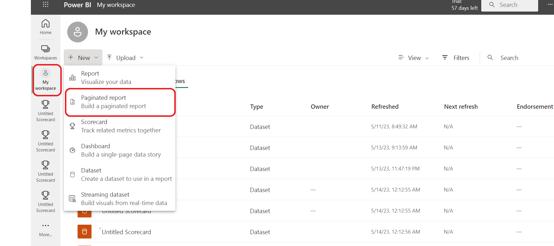
How to Create Paginated Reports Using Power BI
If you need to create and distribute highly formatted, pixel-perfect reports, Power BI Paginated Reports is the way to go.
These reports provide a way to print and distribute data in a structured and organized format that is easy to read and understand.
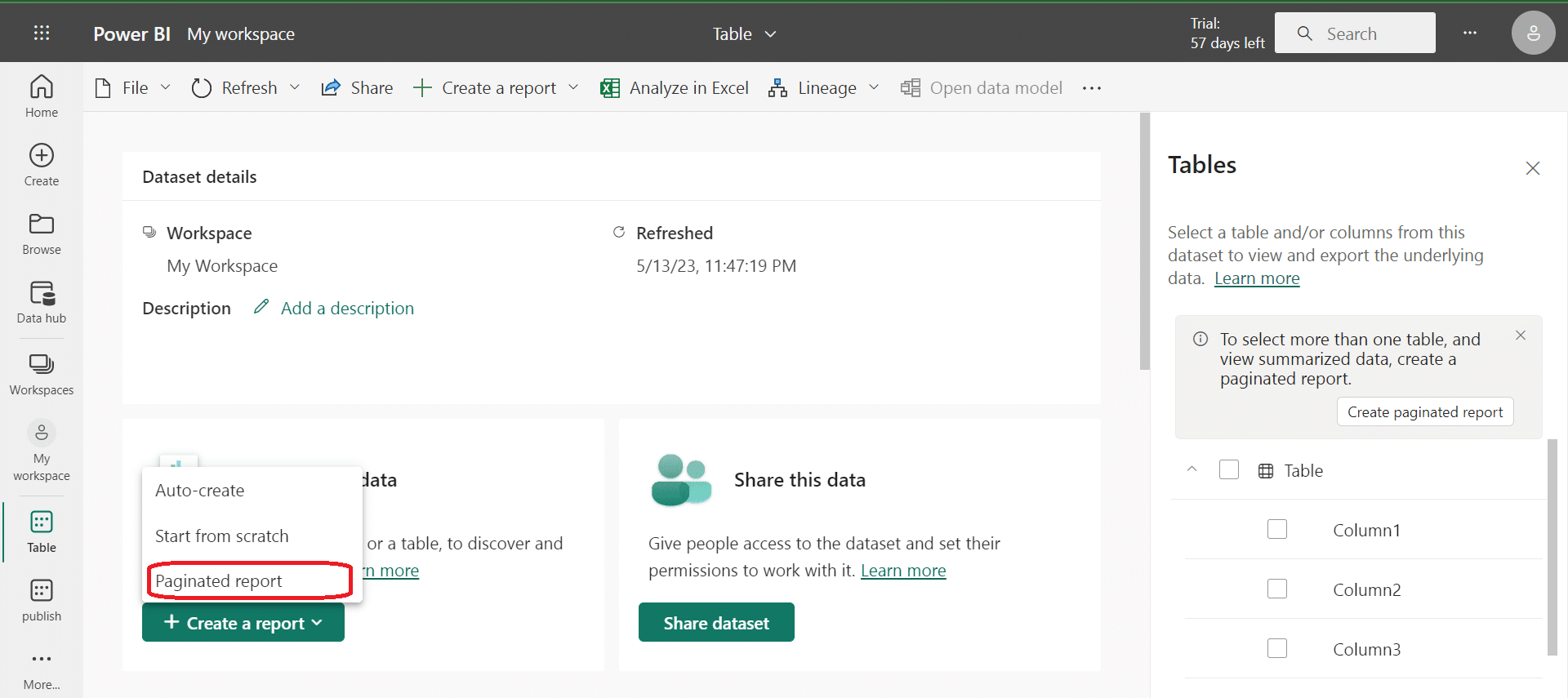
To create a paginated report, you can use Power BI Report Builder or the Power BI service. Report Builder is a standalone tool that you can download and install on your computer. The Power BI service is a cloud-based platform that you can access through a web browser.
Once you have created your report, you can publish it to the Power BI service, where you can manage and distribute it to your users. You can also schedule the report to be delivered to your users via email.
Paginated reports are a great way to create and distribute reports that require a high level of precision and formatting. They are particularly useful for financial reports, invoices, and other documents that require a consistent layout and design.
When you create a paginated report, you can use a variety of info sources, including SQL Server, Oracle, and Excel. You can also use shared data sets, which allow you to reuse data across multiple reports.
Overall, paginated reports are a powerful tool for creating and distributing highly formatted reports. Whether you are a financial analyst, a business owner, or a data analyst, paginated reports can help you to present your data in a clear and organized way.
Note: A free Power BI license lets you publish paginated reports to your workspace only. If you want to publish your reports in other workspaces, then you’ll need a Power BI Pro license. To learn more about the differences between Power BI Pro and Power BI Premium licenses, check out this in-depth article.
Now that we have established how to create paginated reports on Power BI, we will discuss some of the best practices to keep in mind when creating data visualizations in your reports and dashboards.
Data Visualization Best Practices in Power BI Reports
When creating Power BI reports, it’s important to follow best practices for data visualization to ensure that your reports are effective in conveying insights to your audience. Here are some tips to keep in mind:

1. Choose the Right Visualization for the Data
Different types of data require different types of visualizations. For example, a line chart is useful for showing trends over time, while a scatter plot can help identify correlations between two variables. Make sure to choose the right visualization for the data you’re working with.
2. Keep it Simple and Easy to Read
Your visualizations should be simple and easy to read. Avoid cluttering your reports with too many visualizations or unnecessary details. Use clear labels and color schemes that make it easy to understand the information presented.
3. Use Consistent Formatting
Consistent formatting is key to creating a professional-looking report. Use the same font, color scheme, and formatting throughout your report to create a cohesive look and feel.
4. Highlight Key Insights
Use visualizations to highlight key insights and trends in your data. This can help your audience quickly understand the most important information in your report.
5. Use Interactive Visualizations
Power BI allows you to create interactive visualizations that allow your audience to explore the data on their own. Use these features to create engaging reports that keep your audience engaged.
By following these best practices for data visualization, you can create effective Power BI reports and dashboards that convey insights to your audience in a clear and concise manner.
Final Thoughts

Power BI reports are highly customizable, allowing users to design visually appealing dashboards and reports that suit their specific needs.
The interactive nature of the reports enables users to drill down into the data, apply filters, and explore different angles to gain deeper insights.
Furthermore, Power BI reports can be easily shared and accessed by multiple users, both within and outside the organization with Power BI Pro and Power BI Premium licenses, ensuring that stakeholders can access data that are important and up-to-date information.
Whether you are a business user or a data analyst, Power BI can help you create reports that can help you make better business decisions. So, start exploring how Power BI works today and see how it can help you transform your data into actionable insights!
If you want to explore more awesome power BI reports, check out the video below:


