In this showcase, we’re going to discuss the Power BI finance dashboard examples that display the financial performance of an organization. You may watch the full video of this tutorial at the bottom of this blog.
We’ll be looking at the common key metrics used by the finance team of a large corporation.
The finance team would ordinarily be part of the head office. They’d have full visibility over key data, such as, Sales, Profit Margin, the products, and clients.
In this example, the business sells its products across the Asia-pacific area.
Sales Summary
The first report is a quick snapshot of the organization’s sales information.
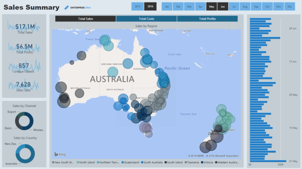
The filter technique implemented in this report allows us to harvest calculations regardless of their complexity. The filters are linked up to the data model.
With this, we can dynamically look at our financial information on a regional basis. We can also view the Sales, Costs, and Profits per city or region. This report also allows us to view our data within a specified time horizon.
All this is made possible through the dynamic filtering technique used in this report.
For example, if we want to look at the Total Profits for New Zealand, all we have to do is click on the corresponding chart or filter.
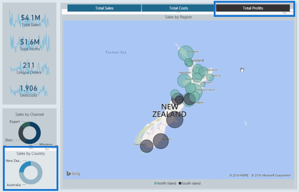
After making a selection, the information in the report will automatically update.
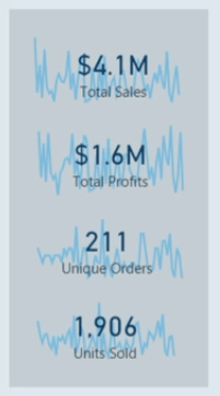
We also have some sparklines that highlight trends that might occur over time.
Regional Product Sales
The second report in this showcase provides a detailed breakdown of our financial data over a regional basis.
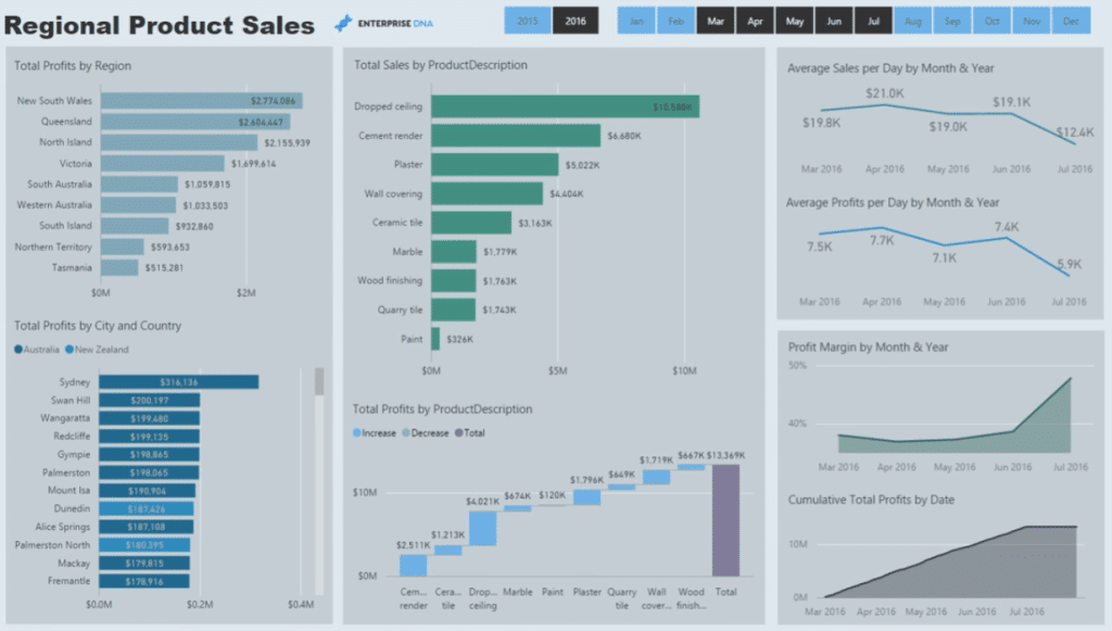
If we want to look at a specific region, all we have to do is select it. As an example, let’s look at Victoria.
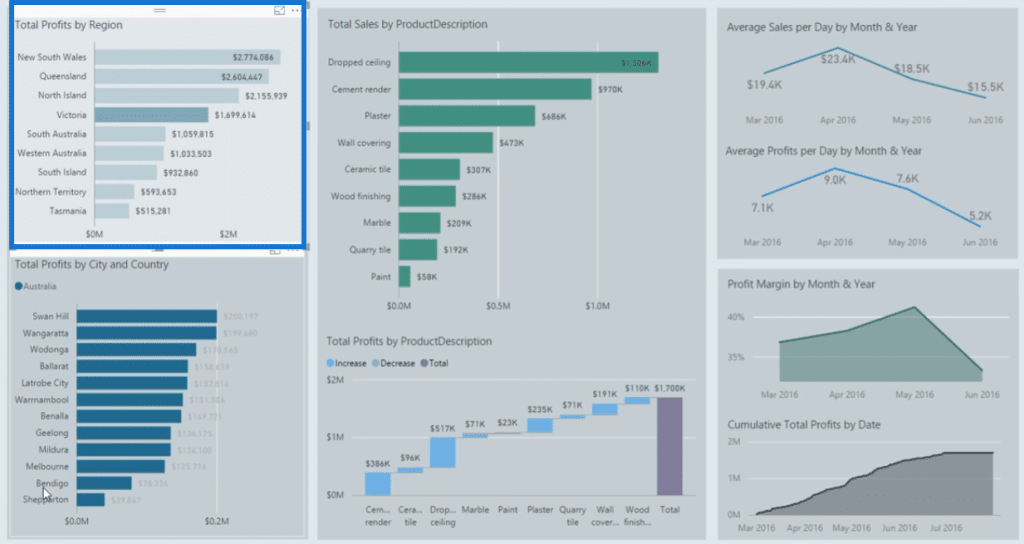
Now, we have a good view on how our Profits are performing in the cities or markets in Victoria.
We can also view our Profits from a product perspective. We can further drill into a specific product to get its information.
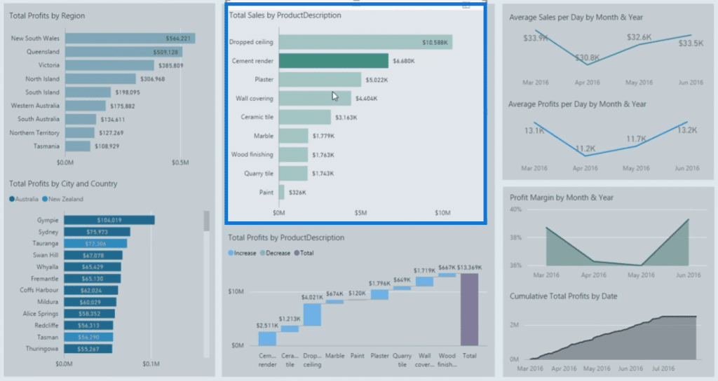
There’s also information on our Sales:
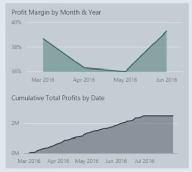
Product Performance
In this next report, we’re focusing on our products’ margins.
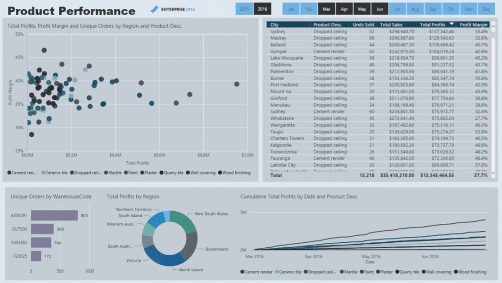
There’s information on Total Sales and Profits. We can also further look into the disparity in the Margins per region and product.
This report also has a line chart. Clicking on data within this chart will automatically filter the information shown in the report.
For instance, if we want to look at a product’s Sales or Profit Margins based on Cumulative Sales, we simply need to make the selection on the line chart.
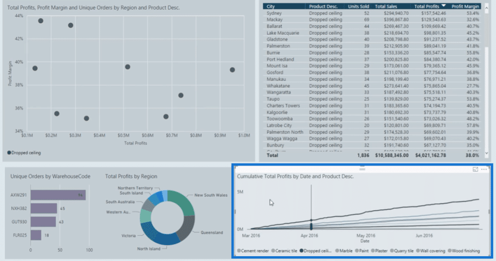
We can then see the difference in Margins between regions and products.
Furthermore, we also have information on individual orders. With this, we can easily analyze why some orders within the same region have different margins.
This report is a great source of analysis for the Sales and Finance team in the organization.
Customer Review
The last report in this showcase provides a great review on the status of our customers.
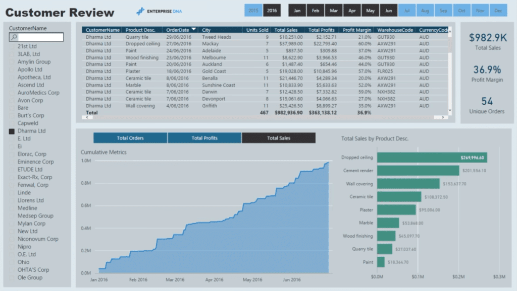
We can select specific customer names and then see the Total Orders, Profits, and Sales we’ve achieved through a client.
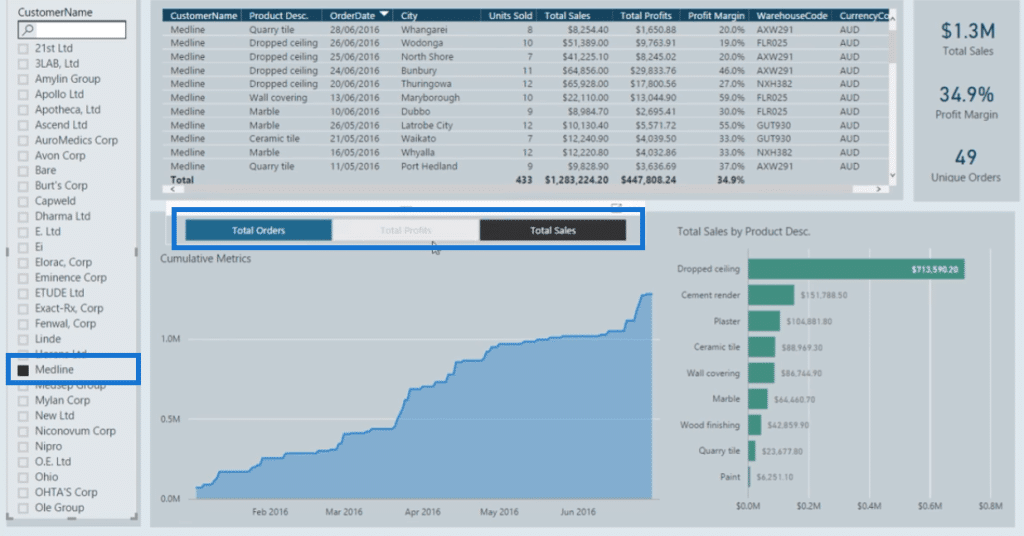
With this report, it would be easy to understand why there’s a drop or increase in customer performance.
We can further drill into the report and retrieve information on a per client and per-product basis.
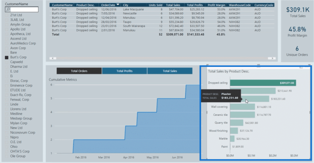
Another tool within this report is the search bar for customer names.
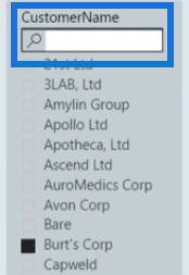
This is great for instances where we have long lists of clients. Instead of endlessly scrolling through a list, we can easily navigate by typing in their name.
***** Related Links *****
Power BI Financial Reporting Tips and Techniques For Accounting & Finance
How To Create Profit And Loss (P&L) Statements In Power BI
Creating Compelling Power BI Dashboards With High Quality Insights
Conclusion
The Power BI finance dashboard examples presented in this showcase offer a great source of analysis for the finance team or department in any corporate organization.
These dashboards are great benchmarks to use when creating company financial reports.
The insights we can get from each report help us to understand the reason for our good or poor financial performance, and what we can do to improve.
All the best,
Sam


