In this post, we’re going to look at an analytical insight where we find out if our profit margins grew together with our revenue. We can do this through the use of Power BI measure branching. You may watch the full video of this tutorial at the bottom of this blog.
This is important because we want to see if revenue expansion or getting the market share is actually good from a profitability perspective.

Are our margins actually improving or is the revenue growth just saturating the market and everyone’s margins including our own are actually contracting?
These are the sort of insights we’re trying to achieve today. I’ll walk you through the steps that I took to create this visualization. It’s not as difficult as you might think it is. This is just a matter of walking through a number of steps one after the other to achieve the insight we want through Power BI measure branching.

Total Sales
We have to start with our core calculations and create formula that finds those insights. To come up with revenue, we’ll just count up our sales or count up the the amount of revenue we make per transaction. I have achieved this using this formula:

[Timestamp 1:16 – Screenshot Formula and Highlight exact formula from SUMX to the end formula]
This is the one I needed to write to get what I want but yours might be slightly different. It might be easier for you and you might even have a revenue column. But in my case, I had to go to my Sales table where for every single row in the Sales table, I will count up then multiply the price. Then the SUMX will calculate all those sales to get the Total Sales.
Revenue Growth
We also want to look at our revenue growth. We don’t want to just look at sales because we want to see if our revenues and margins are increasing from a store basis.
We need to find out what the growth is and the way to do that is to branch under growth and work out if we’re above or below from a percentage perspective in the last time period result, which in this case is last year.
This is where the time intelligence functions come in. The DATEADD is the perfect function to utilize from a time comparison perspective. All I’m doing is jumping back one year.

YoY Growth
With this formula, I can find out my Year-on-Year growth by Total Sales minus Sales Last Year divided by Sales Last Year.

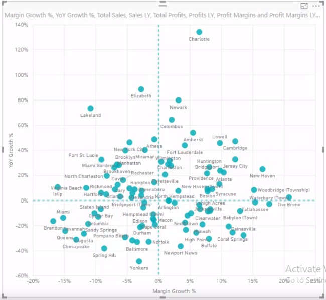
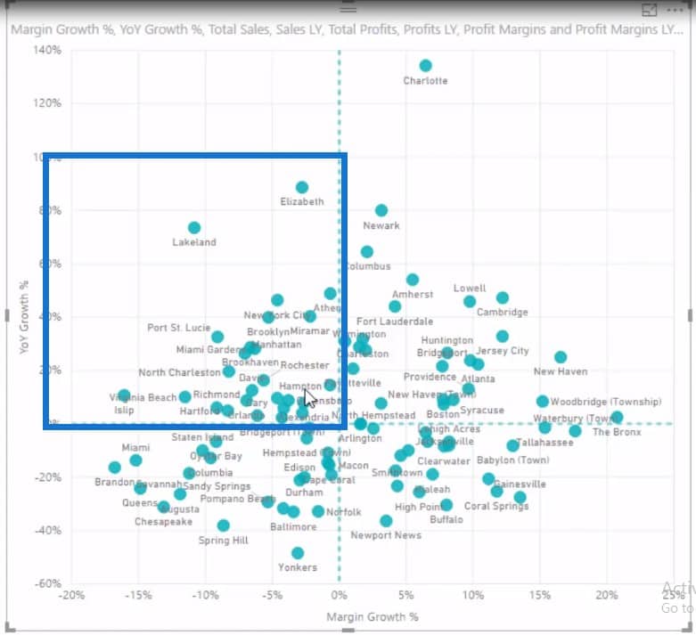
This will give us the percentage YoY growth right, which I’ve put into the axis on our scatter chart. We can see from a revenue growth perspective who’s doing well and who’s not doing well. Some of these stores are doing poorly, while some are doing really well, like Charlotte.
The store in Charlotte is doing extremely well since the revenue growth is up by 134% if we look at the tooltip.

Total Profits And Profit Margins
But then we have to find out what our margins are at the same time. Again, we start out from your core calculations and move on to the more advanced calculations. I always recommend doing this whenever possible.
We start out with our Total Profits by deducting Total Costs from Total Sales.

From Total Profits, we can then work out Profit Margins, which is just Total Profits divided by Total Sales.

Margin Growth
Now, we need to work out our Margin Growth and do exactly the same process as we went through for our Sales Growth. We have our core calculation in Profit Margins, so we just need to go and find out our Profit Margins Last Year. I put it inside the CALCULATE function and used the DATEADD function to jump back one year.

Then I can go and look at what my Margin Growth is by doing exactly the same formula as I did just before. This will give me the Percentage Margin Growth.

So now we have our Margin Growth and YoY Growth percentage. We’ll be putting these two things together to give us the insight because we want to see if margins expanded as revenue grew.
We have both of those calculations now and all we have to do is place them inside the scatter plot. We have every single store within a particular state in the scatter chart.
For instance, if I click on Florida, it is going to give me all my Florida stores.

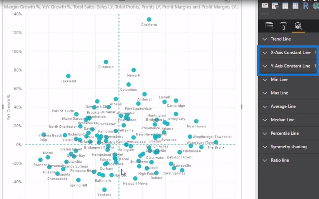
The scatter chart shows my Margin Growth % and YoY Growth %. I have filtered it by slicing every single store to give us the insight we want. To finish it off, I’ve actually put inside my scatter chart these two lines.
This is where the analytics function really comes into play. This analytics function is useful for scatter charts because you can do a lot inside here.
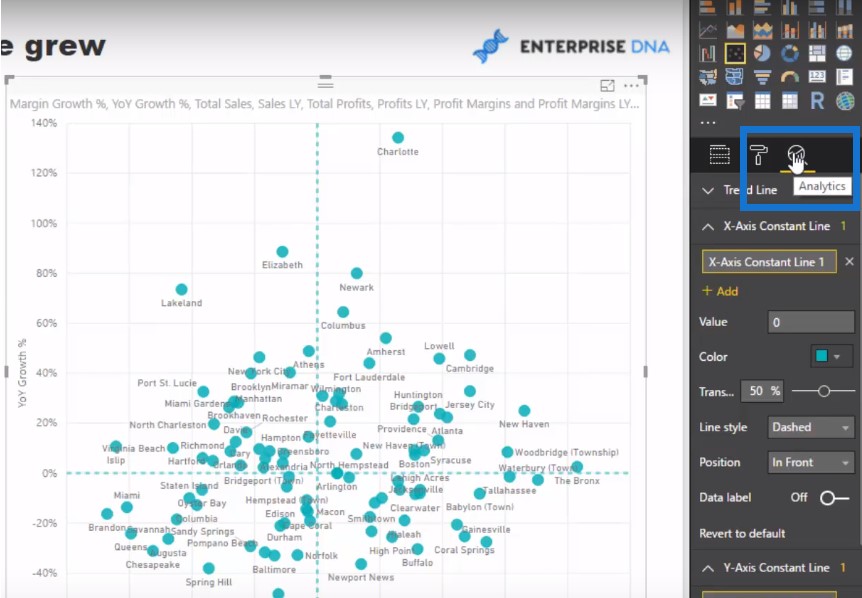
All I’ve done is put a constant line just to make it obvious where the 0% is in the x-axis and y-axis line. Then you can see it breaks it out into these small grids.
On the upper left quadrant, we can see there are customers that we need to understand where they are coming from and what is going on. We grew from a revenue perspective with these stores, but our margins decreased. Why is that?
I’ve also put a lot of detail into the tooltip. Let’s have a quick look at the Port St. Lucie store. The Sales Last Year was $108,463 and Sales This Year is $143,770 so we had a good uptick in both sales and profitability.

However, you can see that profit margins were at 33% last year and they’ve gone down to 30.29% this year. We’ve got good growth in sales and profitability from last year but for some reason the margins have contracted.
Does it have something to do with our competition? Was it due to our salespeople just trying to get stuff out the door to get rid of inventory? There are some of the insights you can achieve using the Power BI measure branching technique.
Conclusion
Think about how you can extend this. I’m just looking at this from a year-on-year perspective, but you can do a month-on-month or week-on-week one as well.
The key takeaway I want you to get from this is Power BI measure branching. Start simple and then you build your way out because you can reuse these core measures in multiple different ways. This is exactly how I build all of my models and work in all of my insights.
***** Learning Power BI? *****
FREE COURSE – Ultimate Beginners Guide To Power BI
FREE COURSE – Ultimate Beginners Guide To DAX
FREE – 60 Page DAX Reference Guide Download
FREE – Power BI Resources
Enterprise DNA Membership
Enterprise DNA Online
Enterprise DNA Events

***** Related Links *****
Power BI Trend Analysis: Are Margins Expanding Or Contracting?
Measure Branching – The Most Important Concept When Using DAX In Power BI
Calculating Percent Profit Margins Using DAX In Power BI
***** Related Course Modules *****
Business Analytics Series
Solving Analytical Scenarios w/Power BI & DAX
Power BI Super Users Workshop
***** Related Support Forum Posts *****
Power BI DAX Dynamic Ranking
Outlier Sales LY Visual
Incorrect Totals – Aggregated Full Amount
For more profit margin support queries to review see here….


