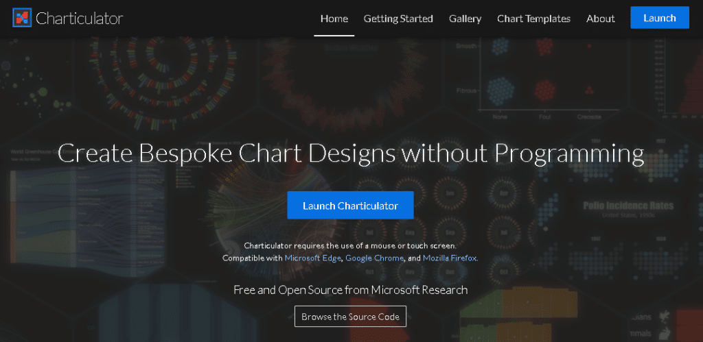
Today, I would like to go over something that I found out by scrolling through Twitter. What I have here is a picture of the home page of Charticulator, which allows you to build custom visuals in the Power BI desktop. You can watch the full video of this tutorial at the bottom of this blog.
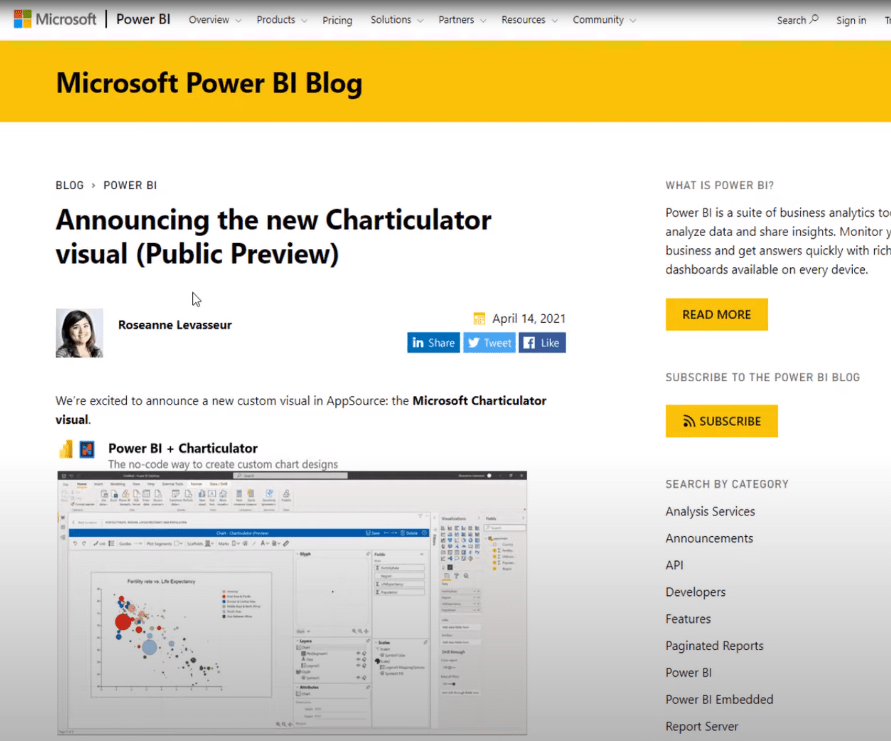
I opened up my phone and was scrolling through Twitter when I came across this tweet from Daniel Marsh-Patrick saying that Charticulator Visual is now available in public preview in the AppSource. I was like, “You have got to be kidding me!”

I clicked on the link and sure enough, it was like Christmas came early for me. I don’t know if you’re as excited for this as I am, but let’s go over to the Microsoft blog post announcement.
A Quick Guide To Using Charticulator Visual
The post provides a quick and dirty explanation of what Charticulator is and how to get started in using it from the Power BI desktop.
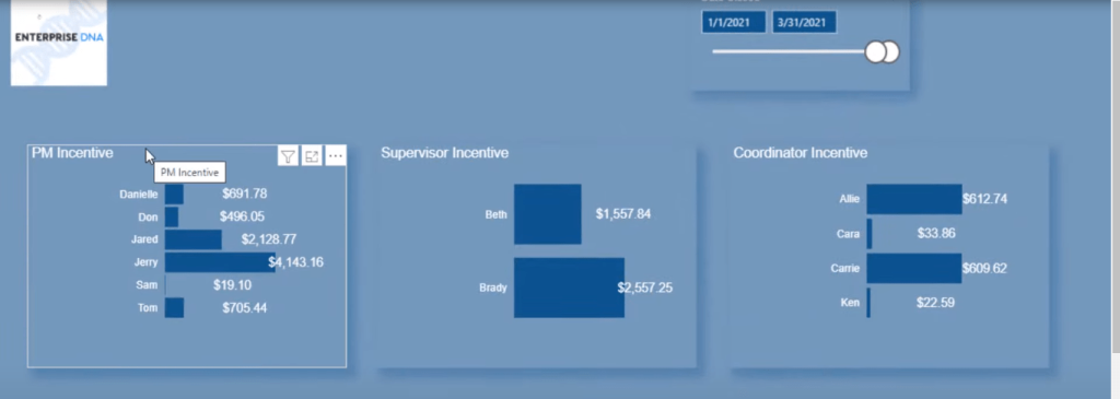
Let’s go back to the Power BI desktop, where I have set up a Charticulator demo page. These are some simple bar charts that I made with the Charticulator visual.
This post is not really about how to create these visuals, but rather an introduction to where to find them, how to download them, and how to get started in using them.
To get the Charticulator visual, go to the Home tab, click on More visuals, and click on From AppSource.

Type in Charticulator in the search box, click on search, then click on the Add button.
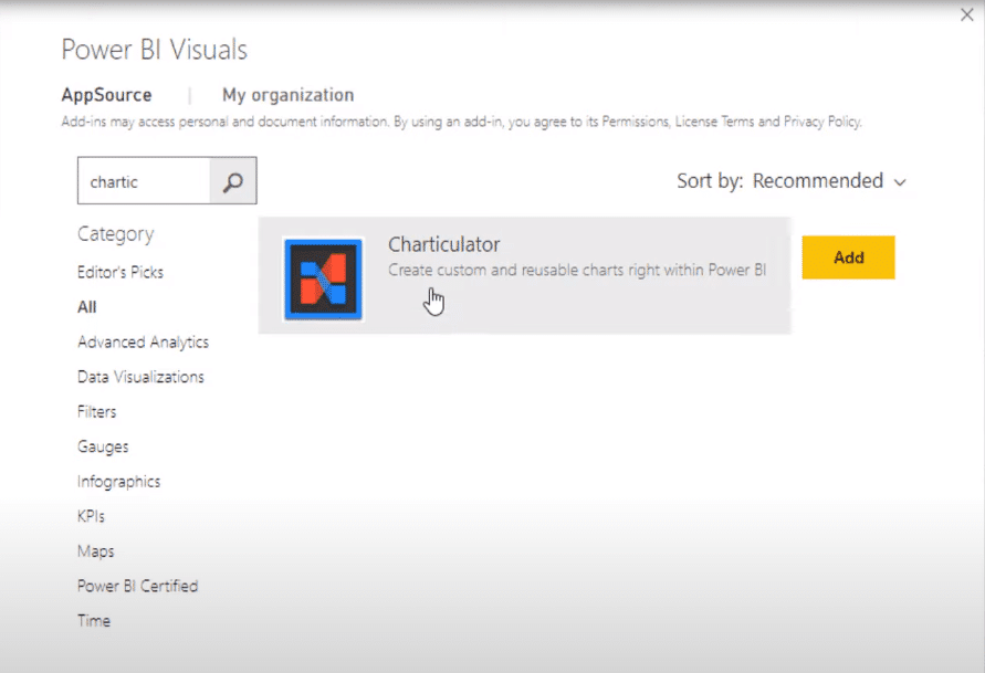
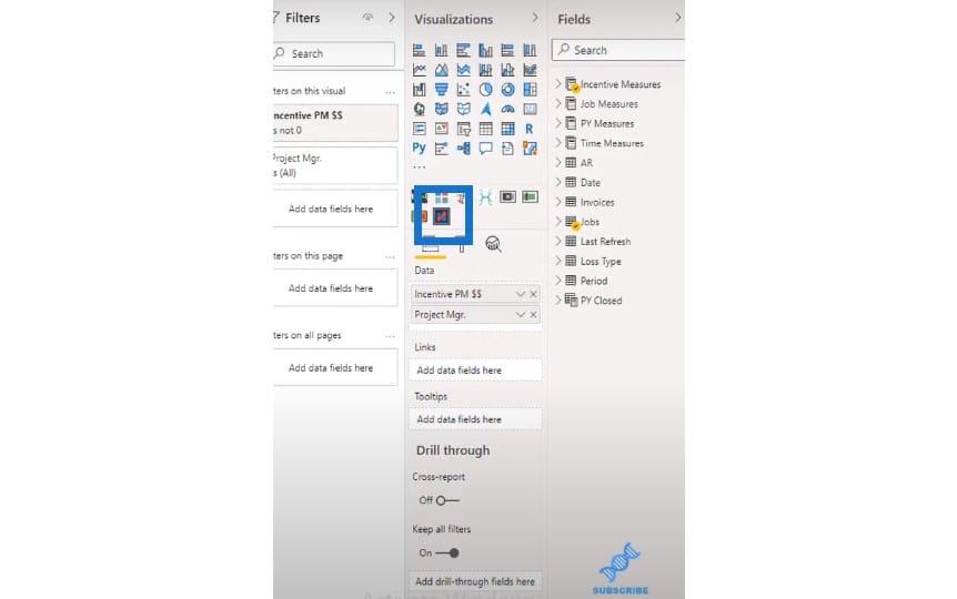
This action will add this icon to your Power BI desktop.
In order to create one of the bar charts I showed you earlier, all you have to do is click on the Charticulator icon.
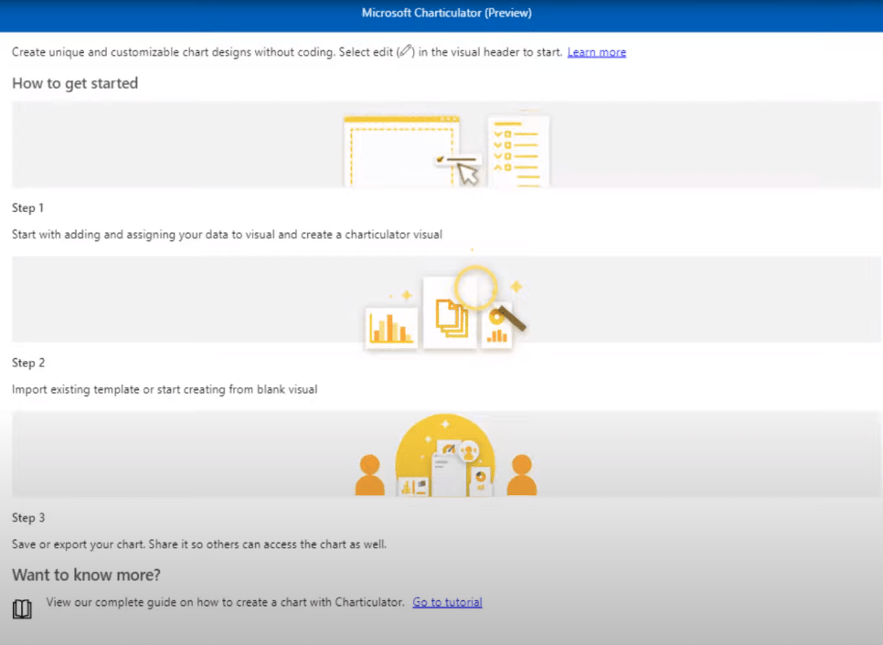
It’s going to pull up this window that will walk you through the app. It will show you the steps on how to get started.
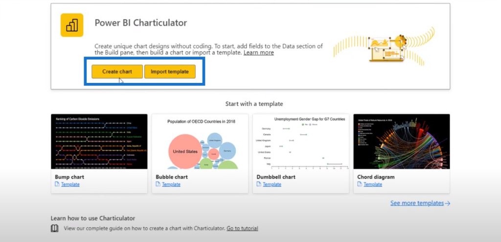
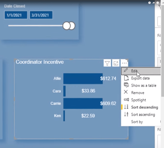
But if you click on the three ellipses or dots at the top right corner and click on the Edit button, you’ll have two options to choose from: Create chart or Import template.
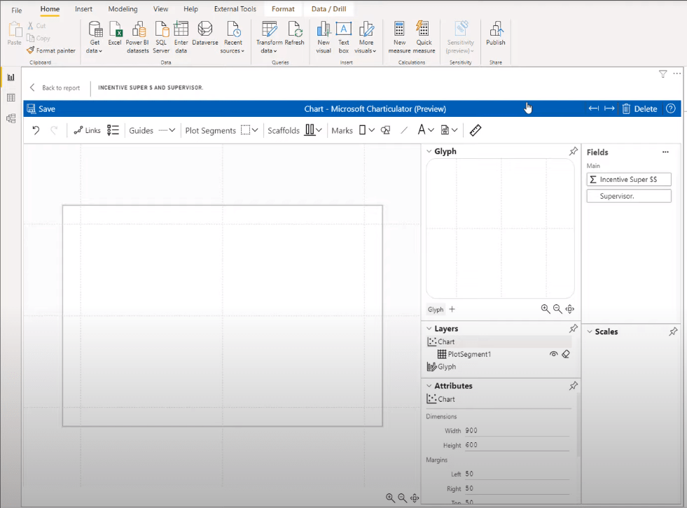
When we click on Create chart, this is the view that we get.
If you’ve used Charticulator in the past, you can see that this is a totally different layout than what we’re accustomed to.
Let me show you what I mean by this.
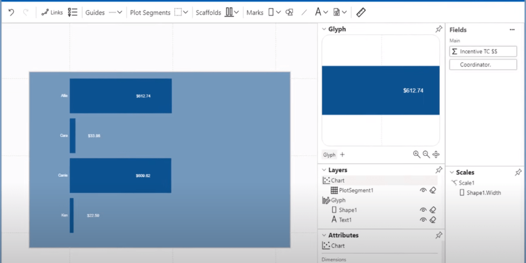
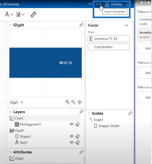
Currently, the Glyph is on the upper right-hand side, while the Layers and Attributes are on the lower right-hand side. And then the actual canvas is on the left-hand side.
But if we head on over to the Charticulator website and click on the Launch Charticulator button, the canvas is on the right-hand side while the Glyph, Layers, and Attributes are all on the left side.
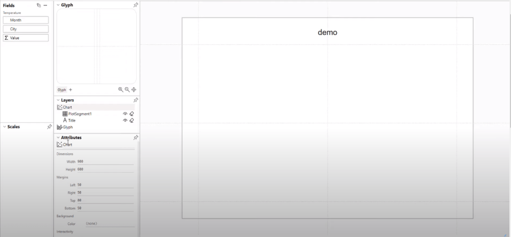
The changes could have been made based on user feedback since Microsoft is pretty good at asking for feedback on how they can improve their products. If people are happy with the way that it looks in the Power BI desktop, then we’ll have to get accustomed to using this.
Let’s go back to the Power BI desktop to show you how I created the visual for the Coordinator Incentive measure.
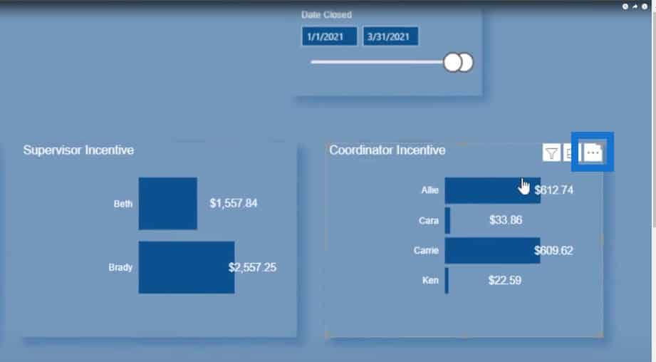
If I click on the three dots and click on the Edit button, this will open up what my chart looks like and will show how I designed it from the Charticulator visual in the Power BI desktop.
Exporting A Template Into The Power BI Desktop
One thing that I want to point out is that once you have achieved the visual the way that you want it to be, make sure to click the Save button.
And then once you hit Save, click on this right arrow icon to export this chart and save it as a template.
I’ll open up one of these files to show you what this template looks like. As we scroll down through the page, we can see our incentive measure here.
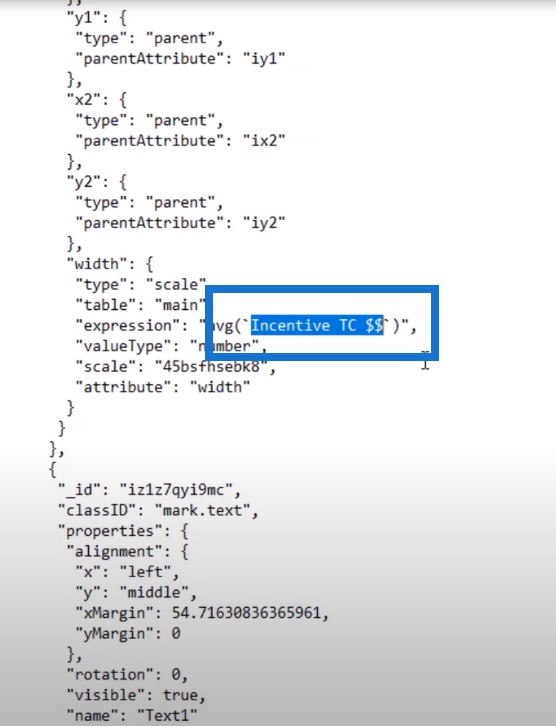
All we have to do is use a Microsoft notepad to save this as a .tmplt.txt file.
After this, you can copy and paste this template to the fields you want to use moving forward. This way, you don’t have to create a new Charticulator visual; you can use this template and then just change the different fields.
Let me show you what happened when I hit the Save and Export buttons:
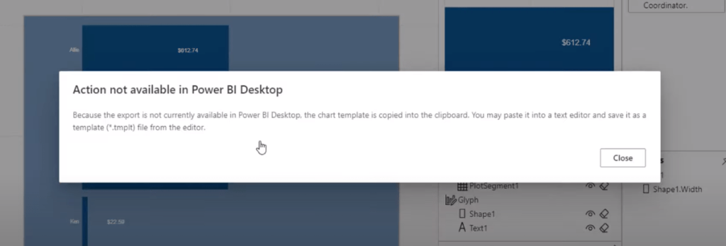
This message tells us to save our file as *.tmplt file.
***** Related Links *****
Best Practices For Data Visualization In Power BI
Data Visualization Technique | Power BI Dynamic Visuals
Recreate A Visualization In A Power BI Dashboard
Conclusion
I showed you earlier the simple bar charts that I created from Charticulator. I know these are quick and easy for me to put together, but there are lots of other things that I could have done.
If you are wondering if there is any content out right now on Charticulator, I can assure you there is something coming out in the near future. One of our Enterprise DNA experts will be having a class coming out very soon on how to create these Charticulator visuals.
So, if you aren’t an Enterprise DNA member yet, now would be a great time to sign up. This way, you’ll have access to the Charticulator course once it is released. I hope that you’re excited as I am for this new visual to be released within the Power BI desktop, instead of having to go to Charticulator.com to do all the work.
Until next time,
Jarrett


