I will show you formatting tricks on how to put think borders on matrix visualizations in Power BI. Evidently, this is a little bit different tutorial compared to what I normally post but it can significantly change the visual of your reports. You can watch the full video of this tutorial at the bottom of this blog.
Let’s take a look at the data.
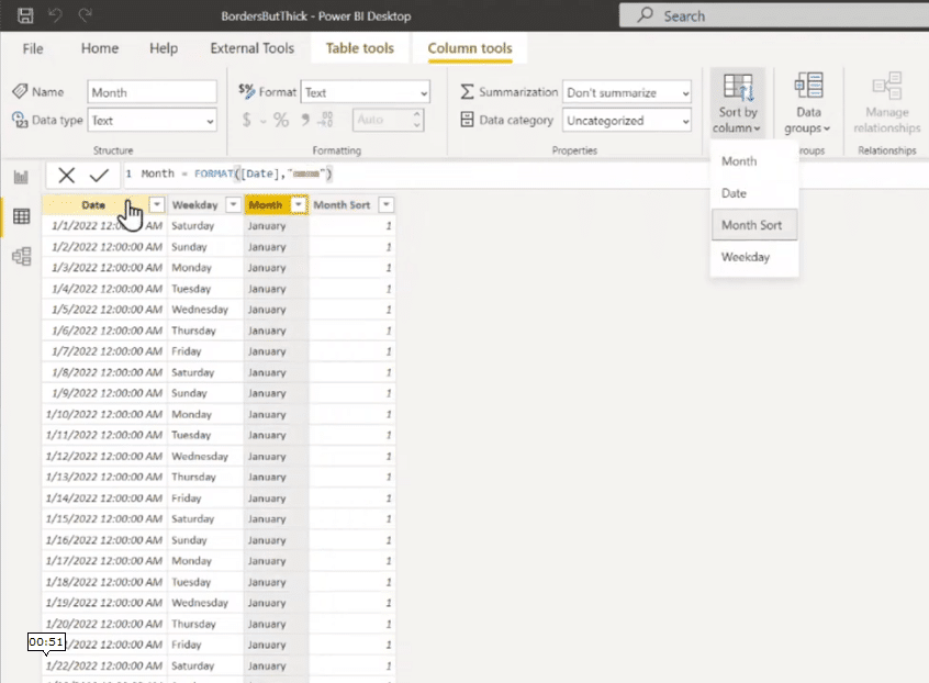
It is a very simple data model consisting of a calendar table, and we got the calendar for this year.
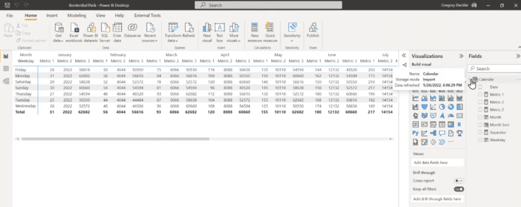
To illustrate, we have the Weekday column that I’ve formatted to return back to the day of the week, we have the Month column that I’ve formatted to return back to the month, and the Month Sort column which is set to be sorted by Month Sort column.
I created three measures, Metric 1, Metric 2, and Metric 3, and then I just formatted this visualization as a matrix. Afterward, I set the row to be the Weekday, the columns to be the Month, and the three measures as values.
With this in mind, it shows a very simple kind of matrix that is fairly common.
Visually speaking, the issue with this matrix is that it’s a little bit difficult to tell which measure belongs to which month. It’s not that obvious.

If we want to make it a little more obvious, Power BI does have the concept of gridlines.
As a matter of fact, I just turned on the Vertical gridlines, and it’s noticeable that they are very faint by default but at least it gives some distinct way to group these together visually.
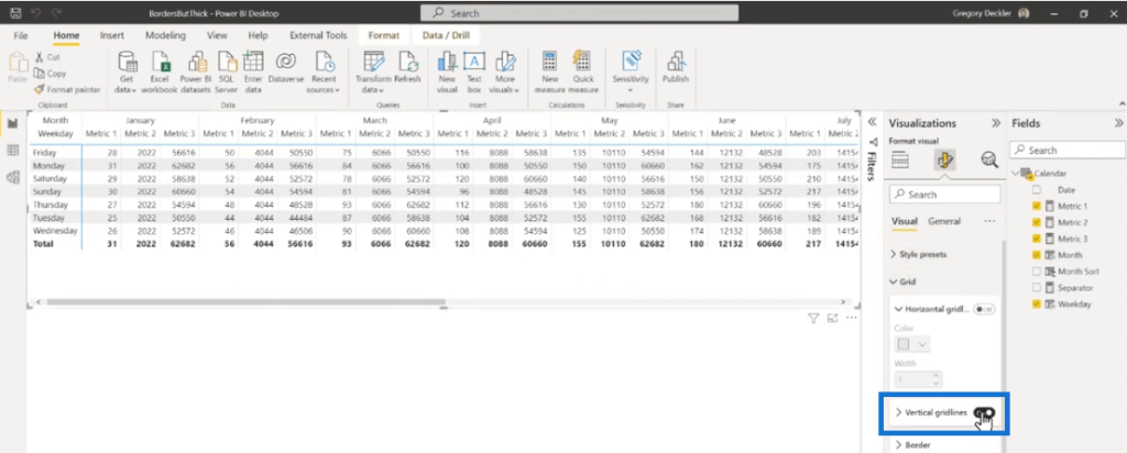
To make it more visible, go to Visual then select Grid settings. We can change those gridlines to a darker color.
For this example, let’s set the color to black, and now it’s a little more obvious compared to before.
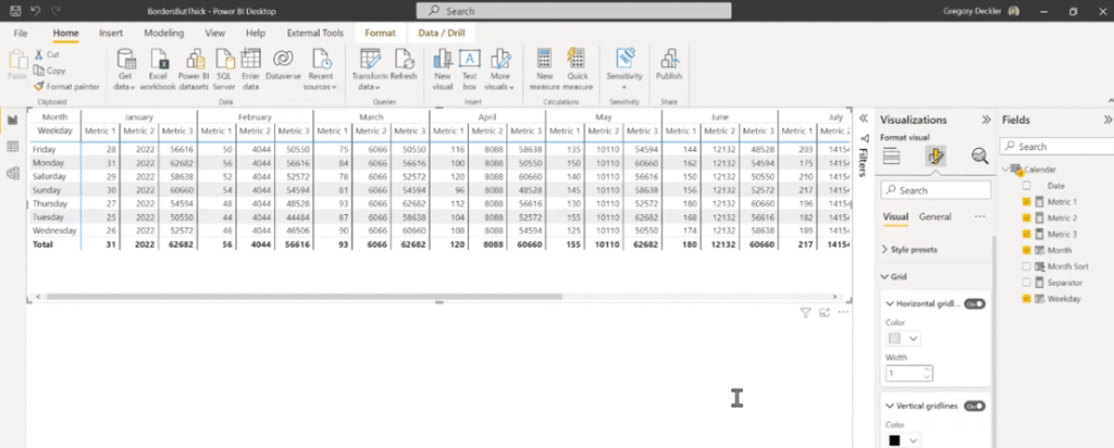
However, these lines have the same sizes as others and it’s still not really what I would want.
If I was in Excel, I would probably grab these cells and then I would put a thick border around them to make it really obvious that these things belong together.
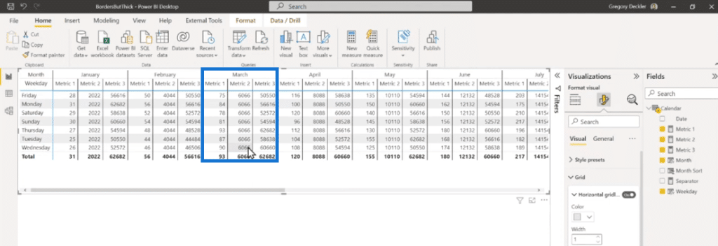
I tried to find something like this but I can’t set this to the border thickness. We can’t do this per individual column or under the Grid settings. I’ve looked around and I haven’t been able to find anything that allows me to really do what I want to do.
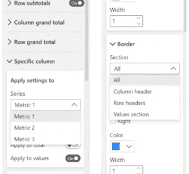
But nothing to worry about, there is a formatting trick that I will show you that allows us to achieve our desired result.
Simple Ways To Put Thick Borders In Power BI
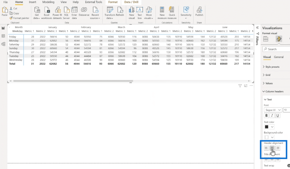
To create the thick borders, let’s select this visual and copy it to a new page.
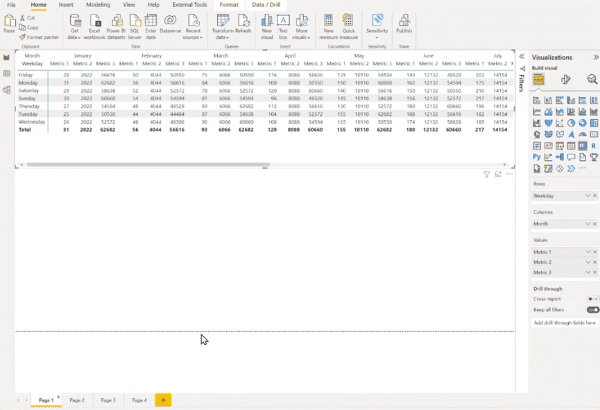
Next is to select the center alignment for the headers.
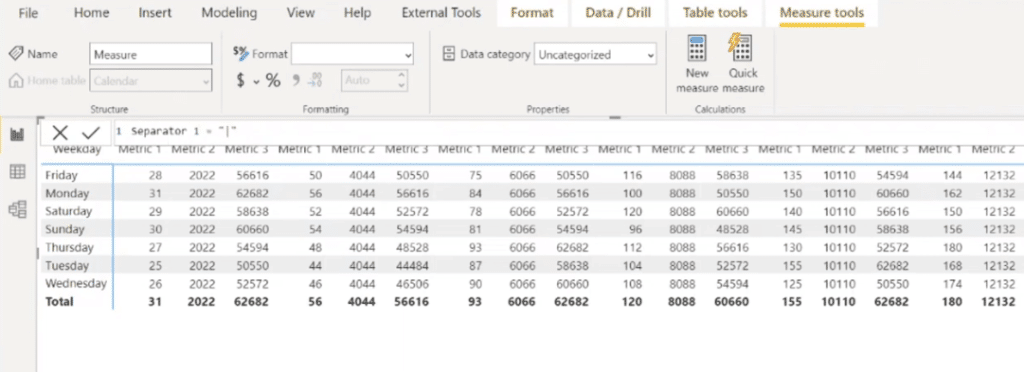
To achieve this effect, we start by creating a new measure. It does not matter what you call this measure and what character you use. You can use a space, a period, or whichever you prefer.
For this example, let’s name it Separator 1 and I like to use the pipe character for this.
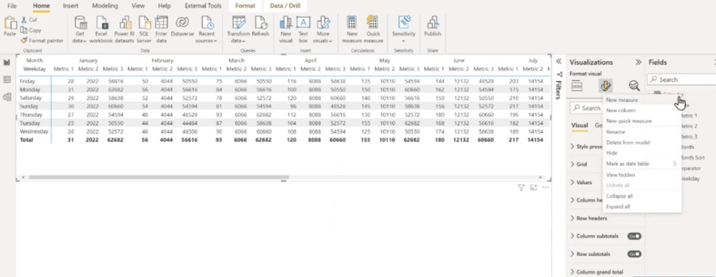
After creating the measure, let’s drag this to the Values section and add it to the bottom.
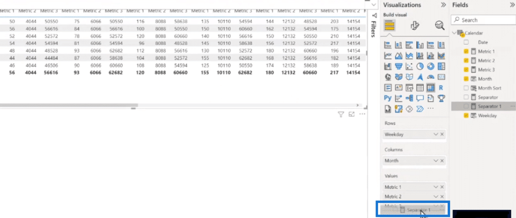
Now we can see we have the Separator 1 column with these pipe characters in it.

We can also rename this to a pipe character and now we have this extra column.
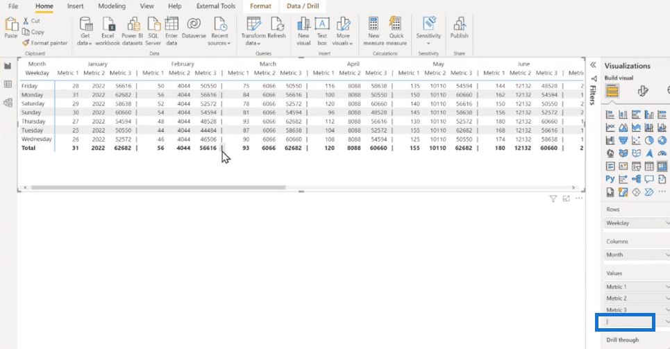
The next step is to go to Specific column and select the pipe character. Then, go to Values to change the background color to black.
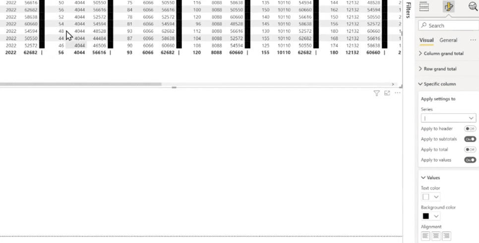
To extend the black thick borders into the total and the header, just click the toggles on.
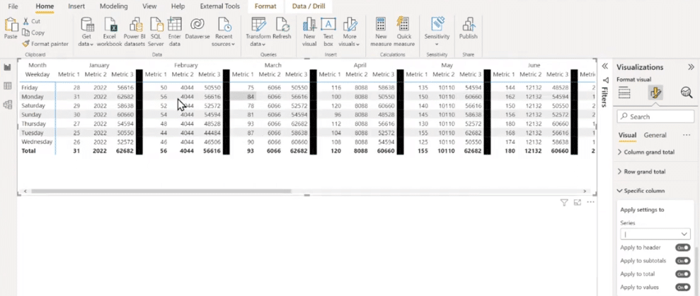
With a little bit of mouse dexterity and steadiness, let’s grab these and shrink them right up to their minimum width by double-clicking the thick borders.

Finally, we now have a much better-looking visual and I can tell in an instant that these things are grouped together.

***** Related Links *****
Report Visualization Framework In Power BI | Part 3
Best Power BI Reports Examples | Formula 1 Reporting Apps
Power BI Theming | Power BI Desktop Standard Theming
Conclusion
Putting simple formatting like thick borders can make your report visually appealing. It looks clean and it’s a natural grouping of values because we know exactly which values belong together in an instant. We also have more visualization options in Power BI that you can explore.
This is a pretty good tutorial that’s why I like to share it with everyone. I hope this will be beneficial for you too. Please don’t forget to subscribe to Enterprise DNA TV Channel for more valuable content like this.
All the best,
Greg
[youtube https://www.https://www.youtube.com/watch?v=lBcjoFcgQOI&w=784&h=441]


