In today’s blog post, we’ll continue with our series on our enhanced report visualization frameworks for Power BI, and discuss the last three remaining items, which is selecting the right visual, condensing information, and using templates.
Prior to this, we discussed the importance of using a grid format, as well as the importance of colors, navigation, and labeling.
Selecting The Correct Report Visualization
This means being effective in what type of visualization you choose. Let’s go back to this example.
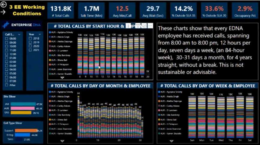
When you’re trying to showcase something, think about what type of visual would showcase the insight a lot better. If we look at the visualizations in this example, it is so hard to understand what they are showing.
Just by selecting the right visualization, this could be made more effective. So for the two charts on the lower left, I would probably change these into a donut chart or a pie chart because there are only three items there.
I know some of you don’t like these visualizations, but to me, these are a much better representation compared to a stacked bar chart.
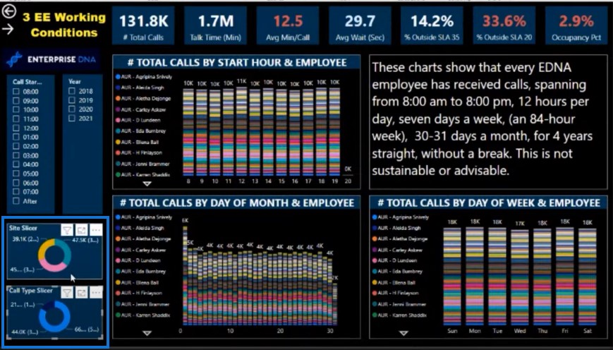
For example, I’ve used this donut visualization in my challenge.
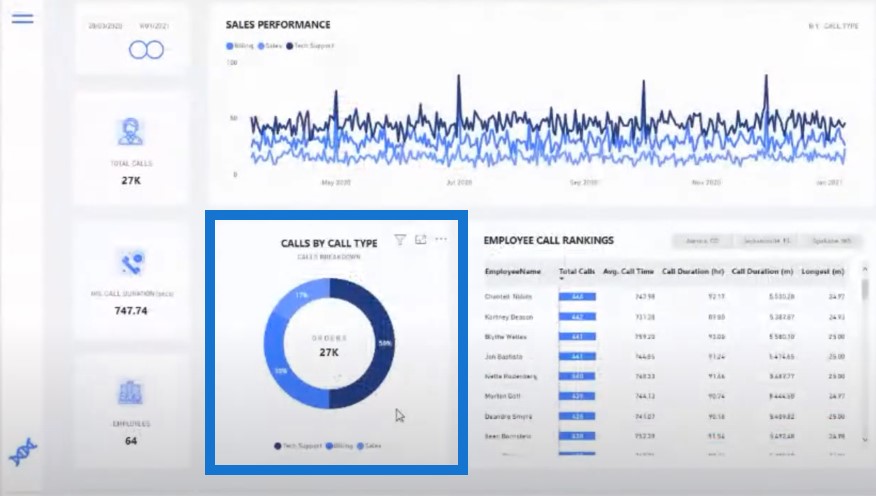
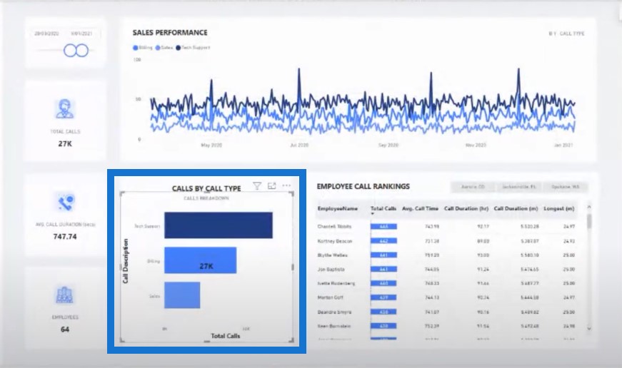
If I change this visualization to a bar chart, it takes too much visual room in the report.
As for the other charts, do we really need to repeat every single person in the legend? We can extract the employee and then have the user select from a table of information.
We can replace one of these visuals with a list of our employees instead.
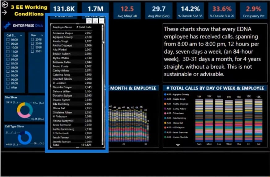
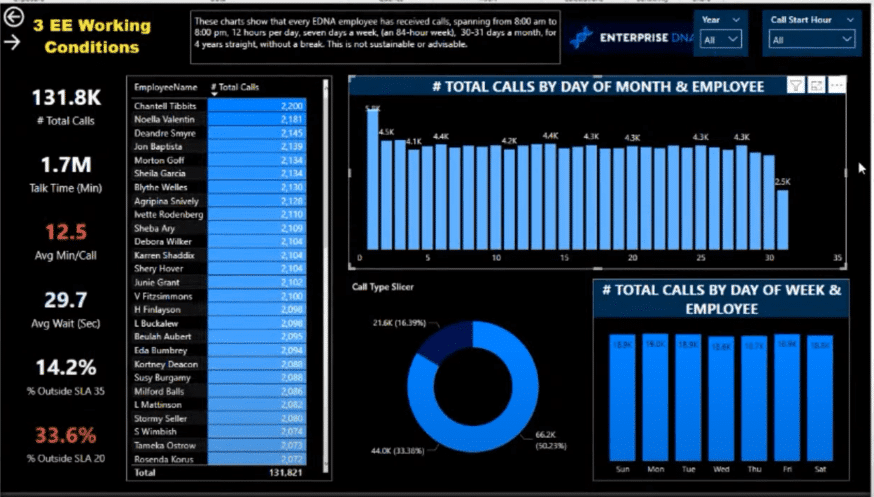
And then I’ll create a chart that allows us to look at the calls someone is taking on each day of the month. I also put some of the visuals into grids because we don’t want to give too much real estate to slicer selections in most cases.
Also, some of these can be made into dropdowns so they will take up less room. The text could also be a lot smaller and placed below a big, bold title. All of these changes we’ve made have improved the navigation experience.
Condensing Information On The Report Visualization
You can make your entire report development less complex by using these fantastic features to condense the information in your report. You can use bookmarks, tooltips, and selections to simplify how much you show and to use the real estate in your report more effectively.
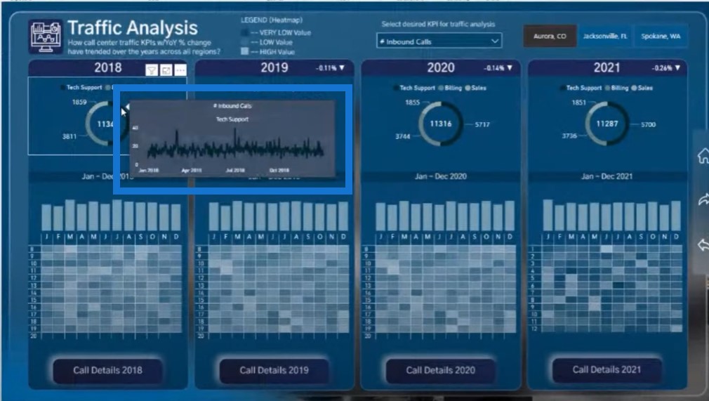
Here’s an example of what I did in my report. I wanted to be able to dive into the specific elements of this visualization. I could have placed additional insights in this report page, but it will look too cluttered and the report will have too many pages. So instead instead of having them on page, I’m just showing them as a tooltip.
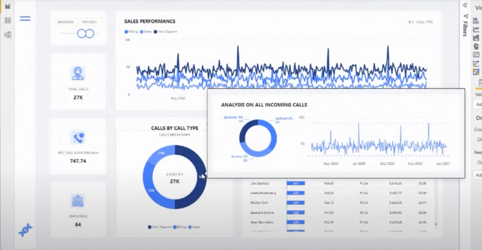
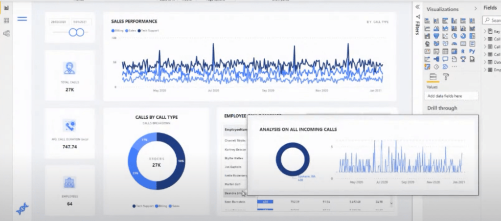
I cannot tell you how more information you can condense into fewer pages. These features have really made it so easy to show so many insights in a more condensed way.
Let’s have another good example of using tooltips. You can see here that there’s a lot of additional information built into this report just by these little tooltips that have been embedded into it.
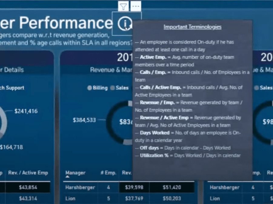
Here’s another really good use of tooltips. This information could be written on your page, right? But it’s embedded into an i icon to show some important information.
This is a fantastic use of real estate on a report, where you’re not putting all of this information on the actual page itself, but showcasing them only when someone wants to learn more about a particular element in your report.
Creating a page tooltip is actually not hard anymore. It’s one of the best features that have been added to Power BI in the last year or so.
Using Templates
The last item in our framework is the use of templates. If you’re a member of the Enterprise DNA and have access to our platform, then you have access to our Showcase page.
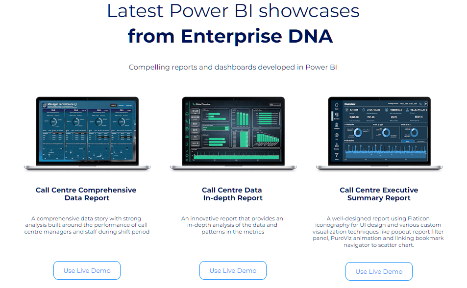
Every showcase can be downloaded and reused into your own report, so all you have to do is just fill in the blanks. You can download the theme, then copy the navigation experience or the grid structure into a blank report, and turn it into your own.
Let’s have a look at one of our showcase. This example isn’t too complicated, but it is straightforward and covers all the framework.
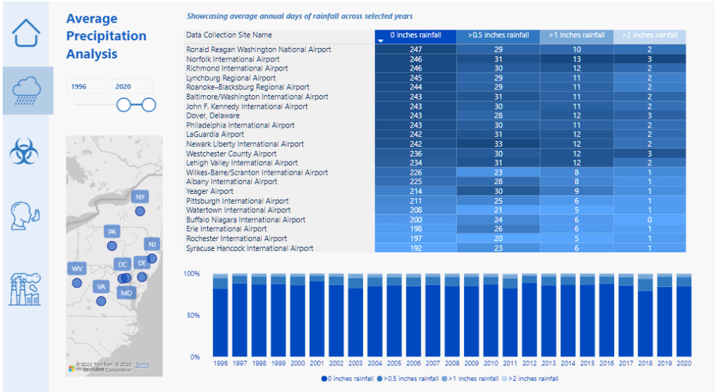
If you like these icons, colors, or grid patterns that have been used, just download the PBIX file from our Showcase page and very quickly fill out the blanks.
***** Related Links *****
Power BI Design – Best Practice Tips For Dashboards
Power BI Report Examples And Best Practices
Small Multiples Chart In Power BI: An Overview
Conclusion
A lot of the items on our framework will help you improve your own reporting designs. Using a grid format, consistent colors, navigation, proper labeling, selecting the correct visuals, condensing information, and using templates are Enterprise DNA’s framework for developing high quality visualizations.
Hopefully, this series has given you some good direction on what to do with your own reports as well.
Sam


