
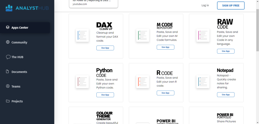
Today, I’ll talk about enhanced visualization frameworks for Power BI. This is the Analyst Hub, an external tool that we’ve built internally to enhance your productivity in Power BI and improve your data visualization and reporting.
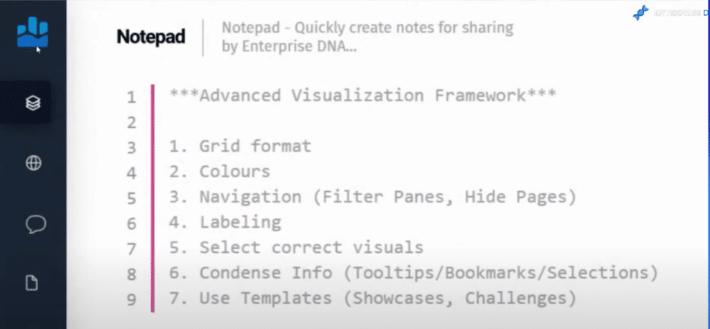
I’ve decided to write my notes for this tutorial in our notepad functionality. This is where I put a lot of my ideas and thoughts around Power BI so it’s all centrally in one place.

Analyst Hub is part of of the Enterprise DNA membership where you get access to all of these tools with your membership or COE license. I have a few other apps that I want to show you within here as we go, but these are the key takeaways for you:
This is an evolved framework that we believe is the best way to make visualizations and to build reports inside of Power BI.
I want to go over all of these items for this blog post and show you some examples of reports that showcase these framework items from the latest round of Power BI Challenge. We’ve learned a lot from watching what other people are developing in these challenges, and observed the good things and the not-so-good things that are happening in these reports.
And so over time, we’ve been able to evolve into this framework around what we believe is the best way to build the highest quality of reports within the Power BI experience.
I’ll show you how some of these have been implemented in a really good way inside Power BI, and then show you reports that I think could be improved by using this framework.
Key Takeaways In Our Data Visualization And Reporting Framework
These are the seven key pieces of our advanced visualization framework.

The first point in our framework is that all the reports should have a grid format.
Colors are also crucial, which is why our second point is that reports should have a consistent color theme, and should not overuse colors.
The third item is building a solid navigation experience within your reports. I think that we’ve evolved from clicking report pages from the bottom of a Power BI report to building a navigation experience inside of our reports.
Number four is simple and effective labeling. When someone looks at your report, you want them to understand what they’re looking at within seconds, and to understand the story that you are trying to tell very quickly.
The next on the list is selecting the correct visuals. Keep your visualizations very simple and easy to comprehend.
Condense your information. You do not need to have 10 different report pages that someone needs to click through. You can get away with having far less pages these days by getting creative with some of the fantastic features inside the Power BI suite, such as tooltips, bookmarks, and selections. By combining these, you can condense your reports.
The last item on this list is using templates. We don’t have to create everything from scratch. There are a lot of resources in the community that you can leverage to use and reuse within your own reports. Not only will it enhance your visualization, but it will also speed it up because you’re leveraging what other high quality developers have done in the past.
Using A Grid Format In Data Visualization And Reporting
I just wanted to give a shoutout to one of our sponsors, Numerro. Numerro have created this design system and a whole range of templates you can use and customize in many different ways.
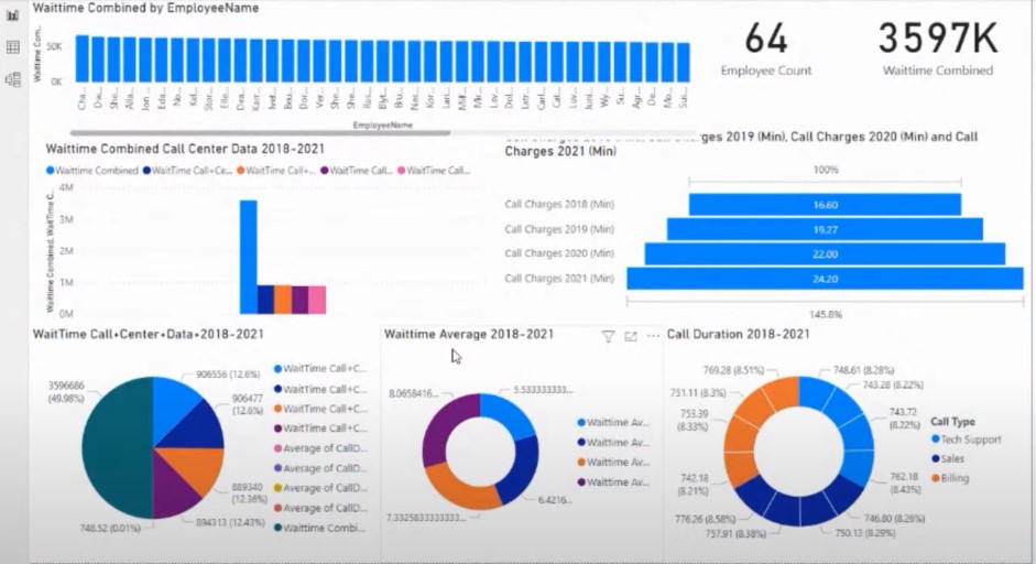
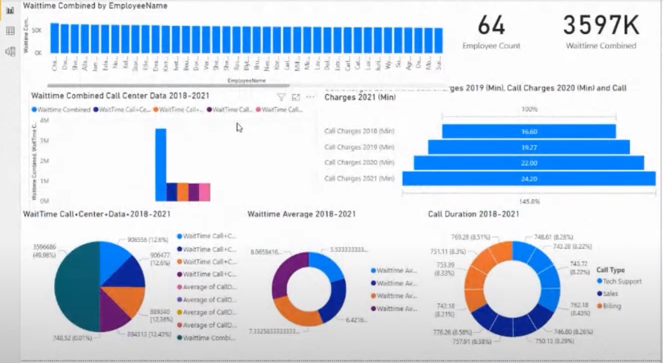
For this particular challenge submission, I used their grid format template. I have a navigation down the left side, and a few key metrics as slicers in another grid.
How you utilize the grid is totally up to you. You can have any variation of grid patterns; it’s just a matter of getting things into a grid. You’ll be surprised at how much better your visualization looks like than having things randomly placed on a page with no structure to it.
Thinking in grids enables you to place things in a way where the eye can focus on a particular area in the report. It improves the overall setup of your visualizations and the storytelling that you do throughout the report.
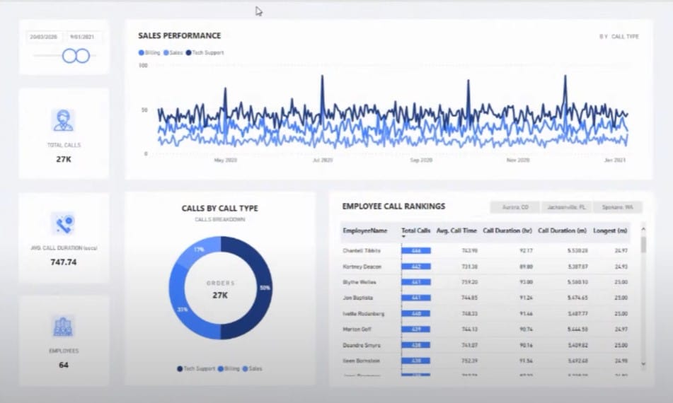
I’ll quickly jump to other examples. This one is done by Federico, our Head of Challenges. And once again, you see a grid pattern. Everything is just easy on the eye, and far more symmetrical. The title and visualization are all in alignment, and still part of a group.
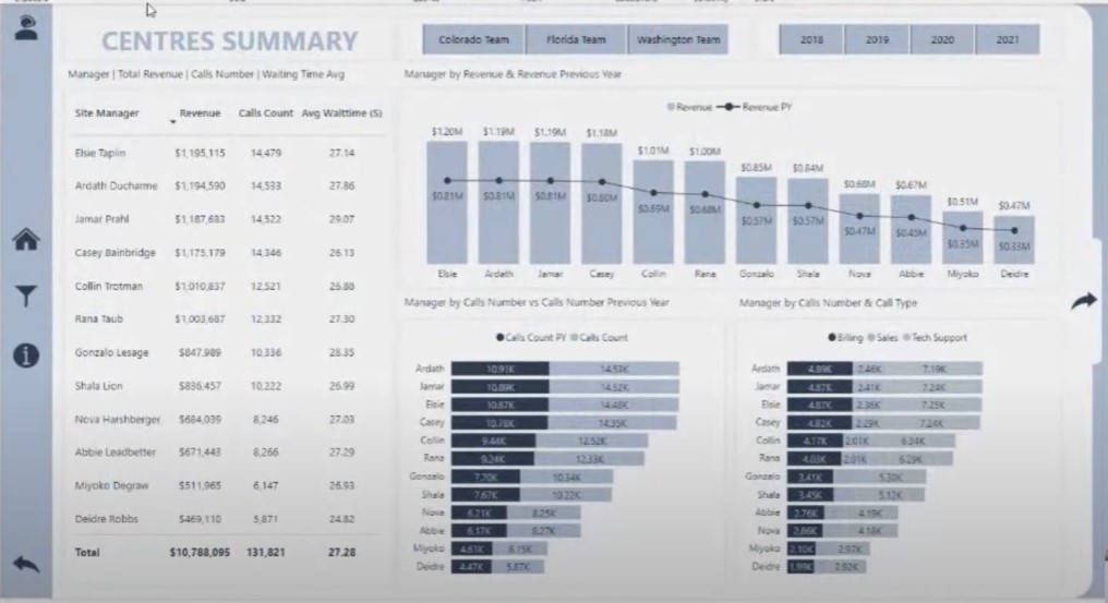
I’ll show you one more example on this particular topic. This particular report here was submitted by the winner of our Power BI Challenge 19. It has a simple grid pattern that is very symmetrical.

I’m also showing reports that require improvement not to discourage everyone from participating, but to use them as examples of how you can quickly improve what you are doing with your particular reports and visualizations.
Obviously, this particular participant in our challenge is just learning how Power BI works and that’s absolutely fine. But you can see here how things were randomly laid out in the report, which doesn’t do much for the experience of the consumer.
Maybe this was thrown together very, very quickly, since nothing is in alignment. There’s no rhyme or reason as to why the visualizations were put where they are.

This is another submission, which provides some really good information. I can also see the grid format has been attempted.

The randomly positioned visuals contribute to a poor navigation experience which detracts from the overall experience of the report.
We have the makings of a grid format, but there are things that can still be improved. We can also add things like titles, labels, and cards that will make the key information stand out.
***** Related Links *****
Power BI Design – Best Practice Tips For Dashboards
Power BI Report Examples And Best Practices
Small Multiples Chart In Power BI: An Overview
Conclusion
Hopefully, this tutorial has shown how much you can improve your data visualization and reporting by using a grid format. It is important to make sure that all the visuals are aligned properly through the use of grids. This increases the appeal of the visualizations, making them easier to read and comprehend.
That’s all for now on grid formats. We’ll continue to discuss the remaining six enhanced visualization frameworks for Power BI in future blog posts. I hope you’ll watch out for those in the coming days.
Sam
[youtube https://www.youtube.com/watch?v=oXs1Mo-SoHc?rel=0&w=784&h=441]


