In this tutorial, you’ll learn how to create lollipop charts using the custom visual in Power BI. It’s a chart that presents different insights for a single category in your data report.
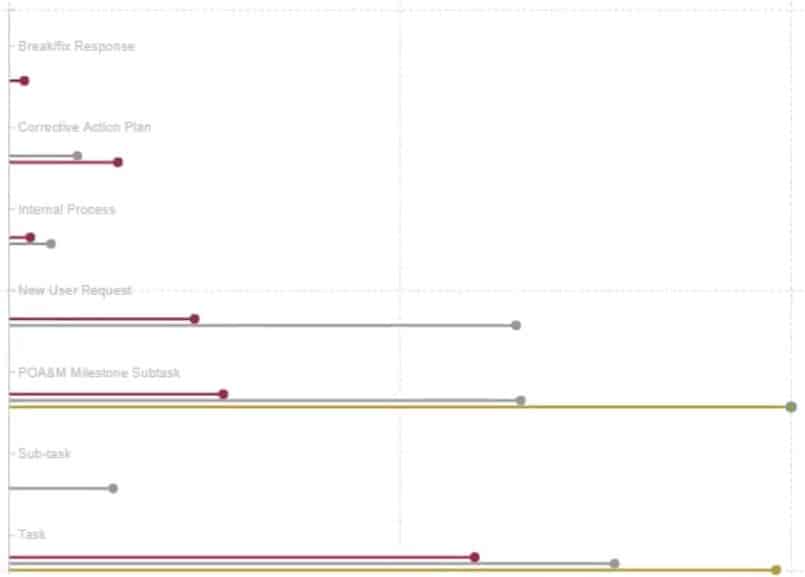
This is the sample lollipop chart that you’re going to recreate. This chart shows how many tickets have been opened according to each category.
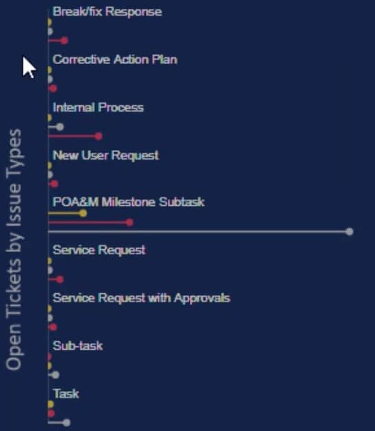
You’ll see that each category has three colored lollipop bars that show different timeframes. Each bar represents a year where yellow, white, and red denote 2018, 2019, and 2020, respectively.
Getting Inside The Power BI Custom Visual
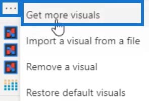
To recreate it, first click the three dots below the visualizations pane and select Get more visuals.
Search for Charticulator in the AppSource and click Add.
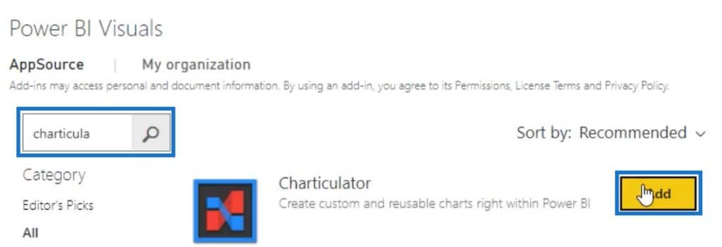
Once done, you can then see a Charticulator link. Click on the link and enlarge the visual in the canvas.

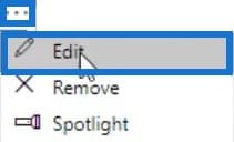
Next, click the three dots of the visual and select Edit.
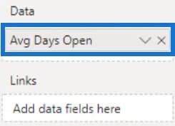
Place Avg Days Open in the Data section of the Field and click Create Chart in the Charticulator.

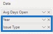
Next, bring Year and Issue Type in the Data section. With that, you can now start creating the lollipop charts using the custom visual in Power BI.
Creating Lollipop Charts
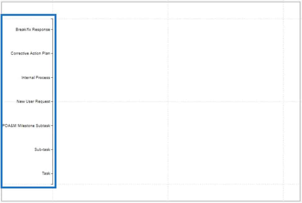
First, bring Issue Type to the Y-Axis of the canvas.
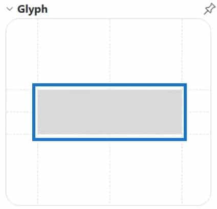
Then, select the rectangle shape in Marks and place it in the Glyph.
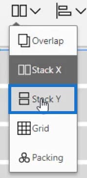
Click Stack Y to change the stacking of the bars.
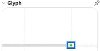
Drag Symbols inside Glyph to bring in the circle and align it to the end of the bar.
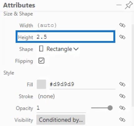
Adjust the height of the bar in Shape1’s Attributes to get the lollipop figure.
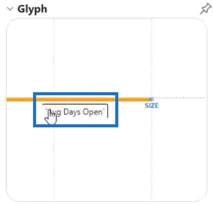
Next, bring Avg Days Open in the width inside Glyph.
The chart will now look like this.
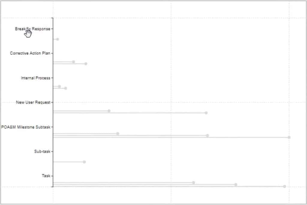
The next step is to transfer the category labels directly above the lollipop charts. Do this by clicking the plus sign below the Glyph canvas to create a new Glyph.

Bring a new Plot Segment to the Y-Axis of the actual canvas and place Issue Type on it.
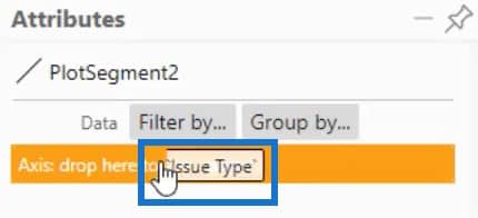
Now, open PlotSegment2’s Attributes and change the position to Opposite. You can also change other attributes such as the font and line to your preference.
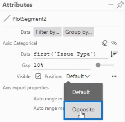
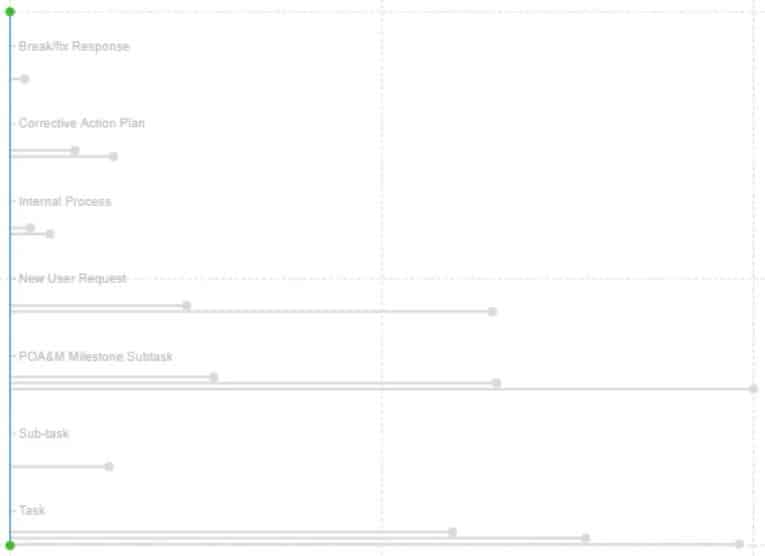
The results will then look like this.
Adding Colors To Lollipop Charts
To add colors to the lollipop bars, open Shape1’s Attributes and place Year in the Fill section. Then, change the color of each year depending on what you prefer.
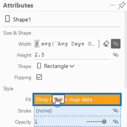
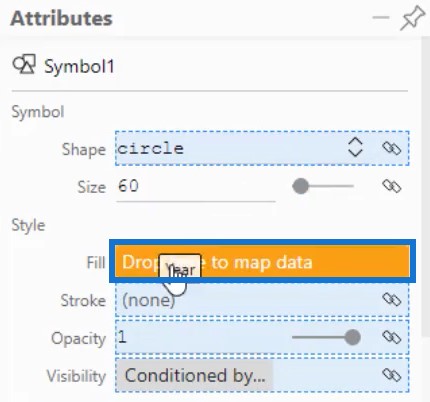
Next, add color to the circles of the tip of the bars. Open Symbol1’s Attributes and bring Year to the Fill section.
Your lollipop chart is now done and this is the final result.
Make sure to save your progress by clicking Save on the upper left corner of the canvas, and then click Back To Report.

You’ll now have the visualization in your report. If you want to edit some attributes like the margin or shape, just click on the three dots and you’ll be redirected back to Charticulator.
Change the attributes to match the style of your report. After that, your lollipop chart visualization will now look like this.

***** Related Links *****
Power BI Best Practice On Reports & Visualizations
Power BI Dashboard Designs: Visuals And Effects
Custom Bar Chart In Power BI: Varieties And Modification
Conclusion
Lollipop charts provide various information and data on a single category. It is a creative way to see details in every activity or task. You can easily monitor the performance of your activities and get valuable data for improvement purposes.
Learn more about lollipop charts by practicing this tutorial in Power BI’s custom visual using your own data. There are also other related visualization content that will help you improve your data visualization skills on our blog and YouTube channel.
Mudassir


