In this tutorial, I’d like to discuss how you can improve your creativity when creating custom visual reports in Power BI. I highly recommend creating projects that are outside your organization’s environment. This is because when creating projects for your organization, your creativity is limited. Most of the time, it’s very formal.
The best thing to do to enhance your creativity is by joining the Enterprise DNA Challenges. With this, you can collaborate with other people, see what they are doing, and learn from their creativity. Having this massive learning resource can help you improve your creativity while doing your own projects.
Creating A Story In Custom Visual Reports
You can challenge yourself by telling a story with the report that you are creating. For example, if you look at this report, you’ll see that I’m trying to convey a story to my end user.
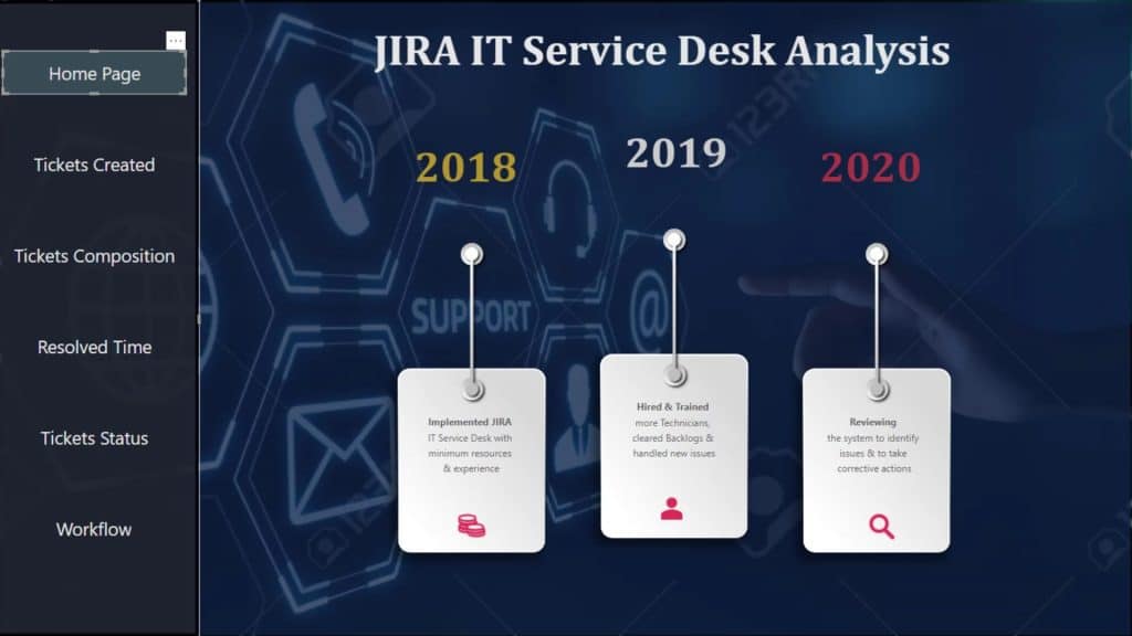
The one thing that really helped me in creating a story on my report is by limiting the number of slicers on the page. When you have this mindset, you’ll try to put maximum efforts in your visualization, on how you are placing your visuals in your report, and on how your visualizations are interacting with one another.
Selecting Color Themes For Custom Visual Reports
The second thing that you should consider is your color themes. For example, if you used light color in your previous challenge, then you can switch to a darker color on your next challenge.
You can get your color themes easily by going to the Analyst Hub Apps center.
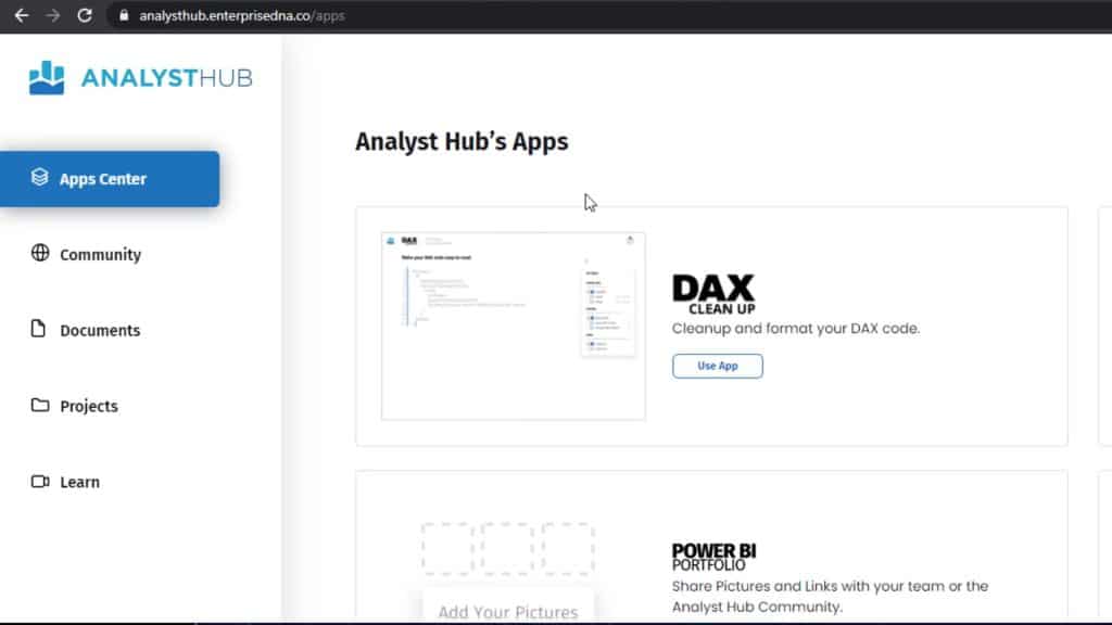
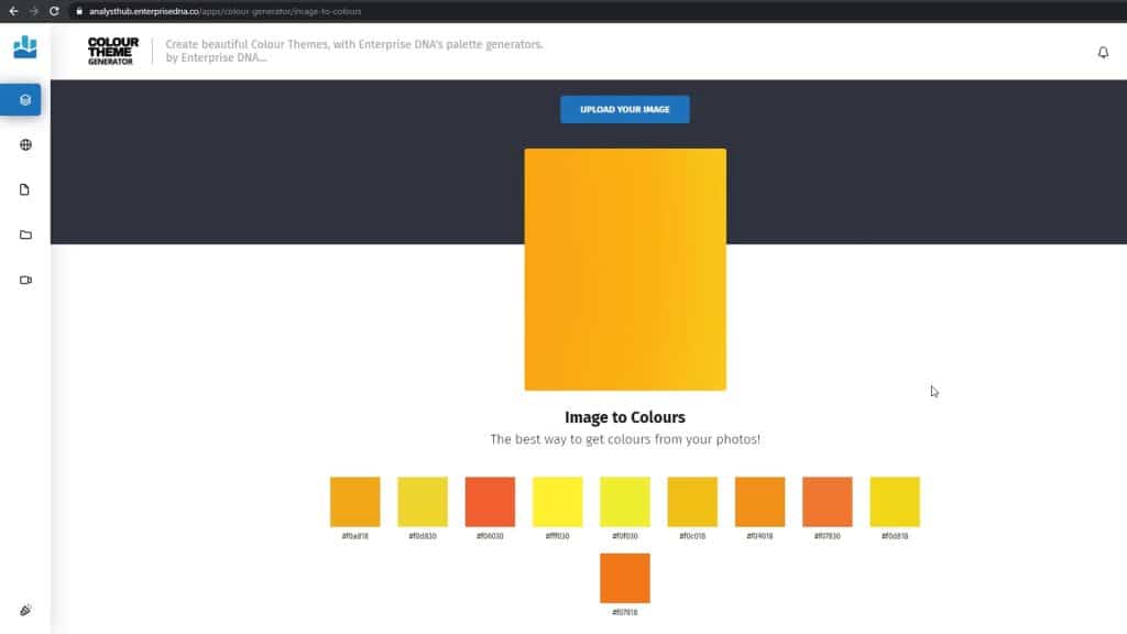
Go to the COLOUR THEME GENERATOR.
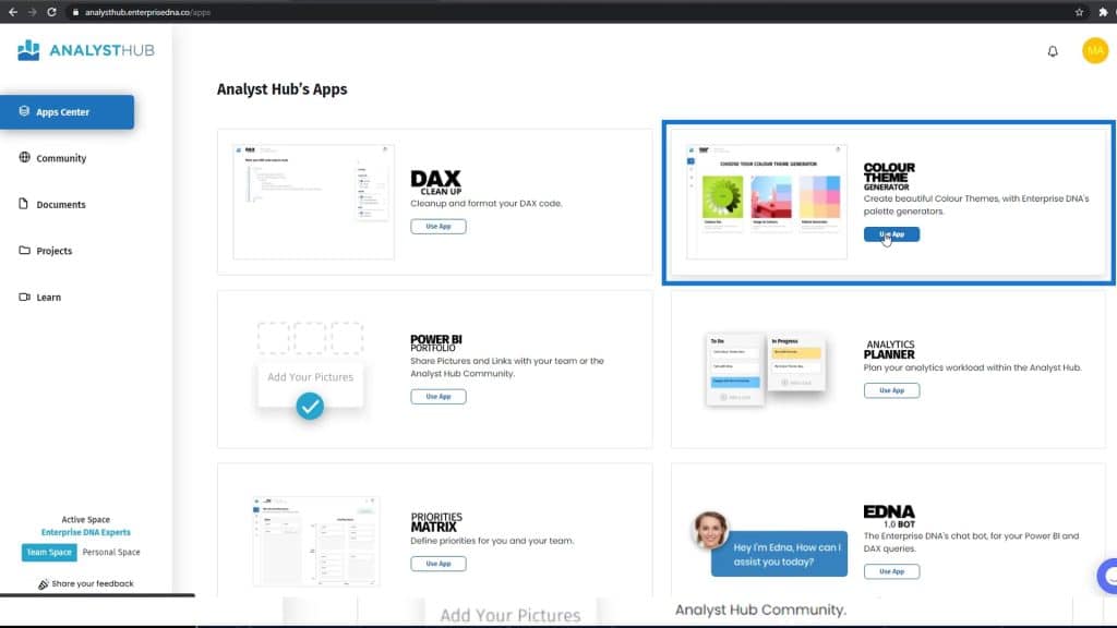
Click the Image to Colours option.
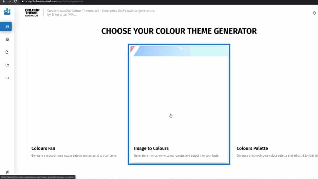
Here, you can upload the image that you want to generate the color from.
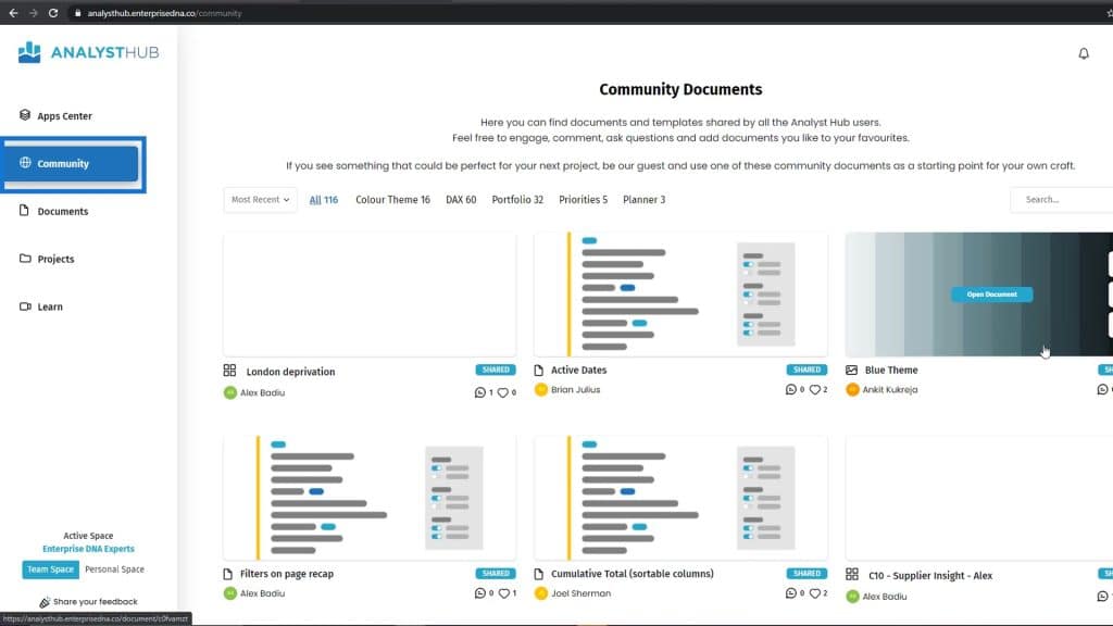
If you’re an Analyst Hub member, you can also go to the Community section. People are posting their color palettes here, and you can use them as well.
Creating A Homepage For Custom Visual Reports
The next thing that you can do to challenge your creativity is by creating your homepage.
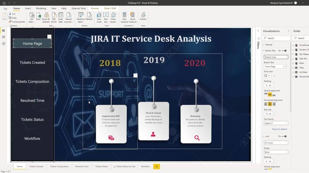
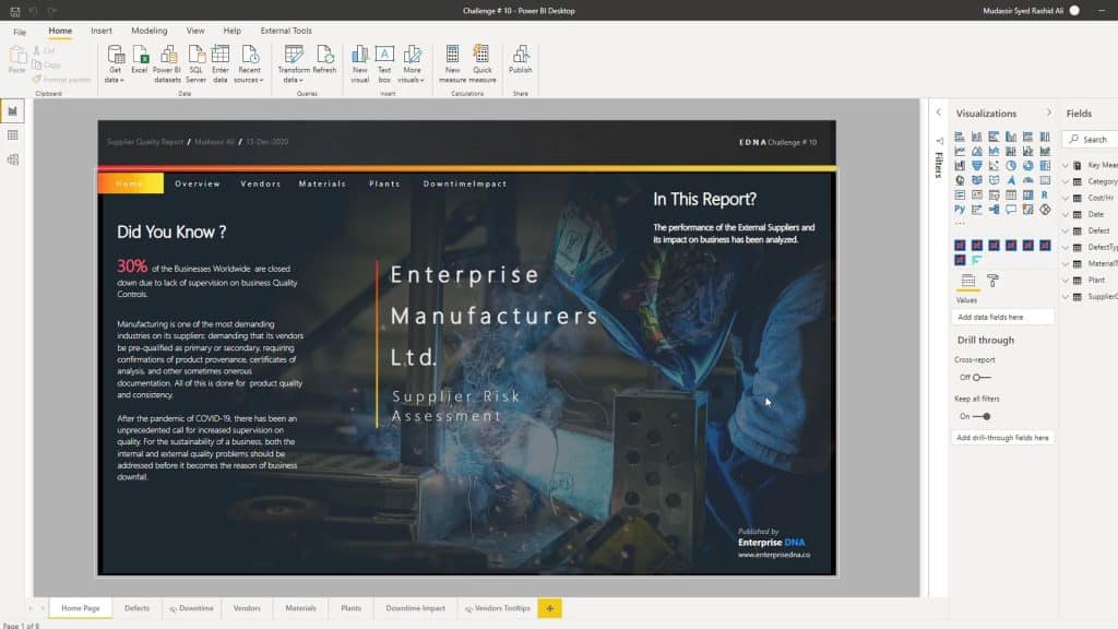
You can go to different websites to get some ideas. In this report, I have created different types of homepages. The first one is an audit type of report page.
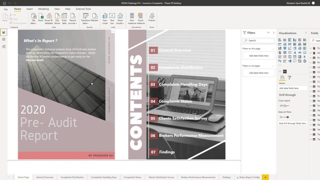
For this one, I used Adobe Photoshop and Illustrator to get the type of homepage that I was aiming for.
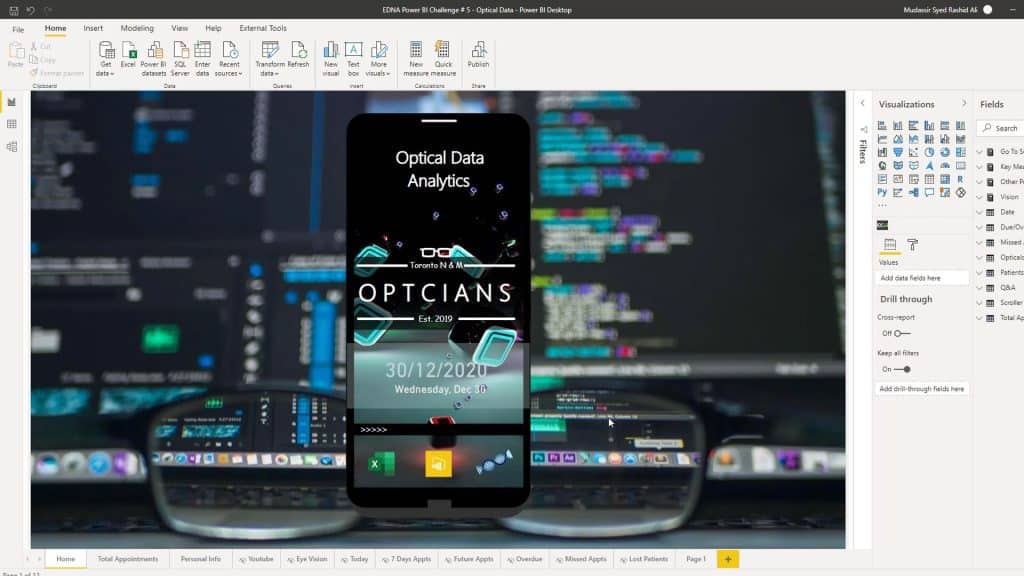
The third one is totally different from the others. You should always try to challenge yourself when creating a homepage.
Creating The Navigation
Now, let’s talk about navigation. In every report you make, you should create a different type of navigation. It might be difficult at first, but if you set your mind to it, you can definitely achieve every look that you want.
As you can see, this report looks like a mobile on its lock screen. The first type of navigation that I’ve used is the lock button.
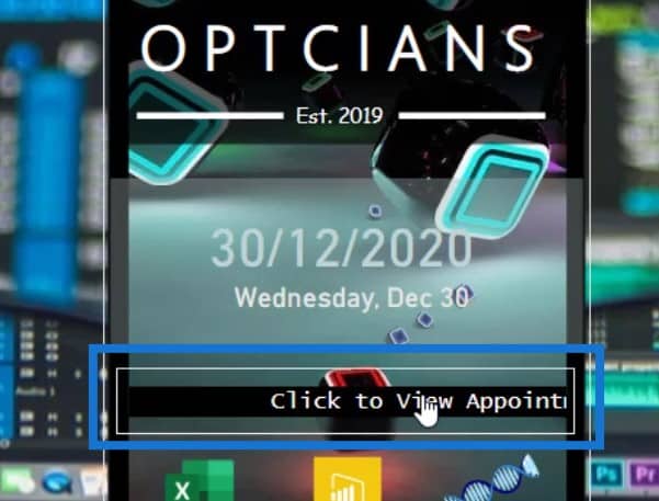
So, if I click on it, the mobile will be unlocked. Then, you’ll see the different types of navigation that are similar to an actual mobile application.

Let’s click on the calendar icon.

Once clicked, it will take me to this page.
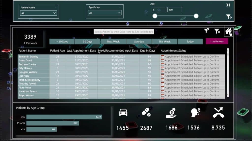
Then, let’s click the homepage icon.
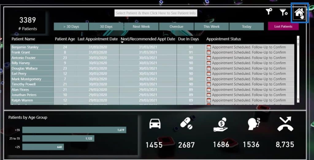
This will bring me back to the homepage again.

Custom Visualizations
Let’s now discuss the main part of this tutorial, which is the visualizations. You should use a visualization differently in every report. To seek inspiration, you can go to Power BI Data Stories Diary.
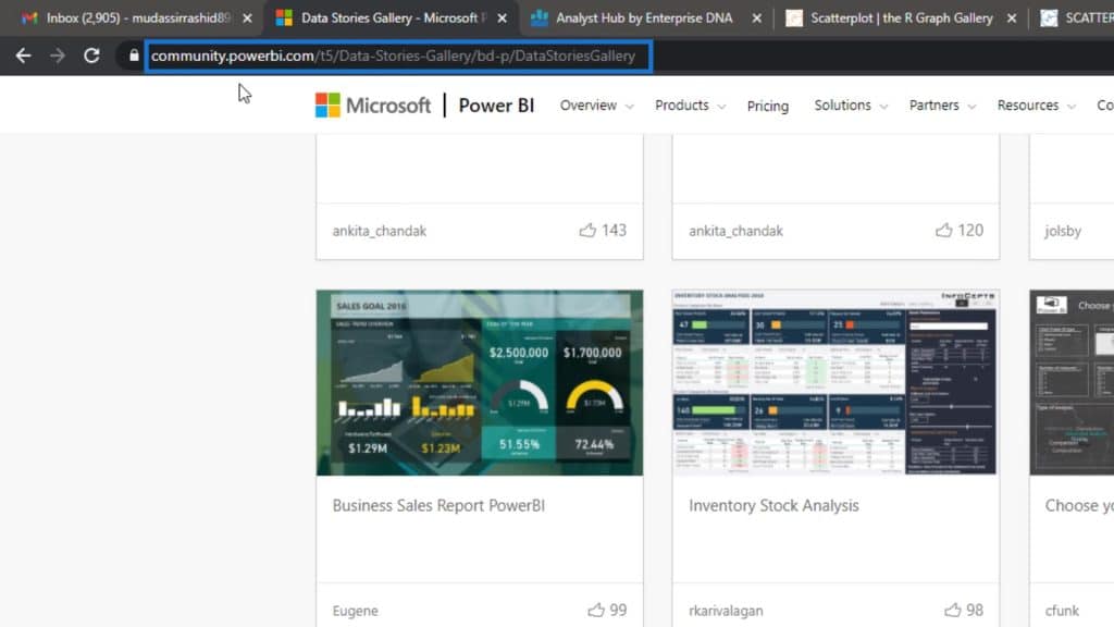
In this section, you can look at some of the reports.
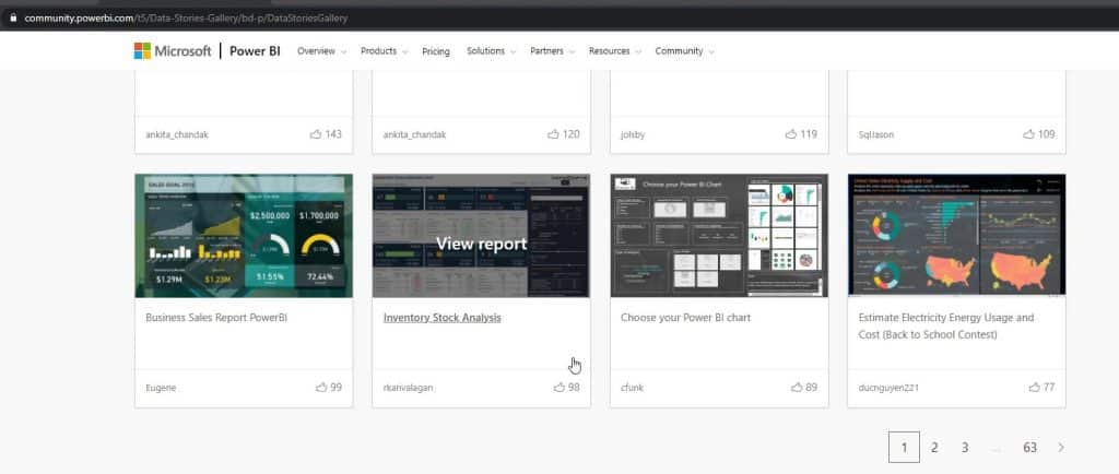
You can also go to the R Graph Gallery which offers a lot of choices.
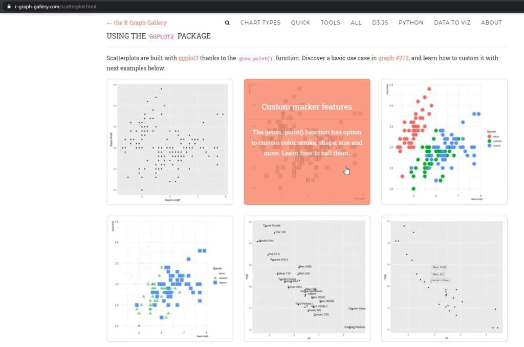
The homepage is where you can go to any type of visualization like Heatmaps or Scatterplots.
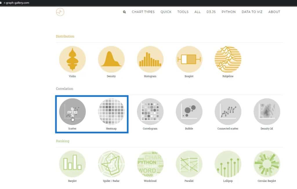
If you click the Scatter charts, you’ll see different types of Scatter charts.
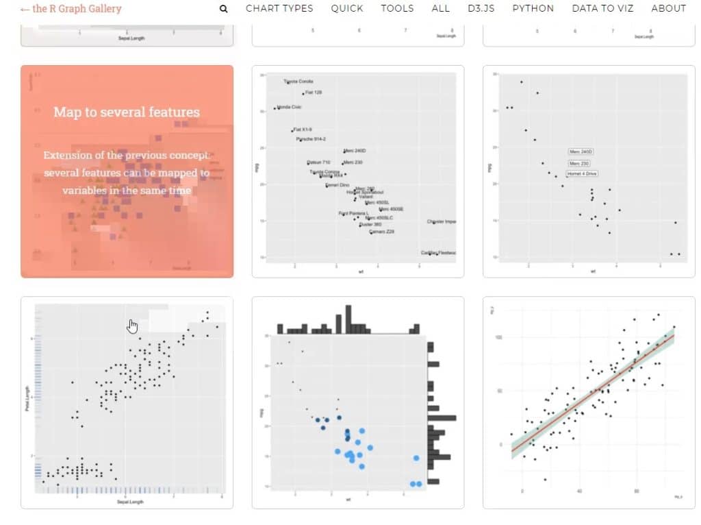
You can look at some of these visualizations and pick one. Then, try to create it in Charticulator. It’s not that easy, but you can create it through trial and error.
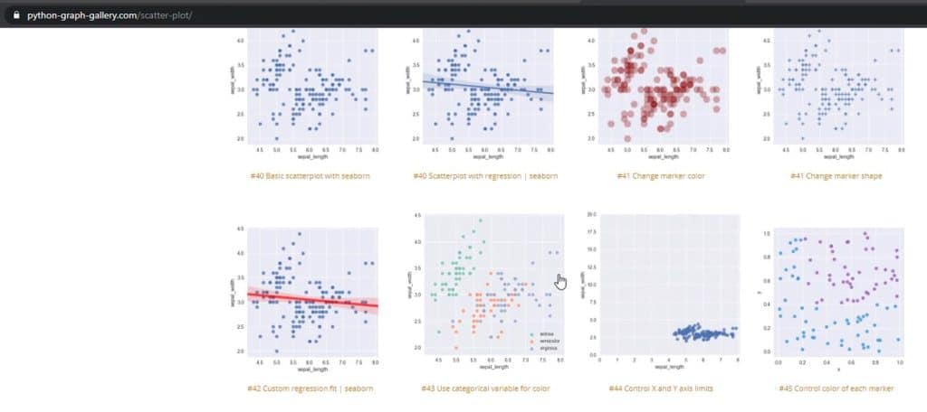
You can also go to the Python gallery. It displays different types of scatter charts as well. You can definitely look at these ones too, and try to create it in Charticulator.
Another thing that I also want to highlight is that you can use line charts differently. For this example, I’m using a 30-day average running total.
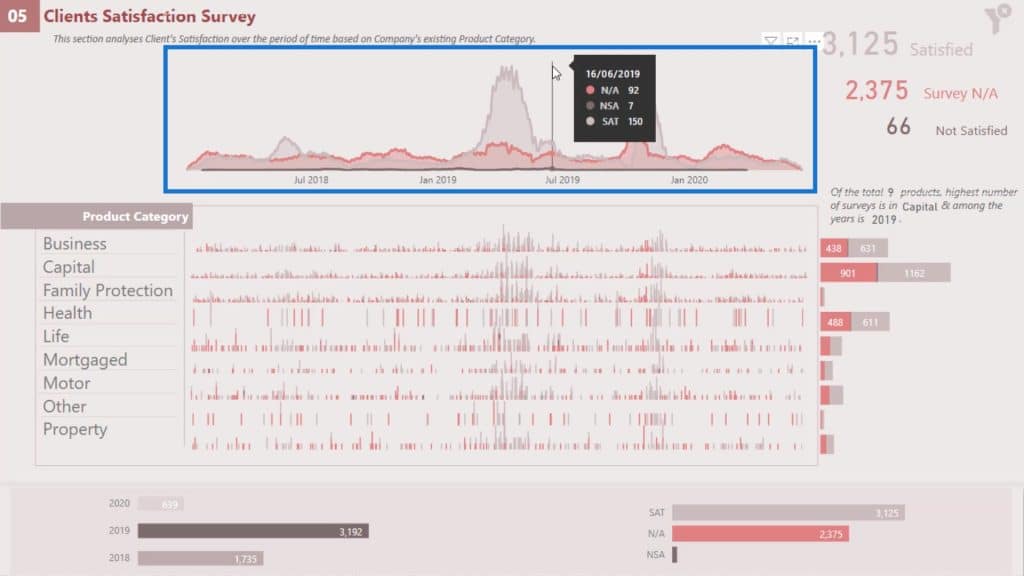
If I change this to 10 days, my visualization will look different.
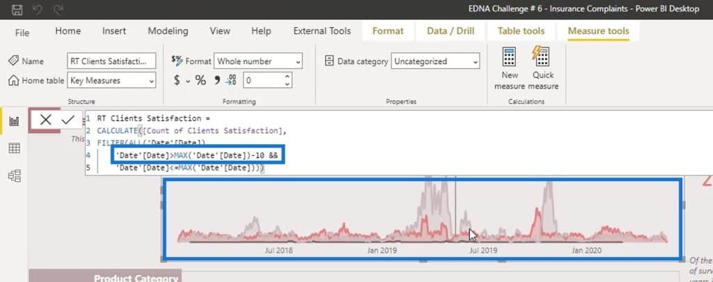
I tried to find a good combination that will look good in my report. In this scenario, 30 days would look better for my report so I settled on using it.
***** Related Links *****
The Best Custom Visual You’ve Never Heard Of
Power BI Custom Visual – Creating Text Summaries
Utilizing Custom Visuals For Power BI
Conclusion
Those are various things you can do to create a good visualization. After trying everything out, you can then settle on only one type of visualization. Most of the time, we try to create our reports in a hurry, which is why we don’t do different types of tests on one visualization.
Remember to do these suggested processes on every custom visual reports, especially for the challenges.
Check out the links below for more examples and related content.
Cheers!
Mudassir


