
This blog will demonstrate how to use a cumulative distribution plot, also known as Empirical Cumulative Distribution Function or ECDF plots, and showcase the advantages of using this plot variation over other plot types. You can watch the full video of this tutorial at the bottom of this blog.
Most people prefer ECDF plots over histograms to visualize the data as they plot every data point directly, and this feature makes it easy for the user to interact with the plot. Today, you will learn how to use an ECDF in Python and Power BI and improve your presentations and reports on data distribution.

Kinds of Distribution Plots
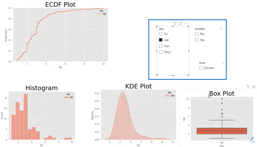
I’ll start by filtering my data on a particular day, Saturday, and we can see below all these Python plots used for describing distributions. We have here our ECDF plot, a histogram, a KDE plot, and a Box plot.
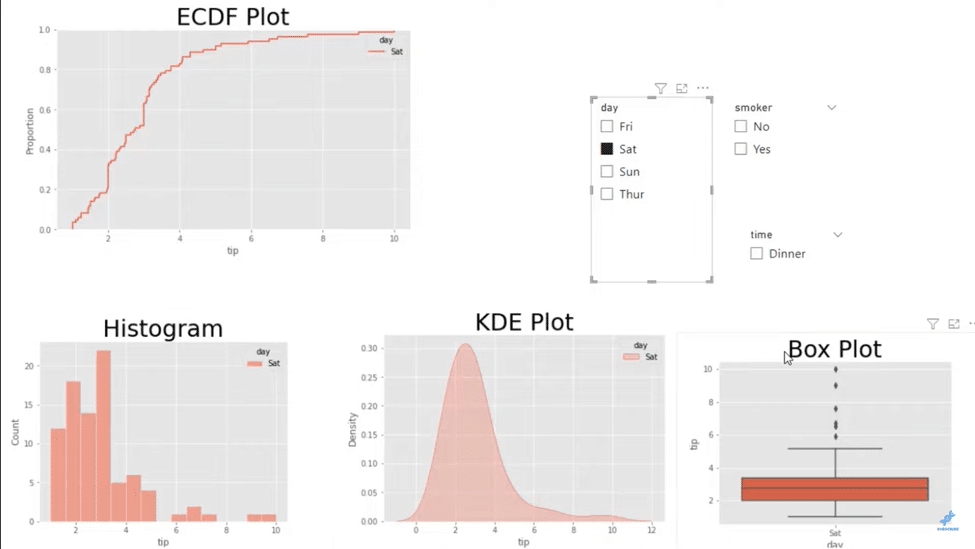
All these plots will describe how data is spread across or distributed. For example, if we go down and look at the histogram, we can see that most of these tall bins will be where our data is situated.
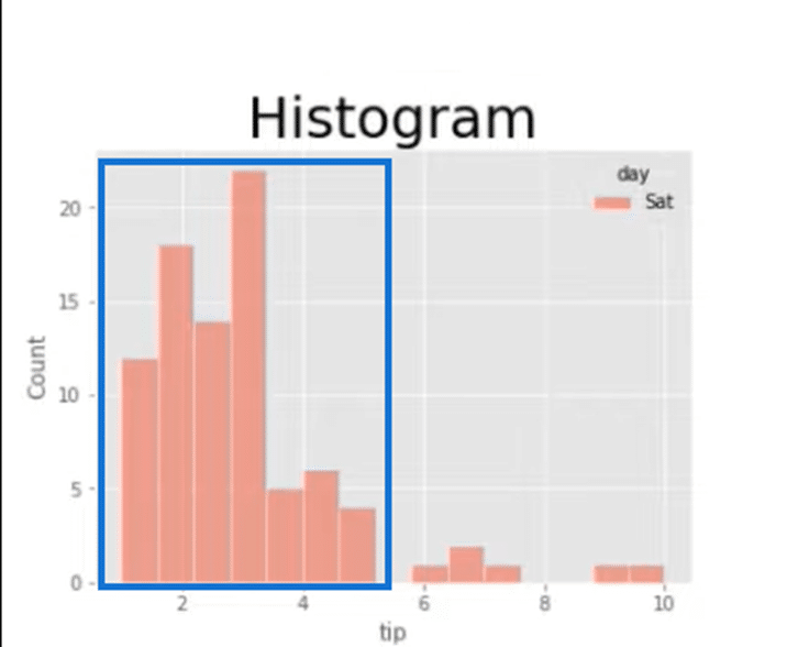
At around $3.50, we have the highest bin for our Tips data in our data set below.
We can also use a KDE plot that gives us a different metric when looking at distribution. Histogram deals with count that’s going to be in these bins, while KDE deals with density.
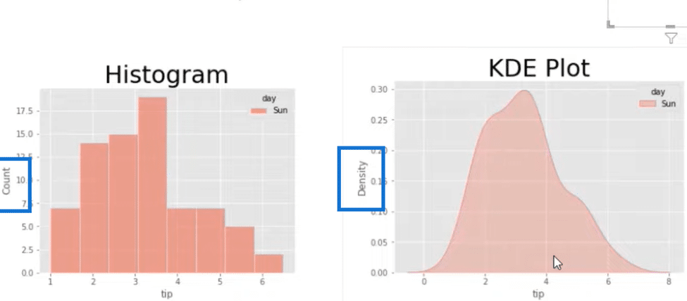
With a KDE plot, you can tell where most of our data is by spotting the biggest density or the highest bulge in the plot if you will. So in the image above, we can say that it’s distributed somewhere between $2 and $4.
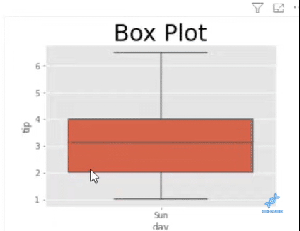
The same holds true in a Box plot, which shows that the distribution is $2 to $4, and this is where most of our data will be. It uses a median, the horizontal line dividing the box, to give us an idea of where the biggest distribution is.
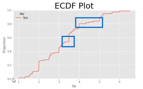
And then, we have the ECDF plot where on the left side of the y-axis, you can see the word Proportion, representing our percentiles. Based on the plot, at $3.50, we’re looking at about 50% of our data, and at $5 and below is where 80% of our data is distributed.

Histogram Plot Code
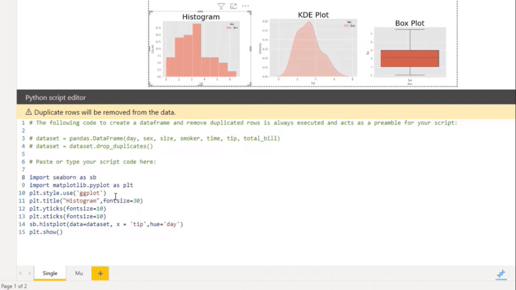
Now I will show you the code for each one of these plots, starting with the histogram. They all have very similar and repeatable coding, so you can quickly pull them up using one code, like a template.
We first need to import Seaborn and save it as sb, followed by matplotlib.pyplot as plt. We’ll use a background style called ggplot and that matplotlib variable to pass in different styles.
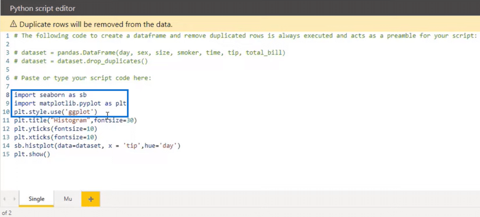
For example, in the image below, we can see that in the 11th line, we’re adding a title for histogram and tick sizes in the following lines. The yticks and xticks represent the x and y sizes accordingly.
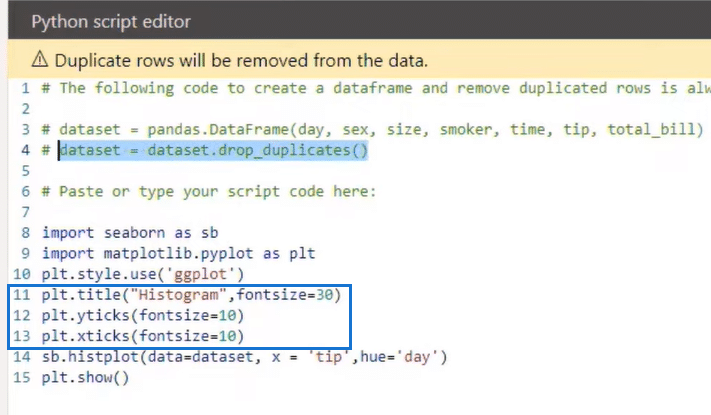
In the 14th line, we use a Seaborn variable to pass in the function that brings in that particular plot, like the histplot in the example above, which represents a histogram plot. We then pass the data from the 4th line into the function as a data set.
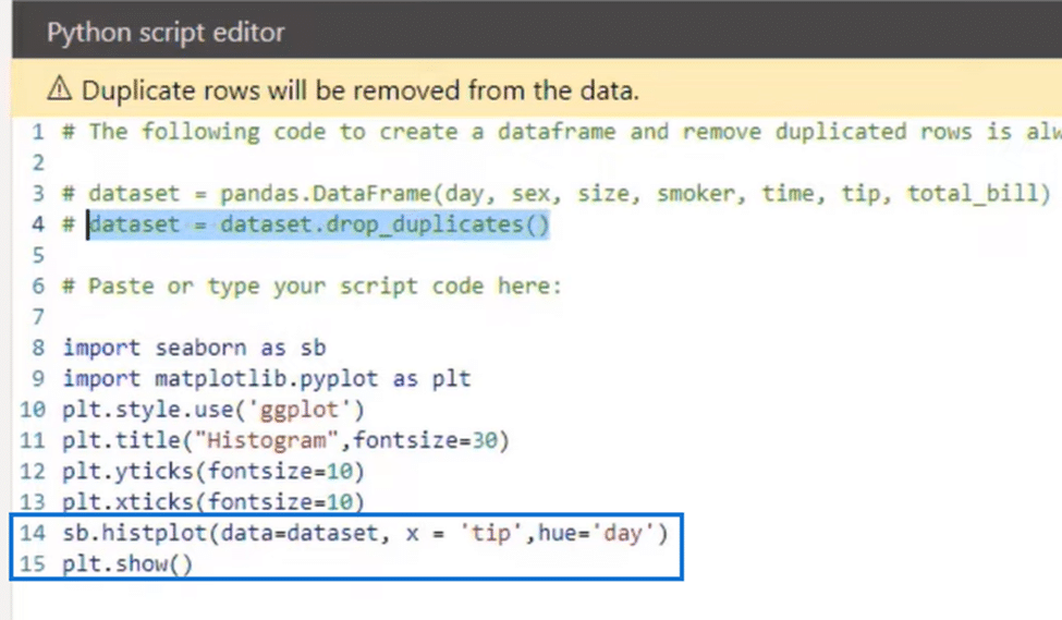
Anything you bring into the values represents your data set and will drop the duplicates. Then we’ll use x for the tips, and a hue, which, together with seaborn, allows you to separate your data by category. If we go back to our visual, we can that it has categories, including the, time, or smoker.
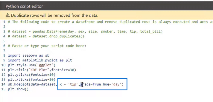
KDE Plot
For the KDE plot, everything is almost identical. We only need to pass in a new parameter called shade to have that shaded look. Other than that, the hue, data, and the rest are the same.
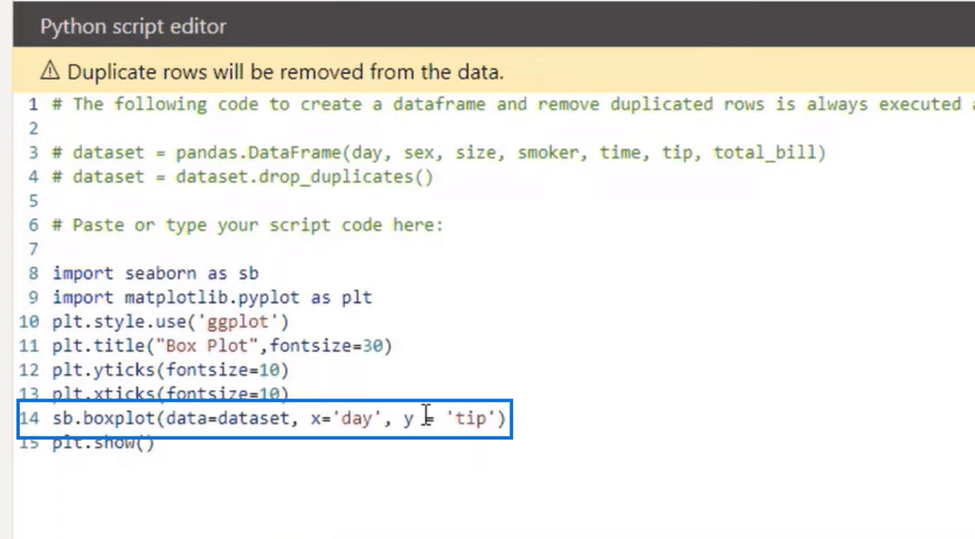
With the Box plot, it’s mostly similar to other plots except for a few minor differences. Here we use the boxplot function where x is the day and y is the tips. We’re also not using hue for this plot.
So it’s the same structure as the ECDF plot and the only difference is in the Seaborn variable, where we pass in an ECDF plot and use hue as day. But we can also change that hue to another category we have, like smoker.
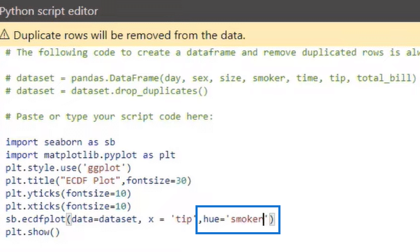
If we pass this category in, we’ll end up with an ECDF plot that has two different lines. In these distributions, we can see that the smokers have more regarding our particular line width.
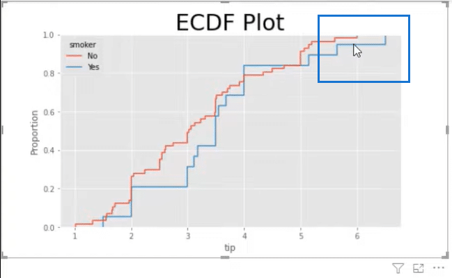
Non-smokers have a hundred percent of that data below $6, while smokers have it at $6. So interestingly, our smokers may be leaving a larger tip on a particular day.
Styling ECDF Plots
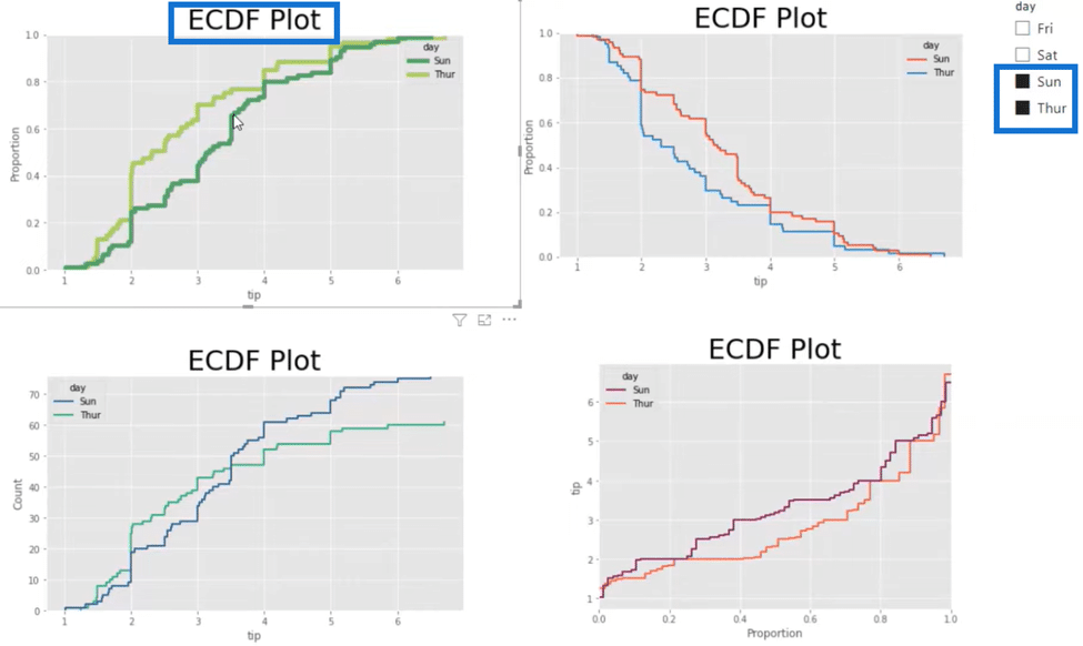
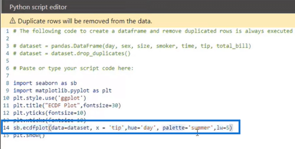
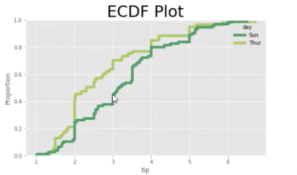
Now we can further style our ECDF plots to make them more presentable. In the image below are different ECDF plots. In the first plot, I made the lines bigger and used a different color palette.
In the first plot, I used different parameters inside the function. As you can see below, I passed in the palette as summer and the line width as 5.
I also compared Saturday and Sunday, which is why there are two different green lines. Here we can see that the $3 tip is at the 45th percentile for Sunday and the 70th percentile for Thursday, which tells us that people tend to leave higher tips on Sunday.
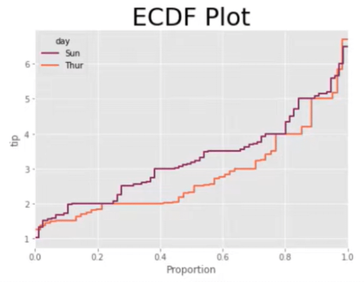
We can also switch the X and Y axis, swap the proportion and tip inside our plot, and change the palette, just like in the image below.
Here we can see that the $2 tip is at the 20th percentile for Sunday, which is the purple line in the plot. So the data is the same with the previous ECDF plot and only the presentation is different.

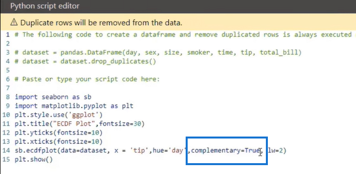
We now have another plot with the same data set and retains the original axis positions as shown in the image above. The difference this time is the direction of the lines is inverted.
ECDF Plots Style
If we look at the code, all we’re doing is passing in the parameter complementary equals = true. This action will allow us to say that at the $2 range and above is where 80% of our data is distributed, instead of saying below the $2 range is where 20% of our data is distributed. Again, it’s the same data with a different look or way of presenting it.
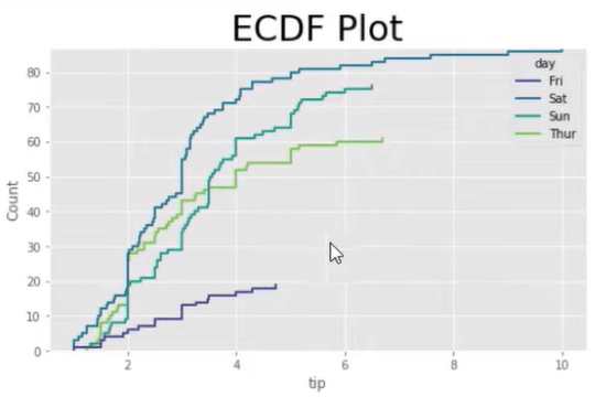
And in our fourth and final ECDF plot, we’re using Count instead of proportion.
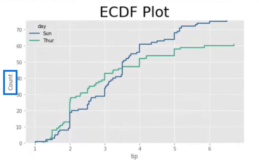
This approach is helpful when we have more than a few plots. By looking at the count column in the image below, we can see that there are not a lot of observations on Friday, which tells us that people aren’t leaving a lot of tips on that day.
ECDF Plots Code Essentials
If we look at the code, you will find Seaborn, which is the main thing for creating this particular plot. We also have matplotlib.pyplot for styling, which you can save as a variable called plt.
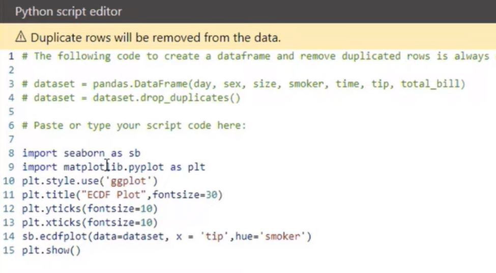
We can then use that variable to create different styles for our particular plot, like adding titles and font sizes. The main part of your code will be your ECDF plot function that we bring in with Seaborn.
***** Related Links *****
Scatter Plot In R Script: How To Create & Import
Python User Defined Functions | An Overview
GGPLOT2 In R: Visualizations With ESQUISSE
Conclusion
Those were the ways you can use different distribution plots, including Histogram, KDE, Box, and ECDF plots. You also learned four ways to present an ECDF plot using the same data set. You can use any approach depending on your preference.
Always remember to bring in the necessary libraries for creating your plot and to use the right function. After that, it’s only a matter of changing visual and stylistic aspects of your plot like the axis positioning and hues.
All the best,
Gaelim Holland


