Seaborn is a powerful Python library that allows you to create stunning data visualizations. One of the most valuable features of Seaborn is the distplot function, which makes it easy to create distribution plots for continuous data variables.
A Seaborn displot or distribution plot depicts the univariate or bivariate distribution of the data in a dataset. It combines a histogram with optional components, such as a Kernel Density Estimation (KDE) line or rug plot. By using Seaborn in conjunction with Matplotlib, you can create a wide range of customized distribution plots that are both visually appealing and informative.
This article will delve deeper into Seaborn distplot and its various parameters and options, making it easier to fine-tune your data visualizations. As you follow along, you’ll learn how to create distribution plots that best represent your data, discover valuable insights, and present your findings in a clear and engaging manner.

Let’s dive in!
What is a Seaborn Distplot?
Seaborn is a powerful Python data visualization library based on the popular matplotlib library. One of the plotting functions available in Seaborn is the distplot, which is used to visualize the distribution of data.
This section will cover some fundamental concepts and explore univariate and bivariate distribution plots.
Note: Starting with Seaborn v0.14.0, the distplot() function will be removed and replaced with the displot() function. displot() function is an updated version of distplot() with many more modern capabilities.
All our examples will use the displot() function to reflect this change.
Fundamental Concepts of Distplot() Function
The Seaborn library provides access to several approaches for visualizing data distribution. The displot() function is one of them.

You can see how we create Seaborn plots in this video on how to create 3D scatter plots in Power BI using Python:
Before we dive deep into displot(), let’s take a look at its syntax:
import seaborn as sns

sns.displot(data=None, x=None, y=None, hue=None, kind='hist', rug=False, hist= True, kde = False, ecdf = False, row = None, col = None)
Where:
- data: Name of the dataset. It can be a Pandas Dataframe or a NumPy array.
- x,y: Name of the data column in the dataset. You can leave them blank if the dataset has only one column.
- kind {hist | kde | ecdf }: Selects the data visualization methods and any other additional set of plotting parameters. It’s set to hist by default.
- hist, ecdf, kde, rug {True|False}: If set to True, it will display the selected visualization over the current distplot. False hides the visualization. By default, only the hist parameter is set to True.
- hue: Adds another variable to the histogram plot via the use of color mapping.
- row, col: They take in the name of other columns in the dataset and specify the order in which their subplots appear on the grid.
In addition to these, the displot() function supports faceting, semantic mapping, and many other features. This helps in visualizing subsets of the data and organizing them across multiple subplots. You can read more about this in the Seaborn displot() API documentation.
Distplot() Examples
Let’s look at an example of a plot:
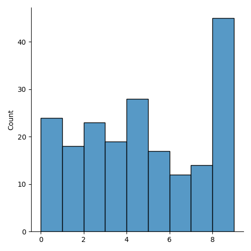
import numpy as np
import seaborn as sn

data = np.random.randint(10,size = 200)
sn.displot(data)
In the distplot example above, we first create an array of random variables with the NumPy module. Next, we pass the array into the displot function to create a histogram.
Output:
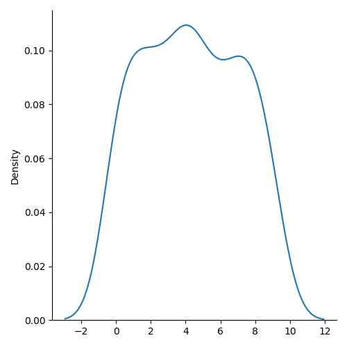
For a KDE plot, you can change the kind parameter:
sns.displot(data=data, kind="kde")Output:
Note: Seaborn provides several datasets that you can use to practice your data visualization skills. You can import them using the seaborn.load_dataset() function.
import seaborn as sns
data = sns.load_dataset(<name>)
Examples of datasets available include:
- titanic
- tips
- anagrams
- taxis
- penguins
- mpg
- car_crashes, etc.
We’ll be using these data sets in subsequent examples. You can also load your own external datasets using the Pandas module.
How to Create a Seaborn Distplot
The simplest type of plot to create in Seaborn is a univariate distribution plot. It displays the distribution of a single variable in a dataset.
Seaborn’s distplot function can be used to create such plots. Let’s go through the plot creation process step-by-step:
1. Importing Libraries
To begin, we need to import the relevant libraries needed for our data manipulation and visualization. We’ll be using seaborn, matplotlib, and numpy for our work. The following code demonstrates how to import these libraries:

import seaborn as sns
import matplotlib.pyplot as plt
import numpy as np
2. Loading Datasets
Next, we’ll load the required dataset for our Distplot visualization. In this example, we’ll use the taxis dataset from Seaborn’s built-in dataset library.
Here’s how to load the sample dataset:
dataset = sn.load_dataset("taxis")
taxis.head()
Output:
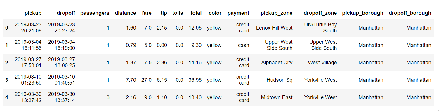
If you would like to load a custom dataset, you can use other data manipulation libraries, such as pandas, to read your data into a DataFrame.
3. Visualizing the Data
Seaborn uses the displot() function to visualize univariate distribution plots with multiple options, such as histograms or kernel density plots. Here, we will cover the essential parameters and create a sample distplot.
Firstly, let’s start by creating a simple distplot with default parameters:
sns.displot(data=dataset, x="pickup_borough")
plt.show()
Output:
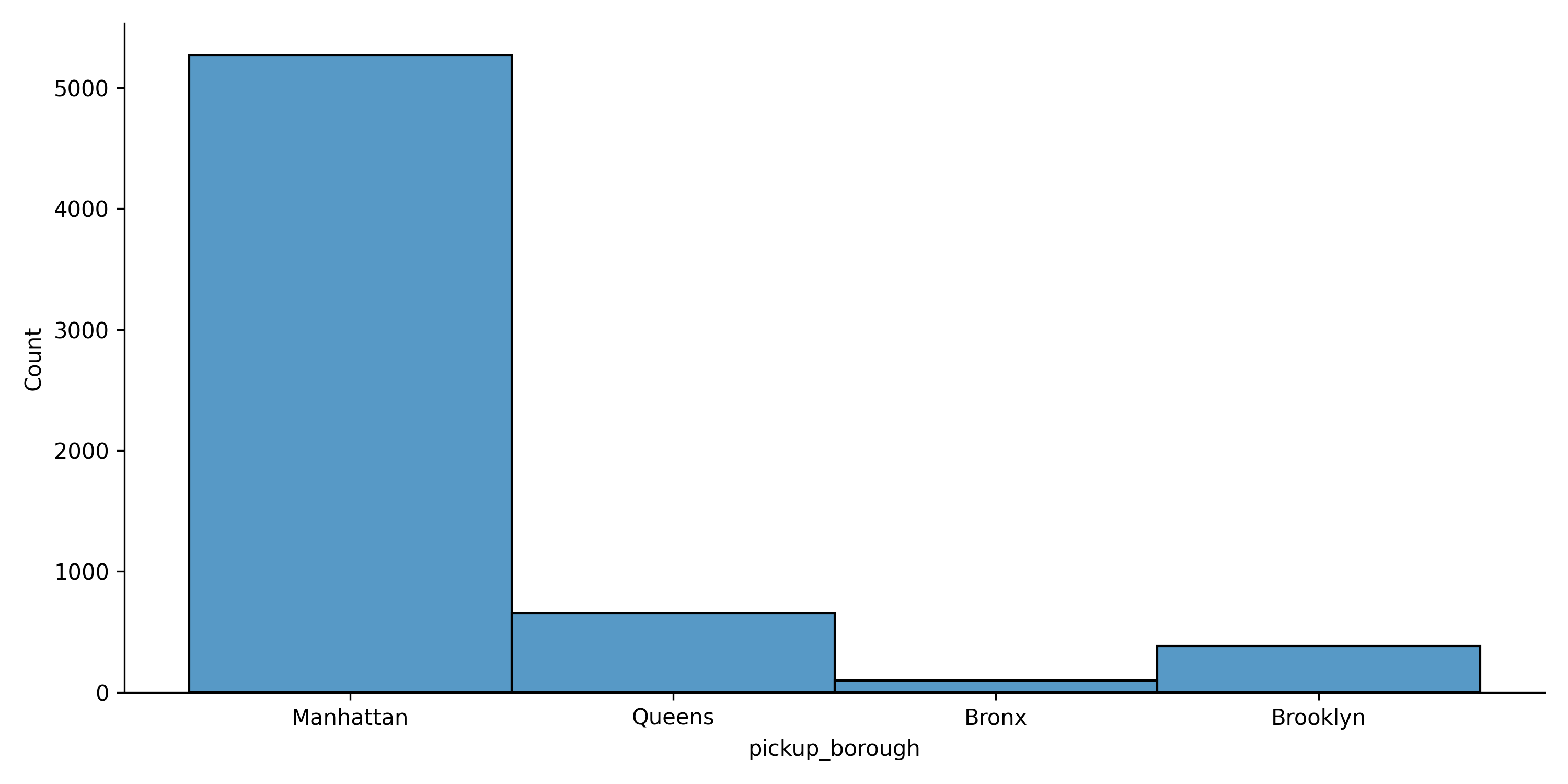
In the code above, we specified the dataset and the column we want to visualize as the x parameter. We visualized the pickup location column as the main column to be visualized.
To customize the appearance of the plot, we can use additional parameters such as hue, col, bins, kind, and palette. These parameters allow us to adjust various aspects of the visualization, such as grouping data by a categorical variable, specifying the type of plot, and defining the color scheme.
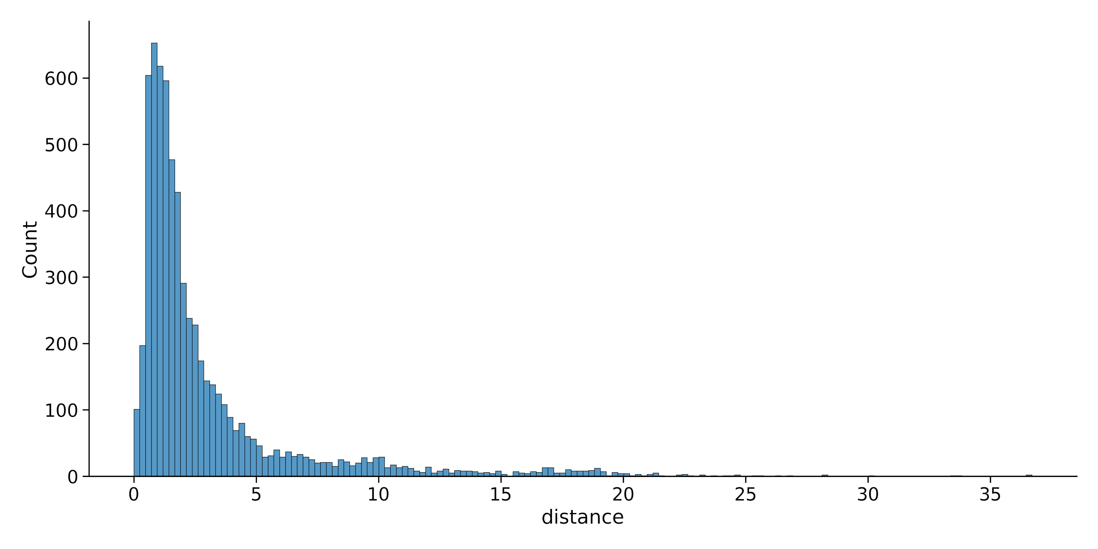
Here’s another example. This time we’ll use the trip distance column:
sns.displot(data=dataset, x="distance")Output:
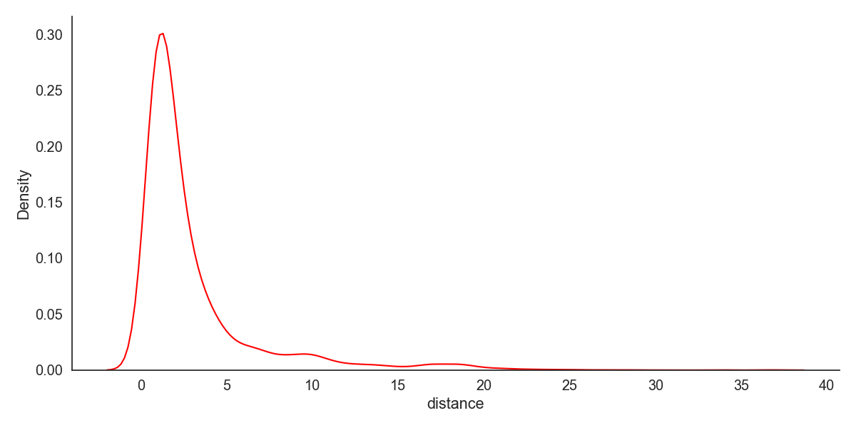
Now, we can change the original plot to a KDE plot by changing the kind parameter. Let’s also change the plot color.
sns.displot(data=dataset, x="distance", kind = 'kde', color = 'red')Output:
We can also combine the KDE and histogram plots on a single visualization:
sns.displot(data=dataset, x="distance", kde = True)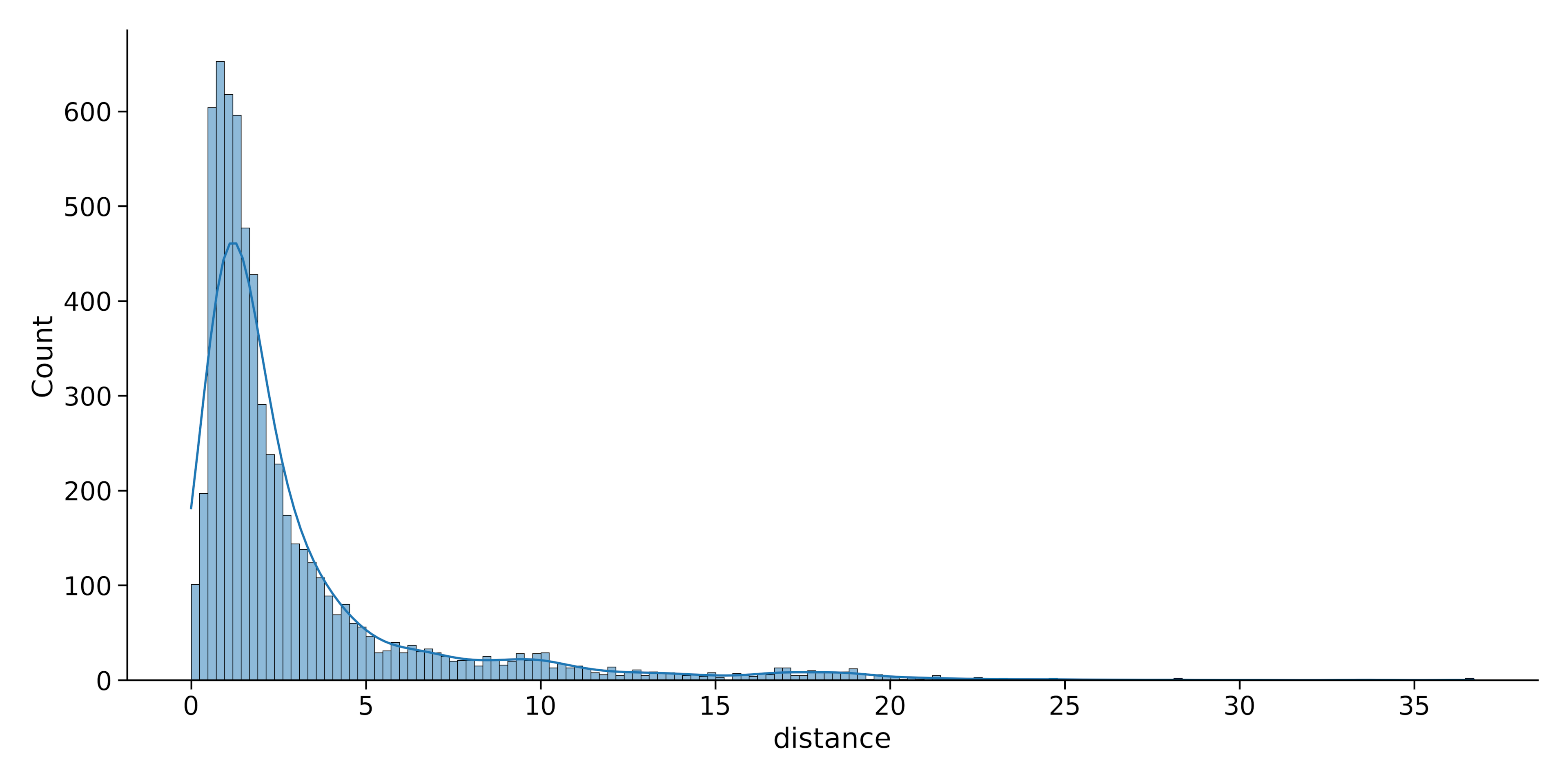
As we can see, using Seaborn’s displot() function allows for powerful and flexible visualization of univariate distributions. There are also numerous customization options for effective data exploration and presentation.
4. Bivariate Distribution
Bivariate distribution plots visualize the relationship between two variables in a dataset. In Seaborn, you can visualize bivariate distributions by plotting one variable against another.
For example, if you have two variables variable1 and variable2, you can create a bivariate KDE plot using the following code:
sns.displot(data=data, x="variable1", y="variable2", kind="kde")Let’s try this with our taxis dataset. Let’s create a bivariate KDE plot between the first 300 values of the distance and fare columns. We can do this with the code below:
sns.displot(data=dataset.head(300), x="distance", y = 'fare', kind = 'kde')Output:
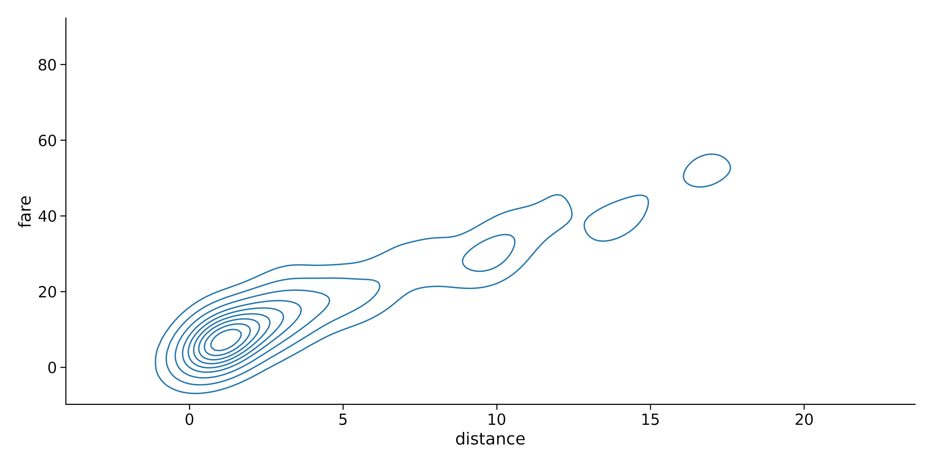
This will generate a plot with contours representing the joint density of the two variables. You can also create a bivariate histogram plot by changing the kind parameter to “hist“:

sns.displot(data=dataset.head(300), x="distance", y = 'fare', kind = 'hist')Output:
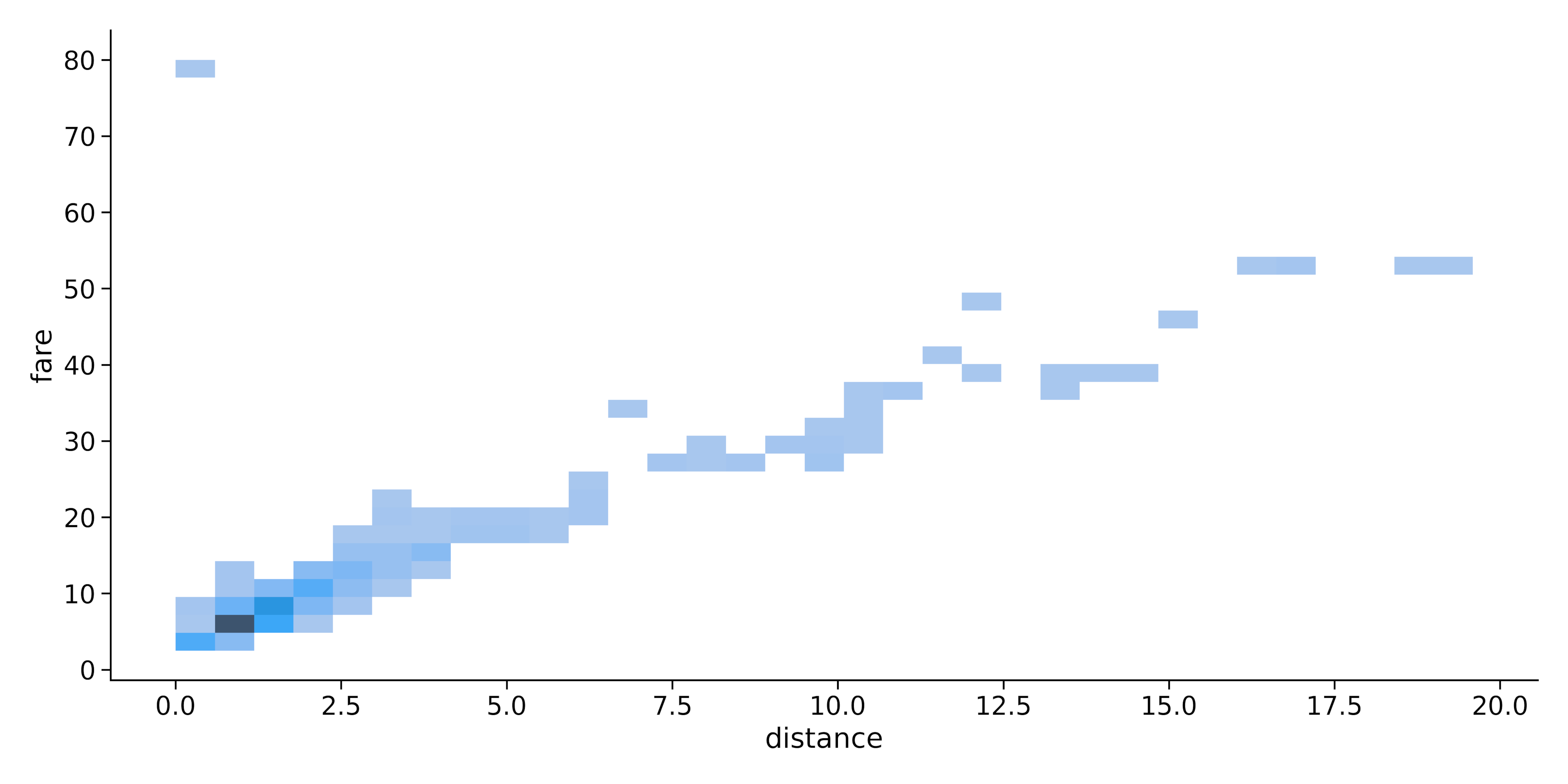
Note: We used only the first 300 values in the dataset for a clearer picture.
In summary, Seaborn’s distplot function provides a versatile tool for visualizing data distributions in both univariate and bivariate settings, allowing for easy exploration and analysis of various datasets.
Distplot Components and Customization
Distplot provides many types of statistical plots for visualizing the distribution of the data in a dataset. This section will provide an overview of the primary components of a distplot and demonstrate how they can be customized to represent your data better.
1. Histogram
A histogram is a graphical representation of the distribution of a dataset by dividing the data into bins and displaying the frequency of data points within each bin. In the example in the previous section, we’ve seen how you can create a histogram by setting the kind parameter to “hist”.
Additionally, you can customize a histogram by altering the number of bins or changing the color. The x and y parameters can be used to specify the data along the two axes.
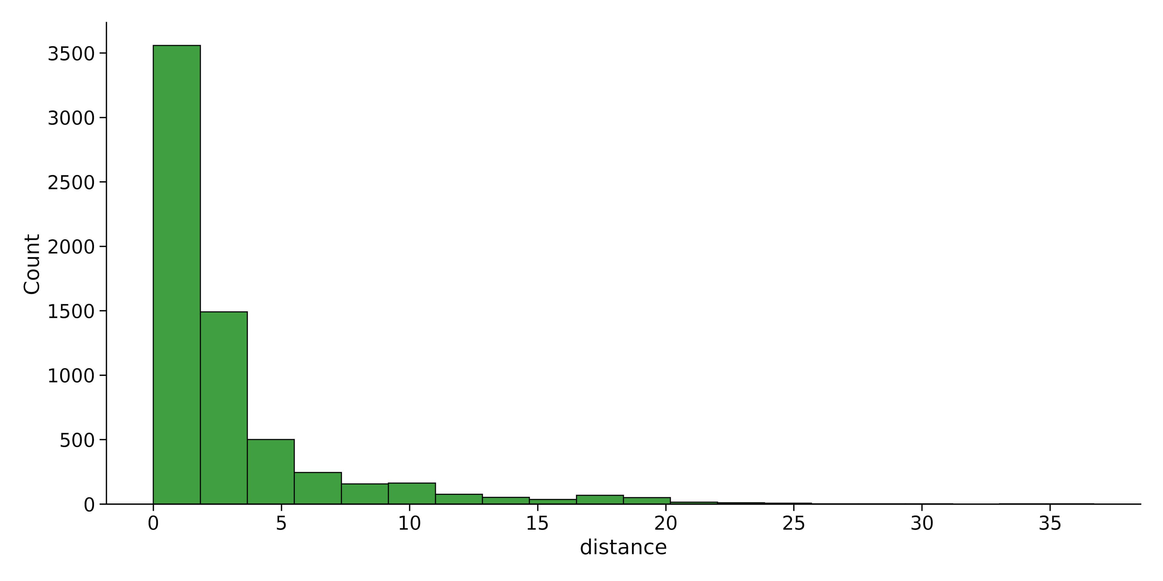
Let’s reduce the number of bins (histogram bars) in the previous section to 20 and change its color to green:
sns.displot(data=dataset, x="distance", bins = 20, color = 'green')Output:
2. Kernel Density Estimate
Kernel Density Estimate (KDE) is a non-parametric method used to estimate the probability density function of a dataset. As we saw in example x, you can create a KDE by setting the kind parameter to “kde”. The x and y parameters allow you to define the variables for the plot.
Additionally, by setting the line parameter to the desired style, it’s possible to customize the appearance of the density line.
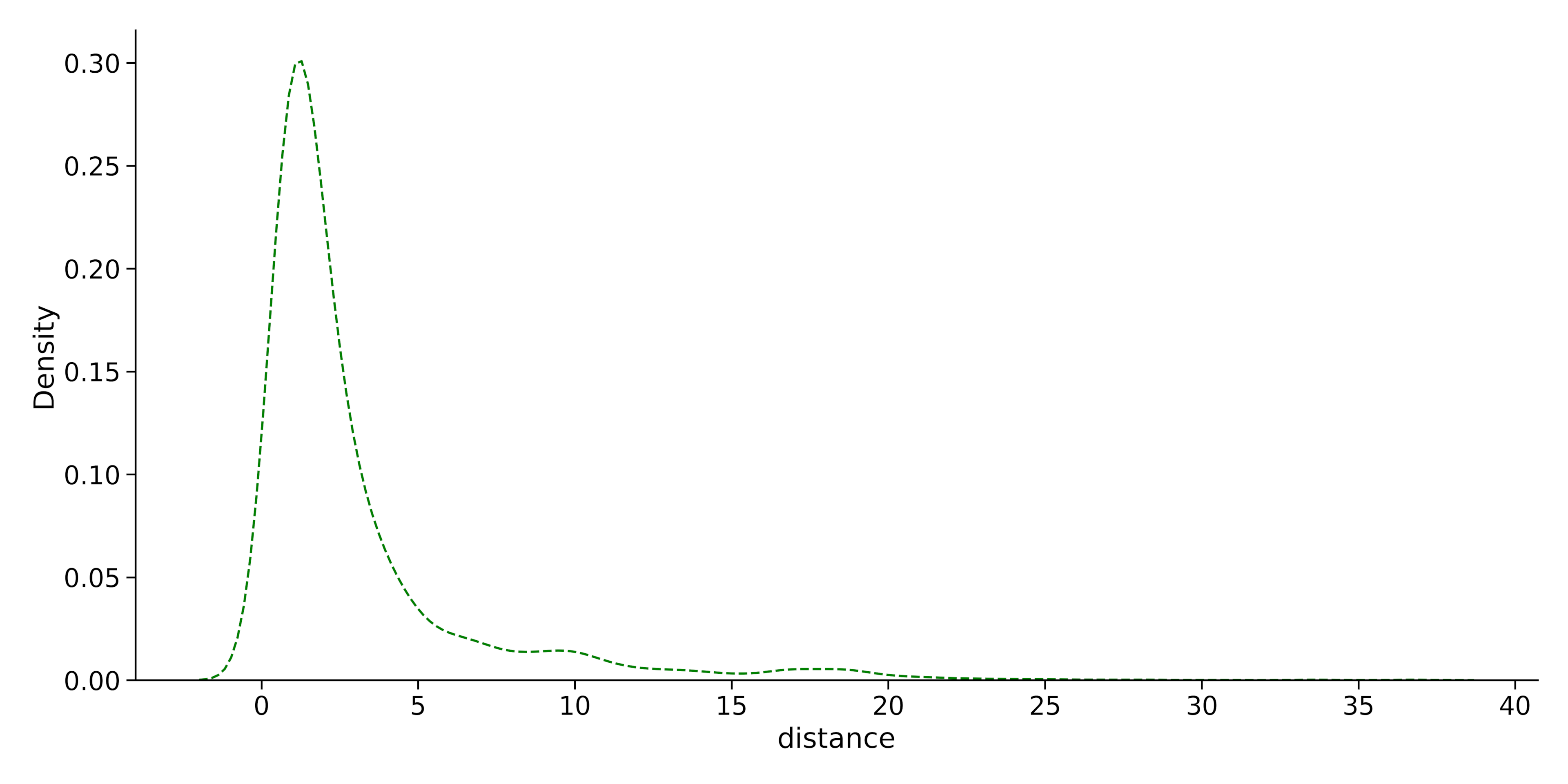
Let’s change the line style and the color of the KDE plot in the example:
import seaborn as sns
sns.displot(data = dataset, x="distance", kind="kde", color="green", linestyle="--")
Output:
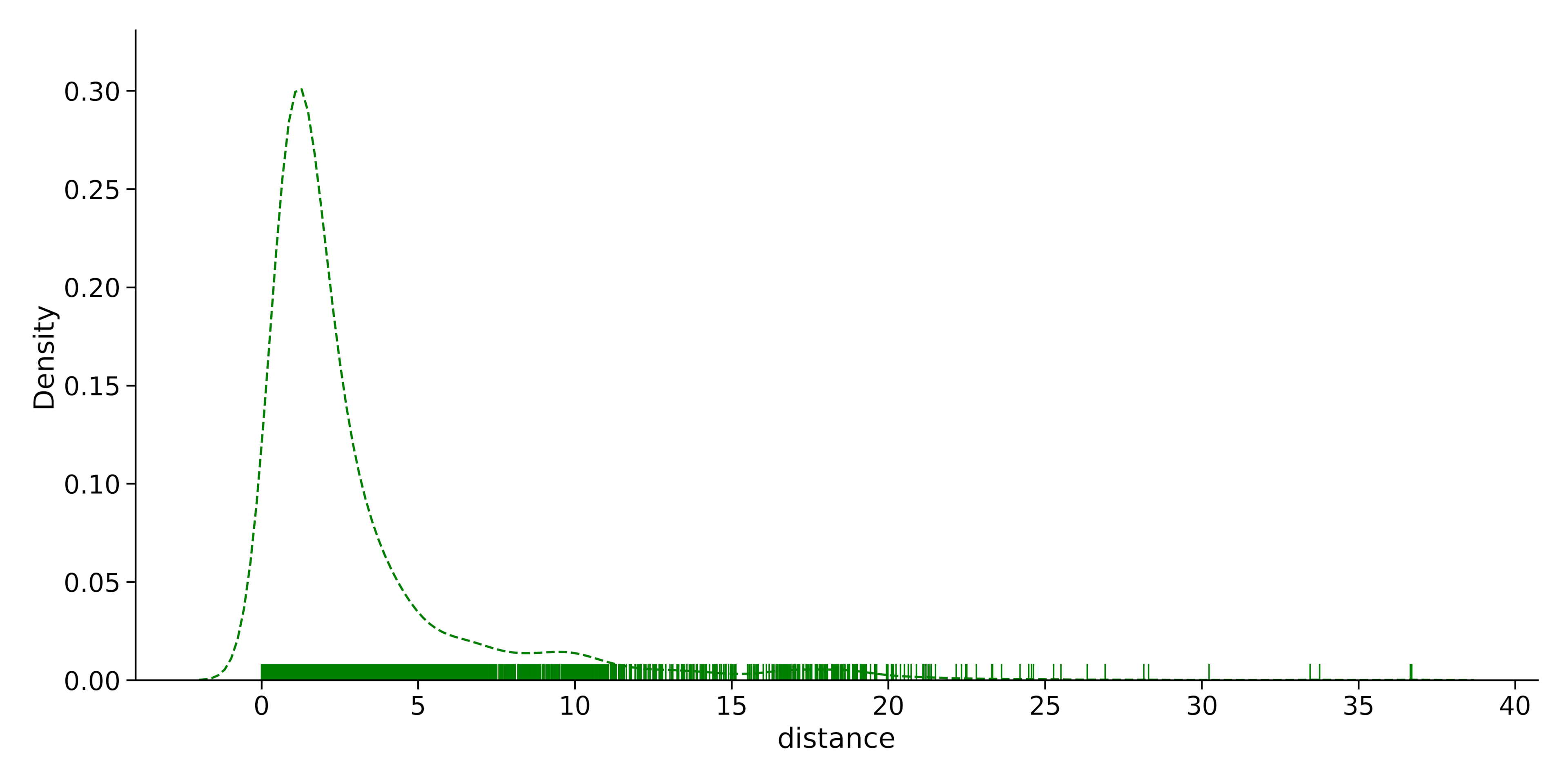
3. Rugplot
A rugplot is a one-dimensional plot displaying data points along a single axis as small vertical lines. In a Seaborn distplot, a rugplot can be added by setting the rug parameter to True.
This can serve as a complementary visualization to histograms or KDEs, giving an indication of data density. The x and y parameters are used to specify the data for the plot.
Let’s add a rug plot to the
sns.displot(data= dataset, x="distance", rug=True, color="green", kind = 'kde', linestyle = '--')Output:
By combining and customizing these components, Seaborn distplots offer a flexible and comprehensive way to visualize your data distributions, helping you better understand and communicate patterns within your data.
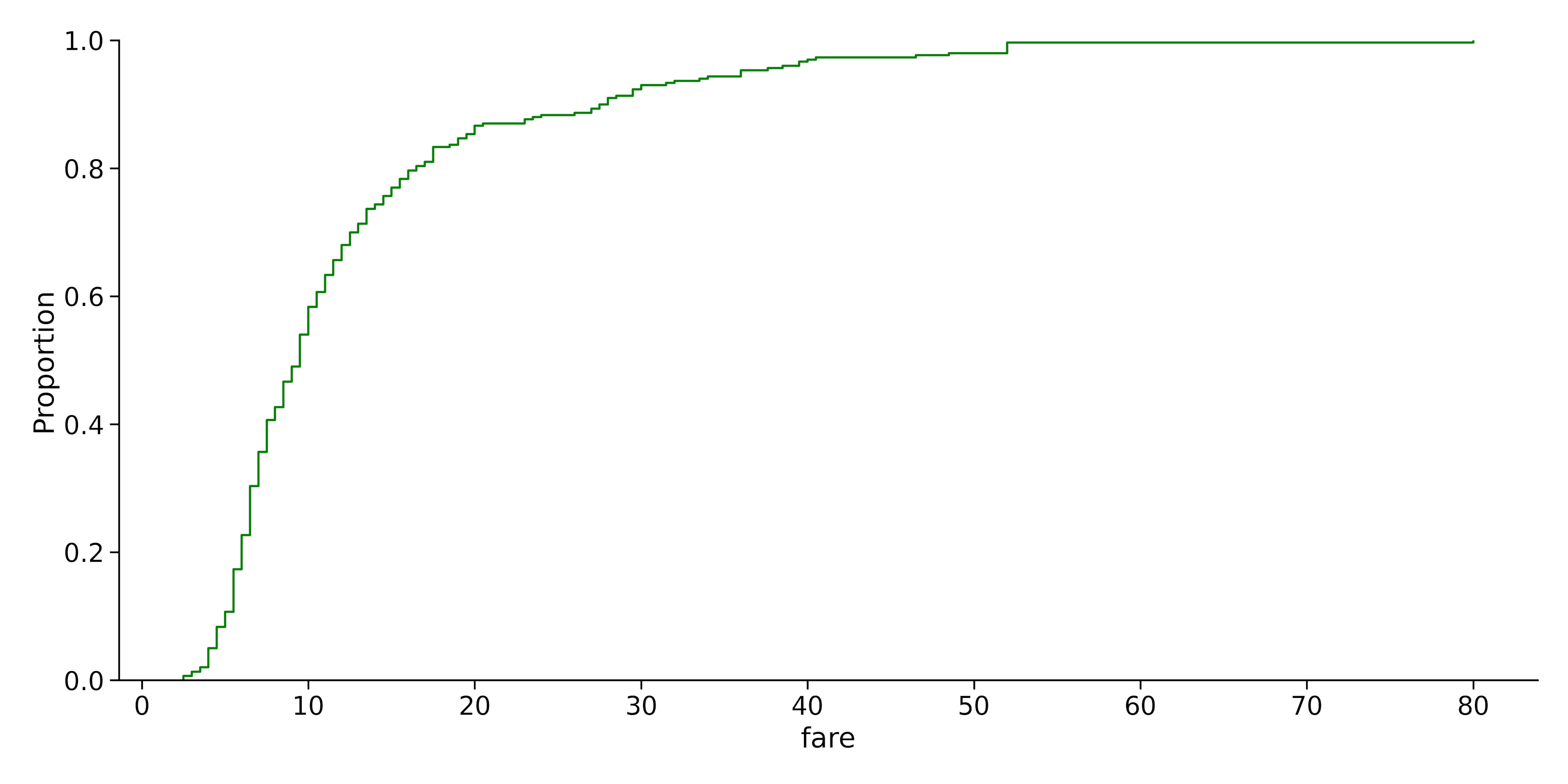
4. ECDF Plot
An Empirical Cumulative Distribution Function plot displays the number of observations or values in a dataset that fall below a specific value. You can choose between using the proportion (percentage) or count(number) of values on the Y axis by tweaking the stat parameter.
We can create an ECDF plot in displot by setting the kind parameter to ECDF. Let’s take a look at an example in our dataset.
Let’s create an ECDF plot with the fare parameter in the dataset:
sns.displot(data= dataset.head(300), x="fare", kind = 'ecdf')Output:
Advanced Distplot Features
In this section, we will cover advanced features of Seaborn distplot, focusing on the use of FacetGrid Plots, Pairplot, and Jointplot.
By leveraging these advanced features, you can create more complex and informative data visualizations using the Seaborn module in Python.
1. Hue
We can add another parameter to our displot using the hue parameter. It separates the plot into different color zones based on another parameter.
For example, we have a histogram showing the total fare paid by the customers. Assuming we want to color the frequency bins depending on the payment methods the customers used, we can use the code below:
sns.displot(data = dataset, x = 'total', hue = 'payment', multiple = 'stack')Output:
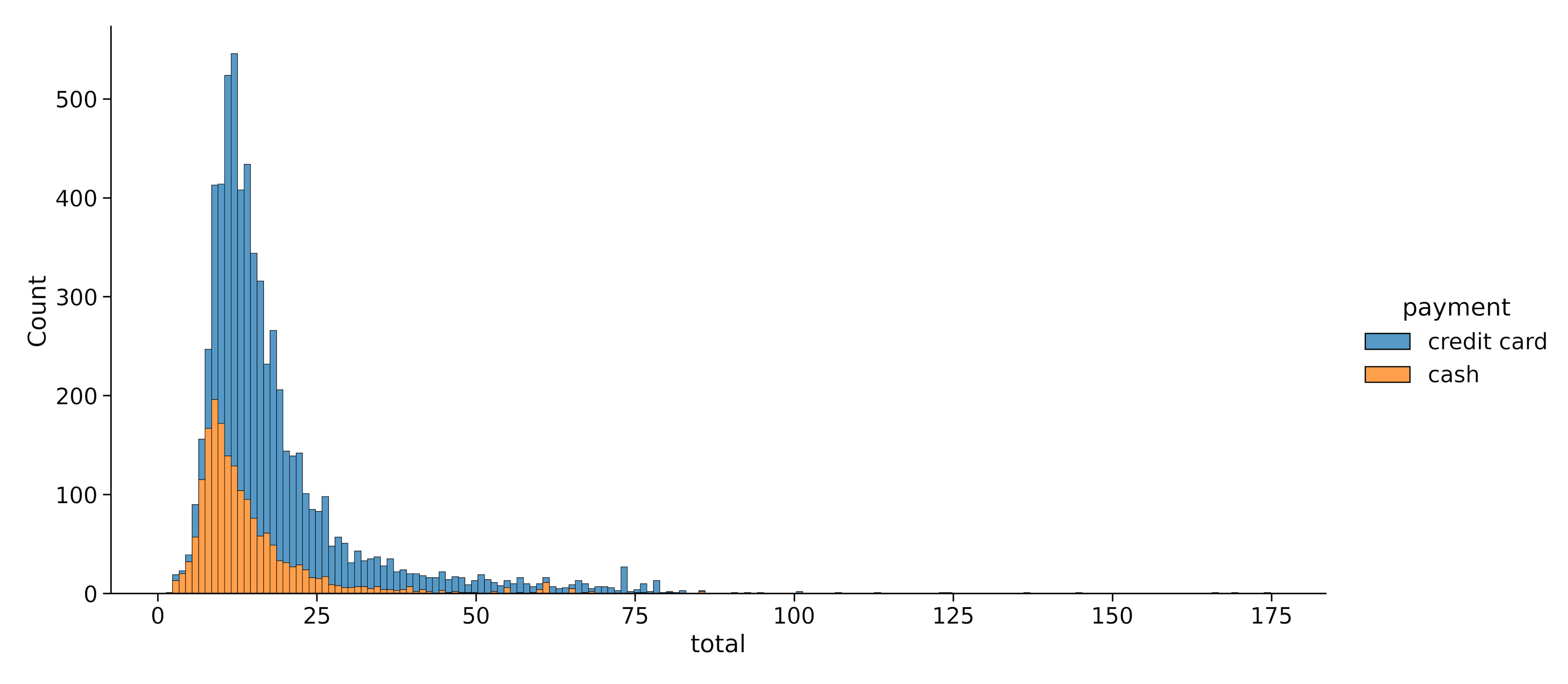
Note: The multiple parameter makes sure the two color zones are properly separated into two distinct zones.
We can do the same thing for Kernel Density Estimates:
sns.displot(data = dataset, x = 'total', hue = 'payment', kind = 'kde', multiple = 'stack')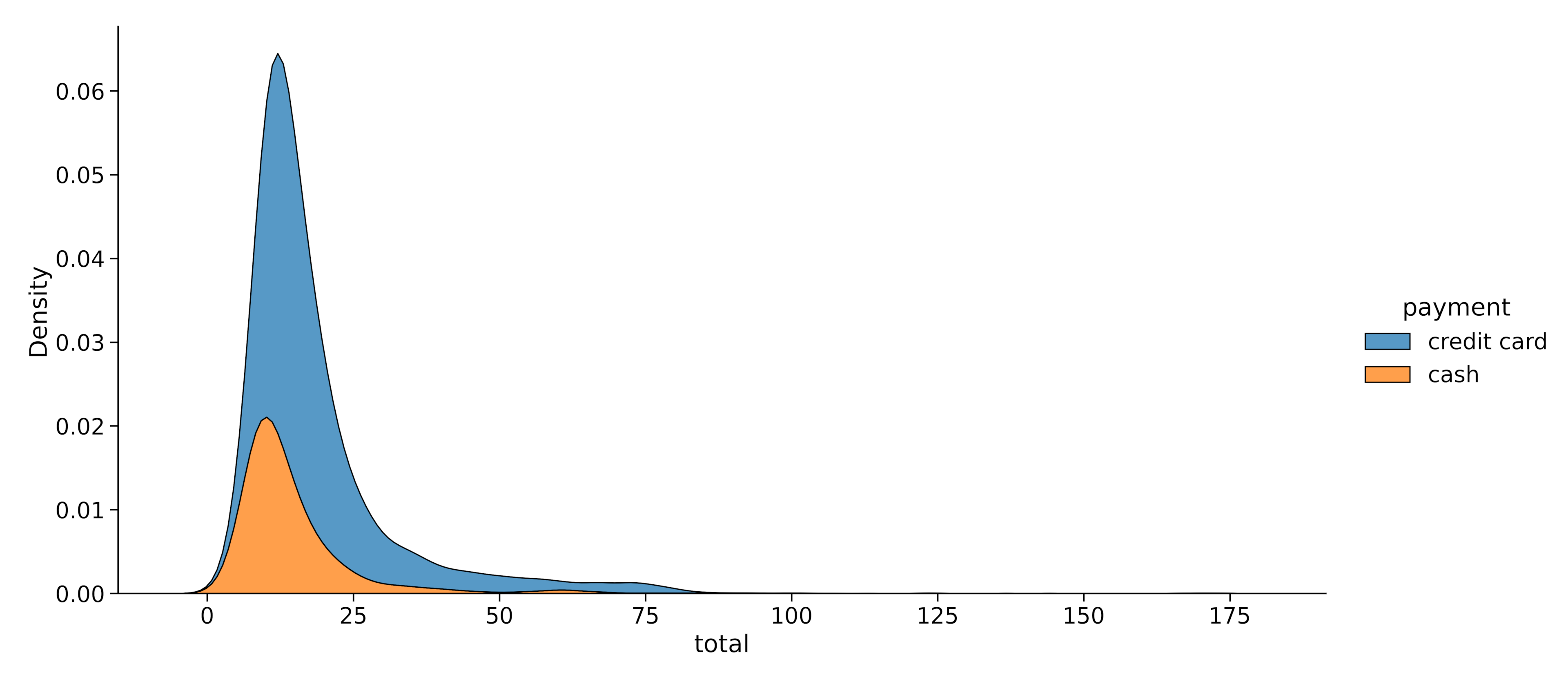
2. Rows and Columns
Rows and columns are parameters that we can use to create multiple subplots within a displot. They both take in another variable as a parameter and create multiple sub-plots using that parameter.
For example, let’s say we want to plot multiple distplots for total fare according to each drop-off location:
sn.displot(data = dataset, x = 'total', col = 'dropoff_borough', col_wrap = 2)Output:
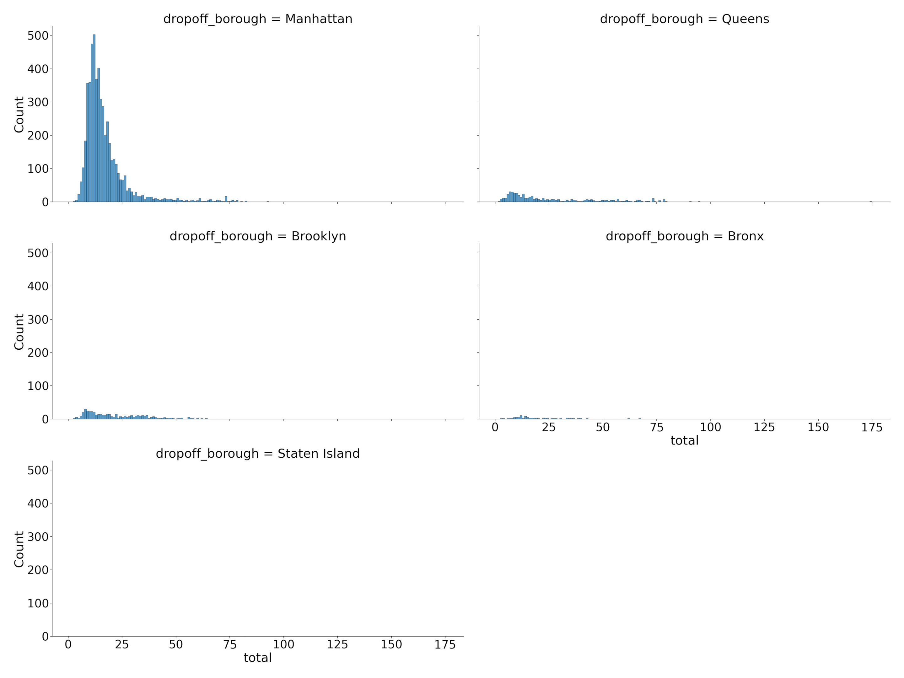
Note: The col_wrap parameter limits the number of plots that can be on a single line. In this plot, I set the maximum to 2.
You can also add another variable by combining the row and col parameters for a more detailed plot.
Examples and Applications of Seaborn Displot()
For our final example, let’s explore the Titanic dataset, which contains information about passengers aboard the infamous Titanic ship, such as age, gender, and survival status.
We’ll create a figure-level function using sns.displot() to visualize the age distribution of passengers who survived and didn’t survive the disaster.
titanic = sns.load_dataset('titanic')
sns.displot(data=titanic, x='age', col='survived', hue='sex', kind='kde', multiple='stack')
Output:
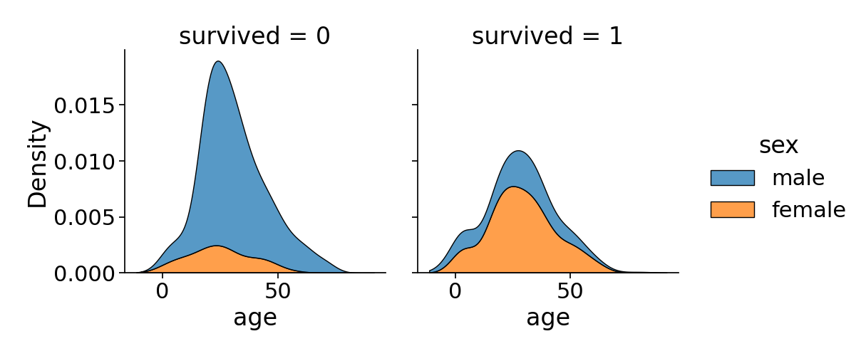
This code generates two side-by-side plots, one showing the age distribution of survivors and the other for non-survivors. Again, different colors are used to represent gender, revealing potential correlations between age, gender, and survival.
The kind=’kde’ parameter produces a Kernel Density Estimate plot, which smoothly estimates the underlying age distribution, while setting the mutiple= ‘stack’ parameter adds a shaded region under each curve.
Final Thoughts
In summary, Seaborn’s distplot offers an elegant and efficient solution for visualizing data distributions in Python. With its its rich array of customization options, distplot enables users to create visually compelling and informative plots.
Embrace the power of distplot to unravel the stories hidden within your data and make data-driven decisions with confidence.
If you liked this guide and want to learn more, check out our article on How to Adjust Marker Size in Matplotlib Scatterplots.
Frequently Asked Questions
Can you load a dataset to Seaborn from Excel?
Yes, you can load a dataset into Seaborn from Excel and all other data formats. You can do this using the read functions contained in the Pandas module.
For example:
import Pandas as pd

pd.read_excel(<file path>) #For reading excel files
pd.read_csv(<file path>) #For reading CSV files
pd.read_json(<file path>) #For reading JSON files
You can also check out this article to learn How to Read and Convert Json Files to CSV Using Python.
Can you export a Seaborn distplot as an image?
Yes, you can export your Seaborn plots into images, pdfs, and other file formats. To do this, you can use matplotlib’s savefig() function.
Let’s look at an example:
import matplotlib.pyplot as plt
import numpy as np
import seaborn as sns

data = np.random.randint(10,size = 200)
sns.displot(data)
plt.savefig('picture.png')
plt.show()
This will save the plot as a png image with the name picture.
Note: Always make sure the savefig() function comes before the show() function. The show function closes and deletes the image from the memory to save sapce.
How to resize a Seaborn displot?
You can resize a Seaborn Displot by adding a height and aspect ratio parameter to the method. For example, if you want an image with a height of 7 inches and an aspect ratio of 16:10, you can use the code below:
sns.displot(data = dataset, x = 'total', height = 7 , aspect = 1.6)