When working with a data set that is comprised of multiple variables, it’s best to be able to make sense of how these differ and interact with each other. In this tutorial, I’m going to demonstrate how you can use the Seaborn function in Python to visualize alternatives to a variable’s distribution. You can watch the full video of this tutorial at the bottom of this blog.
Using Seaborn Function In Python
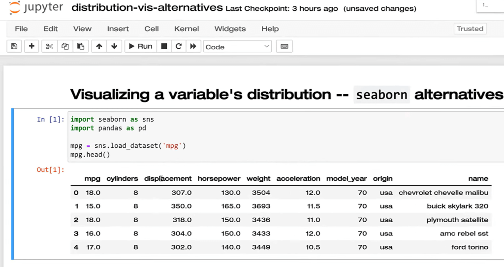
I will demonstrate this on the MPG data set, which is available within Seaborn. So, let’s go ahead and import any packages we need as well as any data that we need. We’re going to look at the distribution of the MPG variable here and how they vary. The two common ways to do that are histogram and the boxplot.
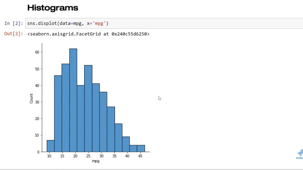
So I’m going to use the displot function (DIS for distribution). Then, I need to specify what data set it is and what variable we’re going to put on the X-axis. And with that, we have the distribution.
This is pretty good. This is very easy to see the entire distribution and the shape. A couple of shortcomings with this visualization of the distribution though. One is that the number of bins that we’re using is arguably arbitrary. The other thing is that we can’t necessarily know instantly what the mean of the variable is.
The nice thing with Seaborn is that once I set up what variable I want, where, and what dataset I’m using, it’s really plug-and-chug with making new visualization. Now we’re going to go to the boxplot. Boxplot doesn’t use bins.
The idea here is we can see the quartile value really clearly, the median specifically, and we see the other quartile values. We see there’s an outlier, and this is a very precise plot. The issue boxplot is that it’s precise with things that generally a lot of business users don’t probably care about.
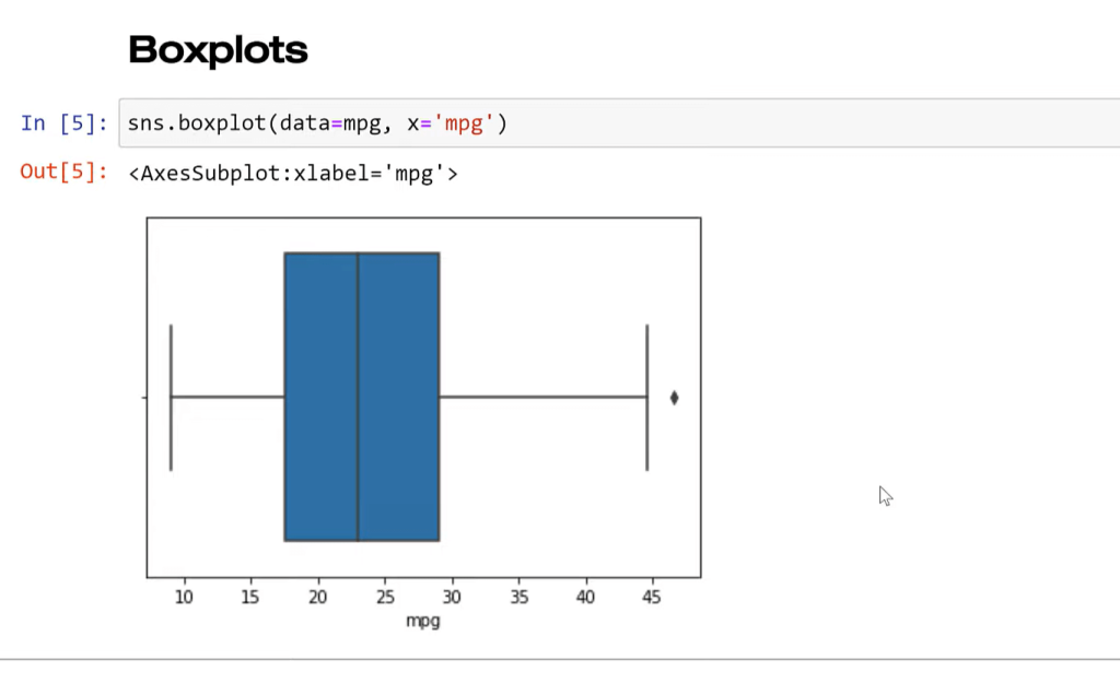
So, this plot is a little bit hard for non-stats people to really get a lot of value. And again, it’s aggregating the data, so we’re losing a lot of detail. It’s hard to know exactly what this looks like. We can see there’s an outlier. We can see most of the values are here. The histogram gives us a more intuitive way to look at that.
These are both good plots. They both have their purposes. Let’s look at some alternatives using Seaborn to visualize. We’re going to stick with MPG for the distribution of that variable.
Similar to boxplot, you can see here that the median is clearly marked. We see the quartile range as well and we can get a better look at what the overall distribution is. This is kind of like a histogram as well. It’s called a kernel density estimate plot or KDE plot. It’s a smooth version of the histogram. We’re not using any arbitrary binning. Everything’s smoothed into a continuous range here.
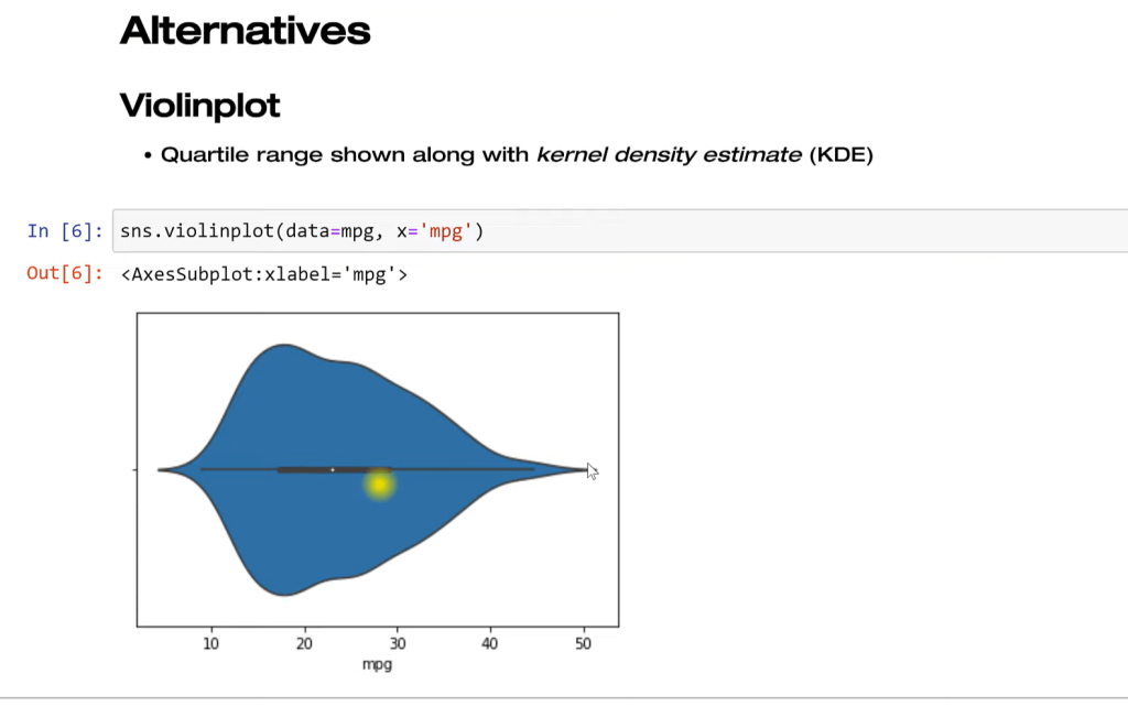
This is sort of a hybrid of these two approaches and really takes care of some of the shortcomings. However, depending on your audience, they might really struggle with looking at this. They may not be used to it, but it does have some benefits to the traditional approaches.
In this approach, we’re not aggregating the data anymore. Every individual point is plotted. This takes elements of the scatter plot, right? If you think about a scatter plot, we plot every individual point on the X and Y coordinates.
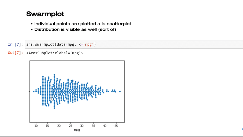
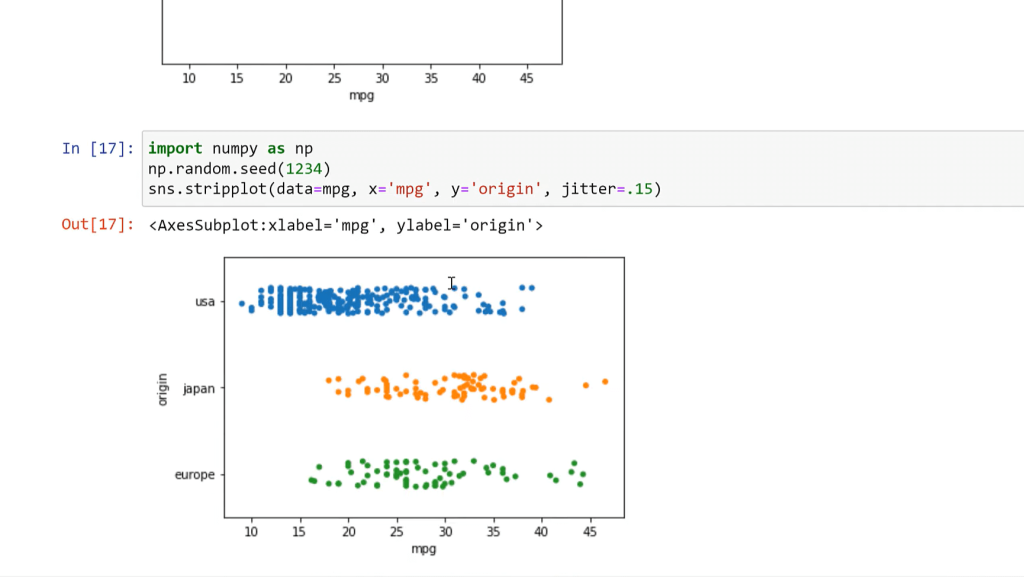
Lastly, we have the stripplot. What we’re doing here is taking that distribution and we’re randomly scattering. This is a random process. We’re not trying to make that distribution shape anymore. The issue with this is that we have all these clumps running into each other, so that might not be good depending on what you’re trying to do. Maybe you want to color these by group or something like that, so there is an option for that.
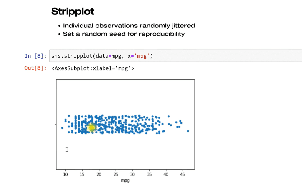
We can change the jitter to .25 and see that as we increase the jitter, these points are spread out a little bit more.
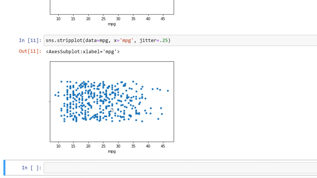
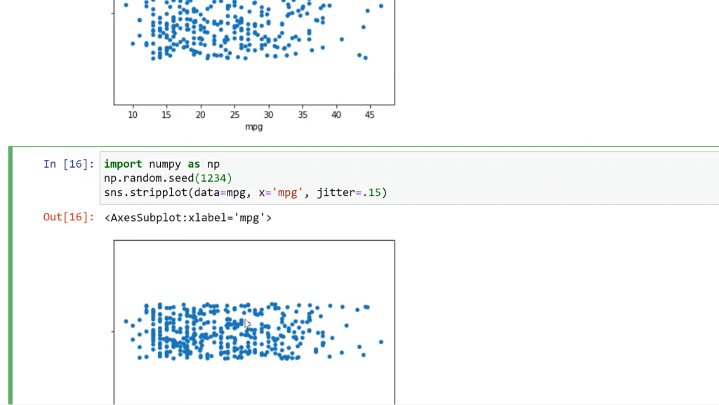
However, every time I run them, they are going to look slightly different. So, if you want to get rid of that and make it the same every time, you can import numpy as np. What this does is what’s called setting a random seed.
Every time I run something that has to do with random numbers, it’s going to use the same random numbers. Things don’t randomly change when you rerun it. This could be good for any kind of simulation that you’re doing, which happens a lot in data science and analytics with this visualization as well. So now, every time I run this plot, we’re going to get the same look of that.
I can also add here Y origin, and now we see that we’re creating a bi-variant distribution. We’re taking the mileage distribution and segmenting that by origin.
***** Related Links *****
How To Use Python Script In Power BI
Python Scripting In Power BI Data Reports
Datasets In Pandas With ProfileReport() | Python In Power BI
Conclusion
These are alternatives to visualizing distributions of one variable. They all have their pros and cons. This is not to say, never use the boxplot or histogram, but it’s just saying, here are some other options, depending on what you’re trying to show.
They’re all pretty much as easy to make as any of the other ones when we’re using Seaborn function in Python. If you want to know more about Python, check out the links below.
All the best!
George


