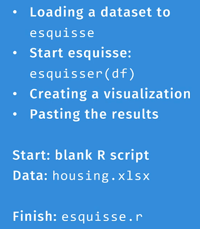
In this tutorial, you’ll learn how to use the ggplot2 and esquisse packages to create visualizations in R.

Specifically, you’ll learn how to load a dataset to esquisse and use the esquisser (df) function. This will launch a graphical user interface that allows you to drag and drop fields. And by using ggplot2, you’ll be able to generate the code used to create the graph.
ggplot2 is an open-source data visualization package for the R programming language. It’s a powerful and systematic tool to create graphics in R. However, it does take some time to understand its functions, aesthetics, and layers.

For this tutorial, you’ll learn how to use ggplot2 with esquisse. The esquisse package allows you to interactively explore and visualize your data in R. It will help you build muscle memory, making ggplot2 easier to use and navigate.
ggplot2 and esquisse are both free to download from the internet.
Using The esquisser ( ) Function
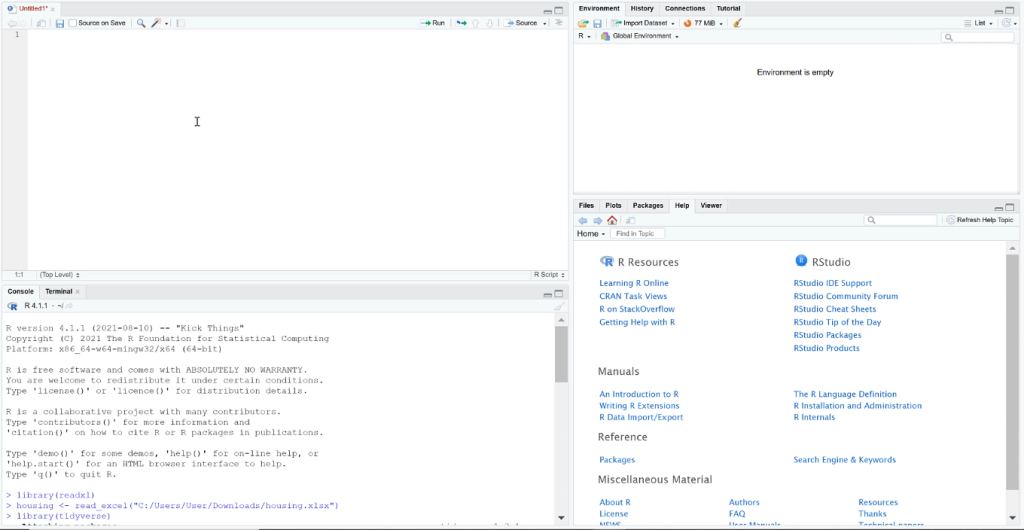
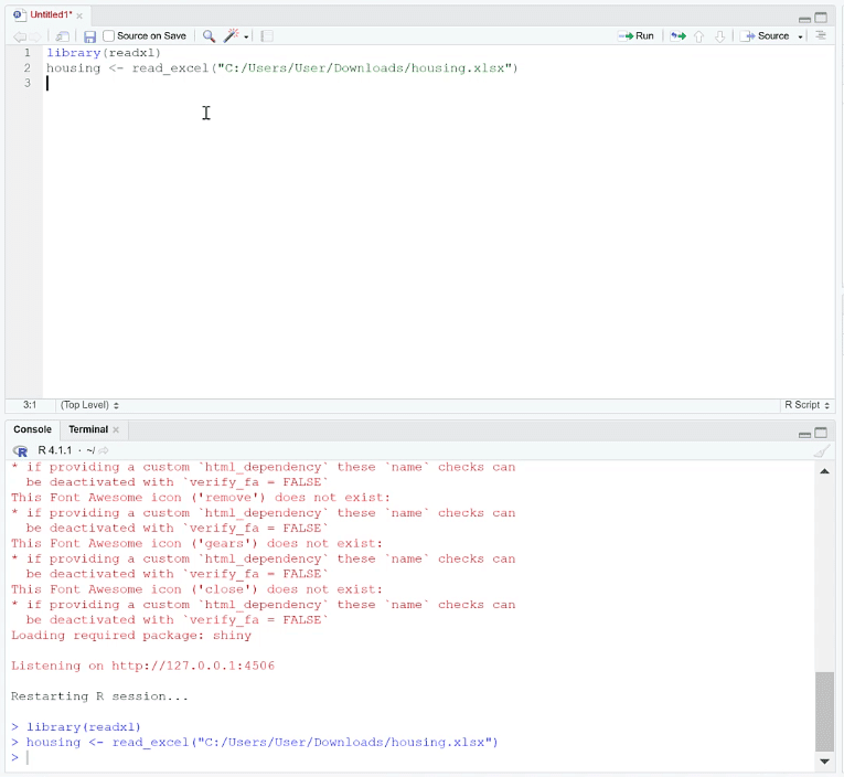
Open a blank R script. When using esquisse, it’s recommended to make the R program interface smaller. You can adjust the interface size by using the keyboard shortcut CTRL + – or CTRL + +.
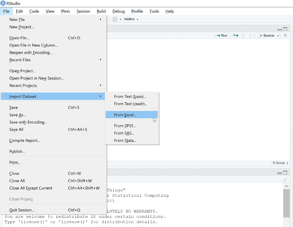
Next, you need to bring in the housing datasets. Go to the File tab and select Import Dataset > From Excel.
Then, select the file where you saved the data. You don’t need to import the file. All you need is the Code Preview found at the bottom-right side.
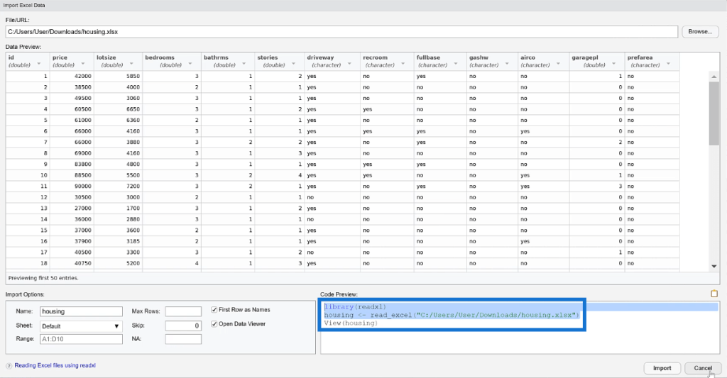
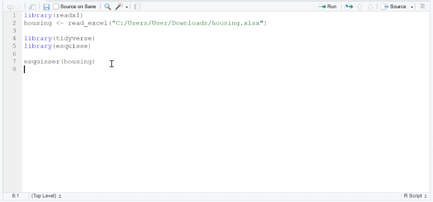
Copy this code and place it in your blank script.

Using esquisse And ggplot2 In R
You need to use the tidyverse and esquisse libraries. Then, input the esquisser function and write housing within the parenthesis.
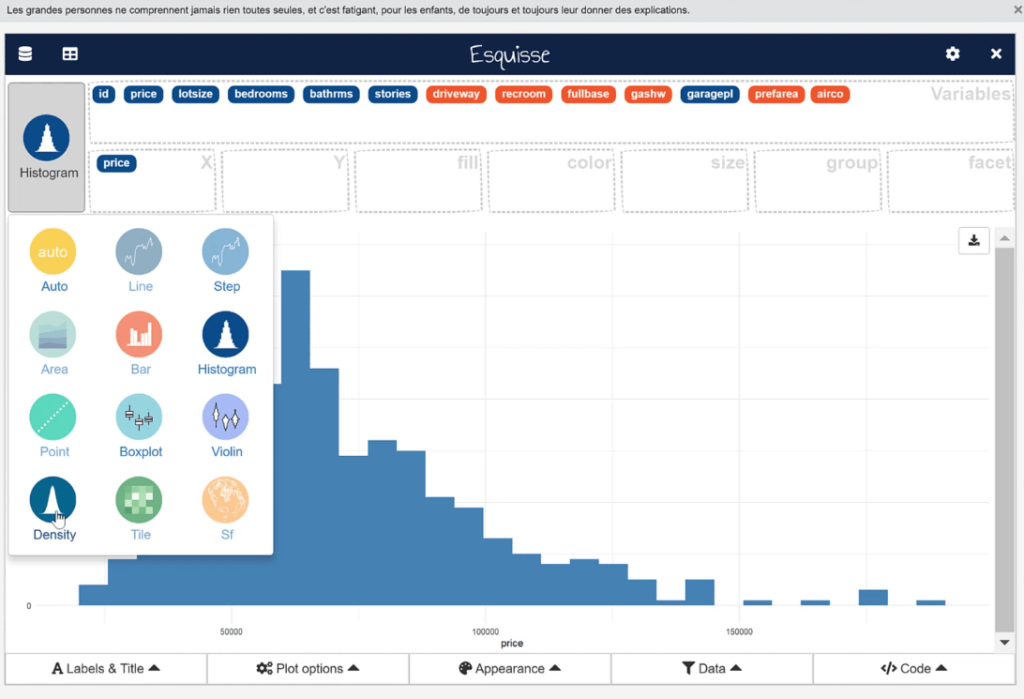
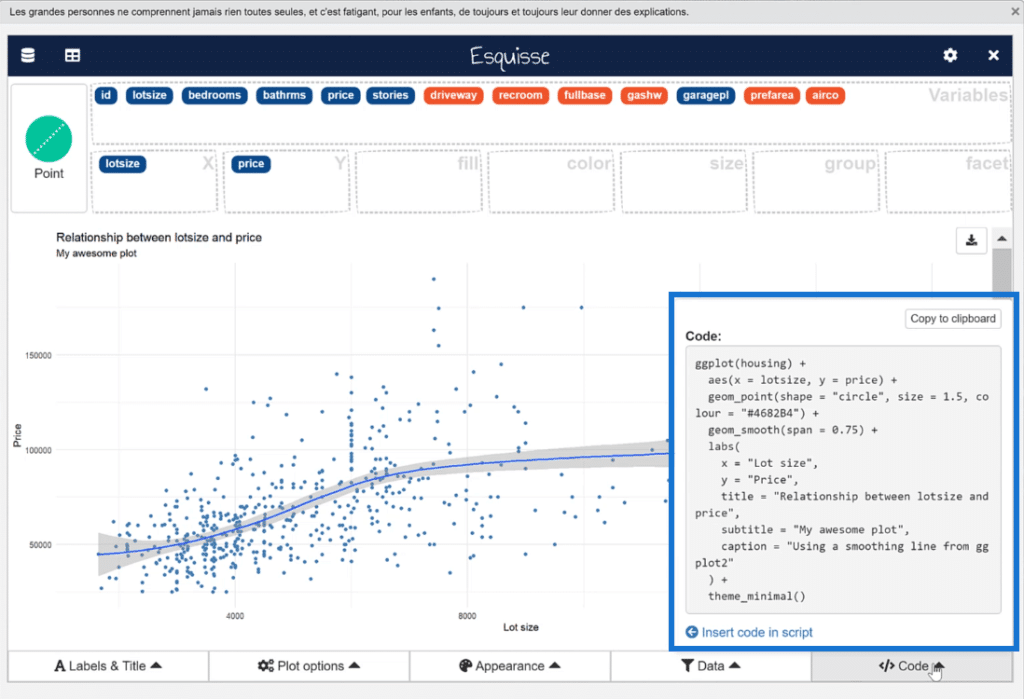
The code opens the esquisse menu that allows you to drag and drop fields to specific areas in a plot. You can also adjust the appearance of the plot, such as changing the color or plot size.
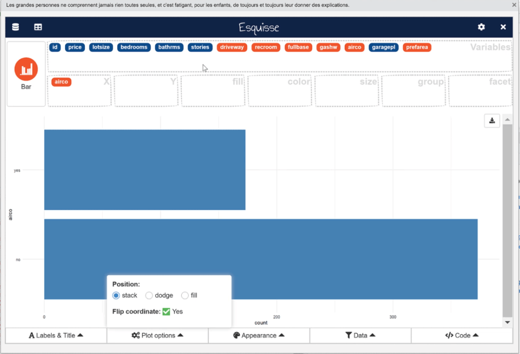
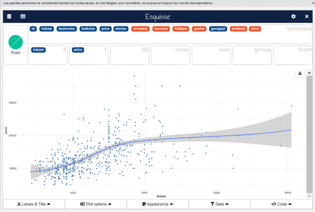
When you place a field on the x- or y-axis, esquisse automatically detects the best visualization type to use based on the nature of the data.
But you can always choose to change the plot type if you want.
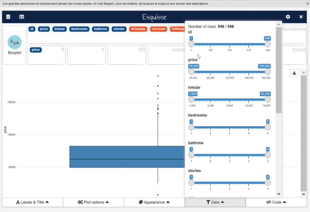
In the Data tab, you can manipulate the plot data and filter each information according to your preference.
You can also add a smooth line to a scatter plot. To do so, click the Plot options tab and change the Add a smooth line option to Yes.
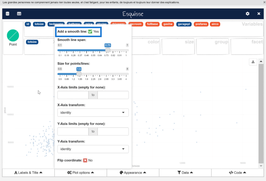
This will then automatically detect the best fit line of the scatter plot that summarizes the pattern between the x- and y-axis.
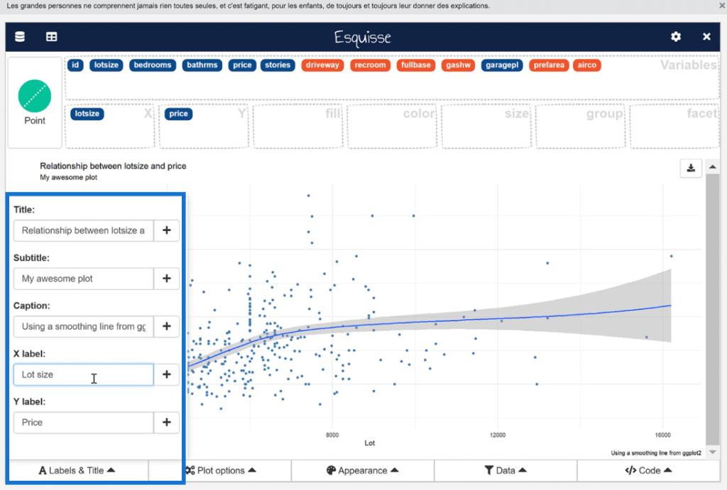
In the Labels & Title tab, you can specify the title and axis labels of your chart.
Once you’re satisfied with your visualization, go to the Code tab and either insert the code into your script or copy it to your clipboard.
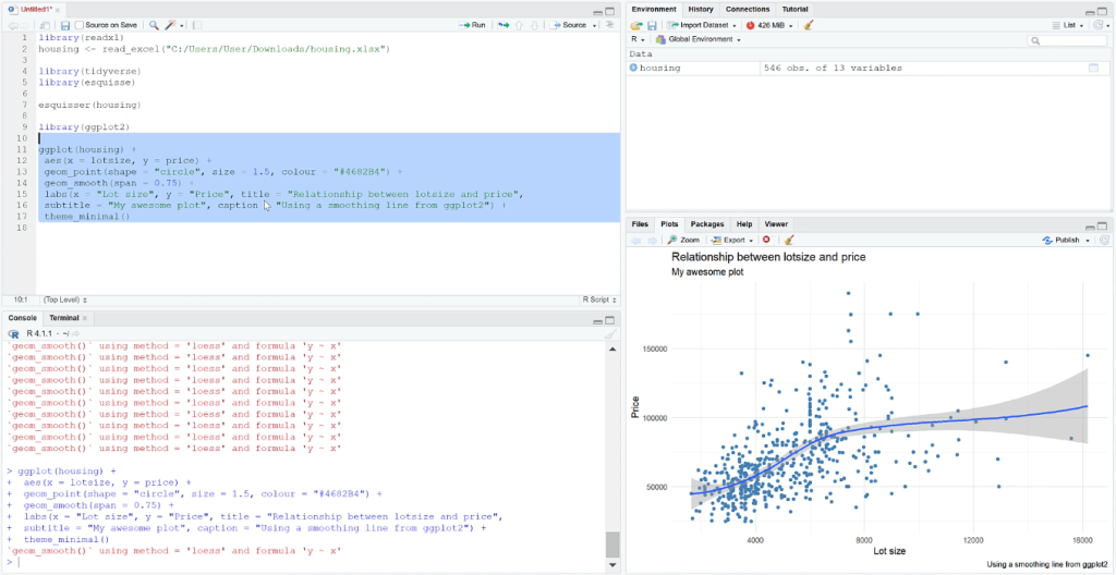
Close esquisse to go back to your R script.
When you run the code, you’ll see your chart appear in the Plots tab.
***** Related Links *****
Three Ways To Use R Script In Power BI
Arrange, Filter, & Group Rows In R Using dplyr
Visualizing Missing Data In R W/ GGMICE
Conclusion
The esquisse package in R is extremely helpful when it comes to understanding how layers within visualizations work together. The great thing about it is its simplicity. You only need to drag and drop data into specific fields and the code gets generated for you.
However, it does come with limitations. There are certain statistical plots that are difficult to create with esquisse. Some visualizations would be better to create with your own code.
The esquisse package isn’t the ultimate solution to creating plots in R. But it is a great tool to simplifying visualization building depending on the end goal of the user.

All the best,
George Mount