In this Report Builder tutorial, you’ll learn how to create and format a chart in your paginated reports.
Report Builder contains a wide array of chart formats that you can use. Charts enable you to visualize data in your report. Visualizations help in making the information easier to understand by end users.
How To Insert A Report Builder Chart
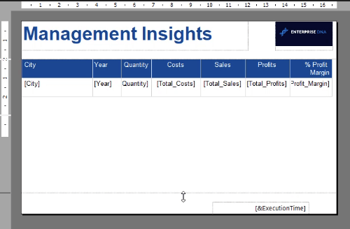
Make space for the chart by dragging down the horizontal dotted line on your report page.
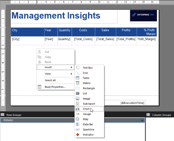
To insert a chart, right-click on the page. Click Insert and then Chart.
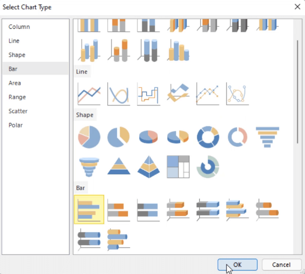
This will open a window that asks you what type of chart you want to insert in your report. You’ll notice that it looks similar to when you insert a chart in other Microsoft products.
Choose the chart type you want and press Okay.
The chart is then placed on the report page. You can resize the chart by dragging its edges. You can also reposition it.
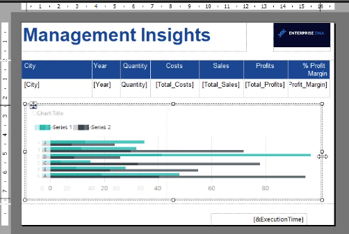
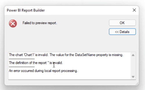
You’ll notice that the chart looks like it has data in it. But that’s just a sample or preview. If you run the report, an error message will appear saying that it failed to preview report.
This happens when the chart doesn’t have a dataset name attached to it.
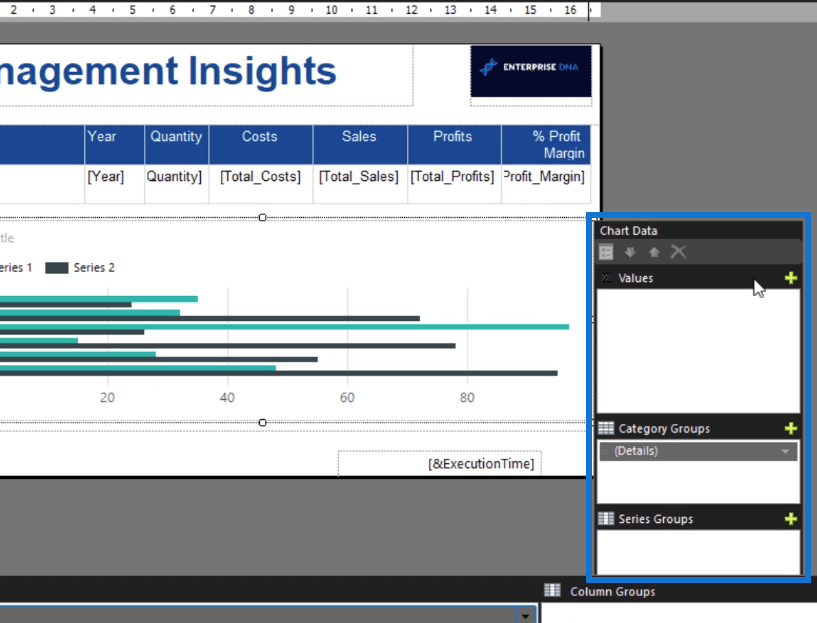
To add a data set to the chart, double-click on it. This opens the Chart Data.
On the Values tab, click the plus sign. Then, select the data you want to show in your chart.
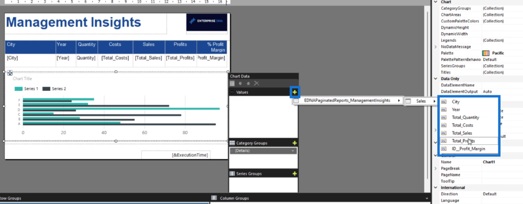
Do the same for the Category Groups and the Series Groups.
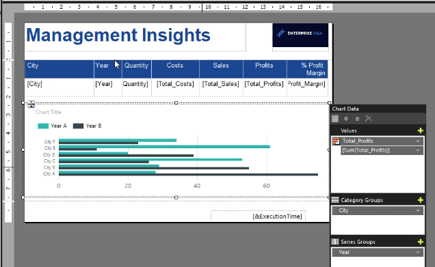
In this case, the Category Group is City, while the Series Group is Year.
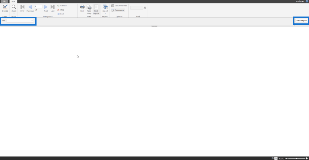
Once you’re done, run the report. Note that when you run a chart, you have to choose the Year. Afterwards, click View Report.
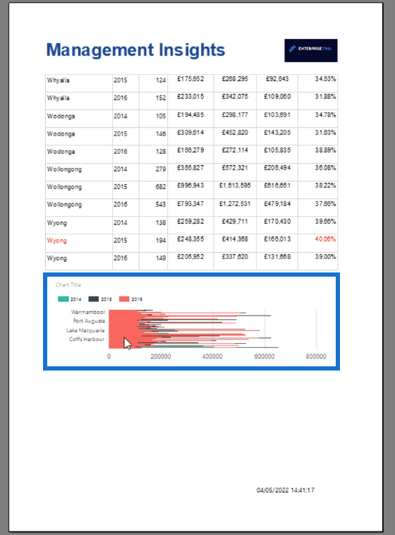
At the last page of the report, you can see the chart.
How To Format A Report Builder Chart
After creating your chart, the next thing you need to do is format it. Right-click on your chart. Select Chart and then Chart Properties.
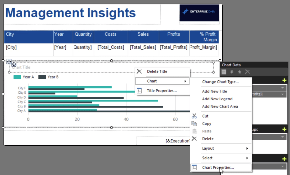
In the Chart Properties window, you’ll find the different properties you can customize to make your chart neater and more professional-looking.
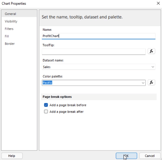
Make sure to change the chart name. This will be useful when you plan to create a lot of charts in your report. This makes it easier to identify them.
It’s also recommended to add a page break between elements in a report. In this case, you need to add a page break between the table and the chart. Adding a page break moves the chart to a new page.
By doing this, you’ve made the chart appear more distinct.
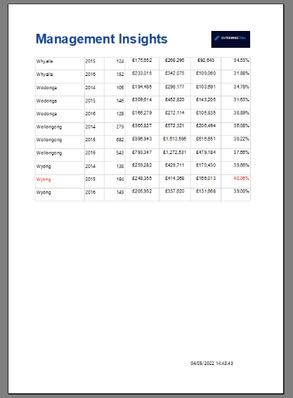
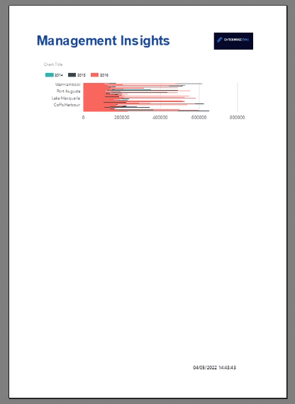
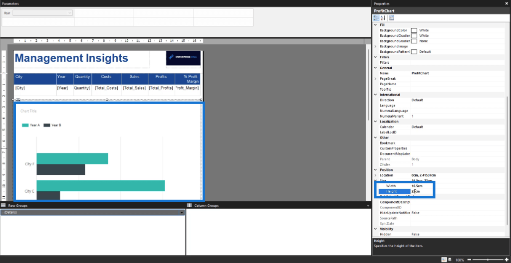
You can also adjust the chart’s size using the Properties pane.
Once you run the report, you can see that the chart looks significantly better than before.
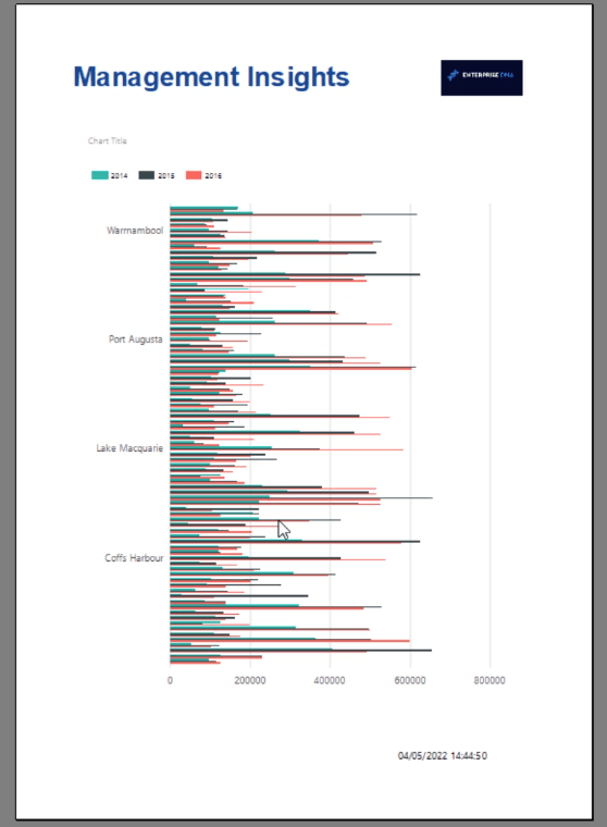
This is because the previous chart’s data was compressed. By extending the chart to fit the report’s page, the information on the chart becomes clearer.
***** Related Links *****
Expression Builder: Applying Conditional Formatting On Paginated Reports
Report Builder Tutorial: Sort & Filter Data In Paginated Reports
Conditionally Format Charts Using Charticulator
Conclusion
Reports are never complete without visualizations. They help make more sense of information. Visualizations such as charts, make it easier to identify trends between different elements in a report as opposed to plainly looking at a table.
To summarize, you’ve learned the basics on how to create and format a chart. In a succeeding tutorial, you’ll further learn how to sort and filter data in a chart in Report Builder.
Sue Bayes


