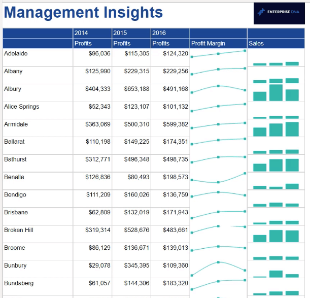
In this tutorial, you’ll learn how to add and format a SSRS Report Builder data bar chart. A data bar is a small bar chart added within tables, matrices, and lists. It’s often used to supplement additional information in the form of a visualization.
Create A SSRS Data Bar Chart
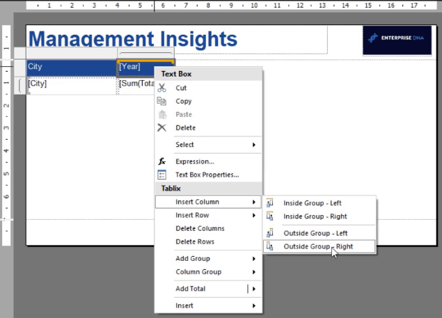
First, insert a new column in your matrix. Make sure you choose the Outside Group option. This will exclude it from the filtering applied to the group.
In this example, the data bars will show the Sales over Years data for each city.
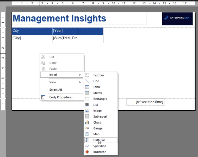
Right-click on your canvas and select Insert Data Bar. You can also add a data bar using the Insert tab.
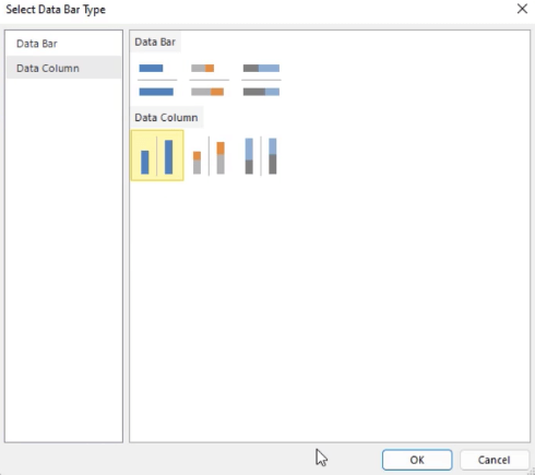
This opens the Wizard where you can select the type of data bar you want to add. In this case, it’s a data column.
Clicking on the data bar opens the Chart Data window. In this window, you can select the Values, Category Groups, and Series Groups for your data bar.
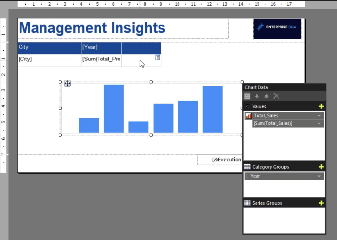
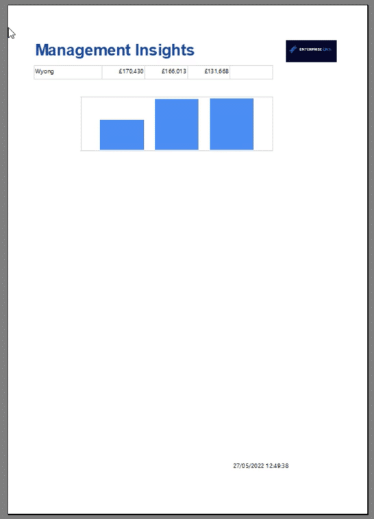
In this example, the Value is Total Sales, while the Category Group is the Year. When you run the report, you’ll see that it contains three columns. These represent the three years’ worth of information in the dataset.
Format A SSRS Data Bar Chart
The next step is to format the data bar using the Properties pane. You can change its name, background color, size, and position.
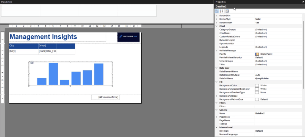
If you want to format the bars, click on them. This opens the Properties pane where you can make changes to the bars in the visualization.
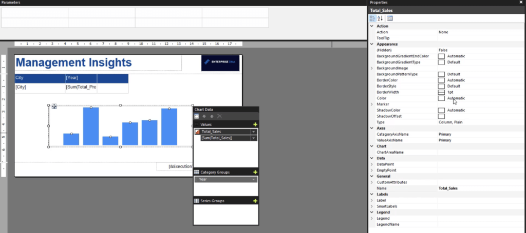
It’s recommended to use a coherent color palette in your paginated report. This makes it look professionally made and tailored for business purposes.
You can set a specific hex code as the main color in your report. You can paste this hex code as a background color or data series color in your visualization depending on your preference.
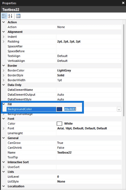
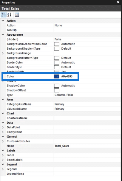
You can also use the Series Properties box to make changes to your data bars. Right-click on a bar and select Series Properties.
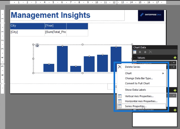
The Series Properties box contains options to format the physical properties of your visualization. Its’s also where you can make changes to the series data.
When you run your report, you’ll see how your data bar looks like with the new changes you made.
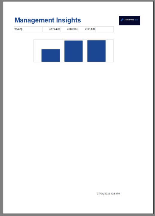
It’s recommended to regularly run your report whenever you make changes. This allows you to see what your report will look like when you publish it.
Add Data Labels In The Chart
You can also add data labels to your data bars. This makes the information on the visualization easier to understand.
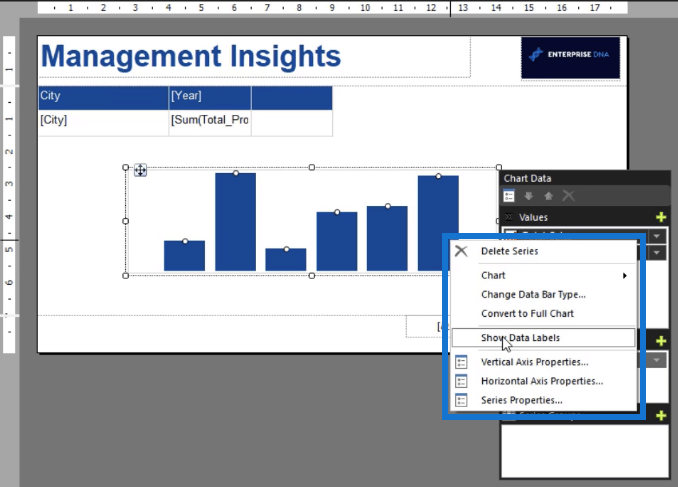
To add data labels, right-click on the data bar and select Show Data Labels.
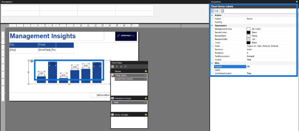
You can format your data labels using the Properties pane. You can change the font type and size, color, and position. You can also format it as a currency by typing in C0 in the Format text box.
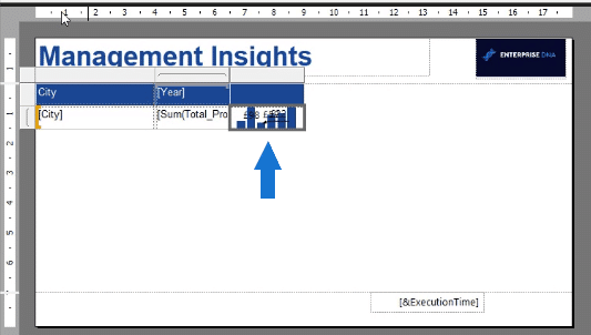
To place the data bar in the matrix, click on it and press CTLR + X. Then, paste it in the new matrix column you created earlier.
When you run your report, you’ll see what the final output looks like. You’ll also be able to identify what you want to change.
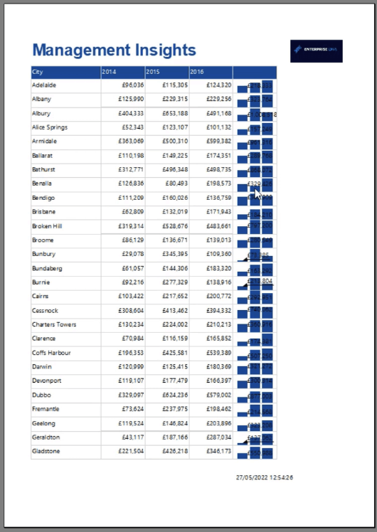
Since for this example the data labels don’t look cohesive with the rest of the report, they’re removed by switching the Visibility option to False.
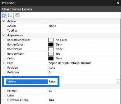
Next, add a column name to the data bar column and make further formatting changes that you see fit.
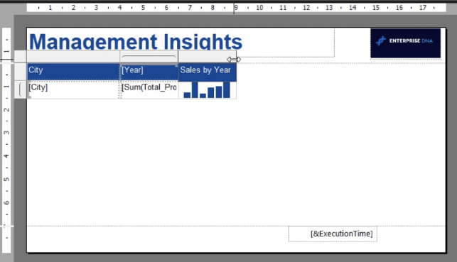
Do another quick review by running your report.
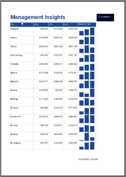
Continue to make changes until you’re satisfied with the output.
***** Related Links *****
Different Bar Charts In Power BI To Elevate Your Reports
Fill Bar Chart – A Bar Chart Variety For Power BI Reports
Conditionally Format Charts Using Charticulator
Conclusion
A data bar chart is a great way to add visual insights to your paginated reports.
The technique demonstrated in this tutorial shows you how to create bar charts for each row data in your table or matrix. It offers a different method compared to creating a separate bar chart at the end of your report.
One of the benefits of using a data bar chart is that it visualizes information for a specific set of data. In this tutorial, the data bar chart was set by City and Year. This is different when you create a separate bar chart where data is collected and presented in one visualization.
All the best,
Sue Bayes


