
I’ve been applying a kind of conditional formatting in Power BI that gives me unique insights in my visualizations. It’s been a game-changer in the way I develop my reports. You may watch the full video of this tutorial at the bottom of this blog.
I’ve done a demo on this same approach before, but I wasn’t able to maximize its use until recently. Since then, I’ve applied it to a number of different reports I’ve been working on. I’ve also found ways to deliver insights that were so difficult to show before.
I’ll give you a peek at the possibilities when you use conditional formatting in Power BI.

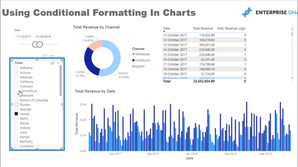
Daily Revenue Logic
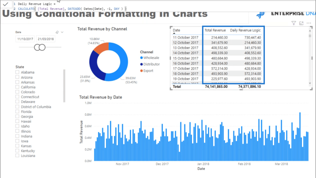
I’m going to start by adding a table here in my report. This will show me the data I’m working with.
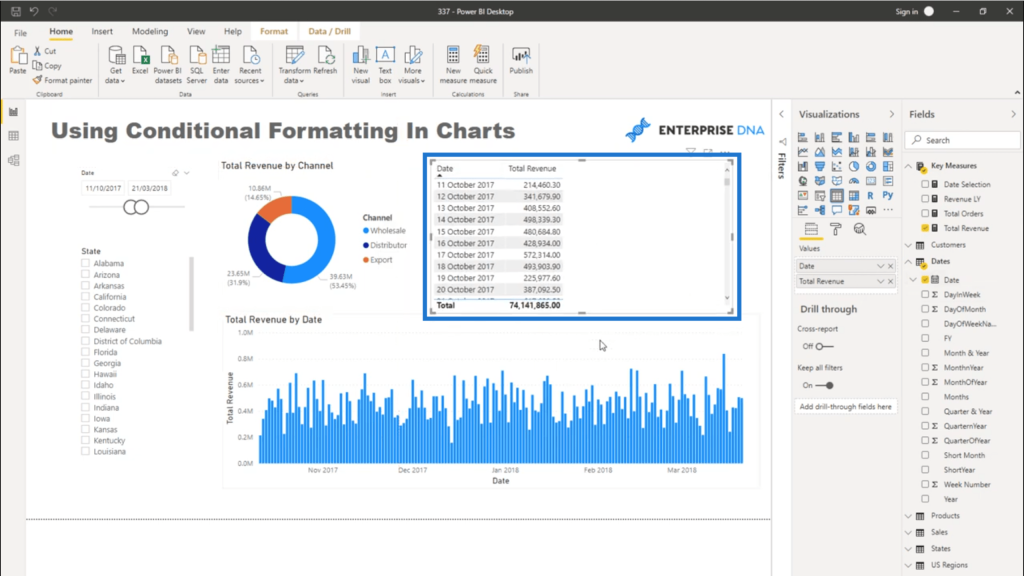
Now I want to see whether the revenue for the current day is larger than the revenue the day before. I’m not just talking about the numbers in the table – I also want to see that from a visualization perspective.
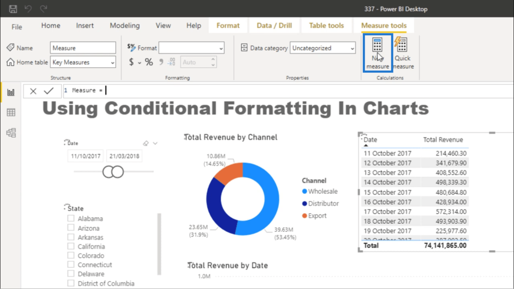
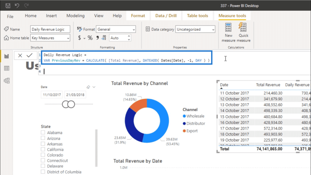
So I’m going to start by creating a new measure.
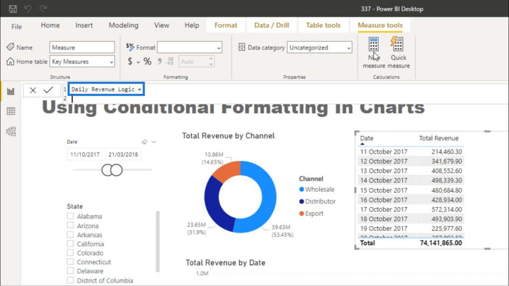
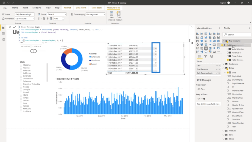
I’ll call this measure Daily Revenue Logic.
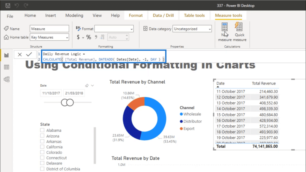
I’ll use the CALCULATE function and reference Total Revenue. Then, I’ll use DATEADD and do a -1 for the Day.
Once I drag that measure into my table, you’ll see that each row is displaying the number from the day before.

I’m going to increase the logic for that measure a little bit. I’m going to turn the original formula I wrote earlier into a variable. I’ll call it PreviousDayRev.
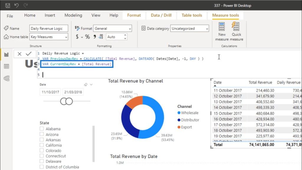
Then, I’ll add another variable called CurrentDayRev. This is going to be equal to Total Revenue.
Next, I’m going to write my logic that IF PreviousDayRev is greater than CurrentDayRev then it should return a 0. Otherwise, it should return a 1.
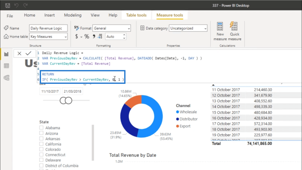
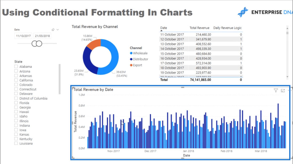
Once that logic is applied to my table, you’ll see that the column now shows zeroes and ones, depending on whether the value for a certain day is greater or lower than the previous day’s.
Applying Conditional Formatting
Now, let me show you how to apply conditional formatting to help visualize that logic I just added.
Under visualization, I’ll go to Data Colors, then I’ll click on the fx button.
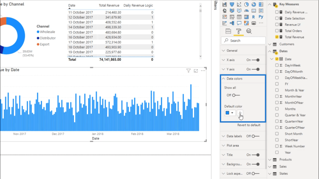
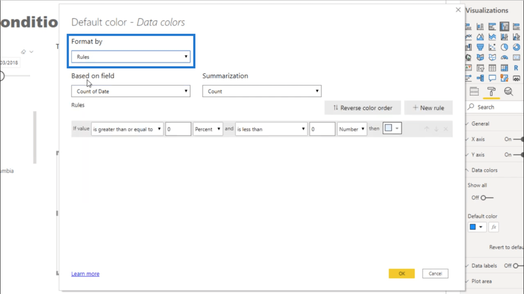
That button opens up a window that allows me to format my visuals based on certain conditions. In this case, I’m going to format my chart by adding Rules.
The great thing about rules is that you can select any field or measure. So I’ll select Daily Revenue Logic from the dropdown menu. Then, I’ll say that if the value is equal to 0, then make it blue.
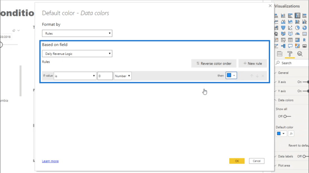
Now I’m going to add another rule. This time, if the value is equal to 1, then make it a deeper shade of blue.
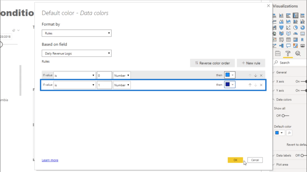
I’ll overlay those conditions into the visualization by clicking OK. Now, the visualization shows those two colors, indicating when the revenues are higher or lower than the day before.
Other Contexts Applied
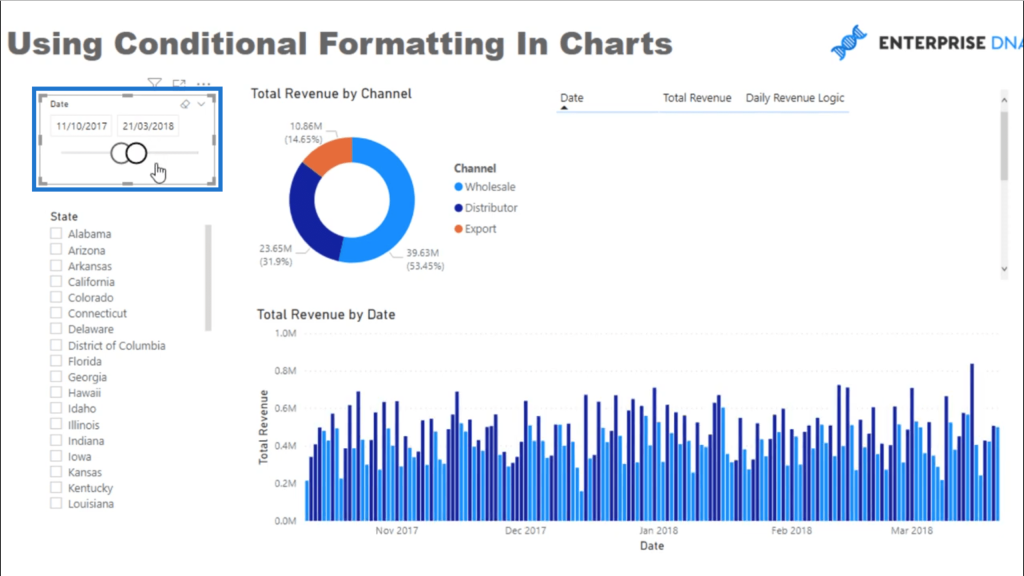
Even if I’ve added that conditional formatting into my visualization, the existing contexts within this report are still applicable. For example, I can still change the timeframe using the date slicer. This action will still affect my visualization.
I can also select a different channel by clicking on the pie chart.
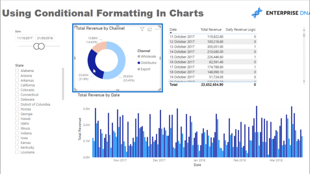
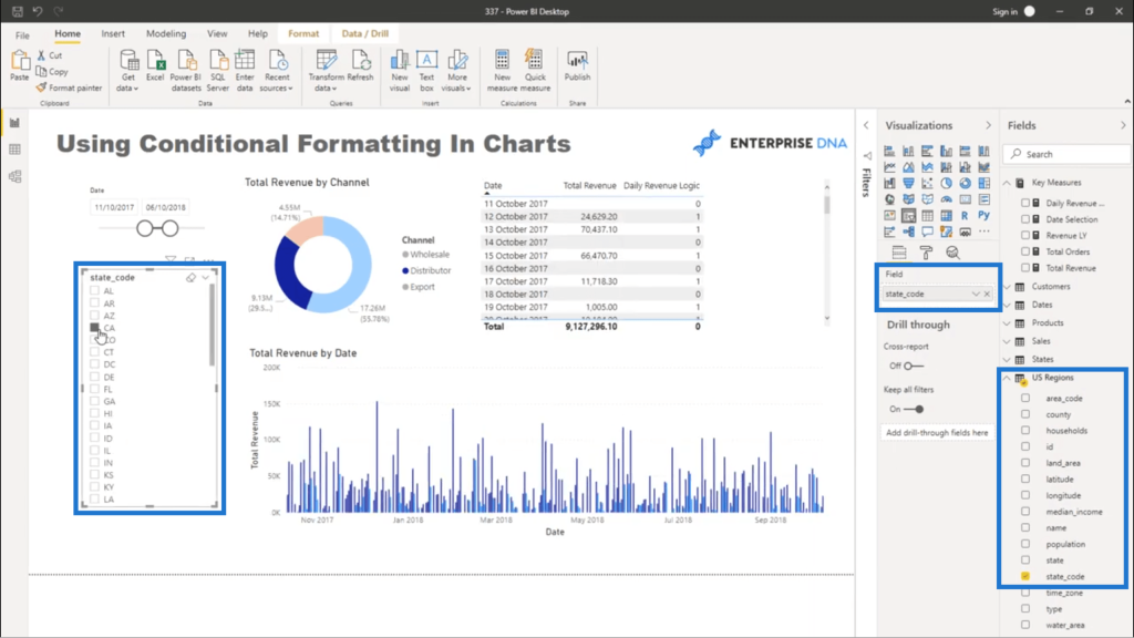
I can even look at the data based on particular states. But notice here that even if I clicked on a specific state, the visualization remains the same.
When that happens, look at whether these filters are set up correctly. Going into my model, I can see that there is no relationship between the States table and the fact table. However, I do see a relationship between US Regions and the fact table.
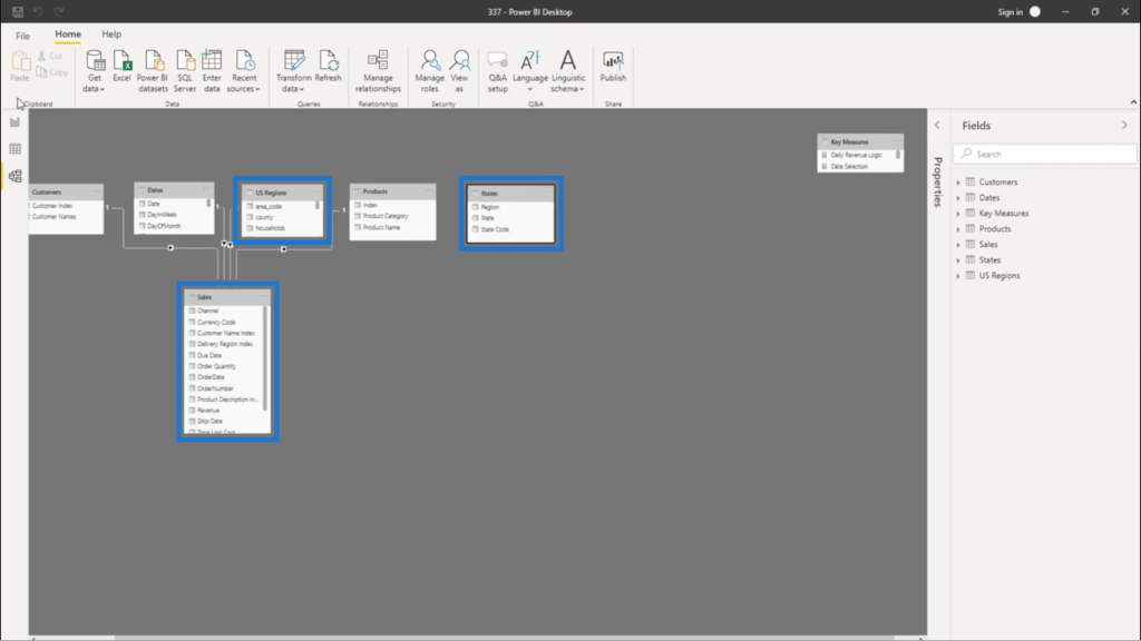
Looking at the US Regions table, it has a column for state_code. So I’ll bring that into my report instead. You’ll see that this filter is now working and is also adding context to my visualization.

***** Related Links *****
How To Control The Interactions Of Your Visuals In Power BI
Custom Conditional Formatting Techniques In Power BI
Using Moving Averages To Show Trends in Power BI
Conclusion
Utilizing the conditional formatting in Power BI can definitely change the kind of insights you’ll get from your reports. It pays to apply creativity even as you look at your report from an analytical point of view.
From here, there are a lot of other possibilities. For example, you could choose to highlight the day with the highest value by applying another rule for that. It doesn’t even have to be shown by date. You can sort the data by customer, for example. There is a whole world of opportunities available to us to represent data in a really compelling way.
All the best,
Sam


