I want to show you an awesome trick for the visualizations in your reports. You can use a dynamic tooltip in Power BI to highlight your visuals. This has been a relatively recent update embedded into the Power BI suite. You may watch the full video of this tutorial at the bottom of this blog.
For today’s post, I’ll showcase an entry from one of our Power BI challenges that came from a non-member. We’re allowing non-members to participate in the challenges at the moment. This is an amazing learning opportunity that we want everyone who’s using Power BI to have the opportunity to participate.
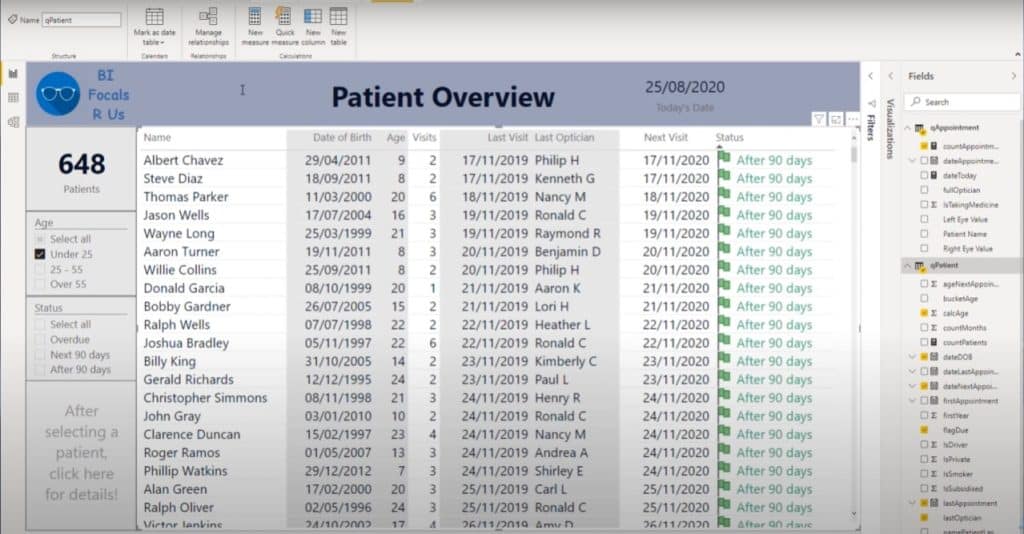
When I did the challenge myself, I went for a totally different route from Paul Ross who utilized this dynamic tool tip in Power BI.
I thought that this was such a unique way to showcase information. This is a really cool technique when you’re showing a table.
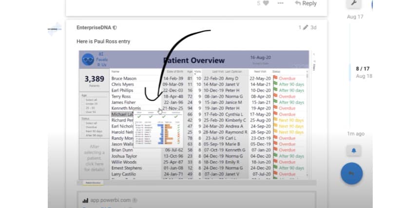
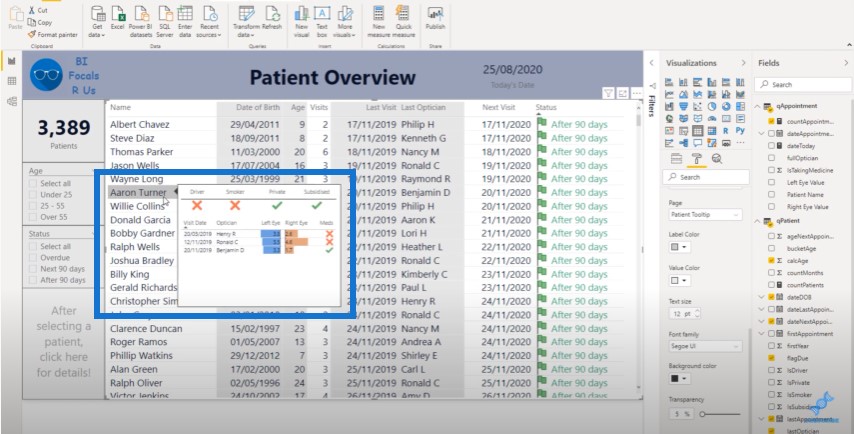
When you go through your table, everything automatically updates within this tooltip in Power BI. You can click anywhere in the table and the tooltip automatically updates the information being shown.
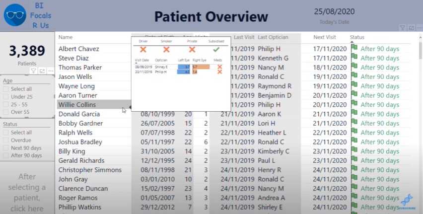
You’ll see that within the tooltip itself, you can see the key information about the patient. We used a patient data set for this challenge, so we get to see the overview of a particular patient and their visits to an optical clinic.
Let’s say we’re on a call with the patient and we want to see granular details like their left eye and right eye scores. We can quickly see the information we need to answer with this type of report.
So how do you actually create this visualization? You can do this within the table visualization.
Previously, when you go to the Tooltip section and turn it on, the default option used to pop up. But now you can actually bring up a report page.
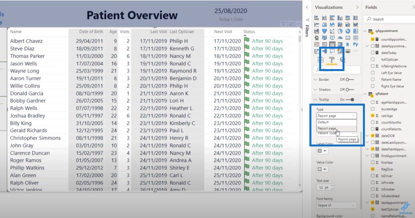
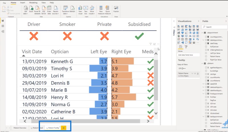
Once you select the Report page option, it will show you the pages that you can bring into the tooltip. In this example, we choose the page called Patient Tooltip.
If we go to the Patient Tooltip page, you’ll see below that this page is actually hidden when you’re online.
Click on Page Size and then click on Type. You will see a range of different options.
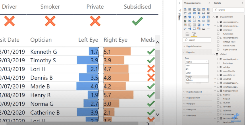
If you choose Tooltip, this will show up on the main page. After that, you’ll just need to work on the different metrics that you want to show.
On the top is a table with some check and x marks that show if they’re a Driver, Smoker, Private, or Subsidized.
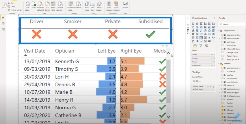
Below that is another table with a range of other information about the patients, which came from the appointment table.
The entire table visualization was made using data bars in conditional formatting. Once you’re able to embed this type of visual into your own data sets and reports, consumers can easily see this dynamic information.
So once you’re done with the metrics and format, go back and switch to the Report Page and Patient Tooltip (which we’ve already done earlier).
You can also customize a few things here to change the overall look of your report.
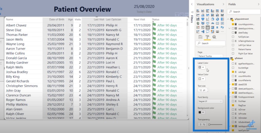
Now, when you hover over the name of a patient, it showcases their information. This is an incredible feature that I’m confident not many of you are using.
There are many different ways you can use this technique. You could use this in a bar chart or donut chart to showcase trends. You can incorporate this into your line charts to show your cumulative totals.
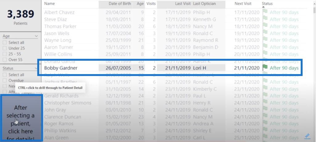
Another cool thing about this report is that you can select a particular patient and click on the bottom left icon to initiate the drill through.
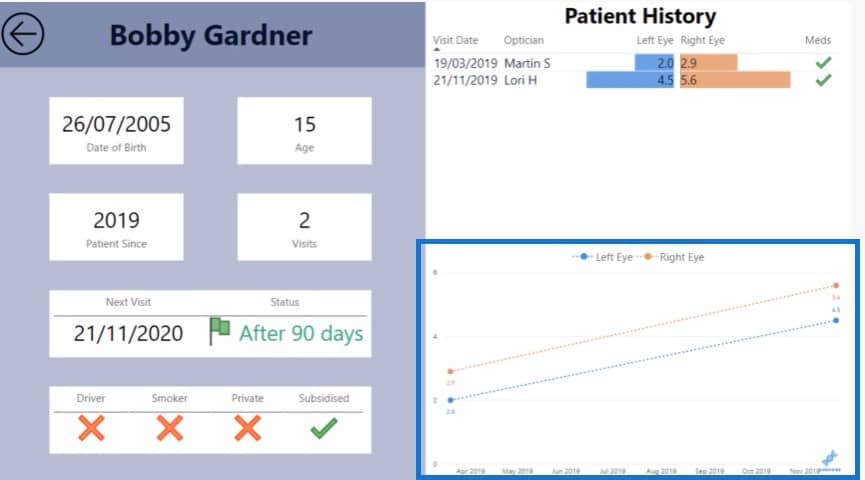
Aside from the tooltip in Power BI, another awesome feature of this report is the ability to drill through another page that showcases patient information like eye test scores over time.
***** Related Links *****
Power BI Data Bars In Table Visualisations
Custom Conditional Formatting Techniques In Power BI
Best Practices For Data Visualization In Power BI
Conclusion
In terms of ease of use, there are many positives in this report. There’s the ability to drill into certain aspects of patient information. When you’re talking to a patient over the phone, you can see all this information quickly.
And if you want to dive into a customer’s history a little bit more, you can click on the bottom icon to view the more granular information. All of this happens quickly and easily with just a click.
This is a great job from Paul who submitted this for the Power BI challenge. I’m relatively confident that Paul learned a lot by actually participating. And that’s what I recommend you do as well.
Simply visit the Enterprise DNA forum to check out the historic challenges and submissions. There’s so much to learn just by reading this stuff, and it’s also important to get involved as well. The Power BI challenges in the forum is probably one of the best learning experiences that’s out there at the moment.


