This tutorial will show you how to create a dumbbell chart using the Charticulator tool. It’s a chart that is composed of circles and lines which are used to monitor and compare two data points. You’ll learn and understand how it provides valuable data and information in your Power BI report.
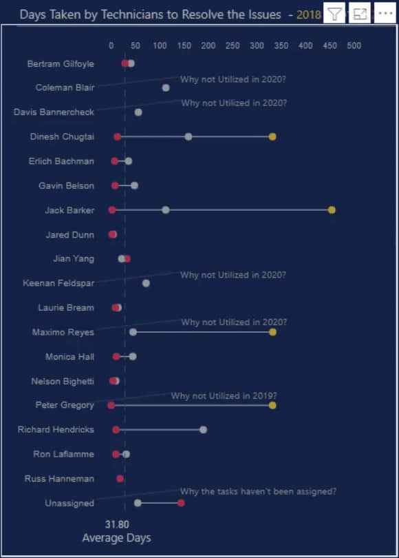
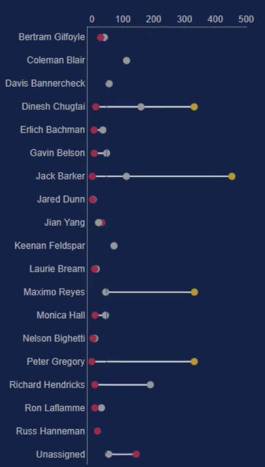
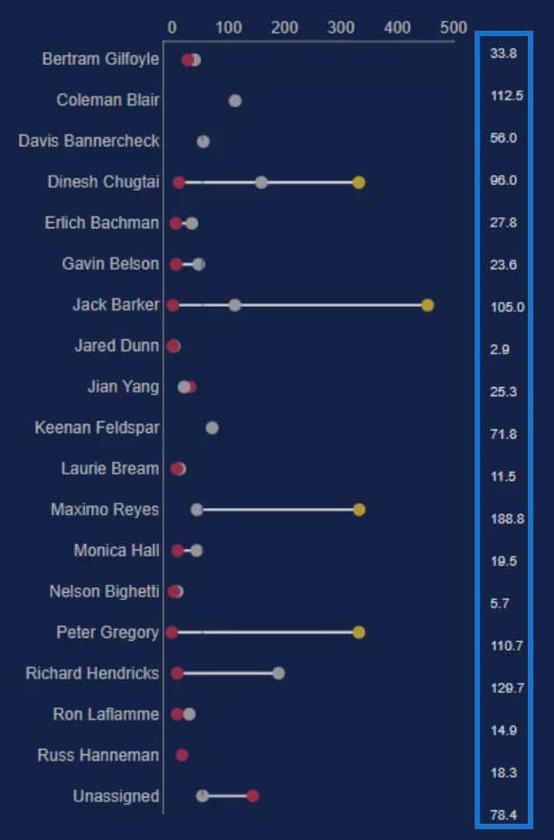
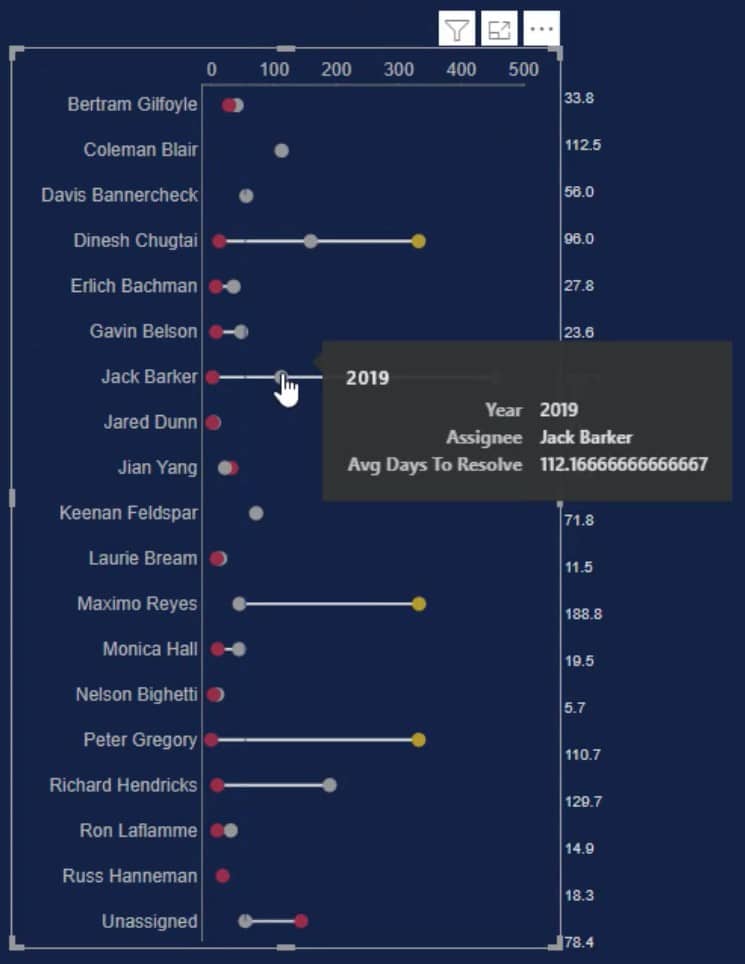
This is a sample dumbbell chart that you’re going to recreate. It shows the average days that each assignee or technician takes to resolve issues for the years 2018 to 2020.
Import A Dataset To Charticulator
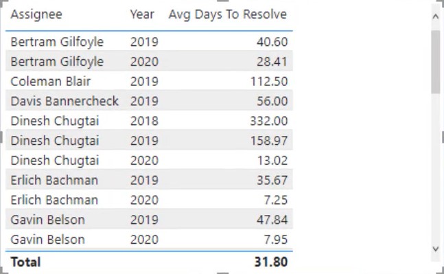
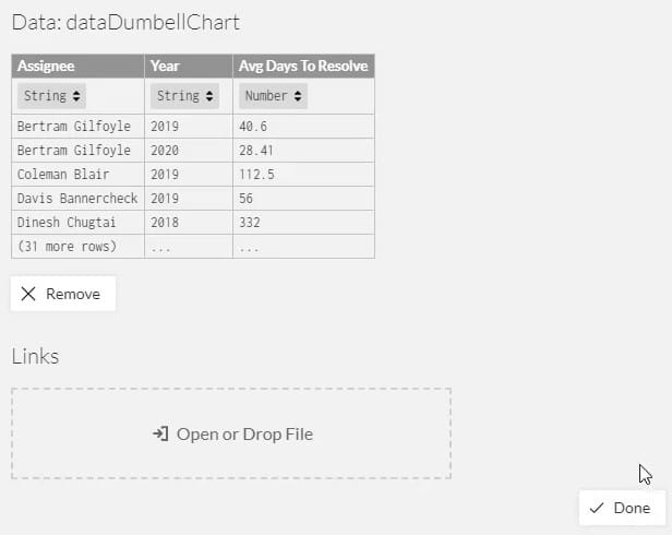
First, create a dataset to be exported to Charticulator. In this example, the dataset contains three data: Assignee, Year, and Avg Days To Resolve.
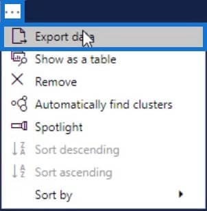
Next, click the ellipsis below the table and select Export Data.
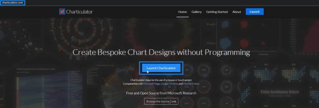
After that, go to charticulator.com and click Launch Charticulator.
Locate and open the exported dataset and click Done. You will then be redirected inside the Charticulator tool.
Create And Design The Dumbbell Chart
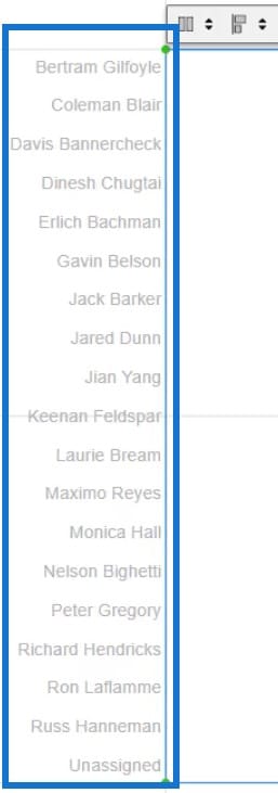
Place Assignee in the Y-Axis of the canvas. You can change the color and size of the labels and ticks in the PlotSegment1’s Attributes.
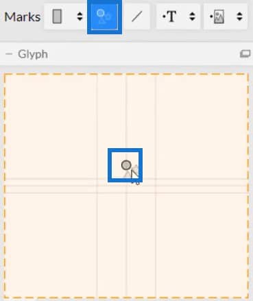
Next, bring in a circle from Symbols to the inside of Glyph.
Place Avg Days To Resolve in the X-Axis of the canvas.
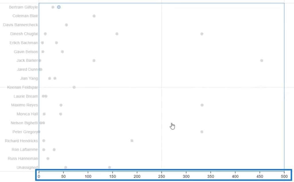
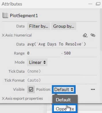
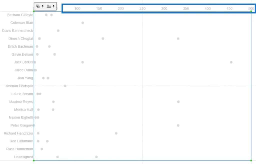
Transfer the labels on the X-Axis to the top of the chart. Open PlotSegment1’s Attributes and select Opposite for the position of the labels. You may also change the color style of the labels to match the Y-Axis.
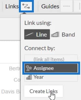
Now, create links to the circles in the chart. Click Links and select Assignee to connect them using lines.
The visualization will now look like this.
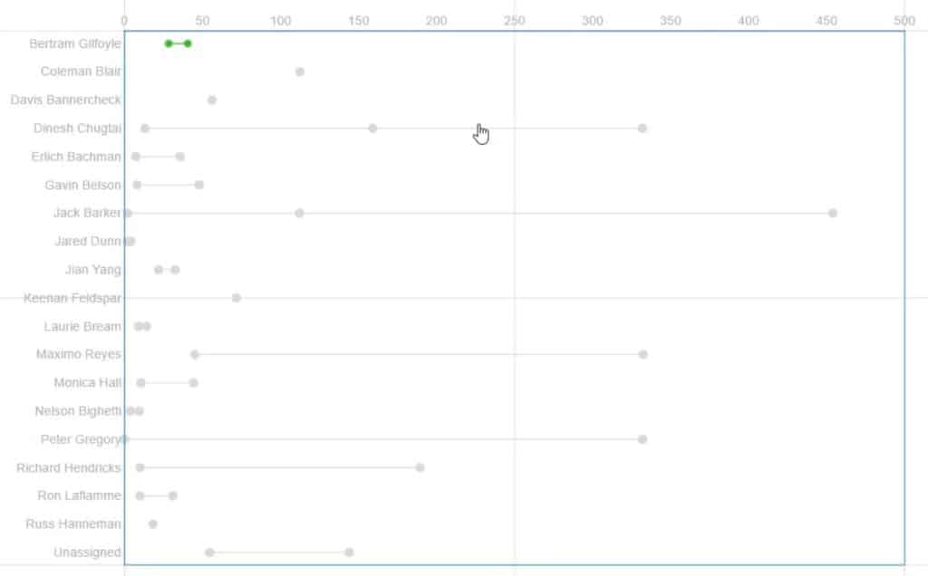
You can format and adjust the entities inside the chart to make it look compelling. You can modify the size of the circle, width of the link, and other attributes depending on your preference.
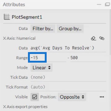
In the chart, you’ll notice that some circles on the left are leaning on the Y-Axis. Adjust them in the Range section of PlogSegment1’s Attributes to create a space between them and the axis.
Add Colors To The Symbols Inside The Dumbbell Chart
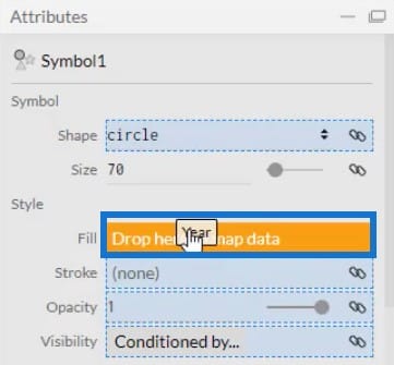
Add colors to the circle by placing Year in the Fill section of Symbol1’s Attributes. You can also define the colors of each year in the attributes.
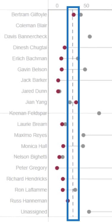
If you want to show the average line in the chart, you can create a line and place it where the average is located. In this example, the average line is at 30.
This is now what the dumbbell chart will look like.
Export The Dumbbell Chart File To Power BI
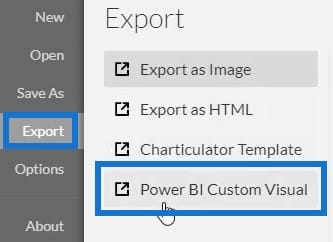
Save the chart file and export it to Power BI Custom Visual.
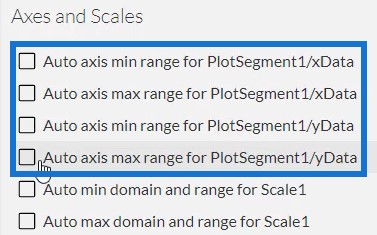
In the Axes and Scales settings, uncheck the auto axis options to avoid automatically changing the axes when a context transition is invoked. Once done, add a visual name and export the chart file.
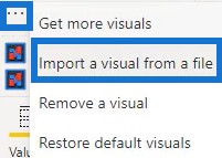
Now, open Power BI and import the dumbbell chart file. Click the ellipsis below Visualizations and select Import a visual from a file.
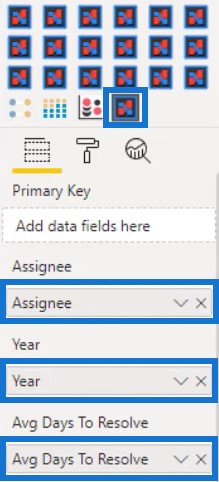
Next, click the Charticulator link with the visual name of the chart and fill the Fields section with the corresponding data.
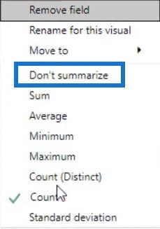
Click the dropdown button on Year and select Don’t Summarize.
You can then see the dumbbell chart in the dashboard. Next, adjust the attributes and margins of each entity to your desired preference and style.
This is what the adjusted chart of the sample visualization looks like.
Show The Average Days To Resolve Values
Another thing you can do is to show the average days to resolve issues beside each assignee. To do this, you need to open Charticulator again and use the same dataset.
Next, draw a line in the Y-Axis of the canvas and then put a circle inside Glyph. Make sure that you draw the line from top to bottom to set the order to descending.

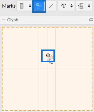
Place Assignee in the Y-Axis of the canvas. This is what the result looks like.

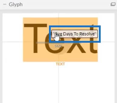
Put Text inside Glyph and align it with the assignees. Then, place Avg Days To Resolve inside Text to show the values.
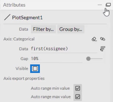
Hide the labels in the Y-Axis by unchecking the Visible box inside Attributes.
Then, hide the circle by clicking the eye button of Symbol1.

Save the file and export it to Power BI Custom Visual. Don’t forget to uncheck the auto axis options in the Axes and Scales settings. Import the visual the same way the dumbbell chart was imported and input the corresponding data in the Fields section.
Place the visual beside the dumbbell chart and align it with the assignees.
Create A Slicer For Context Transitions
Create a slicer to have filter context transitions. For this example, Issue Type is used in the slicer.
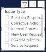
Next, create interactions within the charts. Go to Format tab and select Edit Interactions. Then, click every visualization and the interaction icon of the charts.
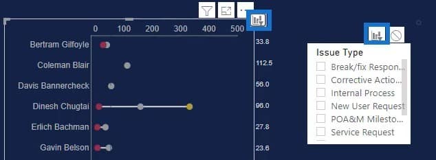
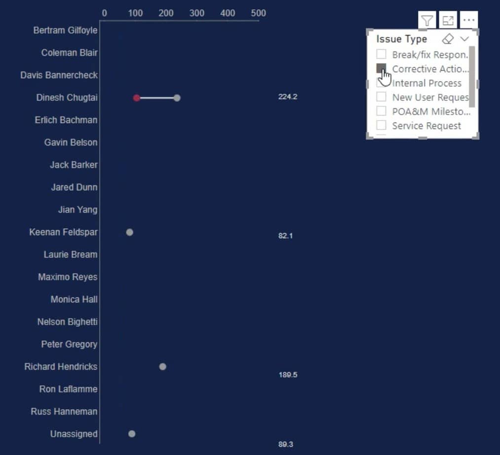
Once done, you can see the Dumbbell Chart change when you select a slicer.
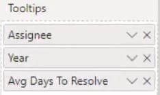
If you put Assignee, Year, and Avg Days To Resolve in the Tooltips section, you can see data whenever you hover over the circles of the dumbbell.
***** Related Links *****
Dumbbell Charts: Custom Visual Vs. Charticulator
Power BI Dashboard Designs: Visuals And Effects
Dashboard In Power BI: Best Design Practices
Conclusion
Monitoring work activities is made easier with dumbbell charts. They provide information using data points and lines that will help you check and supervise a category’s performance. They are great visuals that give insightful information to your Power BI report.
Learn and know more about dumbbell charts and Charticulator by practicing and maximizing this tutorial.
Mudassir


