Creating visualizations in R using ggplot2 can be a powerful way to explore and understand your data. One common type of visualization is the bivariate plot, which allows you to examine the relationship between two variables.
In this tutorial, you’ll learn how to produce bivariate visualizations in R using ggplot2. This blog will specifically focus on visualizations that would be difficult to perform in Power BI but easy to do in R.


Overview
Three main topics will be discussed in this tutorial. You’ll learn how to visualize the distributions of a variable by group, and how to visualize correlations and pairwise relationships.
A pairwise relationship refers to the relationship between each pair of variables in a given dataset.
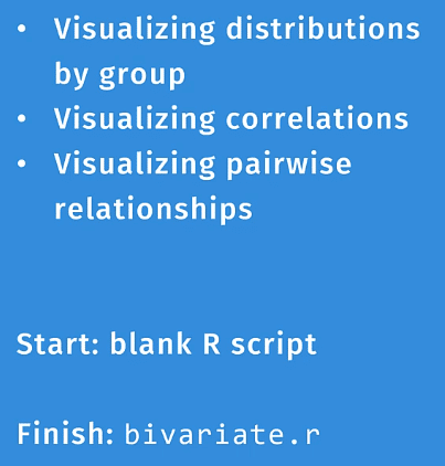
For this tutorial, you need to download the ggplot2 package. Once done, open a blank R script and bring in two libraries: tidyverse and GGally.
GGally is an extension to ggplot2. It’s built to reduce the complexity of combining geometric objects with transformed data.
The Different Bivariate Visualizations In R
A bivariate visualization shows the relationship between two variables.
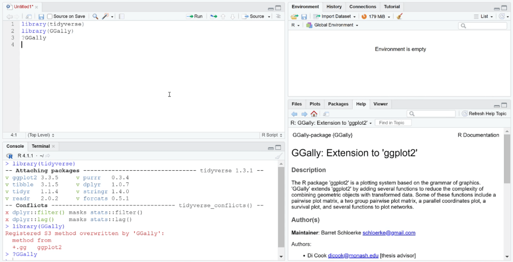
As an example, let’s create a visualization that shows the relationship between the city and the highway. You need to use the ggplot ( ) function and then assign the appropriate data.
The geom_point ( ) function is then used to generate the scatter plot.

Visualizations In R Showing Correlation
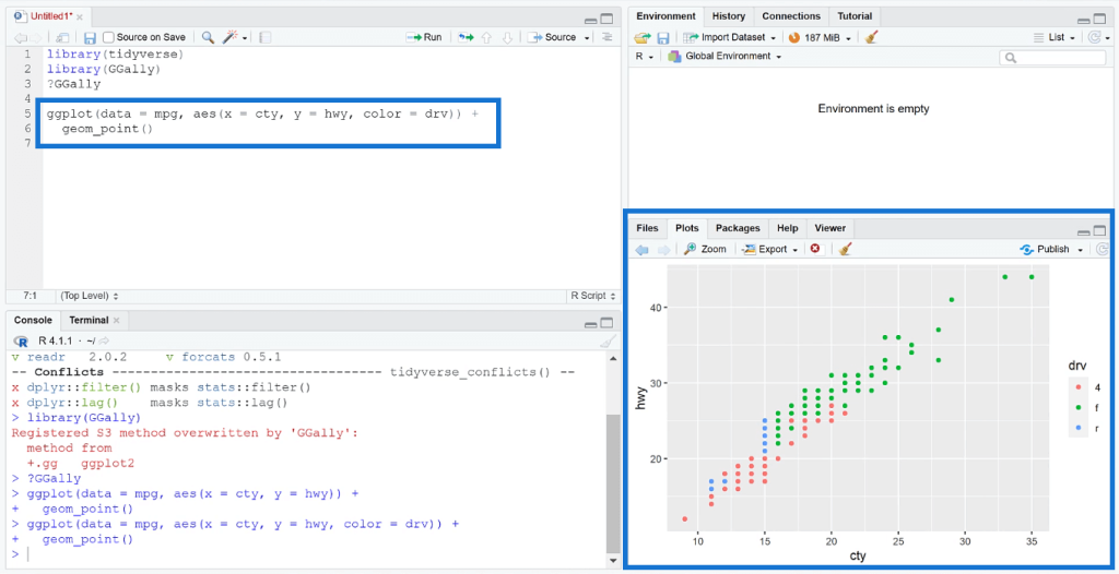
The ggcorr () function is used to visualize the correlation between variables. This will generate a heat map with the lowest to highest correlation values displayed. You can further improve the visualization by adding an argument that will show the labels.
Visualizations In R Showing A Pairwise Relationship
For the pairwise plot, you need to use the ggpairs ( ) function.
Since the data frame in this example contains a large dataset, it first needs to be filtered to only show numeric values or else, the results will show an error.
To filter data, use the pipe operator and the select_if ( ) function.
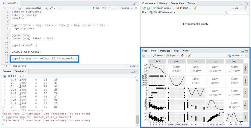
In the Plots tab, you can see the pairwise visualization generated by the code. You can also see the graph and correlation value between each variable.
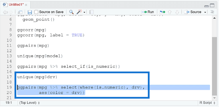
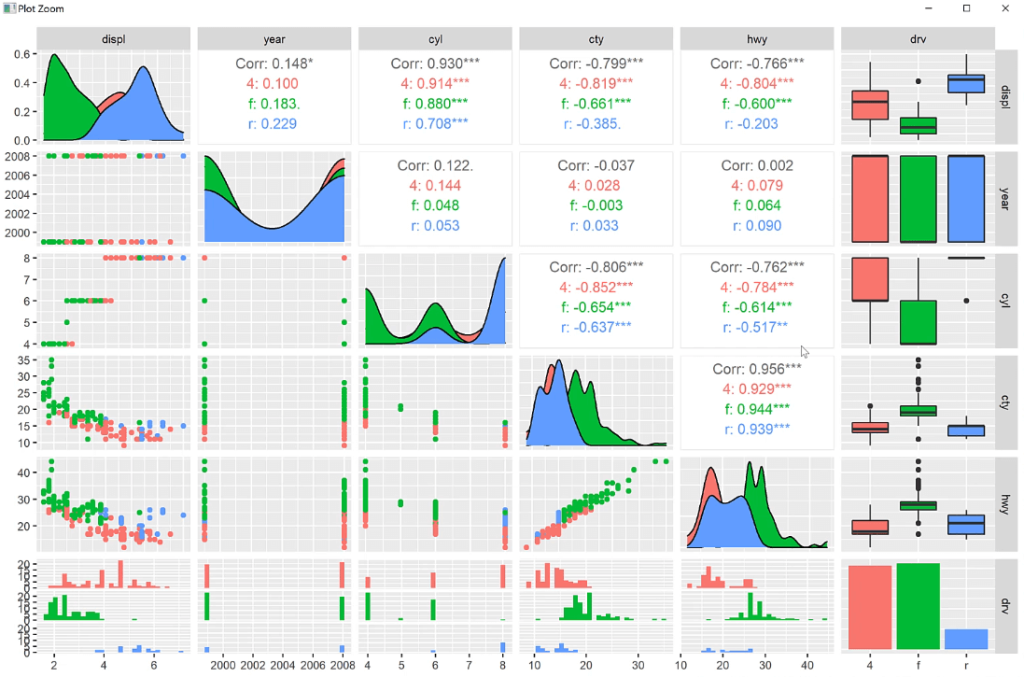
Another thing you can do with pairwise plots is to add extra elements to augment the visualization. You can add another variable and change the color of the data.
In this case, the drive column is added to the code, and the aesthetic mapping function is used to change its color.
When you run the code, you’ll see that the plot shows scatter plots and the correlation values by drive. The diagonal also shows the distribution according to each drive.
***** Related Links *****
R Scripting For Power BI Using RStudio
Seaborn Function In Python To Visualize A Variable’s Distribution
ggplot2 Plots In Excel For Advanced Data Visualizations
Conclusion
If you want to create robust and statistically backed visualizations such as histograms, scatter plots, and box plots, it’s recommended to use ggplot2 with GGally.
The R programming language together with various visualization packages like ggplot2 allows users to build visualizations that show the relationship and correlation between variables.
GGally extends ggplot2 by augmenting several functions that reduce complexity. If you try to create bivariate and multivariate visualizations in Power BI, they’ll prove to be a challenge. However, within the R programming language, you only need to write a single line of code to arrive at the statistical plot you need.
All the best,
George Mount