In this tutorial, I will show how to write ggplot2 plots in Excel to create reproducible and more advanced custom data visualizations with improved quality and aesthetics. You can watch the full video of this tutorial at the bottom of this blog.
ggplot2 plots is a well-known R package for data visualization. We are going to extend that over to Excel via the open XLSX package. This is used to read, write, or edit XLSX files, so it needs to be the modern Excel file extension.

You can use this to really fully automate the production of Excel workbooks from R. It has some similarities to VBA in terms of how it works. The nice thing about using this package is that you are able to extend the capabilities of your Excel reporting with R’s capabilities.
ggplot2 is a very respected visualization package. Many of the top data journalists and publications use this package, and we do cover it in the R for Power BI Users courses at Enterprise DNA. You can take a look at that as well.
How To Write ggplot2 Plots In Excel
For our demo today, we’ll be focusing on the open XLSX package and writing those results, particularly ggplot2 in Excel. We’re going to need to create objects in R. We’re going to be able to manipulate those objects, insert everything into Excel, and then close the workbook.
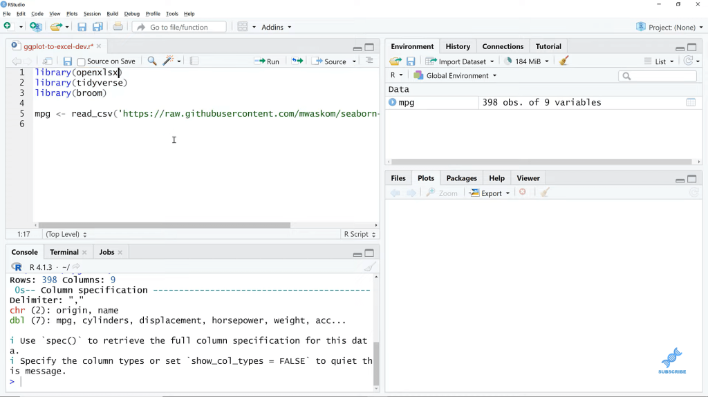
I’m here in R studio. We’re going to read in a data set MPG here from the web. I’ve also got some packages that we’re using.
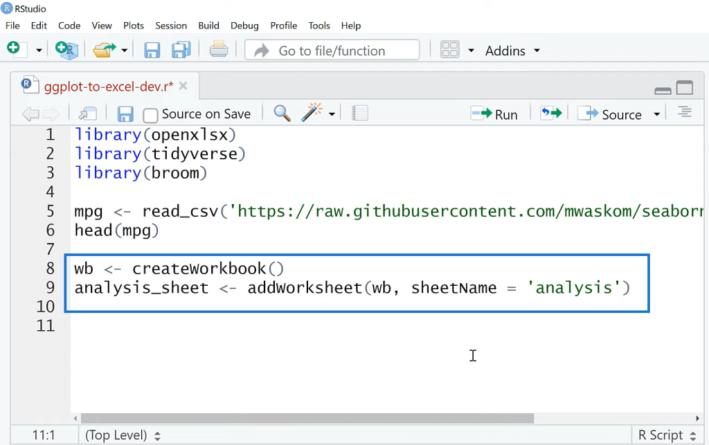
Now, let’s go ahead and get started with the head function. We’ll create the workbook here, and then I’m going to call it analysis_sheet. You could call it whatever you want. It’s going to be addWorksheet to this workbook. Let’s call the sheet name, Analysis.
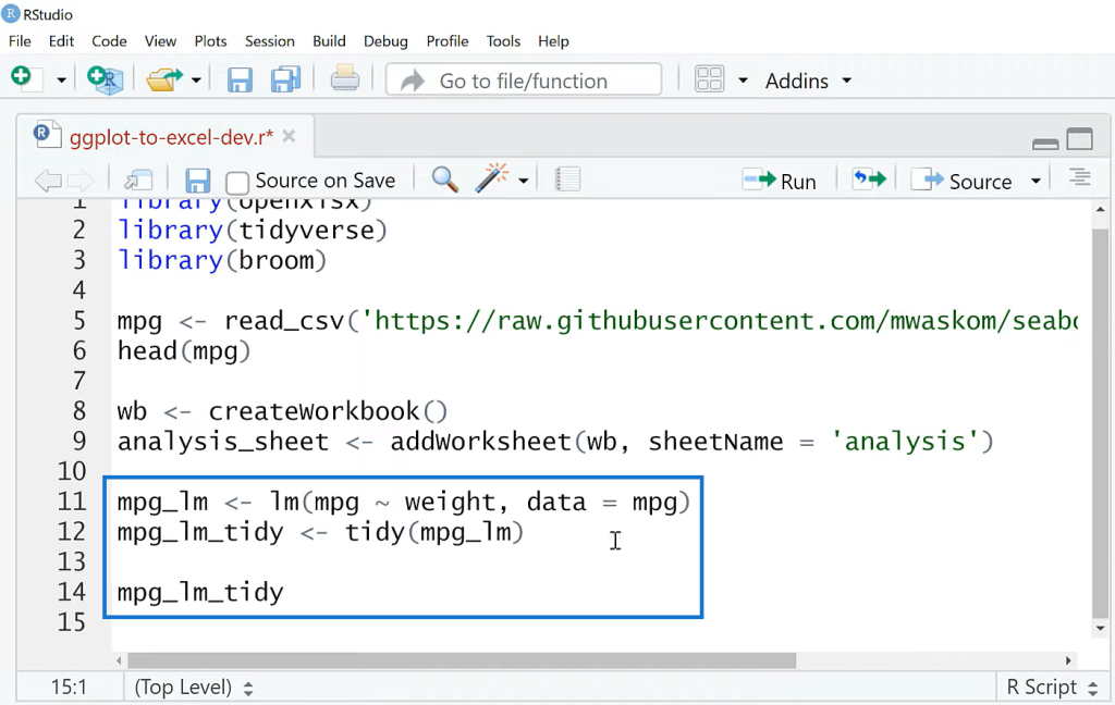
I’m going to make a really basic linear regression. We’re going to visualize those results, and then we’re going to throw that into Excel. I’ll call this mpg_lm for the linear model. R is really built for statistical analysis, so it does have a function to do linear regression. We’re going to model mpg on weight. This is a linear regression.

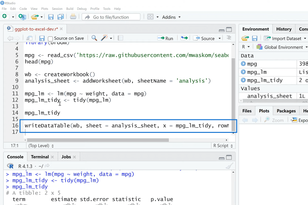
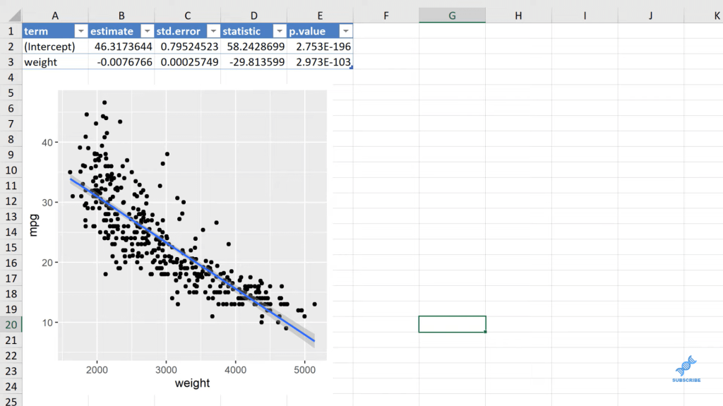
Now, I’m going to tidy the results. The tidy function package is meant to take some of R’s results and put them into a more consistent machine and user-friendly format here. We’ve got everything kind of stacked away in a consistent table shape, so that’s going to make it a lot easier to put into Excel. Excel likes to have things in tables.
Let’s write this out to Excel now. I’m going to use writeDataTable. The sheet is going to be the analysis_sheet, and we are going to say, X is equal to mpg_lm_tidy. This is going to be written as a table in Excel, and we are not going to include the row names.
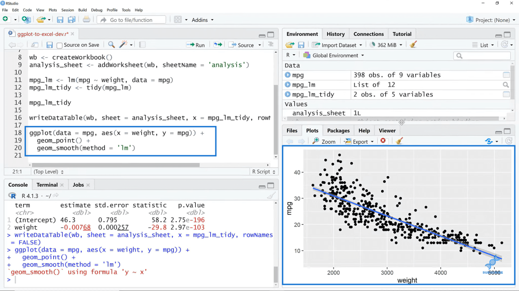
And then, what we’re going to do is visualize this. We’ll check it out first in R, and then we’ll send those results out to Excel. Basically, what we’re doing here is going to create a scanner plot. I’m going to add geom_point, and then add geom_smooth. The method here is going to be lm for linear model. When I run this, we see our regression plot.
We have weight on the X axis. We have mgp on the Y, and then we’re seeing the downward sloping relationship here is our regression fit line. So, we have the coefficients here, the fit values, etc.
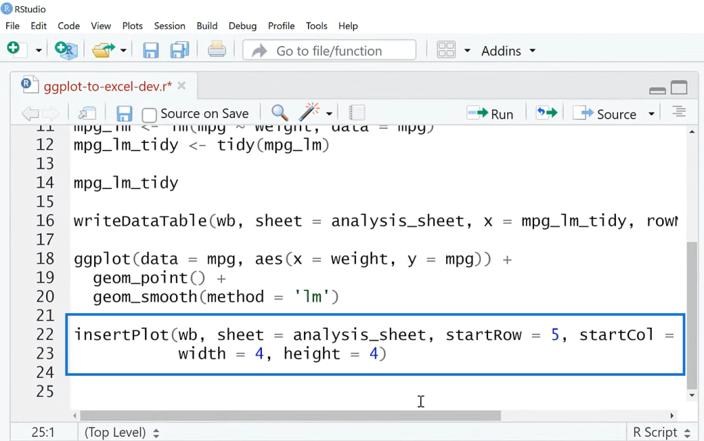
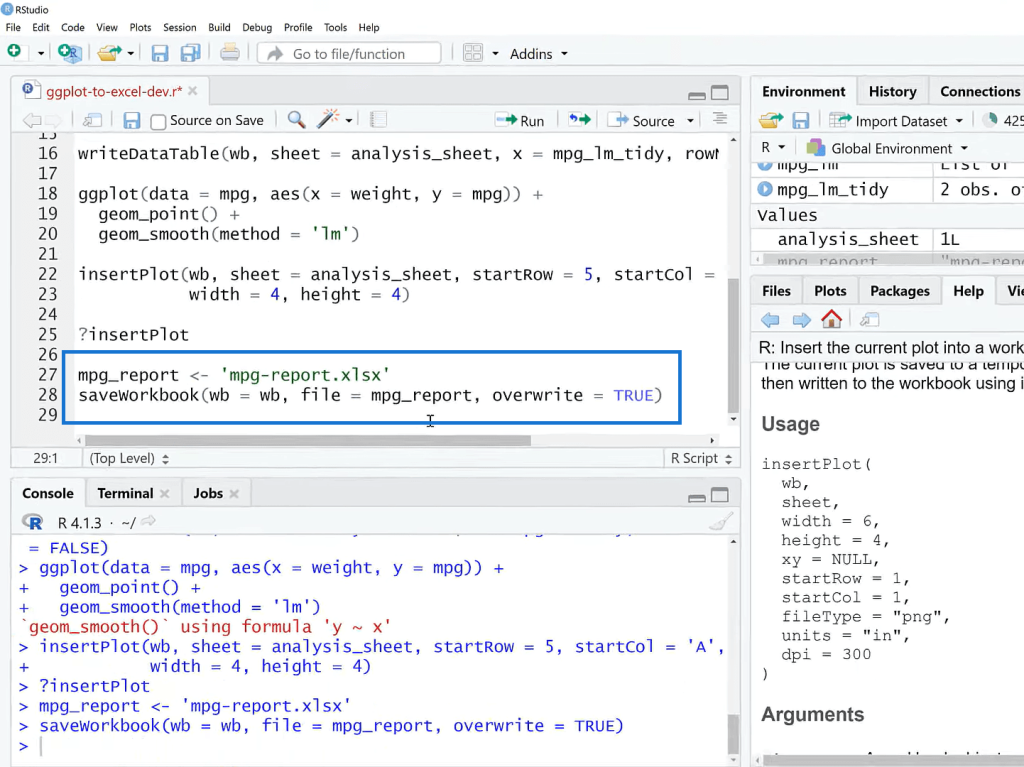
And then, we are going to add the plot so we can add this to the workbook as well. That’ll be insertPlot, say workbook (wb), the sheet is going to be analysis_sheet again, and then we can specify the start row and the dimensions.
The last thing we’re going to do here is to specify where this report is going. I’m going to call this mpg-report, and then I’m going to save my workbook. I’m going to run this, and then we can go fetch this file and take a look.
I’m over in Excel now. The place that this file ends up has to do with where your working directory is in R, so you can tune into that.
***** Related Links *****
Power BI With R And RStudio: How To Get Started
Three Ways To Use R Script In Power BI
Data Frames In R: Learning The Basics
Conclusion
In this tutorial, I’ve shown you how to write ggplot2 plots in Excel. Why would you do this versus in Excel when it comes to plotting? Well, one thing is the reproducibility of ggplot. Everything is code-driven. There’s no pointing and clicking, and that makes things more customizable.
The downsides, on the other hand, is that they’re not interactive. The image is just static. We can’t click on it. We don’t have tooltips or anything like that. ggplot plots may not be familiar to your users, so that can be another downside.
We’ve focused on building ggplot2 plots and sending that out to Excel. You could really build an entire report in R for Excel. Anything you need to do in Excel, you could call remotely from R. One specific use case for this would be those hard-to-do Excel plots that Excel really struggles with. Excel does have some statistical capabilities, so R is going to be a lot easier to perform.
All the best!
George