
Learning how to create a dashboard in Power BI, is actually quite straightforward; in fact, it can be done in 6 simple steps. In this article, we will run you through an easy setup to get you on your way to creating your first dashboard!
Don’t worry; for this tutorial, you don’t need to know DAX or anything about an SQL server; we will keep it simple.
So what is Power BI?
Power BI is a powerful business intelligence (BI) tool built by Microsoft that enables users to visualize and analyze data from various sources.
Whether you’re a business owner, a data analyst, or a stakeholder in a company, using a visualization tool like Power BI can give you clear data insights and a competitive edge.

Raw data and numbers give us little information, if we are honest. Data analytics provides the ability to visualize data, create data models and infographics, and draw charts providing users with at-a-glance insights.
Working key performance indicators (KPIs) and other vital data points could guide your business strategy and direct your next key decision.
So, taking the time to learn Power BI will give you insights into data and introduce context to the thought process behind your decision-making.
From connecting your desired data source to generating colorful reports and visualizations, we cover the step-by-step guide to starting and creating a comprehensive dashboard with Microsoft Power BI; let’s get right into it.
“Data science is a combination of three things: quantitative analysis (for the rigor required to understand your data), programming (to process your data and act on your insights), and narrative (to help people comprehend what the data means).” — Darshan Somashekar
1. Getting Started with Microsoft Power BI
Before anything else, you must download and install Power Bi and familiarize yourself with the platform.
Signing Up and Installation
Power BI is a business intelligence tool from Microsoft. You can download the application on the Microsoft Power BI website, but you’ll need to sign up for an account before that. Microsoft offers you three options for your Power BI account: Power BI Free, Power BI Pro, and Power BI Premium.
Here is what you can expect from each license:
| License type | Capabilities when the workspace is in shared capacity | Additional capabilities when the workspace is in Premium capacity | Pricing |
| Power BI (free) | Access to the content they create for themselves. | Consume content shared with them by Pro or PPU users | $0 |
| Power BI Pro | Publish content to other workspaces, share dashboards, subscribe to dashboards and reports, share with users who have a Pro license | Distribute content to users who have free or PPU licenses | $10 per user/month |
| Power BI Premium Per User (PPU) | Publish content to other workspaces, share dashboards, subscribe to dashboards and reports, share with users who have a PPU license | Distribute content to users who have free and Pro licenses | $20 per user/month or$4,995 per capacity/month (option for Autoscaling at an extra $85 per vCore/24 hours is also made available here) |
Once registered, download and install the Power BI Desktop application for your operating system. Follow the on-screen instructions to complete the installation. The program’s default installation settings will meet all your expectations for most use cases.

Understanding the User Interface
Once you’ve booted up the Power BI application for the first time, go to dashboard. The home screen will look like this:
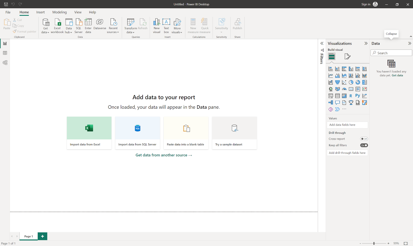
The main sections of the Power BI user interface include:
- The Ribbon
The Ribbon is the menu selection at the top; it contains the necessary functions to create more visuals, add more data sources, change the report’s aesthetic, and save the dashboard.
- Report View / Canvas
The Canvas is where your data sets and data visualizations are stored. You show your clients and stakeholders the aesthetic aspect of your report. The Data View of the canvas will show all available data in your report, while the Model View visually represents the relationship between the tables and elements you’ve created.
- Pages Tabs
Like other Microsoft applications like Excel, the pages tab allows you to navigate and edit multiple reports. You can select an existing dashboard or add a new dashboard through this view.
- Visualizations Pane
The Visualizations Pane introduces possible charts and applies filters or drag fields to edit the report.
- Data Pane
Finally, the Data Pane contains the data columns loaded into the report. You can drag selected columns into the Visualizations Pane to edit charts and apply a slicer or filter.
2. Importing and Connecting to Data Sources
This section will discuss how to import and connect to various data sources while creating a dashboard in Power BI. This process is essential for utilizing data in your dashboard effectively.
Supported Data Types
Before you import your data source, ensure that Power BI supports your data mode. Familiar data sources include:
- Excel files
- CSV files
- Power BI data sets and data flows
- SQL databases
- Web services
- SharePoint lists
- Other cloud-based data sources or connectors
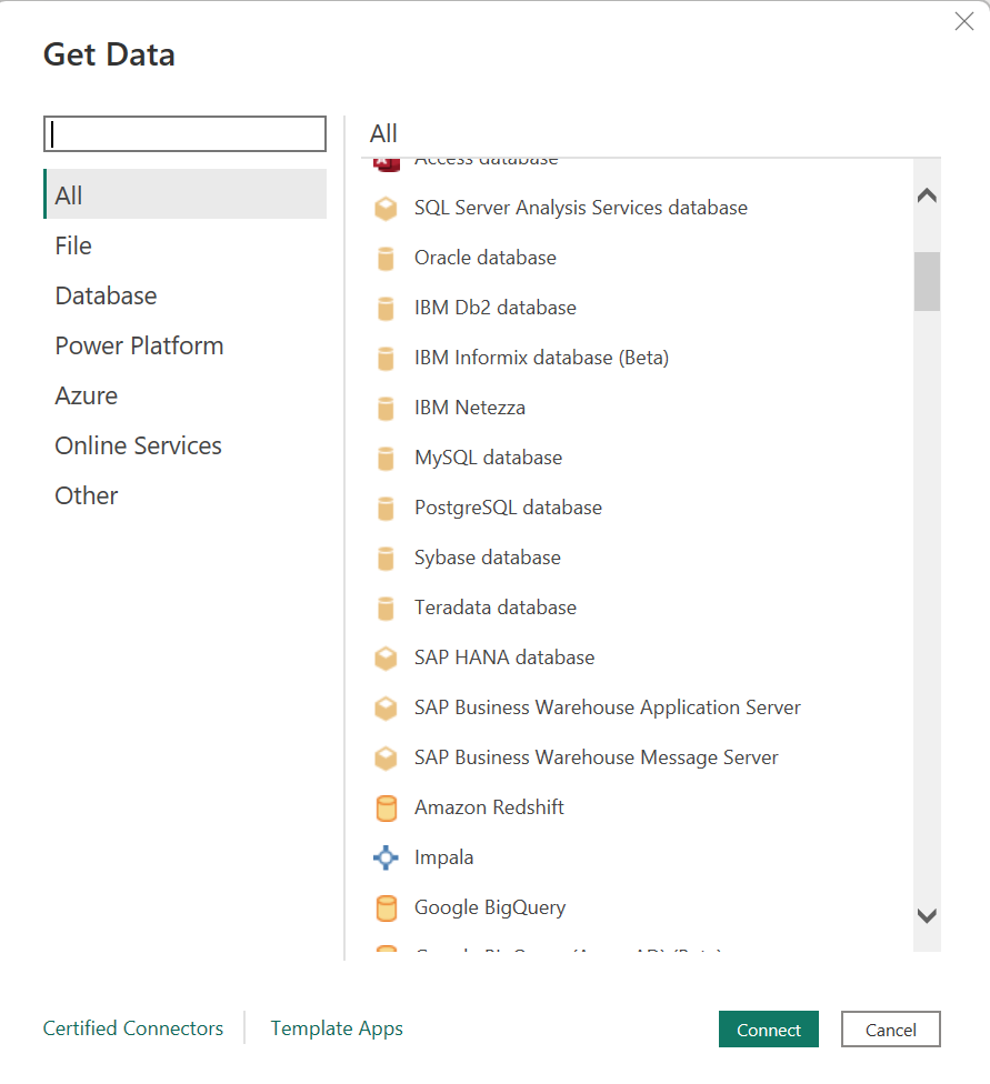
For a complete list of accepted data sets, head to the Ribbon Panel and select the “Home” page; click the drop-down arrow under “Get Data” to choose the data format your data set is in. If you don’t see your data set’s format in the opened menu, click “More,” and a pop-up of all accepted data sets will appear.
Connecting and Configuring Data Connections
Here’s how to connect your data set to Power BI:
- Under the “Home” page on the Power BI ribbon tab, select “Get Data.”
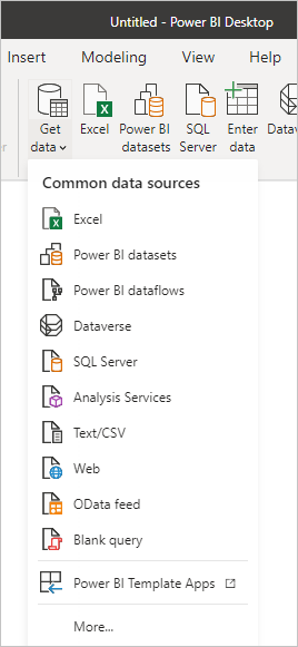
- Choose your data sets’ file type.
- Select your desired data set. You can also configure the selected data source by following the prompts in the “Get Data” dialog box.
- Sometimes, you might need to transform and “clean” your data set with the “Edit Queries” function to ensure that your data is ready for use.
Data cleaning involves removing unnecessary rows, renaming columns or attributes, and cleaning up null values that may affect the insights you could draw from the data set.
3. Creating and Customizing Visualizations
Psychologists have revealed that the average human attention span has reduced to 8.25 seconds, less than that of a goldfish.
Your data reports should be engaging and aesthetic enough to hold your reader’s attention span for longer. You can achieve this by using varying chart types that connect together to tell a story.
For basic data analysis, an excel workbook or Tableau report may be enough, but to really take your visualization to the next level, you need to be using the Power BI service.
Let’s choose visualizations.

Choosing the Right Visualization Type
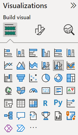
While many types of visualizations could be added to your Power BI report, that doesn’t mean that you should look to add all of them.
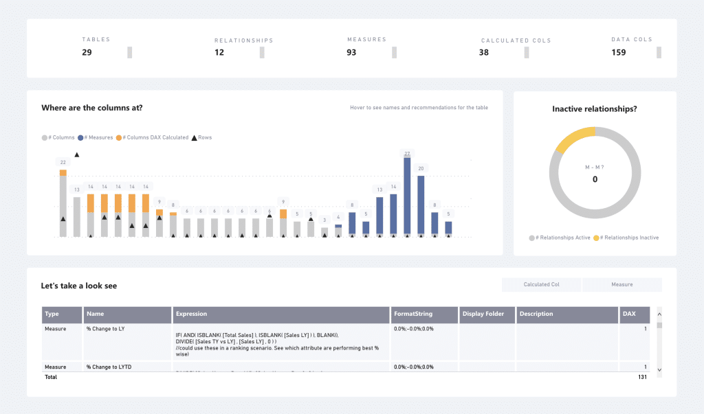
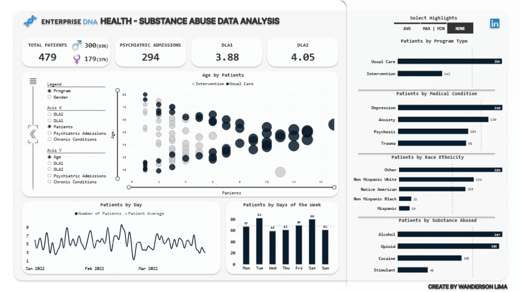
Choosing the right visualization is just as important as using them. The images representing the figures serve as pin icons, which you can use to drag and drop your desired chart.
Here’s a list of common visualization types and the best case for when to use them:
- Line charts – Line charts are often used to visualize continuous data over time. Its intended purpose is to show the trends between two or more variables.
- Bar charts – Bar charts are used to compare two categories or values. They can be plotted horizontally or vertically.
- Tables – Tables are best used to display exact quantities. Because it is hard to analyze, this data chart is often avoided.
- Heat Maps – Although it’s most often used for geographical representations of data, heat maps are generally used to display the relationship between two variables. The analyst can observe how cell colors change across each axis to find patterns and trends.
- Scatter Plot – Best for displaying values for two variables from a data set and observing their overarching relationship. This is often used alongside line charts to quickly identify trends and correlations.
There are also many other visuals, such as a column chart, pie chart, and the like, which, though used sparingly, remain relevant nonetheless. Though make sure to avoid cluttering your single-page report to keep it as minimalist and understandable as possible.
Customizing Appearance and Formatting
After learning to pin visuals, make sure to customize the appearance and format of your visualization. Doing so will not only make your dashboard more aesthetically pleasing, but it will also keep your readers engaged with the content — meaning it makes the overall report more informative.
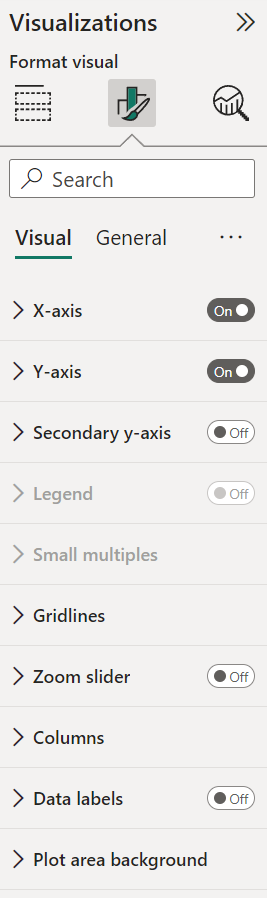
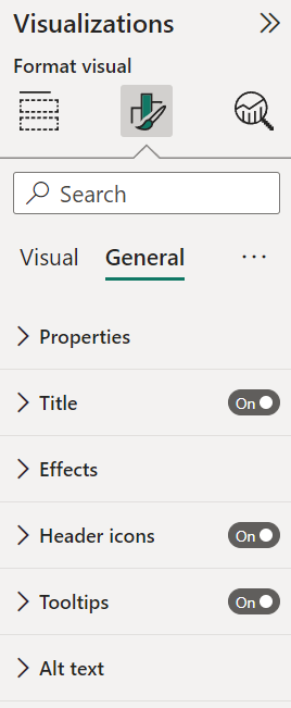
Edit these settings as much as needed (not as you like). Here’s an overview of relevant formatting settings that you’ll likely use:
- Title: Your title should be short and sweet. Make sure it concisely shares the central message of your visualization.
- Color: Choosing appropriate colors to represent data points makes reading graphs and charts easier. Ideally, try to use blue and red hues to take into account color-blind users.
- Legends: Legends are helpful for the readers to learn to associate colors or lines with a variable or data category.
- Axis: The X and Y axis should be clearly labeled for users to quickly identify the axis involved.
While there may be other settings and features you could add, they may not all be necessary. A minimalist dashboard, instead of a cluttered one, is better at sharing and driving home a story.
In creating a data dashboard, always remember “context”. Highlight which data attributes you’d want to show and their data types, and from there, determine the ideal to graphically represent them.
4. Building the Dashboard
Adding Report Pages and Visuals
Assuming that you’ve loaded the data set, create a new report by:
- Going to your workspace
- Hover your mouse to the top and click “Create” ? “Report” in the top-right corner
- Pin a visual to add from the Visualizations pane
- Add data to the visualization with drag-and-drop fields from the Data Pane into the chart
- Edit the appearance to create an aesthetic and consistent dashboard
We’ve already explained how to choose the visualization in the previous section. Choose an option that accurately represents the big data “story” you’re trying to portray.
Organizing and Arranging Dashboard Components
The aesthetic value and appeal to the design are equally important as having the correct data and selecting the right visualization. Here’s how you can achieve that.
Capitalizing on Space and Margins
Spacing applies to the report page margins and the white area between two visualizations. Margin sizes, theoretically, should be equal on the left and right, though margin spaces on the top and bottom are provided leeway to differ.
Spacing and margins are important concepts as they reduce clutter and improve readability for the end user. These spaces can help guide users through the page and draw attention to specific parts of the design.
Object Spacing
When spacing specifically for graphical representations, ensure that you provide enough spacing within and around each chart. Consider also using space depth and wide padding around different sections to illustrate the relation between the two sections.
You should look for your entire report to be consistent throughout. Have the same spacing, margins, visualization size (based on hierarchy), and font options across the board.
Enforcing consistency can be done through a report theme. This applies to the entire report and ensures consistent applications of colors, fonts, pages, and visual formatting.
Sizing and Visual Priority
The general rule of thumb is that the more critical the visualization is, the larger its size will be. This gives users visual priority, as your eyes are naturally led to the larger, more prominent representations on your report. Make them large and support them with data and numbers on smaller nearby graphs for more important visuals.
Implied and Explicit Sections
There is such a thing as implicit and explicit sections in your report. Your brain naturally breaks down dashboards into sections to make better sense of it all. Implied sections are groups of representations in close proximity to each other. This means that they are related to one another.
Explicit sections are divided based on their colors and background themes or shapes. The sections highlighted are assumed to be different from one another. Using implied sections normally demonstrates a closer relationship between objects than explicit sections.
Color
Finally, use color to draw your reader’s attention to a specific section and keep them engaged. Ensure that they are sufficiently contrasted, which is especially important when creating accessible reports for low-vision readers.

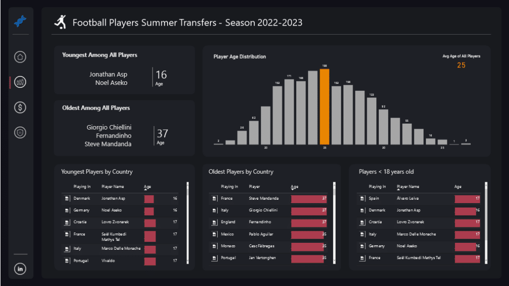
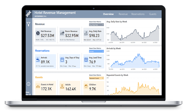
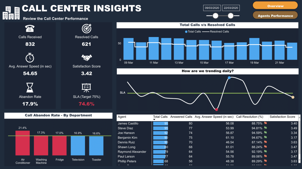
Darker backgrounds have become more popular in Power BI for making metrics “pop”, the below dashboard gives a great example of this.
5. Implementing Interactivity and Dynamic Behavior
To create a better user experience, visual interactions can be added for users to interact with. Imagine being in the middle of a presentation and getting asked: “Which countries have the most sales?”, “Which products drive growth?”, “What are the top characteristics of customers who use our product?”
The ability to edit and apply slicers and filters in real-time is a potent tool to better tell your data story.
To do this, you can follow the subsequent rules:
- Select a visualization to make it active
- Display Visual Interaction options
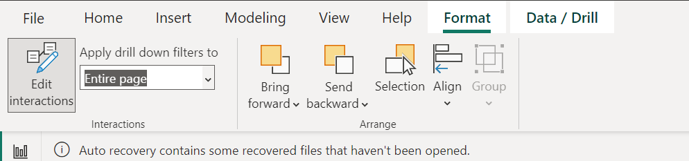
- Click Filter and Highlight Icons on the top right corner of the selected visualization, depending on what you want to do.
If, for example, you want to highlight specific sections of a viz, use the highlight icon ![]() . This greatly helps when you want to highlight a particular point of data without creating another chart.
. This greatly helps when you want to highlight a particular point of data without creating another chart.
6. Sharing and Collaborating
The ability to showcase how you can share and collaborate with Power BI is a powerful feature that allows users to view and edit other people’s work.
Publishing Interactive Dashboards
Once you’ve completed your Power BI dashboard, you can publish and share the completed report for your team or organization to access. Here’s how to do that:
- Locate the dashboard you want to share in your list of dashboards or open it.
- Click the “Share” button.
- In the “Share dashboard” dialog, enter the names or email addresses of users or groups you want to grant access to the dashboard.
- Optionally, include a message for them and then click “Grant access”.
Sharing with Team Members
Sharing with team members can be done through the following steps:
- Go to the “Workspaces” tab. You’ll find other shared projects and a folder entitled “my workspace” which should hold your existing projects.
- Create a new workspace.
- Add members by entering their email addresses. Assign the appropriate permission levels, especially if you’re dealing with secure data.
Leveraging workspaces on Power BI, members can collaborate effectively and efficiently. Stakeholders are indeed granted relevant information.
Best Practices for Dashboard Design
Here are some key things to remember when dealing with dashboard design.
Provide Context and Identify Your Data Story
Every dashboard should have a clear end goal. Never include graphs or charts without knowing their purpose. Provide context to the visualization by asking yourself questions like:
- What objective do you want to achieve with this visualization?
- What behavior of the data set do you want to show?
- Who is your audience?
All in all, your data dashboard must always tell the audience something.
Choose The Right Visualizations
The right visualizations make it easier to relay necessary information. Four types of behavior between data sets are to be shown: comparison, proportion, relationships, and hierarchy. Identifying the type of data set you have will help in picking the proper visualization. For example, data sets with categorical data can be compared and should therefore use a bar chart. When you want to show the relationship between two variables, use a line chart.
Focus on Flow
Our final tip is to focus on the overall flow of your dashboard. Again, you want to ensure that your entire data set tells a story. Logically organize your information and prominently present vital metrics. A natural flow to the dashboard will make reading the whole report easier.
Are you just starting out, check out the clip below.
Ready to Start Learning Power BI and Enhance Your Career?
The best place to start learning is with our Free Power BI Training Course; this will help you on your way to mastering Power BI.
We’ve taught over 150,000+ people across the globe, are you ready to Start Learning?


