Finding the center of gravity of a cluster of locations is a common task for people working with Geographic Information Systems.
One example is when looking at the allocation of addresses to a depot or engineers to a working area. Although Power BI does not yet support true multiple dynamic layers in the map visuals, it’s still possible to demonstrate the methodology.
However, the calculated COG (center of gravity) may be on top of a building, or a mountain. It is merely an indication of a great spot. Further analysis into other conditions like practicality, surrounding infrastructure, availability of staff, and housing is required.
Before jumping into Power BI to demonstrate this, I’ll explain the math to those who are less familiar with this.
Understanding The Center Of Gravity Analysis
This part is a small scheme with four locations. This also contains the coordinates of every individual location.
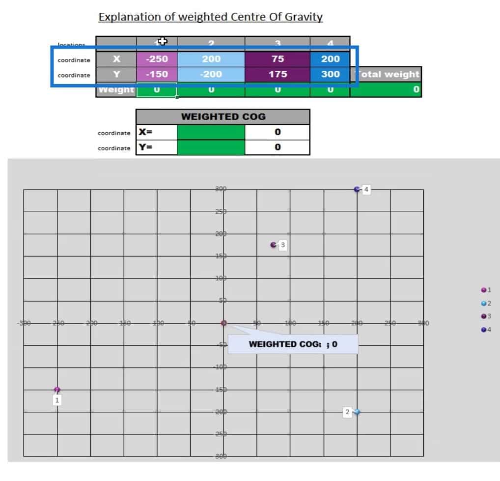
You can see those coordinates represented on this map. As you see, location one is on -250 (X) and -150 (Y).
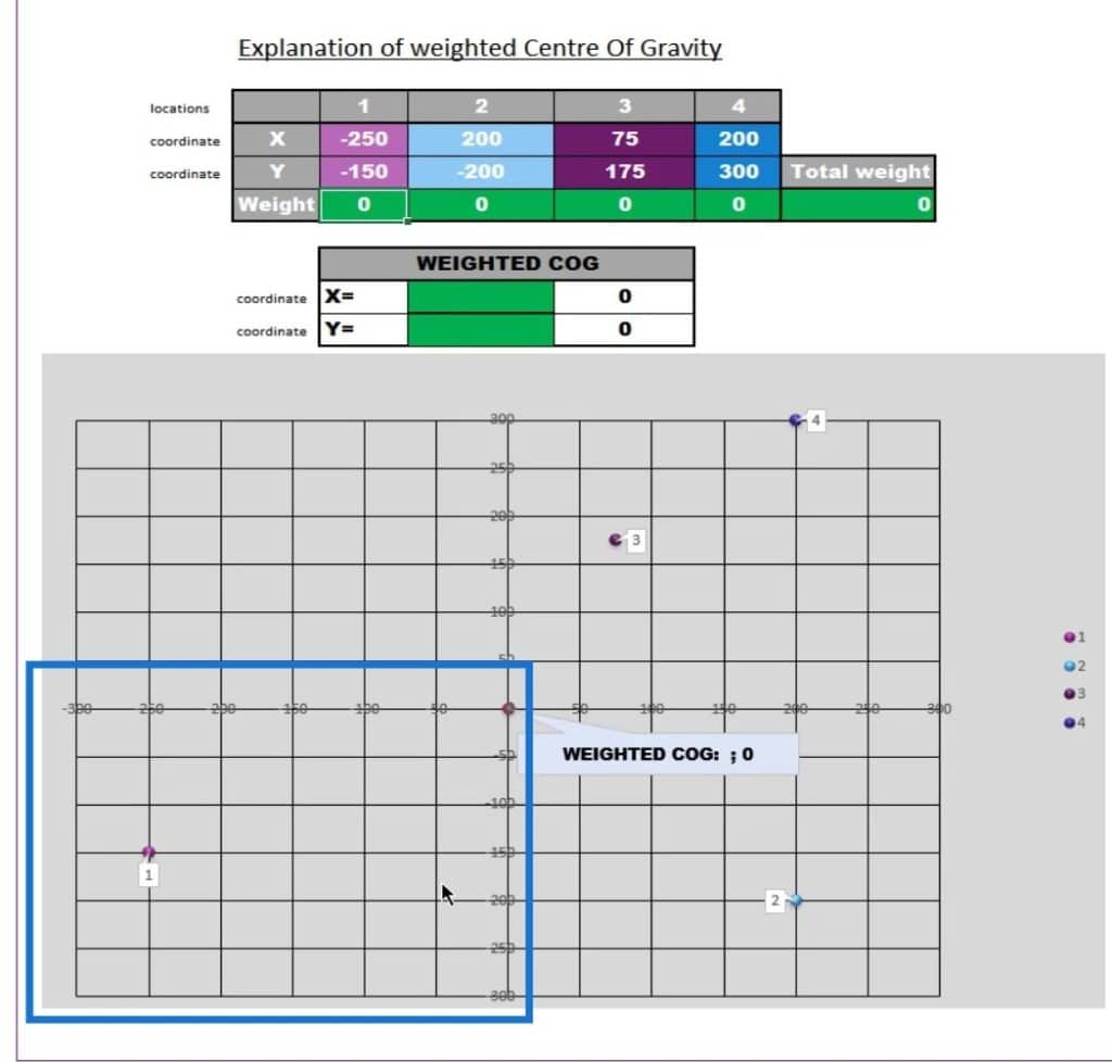
At this moment in time, the weighted center of gravity is right in the middle of all these locations.
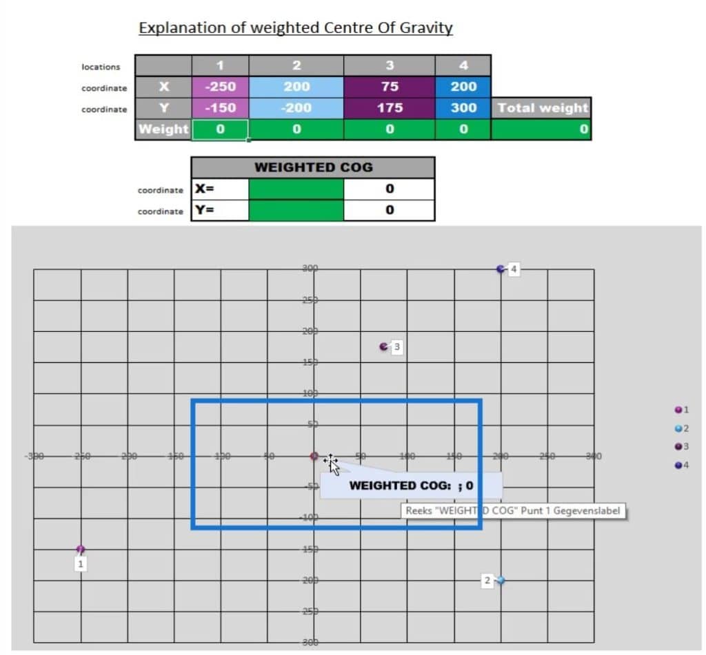
I want to create this weighted center of gravity to move in a direction based on the information that I have, such as the number of deliveries to location 4. It can also be based on weight or revenue. Although in most cases, I consider the deliveries because they are the cost driver.
I need to complete the weights in order to calculate the center of gravity.
So, if I enter 100 under location 1, you can see that the weighted center will move to this point. This is because the others are still 0.
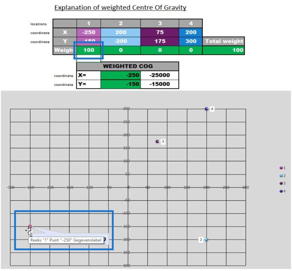
If we set the weight of the others to 200, 200, and 500, the center of gravity will move to another location based on the weights that I have specified.
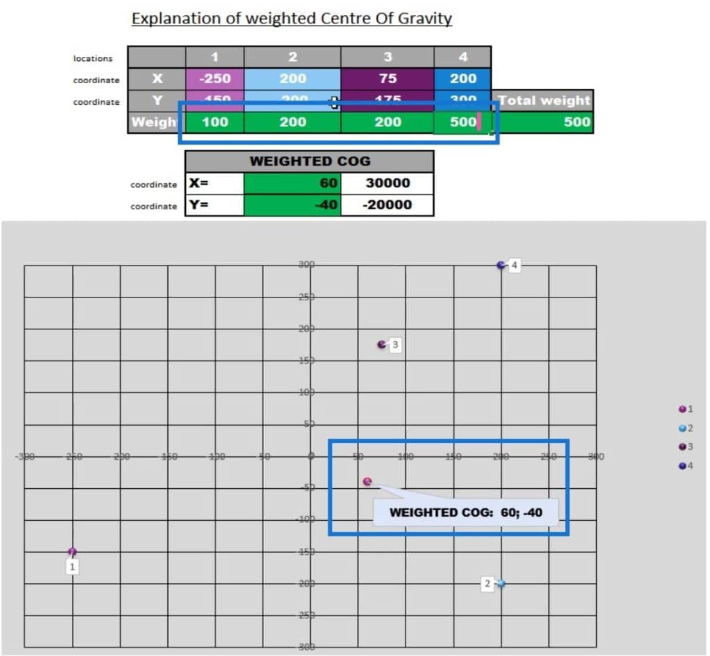
That explains how the weighted center of gravity works.
To calculate the center of gravity, simply multiply the locations X and Y coordinates or a latitude and longitude by the weight for each point.
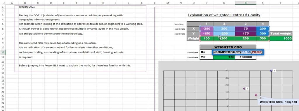
After that, divide it by the total weight to get to the actual weighted center of gravity.
Points To Consider In Center Of Gravity Analysis
In this demo, I only used a small number of customer locations.
A COG analysis is strategic and should be looking at data over an extended period of time, preferably over one year or more to identify seasonality.
Therefore, I recommend starting with a standard analysis to gain insight before setting up the analysis. That can then be done with a smaller subset of the data, after completing the next steps.
Remove small outliers, like incidental customers, and check if there are any included deliveries to or for customers that you may lose. Moreover, add data for new customers based on the profile that they provided.
Run a few iterations of the model to show the different scenarios associated with any changes.
On larger datasets with thousands of points, consider grouping your data in Power Query. I used the postcode and group by, keeping the latitude and longitude of the customer with the highest number of deliveries.
First Sample Scenario
This is a simple COG for a given set of data.
Here’s the data model. As you can see, there are no relationships.
1. Creating The Center Of Gravity Query
First, I created a center of gravity query.
I need to calculate the center of gravity over a selected data set. In order to do this, just like what I’ve shown in the excel sheet, I have to take the total demands.
I also need to calculate the center of gravity for the latitude. In this case, I multiplied the latitude by the number of deliveries.
Then, I did the same calculation for the longitude.
After that, I divided the given COGs by the demands.
Then, this will be returned in a one-row table using the ROW function. I made sure that the number of columns is the same as the number of columns in the dataset. I also made sure that the columns can have a text or a formula. In this case, I have the DAX measures for the longitude and latitude COGs.
Following that, I did the union. So, the final table that I used for the display is the table that contains the union of the center of gravity and the data.
After completing those steps, this table will display the names of the locations, revenue, demands, Longitude and Latitude, and the two columns that I added for this demonstration (COG color and the Size column).
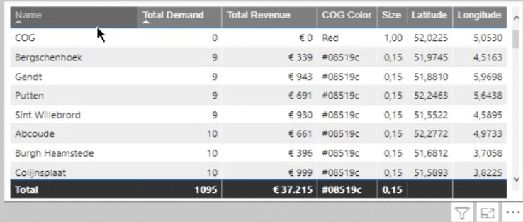
2. Analyzing The Size And Color Measures
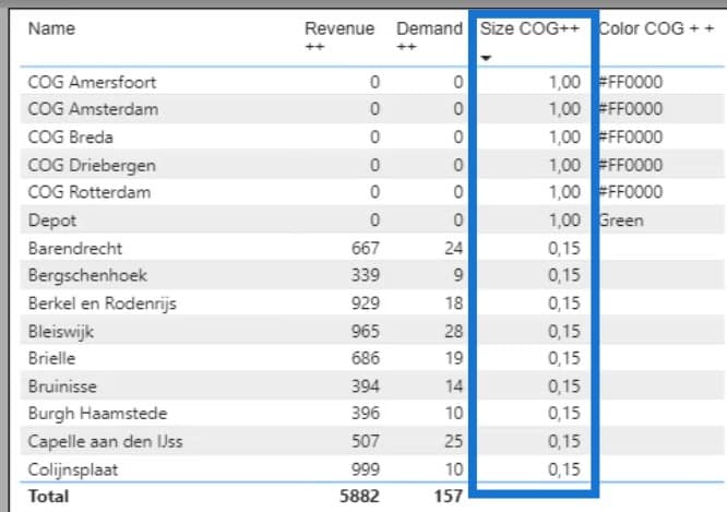
The Size measure identifies whether the Total demand is equal to zero or more than zero. Hence, if it’s a zero, the size will be set to 1. If it’s higher than zero, it will be set to 0.15.
Doing this will create a different size for the center of gravity, which shows as color Red and as size 1.
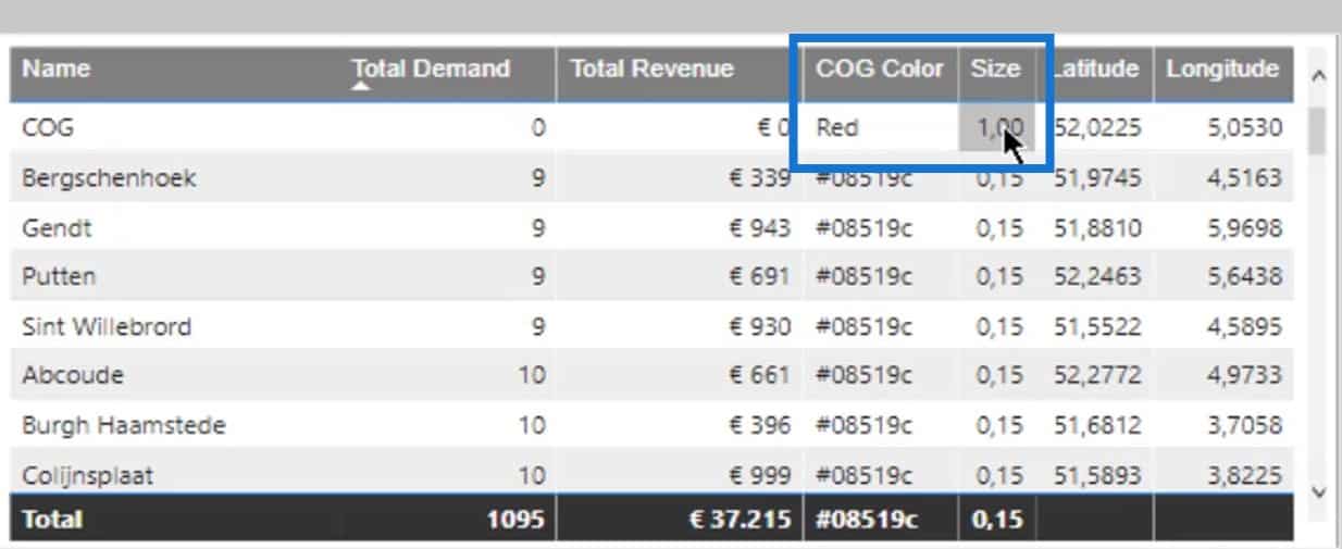
The red color is associated with the COG Color measure.
This basically indicates that if the size is one, the color of the COG indicator should be red. Otherwise, it should be blue.
In the Data colors under the Formatting tab, just set the Format by to Field value, then select the measure for the Based on field option. For this scenario, I selected the COG Color measure.
Now, let’s take this sample analysis one step further.
Second Sample Scenario
In this example, I created five centers of gravities along with their existing dataset.
The map should display the center of gravity based on a selection from the slicer.
Achieving this scenario is quite simple. I’ve taken the center of gravity for each and every point on the map.
I created the same calculation for each measure.
After completing those five COG calculations, I added them up in this union table.
Subsequently, this table now displays the center of gravity on top of the data.
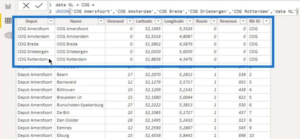
This provides a bit more flexibility in terms of analyzing data across all existing depots.
If I select Blank and Depot Rotterdam, the map will display the data points and the center of gravity for Depot Rotterdam. It will also display the center of gravity for the other locations, which I’d like to keep as a reference.
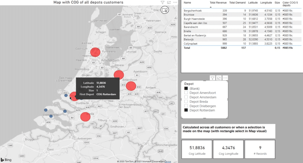
The table will also display the data based on the selection. As you can see, it reflected the corresponding colors and sizes.
The Color measure is the same as the first example. If the size is 1, the color should be red; otherwise, it should be blue.
The other measures are merely a reflection of standard analysis like Total Revenue and the Total Demand.
Third Sample Scenario
For the final example, I added the locations and the center of gravities to the data. Therefore, I have the depots, the data, and the center of gravity.
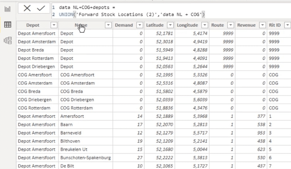
That results in a slightly different map. First of all, what I really like in this map is that it has the depots and all the points.
I can make selections in this slicer as well.
If I clear the slicer, you can see that the map now displays the depots (green circles), and the center of gravity (red circles).
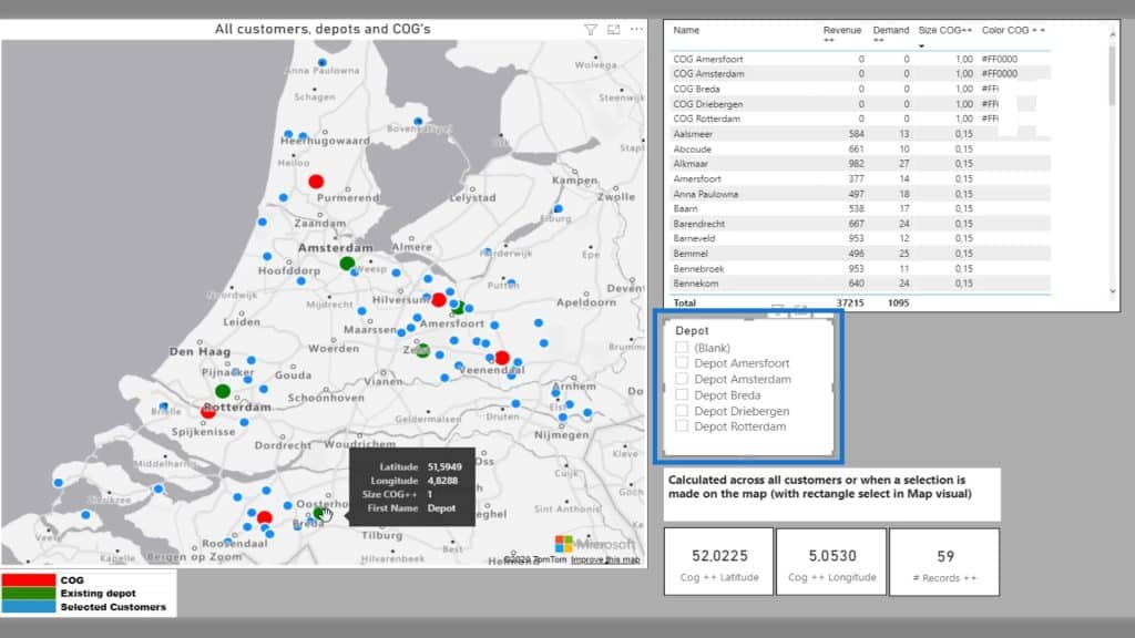
In one view, I have everything that I need to fulfill the analysis.
If I select Depot Rotterdam and the center of gravity, the map will display all the points for Rotterdam. For reference, it will also display the center of gravities of the other locations.
Looking at the table, the size is now responding as I expect it to be.
The same goes for the Color COG.
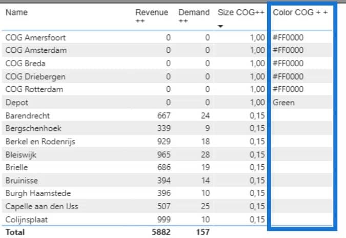
All the data have stayed the same with the exception of the addition of the depots. But for the rest, I just modified the color and added selections that will be reflected in the map.
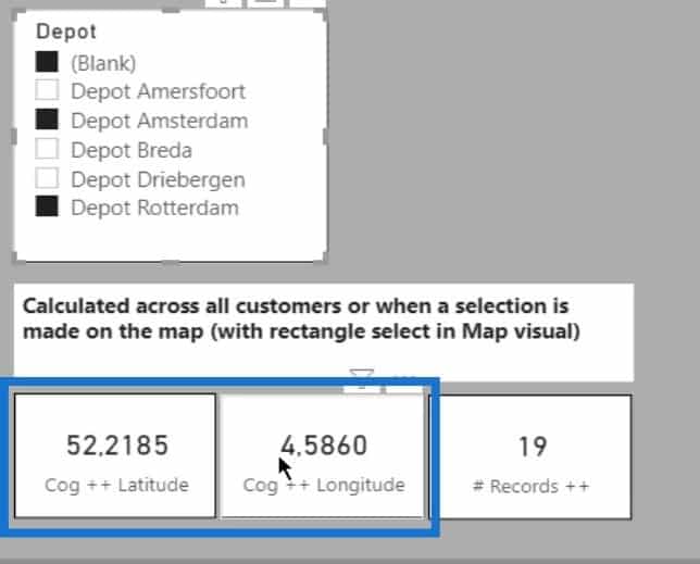
The center of gravity that you see in these 2 cards is the actual center of gravity of the selected points. However, it will not reflect in another point on the map because the data is not updated.
The color measure that I used is different from the first one. This shows the color measure for the first example.
As for the color measure of the second example, I added a bit of logic to create the various colors on the map.
The legend is a small and simple table. Usually, legends in maps are not that good. So, I prefer to create my own if I can.
In this case, I’ve created a small legend description and the color.

For this sample scenario, I don’t need this legend to filter the map. I merely used it to display a guide for what the viewer sees on the map.
***** Related Links *****
Data Visualizations Power BI – Dynamic Maps In Tooltips
Power BI Map Visual: Creating A Custom Legend
Geospatial Analysis – New Course on Enterprise DNA
Conclusion
That covers the tutorial on how to calculate the center of gravity in geospatial analysis and modify the map visually.
You can also experiment with these settings. Keep in mind that you can achieve varying results depending on the way you set up the data.
Check out the links below for more examples and related content.
Cheers!
Paul


