
Today, I’m going to do a quick and easy tutorial on how to calculate one of the most commonly used metrics, especially if you’re dealing with sales, revenues, or transactions. We’ll calculate the percentage margin. I’m going to use profit margin as an example here, but this technique doesn’t have to be always related to profits; it could be any sort of margin. You can watch the full video of this tutorial at the bottom of this blog.
Using The Waterfall Technique
Let’s jump to the model first. We want to make sure that it has been set up in an optimized way. I know that Microsoft formats the model using a star schema. Personally, I’m not very fond of it. Instead, I use the waterfall technique, which is sometimes called the snowflake technique.

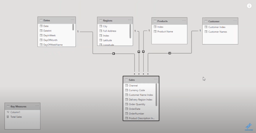
This technique is where the filters flow down to your fact table from your lookup table.
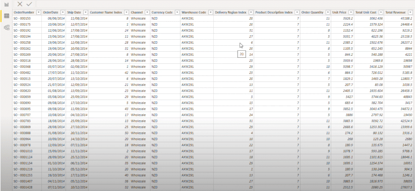
Let’s have a quick look at our Sales table. As you can see, there’s no way to create the percent profit margin because there are no profit numbers in the table.
When they’re starting out with Power BI, most users will create a calculated column, calculate the profits, and then from there, work out the profit margin.
The great thing about Power BI is that you can do all of these calculations inside of measures.
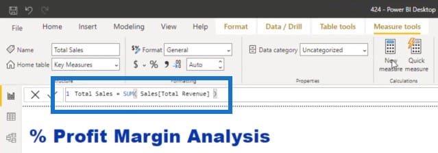
Calculating The Total Sales
I’ve created a simple measure called Total Sales which sums up the Total Revenue column. Even if you’re dealing with something totally different like HR data or marketing data, the techniques I discuss are reusable across any industry and business function.
The examples I will show use the measure branching technique, where we start with our core measures and then branch out into other measures like margins.
Calculating The Total Costs
With measure branching, we start off with a core measure like Total Sales, and then create another measure called Total Costs. In this measure, I’ll use SUMX which enables me to do calculations at every single row of a table. It will iterate through every single row of the table I specify, which in this case is the Sales table. For every row, I will multiply Quantity by Total Unit Costs.
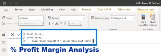
Remember that in the Sales table that we just looked at, there was no actual Total Costs column. There were only these two columns. This is why I needed to do multiplication at every row, and then sum up the results. This is what SUMX and all the iterating functions do.

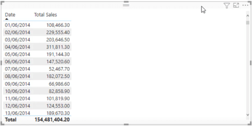
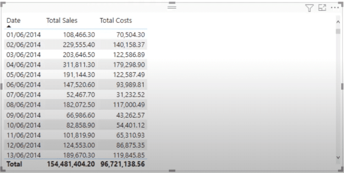
We now have Total Sales and Total Costs in our table.
Calculating The Total Profits
I can create another really simple measure called Total Profits. This is where measure branching comes in. I’m going to simply branch out again and find out the difference between Total Sales and Total Costs.
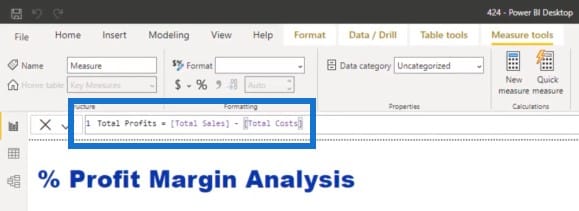
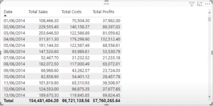
I’ve also placed the Total Profits in my table.
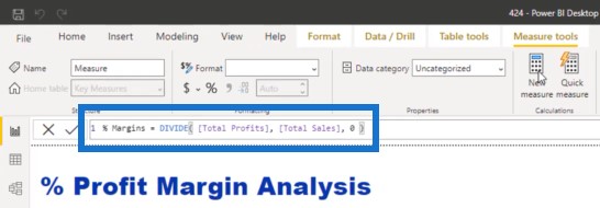
Calculating The Percentage Margin
To calculate the percentage margin, I will create another measure. I’m going to use a function called DIVIDE to divide the Total Profits by the Total Sales, and I’m going to put an alternative result of zero.
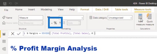
We’ll also turn this into a percentage format.
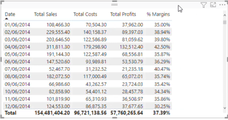
We can now see the percentage margin.
Some of you might ask why we didn’t do this using just one formula. My recommendation is to branch out slowly and start from the simplest measures before you create the more complicated ones. Think about how easy every single measure was that we worked through when we build it step by step. It’s easier to audit when you’re able to break things out in a table and be able to look at the results and double-check the numbers.
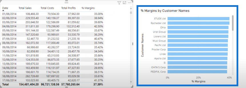
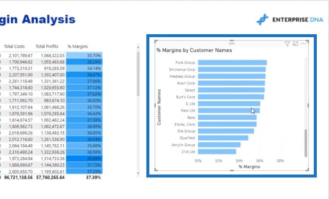
Visualizing The Data
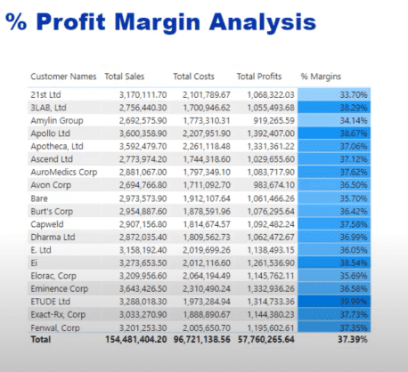
Once I turn this table into a visual, it’s a bit busy and all the data is similar when you look at the customers.
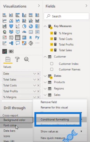
If you want your visualization to stand out, the best way to showcase this is with conditional formatting, especially when you have a lot of data points that are quite similar.
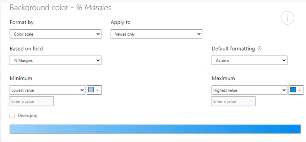
You can change the background color and use two contrasting colors. You can go from light to dark blue.
Another thing you can do is change what you showcase in the axis and start at 30%.
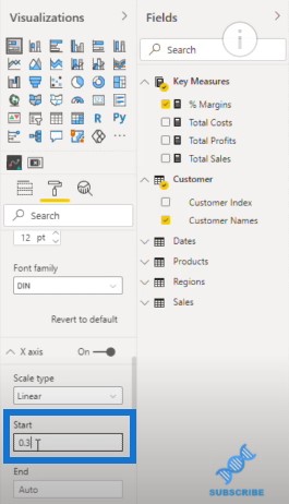
You can now see more variability in the visualization. Obviously, you just need to make sure that your consumers know what they’re looking at.
Another way to show this is to break out your top 5 advisors or your bottom 5 stores.

***** Related Links *****
Calculating Percent Profit Margins Using DAX In Power BI
Calculating Dynamic Profit Margins – Easy Power BI Analysis With DAX
Use Power BI Measure Branching To Check If Your Margins Expand As Revenue Grows
Conclusion
With this tutorial, I hope you’ve learned that when you calculate the percentage margin, you need to make sure that you start off in the right place before evolving into the more advanced calculations and visualizations. This tutorial goes to show how you can tell really good and compelling stories using raw data in Power BI.
Sam
[youtube https://www.youtube.com/watch?v=_bPsHGkwSC8?rel=0&w=784&h=441]


