Bar charts are a popular way of visualizing data and are often used to compare data across different categories. In this tutorial, you will learn how to create a bar chart using SQL Server Reporting Services (SSRS) for your paginated reports.
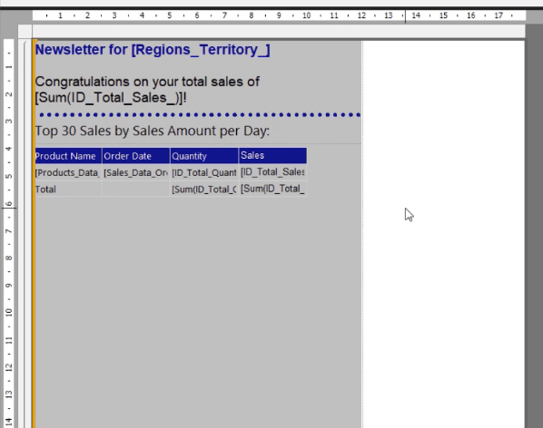
We will use a sample paginated report with matrix showing the Quantity and Sales data of each Product per Region. The matrix and report titles are placed inside a list. We will use this sample report to demonstrate how to create a bar chart that can be used to visualize and compare the Quantity and Sales data of each product across different regions.

Create An SSRS Bar Chart
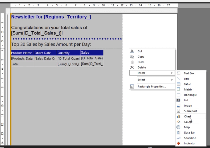
To insert a bar chart in Report Builder, right-click on your report, select Insert and then click Chart.
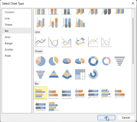
Click on the Bar tab and select the bar chart type you want to use. For this example, a we’ll use the normal bar chart.
Once the bar chart is on your report, adjust its size, location, and position. You can do this manually or by using the Properties pane at the right-hand side.
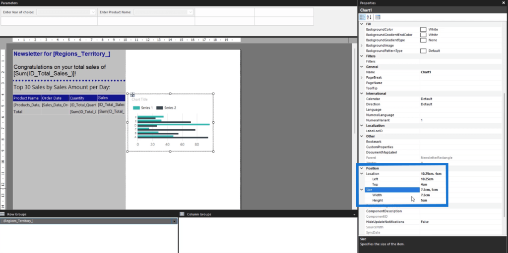
Using the Properties pane is recommended since it gives you exact measurements. This ensures that elements are placed precisely in the positions you want. You’ll also be able to gauge if an element goes over the report page size and then make the necessary changes.
Add Data And Chart Title In An SSRS Bar Chart
After creating the chart, the next thing you need to do is assign the data and chart title.
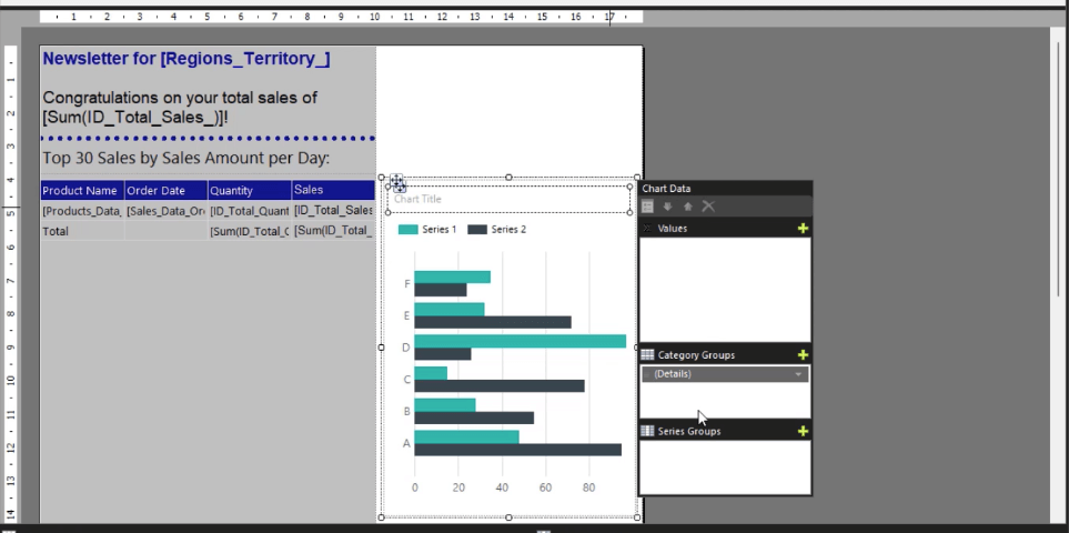
When you double-click on the bar chart, you’ll open the Chart Data wizard. This allows you to assign Values, Category Groups, and Series Groups to your paginated report.
Add A Title
To add a title to your bar chart, double-click on the chart title text box at the top portion of the chart. Type in the name you want to assign to your visualization. In this case, it’s Product by Quantity Sold.

You can adjust the font size, style, and color using the options in the Properties pane. You can also change the background and text box border colors.
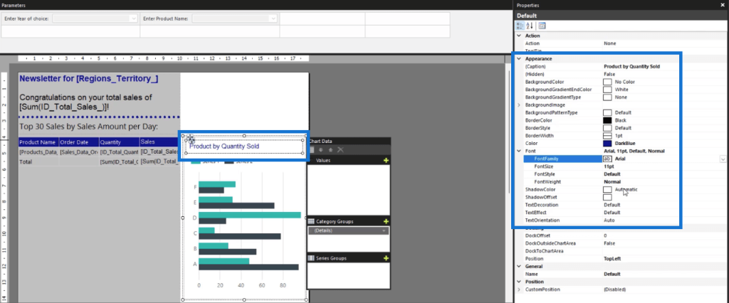
The important thing is to keep the formatting consistent. If you used an Arial font style for your table, use this for the bar chart.
Assign Series Data
Next, let’s add the chart series data.
Go to the Chart Data wizard. In this example, the Values are assigned with the Total Quantity.
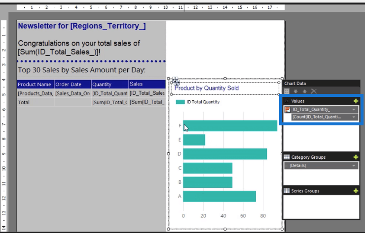
You’ll see that the chart data changes. However, the bars are just used as fillers. You can view the real data when you Run the report.
To format the bar color and size, right-click on a bar and select the Series Properties option.
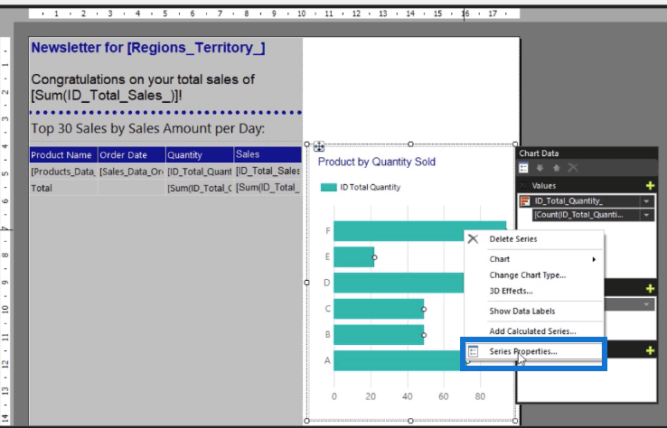
This opens the Series Properties wizard. Go to the Fill tab and open the drop-down arrow for the Color options. Then, choose the color you want the series to be in. Again, it’s important to be consistent with the formatting.
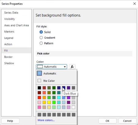
Once done, click OK. You can see that the series is now filled with the color you selected.
Next, assign Category Groups with Product Name. Afterwards, you’ll see that the series name is again assigned with fillers.
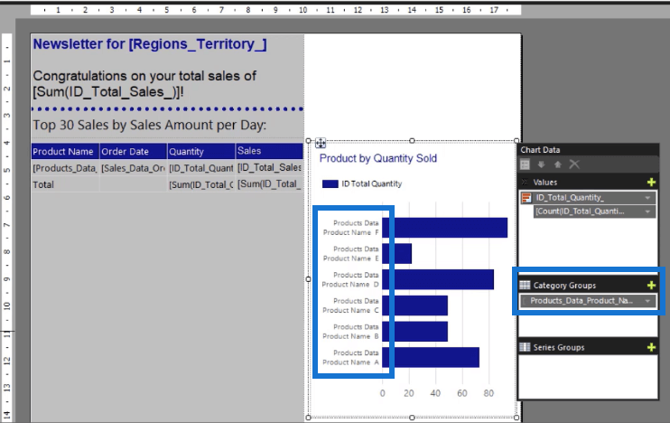
But this is how the bar chart will look like when you Run the report.
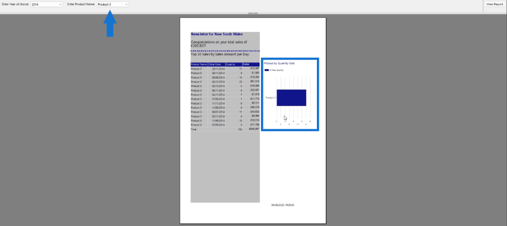
The chart will show data based on the selection you made using the parameter or filter.
***** Related Links *****
Different Bar Charts In Power BI To Elevate Your Reports
Comparison Bar Charts With Charticulator In Power BI
Power BI Data Bars In Table Visualisations
Conclusion
Adding visualizations makes it easier for end users to understand what your paginated report is presenting. In this tutorial, you learned how to create a basic Bar Chart in Report Builder that shows the Total Quantity per Product. The process is similar to how you’d build a chart in Microsoft Excel. However, you need to be familiar with the Report Builder interface and understand how the Expression Builder works.
All the best,
Sue Bayes