I’ve previously showcased how you can compare your actual results versus your budgeted results using advanced DAX. But, what if you also wanted to overlay some time comparison information so you’re comparing your actuals versus budget versus last year? Or perhaps versus last quarter? Or against any other time period you may want to select? You may watch the full video of this tutorial at the bottom of this blog.
In this example that we will work through, I’m going to show you how you can combine all of these, using time intelligence and budgeting analytical techniques in advanced DAX.
It’s seriously powerful stuff and it’s amazing how easily you can actually bring this all together.
Actuals Vs Budgets Vs Last Year
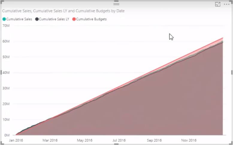
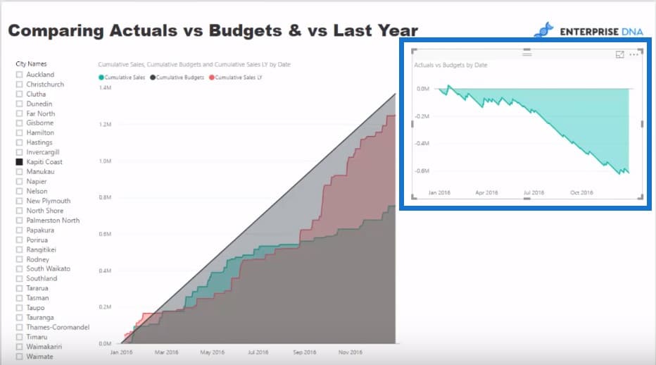
In this blog post, I want to show you some really cool analysis that you should be able to create relatively quickly just by knowing a few of the techniques that go into it. What we’re trying to do here is show our actual results cumulatively and compare them to budgeted information, but also to last year.
The reason why I created this was because I came across a problem where a client has created budget at a yearly level, but didn’t have any allocation for seasonality. They were incorrectly analyzing information versus the static budget when there was actually some seasonality involved in the results.
I thought this is a very relevant example and is something you would want to do in the real world. You would actually want to analyze how your results are going versus a budget you may have made up, but you also want to see how it’s tracking business last year at the same time.
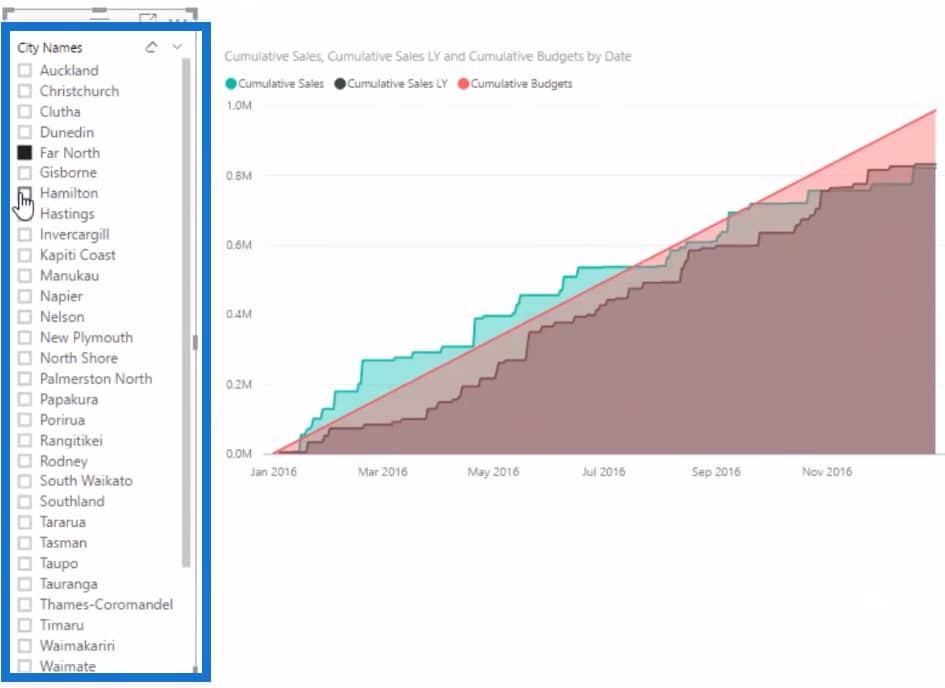
Since everything is dynamic, we can select different regions and quickly see the divergence between budgets, as well as the divisions between actuals versus last year. This is an interesting insight that you can get only from using advanced DAX, and there are plenty of great conversations to be had with these numbers.

Total Sales
I’m going to show you how you can actually build all of this in Power BI. Let’s start from scratch by creating our first measure and calling it Total Sales. This is really simple stuff right where our actuals will be based on, and where we’ll be calculating how many sales we’re making per day.
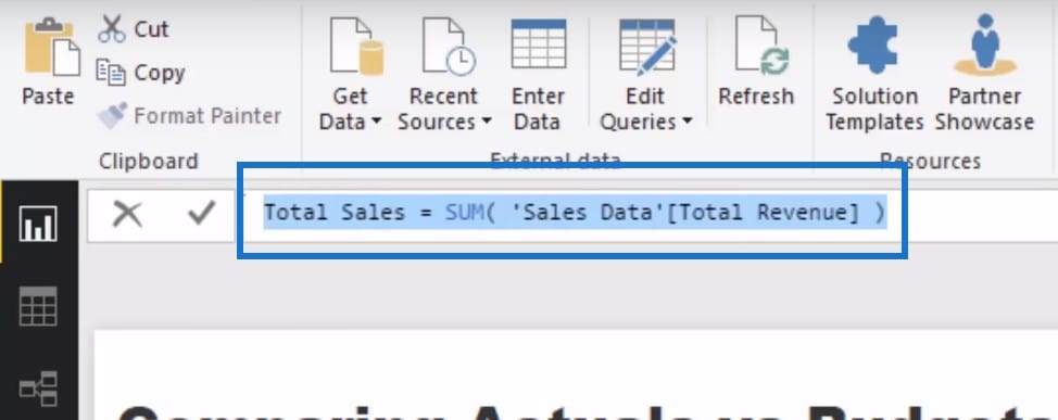
What I’ve done here is to recreate a number of steps and put them into one measure. This is a relatively new but seriously awesome feature in Power BI, so I highly recommend understanding how the syntax of this works so you can write this in your own formulas. I’ve used a lot of variables here, which we will go through step by step.

Budget Allocation For One Day
We have to create some sort of allocation logic where we have yearly budgets but want to allocate them per day. To work out the allocation algorithm for your budgets, we have to come up with Days in Date Context where if this formula was aligned to one date, then this would just equal to one.

For days in a particular year, what we want to do is 1 divided by 365 or 366 and then multiply it by the yearly budget.

Just to summarize, we divide 1 by 365 or 366 and then we multiply that by the Total Budget. This is going to give us our budget allocation for one day.

Total Sales From Last Year
The next thing we have to do is to calculate our Total Sales from last year. That’s not very difficult to do so let’s create a new measure and call it Sales LY. Inside of CALCULATE, I’m going to put Total Sales for the same period last year and then put in dates.
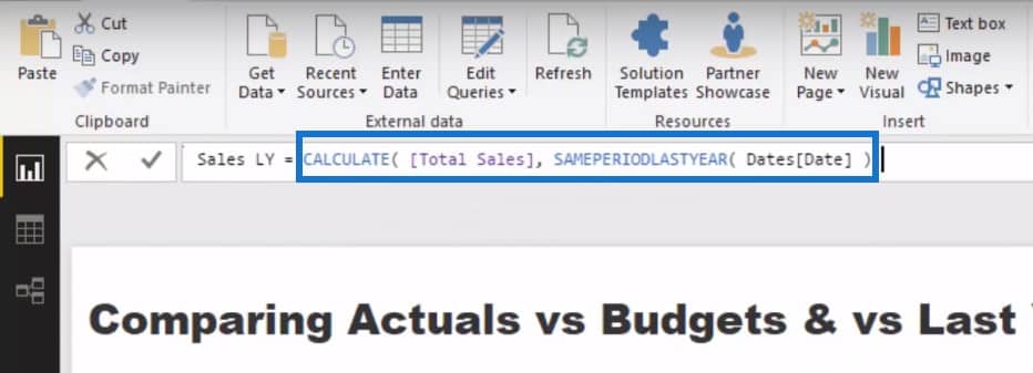
Now that we have our core measures set up, we’ll create a table of all of these data points.
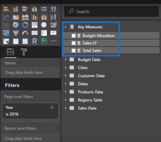
Cumulative Sales
We’re going to see each individual result for that particular day, but we want it to be done in a cumulative way. So we’re going to create another measure to calculate Cumulative Sales. We want to calculate our Total Sales cumulatively so that it’s saying for every single date that we land, we will calculate what the MAX date is. We will work through every single date to get cumulative results. This is a pretty standard pattern and you can reuse this over and over again.
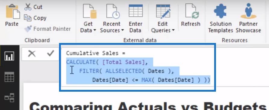
To get the Cumulative Budgets and the Cumulative Sales Last Year, all we need to do is copy and paste the Cumulative Sales formula and then create a new name for these two measures.
Now that we have our three cumulative totals, we can start playing with these inside a chart with the date.
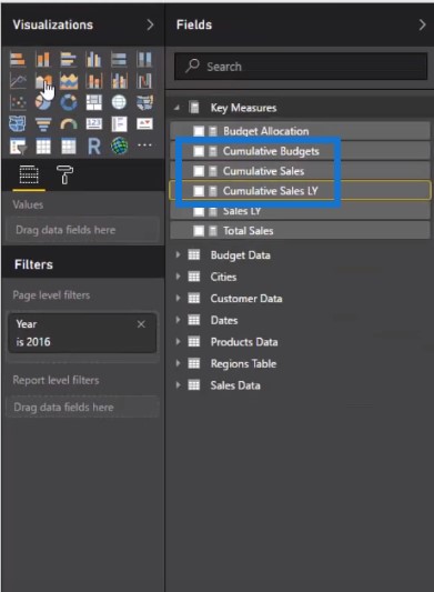
Visualizing The Data
You can see now that we’ve got these three aligned on one chart.
Let’s grab the City Names and put it into a slicer. If we click through all the different cities, we’ll be able to see the cumulative total comparison visualization, which is seriously awesome.
Actuals Vs Budgets
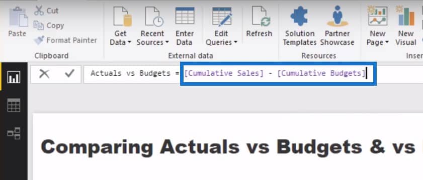
To finish things off, we want to see the variation between our actuals versus our budgets versus our sales last year. We are going to branch into a new measure and call it Actuals vs Budgets. All we have to do is grab our Cumulative Sales minus Cumulative Budgets.
Once we put our Actuals vs Budgets into a visualization, this is now giving us the variation.
We can then quickly recreate this measure for our actuals versus last year.
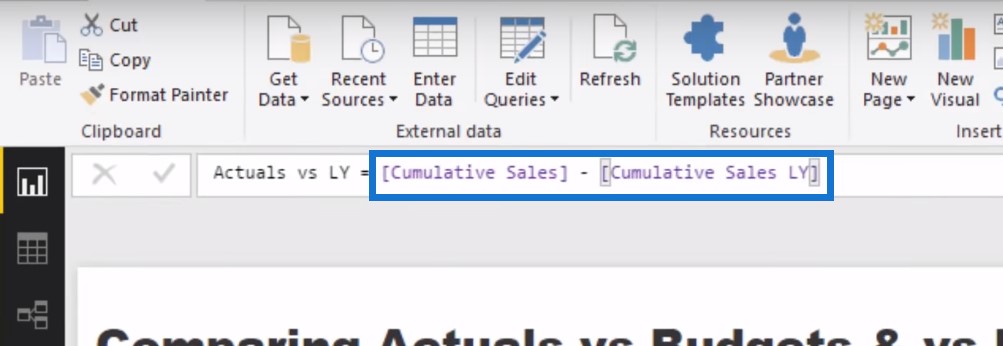
If we click through the City Names, we can see not only the cumulative totals together, we can also see what the variation is and see where the deviation occurs.

***** Related Links *****
Compare Cumulative Information Over Different Months In Power BI
Allocate Monthly Forecasts Across Daily Results In Power BI Using DAX
Measure Branching – The Most Important Concept When Using DAX In Power BI
Conclusion
Historically, it was really difficult to overlay lots of different analytical techniques on top of one another. In Power BI, by utilizing not only the power of advanced DAX but also the power of the data model behind the scenes, you can extract powerful insights with ease.
If you also look to bring the information into cumulative totals, you can actually identify trends as they happen in very quick time. I’m a big fan of cumulative totals for this very reason.
I also showed how to extend these results even further by using measure branching techniques within Power BI to calculate the differences between all of these results.
There may also be some seasonality in your data and performance numbers due to summer or winter months, or sales periods, or discounting periods, so this type of analysis is really going to highlight this well.
Being able to identify these things and being able to compare your actual results versus a variety of benchmarks produces powerful analytical results. Using advanced DAX in Power BI makes this far more intuitive to bring together. Consumers are going to be very impressed with the type of analytical work that you’ll ultimately be able to throw together pretty fast inside of Power BI.
If you want to see how you can solve other analytical scenarios just like this one, check out my Solving Analytical Scenarios course at Enterprise DNA On-Demand. I look to solve as many common scenarios as I can within this one course.
Leave any thoughts or comments below. Cheers!


