Today, I want to have an easy and simple discussion on how visuals interact with one another in Power BI. I want to show you a number of different examples that you can look at to get an understanding of how filters work and how you can manipulate them into showcasing the other visuals in your reports. Using Power BI visual interactions allows you to showcase data in a way that’s both compelling and easy to digest. You can watch the full video of this tutorial at the bottom of this blog.
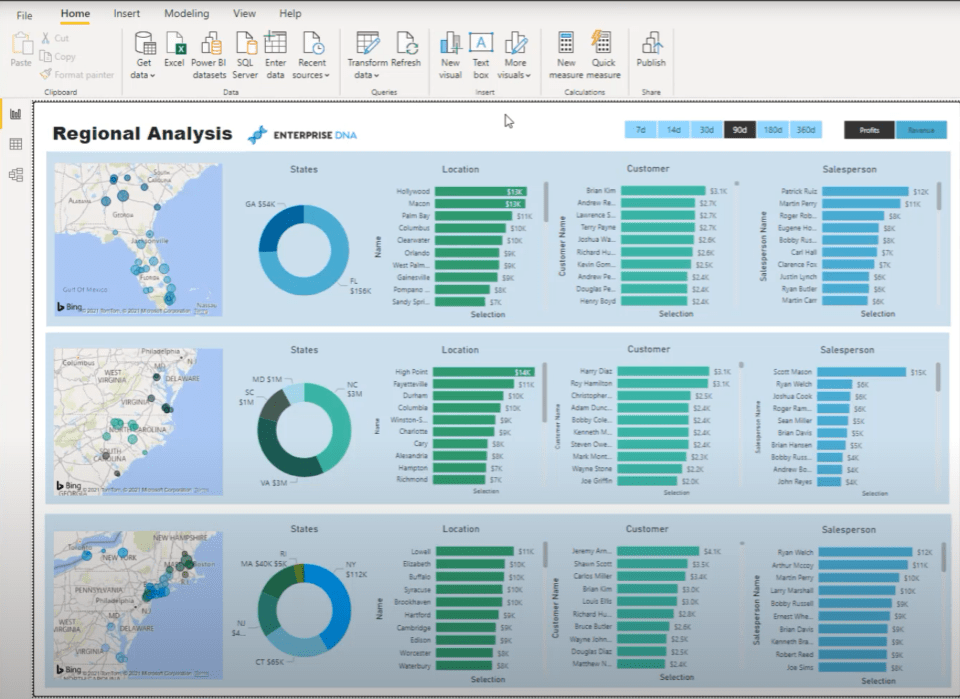
There are two things that I want to focus on. The first thing is to get your model right. This particular area is all about understanding and getting a visual of how the filters are going to operate inside your model.
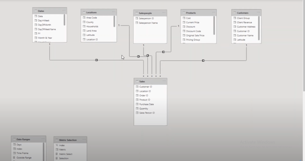
I use the waterfall technique, where I put all my lookup tables on top. Like a waterfall, the filters start from the top layer and they flow down to the fact tables.
Now, you have to just build this visual in your mind. You can be on the Report or Data view, and still know what’s going on behind your Model.
Within this report, we have a range of options to create filters and slicers.
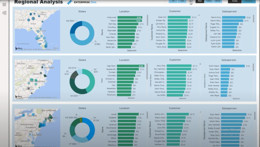
In another video, I’ve gone through how you can create multithreaded visualizations. These visualizations are being determined by custom tables and columns that were put into slicers. This is one way that you can do this, but you can also change the way visuals interact by selecting elements within a visual.
For example, I can select Georgia and North Carolina on the donut slicer and they are going to impact the bar visualizations on the right side.
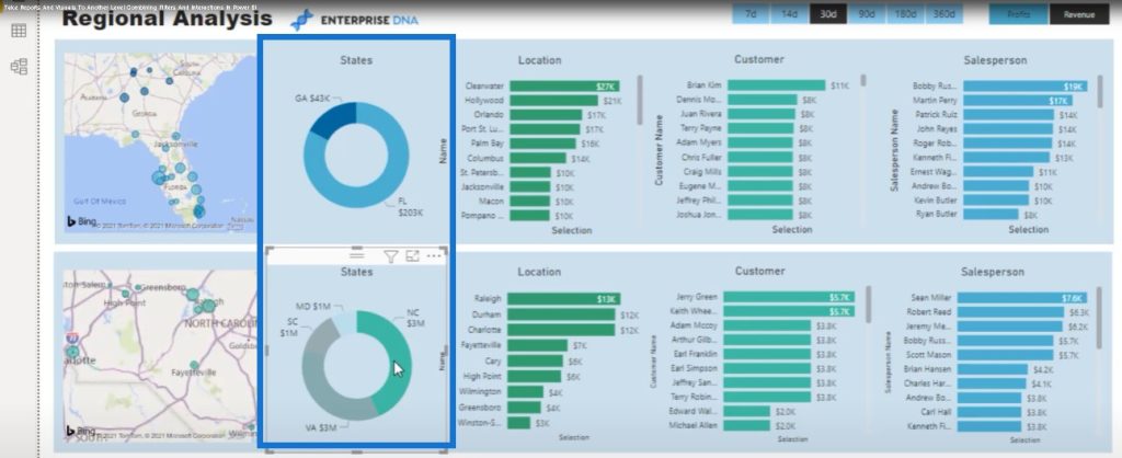
Another way to change the filters is through the Filter pane. You can filter a particular visual, a particular page and all pages as well.
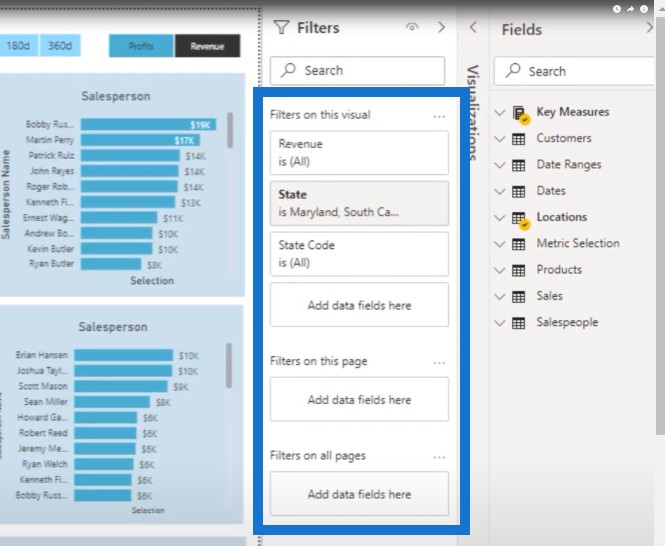
I’ve been using this particular example because I’ve built quite a few unique things into it. This is quite an advanced example to look through so you can determine where you can get to.
Using The Filter Pane For Your Visualizations
I could have done with just a one-page report with all of the different areas on the East coast showing up in one map. But to make it more interesting, I wanted this report to be able to break it up into regions. These regions could be divided into sales regions or store regions.
In this report, I have three different layers. In each layer, I made sure that I was only showing the data. I placed a filter here instead of writing an advanced DAX calculation.
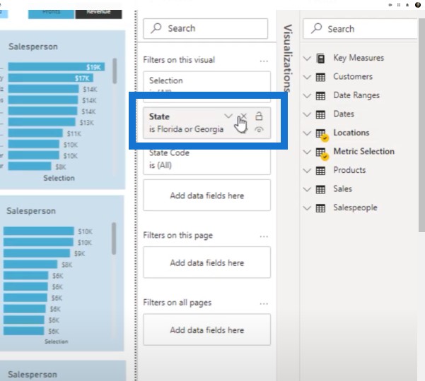
It was so much simpler for me to just go to the State column in my Locations table and place the additional filter on this row of visualizations.
You can also do it by page or do all pages just as easily by dragging and dropping a column into your filter pane.
Editing Interactions In Your Visualization
I also edited the interactions between my visualizations. When I select an element on each different row, it only affects the visualizations in that particular row. For example, if I select Florida, you can see that changes were made on the first row, but nothing on the last two rows changed.
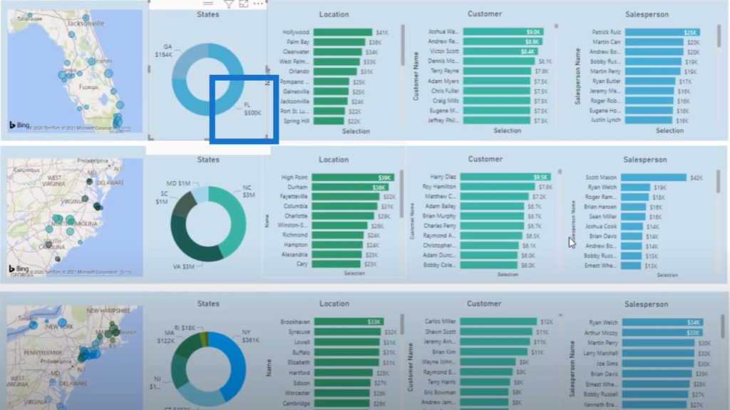
This is not the normal way that Power BI operates. Usually, if you select anything in the report page, it’s going to filter everything else in that report page. It doesn’t do it in this particular case because of the way I’ve edited the interactions between my visuals.
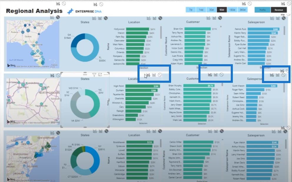
You can do this from the Power BI visual interactions feature. Just click on your visualization, go to the Format tab of the ribbon, and click on Edit Interactions.
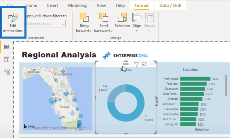
Then I’ve basically turned off the filtering function on rows that I don’t want to see filtered.
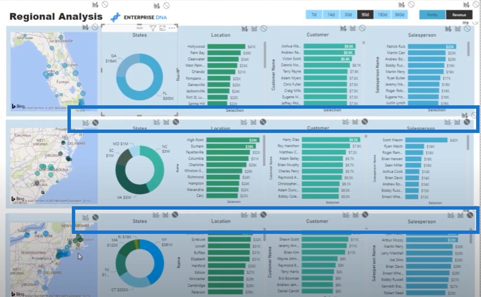
There’s a little bit of work involved. But now that I’ve done the work and set it up, I can select the slicer in the middle row and it will only impact these ones that have the filter icon.
Other Visualization Tips & Tricks
When you get down and dirty into what you can do from a visualization perspective, there are many ways that you can showcase insights. For example, you can use tooltips or use bookmarks to showcase results. There have also been small improvements on how the canvas area of Power BI operates.
Another amazing feature of Power BI is the multi-selecting within visualizations. You can click into multiple visuals at one time. You can do multi-filtering across different rows by holding down the Control key and selecting the visual you want to control.
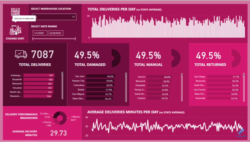
I’ll show you another example that made use of a bookmark. This is another way that you can play around with your visualizations.
***** Related Links *****
Using Filter Fields & Visual Interactions To Create Compelling Visualizations In Power BI
Visualization Technique – Power BI Column Charts & Filters
How To Control The Interactions Of Your Visuals In Power BI
Conclusion
By selecting certain visuals, you can change the way that your visualizations look. I guess what I’m trying to highlight here is the endless ways that you can play around with your visualizations.
For more visualization examples, you can look at the Showcase page of the Enterprise DNA website, where you can see different ways that visualizations have been created and manipulated. There are also plenty of visualizations that others are showcasing within the community area of the Analyst Hub so definitely check these out.
The ability to leverage off what others are doing is one of the best reasons for joining the Enterprise DNA community.
If you’ve enjoyed the content covered in this particular tutorial, please watch the accompanying video. Also, don’t forget to subscribe to the Enterprise DNA TV channel. We have a huge amount of content coming out all the time from myself and a range of content creators, all dedicated to improving the way that you use Power BI and the Power Platform.


