I want to spend some time today going through a question from Enterprise DNA’s member, Lucas, about table visuals in Power BI. It’s an interesting question in itself, but I want to dissect it because it also touches on a bunch of other interesting topics, including disconnected tables, slicer harvesting, and some slicer visualization tricks, conditional formatting, and virtual tables. You can watch the full video of this tutorial at the bottom of this blog.
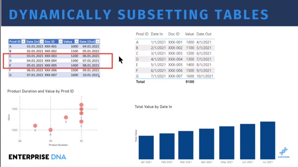
There’s a lot bundled up in this even though on the face of it it’s not a particularly complex question. Lucas had a table, and based on the value of the slicer (in this case, May 1st), he wants to take every record that is less than or equal to the slicer value in Date In, and every record that’s greater than the slicer value in Date Out, and reduce the table just to those records.
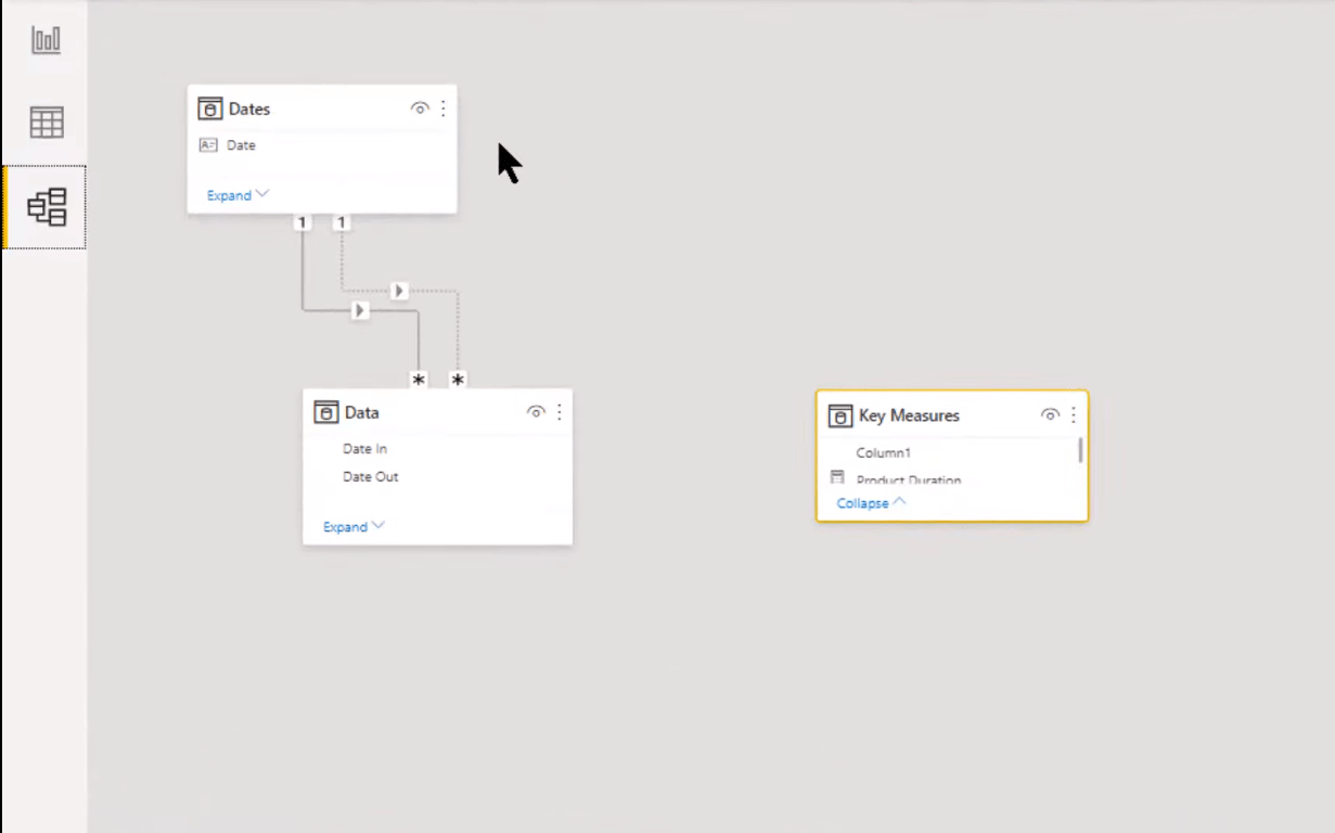
Before we do that, let’s take a quick look at our data model – it’s quite simple. We basically just got the extended date table that’s tied to our fact table just through the active relationship between the Date and Date In and the inactive relationship between Date and Date Out. And then, we’ve just got our measures table. So as you can see, it’s quite a simple data model we’re working with today.
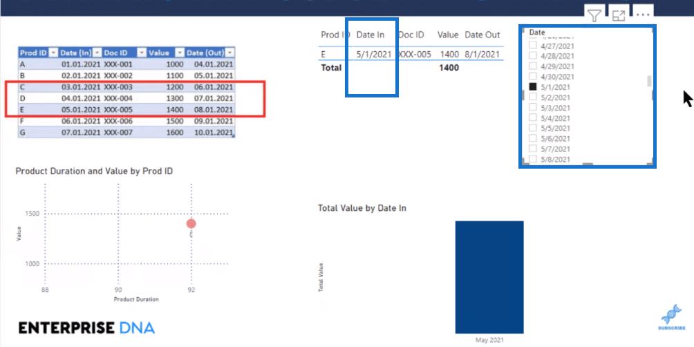
We start out by slicing the data that he was talking about. We just take our Date field and turn that into a slicer. We want a single value, so we’ll turn that for now into a list. It’s not a great user experience because we’ve got to hunt through the list for May 1st, but we’ll get into that in a minute.
So we’ll scroll down the slicer and find May 1st, select it, and now we see some problems with that right off the bat. It’s a blunt instrument, and we’ve got a more refined condition that we’re trying to reach. It basically takes out everything that’s not Date In May 1st, which is not what we want.
And it filters the two visuals below in a way that’s not very useful.
We can tell right off the bat that a straight-up slicer is not going to work for us. And so, what we want instead is a disconnected table. It’s a great technique to use when you want to harvest the value out of what looks like a slicer to the user but isn’t actually interacting with your visuals and you’re just pulling that value into your DAX, and then using that to manipulate your calculations in your visuals.
Creating A Disconnected Table (Calculated Table In DAX)
So let’s get rid of this useless slicer and we’ll create a disconnected table. To create a disconnected table, you can do it either as a physical table in Power Query or as a calculated table in DAX. And I think that the optimal way to do this would be as a physical table.
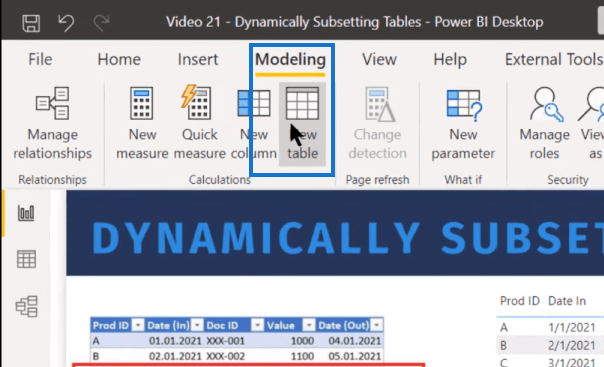
But for this example, I’m just going to create it as a calculated table in DAX, just by going to the Modeling ribbon then to New table.
We’ll use the VALUES function in DAX. So, our disconnected date table is going to equal the values of the date from our Date table. That’s just going to create a one-column calculated table.

And then, we can pull that value in as our slicer.
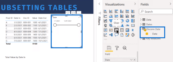
Instead of a list, we’ll have a single value slicer, but unfortunately, there’s nothing like that in the regular choices. The only way to get a single value slider is from the Generate Series, and that’s not something we can do with dates. What we can do is After.
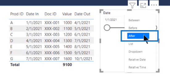
After gives us what looks like a single value slider, but it’s giving us everything from the date of the slider and all the dates subsequent to that. Now, one of the tricky things about an After slicer is how you harvest it. And so, let’s create a harvest measure.
Harvest Measure For A Table Visual In Power BI
Let’s call it Harvest. The typical harvest measure is based on SELECTEDVALUE. And so, we select the value of our Disconnected Date field.

It doesn’t produce an error, but if we go and drop that into a card, it shows blank.
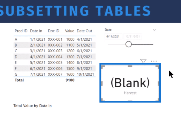
The reason for that is that SELECTEDVALUE has to return a single value, and the After slicer returns multiple values. It returns everything from the initial date all the way to the end of the slicer. Because it doesn’t return a single value, it’s going to harvest this as Blank. So, we need to take that and alter that measure.
We’ll use the CALCULATE function and then take the minimum (MIN) value of our disconnected date table. And now, the “change in context” that we’re going to want is basically ALLSELECTED. It’s the minimum of everything that is selected in the After slicer. So, we take that and we go to our disconnected date field again.

Now we’re getting exactly what we want, which is the single value out of Harvest.
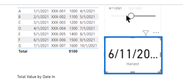
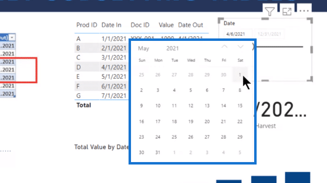
And we’ve got a nice user experience because not only can we slide, we can go up here and take advantage of this date picker. We can just select the date we want (May 1st, for example) right on the date picker and it shows up as a single value.
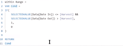
Next, we need to create a measure that is going to use that harvested value to filter our table. We’ll call this measure, Within Range. We’ll use a variable here (VAR Cond), and then an IF statement, where we use SELECTEDVALUE around the Date In and Date Out. Then, we want 1 if that condition true, and 0 if it’s false. Finally, we return condition (Cond) at the bottom.
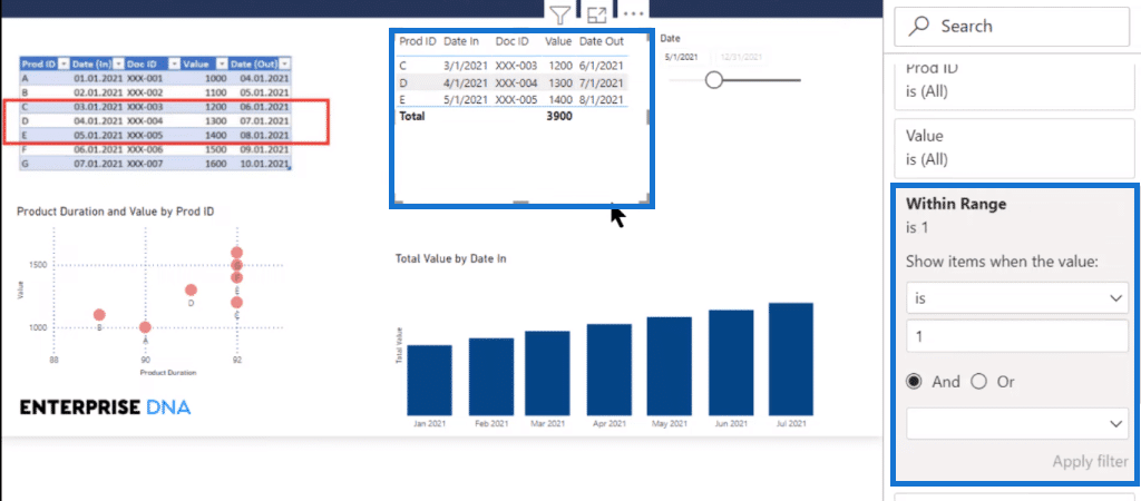
Now we’ve got a measure that does exactly what we want. It just returns one if it’s within the range and zero if it’s not. We can now go to the filter pane, select this table visual, and take our Within Range measure and drop it into the filter pane. We just set it when the value is one, it shows the items. We hit Apply filter and we can see that it’s giving us the right results, C, D, and E.
Conditional Formatting On A Table Visual In Power BI
It’s not filtering the other table visuals, but we can leverage this measure even a bit further by using conditional formatting. Let’s do conditional formatting on Rules and base that on our Within Range measure. Then, we’ll set a rule and pick a color.
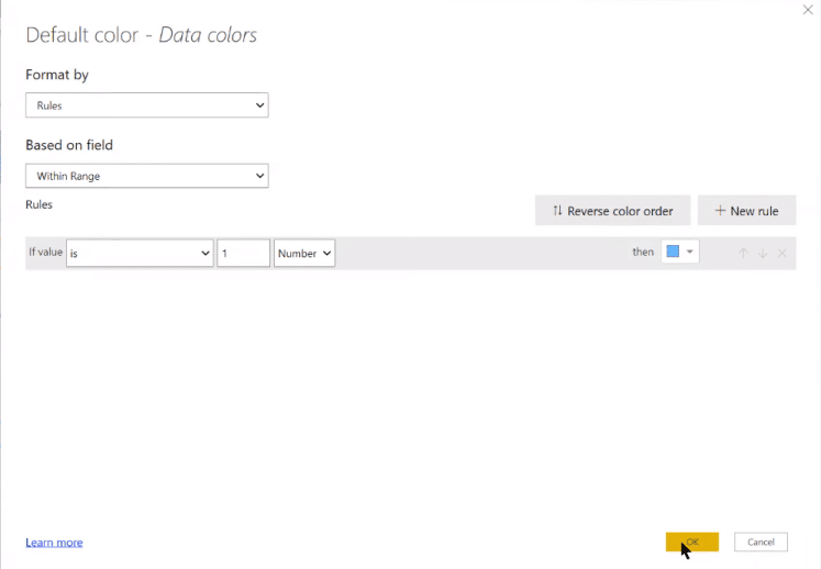
With that, we can see that the table visual (bar chart) below changed dynamically.
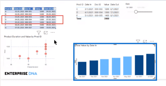
We can do the same with our scatter chart. We just go to data colors, and again, go to the default color and set up the same rule structure that we set up for our bar chart. And now we’ve got a completely dynamic structure here.
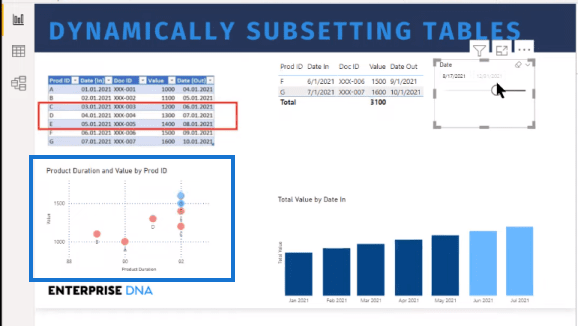
When we slide our slicer around, it changes all the visuals in exactly the way that Lucas had wanted in terms of filtering the table down to the correct values.
***** Related Links *****
Tables In Power BI: Types & Distinctions
What Are The Different Data Table Types In Power BI?
Build A Comprehensive Date Table In Power BI Really Fast
Conclusion
In this blog, I have shown you how to dynamically subset a table visual in Power BI. You’ve learned how to create the correct DAX measure to harvest a value and to use conditional formatting to have completely dynamic table visuals.
I hope you pick up some useful tips along the way. Check out the links below for more related content.
Cheers!
Brian


