In this tutorial, you’ll learn how to create a slope chart using Charticulator. This chart is useful when you want to compare values at different timeframes. It can also show the growth of a category along the points that it is plotted.
Export Dataset To Charticulator
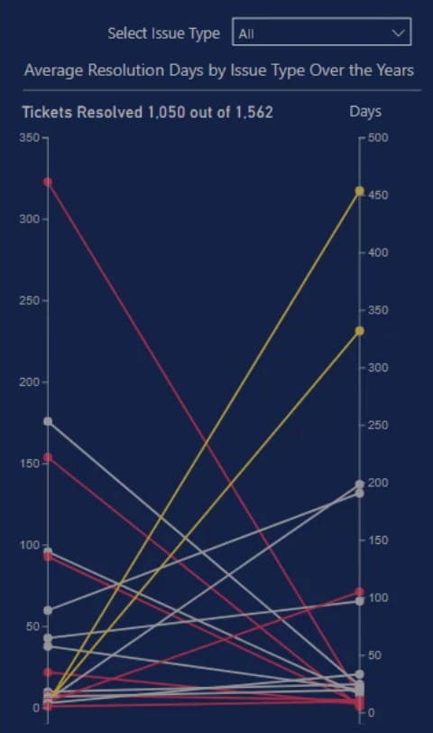
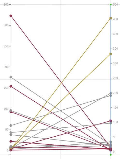
This is the sample Slope Chart that will be recreated.
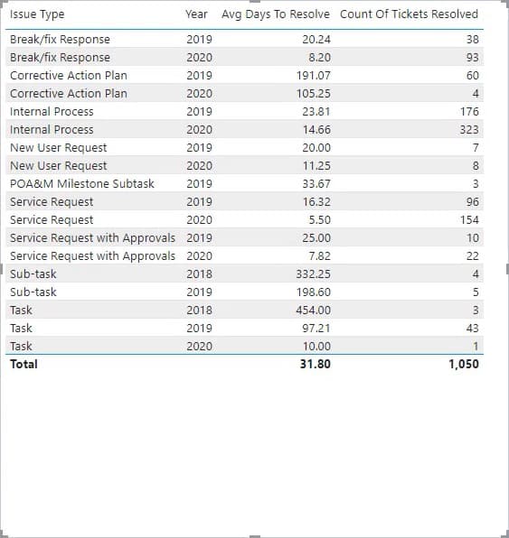
First, create and export a dataset to Charticulator. The dataset of the sample chart contains the Issue Type, Year, Avg Days To Resolve, and Count Of Tickets Resolved.
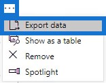
Click the ellipsis of the table and select Export Data.
Go to charticulator.com and click Launch Charticulator.

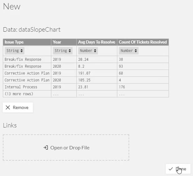
Locate and open the exported dataset.
Create The Slope Chart
Once done, you’ll be directed to the Charticulator canvas. Since the slope chart only needs two Y-Axes, you have to delete the existing axes and create new plot segments.
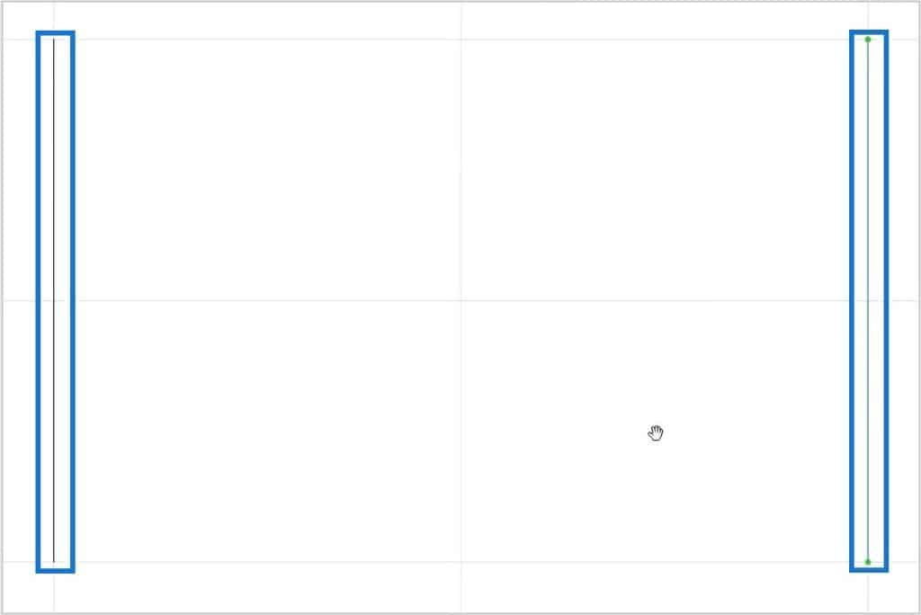
Draw a line from the bottom to the top of each side of the canvas to set an ascending order.
Put Count Of Tickets Resolved in the left Y-Axis and Avg Days To Resolve in the right Y-Axis.
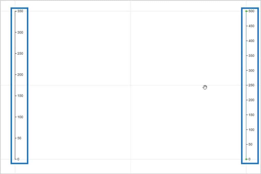
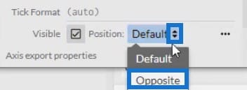
You’ll notice that the values on the left Y-Axis is flipped to the other side. Change it by going to PlotSegment1’s Attributes and setting the Position to Opposite.
From there, you can change the line and tick’s color and size in the attributes of both axes. This is what the result will look like.

Then, bring a circle from Symbols to the Glyph canvas.
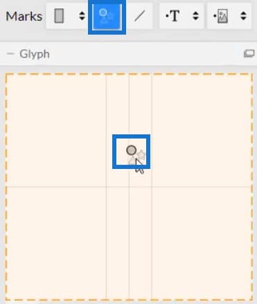
You can then see data points plotted in the axes.
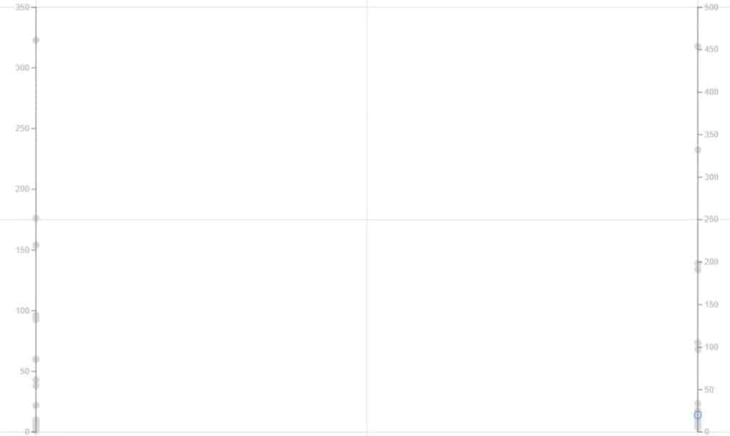
Create lines to connect the two axes. Click Links and select the two Plot Segments.
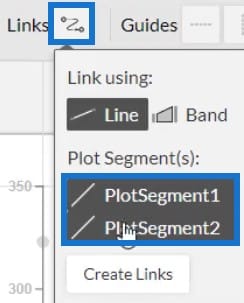
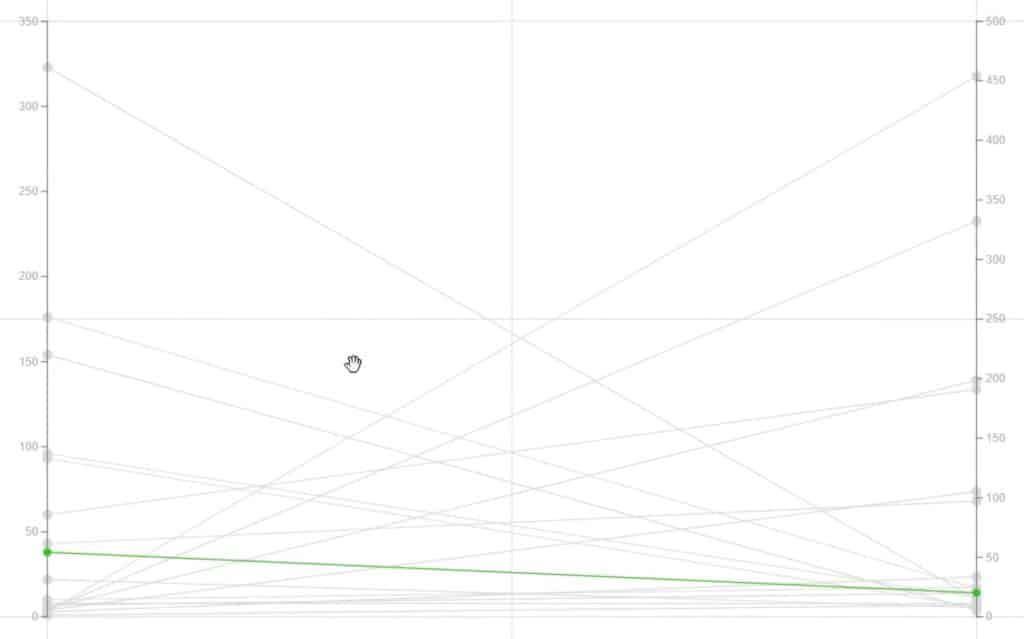
Once done, click Create Links. You’ll then see lines between both axes.
Add colors to the lines by opening Link1’s Attributes and placing Year in the Color section.
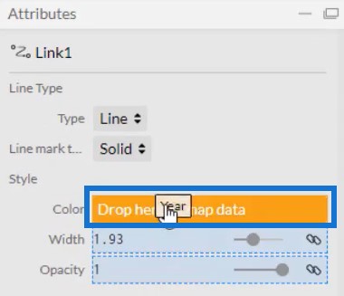
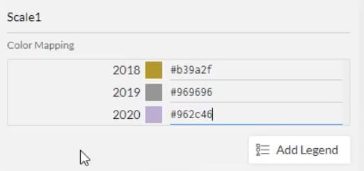
You can modify the colors of each year depending on your style and preference.
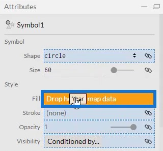
You can also add color to the circles or symbols. Open Symbol1’s Attributes and place Year in the Fill section.
Reduce the size of the chart by bringing the Y-Axes closer to each other. This is now what the slope chart will look like.
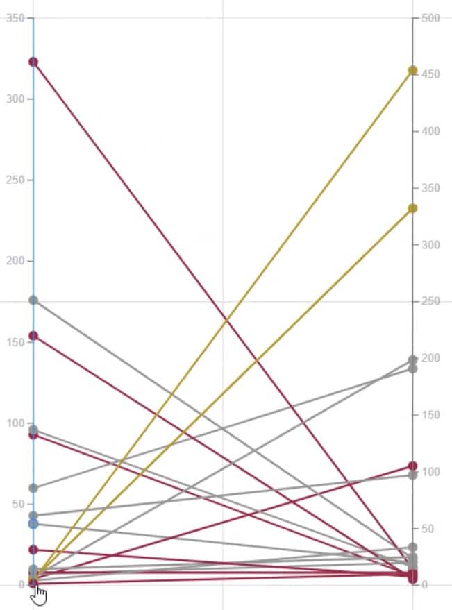
At the bottom of the chart, you’ll notice that some data points are almost touching the bottom of the canvas. You have to create a space between the 0 value and the bottom canvas.
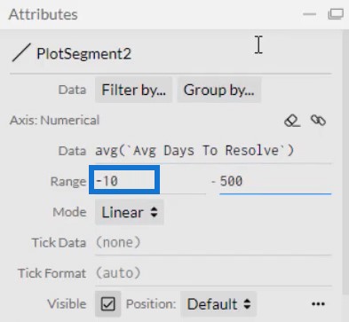
Go to the Attributes of both Plot Segments and set the range.
This is now the final look of the visualization.
Export The Slope Chart To Power BI
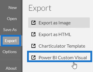
Save the chart file and export it to Power BI Custom Visual.
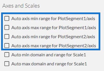
Uncheck the auto axis options in the Axes and Scales settings to make the axes remain unchanged even when context transitions are invoked. Create a visual name and export the file.
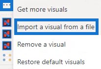
From there, open Power BI and import the slope chart file. Click the ellipsis below Visualizations and select Import a visual from a file.
Next, click the Charticulator icon with the slope chart file name.
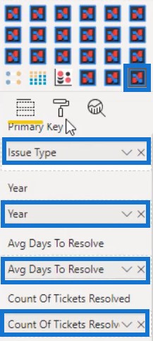
Fill the Fields section with the corresponding data needed. For the Year, click the dropdown button and select Don’t Summarize. You can then see the chart visualization.
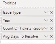
Adjust the margins, size, and other attributes to match your report style and preference. Then, add all the data in the Tooltips section.
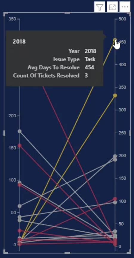
Once done, you can now see all the information when you hover over the circles or data points.
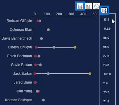
Create interactions with your other charts. Go to Format tab and select Edit Interactions. Then, click the interaction button of each chart. For this example, a dumbbell chart is used for the interactions.
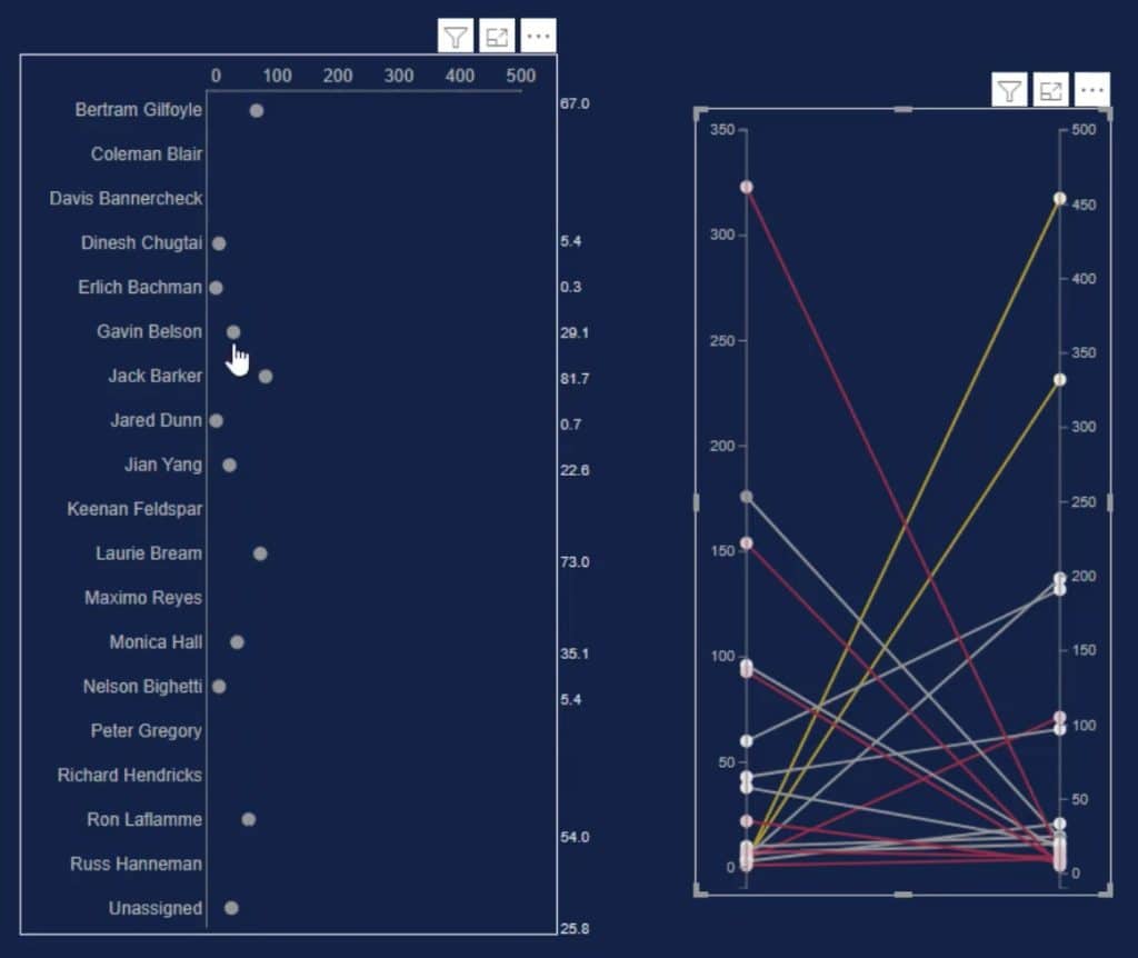
If you select a data point in the slope chart, you’ll see that the dumbbell chart also changes depending on the context invoked.
***** Related Links *****
Power BI Slope Chart: An Overview
Charticulator: A Visual Creator For Power BI
Custom Visual Reports In Power BI
Conclusion
A slope chart depicts changes of a unit over time along two points. It is a simple line graph that displays the beginning and end of each line. You can use this chart if you want to see developments in your own data.
Improve your data development and visualization skills by utilizing this tutorial. Practice with your data in Charticulator and read Enterprise DNA’s other blog posts associated with charts and visuals.
Mudassir


