So you’ve got a bunch of data and you want to make it look pretty. Or maybe you’ve heard about this thing called data visualization and you’re curious to learn more. Well, you’ve come to the right place!
This is a comprehensive guide that will get you started on your data visualization journey.
We’ll take you through the basics of data visualization, give you some tips and tricks on how to make your visualizations pop, and show you how you can use data visualization to tell a story with your data.

What is Data Visualization?

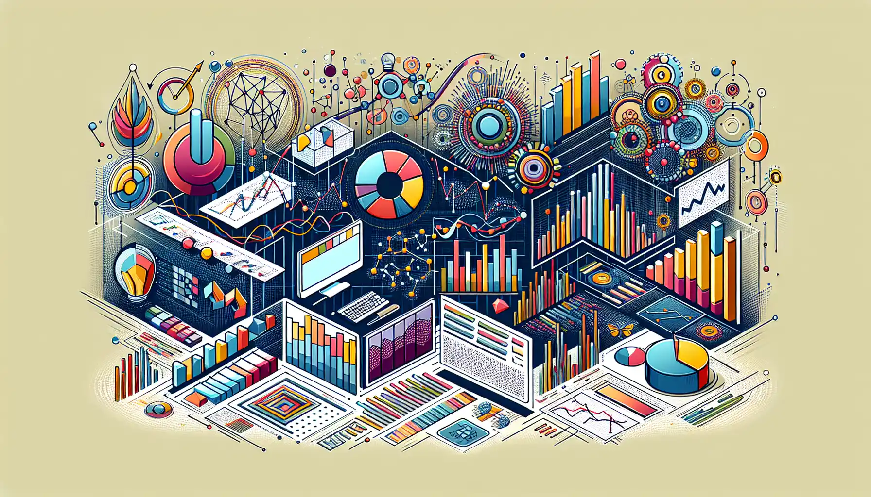
Data visualization is a graphical representation of information and data. By using visual elements like charts, graphs, and maps, data visualization tools provide an accessible way to see and understand trends, outliers, and patterns in data.
What is the Importance of Data Visualization?
Data visualization is a vital part of the data analysis process. It allows you to see the data to make better decisions, which can have a significant impact on the success of your organization.
Some of the key benefits of data visualization include:
- Data Exploration: It allows you to dig deeper into the data and find valuable insights that may not be immediately apparent from the raw data.
- Pattern Recognition: By visualizing data, you can quickly identify trends, patterns, and outliers, which can help in making informed decisions.
- Storytelling: It allows you to convey complex information in a clear and concise manner, making it easier for your audience to understand the message you are trying to convey.
- Decision Making: It helps in making more informed decisions by providing a visual representation of the data, which can be easier to interpret than raw numbers.
- Identifying Areas for Improvement: By visualizing data, you can quickly identify areas where your organization may need to improve and make data-driven decisions to address those issues.
- Data Collaboration: It allows multiple stakeholders to collaborate and make sense of the data, leading to better teamwork and more effective solutions.
In a nutshell, data visualization makes data more accessible, more understandable, and more valuable.
It enables you to uncover hidden insights in your data, communicate those insights to others, and make data-driven decisions that can have a real impact.
What is the Data Visualization Process?

The data visualization process can be broken down into five main steps:

- Data collection and cleaning
- Choosing the right visualization
- Designing the visualization
- Refining and improving
- Presentation and storytelling
1. Data Collection and Cleaning
This is where you gather your data from various sources and make sure it’s in a format that can be easily visualized. You might need to do some cleaning up or formatting of the data to get it ready for the next step.
2. Choosing the Right Visualization
This step is all about selecting the best type of chart or graph to represent your data. There are many different types of visualizations, and each one is best suited to a particular type of data or message.
3. Designing the Visualization
Once you’ve chosen your visualization, you need to design it in a way that is visually appealing and easy to understand. This might involve choosing colors, fonts, and other design elements.
4. Refining and Improving
This is where you fine-tune your visualization to make sure it accurately represents the data and conveys the message you want to get across.
5. Presentation and Storytelling
Finally, you present your visualization to your audience. This might involve creating a slideshow or interactive dashboard, or simply sharing the visualization in a report or online.
Data visualization is both an art and a science. It requires creativity and an eye for design, but it also relies on a solid understanding of data and the best practices for visualizing it.
What Are The Types of Data Visualizations?
There are many different types of data visualizations, each with its own strengths and weaknesses. Some of the most common types of data visualizations include:
- Bar charts and column charts: These are great for showing comparisons between different categories or groups. They’re easy to read and understand, making them one of the most popular types of charts.
- Line charts: These are used to show trends over time. They’re great for visualizing how a particular variable changes over a continuous period.
- Pie charts: Pie charts are used to show the proportion of different parts that make up a whole. They’re not as versatile as other types of charts, but they can be useful for visualizing percentages.
- Scatter plots: These are used to show the relationship between two variables. They’re great for visualizing correlations or patterns in the data.
- Heat maps: Heat maps use color to represent the magnitude of a variable in a two-dimensional matrix. They’re great for visualizing patterns or trends in large datasets.
- Network diagrams: These are used to show relationships between different entities in a network. They’re great for visualizing complex relationships or structures.
- Geospatial maps: These are used to visualize data on a map. They’re great for showing regional or global patterns in the data.
There are many other types of data visualizations, and often, the best type of visualization will depend on the specific dataset and the message you want to convey.
How to Create Effective Data Visualizations
Creating an effective data visualization involves a combination of art and science. Here are some tips to help you create impactful and effective visualizations:
- Understand your data: Before you start creating a visualization, make sure you understand the data you’re working with. What are the key insights you want to convey? What story does the data tell?
- Choose the right visualization: Different types of data visualizations are better suited for different types of data and messages. Choose the visualization that best conveys your message.
- Simplify your design: Keep your design clean and simple. Avoid cluttering your visualization with unnecessary elements. Use colors and shapes purposefully to draw attention to the most important parts of your visualization.
- Use color strategically: Color can be a powerful tool in data visualization, but it can also be overused. Use color to highlight important data points or relationships, but avoid using too many colors, which can make your visualization hard to read.
- Tell a story: A good data visualization tells a story. Think about the narrative you want to convey with your visualization and design it in a way that guides the viewer through that story.
- Seek feedback: Don’t be afraid to show your visualization to others and ask for feedback. Getting input from others can help you identify areas for improvement.
By following these tips and putting thought and care into your data visualizations, you can create powerful and impactful visualizations that effectively convey your message and insights.
What Are The Best Data Visualization Tools?

There are many data visualization tools available, each with its own strengths and weaknesses. Here are some of the most popular data visualization tools:
- Tableau: Tableau is a powerful and user-friendly data visualization tool that allows you to create interactive visualizations and dashboards.
- Power BI: Power BI is a Microsoft product that offers a wide range of data visualization and business intelligence tools. It’s great for creating interactive dashboards and reports.
- Google Data Studio: Google Data Studio is a free data visualization tool that allows you to create customizable and interactive reports and dashboards using data from various sources.
- D3.js: D3.js is a JavaScript library that provides a lot of flexibility for creating custom data visualizations. It’s great for creating highly customizable and interactive visualizations, but it has a steeper learning curve than other tools.
- Plotly: Plotly is a Python library that allows you to create interactive visualizations for the web. It’s great for creating dashboards and reports.
These are just a few of the many data visualization tools available. The best tool for you will depend on your specific needs and the type of visualizations you want to create.
Final Thoughts

Data visualization is a powerful tool that can help you uncover insights and tell compelling stories with your data.
As you embark on your data visualization journey, remember that it’s both an art and a science. You’ll need to combine your creativity and design skills with a solid understanding of data and the best practices for visualizing it.
Whether you’re creating a simple bar chart or a complex interactive dashboard, the key is to think carefully about the story you want to tell with your data and to design your visualizations in a way that conveys that story clearly and effectively.

Now go out there and start visualizing!
Need help with specific visuals or data techniques. Check out the Skills Advisor in Data Mentor!

Frequently Asked Questions

What are the best practices for data visualization?
Some best practices for data visualization include keeping your design simple and uncluttered, using color strategically to highlight important information, and ensuring your visualization is easily understood by your target audience.
What are the common data visualization techniques?
Common data visualization techniques include bar charts, line charts, scatter plots, pie charts, and maps. These techniques help to represent data in a visually appealing and easy-to-understand manner.
How can I improve my data visualization skills?
To improve your data visualization skills, consider taking courses on data visualization tools like Tableau or Power BI. Also, practice creating different types of visualizations using real data sets to gain hands-on experience.
What are the best data visualization tools for beginners?
Some popular data visualization tools for beginners include Tableau, Microsoft Power BI, Google Data Studio, and Plotly. These tools offer user-friendly interfaces and a wide range of visualization options.
How do I choose the right data visualization for my data?
When choosing the right data visualization, consider the type of data you have and the story you want to tell. For example, if you want to show trends over time, a line chart would be appropriate. If you want to compare categories, a bar chart might be more suitable.
What are the different types of data visualization?
There are various types of data visualization, including charts (such as bar, line, and pie charts), graphs (like scatter plots and network graphs), maps (choropleth, point, and line maps), and tables. These visualizations help to represent data in different ways to convey information effectively.