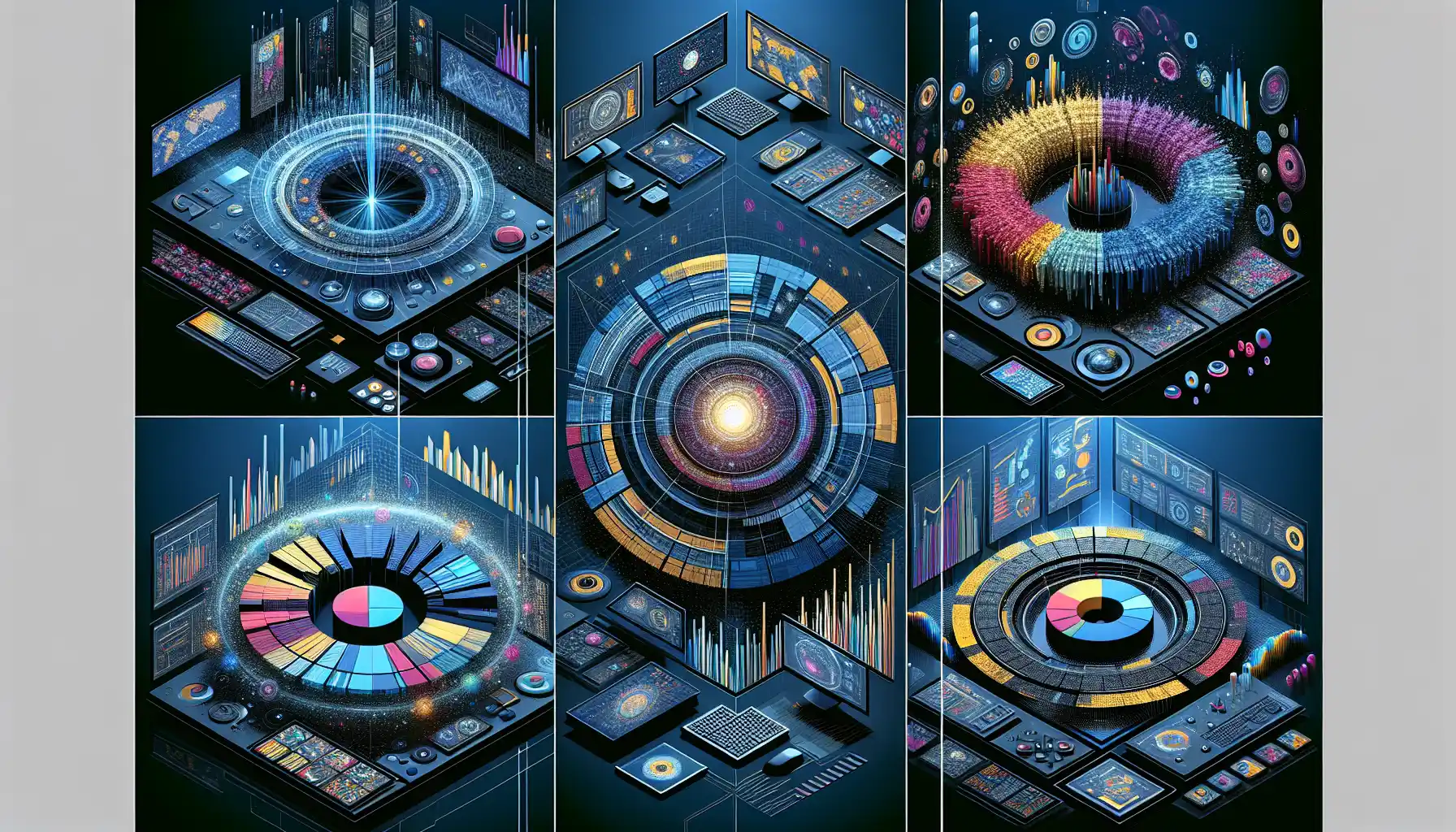
Data visualization has come a long way from simple bar charts and line graphs. As the volume and complexity of data continue to grow, advanced data visualization techniques have become essential for making sense of it all.
In this article, we’ll explore two advanced data visualization techniques — geospatial data visualization and multi-dimensional data visualization.
By combining these techniques with more traditional data visualization methods, we can create highly informative and visually compelling data visualizations that provide deep insights into complex data sets.

Geospatial data visualization involves mapping data points onto a geographical map. This can help us understand the spatial relationships within the data.
Multi-dimensional data visualization involves representing data points in a space with more than two or three dimensions. This allows us to see patterns that would be hidden in simpler visualizations.
Advanced data visualization techniques offer a powerful way to communicate data’s complexities and insights. As data professionals, we must continue to expand our data visualization toolkit to unlock new insights and share them with our audience.
Let’s dive in!
Understanding Data Visualization

Data visualization is the presentation of data in a graphical format. It helps people understand the significance of data by summarizing and presenting huge amounts of information in a simple, visual way.
Data visualization can help you find insights that you might otherwise miss or that are too complex to explain with text or tables.

For example, you can use data visualization to:
- Identify areas that need attention or improvement.
- Clarify which factors influence customer behavior.
- Help you understand which products to place where in a store.
- Predict sales volumes.
Data visualization is a quick, easy way to convey concepts in a universal manner – and you can experiment with different scenarios by making slight adjustments.
By providing a visual representation of what might seem like endless streams of data, data visualization is an invaluable tool to help data scientists make better business decisions, provide a more in-depth analysis, and share their work with others more effectively.
What is Advanced Data Visualization?
Advanced data visualization is an emerging field of data visualization that focuses on visualizing complex, multi-dimensional data.
It goes beyond traditional data visualization techniques to help people understand the significance of data more effectively.
This approach uses sophisticated software and algorithms to interpret and display large volumes of data in an understandable format.
With the rise of big data and the increasing importance of data-driven decision-making, advanced data visualization is becoming an essential tool for businesses and organizations to turn their data into actionable insights.
This approach offers several advantages over traditional data visualization methods, including the ability to:
- Identify trends and patterns: Advanced data visualization can help you find hidden patterns and trends in your data, which can be useful for making predictions and understanding the root causes of certain events.
- Improve data understanding: By presenting data in a visual format, you can make complex data sets easier to understand, allowing you to communicate your findings more effectively to a wider audience.
- Make data-driven decisions: Advanced data visualization allows you to make better decisions by providing a clear picture of what the data is telling you. This can help you identify opportunities, avoid potential risks, and optimize your business processes.
Some common tools for advanced data visualization include Tableau, Power BI, and QlikView. These tools offer a wide range of features for creating interactive, multi-dimensional visualizations that can help you gain valuable insights from your data.
Exploring Geospatial Data Visualization

Geospatial data visualization is a type of data visualization that involves presenting information about geographic features and phenomena in a visual way.
It is an important field because it allows people to understand the spatial relationships between different pieces of information and make better decisions.
This type of visualization can include maps, graphs, and charts that show data about locations, distances, areas, and movements.
In recent years, geospatial data visualization has become even more powerful due to advances in technology and the availability of large amounts of data.
There are several important applications of geospatial data visualization, including:
- Urban planning: Geospatial visualization can help urban planners understand how cities are growing and changing, allowing them to make informed decisions about zoning, transportation, and infrastructure.
- Disaster response: During natural disasters, geospatial visualization can help emergency responders quickly understand the scope of the disaster and allocate resources more effectively.
- Healthcare: Geospatial visualization is used to track the spread of diseases, identify areas with high rates of certain health conditions, and plan for the location of healthcare facilities.
- Environmental management: Geospatial visualization can be used to monitor changes in the environment, such as deforestation, land use, and climate change.
- Retail and marketing: Businesses use geospatial visualization to understand where their customers are located, how they move through stores, and how they interact with products.
To create effective geospatial visualizations, it is essential to have a good understanding of geographic information systems (GIS), data science, and graphic design.

The process typically involves acquiring geospatial data, processing it, and then using specialized software to create visualizations that convey important information in a clear and understandable way.
Geospatial data visualization is a rapidly evolving field that has the potential to revolutionize the way we understand and interact with the world around us.
Multi-dimensional Data Visualization

Multidimensional data visualization is the process of displaying information in a way that allows you to see more than two dimensions at once.
This technique is essential for understanding complex data sets, as it can reveal patterns and relationships that would be difficult or impossible to see using traditional two-dimensional visualizations.
There are several common techniques for visualizing multi-dimensional data, including:
- Parallel coordinates: This technique involves drawing lines between points on multiple axes, allowing you to see how data points relate to each other across multiple dimensions.
- Scatterplot matrices: A scatterplot matrix is a grid of small scatterplots, each of which shows the relationship between two variables. This allows you to see how variables relate to each other and identify patterns in the data.
- Star plots: Star plots use a series of lines radiating from a central point to represent different variables. By looking at how these lines intersect, you can see how variables relate to each other across multiple dimensions.
- Hypercube visualization: Hypercube visualization represents data in four or more dimensions by projecting it into three dimensions. This allows you to see how data points relate to each other in a higher-dimensional space.
- Chernoff faces: Chernoff faces represent data using human faces, with different facial features representing different variables. This can be a fun and intuitive way to visualize multidimensional data.
It’s important to note that the most effective technique for visualizing multi-dimensional data depends on the specific data set and the questions you want to answer.
Experimenting with different visualization techniques can help you find the best way to represent your data.
With the rise of big data and the increasing complexity of the problems we face, multi-dimensional data visualization is becoming an essential tool for making sense of the world around us.
By learning how to effectively visualize data in multiple dimensions, you can unlock valuable insights and make better decisions in a wide range of fields.
5 Examples of Advanced Data Visualization
Advanced data visualization allows data scientists and analysts to unlock the potential of data and turn it into actionable insights. By using cutting-edge tools and techniques, they can create visual representations of complex data sets that are both informative and visually compelling.
In this section, we’ll look at five examples of advanced data visualization to see how it’s being used in the real world to drive innovation and make better decisions.
1. Data Visualization in Healthcare
In the healthcare industry, data visualization plays a crucial role in understanding patient data, improving patient outcomes, and making data-driven decisions.
For example, doctors can use visualizations to track a patient’s health over time, identify trends, and adjust treatments accordingly.
Healthcare organizations can also use data visualization to identify areas for improvement in their processes, such as reducing patient wait times or improving the efficiency of their supply chain.
2. Data Visualization in Finance
In the finance industry, data visualization is used to analyze stock market trends, monitor the performance of investment portfolios, and detect potential fraud.
By using advanced data visualization techniques, financial analysts can quickly identify patterns and anomalies in large datasets, allowing them to make more informed decisions and respond to market changes more effectively.
3. Data Visualization in Marketing
Data visualization is also widely used in marketing to analyze customer behavior, track the success of marketing campaigns, and identify new opportunities.
For example, marketers can use visualizations to understand how different customer segments interact with their website, which can help them optimize their website design and improve the customer experience.
4. Data Visualization in Government
In the government sector, data visualization is used to make data more accessible and understandable to the public.
Government agencies often publish interactive dashboards that allow citizens to explore data on topics such as crime rates, education, and public health.

This transparency helps to build trust and allows citizens to make more informed decisions.
5. Data Visualization in Sports
In the sports industry, data visualization is used to analyze player performance, identify game trends, and provide insights to coaches and teams.
For example, in soccer, data scientists can use visualizations to track player movements, passing patterns, and shooting accuracy.
This information can help teams optimize their strategies and make better decisions on the field.
The Future of Advanced Data Visualization

The future of advanced data visualization is bright. With the rapid growth of big data, AI, and machine learning, the need for powerful data visualization tools has never been greater.
As technology continues to advance, we can expect to see more sophisticated data visualization techniques that can handle even larger and more complex data sets.
The development of tools that can create highly interactive, customizable visualizations will allow users to explore their data in new ways and gain deeper insights.
In addition, as data visualization becomes more accessible, we can expect to see a growing number of industries adopting it to make better decisions and solve complex problems.
From healthcare to finance to government, data visualization will continue to play a crucial role in helping organizations turn their data into valuable insights.
So, what does the future hold for data visualization? It is difficult to predict, but one thing is for certain: data visualization is here to stay, and it will only continue to grow in importance and sophistication.
As data professionals, it is essential that we stay up-to-date with the latest trends and technologies in data visualization to ensure that we can effectively analyze and communicate data in this rapidly evolving data-driven world.
Final Thoughts

In conclusion, the world of data visualization is evolving rapidly, and the techniques we’ve explored here are just the tip of the iceberg. As we move forward, it’s clear that advanced data visualization is a game-changer.
By mastering these advanced techniques, data professionals can unlock the full potential of their data and gain valuable insights that can drive innovation and growth. With the right tools and a willingness to learn, the possibilities are endless.
Data visualization has the power to transform how we understand and interact with the world around us, and it’s an essential skill for anyone working with data. So, let’s continue to explore, experiment, and push the boundaries of what’s possible with data visualization.
For more Data Viz tips check out Data Mentor Agents. Describe what you’re working on and get detailed learning docs on virtually any data topic!
Frequently Asked Questions
What are the key elements of advanced data visualization?
The key elements of advanced data visualization include interactivity, real-time data updating, and the use of modern data visualization tools like Tableau and Power BI. These elements help to enhance the effectiveness and usefulness of data visualizations.
How does advanced data visualization differ from basic visualization?
Advanced data visualization goes beyond basic visualization techniques by using more complex tools and methods to create visual representations of data. This allows for a deeper understanding of data and the identification of more intricate patterns and insights.
What are the common tools and software used in advanced data visualization?
Some common tools and software used in advanced data visualization include Tableau, Power BI, QlikView, R, and Python. These tools offer a wide range of features and functionalities to create interactive and sophisticated data visualizations.
What is the importance of advanced data visualization in decision-making?
Advanced data visualization plays a crucial role in decision-making by providing a clear and concise representation of data. This allows decision-makers to quickly identify trends, patterns, and insights, leading to more informed and data-driven decisions.
How can you learn advanced data visualization techniques?
To learn advanced data visualization techniques, you can take courses and attend workshops that focus on the topic. Additionally, there are numerous online resources, tutorials, and forums where you can find information and guidance on advanced data visualization.
What are some examples of advanced data visualization projects?
Examples of advanced data visualization projects include interactive dashboards that provide real-time data updates, 3D visualizations of complex data sets, and data visualizations that incorporate machine learning algorithms to identify patterns and anomalies in data.