As a beginner in data visualization, you’ll need to learn the various chart types to effectively communicate your data’s message.
Selecting the right chart type is crucial because it can make or break your audience’s understanding of the information you’re presenting.
The good news is that you’re in the right place! We’ve prepared this beginner’s guide to data visualization techniques to help you get started on your journey.

In this article, we’ll walk you through the basic principles of data visualization and explore the different types of charts and graphs, helping you select the most appropriate ones for your data.
So, let’s dive in!
What is Data Visualization?

Data visualization is the process of representing information graphically, allowing people to quickly and efficiently comprehend large amounts of data.
By visualizing data, you can identify patterns, relationships, and trends that are often difficult to detect in traditional tabular formats.
This helps you make more informed decisions and communicate complex ideas more effectively.
There are two main types of data visualization:

- Exploratory: This is the process of analyzing a data set and creating visual representations to understand its structure and identify patterns. It is typically done by data analysts and scientists.
- Explanatory: This type of data visualization is designed to present findings or tell a story. It is used to communicate the results of an analysis to a broader audience. Infographics are a popular form of explanatory data visualization.
The 5 Steps of Data Visualization
The data visualization process involves several steps.
Below are the five basic steps that you can use as a starting point to create visually appealing data representations.
Step 1: Data Collection
Before you can start visualizing data, you need to collect it from various sources.
This can include databases, spreadsheets, and web services.
The data should be organized in a way that makes sense and is easy to work with.
Step 2: Data Cleaning
Once you have collected the data, you need to clean it.
This means removing any duplicate entries, correcting errors, and making sure the data is in a format that can be easily visualized.
This step is crucial, as visualizations are only as good as the data they are based on.
Step 3: Data Analysis
The next step is to analyze the data to find patterns, relationships, and trends.
This can involve using statistical methods, machine learning algorithms, or other techniques to extract insights from the data.
Step 4: Visual Design

After you have analyzed the data, you can start designing your visualization.
This involves choosing the right type of chart or graph, selecting colors, and arranging the data in a way that makes the most sense.
The goal is to create a visualization that is both visually appealing and easy to understand.
Step 5: Data Presentation
The final step is to present your visualization.
This can be done in a variety of ways, including embedding it in a report, sharing it on a website, or presenting it in a slideshow.
The key is to make sure that your audience can easily interpret the data and understand the insights you have uncovered.
6 Common Chart Types
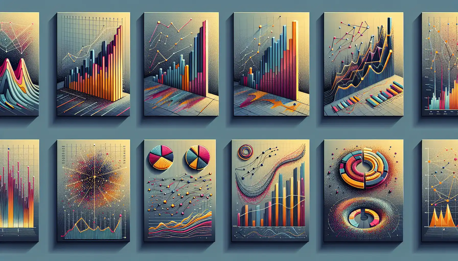
When working with data, there are several common chart types that you can use to visualize your information.
These chart types have specific applications, and choosing the right one will depend on the type of data you have and the message you want to convey.
In this section, we’ll go over 6 common chart types and their use cases to help you get started with data visualization.
1. Bar Charts
Bar charts are a simple yet powerful way to represent data. They display data in rectangular bars, where the length of each bar is proportional to the value it represents.
Use Case: Bar charts are ideal for comparing values across categories. They are also useful for showing changes in data over time or to reveal patterns, trends, and relationships.
2. Line Charts
Line charts, as the name suggests, use lines to represent data points. They are effective at displaying trends over time and showing the relationship between two variables.
Use Case: Line charts are ideal for showing trends and continuous data over time, such as stock prices or population growth. They are also useful for comparing two or more sets of data.
3. Scatter Plots
Scatter plots are used to display the relationship between two variables. Each point on the chart represents a single data point with the x-coordinate representing one variable and the y-coordinate representing the other.
Use Case: Scatter plots are useful for identifying patterns or relationships between two variables, such as correlation or causation.
4. Pie Charts
Pie charts are circular charts divided into segments, with each segment representing a proportion of the whole. They are often used to show percentages or proportions.
Use Case: Pie charts are ideal for representing parts of a whole, such as market share, budget allocation, or the distribution of different types of data.
5. Area Charts
Area charts are similar to line charts, but the area below the line is filled with color. This type of chart is used to represent the cumulative total of multiple data series over time.
Use Case: Area charts are useful for visualizing changes in the contribution of each data series to the whole over time.

6. Histograms
Histograms are bar charts that represent the distribution of a single variable. The x-axis is divided into intervals, or “bins,” and the y-axis represents the frequency of data points falling within each bin.
Use Case: Histograms are ideal for understanding the distribution and shape of a data set. They are often used in fields such as finance, engineering, and the sciences.
These are just a few of the most common chart types used in data visualization.
It’s important to choose the right chart for your data and your message, as different chart types are better suited to different types of data and different objectives.
How to Select the Right Chart Type

Selecting the right chart type is crucial because it can make or break your audience’s understanding of the information you’re presenting.
Choosing the wrong chart type can lead to misinterpretation and confusion.
To avoid this, follow these steps to select the right chart type for your data:
Step 1: Identify the Message
Start by clearly defining the message or insight you want to convey.
What is the main point you want your audience to take away from the visualization?
Step 2: Understand Your Data
Before choosing a chart type, you must understand the nature of your data.
Is it numerical or categorical? Is it continuous or discrete?
Step 3: Determine the Comparison or Relationship
What kind of comparison or relationship are you trying to show?
Is it a trend over time, a part-to-whole relationship, a ranking, or a correlation?
Step 4: Select the Appropriate Chart Type
Based on the previous steps, you can now choose the most appropriate chart type for your data and the message you want to convey.
Step 5: Test and Refine
After creating your visualization, test it with a small group of users to see if it effectively conveys the intended message.
If necessary, refine the visualization to make it more clear and impactful.
Step 6: Add Context and Finalize
Once you have the right chart type, add necessary context, such as labels, titles, and annotations, to make the visualization easy to understand.
Then, finalize the chart and present it to your audience.
By following these steps, you can ensure that you select the right chart type for your data visualization needs, leading to better understanding and more impactful presentations.
Final Thoughts

In this beginner’s guide to data visualization techniques, you’ve learned the basic principles of data visualization and explored different types of charts and graphs.
Data visualization is an important skill that can help you communicate your findings more effectively, which is crucial in a world where data is king.
Mastering data visualization will not only improve your ability to understand data but also to present it to others in a way that is clear and compelling.
While there’s a lot more to learn, we’ve provided you with a solid foundation to get started on your journey.
We hope that this article has sparked your interest and motivated you to continue learning about data visualization.
Now it’s your turn to get out there, start visualizing, and see where this powerful skill can take you.
Frequently Asked Questions

What are the basic principles of data visualization?
The basic principles of data visualization include understanding your data, choosing the right chart type, and adding context to your visualizations.
You should also consider your audience and their needs when creating visualizations.
What are the different types of data visualization techniques?
There are many different types of data visualization techniques, including charts, graphs, maps, and infographics.
Each technique has its own advantages and is suitable for different types of data and messages.
How can I choose the right chart type for my data?
To choose the right chart type, you should first identify the message you want to convey.
Then, understand your data, determine the comparison or relationship you want to show, and select the appropriate chart type based on your needs.
What are some data visualization examples?
Some data visualization examples include bar charts, line charts, scatter plots, pie charts, area charts, and histograms.
You can also create more complex visualizations, such as network diagrams, flowcharts, and heatmaps.
How do I create compelling visualizations?
To create compelling visualizations, focus on the story you want to tell with your data.
Choose the right chart type, add context to your visualizations, and use colors, fonts, and styles that enhance your message.
What are some best practices for data visualization?
Some best practices for data visualization include keeping your visualizations simple, using the appropriate chart type, and labeling your visualizations clearly.
You should also use color and other design elements purposefully and consider the needs of your audience when creating visualizations.