In this tutorial, I want to show you how to set up compelling visualizations using deviations in your reports in Power BI. You may watch the full video of this tutorial at the bottom of this blog.
These are some really powerful insights that have historically been very difficult to complete and highlight in combination.
I’m also going to look to highlight these specific deviations and what is causing the changes in our data.
All together this is some really high-quality analysis that can be easily replicated in your own models.
Deviations In Budget Reports
First, what I want to show is differentials and how you can utilize these within your models and reports in Power BI. This is the Product Budgeting insight we want to achieve by the end of this tutorial.

Highlighting deviations between forecasts or budgets can be great elements to add to your reports.
You don’t have to make them the focal point. They can just be small elements that showcase big deviations because that’s what really matters.
Now, going to the example, what I’m trying to focus on here are these 3 charts on the left hand side:
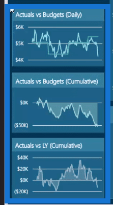
I’m highlighting this particular case because this is all about budgeting, and about looking at Actuals versus Budgets.
And as you can see, I’m showing three different perspectives:
- a daily perspective
- actuals versus budgets from the cumulative perspective and,
- actuals versus last year from the cumulative perspective.
Even with this very small space inside your reports, you’re actually showing a lot of information.
Let’s say someone was to dynamically move around your report and want to very quickly change the time frame rate or change the selection in terms of the products that we’re looking at from a budgeting performance.
It will be easy to show the results on whether or not there are any substantial deviations.

When we click on the Actuals vs Budgets chart from a daily perspective, we can see that it can be expanded and see that there’s been a significant deviation.
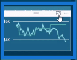

In another chart, you can see that this lighter green line quickly deviated from the cumulative result.

Shifting Between Calculations Using The Measure Branching Technique
Before proceeding with how to create these visualizations, let’s first have a look at this example.
Here, I’m showing the Cumulative Sales versus Cumulative Budgets.
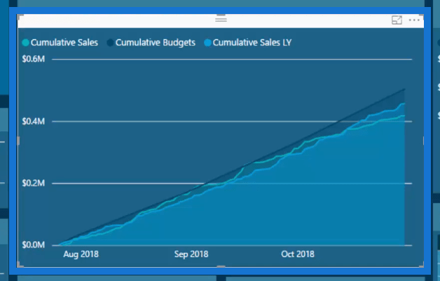
Now, if you can actually get these results, you can now move to these differentials and deviation results pretty quickly.
All it takes is to use the Measure Branching technique which is literally just branching out from your core measures.
These measures are very simple calculations using aggregation or iteration formulas. And the term “branching” is when you use these core measures to branch out into more advanced calculations.
So, you might start with sales but then you move into a branch of cumulative totals. Afterwards, you can then start combining certain elements from these branches.
You can do Cumulative Budget minus Cumulative Sales. Then all of a sudden, you’ll have a deviation result where you can show the actuals versus budgets.
Showing The Deviation Between Two Budgets
Now, let’s have a quick look at how we can show this.
First, let’s narrow the time frame and turn the chart into a table:
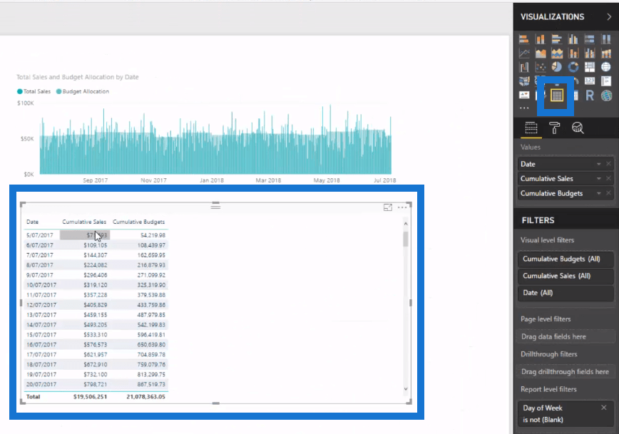
I’ve got my cumulative sales versus cumulative budgets.
Now, I want to deviate and branch out into the difference between these two elements. You’ll see how easy it is to actually do this.
I’ve created a measure called Actual to Budgets. The formula for Actual to Budgets is Total Sales minus Product Budgets.

But if we wanted to know the Cumulative Difference to Budget, we can use the same formula.

All I’m doing is using the formula Cumulative Sales minus Cumulative Budgets. This is going to give me the deviation result.
Now the great thing about measure branching is you don’t actually need the measures to be shown inside a visualization to show the result in reports in Power BI.
You can simply copy and paste the table, and then change it to a chart showing Cumulative Difference to Budget by Date.

I think that this highlights things in a really effective way.
Importance of Visualizations in Reports
If you look at how the information is shown, you can see that a lot of the elements inside the chart have been taken away.
You’ll see that there’s no x-axis or title. It’s just a straightforward chart that shows the deviation.
It takes up a small amount of real estate in your report, but it can show a huge amount of information with just a glance.
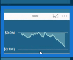
Consumers could easily look at it and make a selection.
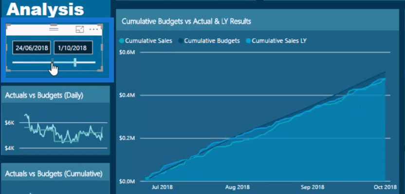
Then, very quickly, they will be able to see if there’s anything that should be taken notice of or if there’s anything important that can be understood in about five seconds based on the selection.
This may be a bit simpler than the other things that I’ve discussed, but you need to take note no matter how small these elements are in your report.
Showcasing differentials and deviations are the things that you want to be able to notice or pick up very quickly depending on the context or filters that you put on your reports in Power BI.
Showing these in a piece of real estate in your report in an effective way can really give it life.
All it takes is just a bit of effective measure branching.
***** Related Links *****
Power BI Data Sets: Learn How To Detect Abnormal Behavior Using DAX
Detecting & Showcasing Outlier Results In Power BI
Compare Multiple Metrics Cumulatively In Power BI Using Advanced DAX
Conclusion
Basically, we started from scratch and then slowly built up the steps as to how to create this entire budget report.
This is a huge amount to learn especially if you focus on budgeting.
There are plenty of different visualization, measure branching, and modeling techniques to learn. You can always play around with this report and have a look at how the other techniques can be created.
In utilizing these techniques in your reports, there are lots of great ways to do so in basically any shape or form.
Hopefully you learned a lot from this tutorial.
All the best,
Sam


