The Shape Map Visualization is probably my most favorite map visualization inside Power BI. I think it blends in reports and dashboards well. It actually looks a lot better on a report than if you just use the standard map feature. You may watch the full video of this tutorial at the bottom of this blog.
It also has other great visualization features like Drill In, Drill Out and ways to change colors for different segments inside of the shape map.
Overall in my view, it’s a much more compelling way to spatially highlight things inside Power BI and that’s what I want to showcase in this tutorial. I’ll show you how to use the Shape Map and what you can do with its features.
The dashboard that we’re using in this example was part of the Enterprise DNA Webinar Series, which was all about effective Power BI reporting.
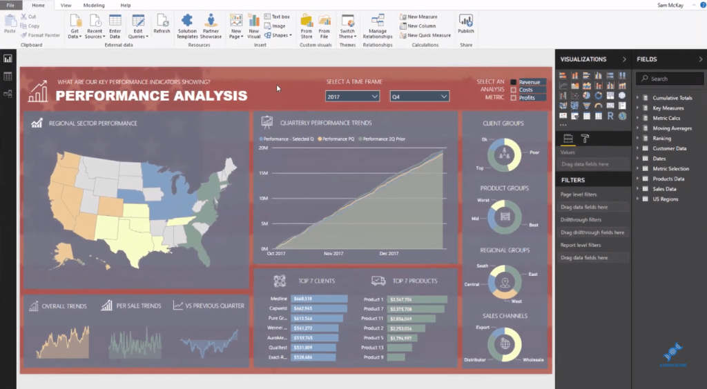
I’ve set this model up to dynamically change for any metric that I select. So I have Revenue, Costs, and Profits in the upper right corner of the dashboard, and my report will change based on the selection I make. But this tutorial focuses on the Shape Map visual, which is situated on the upper left side of the dashboard.
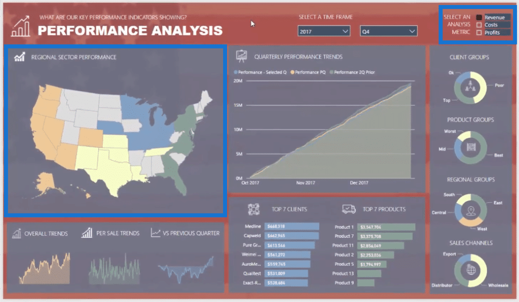
If you want to understand how I developed a lot of things in this model and how to create dynamic visualizations, check out the entire session. Now let’s take a look at the Shape Map Visualization.
How To Use The Shape Map Visual
We can find the Shape Map visual in the visualization pane, which is great. It’s not a custom visualization, but it’s rather a built-in one.
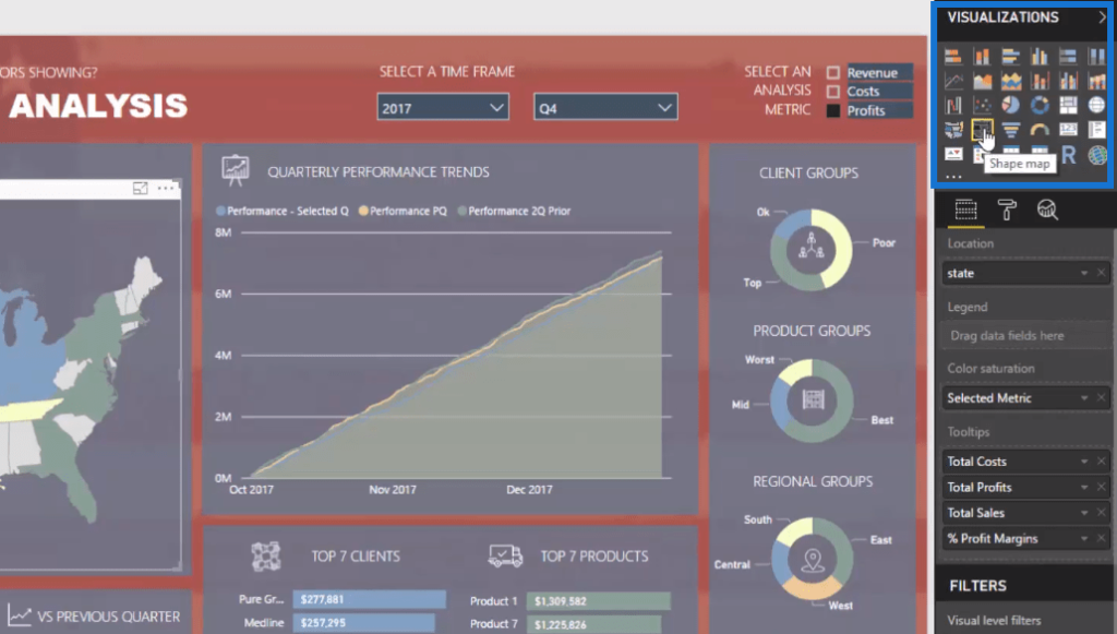
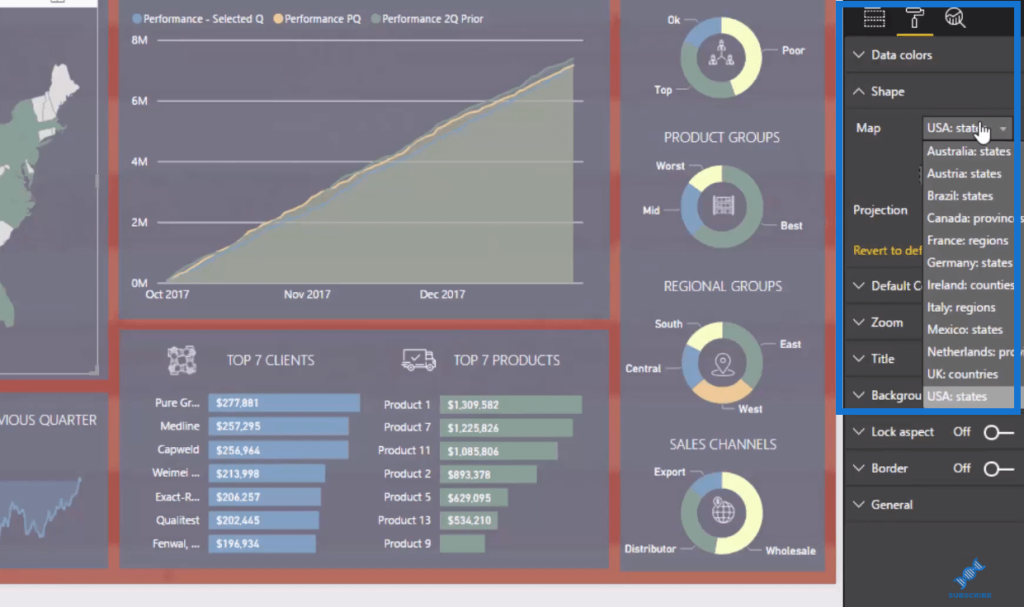
We simply click on it and we’ll see its features. We can change this map to any of these different shapes or countries listed here. However, not all countries are available, so it’s not going to suit everyone.
Only the major countries or key centers are available, so if you’re based in or selling in the US, Australia, and in all these countries listed here, this is perfect for you.
If we want to prevent any issues in our data and we want to create a column or dimension that has states in it, this is going to make our lives so much easier. We just need to drag it in and then we get this great visualization that interacts with the rest of our report.
Drilling Into Data Using The Shape Map
What I really love about this Shape Map visualization in Power BI is how efficiently we can interact with our data or drill into our data. From a visual perspective, it just looks so much better and more compelling.
We can click around on any state and it filters the rest of the report, showing results in that particular state.
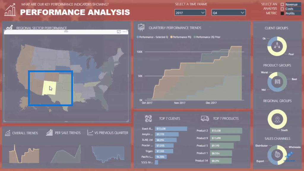
Another technique is to utilize the Zoom feature.
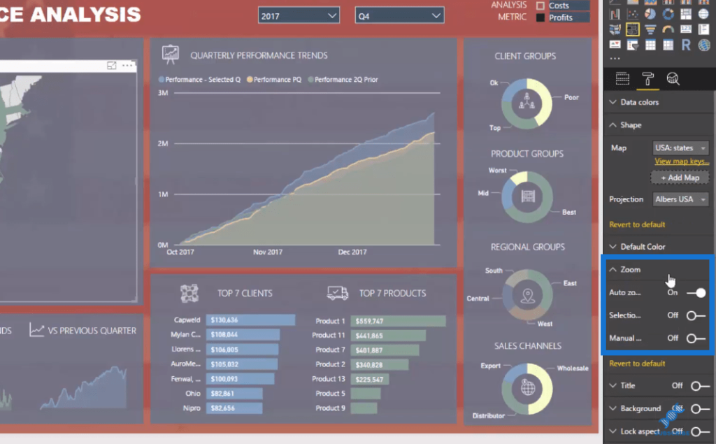
I’ve created Regional Groups here, and so if we click on a specific region, our map visual zooms in on the country to feature the region we have selected. In this example, we’re clicking on Central America.
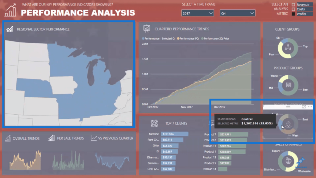
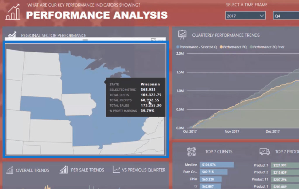
We can even drill into the individual states within Central America like this.
Other Features And Elements Of Shape Map
We can layer in some of the other great features of Power BI development as well, such as Tooltips. When we select the visualization, we can see here a number of Tooltips.
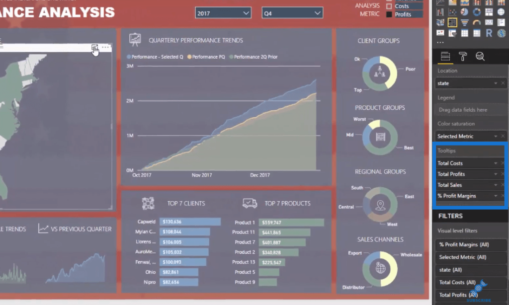
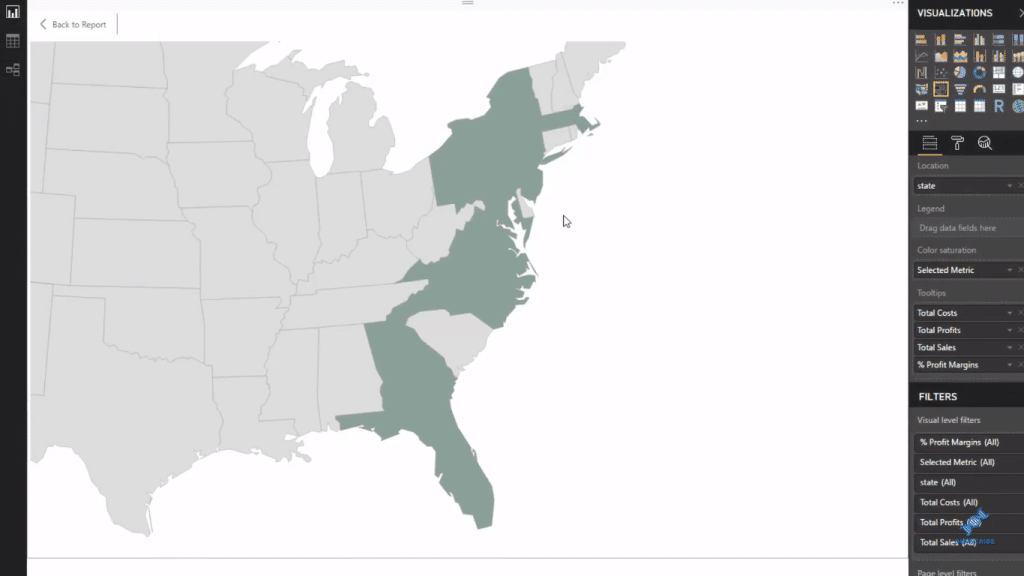
Another thing we can do with the Shape Map is expand it, which gives us a clearer image of our visual.
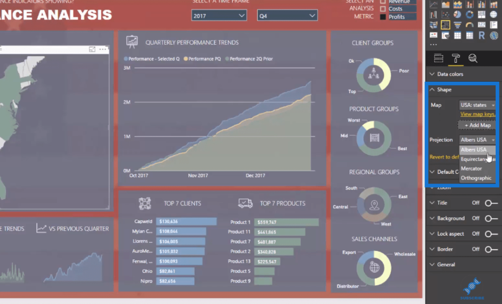
We can also change the Projection of the Shape Map.
What I also love about the Shape Map visual is that it really sits within the report. There’s quite a big difference when we use a visualization like this.
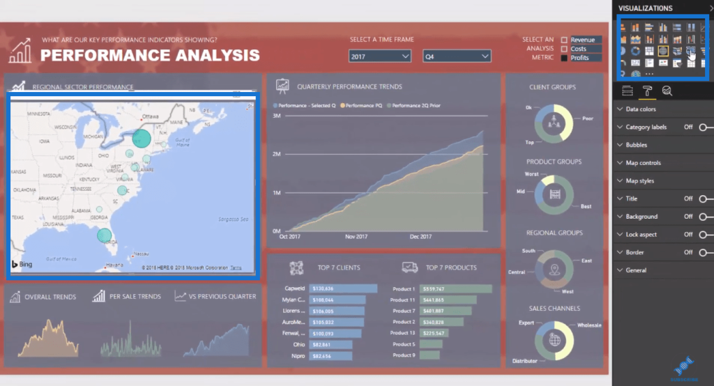
Compared to the Shape Map, this doesn’t integrate well into the report.
***** Related Links *****
Using Filter Fields & Visual Interactions To Create Compelling Visualizations In Power BI
The Importance Of Creating Compelling Power BI Visualizations
How To Create Compelling Reports & Dashboards In Power BI
Conclusion
This is certainly a great visualization tutorial to delve into more. In this blog, we went into the Shape Map visual inside Power BI in far more detail and learned how we can utilize it well.
One major drawback with the Shape Map Visualization in Power BI though is that there are location restrictions. Not every country or region is broken up the way you need it to be into shape maps. And only a few countries are available for your analytical work.
If you’re analyzing something in the US or in other major countries like Europe or Australia, the Shape Map visual is a great visualization to add to your reports and to also segment analysis based on regions or geographic areas.
All the best!
Sam
[youtube https://www.youtube.com/watch?v=WloJUuDxZJs?rel=0&w=784&h=441]


