
In this tutorial, you’ll learn how to create a scatter chart for your Power BI report. This is a chart that shows data for two or more variables using Cartesian coordinates. You can use it to monitor relationships between different categories.

Creating A Scatter Chart In Charticulator
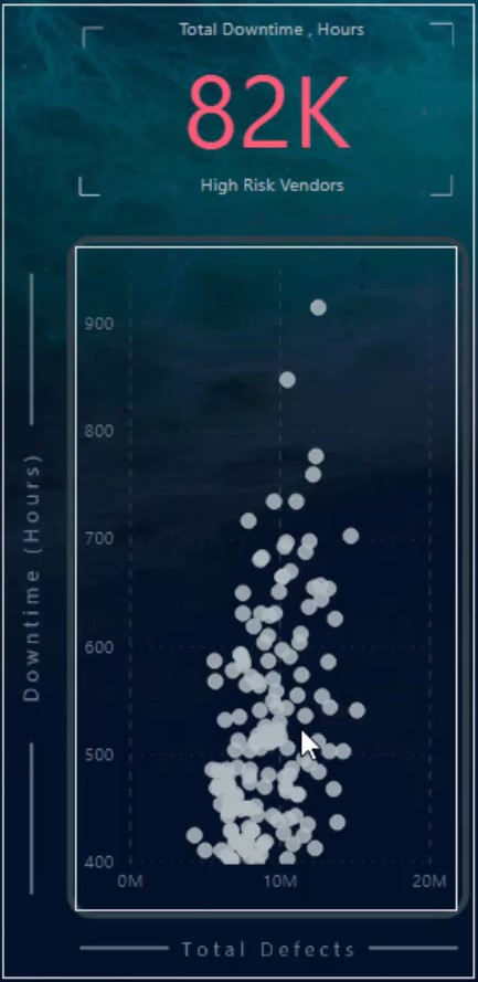
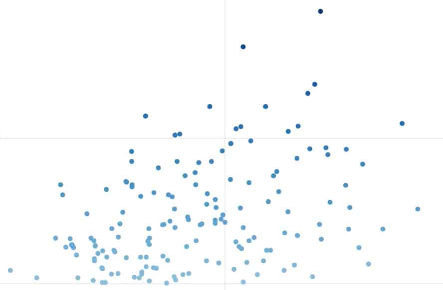
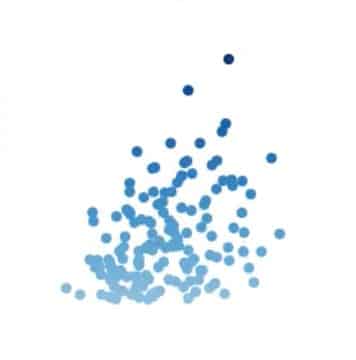
This is a sample scatter chart that you are going to recreate.

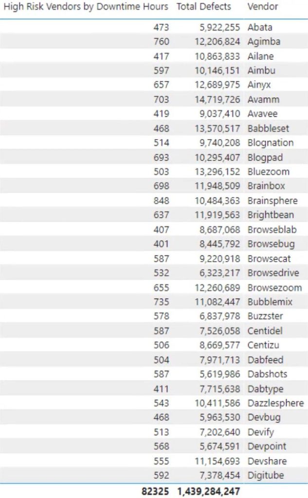
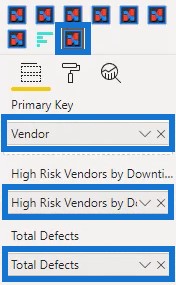
First, you need to create and export a dataset to Charticulator. For this chart, the dataset contains two measures and one category. The measures used were Total Defects and High Risk Vendors By Downtime Hours along with the category Vendor.
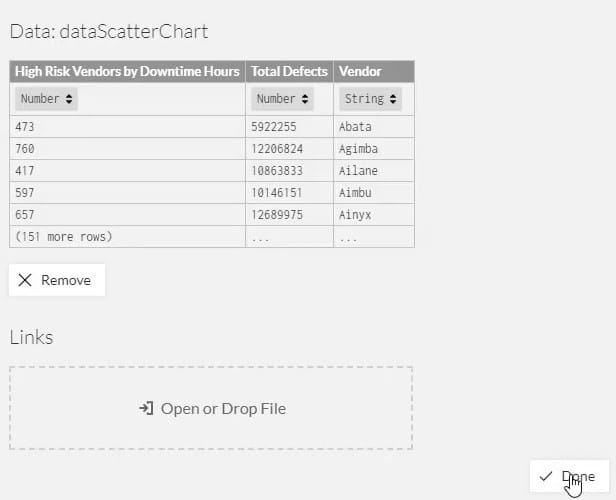
Export the data by clicking the three dots and selecting Export Data. Then, go to charticulator.com and click Launch Charticulator.

Locate and open the exported dataset and click Done. You will then be directed to the Charticulator canvas where you can start creating the chart.
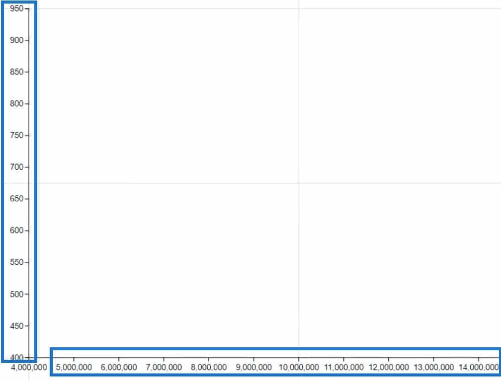
Place Total Defects and High Risk Vendors By Downtime Hours in the X and Y-Axis, respectively.
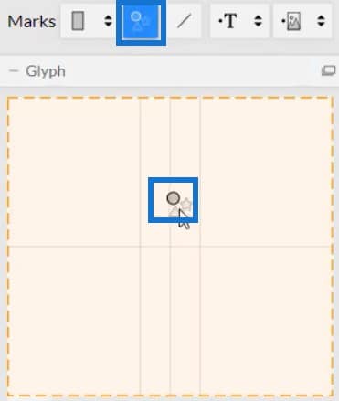
Next, bring the circle from the symbols beside Marks inside the Glyph canvas.
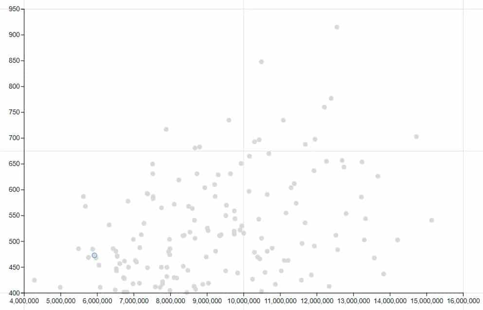
Your scatter chart visualization will then look like this.
Hide the labels on the axes by opening the PlotSegment1’s Attributes and unchecking the Visible box for both axes.

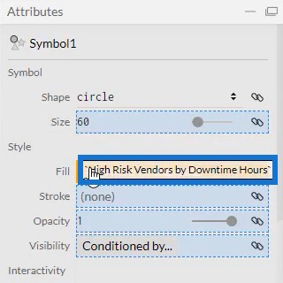
To add colors to the circles inside the chart, you can use any of the two measures inside the Fill section of Symbol1’s Attributes. For this example, High Risk Vendors By Downtime Hours is used for the colors of the symbols.
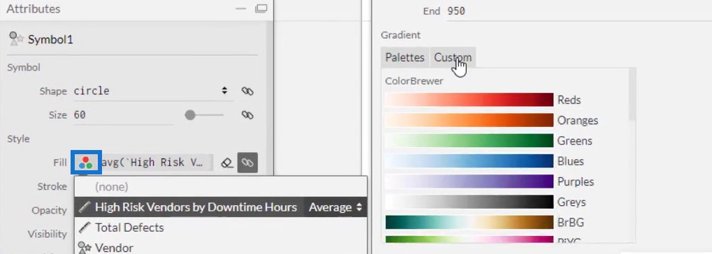
You can change the color palette or customize your own color for the symbols depending on what you prefer.
The visualization will then look like this:
Importing Scatter Chart Files In Power BI
Save the scatter chart file and export it to Power BI Custom Visual.
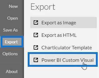
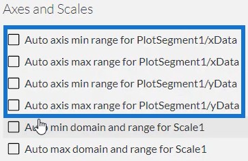
Uncheck the auto axis options in the Axes and Scales settings to ensure that the axes remain unchanged even when a filter context transition is invoked. Lastly, create a visual name for the chart. Once done, you can export it to the Power BI Custom Visual.
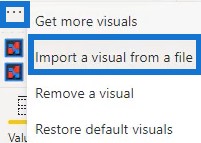
Open Power BI and export the Scatter Chart file. Click the three dots or the ellipsis below Visualizations and select Import a visual from a file. Then, locate the file and click Open.
Click the Charticulator link with the visual name of the scatter chart file and place the corresponding measures and category in the Fields section.
Your scatter chart visualization will now look like this. You can change the background, font, and margins to your desired preference.
The only thing left to do is to add interactivity among the charts in your Power BI report to invoke context transition. Go to the Format tab and select Edit Interactions. Then, click the visuals or charts that you want the scatter chart to interact with. After that, you’ll now have a great data-generating visualization.
***** Related Links *****
Power BI Scatter Chart: Conditional Formatting
Scatter Charts In Power BI – Highlighting Key Points
How To Use The Built-in Analytics For Power BI Scatter Charts
Conclusion
Scatter charts display a lot of information in your report where you can observe two different categories. Data points are plotted using coordinates to easily identify the relationship between each variable in your report.
Learn more about scatter charts and other visualizations by exploring and practicing Charticulator with your data.
Mudassir


