In this Power BI Showcase, we’ll be reviewing retail site performance reports in Power BI.
We’re looking at a sizeable business located on the East Coast of the US. We’re getting the metrics of all the retail sites which includes some main states and cities. You may watch the full video of this tutorial at the bottom of this blog.
Retail Sites Performance Overview
This report contains an overview of the metrics for the retail sites’ performance.
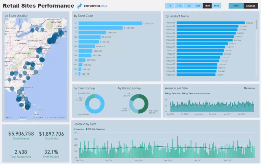
With this map, we can review information spatially.
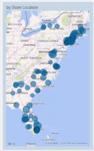
We’ve also got some insights into different categories. There’s data per state code, per product name, per client group, pricing group, and also by average Sale per order.
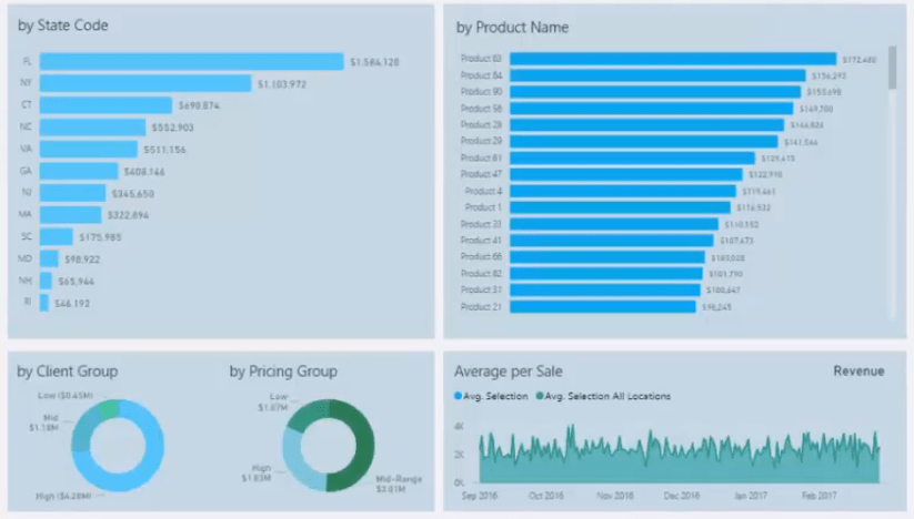
At the bottom of the report, we’ve got a chart that’s showing information through time.

One thing that’s been integrated into this report is the dynamic way that you can filter the time frame and metric you want to look at.

Using DAX and data modeling techniques, we’re able to dynamically navigate towards any time frame in our data. So, the report isn’t simply composed of a static date.
We can review the last 30 or 14 days, or even the retail sites’ performance last year.
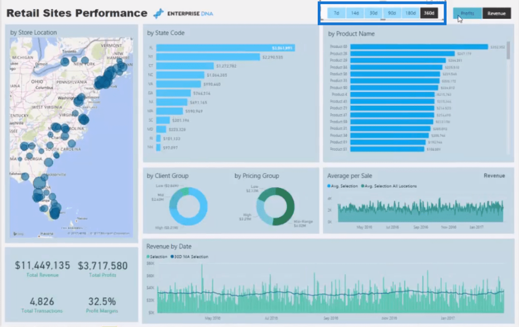
We can also change between Revenue and Profits.
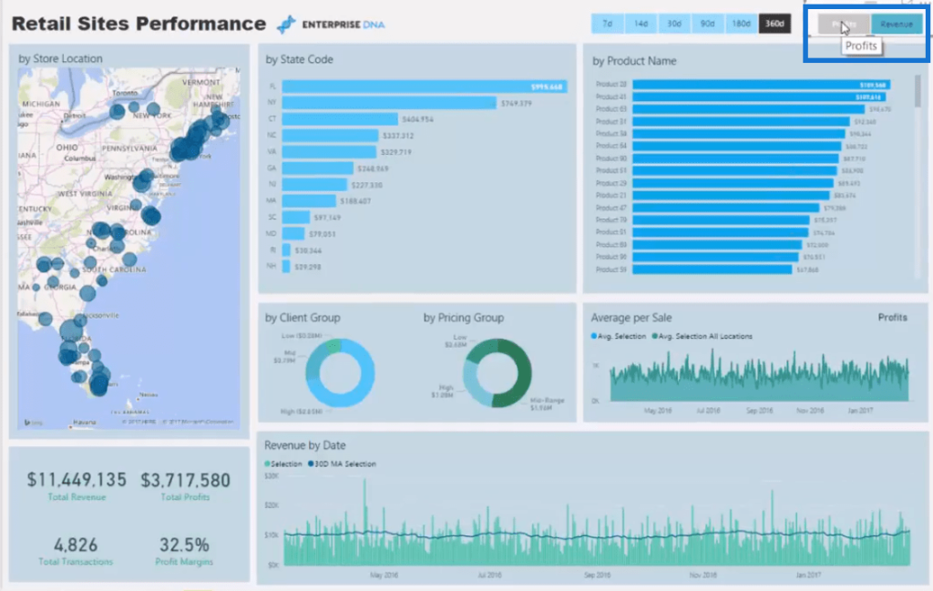
This can be set up to have any potential key metrics. It could be for Profit Margins or Total Costs, among others.
We’re somehow turning this report into numerous reports because of the different information it can show using the same visuals.
If we have a monthly meeting with management, we could easily show the retail sites’ performance per state or product within the last 30 days.
Regional Analysis
In the second report, we have information on the metrics per region.
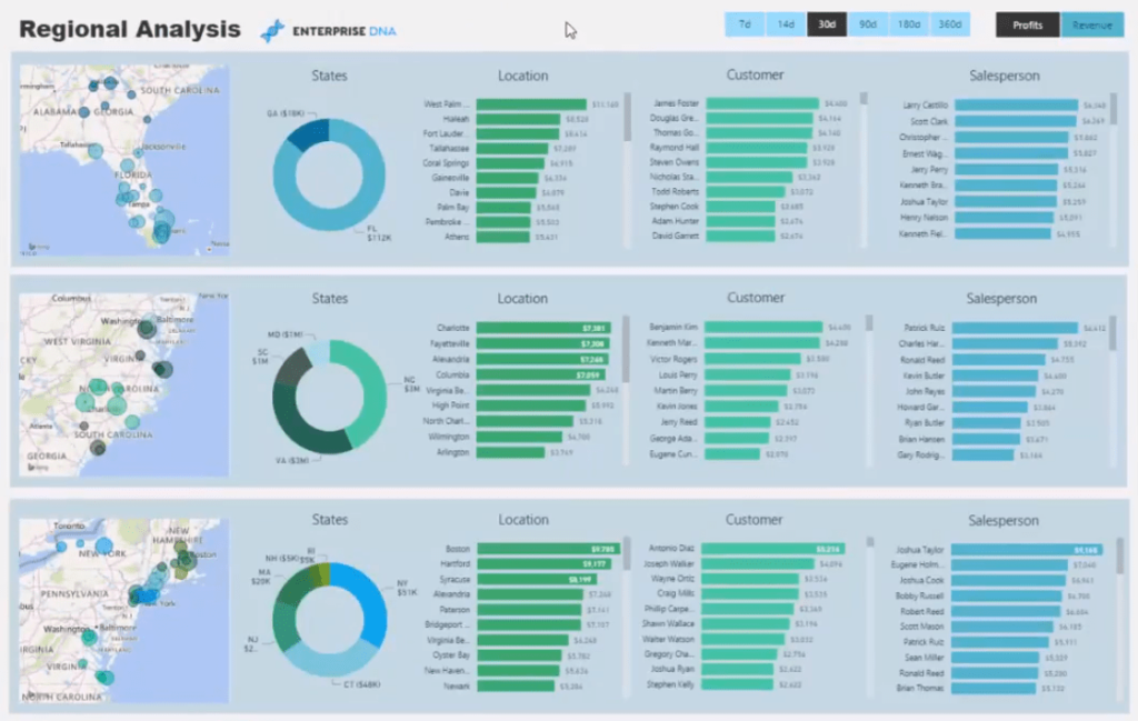
We’ve broken down the information into a more manageable state level analysis.
The region is divided into three states: the bottom, the mid-east, and the higher east coast states.
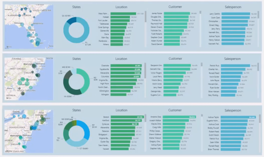
Each state has its own chart showing information on specific locations, key customers, and key sales people.
If we want to drill into Georgia, we can click on the donut chart.

We’ll then see all the main Sales locations, key customers, and sales people in Georgia.
We can also change the metrics shown in these visuals. We can look at different time frames and at different metrics using the slicer.
So, for example, we can look at the last three months of data for the state of Georgia.

We can then review our Sales in each of these locations within that time frame.
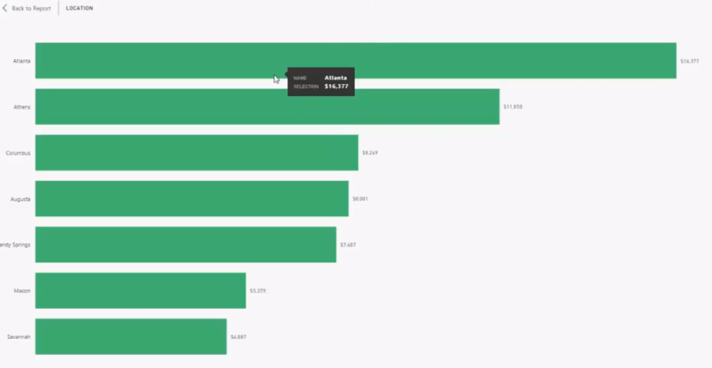
We’re currently showing profits. If we want to look at the Revenue in Florida, all we need to do is click on Revenue in the slicer and Florida in the donut chart.
With this, we can review all the different retail site locations we have in Florida.
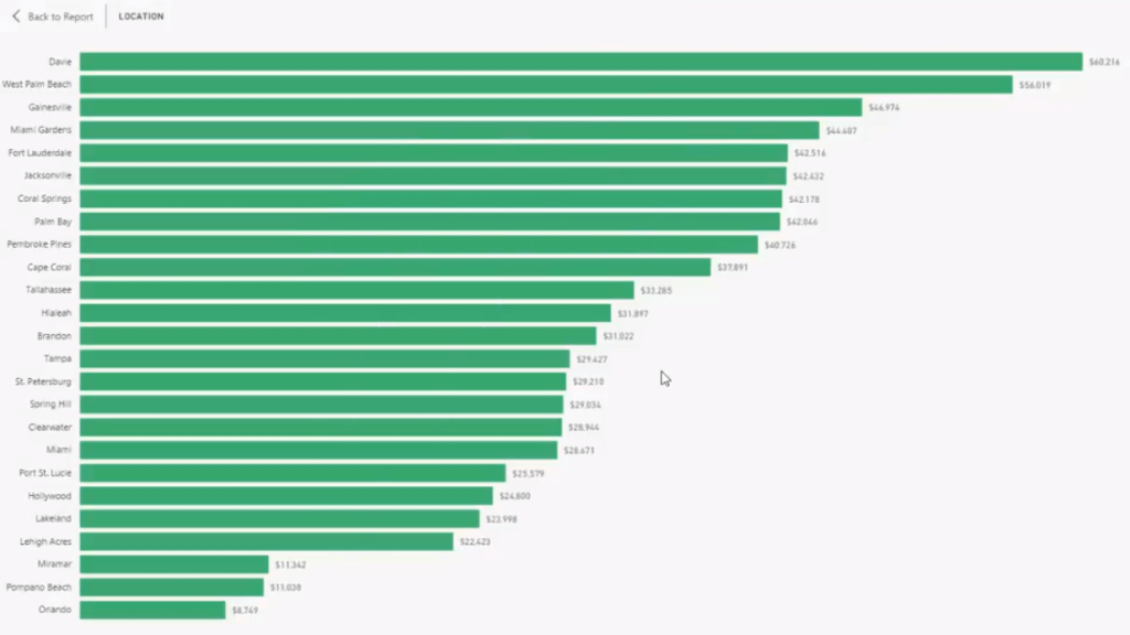
The same also applies to the other regions and states.
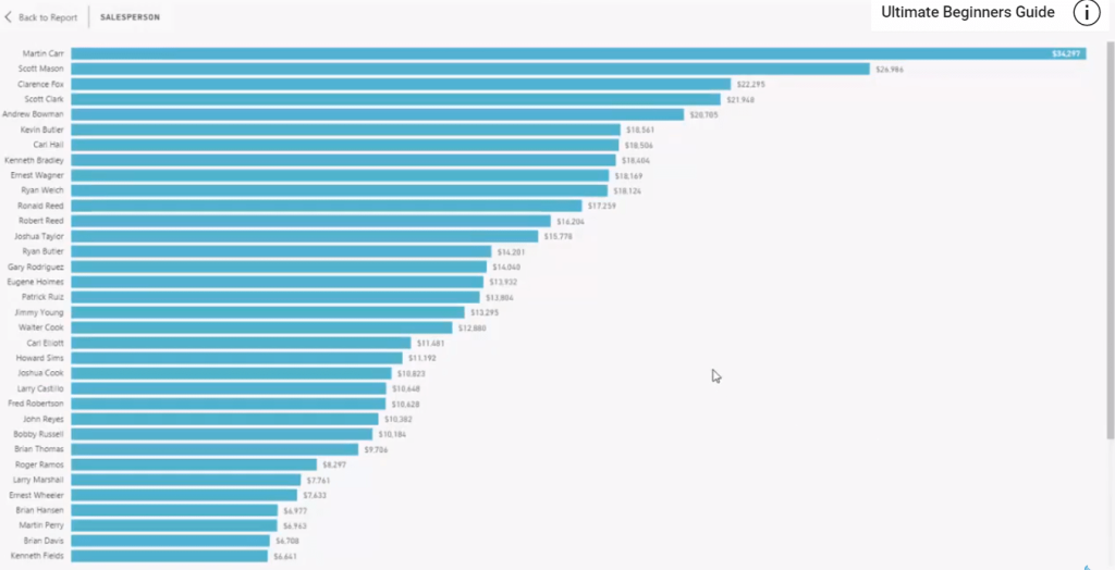
If we wanted to drill even further, we could look at a specific store and look at its Sales performance.
We can dive into all the information we need in terms of the performance metrics within a range of different dimensions.
Store Product Sales
The third report is analyzing the performance of each retail store.
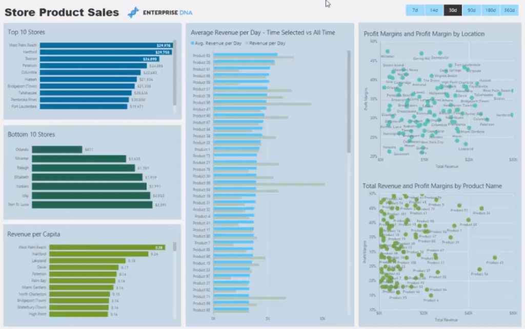
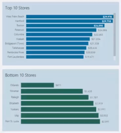
We have information on our top and bottom 10 stores.
We can also see our Revenue per capita and compare this between our different stores.
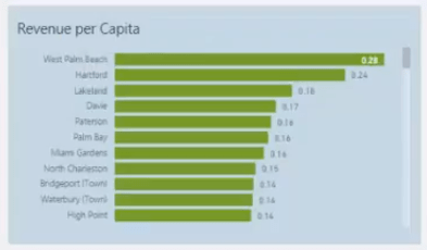
Similar to the previous reports, we can also review the information within a different time frame.

This chart shows information on whether we’ve achieved our Revenue goal for a specific time frame versus the Revenue per day of all time.
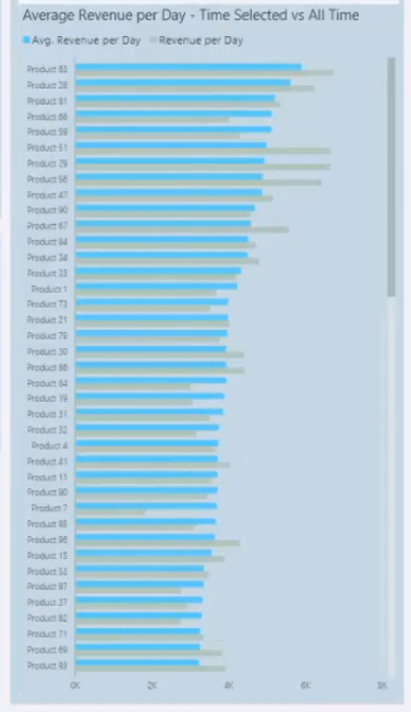
This is a good way to find out why we’ve had specific products that sold poorly per day in the last 30 days versus its historical performance.
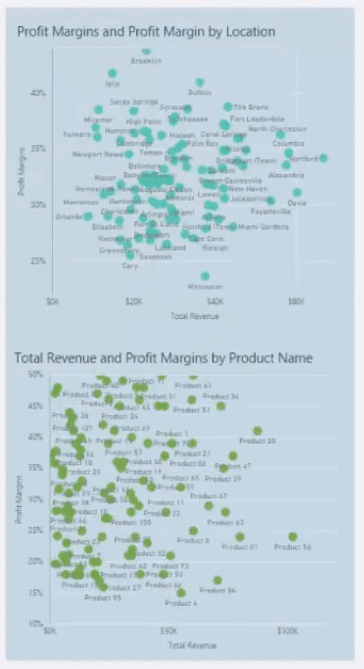
Furthermore, we also have information on our Profit Margins based on location and product.
Store Budgeting
The last report in this showcase contains information on our Budgets per store.
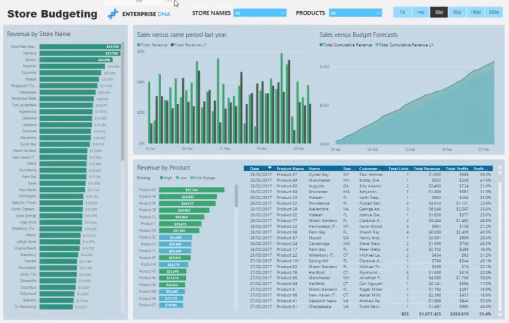
We can drill into any store or store groups and see their Sales performance versus the estimated Budget.
We can again change the time frame using the slicer. So, if we have a 90-day budget, we can dynamically see all the store information within that period.
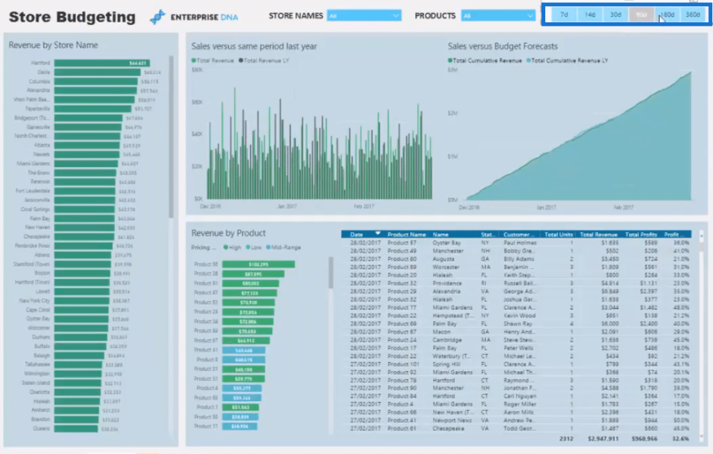
We’re able to know which stores have performed well.
In this chart, we can select multiple stores and see their Sales metrics. For example, we have the top five stores:
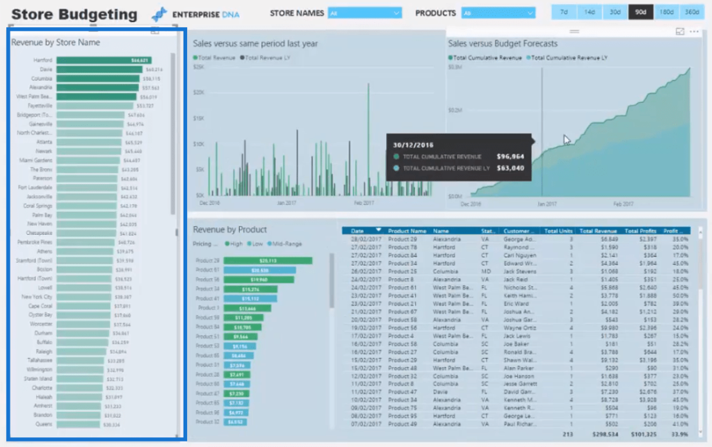
With this, we can also see the products have contributed to the Sales versus Budgets performance of the top five stores, and when those Sales occurred.
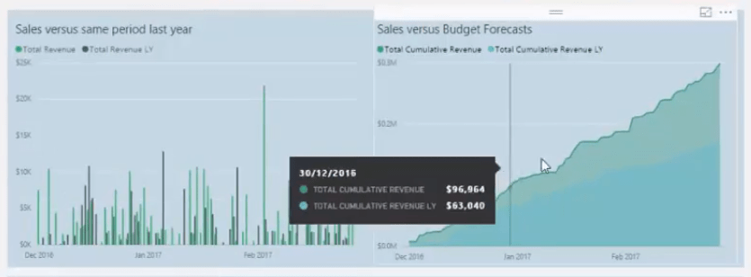
We can also see our individual Sales.
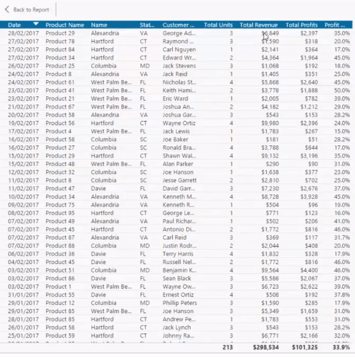
The unique thing about this report is the dynamic way we can change the time frames along with the specific products and stores we want to view.

***** Related Links *****
Discover Multiple Product Purchases Using DAX In Power BI
New Vs Existing Customers – Advanced Analytics In Power BI
Automatically Find Your Top 3 Salespeople Per Region Using DAX In Power BI
Conclusion
This Power BI Showcase featured reports that are perfect for companies who belong in the retail industry.
These reports offer valuable insights to the overall performance of retail stores even when they’re spread throughout a wide region.
The information provided by the different visualizations enable us to identify which stores, products, and areas are performing well, and what we can do to achieve those good results in poor performing stores.
All the best,
Sam


