
In this tutorial, I’d like to demonstrate how you can create logistics reporting apps in Power BI using real-world data. I want to show the extensivity of what you can do in Power BI and its great capabilities. You can watch the full video of this tutorial at the bottom of this blog.
We’ll go through an example coming from one of our members as part of Enterprise DNA’s Power BI Challenge 12, and I’ll share how I would personally approach the problem and the improvements that I think can be applied to the model.

Sample Logistics Reporting Apps In Power BI
The first thing that I really love about this report is the actual navigation experience. It is like a fully built web application. It’s like a GIF image where there’s an overlay aspect coming to it when you click on it. The member has broken it down into four different analysis segments. We’ve got Air, Road, Rail, and Sea segmentation.
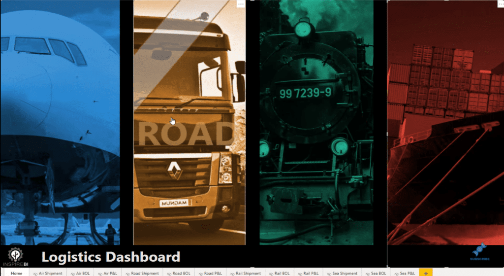
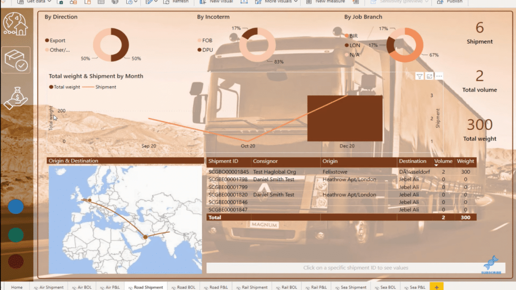
If you click through one of these segments, say Road here, you get taken to a different page that gives you insights about all the different transportation that is happening via road.
I think it’s a good place to start. When you’re assessing any data set, you really want to try and understand the story that you’re trying to tell. The story you tell can change quite a lot depending on what you deem as your most important filters or your most important dimensions. In this case, the most important dimension was breaking up the data.
And so, there’s some analysis and other key information within each segment, but there’s also navigation on the left-hand side that you can click through. You can drill down into the data for more information. These are the things that are great for anything to do with logistics. It shows the versatility of what we can do with Power BI.
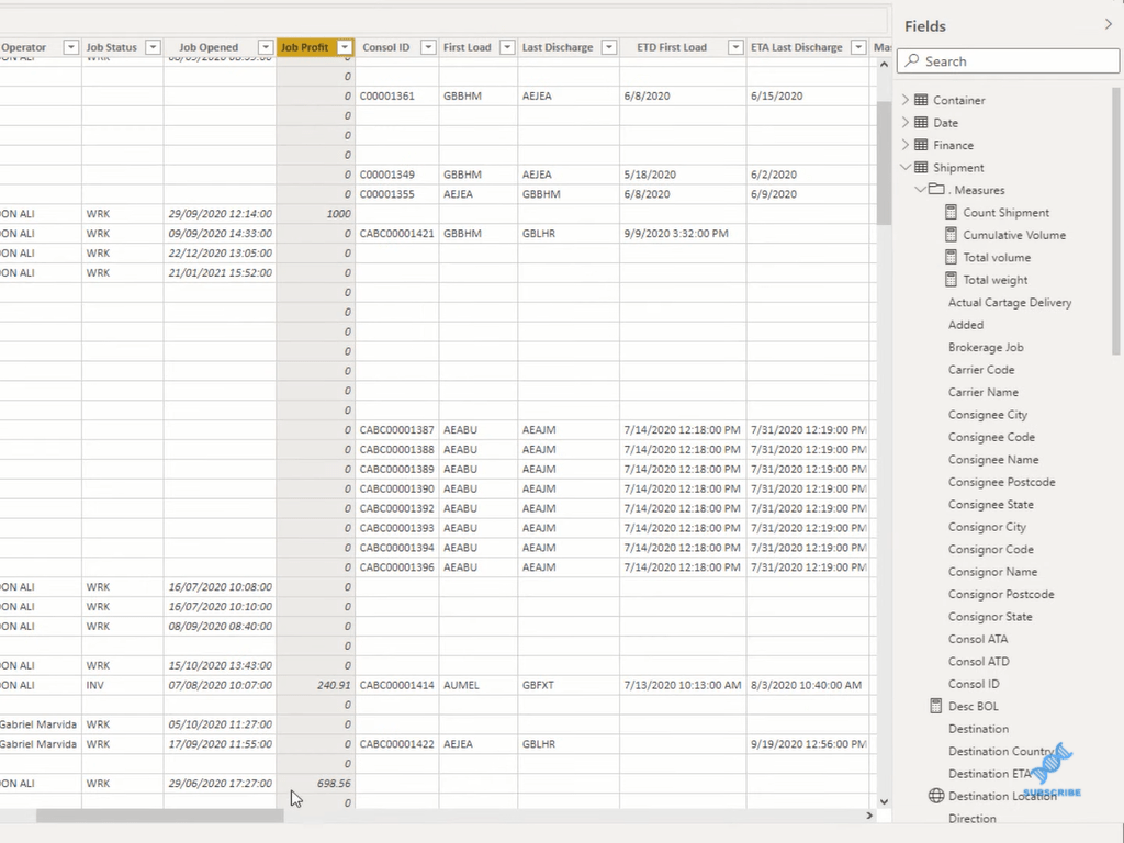
Data Model & Data Set For Logistics Reporting Apps
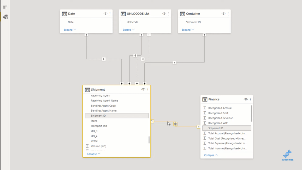
Now, I want to quickly run through how I look at data sets and how potentially I would do this differently because what has been done in this case is that the model has been kept very simple. First, I love the fact that the member used the waterfall technique, where we’ve got our lookup tables at the top, and our fact tables at the bottom.
However, this one-to-one relationship on Finance here isn’t something that I would generally do. I would probably leave this as sort of like a table by itself. But, maybe I’d create a lookup table of the common column, such as Shipment ID. I would try and bring these two Shipment ID columns together and merge them into one. Or alternatively, I could remove duplicates, place them as a lookup table, and then create a one-to-many relationship from that column of unique values.
Now let’s just have a look at what shipping data looks like. With any logistics information, you’re going to have a line item like a piece of transactional information, which is going to be really the Shipment ID. Then, it’s going to stem out to when it left, where it left from, and then where it went to, when it landed, and so on.

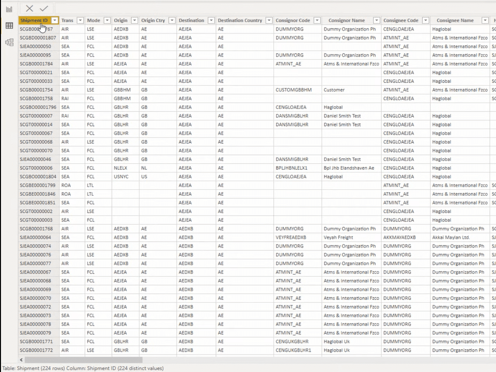
There are a lot of things that can come out of just that information, but the main thing here is obviously the Shipment ID. That’s going to be our index inside our fact table. However, you can see that this is actually a huge table. Even though the number of rows is quite small, there are 121 columns. That is way too many columns for a fact table.
What you want to do with data sets like this is you want to break out the segments of information that make sense. One thing that I can quickly identify that would be a good lookup table is Locations. Information on codes on the origin countries, the destination countries, etc. is significant for this type of reporting app. This way, you don’t have duplicates of information over and over. That’s going to reduce the complexity of your model and reduce the file size.
There are a lot of other things that we can improve here, including the Type of Goods, Clients, Vessel, and Types of Deliveries, which we could break into lookup tables as well.
What I’m also looking for here are the columns of numeric values because this is where I’m going to create my measures. I’m going to just do simple sums so I can filter by using the lookup table dimensions that I’m creating.
And so, the model would look a little bit different. I would have maybe four or five more lookup tables at the top and flow them all the way down to respective indexes in the Shipment table.
Conclusion
This is an example of a logistics reporting app in Power BI. In this example report, I’ve shown you what a logistics data set and data model looks like and I’ve shared with you my thoughts and points of improvement.
I hope you’ve found this tutorial helpful in your own Power BI reporting endeavors. Check out the links below for more related content.
Cheers!
Sam
***** Related Links *****
Power BI Reporting Techniques: Setting Up Application-Like Reports
Power BI Demo Data For Sample Reports & Apps | Enterprise DNA
Creating Dashboards And Apps In Power BI Service
***** Related Course Modules *****
Data Visualization Tips
Dashboarding & Data Visualization Intensive
Financial Reporting w/Power BI
***** Related Support Forum Posts *****
Multiple reports in one App
Navigation Between Reports Inside an App
App & Report Access / Permissions
For more reporting apps support queries to review see here…..


