
In today’s blog, we will walk through the process of visualizing Python correlation, and how to import these visuals into Power BI. You can watch the full video of this tutorial at the bottom of this blog.
Understanding Correlations
Here’s a nice image showing the different types of correlations.

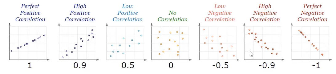
Starting from the left, we have the perfect positive correlation which means it has a correlation value of 1. Then, it is followed by positive correlations in descending order leading to 0.
The middle graph shows no correlation suggesting a correlation value equal to 0.
Finally, the right hand side presents decreasing negative correlations values from 0. The rightmost graph is the perfect negative correlation which has a correlation value of -1.
Packages for Python Correlation
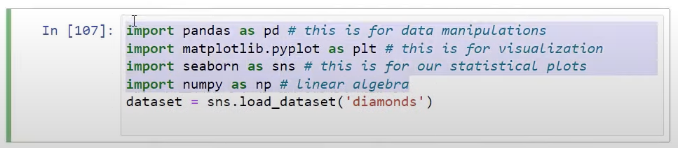
We will be using four packages for this tutorial. Our first package is Pandas to be used for data manipulation and saved as variable pd.
For visualization, we will use Matplotlib, saved as plt variable for easier use of these functions. Seaborn, our statistical visualization library, will be saved as sns. And lastly, Numpy, to be saved as np, will be used for linear algebra.

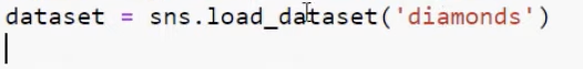
For the data, we will use a sample dataset in Seaborn. Then using the sns variable, we will bring in the diamonds dataset as shown below. .
Attributes of the Data
We can view the attributes of our data using dataset.info function. This function shows us all the different data types as seen in the last column below.

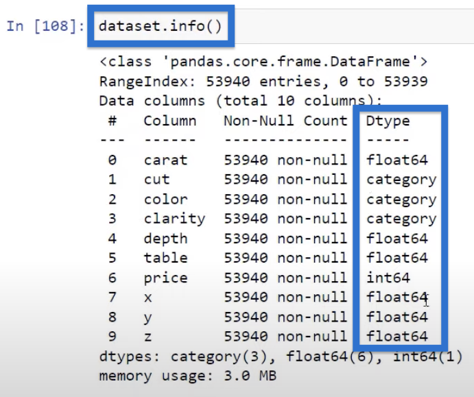
Note that correlation only works on numerical variables, thus, we are going to look at the numerical variables most of the time. However, we will also learn how to utilize some of the categorical variables for visualization.
The Python Correlation Dataset
By using the function head written as dataset.head, we can get the top five rows of our data which should look like this.

We have carat in the first column, followed by the categorical variables cut, color, and clarity, and then numerical values for the rest of the data.
Python Correlation: Creating A Scatter Plot
When visualizing correlations and looking at two variables, we usually look at scatter plots.
Thus, using the Seaborn library, we’ve created our scatter plot using the scatter plot function where we passed in the data we saved above as data=dataset. Then, we identified the X and Y variables—carat and price, respectively.

Here’s our scatter plot made with the Seaborn library.
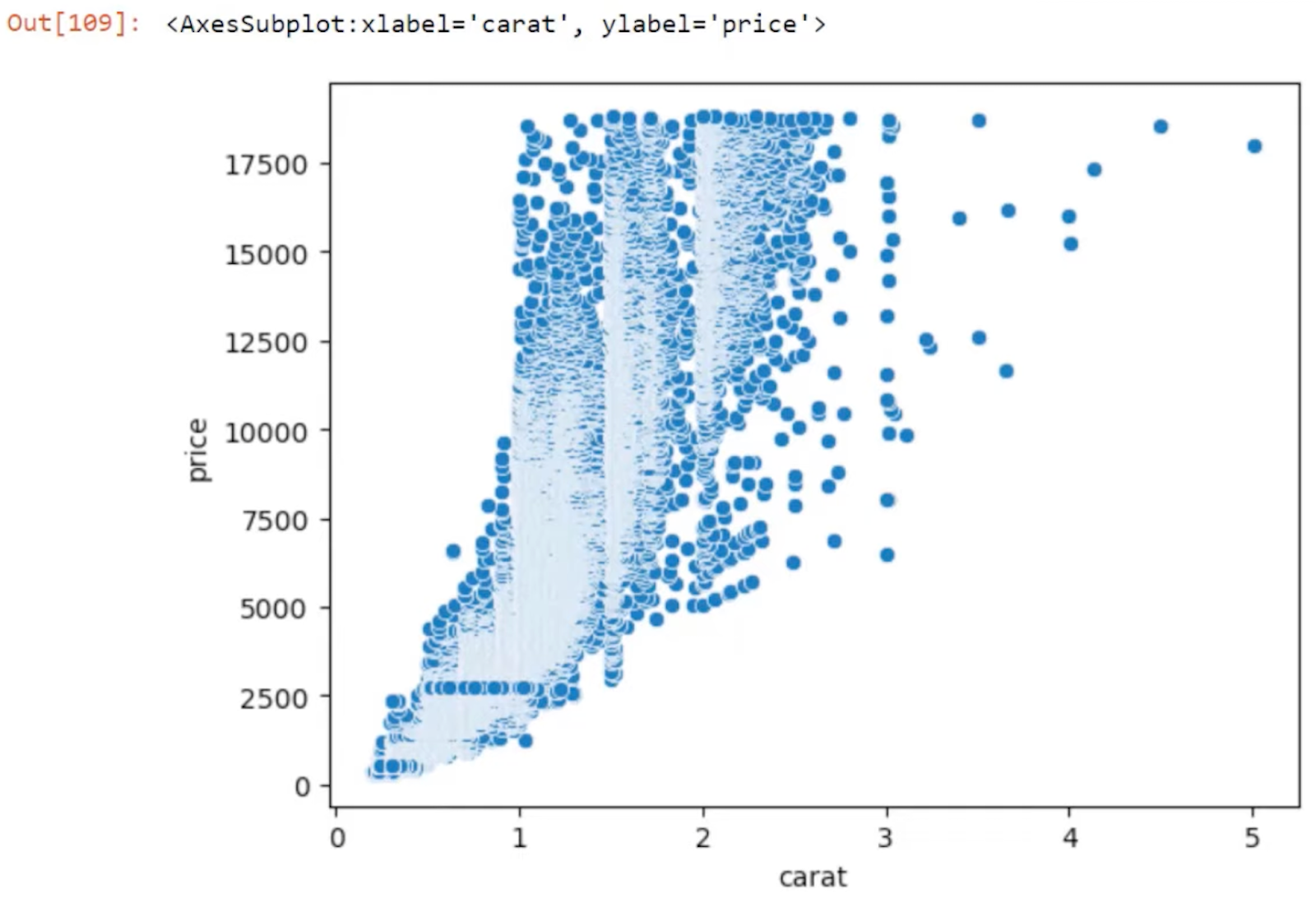
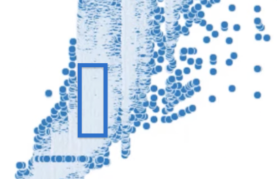
You can see that this scatter plot is quite dense. That’s because we have about 54,000 rows of data and the points are not necessarily represented in the best way.
We can press the Shift + Tab keys to see the different ways to style the scatter plot. It will show us a list of different parameters that we can add to our scatter plot.
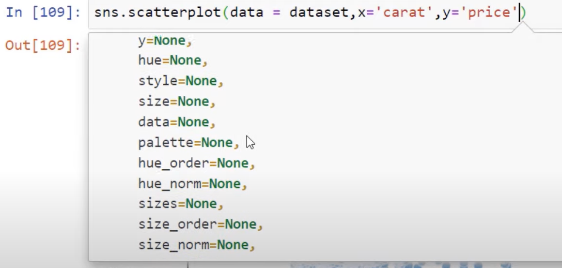
Scrolling further down will give us information on what each one of the listed parameters does.

Additional Scatter Plot Parameters
Let’s dive in a little bit. We can make the linewidth=0 because the white lines in our first scatter plot, shown below, somewhat obscure things.
We also want to adjust the alpha so we can control the opacity. Let’s use alpha=0.2 for our example. But of course, you could change that to 0.1 as well.

If we add these parameters and click on Run, you can see our scatter plot gets more opaque without the white lines.

You can play around with the parameters to get the best visual you are looking for.
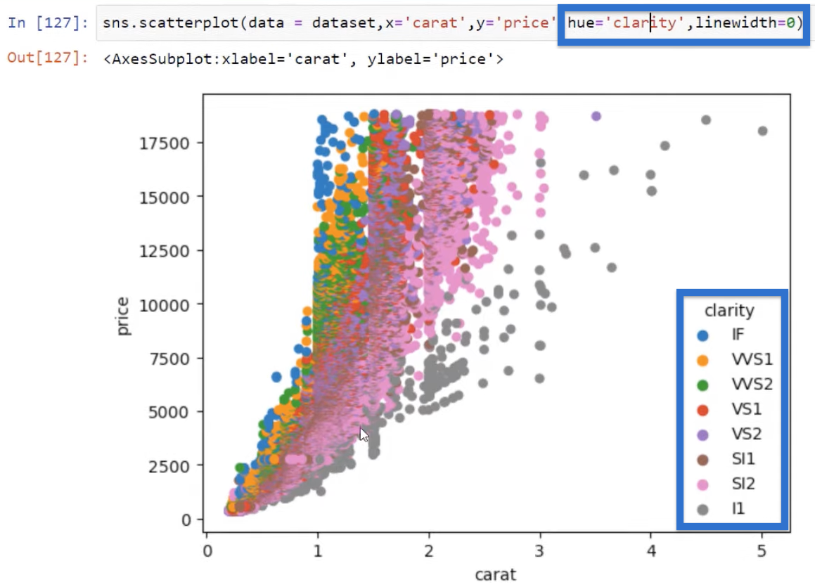
Using the Categorical Variables
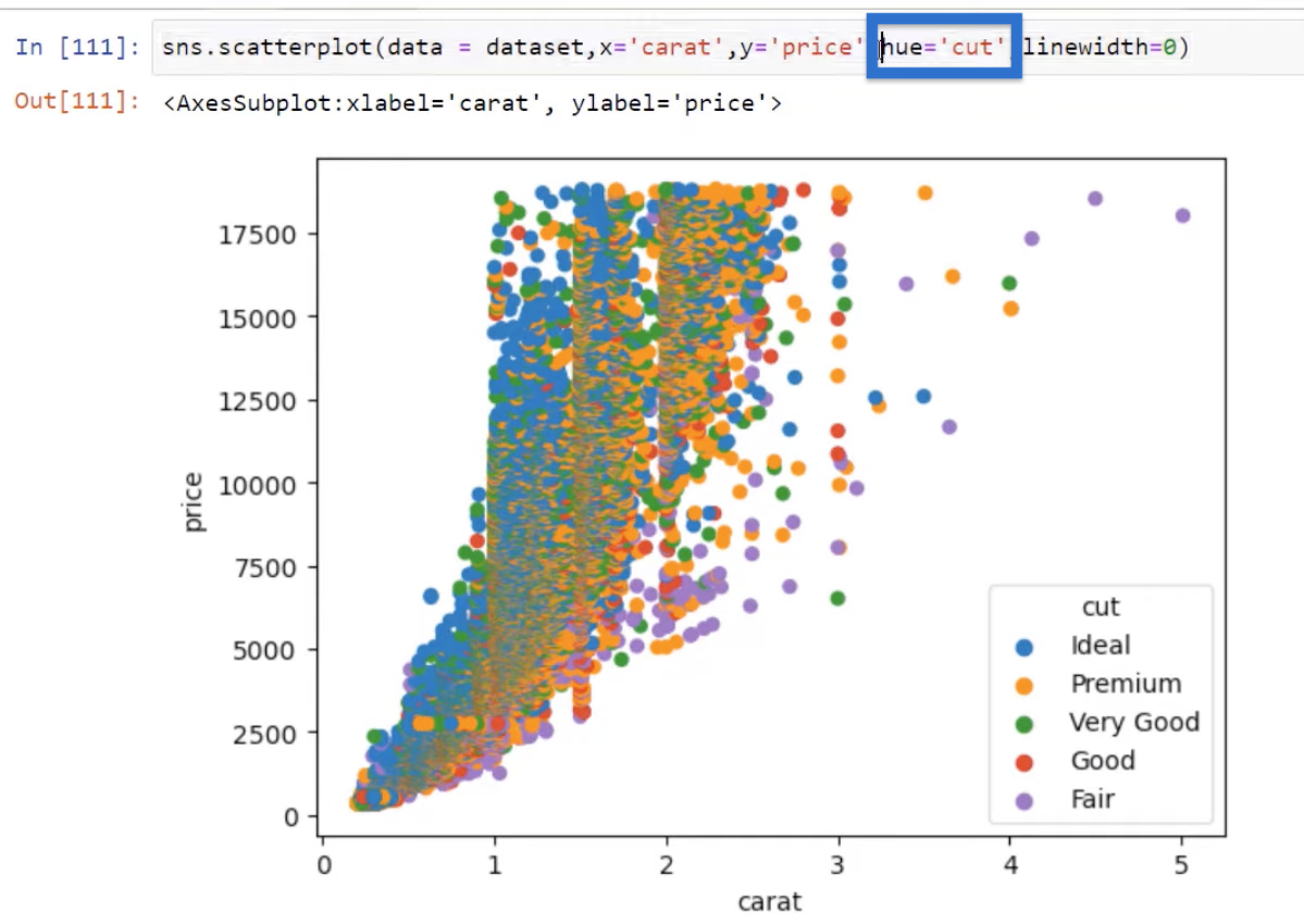
We can also utilize some of our categorical variables to improve our visuals. For example, we know that our data has a cut for our diamond.
What we can do is pass in that cut category using the hue parameter as hue=’cut’. This will allow us to visualize these points by changing the colors.

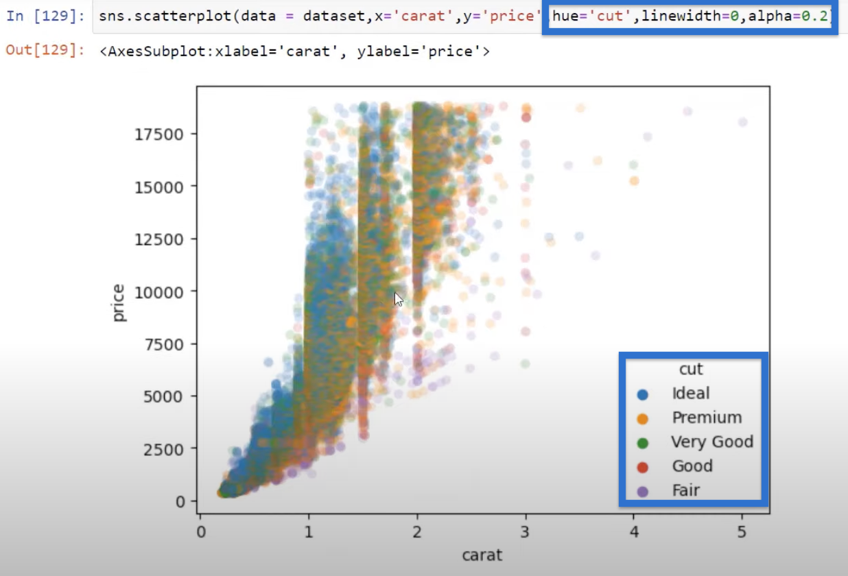
Of course, we can add more parameters like the alpha, for example. We can add that again, set to 0.2, and see how that changes the visual. Let’s click Run and you can see a little bit of a difference.
We can play around with the parameters to get the visual that we are looking for. We can also use different categories such as clarity, which gives us the clarity categories and also gives us a slightly different view of that scatter.
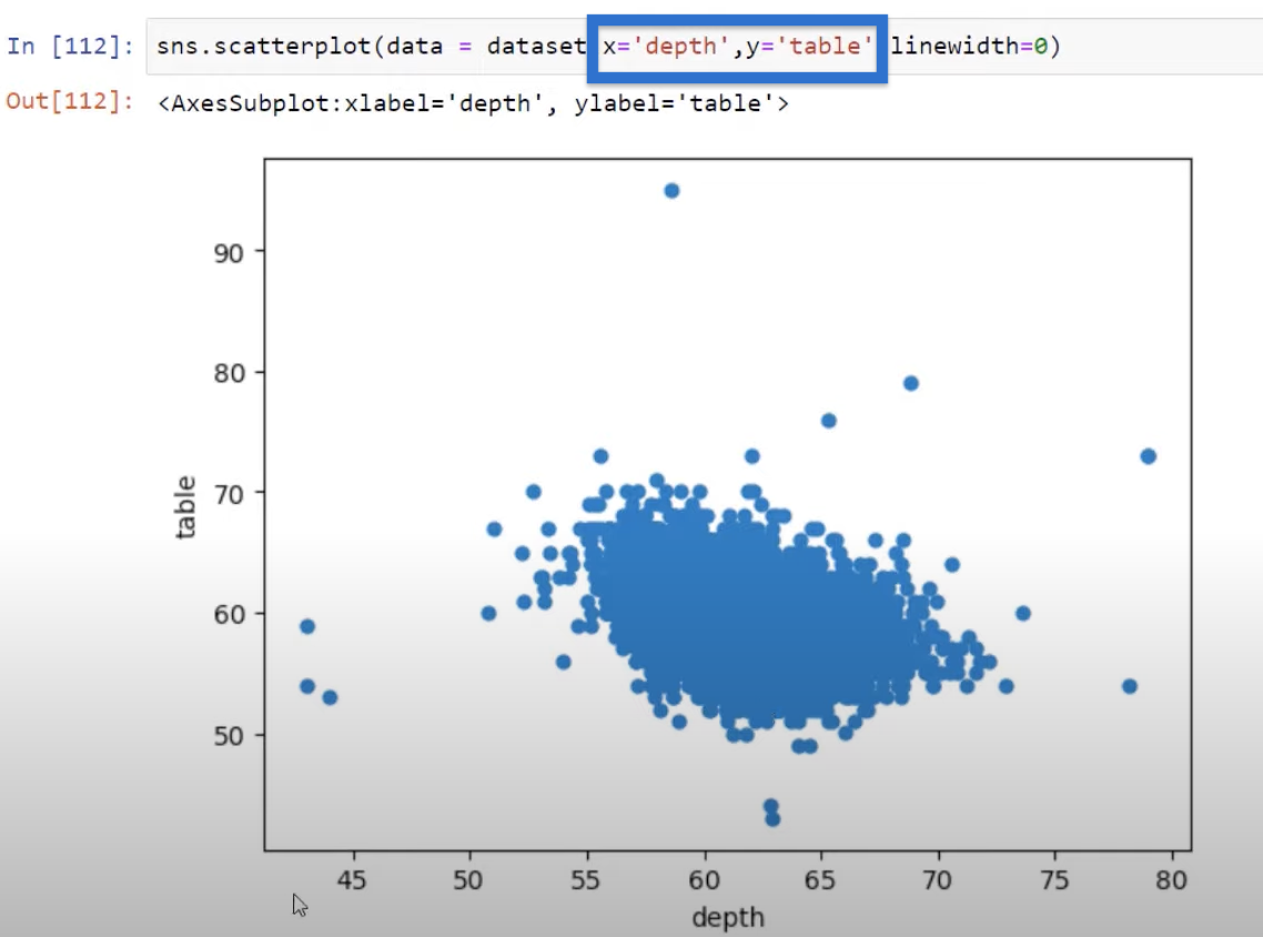
Correlation With Other Variables
You may also be interested about how other values are correlated other than price and carat. So if we look at a scatter plot for table, which is the numerical dimension of that diamond and depth, we can see there is no one-to-one linear relationship.
We can also look at two other variables such as depth and price. Based on the graph, we can see that the data centers around the middle area.

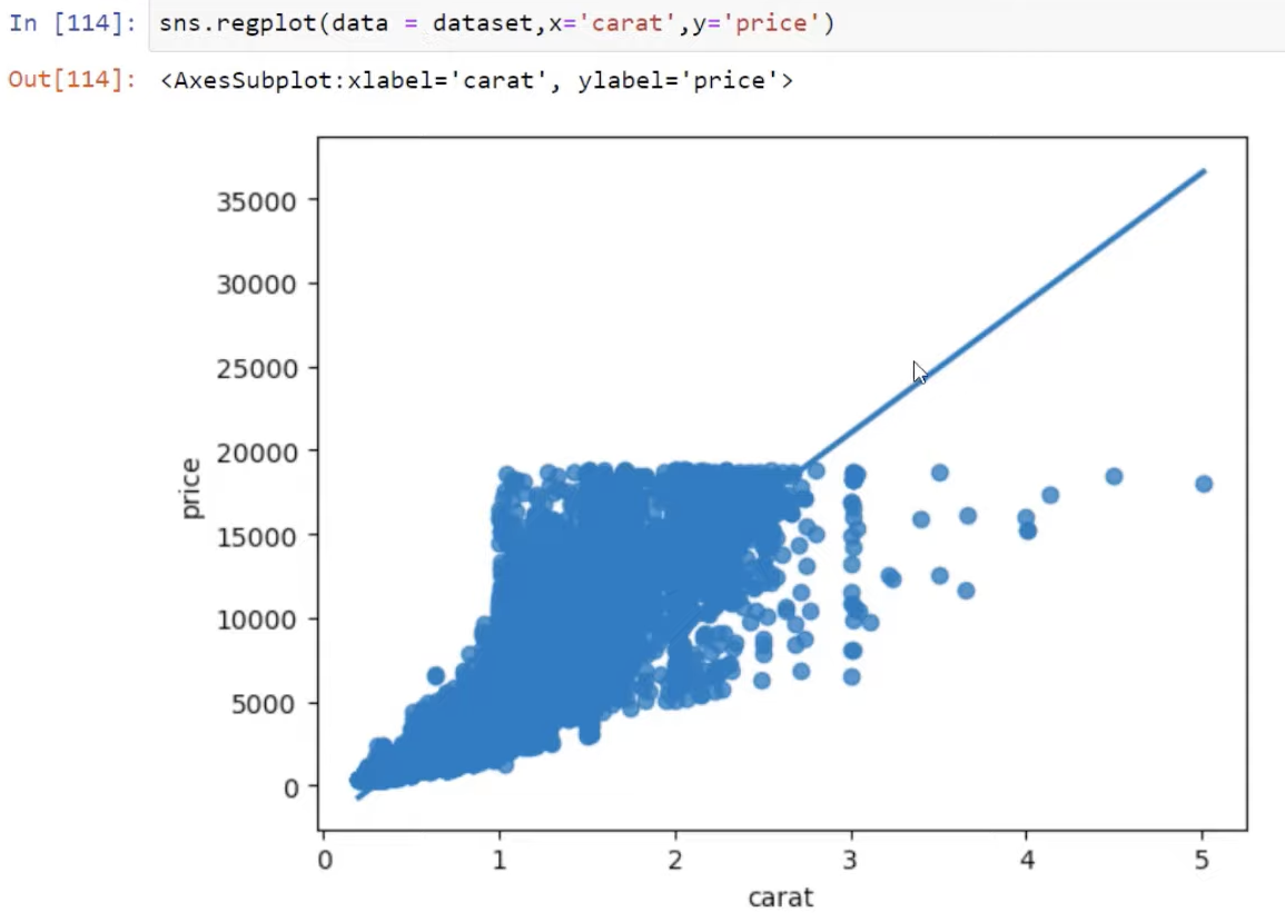
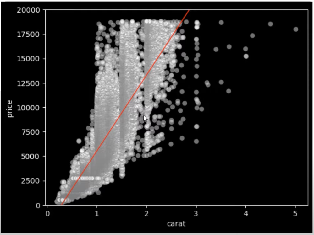
Python Correlation: Creating A Regression Plot
Let’s advance to what we call a regression plot that allows us to evaluate the linear relationship between two variables.
So instead of the scatter plot function, we will use the regplot function this time. We will pass in the same structure—our data then the X and Y variables.

The result shows a line which measures the linear relationship between the variables. It is also evident how our values circle around that regression line.
This is not a very beautiful visual at the moment, but we can still optimize it to get a better one. For example, we can pass in a style using the Matplotlib variable. We can change the style to dark background using the code plt.style.use(‘dark_background’).

Take that same regression plot and pass in some keywords for our scatter and line. Let’s use color red and a line width of 1 for our regression line. This is written as line_kws={“color” : “red”, ‘linewidth’ : 1).
For our scatter keywords, let’s set the color as white, edge color as grey, and the opacity as 0.4 to be written as scatter_kws={“color” : “white”, ‘edgecolor’ : ‘grey’, ‘alpha’ : 0.4).

These parameters give us a little bit of a different view shown below.

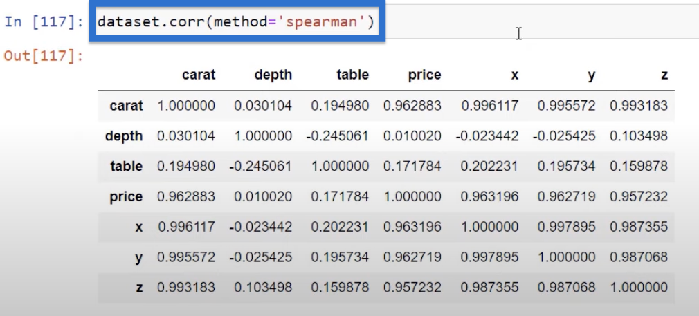
Python Correlation: Creating A Correlation Matrix
So far, what we’ve been looking at are scatter plots with just two variables, but we may also want to look at all of our variable correlations.
This is performed using our dataset with a data frame function called correlation represented as dataset.corr. And what we will get is a matrix that shows us correlations on each one of these variables.
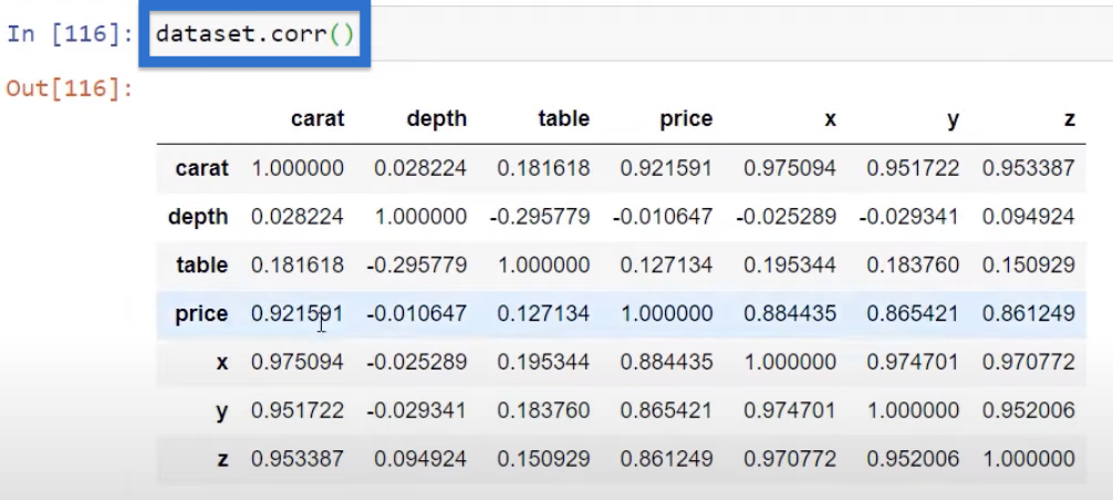
The numbers in the table above represent the Pearson correlation, which focuses on the linear relationship between all of these variables.
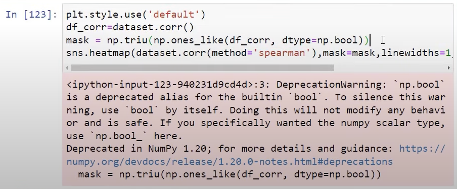
But if we are not sure if our variables are fully linearly correlated, we can use a different type of correlation which focuses more on impact than the linear part. It is called a Spearman correlation.
And we can see information on all of these things by pressing Shift + Tab. If you scroll down, we can see the Spearman rank correlation, Pearson correlation coefficient, and quite a lot of different ways to measure our data.
Looking back to our correlation matrix earlier, we know that price and carat are pretty well correlated.

They are from our plot here showing that they are quite linear at 0.92.
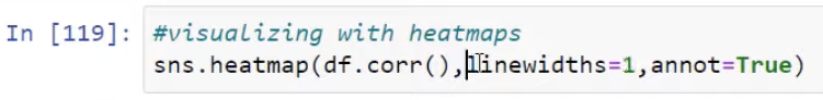
Now if we use the Spearman correlation instead, the impact or the rank is going to be a little bit higher at 0.96.

These different types of correlations allow us to pick up different attributes of correlation between those variables.

Multiple x Single Variable Correlation
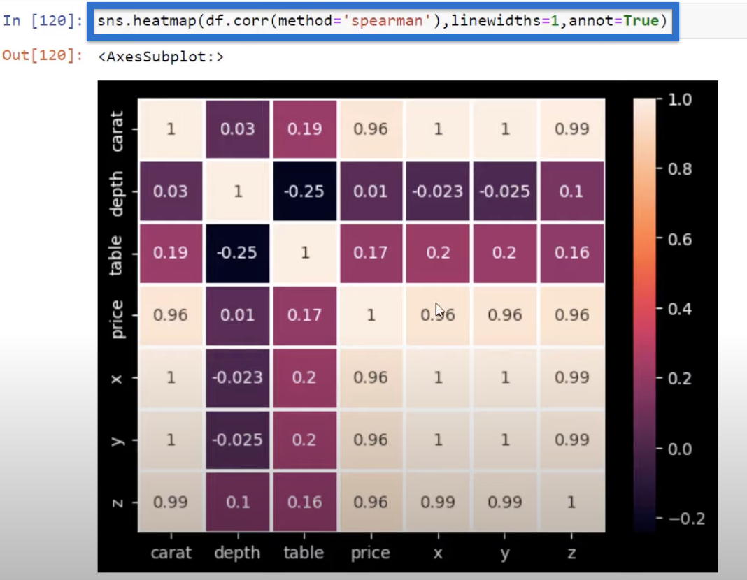
Sometimes, we don’t want to see a matrix because we are more concerned about the correlation of all the variables with one variable alone (e.g., price).
What we can do then is isolate price using dataset.corr followed by ‘price’.

Now, we can see that price is correlated with all our different numerical variables in this table. And the reason we may want to do this is for visual plots.
So let’s look at visualizing our correlation matrix with a heat map.
Python Correlation: Creating a Heat Map
We can pass this correlation variable into a Seaborn heat map using the function sns.heatmap.
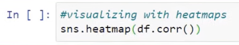
This will give us a heat map that looks like this.

Again, we can add parameters to our preference. We can pass in the parameter linewidths=1 and add annotations using annot=True.
And you can see that our heat map now looks quite different. Right now we have a pretty nice heat map.

We can see the usefulness of adding the lines and the annotations. Again, if we press Shift + Tab, all the different parameters that can go into that will show up.
Next, try to add method=’spearman‘ in our code, so you’ll know how to use a different type of correlation depending on your use case.
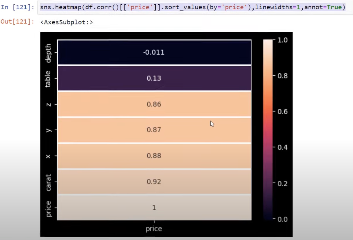
Heat Map With One Variable
Next, we isolate one variable and create a heat map with the correlation going from negative to positive.

This will give us this heat map below.
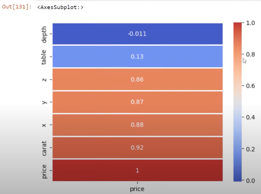
We can definitely change the styling as well. For example, we can use the cmap parameter as cmap=’coolwarm’. This changes the colors to cool and warm, and will eliminate our black background too.

If we click Run, we will get this heat map below. For cool, we have the blue and then for warm, we have the red bars.
We can also change the direction to align our map with the color bar. This is done by editing our sort_values parameter and adding ascending=False.

This will go from the most correlated (the red bar) to the least correlated (the blue bar).

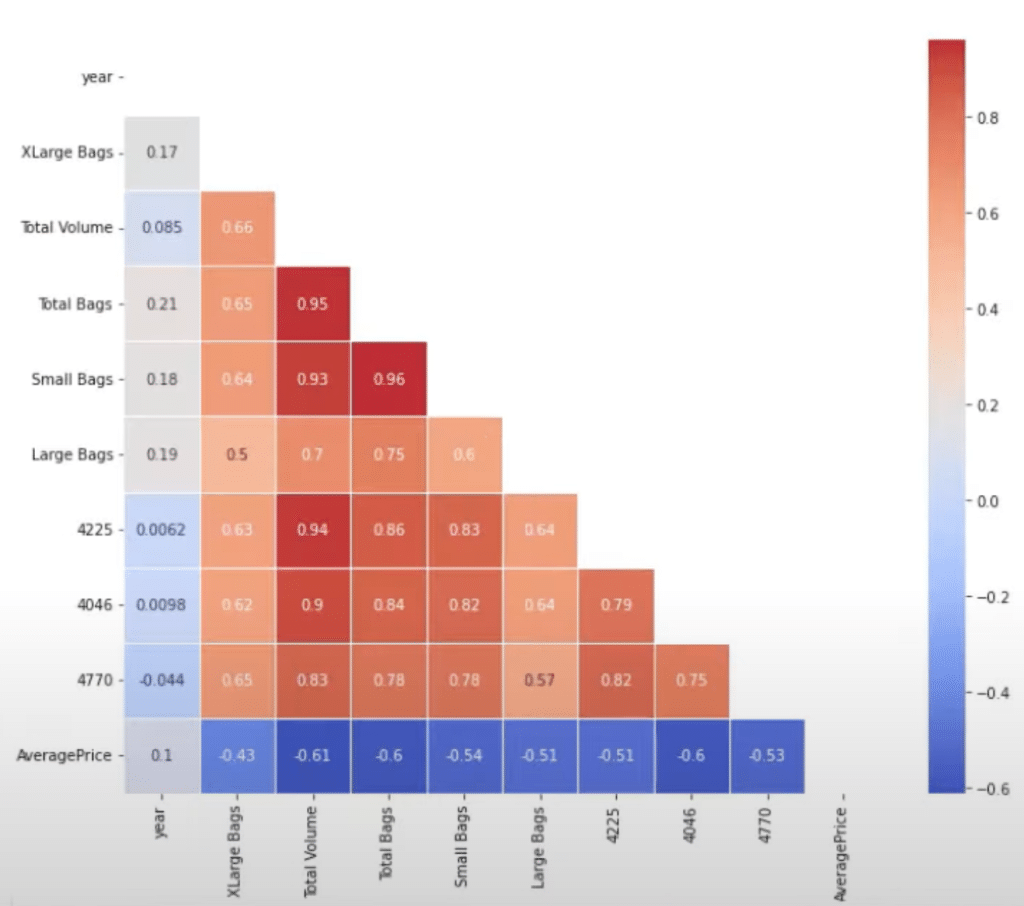
Python Correlation: Creating a Staircase Visual
One advanced way to visualize our Python correlation is by using a mask to block out all of the correlations that we have already done.
We can do this with Numpy, using some TRUE and FALSE functions to make a staircase visual for our correlations.
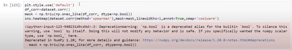
Here’s how the results should look like.
Let’s see how we can pipe this over into Power BI.
Staircase Visual in Power BI
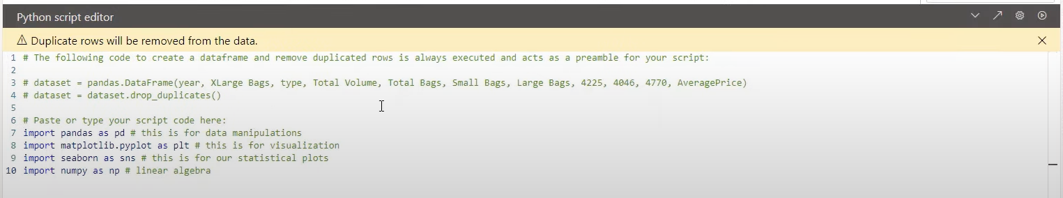
First, open Power BI. I’ve brought in an avocado dataset so we can see a different visual. You can see this dataset under the Fields pane. Initialize the Python visual by clicking on the Python icon under the Visualizations pane.
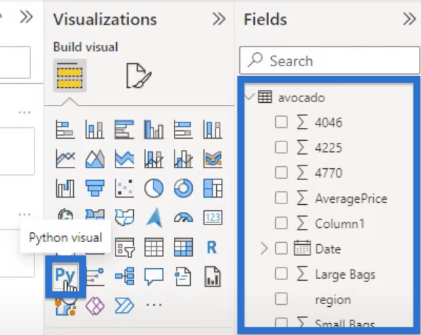
We need to create the dataset by adding in all the numerical variables that are indicated with the ?. Add them by clicking the check boxes beside these variables.

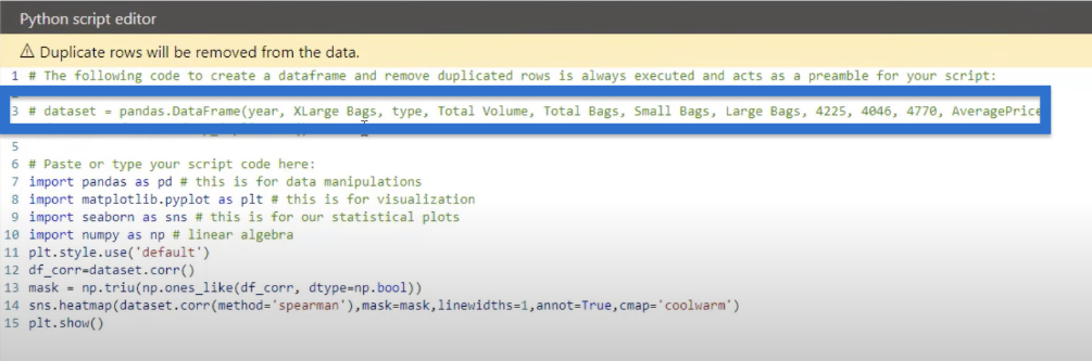
Now that we have a data set, we can go over to our Jupyter notebook and copy this code we had earlier.
Then, we will copy the code to the Python script editor in Power BI.
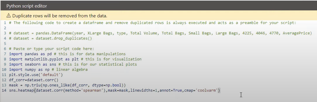
Next, we will choose our visual, which would be the staircase visual. We’ll go back to Jupyter, copy the code that we used for our staircase visual.
Paste the code into the Python script editor.
The last thing to do is make sure we are using plt.show, which is required in your Python script. Add plt.show in the last line of the code and click the run icon on the upper right corner of the script editor.
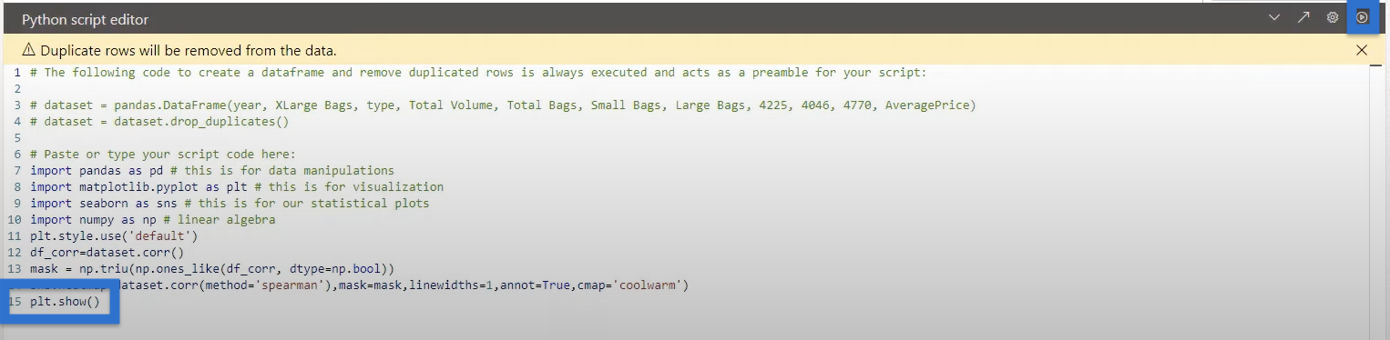
For a bigger visual, stretch the box a bit so we can see the script running in the corner. We have our visual for our heat map, which looks quite nice.
And in Power BI, we can definitely see how that visual may change according to the dataset. For example, we can click the Slicer icon in the Visualizations pane and go to Type in the Fields pane.
It will give us the two types in our data set, the conventional and organic. If we click one type, say organic, you can see that the heat map changes.

Changes will also apply when we click on the conventional type next.

Remember that we need to have a categorical variable in the dataset of our Python script to make these filters work. As we can see, the data set we created included type, enabling us to filter the visual in that manner.
***** Related Links *****
Building Your Data Model Relationships In Power BI
Text Analysis In Python | An Introduction
Python Scripting In Power BI Data Reports
Conclusion
In this blog, you learned how to visualize correlations in Python and Power BI using different methods such as Pearson correlation and Spearman rank correlation.
Now, you can create scatter plots, regression plots, correlation matrix, heat maps, and staircase visuals to get the best visual for your data set. You can also use a variety of parameters to improve the styles and visuals.
All the best,
Gaelim Holland
[youtube https://www.youtube.com/watch?v=SOUMbjtWkPQ&w=784&h=441]


